
SEO is all about one thing — helping the right people find the right stuff online.
This has been my obsession for more than ten years now. I want to figure out the best ways to do just that.
Not many people realize this, but a few years ago, I felt like I had hit a wall in my knowledge of SEO.
I had spent years trying to figure it all out — the algorithms, the linkbuilding, the content optimization, the technical optimization.
I felt like I had a good handle on things. Sure, I could always be improving on my knowledge.
But honestly, it was quite discouraging.
It was kind of like the feeling you get when you graduate college or high school. You’ve waited so long for this day, and then you’re like “Oh, so this is what it feels like?”
It wasn’t that I had mastered everything about SEO. It was just that I knew most of what there was to know.
End of story.
Boring.
Discouraging.
And then, BOOM! Everything changed.
I should have seen it coming. Mobile was dominating, and finally, Google pulled out all the stops.
SEO changed forever.
There have been several huge SEO changes over the years. We all know about Panda and Penguin, but the big consumer-facing changes may have an even bigger impact — like Google’s Knowledge Graph.
The biggest change of all, however, has been the mobile revolution.
That’s when my SEO knowledge went from, “I’m comfortable with this stuff” to “I have no idea what I’m doing!”
Google announced its mobile-first index in November 2016 because they were trying to solve a problem.
Most people were using Google on their mobile devices, but Google’s ranking systems were based around the desktop.
The solution — mobile-first indexing — changed the world. We’re never going back to the days of optimizing search for desktop only.
So what does this mean for you? As it turns out, there are a lot of implications. You might have to make some serious changes to your site if you want to even have a shot at ranking well.
In this article, I’ll go over exactly what the mobile-first index is, what it looks for, and how you can rank well by keeping it in mind.
Learn how I generate over 195,013 visitors a month through mobile-first indexing.
Why this massive shift towards mobile-first indexing?
In case you missed it, mobile is the new normal.
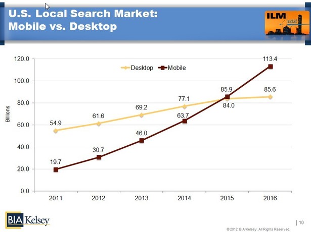
3 out of every 5 searches happen on mobile, and mobile far outpaces desktop as the number one method of searching.
That datapoint in itself is reason enough to move to a mobile-first indexing approach.
But there’s more. It used to be that mobile searches happened by people, out and about, on the go, away from home.
Not anymore. A full 77% of mobile searches now happen at home or work.
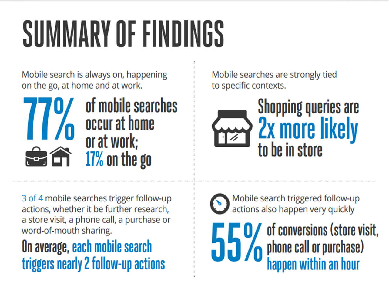
So what do these users do after they search on their mobile devices?
They shop, of course. According to Digital-Stats, 75% of mobile searches produce at least two follow-up actions.
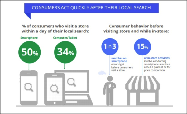
In other words, they convert. And what conversion rates they are!
According to one infographic, the conversion rate for visiting or purchasing is a whopping 90%.
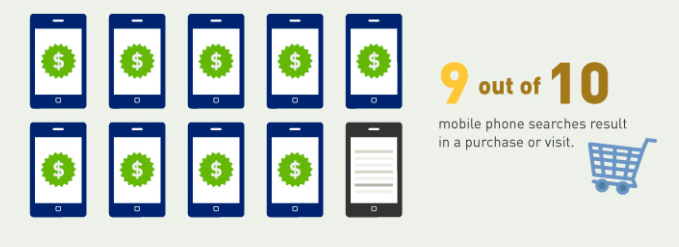
All this mobile searching leads to real results, real action, and real revenue for millions of businesses.
It’s not just statistics. This is real life.
An in-depth look at the mobile-first index
Here’s what the official post from Google Webmasters has to say about the mobile-first index. Hang on, because this is a big paragraph.
To make our results more useful, we’ve begun experiments to make our index mobile-first. Although our search index will continue to be a single index of websites and apps, our algorithms will eventually primarily use the mobile version of a site’s content to rank pages from that site, to understand structured data, and to show snippets from those pages in our results. Of course, while our index will be built from mobile documents, we’re going to continue to build a great search experience for all users, whether they come from mobile or desktop devices.
Mobile-first indexing is pretty much what it sounds like. From now on, Google will primarily consider the mobile version of your site to rank it in Google (both the mobile and desktop versions).
That means if you have a site optimized for mobile, you’ll rank well on both mobile and desktop.
On the other hand, if your site doesn’t perform well on mobile, your rankings will sink on both mobile and desktop.
This is a bold move by Google. Bold, but necessary.
While almost all marketers and SEOs have prioritized mobile content, it’s more important now than ever before to focus on mobile.
In short, to rank well on Google with the mobile-first index, you need one important ingredient: a responsive mobile-optimized site. (We’ll dive into this later on.)
This doesn’t mean that all non-mobile SEO is for nothing, but in the coming years, mobile SEO will probably be the only thing marketers and SEOs will focus on.
The mobile-first index is still rolling out, but we’re seeing its impact already.
In the next several months, Google will probably finish the release, so it’s possible that the mobile-first index will be everywhere by the end of 2017.
What the mobile-first index looks for
It’s obvious that the mobile-first index favors mobile-friendly content. But let’s qualify that statement a little.
Jayson DeMers gave a great definition of what Google considers to be mobile-friendly.
Google just cares that people will be able to load all pieces of content on your page, read the text without having to zoom or scroll, and interact with any buttons present.
Generally, mobile-friendliness has the following characteristics:
- Responsive design (i.e., site design that changes depending on the size of the screen it’s being viewed on)
- Ease of use on a mobile device
- Site speed
- Good interstitials
Responsive design is a big must-have. It’s Google’s preferred type of site design, and it’s safe to say that responsive sites will do really well in the mobile-first index.
A great mobile site should look nice, be easy to navigate, and display well on a mobile device. Etsy is a perfect example:

Evernote also has a wonderful mobile site:

Both sites fit all of the criteria: they look nice, they’re easy to navigate, and they display well on mobile.
These are the same characteristics your mobile site should have. If you’re lacking one or more of these features, your ranking could plummet.
Depending on the current state of your mobile site, you may need to create a completely new mobile site from scratch or simply make a few changes to your existing site.
Here’s a checklist of everything you need to do to prepare for the mobile-first index.
1. Use responsive design
This is by far the most important thing you need to do to rank well on the mobile-first index.
Responsive sites are essentially two-for-one value. They rank well on both mobile and desktop because the design changes to fit the size of the screen.

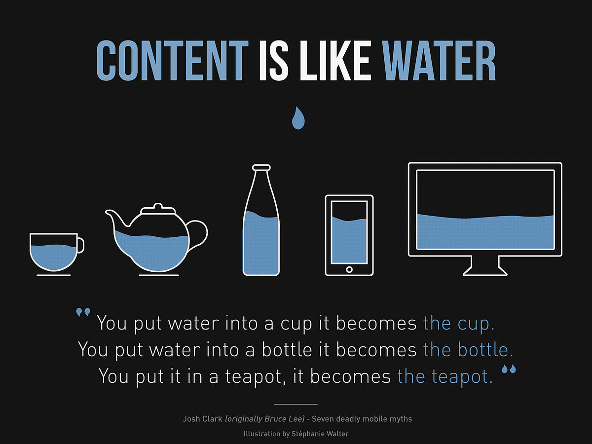
I like the way that Bruce Lee…I mean John Clark…defined responsive design.
Before we go any further, I should make an important clarification: All responsive sites are mobile-friendly, but not all mobile-friendly sites are responsive.
Let’s look at what “responsive” and “mobile-friendly” mean. A great article by Atomic74 breaks down the terms like this:
Responsive: Changes based on the size of the screen/type of device being used
Mobile-friendly: Works the same way across devices
In other words, a mobile-friendly site will look the same on desktop and mobile, but it will be designed for mobile.
That means the desktop version may be a little less than what it could be had it been designed exclusively for desktop use.
Responsive sites, on the other hand, give people the best of both worlds. And that’s a large part of the reason why Google recommends implementing responsive design.
Today, the term mobile first is so commonplace that it has become an accepted part of design and development best practices.
In fact, to some people, the term “desktop version” of a website seems dated and passe — like listening to Backstreet Boys in 2017.
Today, it’s becoming more commonplace to refer to the “desktop version” as the “non-mobile version” of a site. Why? Because mobile is the standard.
But we still have to cater to the non-mobile population. That’s why we use responsive design.
Now let’s take a look at responsive design in action.
Earlier, we looked at Etsy. Now let’s take a look at how its desktop version compares to the mobile version.
Desktop:

Mobile:
On the mobile version, everything becomes more compact, but you can tell it’s still the exact same size.
It’s as if the developers took the desktop site and shrunk it. That’s exactly what responsive design is.
Whether you’re using a computer, phone, or tablet, you get a great experience, and the site changes to fit the device you’re using.
If you want to rank really well on Google from now on, you should make your site responsive. You do the work once and enjoy the benefits day after day.
If you’re new to responsive design, there are a few things you can do.
First, Google offers a free course on responsive design:

This course walks you through the basics of responsive design and how to create a responsive site.
It’s an excellent resource that’s officially produced by Google. (And did I mention it’s free?) You can’t get much better than this.
Google also provides some helpful tips in a text-based version of the course, which you can view here.
If you want to learn more, this article by Smashing Magazine is a must-read.
Before we go on, I want to remind you of those characteristics I mentioned at the beginning of this article and give you some tips.
- Ease of use on a mobile device. Design for the fat finger, as Moz says. You should make buttons and links easy to click on and hard to miss.
- Site speed. Page speed plays a vital role in its mobile performance. Here are 10 quick tips to help you improve your site speed.
- No interstitial popups. Google’s been cracking down on a certain type of mobile popup called interstitials. Here’s why you should avoid them (and what to use instead).
Like I said, responsive design is the #1 biggest factor that can help you rank well with the mobile-first index. But your website design in general also needs to be awesome.
It’s so worth it to put in the work today so you can rank better tomorrow.
2. Optimize your content for mobile
I’ve seen too many sites that claim to be mobile-friendly, but their content is definitely not.
I think there’s a big difference between what most people think is mobile-friendly and what is actually mobile-friendly.
That’s especially true when it comes to content. Your mobile visitors need to have the same great content experience that desktop visitors are having.
The fact is, there’s a good chance that most of your visitors are accessing your site through mobile as it is.
American adults spend more of their Internet time on a mobile device than a desktop device.
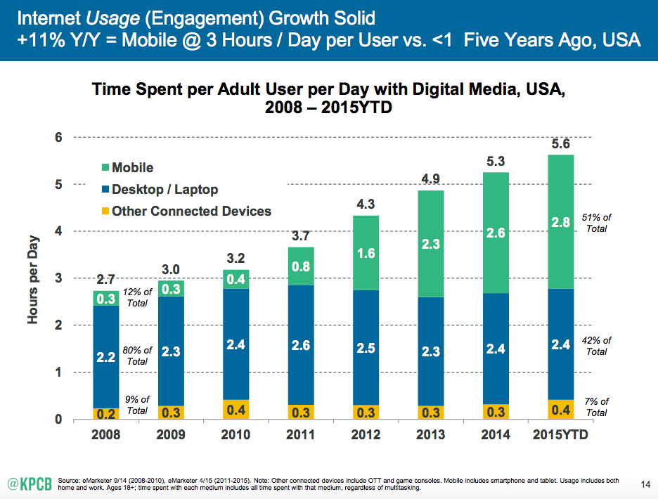
Thus, all their searching, interacting, and content consumption is happening in a mobile context.
It logically follows from a mobile-first indexing standpoint that your content should be produced with mobile-first users in mind.
Here are some important steps you need to take to make sure your mobile visitors are fully experiencing your content.
Rethink your articles. As HubSpot points out, a 3,000-word blog post looks great on a desktop, but it can be intimidating on a mobile device.
If you post long-form content like me, try using shorter paragraphs and then breaking those paragraphs up with media (like infographics and screenshots).
Ever wonder why my paragraphs are so short?
Because a lot of my readers are mobile readers. I want them to be able to read this text just as easily as the non-mobile readers.
If you’re reading this on a desktop, here’s a mobile screenshot of one of my other blogs:
Now if you tend to post shorter content, you don’t have a lot to worry about. Just make sure the content is nicely formatted for mobile screens.
Use multiple types of content. Audio and video perform exceptionally well in mobile environments. If you have a good combination of written content and audio or video, your mobile users will have a much better experience.
For example, Asana features a video on its homepage:

It’s easy to view on both mobile and desktop, and it provides a nice change from plain text. You should include more media on your site for that reason alone.
Don’t use Flash. This one should be obvious by now.
Since iPhones don’t support Flash, you’ll be alienating millions of mobile users. Use HTML5 instead.
3. Create a mobile-first strategy
Lots of site owners are still living in a desktop-first world. They create everything with the desktop in mind and then transfer it over to mobile.
But that doesn’t fit the world we live in.
According to Smart Insights, mobile Internet use makes up 51% of total Internet use. Mobile use has officially overtaken desktop use, and it’s important to focus on that.
From now on, consider mobile environments first. Most of what looks good on mobile will look good on desktop.
But what if you don’t have a mobile site?
Many of you are probably thinking, “I don’t have a mobile site. What will happen?”
In short, nothing.
But that doesn’t mean your ranking isn’t suffering. Quite the opposite.
Let me explain. If you don’t have a mobile site, Google will just use your desktop version to rank your site.
Google already has a bias against sites that aren’t mobile-friendly.
So that means that if your site isn’t mobile-friendly now, it’s already taking a hit. Google has prioritized mobile-friendly content, and this official indexing move is just making it more official.
Mobile Internet usage has been climbing steadily over the last few years. Google has seen that and adjusted their ranking systems accordingly.
So your site is already being judged on its mobile-friendliness or lack thereof.
In my opinion, it’s not worth it to stick with just a desktop version now. Even if you’re ranking pretty well, you could lose to sites that may not be as good as yours but that are mobile-friendly.
In other words, having a mobile-friendly site might mean the difference between ranking well or sinking in the SERPs.
Conclusion
Creating a mobile-first experience is more important now than ever before.
Let me reiterate one statistic from earlier: Mobile Internet use makes up 51% of total Internet use.
You can’t afford to ignore mobile optimization any longer. Google has already been prioritizing mobile-friendly sites, so if you don’t have one, I’d recommend doing that as soon as possible.
Like I said, your best bet is a responsive site. It takes care of both the desktop and mobile user experiences in a single move.
Don’t let the lack of a mobile-first experience stop you from ranking well. If you take the time now to focus on making your mobile site great, you’ll be able to rank better and give users a better experience.
What are your thoughts on mobile-first indexing? What changes have you implemented as a result?
Comments (82)