
If you run an e-commerce website, you know that ranking higher than your competitors on Google is the key to driving sales.
However, if you don’t have some super handy search engine optimization tricks under your sleeve, the chances of you ranking higher than your competitors is slim.
And one of those search engine optimization tricks is staying on top of where user behavior is headed.
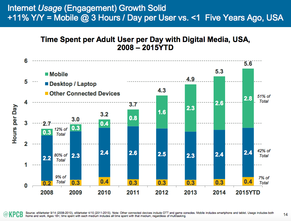
In 2014, a comScore report showed that mobile traffic has overtaken traffic from desktops. In 2015, Google officially declared that mobile searches triumphed desktop.
But, traffic is just the beginning stage of the funnel for your e-commerce site.
Conversions hardly occur on the small screen, because of high physical and mental friction, while more than half of all email opens now occur on the small screen.
Visitors to your e-commerce site might take a multi-screen approach and only browse your products on mobile. And, they might later complete the purchase on their desktops.
So, mobile is only seen as a supplementary source of exposure. It’s not a commerce medium. Am I right?
Nope.
Mobile has reached the tipping point, as the chief purchasing medium.
Mobile receives the same number of clicks as desktops and tablets. The improvement in mobile technology, coupled with user’s familiarity with using their phones, has led to a serious increase in mobile transactions.
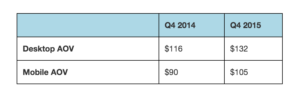
The revenue gap is closing:
The average order value (AOV) on mobile has grown by 15% year on year (it’s 13% for desktops). Mobile accounts for 30% of email orders and 25% of email-driven revenue.
It’s now more important than ever to craft a superior mobile experience for your customers visiting your e-commerce website because:
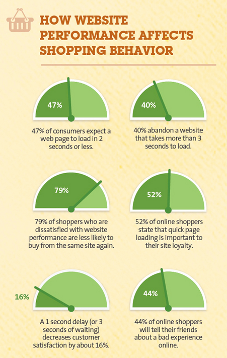
- 53% of mobile shoppers will abandon a website if it doesn’t load in 3 seconds.
- Mobile media consumption activity trumps laptops and other media.
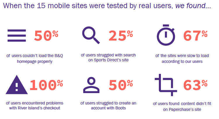
The bad news is that mobile retail websites still aren’t meeting user expectations. There are various problems plaguing conversions. Look at the results of tests, conducted by eConsultancy, on 15 websites.
Don’t worry, you can still catch up with the mobile game.
How so?
To start: by reading this post.
In this article, I’ve compiled mobile eCommerce optimization techniques that will help you close more sales.
Personalization: It’s time to go local with shopping and shipping
Mobile users are often looking for local businesses. As per Deloitte, 58% of consumers owning a smartphone have already used it for store-related shopping.
That calls for serving local information to your users.
And, on mobile, it’s easy to access enriching personal information and to understand user behavior.
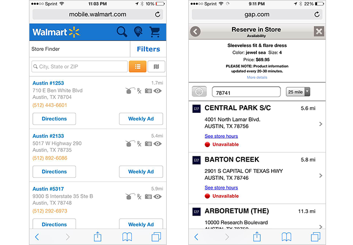
You can ask for permission to access your customer’s location through GPS and harness the info to create a personalized offer.
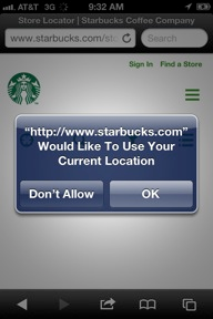
And, once you’ve got the location info, you can directly present the shipping duration and other info to the user, based on his locality. Here are a couple of examples.
- Estimated 2-3 Day shipping time to New York.
- Nearby brick and mortar stores.
Also, 75% of mobile shoppers have used a mobile coupon. Indeed, 50% of people download apps to receive a discount. Which means that you should offer personalized mobile coupons to your customers to drive them to your ecommerce site.
You can send push notifications based on the weather, time and location of a user (if possible, try to layer your messages with the user’s past behavior). Let me share two examples to get your creative juices flowing.
1. Quirky and GE joined forces to create a mobile-controlled air conditioner. And, they sent out weather forecasts daily through emails and text messages (based on a weather alert system, Poncho).
So, when did they send the promotional message to buy the air conditioner?
Only when the temperatures crossed 75 degrees.
60% of those emails and close to 100% of the text messages were opened.
2. New York Ice cream store, Van Leeuwen, rolled out mobile payments through PayPal.
The app uses geolocation to show nearby offers and sales to a customer. Van Leeuwen saw a 5% increase in its revenue from the payment app.

You can further segment your users and offer a welcome coupon to a new user. Or, surprise your repeat customer with a special discount to trigger a loyalty loop.
There’s always a possibility of a customer getting turned off by a huge number of updates. So, you should also consider offering your users an option to manage the information that they want to receive.

Optimize your e-commerce site for mobile and ensure blazing-fast loading speeds
Slow loading speeds lead to a poor user experience and cost eCommerce websites millions of dollars each year.
On mobile, internet connections are slower and the user is more impatient. To enhance the user experience and mitigate their frustration, you need to ensure that your ecommerce site loads quickly. You also need to confirm that your content is relevant and easily readable (Google recommends a base font size of 16 CSS pixels).
Google’s mobile-friendly test tool is a good place to start.
You can also use an emulating tool, like Mobiletest.me. It replicates how your e-commerce website will look on a range of devices.
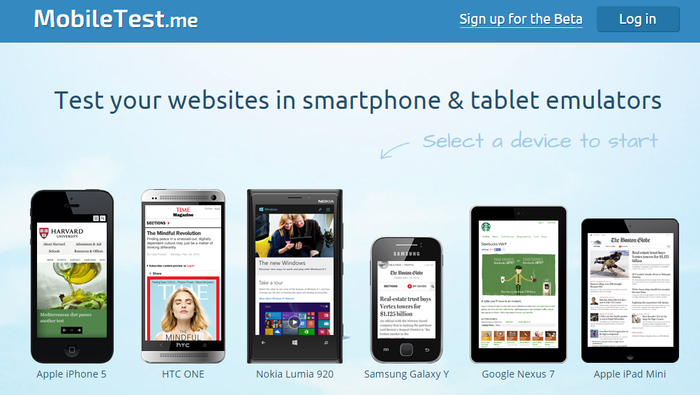
Once you type in your site URL, click on the ‘Go’ button.

You’ll get an emulated version of your website.

Here are other key pointers you need to keep in mind for mobile page optimization.
1. Eliminate every unnecessary word from your page – Search Engine Land found that mobile searchers are very specific in their queries. So, your content should only serve the most relevant information to the user, based on his current stage in the buying cycle.
You can’t afford to serve irrelevant information on mobile because of the limited working memory of a user. Your headlines should be short and punchy. You can gain the attention of the reader, only if you clearly state the benefits to them.
If you’re going long-form, then consider using accordions to give your customer a bird’s eye view of your content.
2. Use HTML localStorage specification for faster loading time – Browser caches and CDNs don’t work well for reducing your load time on mobile.
A better solution is using HTML localStorage specification or automated mobile acceleration solutions.
Your images also need to have an appropriate size and resolution fitting the mobile screens. Use tools, like Pixlr, for editing your uploaded images based on your page width.
If you’re using WordPress, you can also use plugins, like WPSmush, to compress your images without sacrificing their quality.
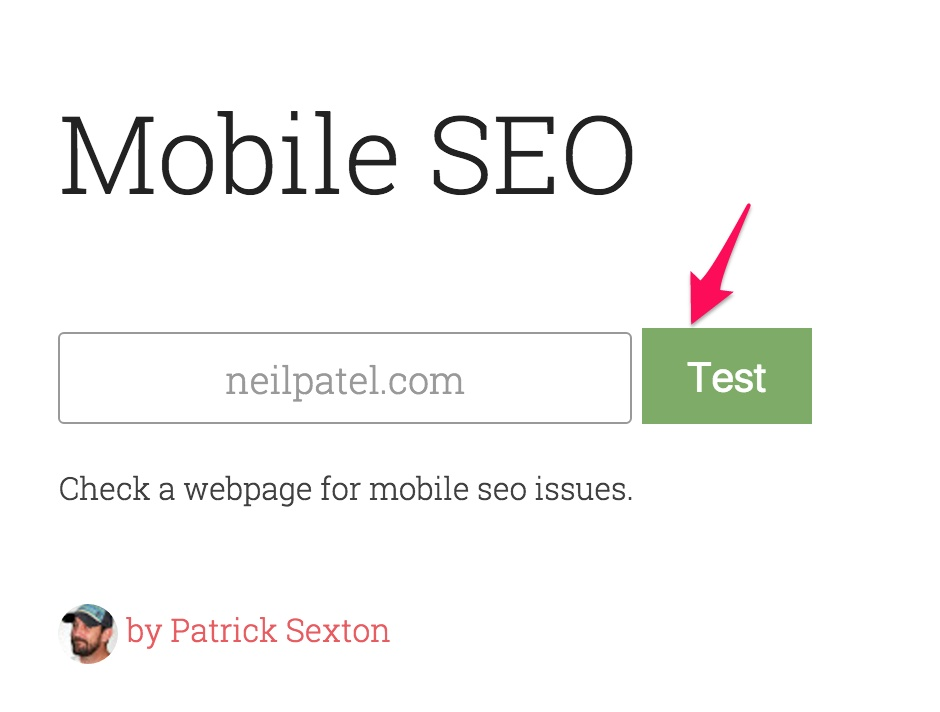
Finally, I want to introduce you to a tool by Patrick Sexton so you can walk away with some actionable advice for improving your mobile ecommerce site.
Head over to varvy.com/mobile, enter your website address and press the green “Test” button.
Here are the results I obtained.
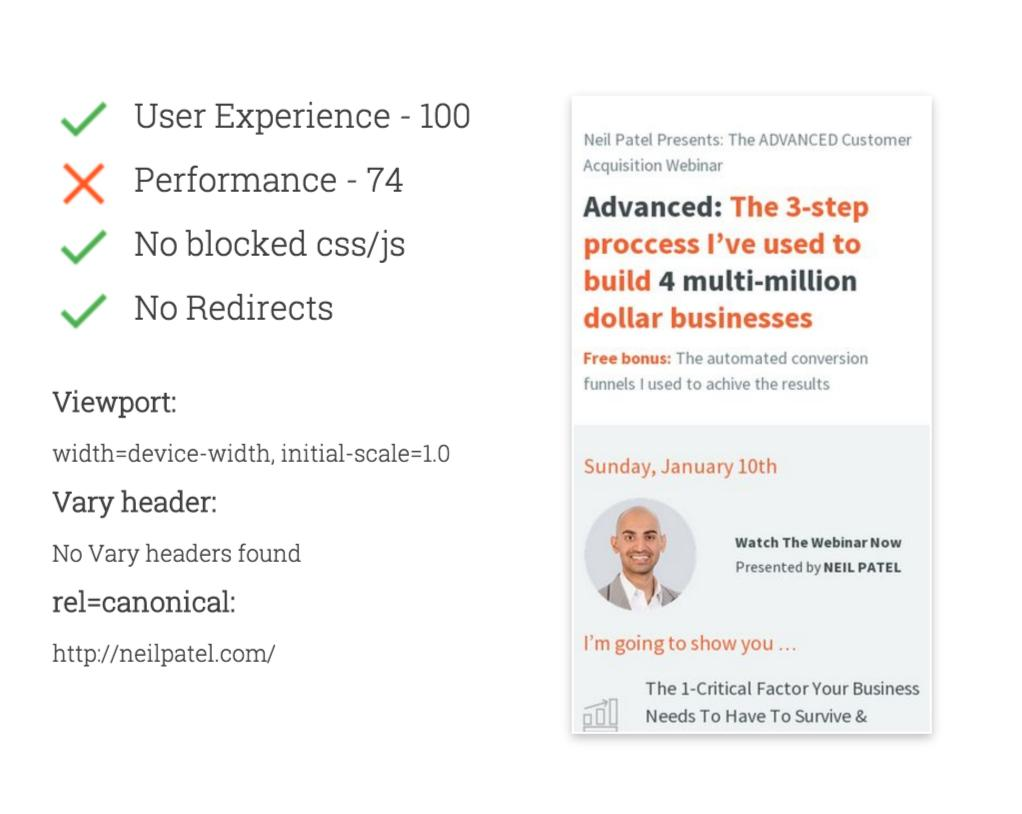
And, as you’ll scroll down, you’ll get recommendations for fixing your website.

3. No popups and sidebars – They’re both irrelevant and hinder the user experience.
Popups are difficult to close on mobile devices.

And, sidebars are distracting and awkward for the small screens.
So, what are the alternatives?
If your tool offers the option to disable pop-ups on mobile, then great. Otherwise, you can use a link that triggers the pop-up from within your content.

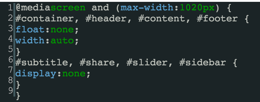
Here’s the code to hide your sidebar. You’ll need to access your website’s CSS file from “Appearance” > “Editor,” in WordPress, to add this code.
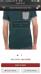
Keep important elements above-the-fold. And, your CTA button should be bold and specific.
On desktop, you get sufficient space to address your customer’s objections. But, I recommend that you keep your CTA above-the-fold.
On mobile, it’s even more important to respect the fold.
Want a user to abandon the cart?
Make a poor first-time impression and hide the buy button below-the-fold (discouraging action).
One solution that mobile e-commerce web sites use is adding a shopping basket at the top of the screen (right-hand corner). It displays the number of items added to the cart and an easy pathway for the user to checkout.
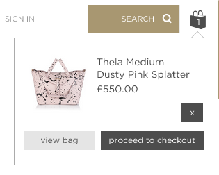
You can also launch a pop-up that offers the user the option to checkout if he wants to. Or, he can also continue shopping, if he wants to.

As I told you, mobile searchers are often very clear with what they want to achieve. They have probably already read about and checked out your product description on their laptops/desktops.
Now, it’s your duty to make the conversion path frictionless for them, by reducing the number of actions that they take.
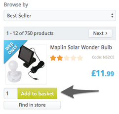
So, test ‘quick buy’ buttons to reduce the number of clicks to checkout.
You can also offer an “Add to basket,” option from the search results page.
The important elements that you might want to include above-the-fold are your logo and the ratings of the product. Your logo establishes your brand identity and reviews/testimonials are proof of your value, so they help to build trust in a prospect.
A great ratio to prioritize your most important elements is 70/30. Keep 70% of your most important elements (most relevant to your users) above-the-fold.
Next comes your CTA. It should be thumb-friendly (big in size) and preferably in contrast with its surroundings. Look how Groupon and eBay draw attention to their ‘buy now’ and ‘add to cart’ buttons.
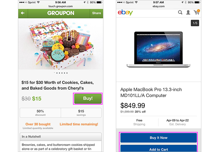
Note: Don’t try to get clever with your CTA copy on your mobile ecommerce site. It should enforce urgency and encourage action from the user, like “Buy Now” or “Add to Wishlist.”
Simplify your mobile form interactions by eliminating all of the inessential form fields and following these four other tips…
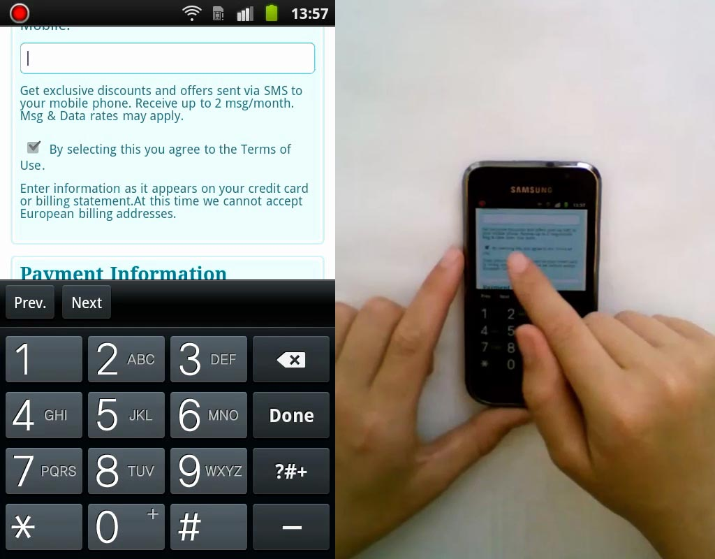
Even on mobile, PayPal requires 11 pages of scrolling from the user.
You know what’s easier than going through this cumbersome typing and tapping task?
Abandoning your website.
Remember: user experience is vital.
That’s why you need to limit the number of fields requesting information from the user. Get this number down to the most essential fields.
But, what if you can’t condense your form into one cohesive page?
Then, the user will concentrate on every field separately (losing sight of the overall picture).
So, all your form labels should be easily understood without context.
Jamie Appleseed, from Baymard, demonstrates it with a good example. A form field label shouldn’t be “Phone,” even if placed with “Billing Info.” Instead, it should be context-independent, reading “Billing Phone”.
Here are four more tips for ensuring mobile-friendly form interactions.
1. Names and addresses have a great chance of getting replaced by auto-correct. So, disable it on necessary fields by using the following code –
<input type=”text” autocorrect=”off” />
2. Unnecessary space between form fields requires conscious decision-making for the user to scroll. Bigger thumbs and fingers might need more space. Start with ¼ inch of space and try to find the right balance by testing.
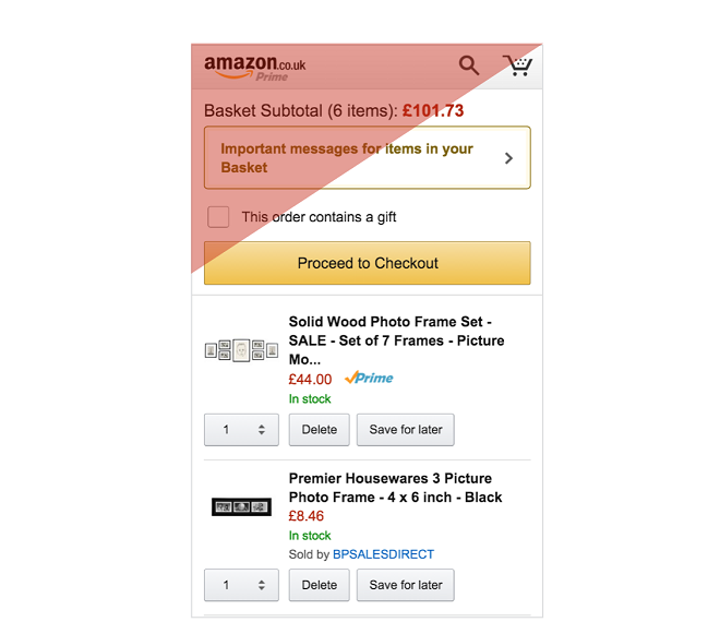
3. Put your form fields in regions that are comfortable to reach with a thumb.
Look at how Amazon places its CTA buttons in the easily reachable zone.
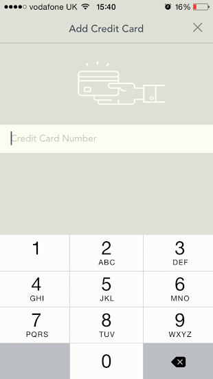
4. Your keyboard should adapt for info required in different typing fields. In the example below, YPlan changes into a numerical keypad for entering credit card information.
Smooth your website navigation and offer a guest checkout option
Only critical links, like your product categories and checkout, should occupy real estate on the mobile navigation of your e-commerce site. All other unimportant links should be collapsed under the menu bar.
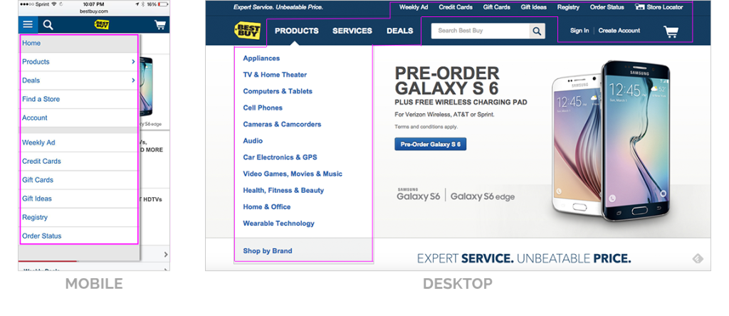
Look how differently Best Buy places its navigation in desktop vs. mobile (I bet they’ve prioritized the links based on customer data).
Once your customer has made his buying decision, the checkout process can feel tedious and boring.
A great way to keep your customers motivated is by showing a progress bar.

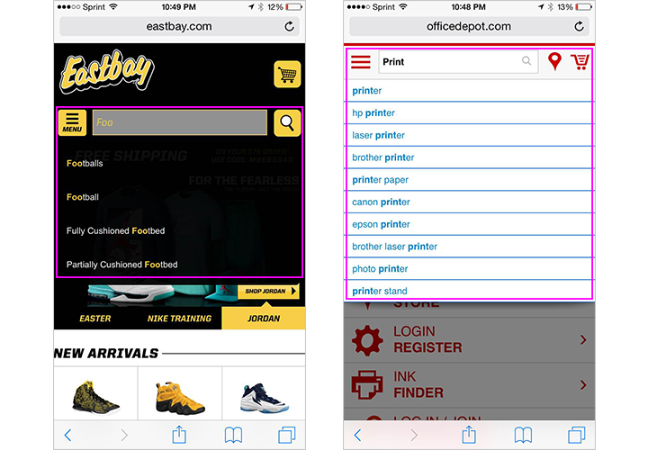
The next important navigational item that should be prominently visible to the user is the search bar. If possible, offer search suggestions, corrections and auto-completions, to save users from cumbersome typing.
The previous search data from your users can serve as a great staple for serving the most relevant suggestions.
Finally, I want to talk about an important fallacy that many eCommerce web site owners suffer from…
Forcing the user to create a new account while checking out. This isn’t a good practice as it equates to higher effort for the user to complete their purchase.
Did you know that 23% of users will abandon the shopping cart, if they’re forced to register?
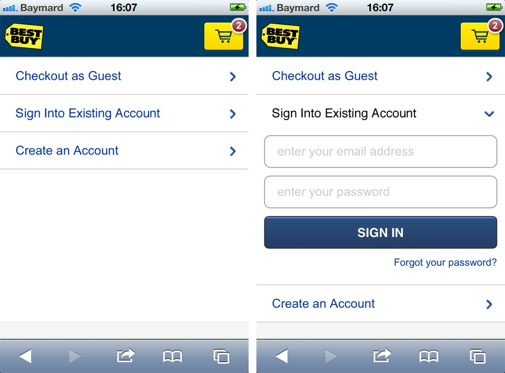
I would encourage you to keep the user experience in mind again and try something along the lines of the Best Buy example below. The user gets 3 clickable headers (at the checkout), giving him an overview of the different possible paths.
A major retailer saw a boost of $300 million in revenue, after removing the “Register button.” Give it a try.
Conclusion
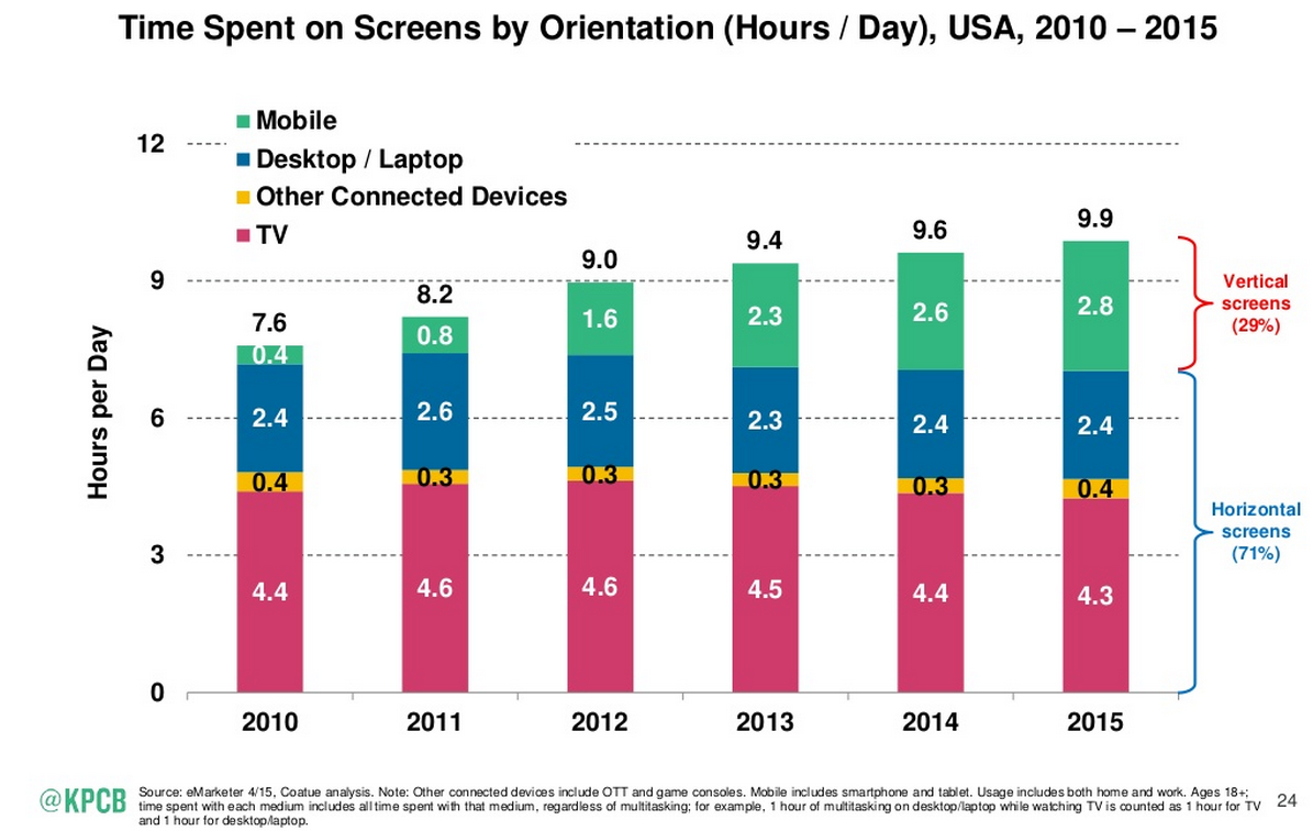
From browsing an ecommerce site to scrolling through social media feeds, the time spent on vertical screens has already surpassed that on horizontal screens. With user familiarity and advanced technology, mobile conversions are on the rise.
If you’re an eCommerce web site owner, you need to leverage this opportunity by optimizing your e-commerce site. I’ve broken down the process into five easy strategies for you.
- Personalize the mobile shopping experience.
- Speed up your website for mobile devices and ensure that your content is mobile-optimized.
- Use a 70/30, top-heavy design to prioritize your important elements above-the-fold. And, use a prominent, persuasive and clear CTA button.
- Keep your form interactions frictionless.
- Offer a guest checkout option and flawless navigation.
I hope you can satisfy your mobile users and generate more sales from the small screen.
Have you tested any optimization strategies on mobile that led to an increase in conversions?
Comments (30)