Imagine your name is Carl Douglas McMillon.
Just for a second.
Because if that was your name, then you would be the CEO of Walmart.
What would it be like to run the show for them?
You’re operating one of the world’s most recognized brands.
Billions of dollars in revenue, every single month.
But, you’re not measured by how much money the company’s making already. You’re measured by how much more money the company will make this year.
You take a look at the growth curve. And, you’re horrified.
It looks like the college readiness graph, which shows how many students score at least the average score on the SAT:
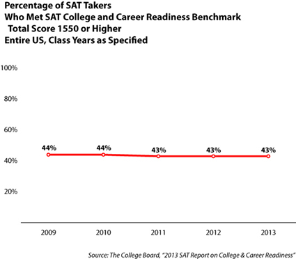
(Image source: AICUO)
Completely flat.
While it’s normal that the number of people who score the average amount of points on a test remains roughly the same, it’s not a good sign for company growth.
This is called stagnant growth and it means you might have to look for another job sooner than later.
You have to get more people to buy from Walmart.
But, how do you do it?
Everyone already knows Walmart. You’re basically in every geographic location that you can be in, plus, you’re cheap as hell.
What do you do?
Easy. You pick up the phone and call a conversion optimization expert.
If you call the right guy, he’ll make you 20% more money, in a matter of months, using conversion rate optimization techniques and securing a bright future for Walmart and making sure that you can keep your comfy desk chair.
And, that’s exactly what they did.
Walmart, I mean, at least their Canadian branch.
But, before I show you how they increased their conversions by 20%, which, for Walmart Canada easily means making another million bucks, it’s time to establish some definitions that you can use to work through this conversion rate optimization guide.
Definitions
What does a conversion optimization expert even do? Sounds complicated!
For once in their life, Wikipedia really nailed the definition of conversion rate optimization:
“In internet marketing, conversion optimization, or conversion rate optimization (CRO) is a system for increasing the percentage of visitors to a website that convert into customers, or more generally, take any desired action on a webpage. It is commonly referred to as CRO.”
I hate to admit it, but it’s hard to explain it in an easier way.
But, in order to fully understand it, we need to back up a bit and look at what a conversion rate, and therefore, a conversion, even is.
Conversion rate is actually as old as business itself. Just the language is new.
Imagine a marketplace in ancient Rome.
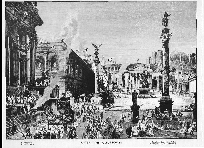
(Image source: Forum Ancient Coins)
Let’s say you’re trading precious diamonds that you’ve managed to get a hold of from the far corners of the ancient empire.
Like many other marketers, you offer your goods in a market stall.
Over the course of the day, 100 toga wearers pass your stall and start trading and debating with you.
Hermes, the god of trade, wants good things for you and you convince 30 of your visitors to buy a diamond.
The day before, you were a little sleepy, and since espresso hasn’t been invented yet, you only managed to sell 15 of the valuable jewels, even though the same number of people, 100, visited your stall.
However, that means that from one day to the next, you doubled your conversion rate – an increase of 100%!
Whether in ancient Rome or on a modern ecommerce website, the conversion rate just describes the share of visitors to your store (or now your website) who actually buy from you.
So a conversion is really just another word for making a sale. Whenever someone actually ends up buying from you, that is counted as a conversion.
You can extend the meaning of conversion rate, however. For example, you could call it a conversion if someone who visits your Twitter profile ends up following you.
Or, a conversion could happen when someone visits a landing page that you created and signs up for your email list.
In online marketing, a conversion is when your visitor takes the action that you most want them to take.
That means that your conversion rate comes down to this simple formula:
![]()
(Image source: Wikipedia)
You define what a conversion is, but it means sales, in most cases.
However, if you’re running a small consulting business, maybe you just want people to pick up the phone and call you. That can be a conversion.
If you’re running a restaurant, maybe you’ll count dinner reservations.
Okay, okay, you get it.
But, why does conversion rate optimization matter?
What increasing your conversion rate really means
Let’s walk through an example, so you can see why conversion rate optimization is important.
When Walmart does something, they do it right.
There’s a reason that the family members rank among the top 10 of the world’s richest people.
Naturally, optimizing the website of Walmart Canada for conversions wasn’t an easy task. Most conversion optimizers would tremble at the sheer size of the project.
In 2013, Walmart.ca noticed that a large chunk of the traffic to their e-commerce website came from mobile devices, like tablets and smartphones.
Unfortunately, the page wasn’t optimized for mobile at all, resulting in 2 major problems.
The design was terrible and the loading times gigantic. 2 proven revenue killers, because online, it has to be beautiful and fast.
(I’m guessing the image in the middle worked, but still, pretty bad)
According to SimilarWeb, the website gets 6.6 million hits per month.
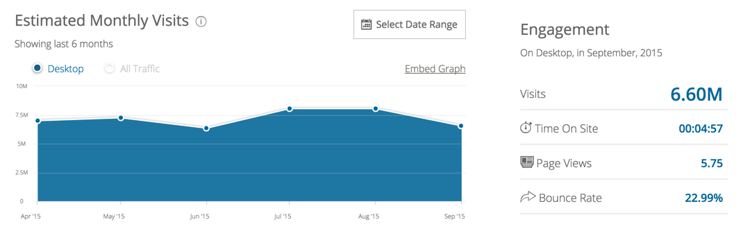
That’s probably more of an estimate, but let’s just run with it. Assuming 5% of people end up buying something (not unlikely, considering people spend almost 5 minutes on the site, on average, browsing almost 6 pages), that means 330,000 people buy from their online store each month.
What options do you have, if you want to increase revenue from the online shop?
You could:
- buy more ads, for example with Google Adwords, until you get 20% more traffic to the shop (terrible idea).
- do targeted SEO, trying to increase traffic by 20% (takes forever and costs a lot if you don’t do it yourself).
- hire 10 more marketing people and hope they figure it out (didn’t you want to make a million, instead of spending one?).
- offer 20% more products (so basically come up with a ton of new stuff to sell).
All of these options are bad.
They’re all “more options.” They take more time, more money and more resources, while leaving the results completely unpredictable. You don’t know if these strategies will work at all and if they do, how long they will take to kick in.
Herein lies the magic of the conversion rate: You just optimize what’s already there and thus create more profit from your existing customers and traffic.
This is exactly what Walmart did and how they doubled the sales made on mobile devices. Looking at all online channels shows an increase in conversions of 20%.
Continuing with our example, a simple step up in design and improving loading times would lead to 396,000 people buying instead of 330,000.
Say the average purchase is $20.
What would that mean?
If 66,000 people more spend $20 on Walmart.ca each month, that leads to a revenue increase of $1.32 million.
How’s that for making a quick million dollars on low-hanging fruit?
Would you spend $100,000 on a conversion agency, if they made you 1.3 million with improved e-commerce conversions? Yep.
So, they focused on user experience first.
This is what the re-design looks like:
The page also adapts to mobile.
(Image source: ConversionXL)
Not only did they boost loading times by about 35%, they also hooked the site up on a fully scalable grid, to make navigation easier.
The design has been improved and holds up to modern user experience criteria.
Furthermore, the website is now responsive and exactly fits itself to custom browser and screen sizes for different kinds of tablets and smartphones.
But, they didn’t stop there.
The devil is in the details.
They also used A/B split testing to determine what really works and what doesn’t. That’s how they came up with this.
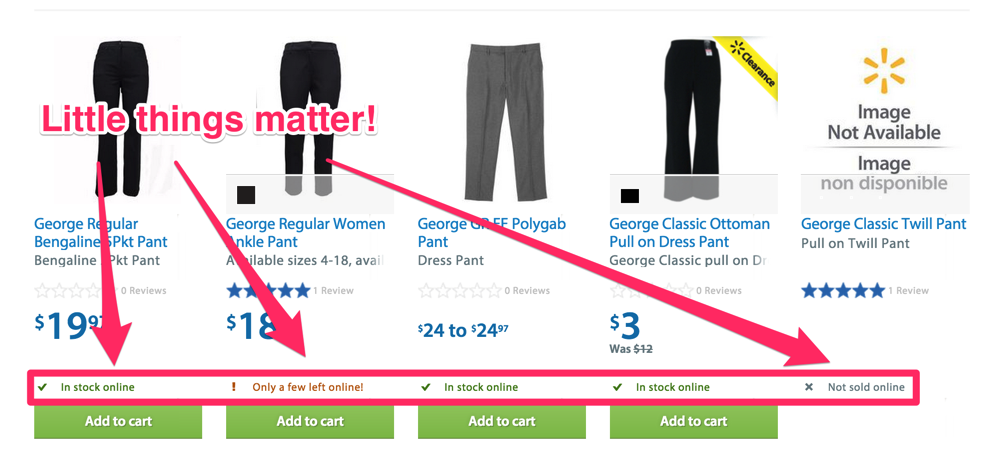
Collected data showed that removing the “Add to cart” or “View item” button, for things that weren’t available to order anyways, drastically improved conversions.
Furthermore, they now instantly show you whether the item is in stock, about to be sold out (which is a great urgency play) or not even sold online.
This helps shoppers decide what to add to their cart more selectively and thus, boosts conversions.
Your conversion rate is the easiest way to increase profits for your business and that’s why it’s so important to optimize it.
That said, I want to now introduce you to 5 conversion rate optimization strategies that you can implement today to improve your conversion rate.
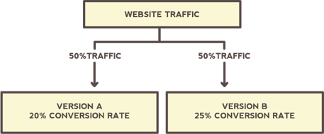
1. A/B testing
Think of it as conducting a scientific research study.
You split your traffic into two groups.
Group A gets to see a different version of your website than group B.
(Image source: Quick Sprout)
You can test different factors, like headlines, colors, buttons, website design, calls-to-action, font size and more.
Even the president uses it.
During the 2008 election, Obama’s team split-tested the website of the campaign.
They tried 24 different versions. Once they found a site conversion winner, it helped collect 2.8 million more email addresses.
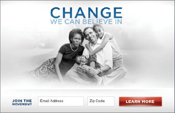
(The winner – via Quick Sprout)
The key with A/B tests is to change only one thing from variation to variation. This is a cornerstone of conversion rate optimization.
For example, if you change the placement of the button, the image and the copy from version A to B, and B actually performs better, how can you know what it was that improved your conversion rate?
Was it the button being on the right instead of left? Or the new image?
You can only derive meaningful results from A/B testing if you can attribute the changes in conversion rate to a specific change that you made.
Take a look at the two screenshots made of this blog:
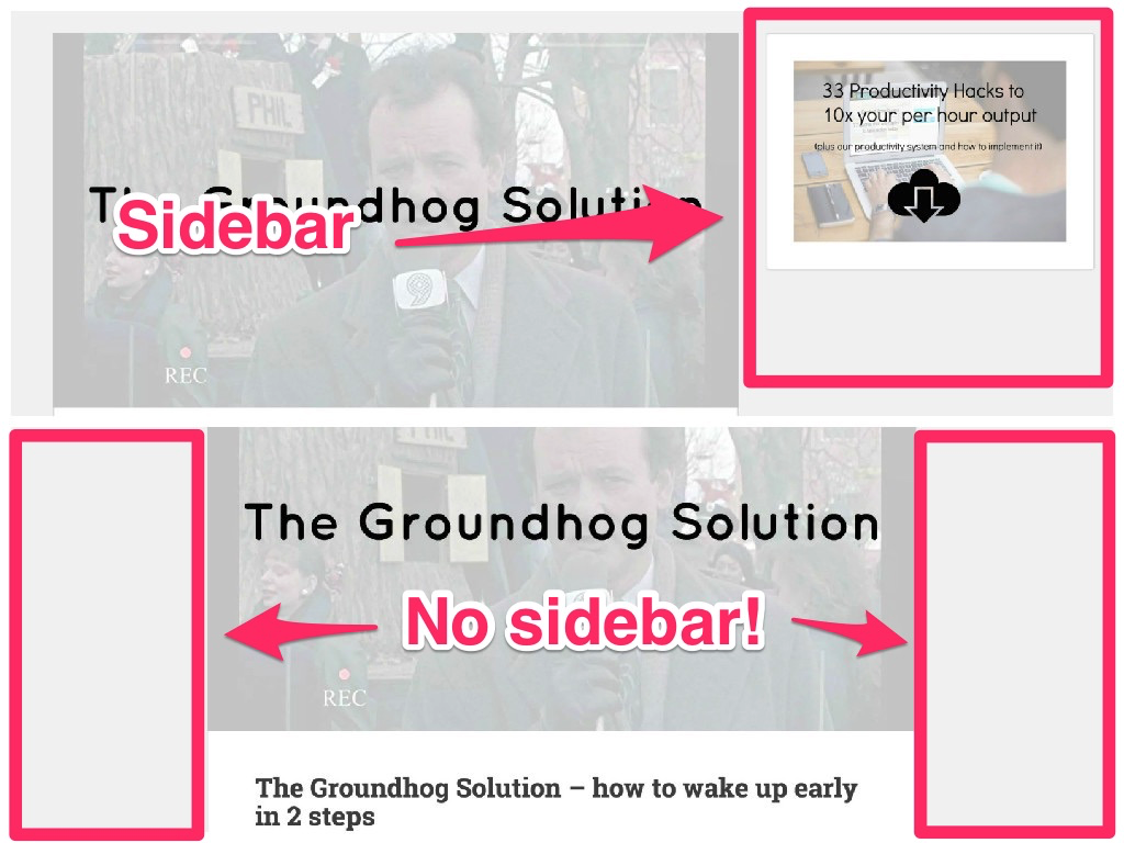
On one visit, there’s a sidebar. On another, there’s no sidebar.
That’s also how you know that your competitors are doing A/B testing.
Note: Tests are often tied to users with cookies, so you don’t see a different version of the page every time you visit. Try checking back once a week or once a month, since pages are usually only switched around after a certain period of time.
If the goal of the blog is to generate email signups and they drive 1000 visitors to each version of the page and, with the sidebar, 10% of people sign up and without it, 20% of people sign up, then they know no sidebar works best.
However, it is important to collect enough data. Otherwise, your results won’t be statistically significant.
Once you get results, instead of completely giving up the version that doesn’t work as well, try increasing the share of traffic to the better converting option instead.
Split your traffic 75%/25% and see if the conversion rate holds up.
Then, you can let go of one version altogether.
Note: I also recommend doing A/A tests first, where you copy your landing page, but leave it exactly as is, in order to test your software and see if it reports false data.
There are a ton of things that you can A/B test, but here are some good starting points:
- Headlines
- Colors of design elements (like buttons)
- Placement of buttons (left vs. right vs. center)
- Page layout (sidebar vs. no sidebar)
- Copy (how do you describe your product?)
- Calls-to-action (buy now vs. try now)
- Media (images vs. videos vs. text)
These are also fairly easy to test and don’t take a lot of time. To start testing, you can use software, like Optimizely, but make sure that you have enough traffic to get meaningful results first.
2. Customer Value Proposition
Customer value proposition, or CVP for short, clearly describes the added value that you bring to your customers and that no one else can give them.
It’s much more important to answer the question “Why should I buy from you?” as opposed to “What do I get, if I buy from you?”
A powerful and carefully crafted CVP moves you right to the bottom section of the customer conversation funnel.

(Image source: Search Engine Land)
What you do should be utterly clear, the second someone lands on your page.
Your CVP can then take it a step further and help the customer find out if they share your why, your values and whether or not they can trust you.
Let’s look at some examples.
Chili’s has designed a great landing page, using Unbounce, with a clear CVP:
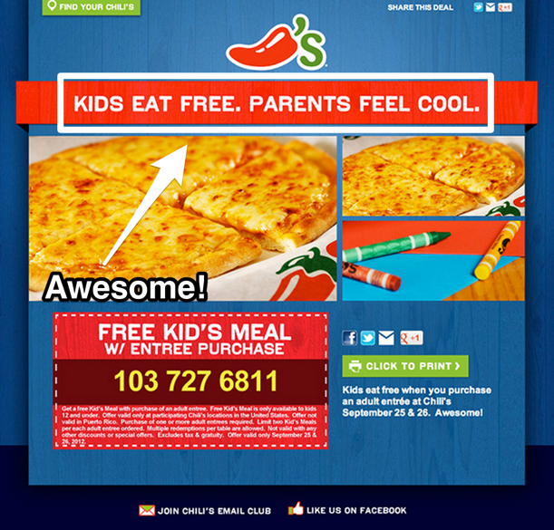
Kids eat free. Parents feel cool.
As a parent, I immediately understand why I should buy from them. I get to feel like a great parent.
My kids eat for free, which is something that no one else offers to me.
I immediately know that they sell pizza, because of the picture. The next step, how I can believe them, is right at the bottom.
A coupon for a free kid’s meal.
Okay, they’re putting their money where their mouth is. I like it.
This small business sells lemonade. They also have a good CVP.
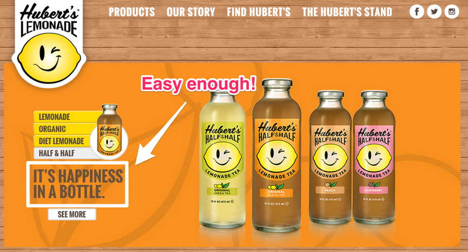
There are lemons on the bottle and, in the top left corner, the first thing that I see is bottles, so I instantly know that this guy sells lemonade (plus it’s also part of the URL).
The CVP is a bold, 5 word sentence on the left, where my focus is drawn first.
Happiness in a bottle.
I drink the lemonade, it makes me happy.
I get that.
Here’s a counter example.
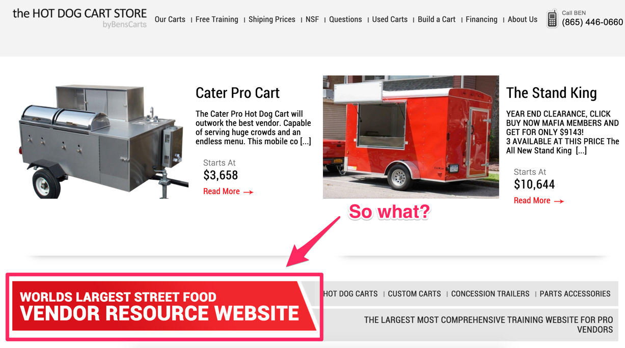
The Hot Dog Cart Store not only fails to place a great image or CVP above-the-fold, but they lack one altogether.
The only prominent statement is “World’s Largest Street Food Vendor Resource Website,” which is terrible.
Would you ever describe your business as a “street food vendor resource website”?
I hope not.
Nobody gets up in the morning and says: “I’m going to create the best street food vendor resource website in the world!”
Not only does it sound unnatural, there is no clear value statement, no differentiation from the competition and no unique reason to buy from them.
That they’re the world’s largest site creates a little bit of credibility, but it’s not nearly as powerful as “happiness in a bottle.” Don’t you agree?
By the way, the better your CVP, the more consistent across products it is.
Uber is a great example.
This is what their landing page looks like, for people trying to get a ride:
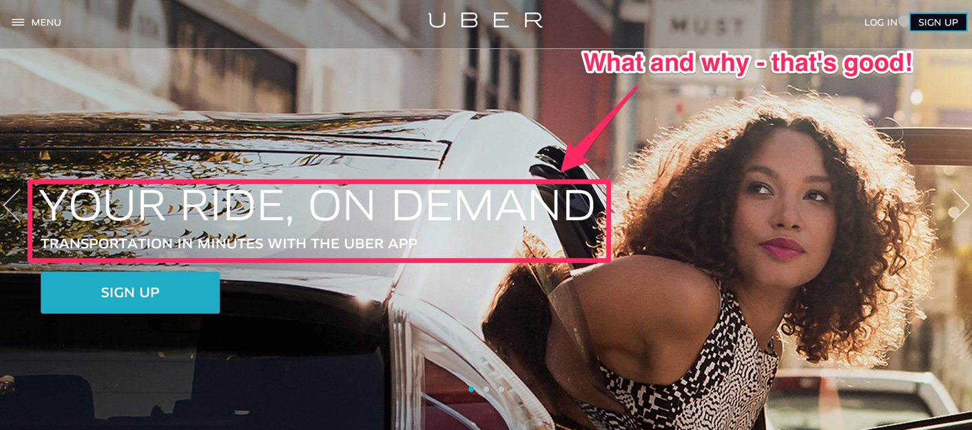
It instantly tells me what I’ll get (a ride), why I should use them (it’s on demand, so I control it) and what makes it super valuable (it’s very fast).
But, what if I want to drive, not just get rides?

Same thing. I get to use my car, work on my schedule and it’s my choice.
They give me total control of the experience and my time, the same thing I get when ordering one to get a ride.
Your CVP can be a simple one liner, or include all of the following pieces:
- Headline
- Subtitle
- Bullet points
- Image
- Social proof
It is a brilliant and easy way to increase your conversion rate. Optimizing it doesn’t cost anything (except some A/B testing software maybe), but has a big effect.
3. Use colloquial language
If you go to the canteen in your office during lunch break and you meet a new co-worker, what do you do?
You ask them about their job, of course!
Let’s say you both work at a company that manufactures security cameras.
You: “Nice to meet you John. So, what do you do here?”
John: “I’m responsible for creating a new line of thermal security cameras. So far, we’ve launched 2 of them.”
You: “Wow, that’s cool. How are these different from our regular ones?”
John: “Well, they can tell you the temperature of each object or person that they film, from -40 up to 1000 degrees F. Plus, these things recognize what the object is and even tell you when its temperature is not within the normal range. They also work in complete darkness, smoke or fog and aren’t sensitive to glare from bright lights.”
You: “They can tell if my body temperature is more than normal? I had no idea we were building stuff that is so awesome!”
After lunch you part ways and John proceeds to set up the landing page for one of these two new cameras.
Here’s what John writes:

Doesn’t that make you want to bang your head against the wall? This is the exact description Mobotix offers, for one of its thermal cameras.
The same nice guy who just explained to you, in crystal clarity, what the product does, completely twisted his fingers when writing the copy.
Somehow, as soon as we sit down to write, we instantly go into “must sound smart” mode.
Instead of keeping it simple, just like when we’re talking to a friend, we rack our brain to find the most complex terms and descriptions, so we sound sophisticated.
That’s dumb.
And, it doesn’t work.
Who buys those cameras? Average people!
When John’s neighbor Jim goes to their website, because he wants to install a front yard security camera, he won’t understand a single word.
He doesn’t need “the modular design of the M15 system platform” that “ensures maximum flexibility” or a “telephoto to hemispheric” feature.
What he wants is an awesome security camera that can read thermal data from what it sees. And, he wants a camera that works at night or when it’s foggy and one that’s not easily blinded by light.
Lorex, a competitor, does a better job at explaining their thermal cameras.
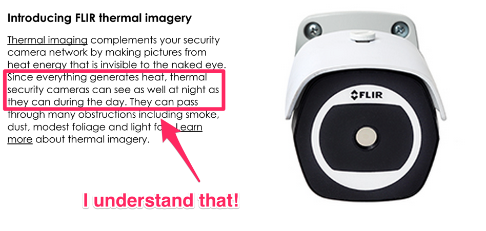
Just what I want to know, plus I can learn more, if I choose to.
Keep it simple folks.
Don’t try to sound smart. Try to sound human.
Even better, don’t try at all.
In the end, there’s always a human being at the other end of the screen, so talk to them, instead of writing for an imaginary crowd.
4. Create a sense of urgency, to make your customers take action
Remember the “only a few left!” message on Walmart’s site?
That is urgency.
Telling your customers that they have a limited time to act will help them make a purchasing decision.
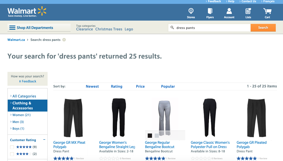
In Walmart’s case, you’re confronted with a huge choice, even if you’re just trying to buy dress pants. There are hundreds of options.
The paradox of choice suggests that if we face too many options, we often choose none.
Creating urgency can help to mitigate the risk that people will suffer from paralysis by analysis.
(Image source: Thomas Van)
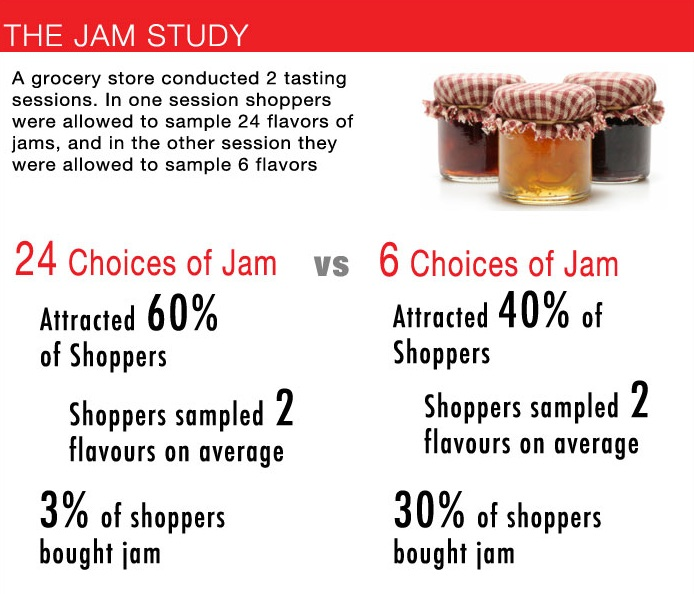
A great study that underlines this, is the jam study. Conducted by Dan Ariely, a behavioral economist, the study tested how offering a greater variety of products would influence purchase decisions.
Two jam tasting sessions were held at a grocery store, one offering 24 jams to taste, the other 6. While the first one attracted more consumers, they ended up sampling just 2 jams, on average.
However, only 3% of the consumers ended up actually buying some jam when 24 options were available, while 30% bought jam when just 6 flavors were presented to them.
(Image source: Thomas Van)
The wide array of choice paralyzed them and left them making no decision at all. Urgency is one way to handle this.
By letting your customers know that some options will disappear soon, they are more likely to select them, ignoring the big selection that’s available.
You could do it by keeping sold out items on display, as is often done with tickets. For example, check out this Broadway show:
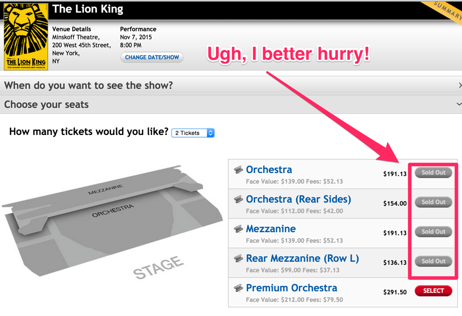
I’m very aware that all other categories are sold out, so if I really want to see that show on Nov 7th, I better hurry and buy what tickets are left.
Hotels do this constantly.
Booking.com are the masters of this. Look at how many urgency plays they’ve got going:
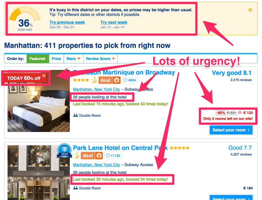
First of all, at the top of the page, they let you know how booked this area already is.
Second, they offer a 60% off coupon for one of the hotels, but it’s only valid today.
Third, they tell me how many people are currently looking at that very hotel and considering it as an option.
Fourth, they show me when the hotel was last booked and how many bookings have occurred today.
Finally, right where the price tag shows, they tell me that only 2 rooms are left.
If that doesn’t make you take action, nothing will.
Your best two ways of creating urgency are reducing:
- Time (last day to get this offer)
- Supply (last 2 rooms available)
There’s a catch, though.
Your urgency must be authentic.
Many hotel sites play this game. Somehow, there are often “only 2 rooms available,” for a stretch of 4 weeks.
People aren’t stupid. Once they find out that you’re lying, their trust is gone forever. This brings me to my last point.
5. Wipe out all concerns, up front
You know that buying clothes is a fine art and can actually make you a lot of money, if done right.
Naturally, when I bought all of these expensive clothes for my experiment last year, I had to make sure they were a perfect fit.
If I’m walking around in $750 dress shirts, they better fit perfectly.
In some cases, I wasn’t exactly sure and when I tried them on in the store, they didn’t quite feel right.
One time, when I was just posing in front of the mirror, turning and tugging at my shirt, a sales guy came up to me.
He asked: “Does it fit?”
I said: “I’m not so sure.”
He used his thumb and a tape measure to determine certain metrics and critical lengths between two points on a shirt and then he said: “You’re right, there is a little bit too much space under your arms, we can shorten that right here in the store and then it’ll fit perfectly.”
I bought the shirt. They fixed it. And, it fits perfectly.
Wouldn’t that make you much more comfortable about a purchase?
It’s the same with shoes. When you’re trying them on and walking around, sales people will often test your fit, by pushing and pressing the shoe while you’re wearing it.
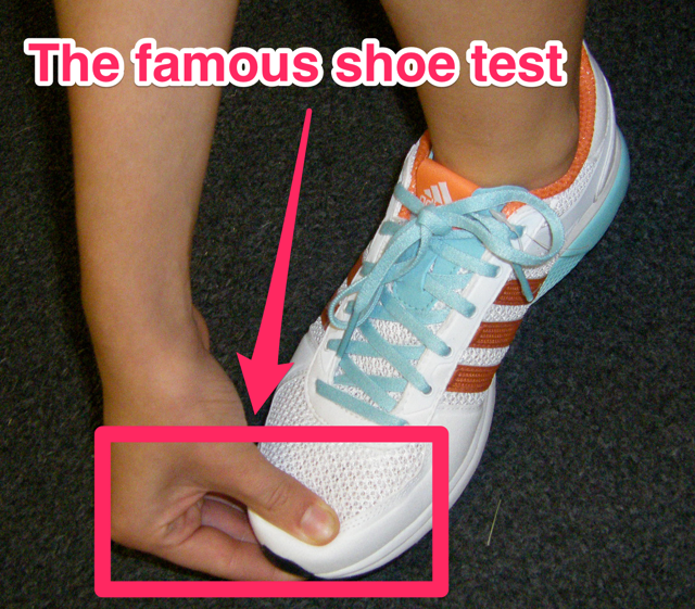
(Image source: Runner’s World)
The goal is to make you feel more secure about your purchase and eliminate your concerns.
A good salesman makes sure that whatever you buy is a perfect fit.
You have to be a good salesman (or woman) online, as well!
Online, you can’t advise your customer live and in-person (in most cases, but how about live chat?), but you can still address their concerns.
A good way to do so is a frequently asked questions section (FAQ). Most people who sell online courses do it:
(Example from Charlie Hoehn)
Another is to show customer testimonials, like we do at KISSmetrics.
Start out by making a list of common objections. Put yourself in your customer’s shoes.
What counter arguments could you have against buying?
A few very common issues:
- You don’t understand my problem well enough
- You understand my problem, but I don’t believe you can solve it
- You understand my problem and I believe that your product works, but my situation is special and I’m not sure if it’ll work for me
- You understand my problem, I believe your product works, even though my case is special, but you’re more expensive than the next best alternative
How do you address those?
- Be very specific, when explaining what problem your product actually solves
- Show references, ratings, awards you’ve won, certifications and social proof
- Show case studies and testimonials from various industries and applications of your product
- Draw a comparison with your competitors (before they do), and show why your product is well worth the money (remember the CVP!)
Make sure that your product perfectly serves your customer’s needs and then convince them of it by being a good salesman, taking them by the hand and eliminating their objections.
Conclusion
Now you know what a conversion rate actually is and why conversion rate optimization is so important.
In your business, revenue is your most important success indicator. Conversions are the next best thing.
If you can increase the percentage of people who end up becoming paying customers, you can quickly increase your revenue and grow your business, by optimizing the resources that you already have and capturing more of your low-hanging fruit.
Here, once more, are your first 5 steps to optimizing conversions:
- Start A/B testing
- Craft a powerful customer value proposition
- Use simple language instead of over-complicating your copy
- Create some urgency to make your customer take action
- Address your customer’s concerns and remove them
The only question is…
Where will you start?
Comments (49)