
Your landing pages need to be mobile-friendly.
Mobile landing pages are no longer a “nice-to-have” feature. They are non-negotiable.
But according to Google’s latest benchmarks, most companies still aren’t getting it right.
And missing the mark could mean losing out on tons of business.
In fact, you may actually want to give your mobile landing pages first dibs.
There’s a chance they’ll get more traffic and end up being even more important than the desktop browser version.
The rise of mobile usage happened fast, even in “Internet years.” But for business owners, it’s critically important.
Whether your goal is phone calls, email sign-ups, or pretty much anything else, a great landing page built with mobile in mind makes a world of difference.
You can’t risk having an underperforming mobile landing page.
Thankfully, there are a few ways to make sure your mobile landing page is up to speed (literally) and ready to drive conversions.
And since I bet conversions are important to you, let’s walk through how to put together awesome mobile landing pages to get the job done.
The rise of mobile: why desktop-only landing pages don’t work anymore
So why is mobile so important? Why do bloggers like myself keep stressing it?
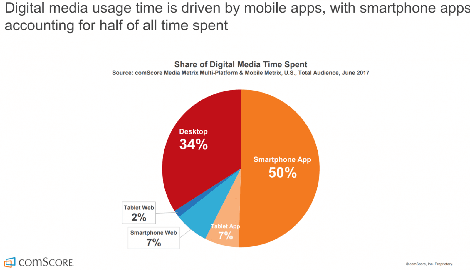
Because mobile is now the #1 way that people access the Internet!
Marketing masters saw this coming way back in 2010, but mobile just recently overtook desktop use in October of 2016.
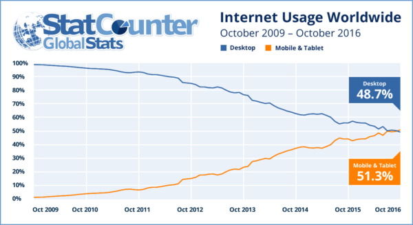
And by November 2016, mobile smartphone and tablet browsing accounted for a full 51.3% of internet browsing.
All signs point to mobile being here to stay.
In fact, it’s now at the forefront of digital marketing and web design.
And that brings us to the issue of underperforming mobile landing pages.
A lot of people are going to click through to your landing page on a phone or a tablet, not a laptop or a desktop.
There’s a good chance this applies to the majority of your potential customers, in fact.
Think about it: how many times have you followed a link from an ad or a Google search on your phone, then bounced because it didn’t load fast enough?
If you haven’t, you’re more patient than most.
And how often are you using a phone to browse?
Probably a lot. In fact, a full 80% of people who use the Internet also own a smartphone.
Maybe you’re even on your phone the majority of the time, especially when you’re not at work.
If so, you’re not alone.
Mobile usage is increasing every single day.
Take a look at these stats:
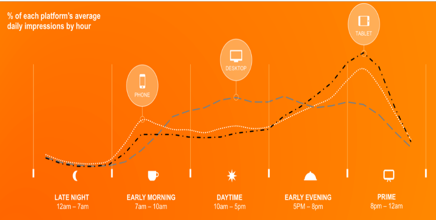
Mobile and tablet traffic surges after working hours.
And you can rightfully expect more traffic outside of working hours when people aren’t conducting business.
So it makes sense that much of your traffic is probably shifting to mobile usage.
After all, mobile devices have gone from a luxury to a necessity over the last 10 years.
They’re convenient, accessible, and most importantly, they’re everywhere.
48% of consumers start researching a topic or a product from a mobile search engine, not desktop.
You can realistically expect at least 50% of your traffic to come from people on a mobile device.
So at this point, it makes absolutely zero sense not to approach just about all of your marketing activities with mobile in mind.
Including, of course, your landing pages.
So how do you design a landing page for mobile?
Are there differences in what people look for on their phone vs on a desktop?
What are the key features that a landing page needs to have to maximize conversions among mobile users?
Let’s jump right in.
6 things every mobile landing page needs
There’s more to designing a mobile landing page than just making sure it’s responsive.
In fact, Google recently rolled out an assessment tool designed specifically for landing pages.
Mobile-friendly landing pages are a big Google priority.
And with good reason. 71% of mobile users bounce when they click through to a desktop site that doesn’t look right on a small screen.
But it’s much more than just bouncing:
People’s goals and behavior are sometimes a little bit different on their phone than on their laptop.
You’re also dealing with a totally different user interface on a device people use differently.
Typing with your thumbs can be a chore, compared to effortlessly touch-typing on a laptop keyboard.
There’s also less space on the screen, affecting what you can and cannot fit in “above the fold.”
And when you’re looking at someone’s landing page on your phone, you probably don’t want to spend a whole lot of time on it.
All these things affect what works and what doesn’t for maximizing your conversion rate among mobile users.
So what are the key areas you should keep in mind when putting together a mobile landing page?
Here’s what to focus on:
1. Keep it simple.
There is one big factor that keeps coming up again and again: simplicity.
And it’s extremely important.
Nielsen ratings published the graph “hazard function,” showing the likelihood of bounce in correlation to time on site:
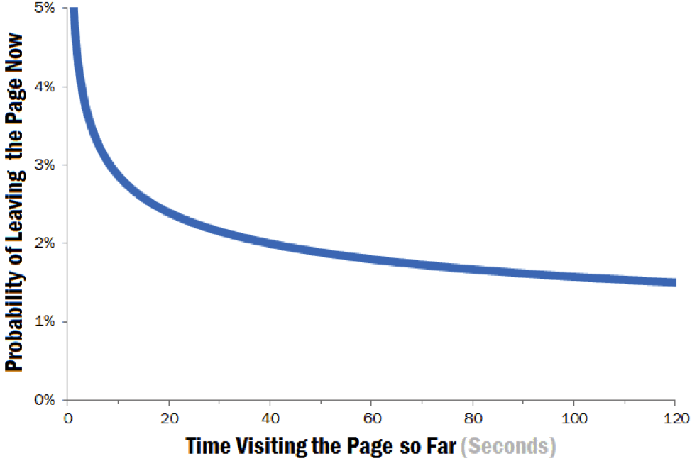
So what’s the takeaway? And how does it relate to simplicity?
The longer someone has to be on a web page searching around for what they need, the more likely they are to leave.
People want to get what they’re looking for, fast.
No one wants to scroll through tons of clutter to get to your sign-up form.
Here’s a great example of a desktop landing page vs a mobile landing page by Squarespace.
Here’s their desktop landing page:
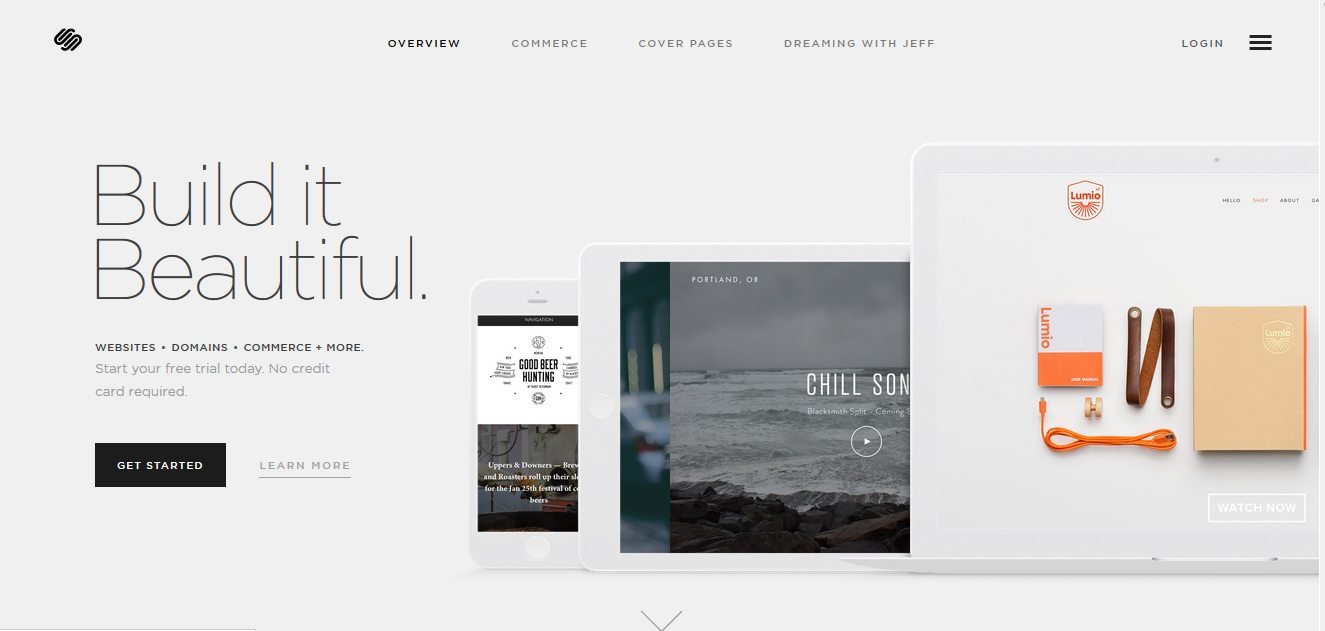
Great design, minimalistic, strong and clear CTA — this is a great landing page.
It’s simple and lacks clutter that could drive away potential conversions.
Now, take a look at the mobile version:
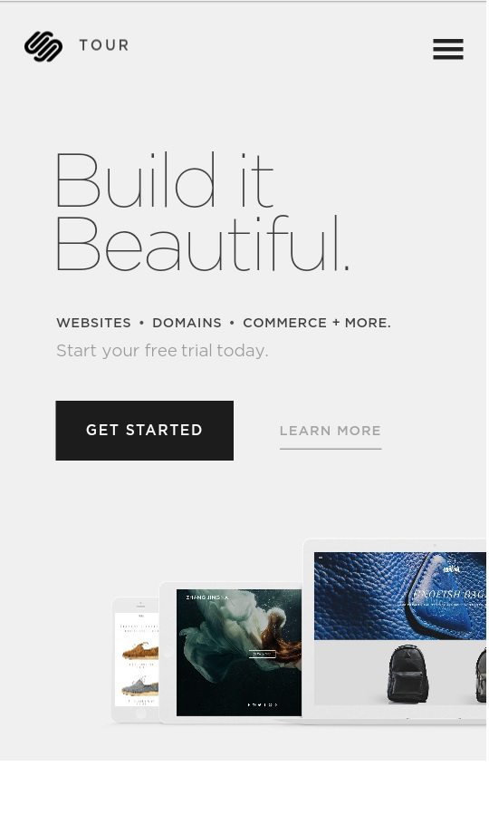
So what’s the difference?
You’ll notice that the mobile version strips away everything that doesn’t absolutely need to be there.
The desktop version is minimalistic as it is, but the mobile version removes elements at the top, like the hamburger menu and login button.
Here’s another example of a masterful mobile landing page, this time from Motorola:
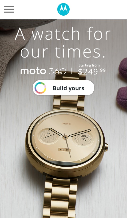
When it comes to mobile landing pages, simplicity is key.
2. Keep the copy short.
Nowadays, blog posts need to be long-form to generate traffic.
Anything under 2,000 words is likely to produce sub-par traffic.
At the same time, you’ll find tons of conflicting advice from different sources when it comes to landing page length.
Some recommend extensive copy, which means over 2,000 words.
Others recommend a more modestly-sized write-up.
A lot of this ultimately depends on your audience, which you should always keep in mind.
For example, if someone finds your plumbing business, they are probably looking for instant help to fix a bad situation:
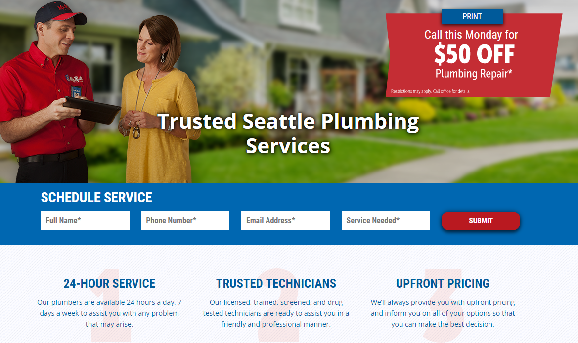
So in this case, you’d want to make sure all the information you need is there, reducing any fluff.
There are other situations where a mobile landing page might need a bit more meat to it.
It just depends on the context.
The way you buy plumbing services isn’t the same as the way you buy accounting software or luxury watches.
It comes back to that old marketing saying: “Know your audience.”
But as a general rule of thumb, I recommend taking a “less is more” approach to mobile landing-page copy. Trim it down to the essentials.
It makes sense since it adheres to rule #1 of keeping it simple.
I actually increased my conversions by 13% on Crazy Egg by reducing my landing page content by 60%.
So play around with it and see what’s best for your audience.
One way to do this is with A/B testing, but more on that later.
3. Go for short, pithy headlines.
Like the copy on the page, mobile landing-page headlines should be short yet impactful.
Don’t focus on beefy “clickbait” headlines.
That might be a little counterintuitive, but in this case, the most important factor is being clear and concise.
What does it need?
- Make it specific. Don’t be vague in a landing-page headline. It should be immediately obvious what a visitor is supposed to do there.
- Focus on one desirable thing. I’ll be coming back to the “one thing” concept later on. In the headline, you want to focus only on one key value proposition. What does someone get from taking action on the page?
Here’s a great example from UserTesting, a software platform for — you guessed it — user testing and research.

It’s short and concise.
It has a clear value proposition.
It doesn’t take long to read it, and you instantly understand exactly what UserTesting is, what it does, and why you might want to sign up and try it.
Another great headline example can be found on Help Scout.
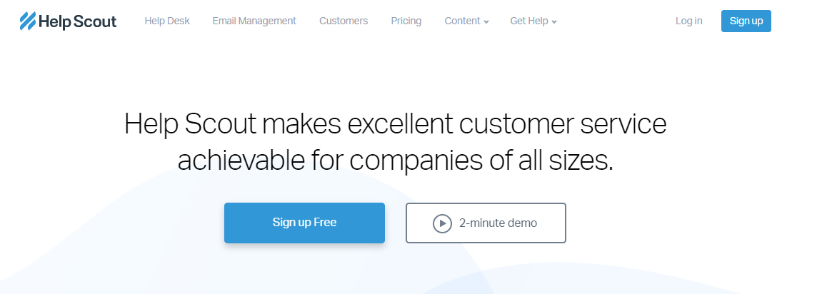
It’s condensed, yet tells you exactly what they do and how they can help you.
4. Make sure the load time is lightning-fast.
Remember that “hazard-function” graph from earlier?
Load time is a part of that.
Slow page speed is a conversion killer.
Every second counts.
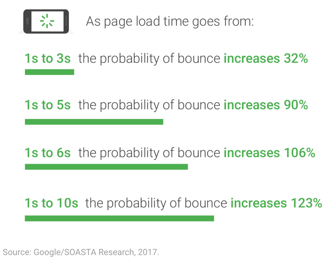
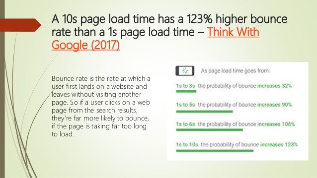
The numbers speak a harsh truth:
On mobile, it doesn’t take long for a person’s patience to wear thin.
You’ll notice that the bulk of people aren’t going to wait more than 10 seconds max for your page to load.
If it takes longer, they’re gone.
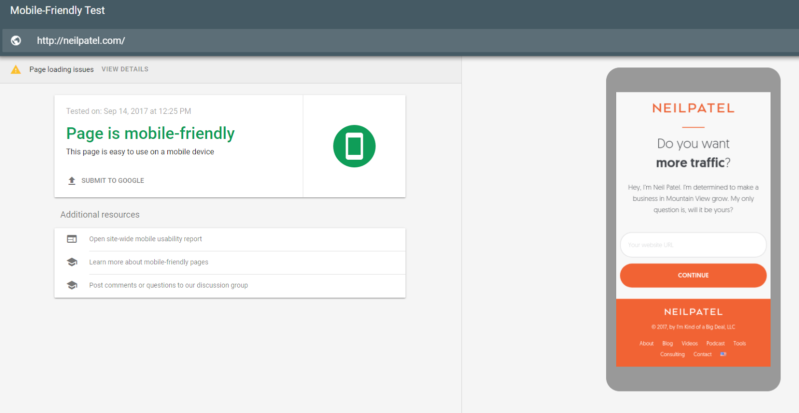
The upside to all of this is that by simply improving your page speed, you can reduce the likelihood of a bounce and missed conversion!
And luckily, it’s a fixable problem.
Try using Google’s Mobile-Friendly Test to get actionable ways to fix your speed:
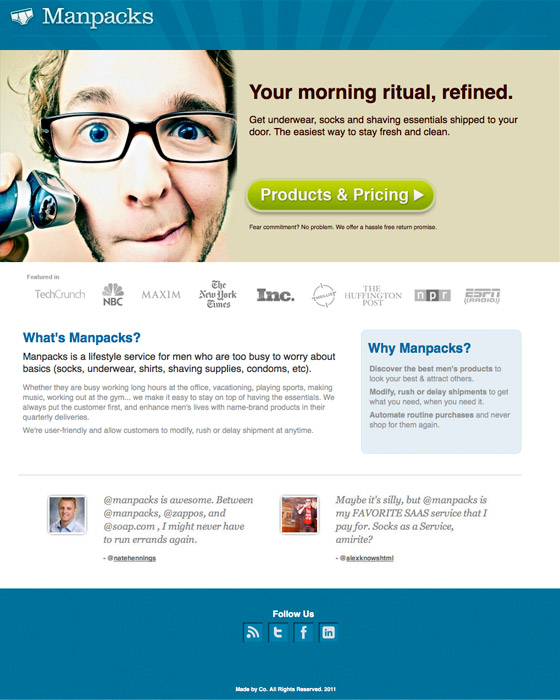
5. Keep the focus on just one CTA.
Just as you should keep a mobile landing page focused on just one key value proposition, you should also design it to revolve around one key CTA.
Multiple calls to action are nothing but confusing clutter for your audience.
You also want the CTA button itself to be big and obvious.
In this example from PayPal, you’ll notice that despite the large image toward the top, your eye is drawn to that big blue button at the bottom.
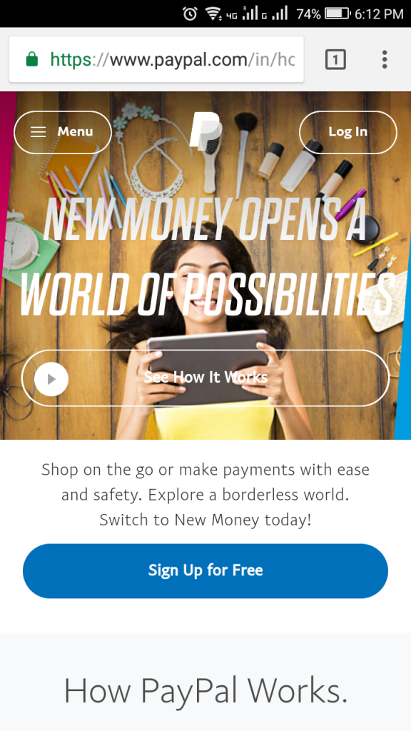
See what I mean?
The page does have another option, “See How It Works.”
But because that’s not the key focus, it’s downplayed in the visual design.
In contrast, that big blue button sticks out like a sore thumb.
You don’t even have to think to know exactly what this page wants you to do.
That’s what I’m talking about.
Great mobile landing pages, the ones that convert, are clear and simple.
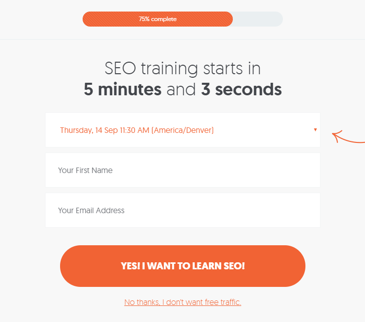
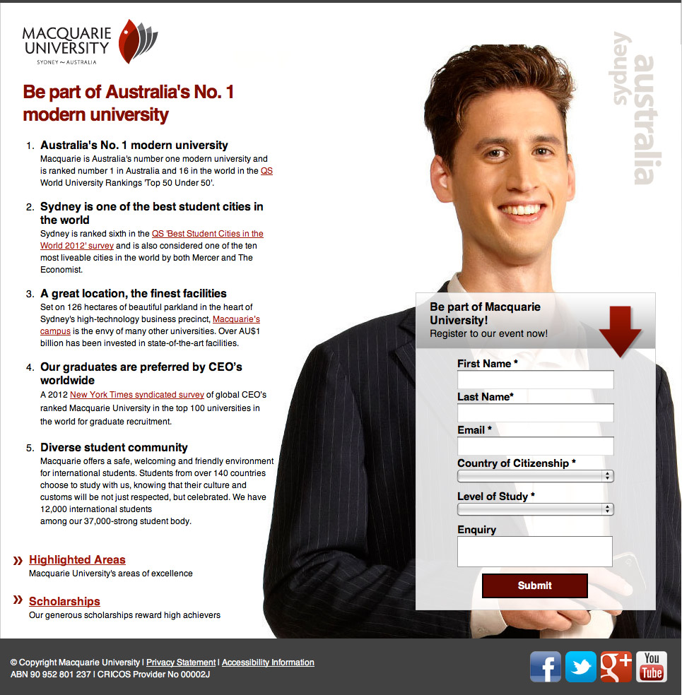
6. If there’s a sign-up form, keep it to an absolute minimum.
What if your landing page is geared toward getting people to sign up for something?
On mobile, you’ve got to keep it minimal.
Remember, people are typing with their thumbs here, not on a keyboard.
No one wants to fill out a 10-item form that gives you their full life story. Not with their thumbs.
It should be clean and simple:
You’ve got to ask yourself:
What information do I absolutely need from people?
Some form fields have to stay. Name, email address, etc.
But anything else, you can toss out.
Put yourself in your customer’s shoes.
Many times, mobile traffic is on the go, so people aren’t coming to your site with a ton of extra time to sit down and fill out a form.
6 simple steps to creating a great mobile landing page
Now that you’ve nailed down the 6 things every mobile landing page needs, it’s time to put them into action on your own page.
Here’s how to get started.
1. Figure out your goal
Before you get started, you need to know exactly what it is that you’re trying to accomplish.
Remember, landing pages are specialized.
Each one should be carefully crafted for one clearly-defined purpose: getting people to convert.
“Conversion” can consist of a lot of different things.
It could mean signing up for your email list in exchange for a free e-book, downloading your app, or signing up for a free software trial.
You need to figure out exactly what you want people to do on your landing page.
With this in mind, you can separate landing pages, as a whole, into broad categories:
- Pages designed for lead generation: These use a lead magnet to entice people to fill out a contact form.
- Pages designed for click-throughs: These are used to give the audience more information and prime them for purchase.
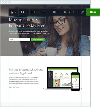
Here’s an example of a lead generation landing page:
It’s clear from the beginning what you’re supposed to do on the page.
And the contact form is just the right length.
Here’s an example of a landing page used for click-throughs:
It goes a little more in-depth and gives the reader a chance to learn and interact more.
Figure out your goals to decide which will work best for you. Then determine what metrics you want to measure.
2. Choose the right tool for the job.
To set up your page, you can use any number of tools that don’t require you to know how to code.
Leadpages is one of the most popular options.
Their interface uses an intuitive drag-and-drop builder to let you customize your landing pages.
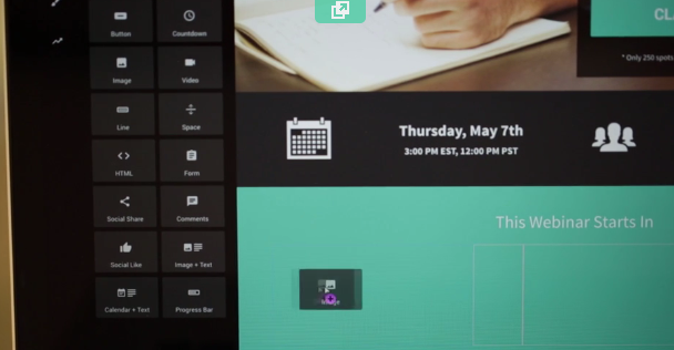
You can start off with any of their various free templates. You can find one for just about any industry or use case.
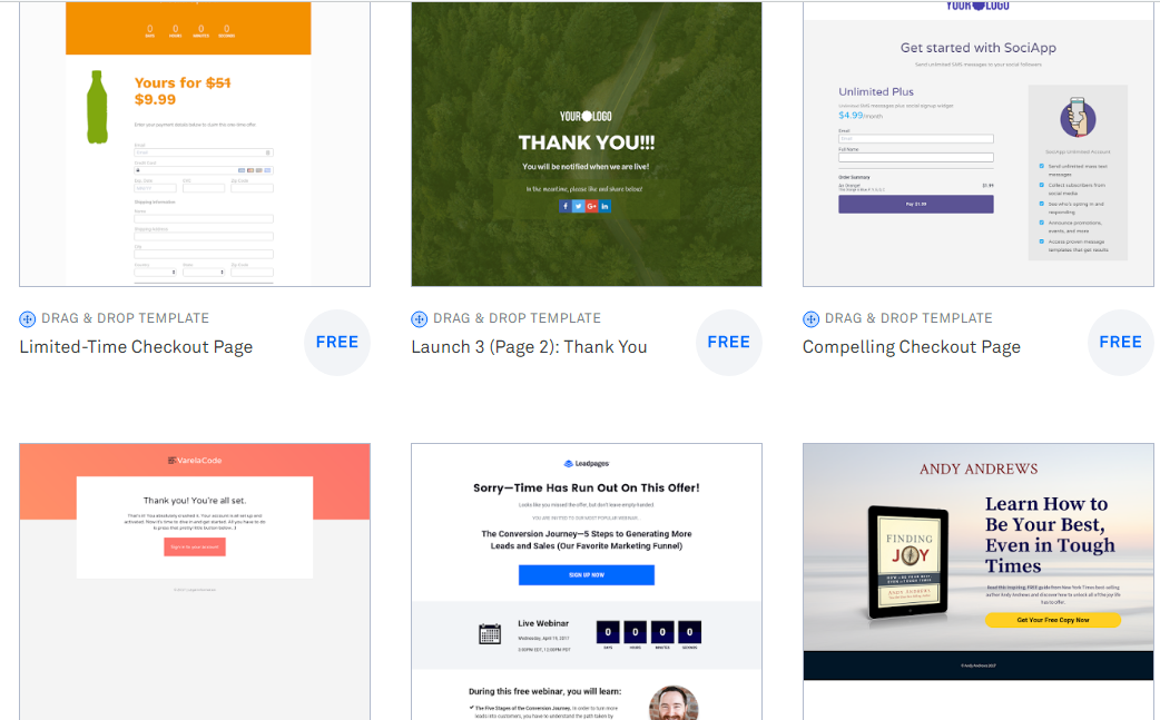
There are also other tools out there that offer similar features.
A lot of people like using Instapage. Like Leadpages, it’s a simple drag-and-drop builder.
Then, there’s ClickFunnels. This one actually offers a bunch of other services in addition to landing page creation.
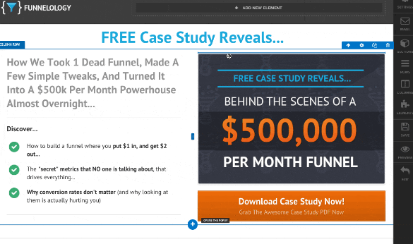
The idea behind ClickFunnels is to help you create whole sales funnels, from start to finish.
So when you’re ready to build your page, you’ve got a bunch of different options to choose from.
3. Create a clean, streamlined, user-friendly visual design
Once someone gets onto your landing page, they should know exactly what they’re supposed to do there.
Otherwise, they’re not sticking around to find out.
When it comes to simplistic design, I really like this example from Wistia, a B2B video hosting service.
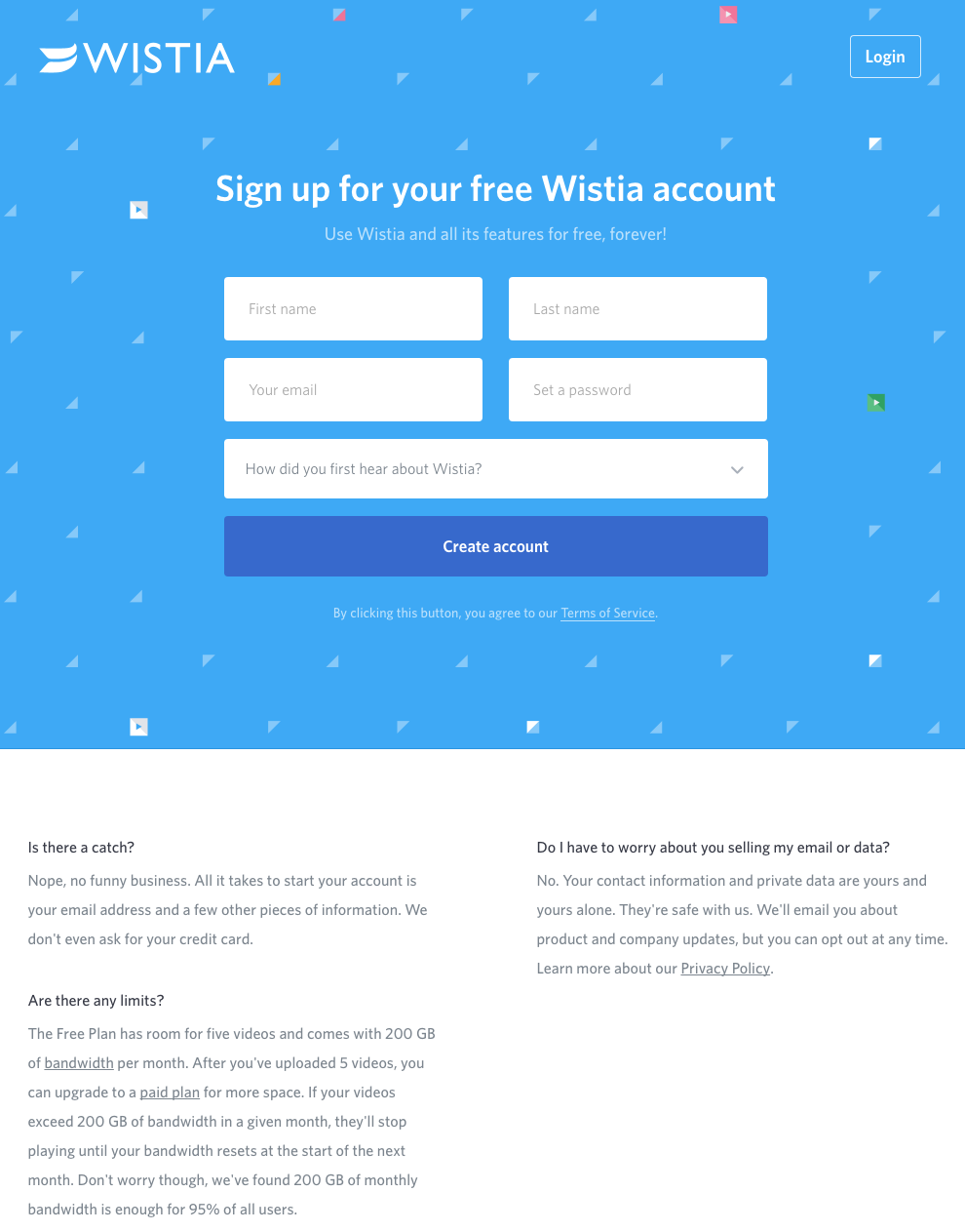
It’s so uncluttered and clean.
Of course, you can add a little more detail without making the page overwhelming.
Like in this landing page for IMPACT, a branding and design agency.
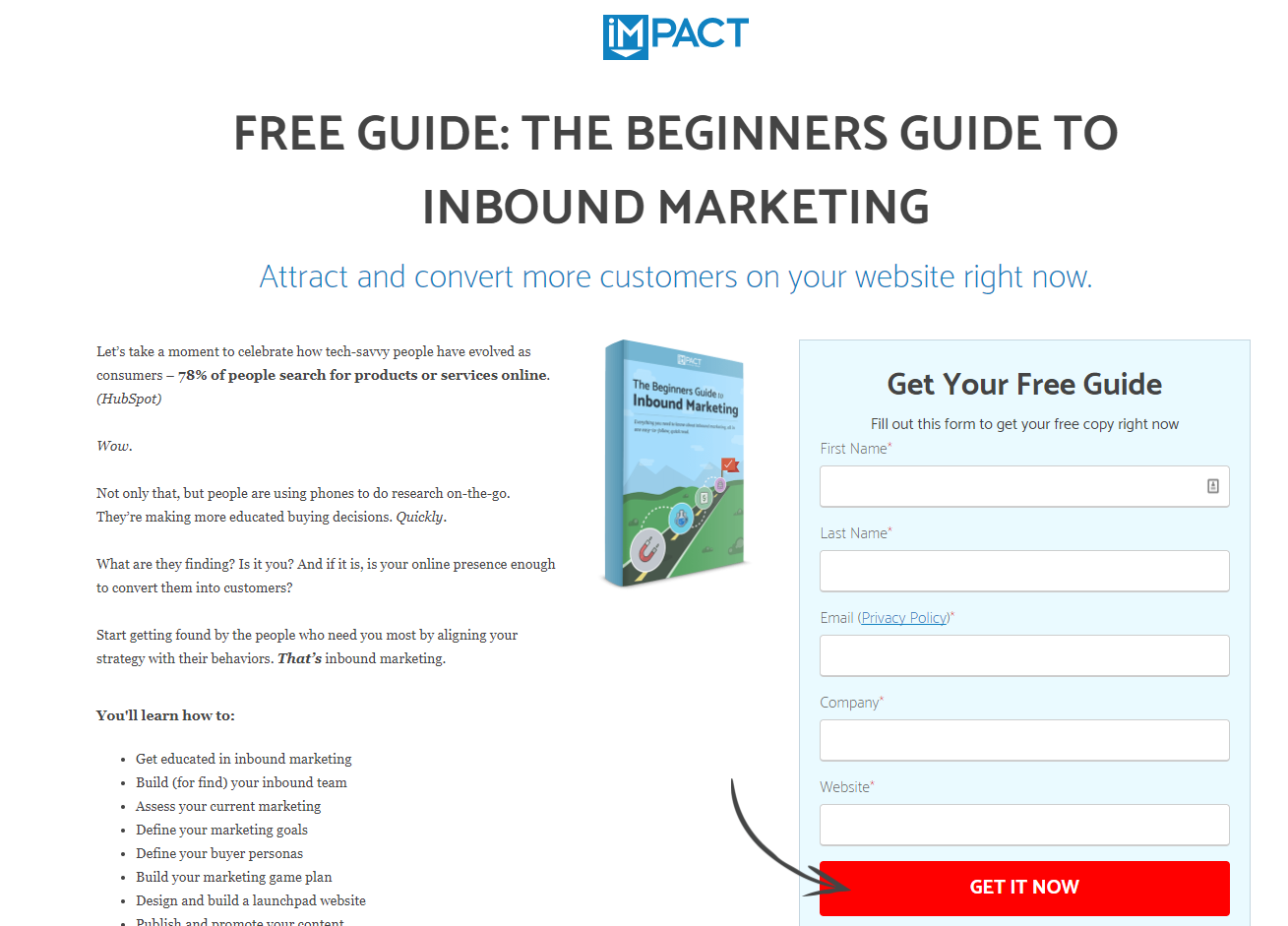
It doesn’t skimp too much on the information, but it also doesn’t overwhelm you with thousands of words of copy.
And, it tells you exactly what you need to know about what you’re signing up for.
Plus, it points a visual arrow to the CTA driving the focus and attention immediately to getting the product.
It’s a good balance.
4. Use a crystal clear CTA and concise copy.
Your page needs a strong, clear CTA, and simple copy.
Depending on what you’re selling, this can be something that looks pretty general at first glance.
Like this landing page from Evernote.
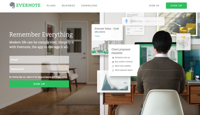
“Remember Everything” seems pretty ambitious!
But below the headline, there’s just enough text to explain what they mean.
And then the “Sign Up” button is bold and highly visible.
Netflix also has a landing page that’s simple yet powerful.

Not counting the header at the top, there are only 12 words on this page.
But those 12 words tell you everything you need to know.
5. If it’s a sign-up form, strip it down to the essentials
If they are just signing up for a newsletter, there’s no need to get their cousin’s best friend’s dog’s name.
No one has time to fill out 10 different form fields, especially if they’re on mobile.
Check out this great example from Hipmunk, a travel planning service.
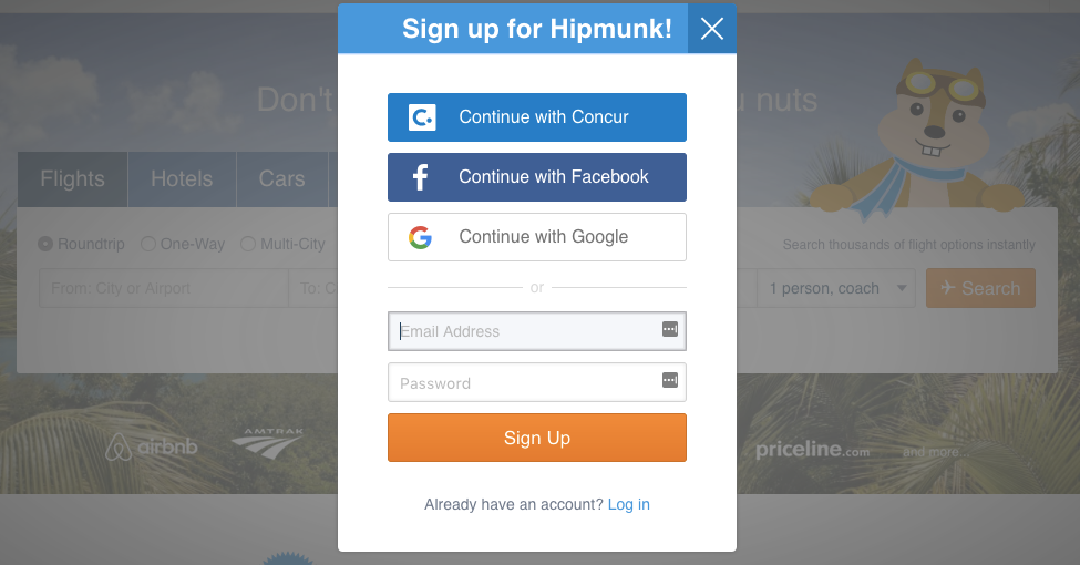
Just look at how simple this is. There’s no fluff here.
Also, notice the “Continue with Google,” “Continue with Facebook,” and “Continue with Concur” options.
If you’re trying to get people to sign up for an account with your service, these options can speed up the process tremendously.
6. A/B test it
You should always use the power of A/B testing to optimize your landing pages.
Create more than one version of a landing page.
You can introduce variables like different layouts, graphics, or copy.
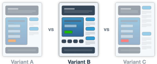
Some items will work better than others, and you can double down on what performs well while tossing out ideas that just aren’t moving the needle.
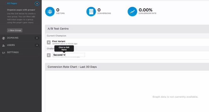
With a tool like Unbounce you can easily A/B test different landing pages by creating a variant:
Conclusion
Mobile browsing is here to stay.
And as it starts becoming the dominant way people access the internet, marketers need to adjust their strategies.
So it’s almost crazy not to focus on mobile when you’re creating landing pages for your business.
This can mean using design and interfaces that display well on mobile.
It can also mean tweaking the size of contact forms, which are more of a chore to fill out on a smartphone than on a laptop.
If a page doesn’t look right on mobile, users will bounce.
And more bounces means less conversions.
When you create your landing pages with mobile in mind, you’ll almost certainly improve your overall conversion rates.
How do you adjust landing pages for mobile users?
Comments (0)