
Mobile isn’t just the way of the future. It’s the way of the now.
Google is working on splitting desktop and mobile into separate indexes. And mobile will be primary.
SEOs like myself have been pushing mobile for the better part of five years now.
It’s no longer a new idea.
Research shows mobile users outpaced desktop as of 2014. That was a long time ago.
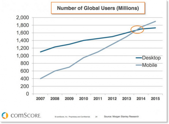
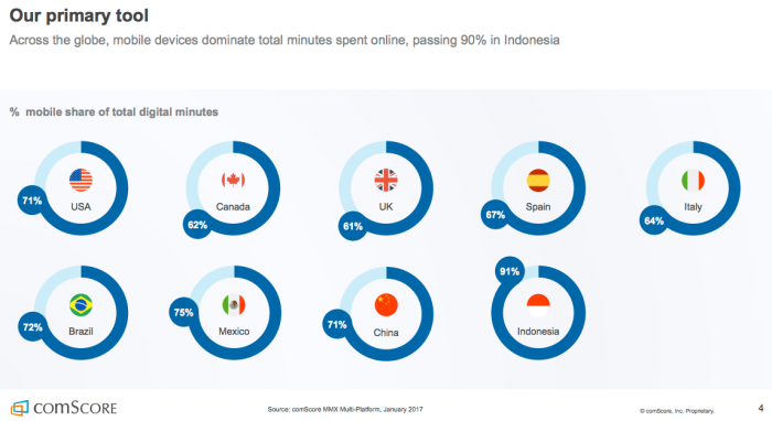
Did you know mobile devices are our primary connection to the Internet?
In fact, mobile accounts for 71% of total online time in the U.S.
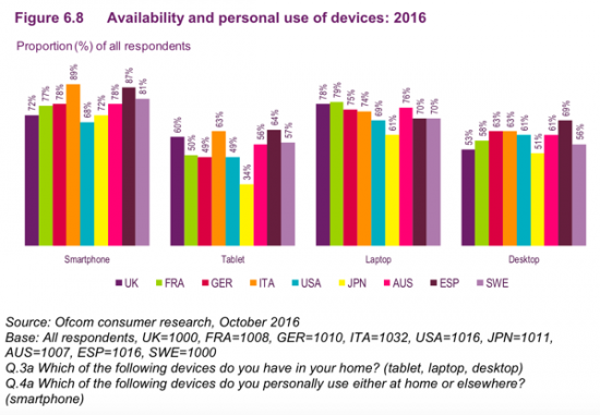
It’s not just mobile, but smartphones specifically. We love our smartphones!
They’re used more than desktops, laptops, and tablets.
Knowing all this, it only makes sense to optimize your website for mobile devices, right?
But how exactly do we do that?
Mobile search is different than desktop search in a few ways.
People are increasingly using apps, voice assistants, and IoT devices for online searches.
We also use mobile devices on the go. The context of mobile search can be different than on desktop devices.
So making sure your website shows up in mobile search is now mandatory.
To get you started, I put together my list of the best ways to make sure your website shows up on mobile SERPs.
Let’s get right into it.
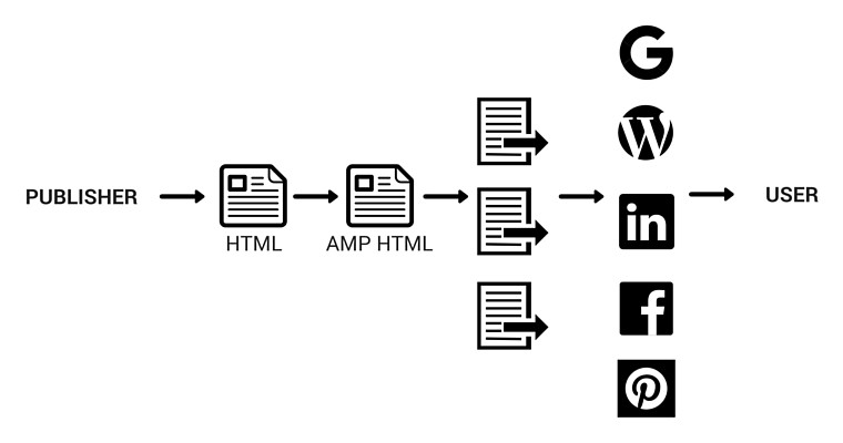
1. Use Accelerated Mobile Pages (AMP) markup
As of February 2016, AMP has been officially integrated into Google’s mobile search results.
This means you’ll reap some very important benefits by implementing AMP markup into your web page.
First, you’ll be included in Google’s SERPs above search results and even paid results for certain searches.
In addition, you can implement the AMP content carousel into your own web page like I did with mine.

Users can now scroll down through the search results and across on some sites for more content from my web page.
Each blog I post creates another carousel entry.
This technique allows you to pack a ton of content into one search result, greatly amplifying your reach.
It’s how you make the most of your search rankings. Twitter is using this technique to display a user’s recent tweets.
Now I have two horizontal content feeds in the vertical search results.
Are you starting to see why AMP is important?
It’s meant to strip mobile pages of all the bells and whistles to focus only on the necessary components.
Google and other search providers are making this push to force web developers to create simpler designs with fewer load times.
There are three components to successfully implementing AMP into your website’s structure.
- AMP HTML – This redesigned HTML uses custom AMP-related commands for more dynamic mobile content.
- AMP JS – Asynchronous loading is the goal of the AMP Javascript structure.
- AMP CDN – A Google-hosted content delivery network with cached content.
By optimizing for AMP, you create a duplicate layer of your content optimized for mobile devices.
Both are served to search engines and social media platforms, literally amplifying your content.
Killing two birds with one stone is a dream scenario for marketers.
AMP isn’t the only trick to get you more visual mobile content.
Google also relies heavily on schema for mobile searches.
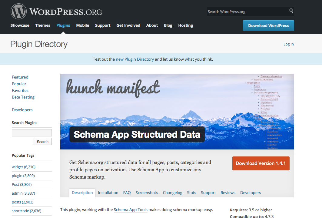
2. Implement Schema markup
You already know I’m a fan of structured data.
It’s one of the few technical parts of digital marketing I like to roll up my sleeves for.
This is because structured schema data can trump all other SEO efforts by answering a specific user question well enough to be featured as essentially the only answer.
It doesn’t take a technical genius to get started. There’s a plugin for WordPress called Schema App Structured Data that I love.
Google has long been working on providing simple answers to user queries.
When we search the term “what is content marketing?” for example, we are presented with an infobox with answers to related questions.
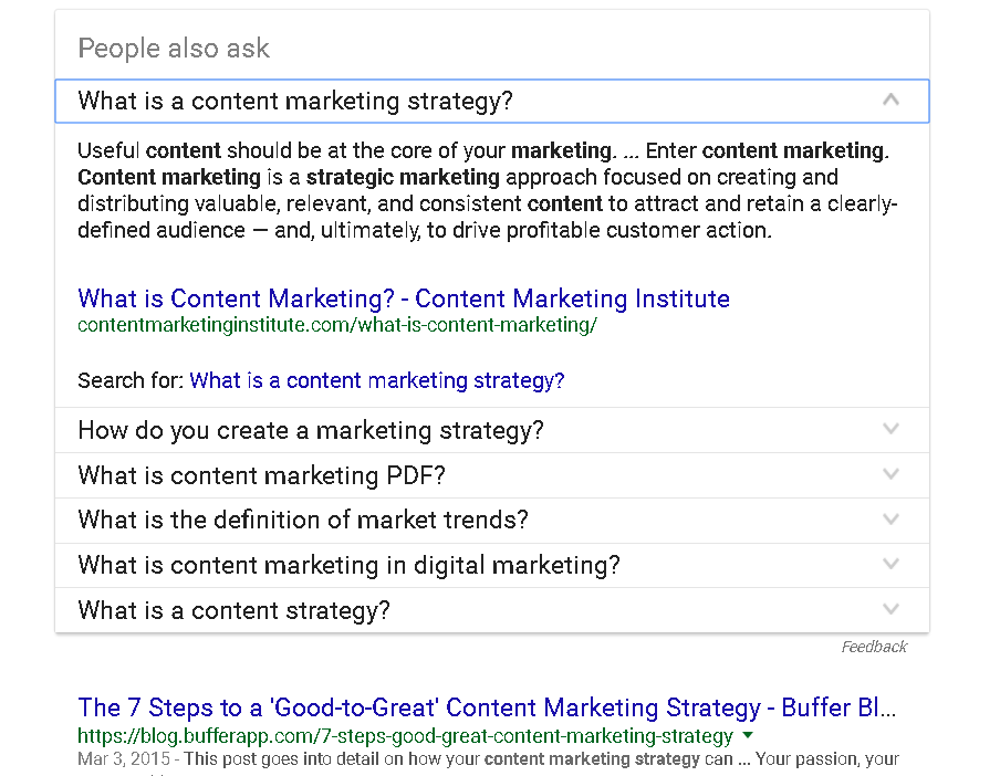
By answering as many specific user questions as possible in your blog, you’ll gain more exposure.
Of course, that’s only if you implement schema markup.
But that’s not the only benefit.
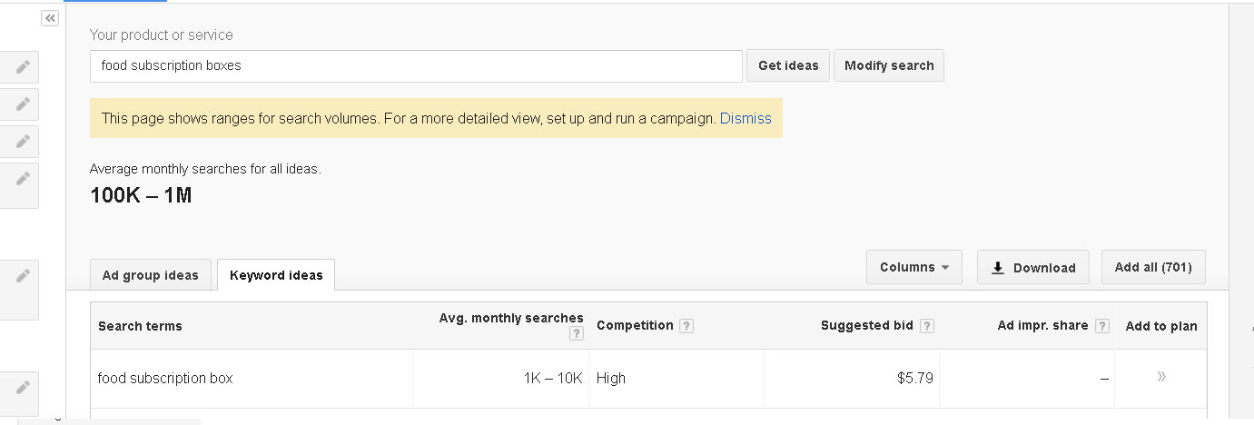
Check out this search of “food subscription boxes.”
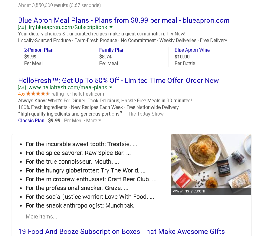
Buzzfeed’s schema allows it to outrank everything but the PPC campaigns for Blue Apron and HelloFresh (neither of which is shown in the preview of Buzzfeed’s article).
Essentially, Buzzfeed put a list within a list of the search results.
This once again proves the success of listicles online (and Buzzfeed’s mastery of them).
Even the PPC campaign for the term is somewhat high at nearly $6.
Using elbow grease instead of spending money is never a bad idea.
We still have some more technical stuff to go through, so I hope you’re still with me.
Don’t worry. It doesn’t get too wonky.
3. Choose a responsive web design
Ever since Mobilegeddon in 2015, responsive web design has been mandatory to maintain rankings.
And Google has made it very clear it’s only going to continue prioritizing mobile design.
Responsive HTML adapts according to the screen size and orientation of the device viewing the content.
For example, the code for a fixed-width column looks like this.

This is non-responsive HTML that will fix the width at 320px. While this will display well on an iPhone, it’s going to look terrible on a desktop or tablet.
Instead of considering every possible screen size for every device, this simple, responsive code can be used.

It’s sleeker, simpler, and much more powerful.
These simple changes ensure that every image and character on your website is displayed exactly how you want.
On a desktop, the weather report may be landscape.

But on mobile devices, this information needs to be displayed vertically.
Responsive design is the most effective way to personalize each end user’s experience while also minimizing HTML code on your end.

Of course, you don’t even have to program your website yourself. Many people and businesses use WordPress.
Thankfully, the WPBeginner editorial staff put together a great list of the best responsive themes for any website.
Now we need to talk about images.
4. Compress images
Images are necessary for dynamic web content.
You’ll notice I use a ton of graphs, screenshots, videos, and other visual content throughout my blogs.
It’s no accident. Visual content is a top priority for digital marketers.
As a general rule, I like to have at least one image for every 100 words throughout my blogs.
That means there are a TON of images on my web servers.
In fact, a large portion of my monthly spending is just for images.
While we want high-quality images, it’s also important to not take up a lot of space.
Compressing images frees up space while decreasing page load times. It’s a win-win for everyone!
Here’s a quick chart explaining how image file formats differ in lossless compression and other attributes.
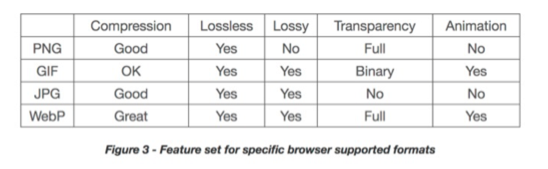
PNG is most often recommended for its ability to compress up to 95% in Photoshop with little loss in quality.
This is because web optimization is much different than print.
It takes time on the front end, but optimizing all image and video files before uploading them to your website saves a LOT of time and money in the long run.
While visual content is important, there’s one type of visual content that needs to be removed from your site.
Can you guess what it is?
5. Remove Flash
I don’t typically like to be negative about much, but Flash is one of those things I was never excited about.
Maybe I’m just not technical enough to appreciate it.
In the early years of the Internet, Adobe Flash was all the rage.
Animated websites were created with overly complicated designs that eventually become too much.
Sleek, simple designs like Google, Medium, Craigslist, Facebook, and Amazon prevailed while flashy (pun intended) designs started to fall off.
Designs like this may look cool, but they don’t translate at all to mobile.

Vulnerabilities in Flash make it even less attractive for web design.
It’s also banned from Google’s AMP project.
What Flash is great for is games.

It can be integrated into apps with amazing results.
Flash doesn’t have a place on your website, though.
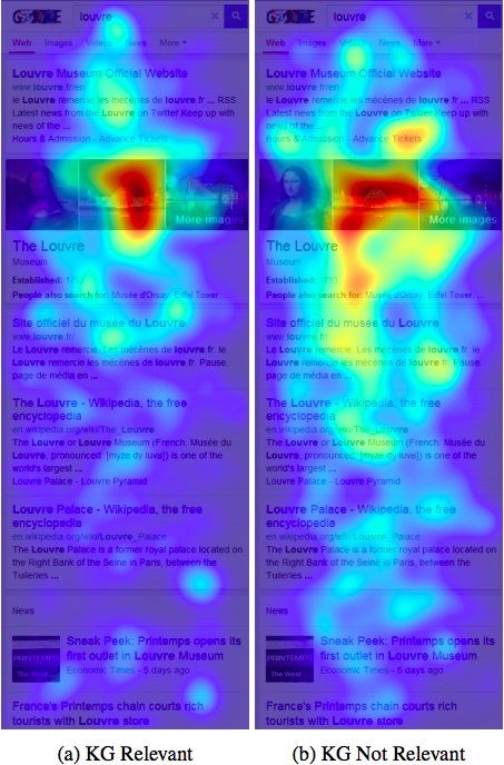
6. Look at your mobile website
Your content needs to be mobile-friendly.
People naturally see websites in a certain way on mobile devices.
Here’s a handy chart to show the hot zones that are being focused on most.
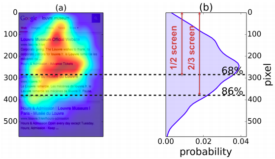
It’s much different than the typical F pattern we use to read desktop pages.
No amount of design and development can replace looking at your mobile website from a customer’s perspective.
You’ll also be able to tighten up your page structure.
When the most relevant information follows an image, it’s most likely to be actually read.
This is the ideal spot for a CTA or purchase button.
These are the types of decisions you can only make by looking at your website.
You wouldn’t release an app without beta testing it.
Don’t let your website be the weak point of your digital marketing efforts.
Speaking of which, don’t forget to take advantage of free tools available to you, especially from search engines.
7. Take advantage of free Google tools
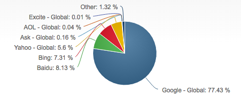
There are plenty of search engines out there, but Google remains the king.
It accounts for 77.43% of the 6,586,013,574 daily Internet searches!
Getting your site indexed in Google is the crucial first step for publishing any website or content online.
So it only makes sense to use all the free tools Google has available for us.
And Google is integrating valuable mobile data everywhere.
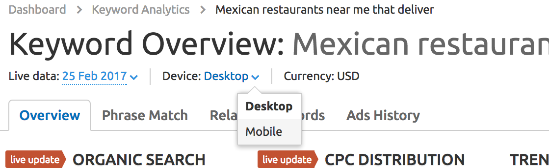
Starting with keyword research, we find it’s possible to change the device type in order to focus on mobile keywords.
Google Search Console also has a mobile-friendly test that can show you whether or not your site is mobile-friendly.
Here’s what my site looks like on it.
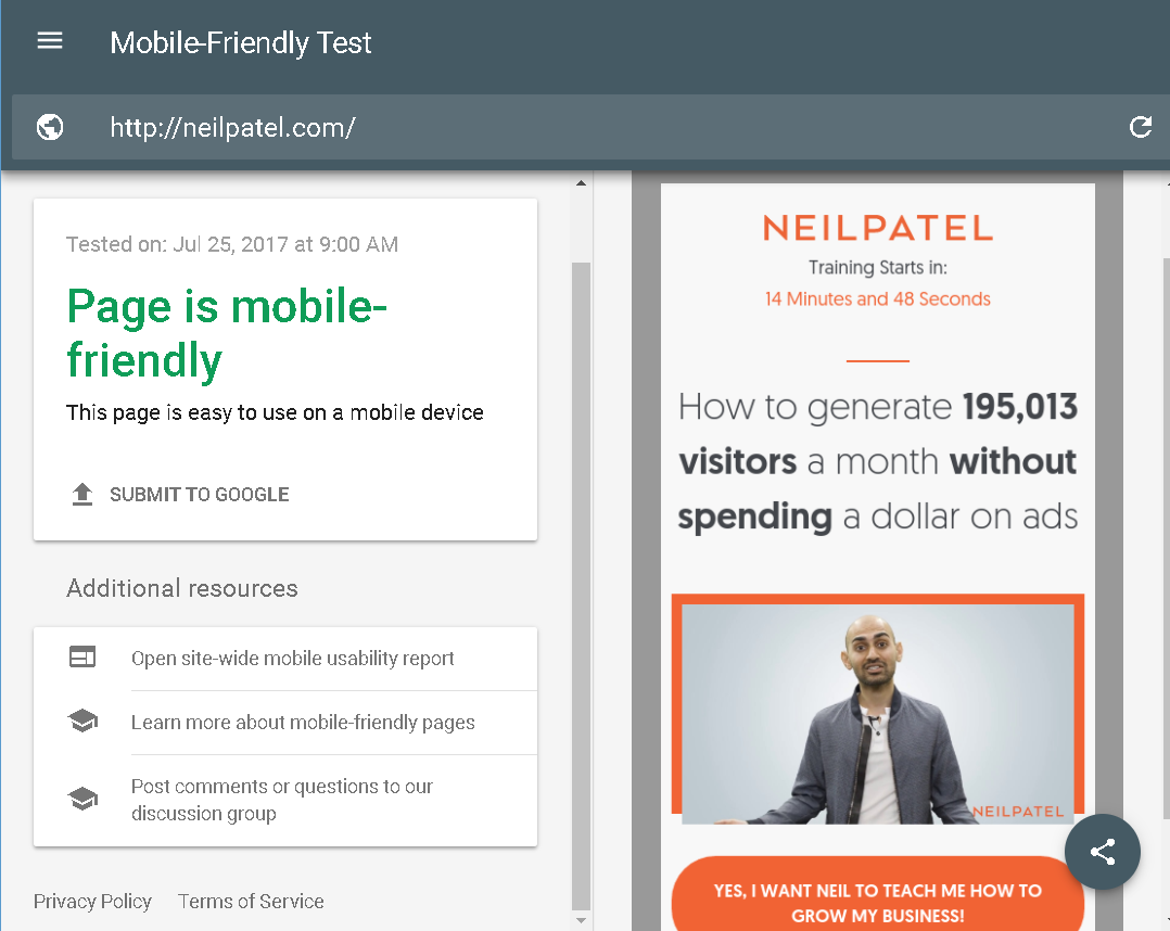
This is a great starting point to figure out what you’re doing right and wrong.
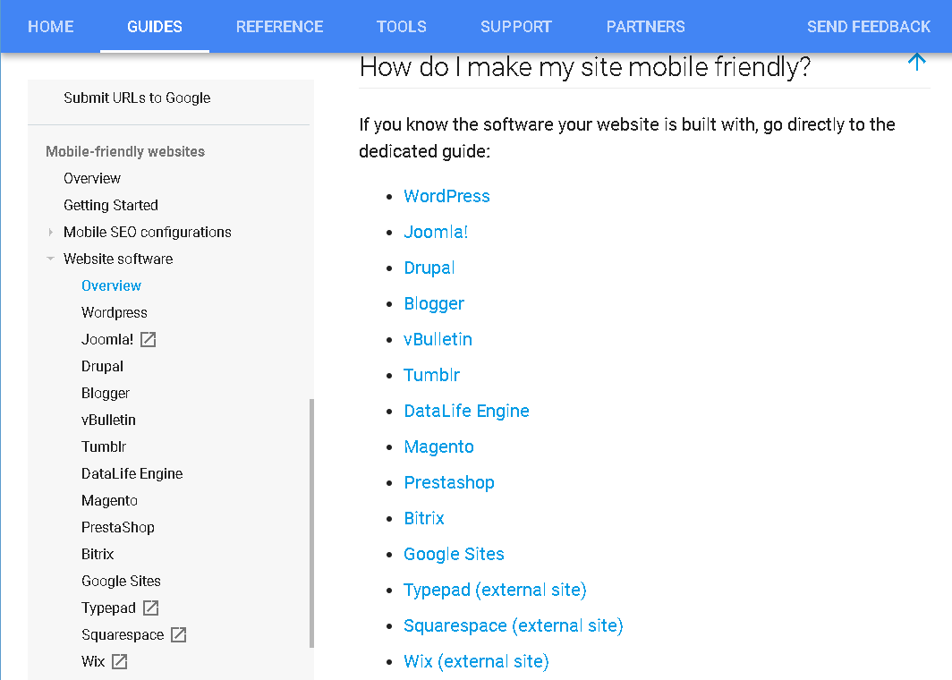
Google also has a repository of information explaining how to optimize your website for mobile. It’s sorted by platform.
This means whichever CMS you use, you can optimize for mobile devices.
These helpful guides are just part of Google’s webmaster support ecosystem. It also has forums and live chat support too.
Even Google Analytics was updated last year to include more detailed mobile information.
By clicking Mobile → Devices, I can see more detailed information about which specific mobile devices are accessing my website.
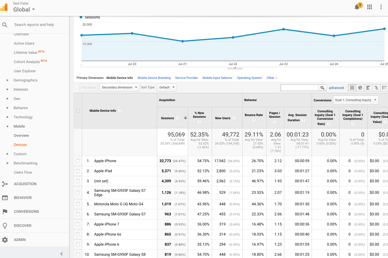
It’s important to get used to checking for mobile within all your normal data reports.
Segment your traffic whenever you can, and you’ll be well on your way to tracking mobile.
Now we have to discuss one of the most important factors that affect your mobile site performance.
It’s time to discuss site speed!
8. Speed up anything and everything
Speed is important.
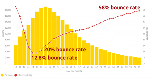
Studies have consistently shown slow page load times translate to high bounce rates.
Here’s a chart showing the correlation.
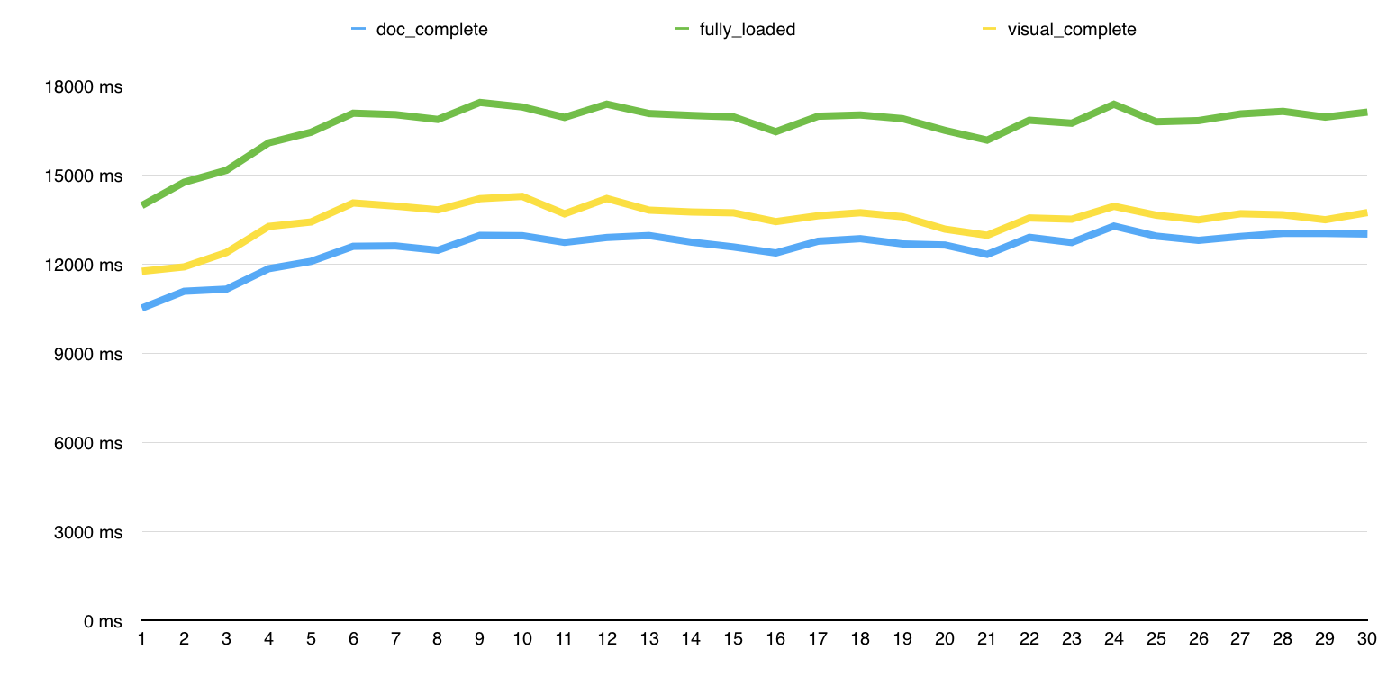
We also analyzed over 100,000 URLs to learn the page load times of different URLs based on ranking.
The highest ranking results in SERPs consistently have faster page load times.
We found the top 5 search results outperform the rest.
This means if you want to rank high, you’ll need a faster website.
There are several key ways to go about this, and compressing images (which I discussed earlier) is just one of them.
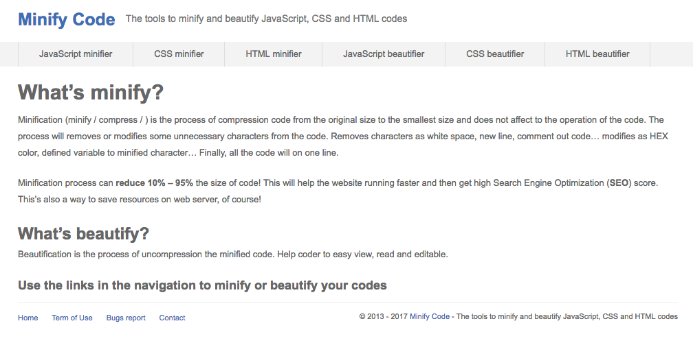
Another great way to increase site speed is to minify code.
We often add so many plugins and features that a simple website can quickly become bogged down with too much HTML, CSS, and Javascript code.
We need to pare it down to the basics for mobile devices.
This can be done on minifycode.com.
Here are a few other tricks to try:
- Use a CDN.
- Optimize database queries.
- Decrease HTTP requests.
- Lower server response time.
- Use RFPL caching.
These can get a bit technical, so I won’t go into too much detail here, but there are links for further resources.
My next tip seems obvious, but it’s often overlooked.
9. Tag posts based on mobile searches
Mobile searches have different semantics than desktop.
When searching on the go, you’re more likely to be distracted, make typos, and input words out of order.
This creates an opportunity for savvy SEOs.
While I’d never advocate making typos on your website on purpose, tags can be used to draw traffic from awkward phrasings.
Tags can be entered on WordPress by selecting “Posts – Tags” or entering tags in individual posts.
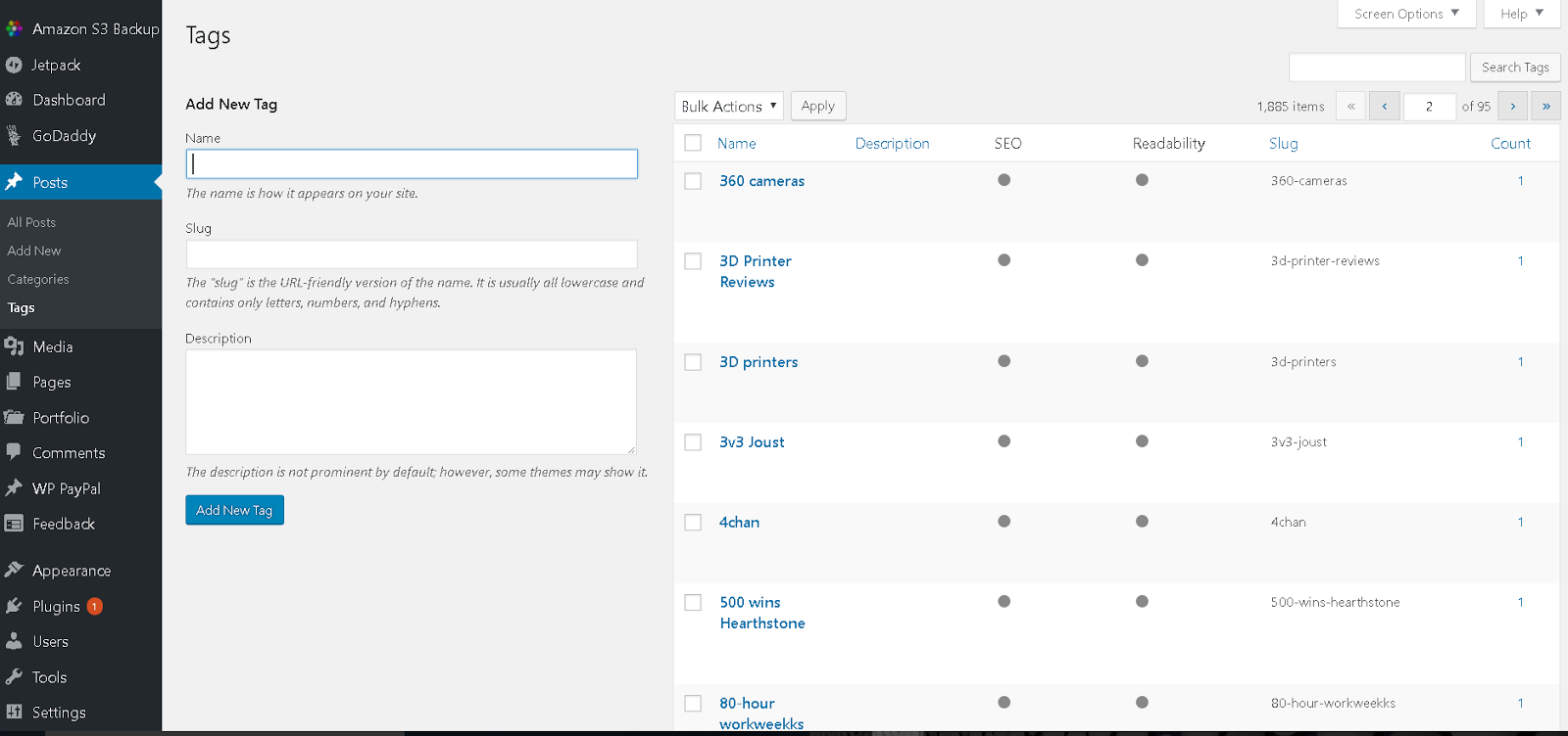
We can manipulate these to help rank for mobile-friendly searches.
For example, if we wanted to rank for “Android games” and look up related searches on Google’s Keyword Planner, we see “game android” gets just as much traffic.
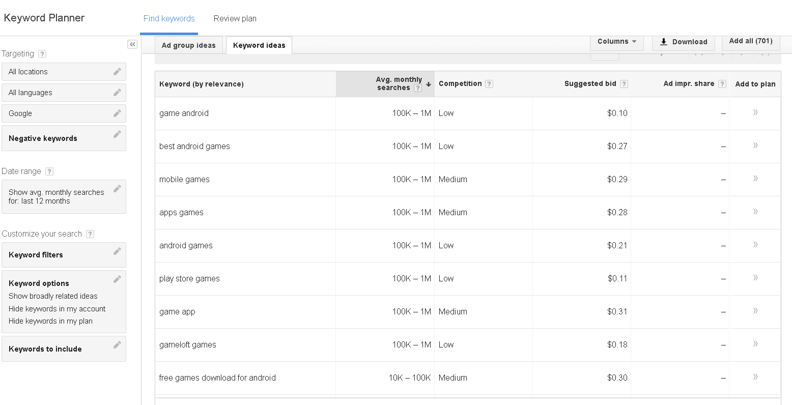
Not only is the traffic equivalent, but it’s also half the price for an AdWords PPC campaign.
This insight doubles our potential reach!
It also closes off any potential gaps your competition could exploit to overtake you in the search rankings.
Title tags are another place where mobile differs from desktop. In May 2016, Google increased title tag character limits to 78 for mobile (versus 70 on desktop).
This gives us 8 extra characters to play with.
Here’s an Amazon product result on desktop.

It actually cuts off at 60 characters since it can’t fit the next word, along with ellipses, into the 70-character limit.
Here’s the same search result on mobile.
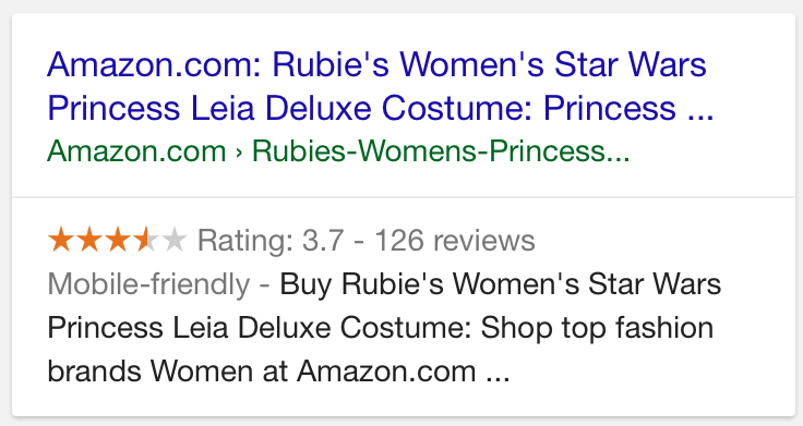
Here we were given a full 2 keywords that didn’t appear on the desktop site. While the longer title is truncated on desktop, we have an opportunity to improve mobile search.
In this example, the keyword “Costume” is essential, and whoever created the title tag didn’t realize it would be cut off on the desktop site.
It’s not immediately obvious we’re looking at a Princess Leia Costume until we’re on a mobile device.
This especially comes in handy with long-tail keywords.
I always say you need the keyword in the title for stellar results, and the longer the title, the more keyword searches you include.
Now we have one last tweak to make to optimize your website for mobile.
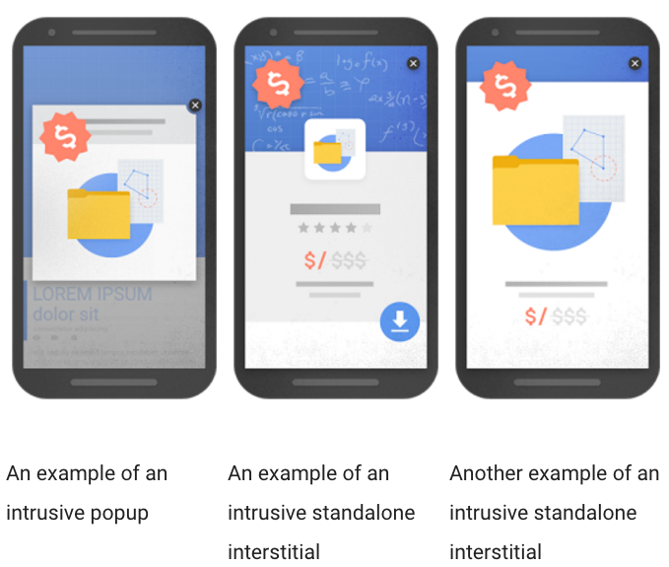
10. Remove pop-ups from your mobile site
Pop-ups have been in Google’s crosshairs since August 2016.
That’s when the search giant announced a new search algorithm designed to penalize sites with pop-ups that can be intrusive on mobile devices.
This is because pop-ups go full screen on mobile devices, and can interrupt the browsing experience.
Here are three examples from Google of what it’s targeting.
Consider replacing your display advertising pop-ups with other forms of digital advertising.
For example, you can use in-text hyperlinks with affiliate referrals to gain affiliate ad revenue.
You can also throw in CTA prompts and buttons within your page content.
These alternatives help you gain advertising revenue and monetize your site without being penalized by Google.
This doesn’t mean you can’t still run pop-ups on desktop, but they’ll become less and less effective as more searches migrate to mobile.
Conclusion
Mobile is the future of online search.
More people have mobile devices than desktop, and the amount of time we spend using them for search is increasing at a rapid pace.
The use of voice assistants, in-app searches, and IoT devices that skip search entirely are changing how we use search on mobile devices.
By optimizing your website to resolve mobile queries, you’ll increase search rankings and build a sustainable digital marketing foundation.
What are you doing to prepare your website for the shift to a mobile web?
Comments (10)