
A responsive design alone doesn’t make a site “mobile friendly”.
Sure, it will pass Google’s mobile-friendly test, but does a mobile-friendly site only mean that the site will adapt to different devices?
Not really.
A truly responsive site is one whose content is optimized for mobile devices. Text, images, videos, slideshows… because it’s these things that a user really cares about.
If a site fits beautifully on a mobile device but its content looks as if someone blew its proportions, it will never be mobile friendly.
Wondering why should you care?
Well, you should because a majority of all digital content consumption happens on mobile devices.
Not only that, the percentage of mobile-only people is steadily outgrowing the percentage of the desktop-only audience.
In other words, responsive design is vital to keep and attract customers who rely on mobile devices.
To make sense to this growing mobile-only readers, a responsive site alone is not enough.
In addition to a responsive design, you must also write mobile-friendly content that will be appealing to a mobile user.
Have enough mobile talk yet? We’re just getting started… but it’s for your own good!
Keep in mind that mobile-friendly content is easy to write and this post will prove it.
Here, I’ll show you the many ways to write content that reads well on mobile devices. But before we see how to optimize your content for a mobile device, let’s first see how people read on them.
Understanding a mobile user’s reading patterns when they’re on their device will help you write better because it will free you from focusing on generic web writing rules.
Ready to join the mobile web?
Let’s get started.
Understanding how people read on a mobile device
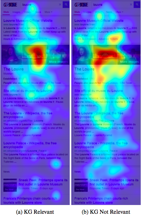
The following screenshot shows how people consume data on mobile devices:
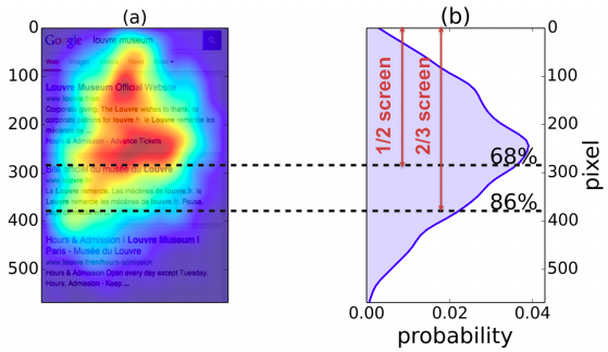
As you can see, image (b) shows that the mobile reading pattern doesn’t have a sharp focus on the golden triangle or the F-shaped reading pattern that is associated with desktop reading. Instead, the focus appears somewhat distributed.
The way people read on a mobile device is different from the way people read on a desktop.
For example, it’s expected from a desktop reader to be drawn to the content that’s placed on the top-left section (the golden triangle or the F-shaped reading pattern) on a site.
However, when on a mobile device, the same reader may not necessarily focus on the left-side content. They will look more to the left but the gaze is somewhat distributed.
So essentially, there’s no “most important” area to optimize first. All the content needs optimization.
Let’s now explore a few ways to make your content easy to read, understand, and remember for your mobile readers.
Go for the bite, snack, and meal approach
Your mobile traffic, just like your desktop traffic, is made up of all kinds of readers: the ones who skim, the ones who read word-for-word, and the ones who alternate between skimming and reading.
The bite, snack, and meal approach appeals to all these readers.
In the bite, snack, and meal writing technique, you offer your content in 3 distinct elements: bite, snack, and meal.
Bite: headline
The “bite” in your content is your headline. Its job is to pique the interest of your most impatient readers and get them to read your content.
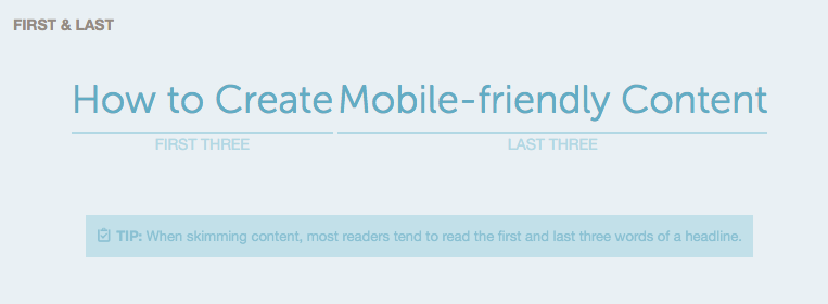
For the post you’re reading, the bite is “How to create-mobile friendly content” — a clear headline telling you exactly what to expect in the post.
Snack: your summary (this could also be your conclusion)
The “snack” in your content is your content’s summary or gist. This summary tells your reader what the post is about. If a reader reads nothing but your content’s summary, they should still get an idea about what’s covered in your content.
Again, if you look at this post, the snack would be the opening lines where I talk about what mobile-friendly content is, the importance of optimizing content for people who read on mobile devices, and the tools to create content for a mobile device.
Leslie O’Flahavan, the creator of this writing technique, says that
A post’s first para that could be an anecdote or a provocative hook could also be called the content’s “snack“.
Meal: your full post
Finally, the “meal” is your content in its original, full form.
The job of your headline and summary or opening line is to draw your reader into your content. The bite, snack, and meal approach to writing lets you do just this.
If you observe this writing style, you’ll notice its similarity with the inverted pyramid style of writing where the reader is presented with the most important details before the secondary ones.
Chunk content for easy reading
Thanks to a small screen size, reading huge walls of text can be a nightmare on a mobile device. To make reading easy for a mobile user, the first thing you must work on is your content’s structure.
The more optimized your post structure is, the better it will read. Chunking is an effective tactic to improve your post structure and make it more mobile friendly.
When asked about overcoming mobile content challenges, MasterCard’s Broitman suggested making content for mobile more “snackable.”
He added,
Creating snackable content is critical as content is often consumed on a mobile device in the white spaces of one’s day–waiting for the train, between meetings, or any time between longer stretches of attention or activity.
Chunking is a great way to make content more snackable. Simply put, chunking is the practice of presenting related content together in small chunks.
Nielsen says:
In practice, chunking is about creating meaningful, visually distinct content units that make sense in the context of the larger whole.
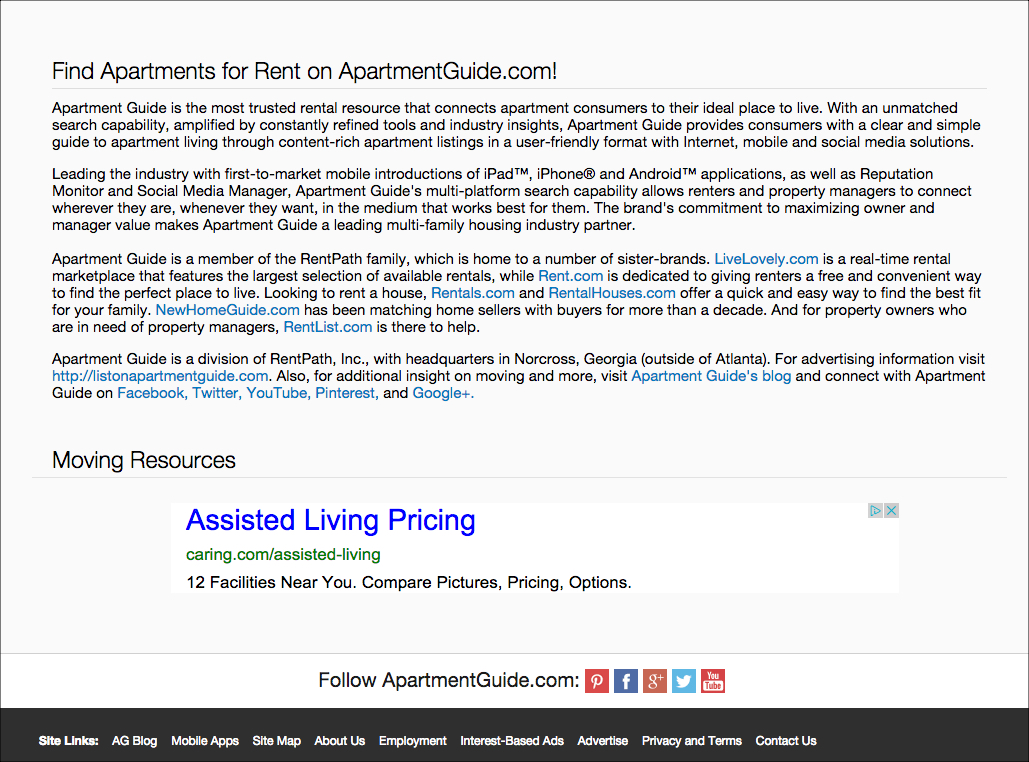
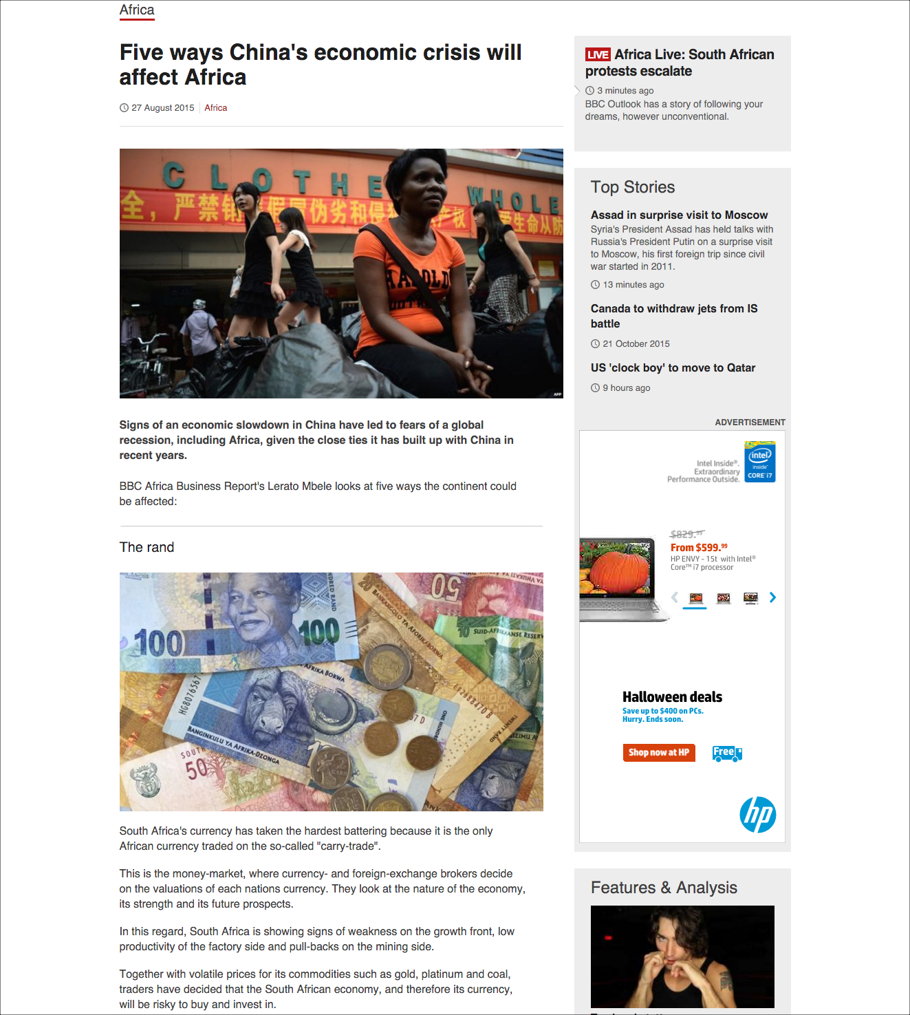
To explain the difference chunking makes, Nielsen offers the following examples.
As you can see in the above screenshot, it’s extremely difficult to read the text – and if you’re reading this on your desktop, consider how this would appear on your mobile device.
On the other hand, the following screenshot shows an easy to read (and scan) structure made possible with chunking elements like a headline, summary, and an image.
I’m sure if I asked you to read either of the two, you’d choose the second one.
You can use several tools to chunk your content for mobile devices (and desktop reading):
- Short paragraphs
- Whitespace
- Subheads
- Summary
- Images
- Lists / bullets
- Styling (bold, italics)
(I’ve discussed these in detail below.)
Write short titles to make them more mobile friendly
CoSchedule suggests that headlines with about 6 words get the highest click-throughs. The Emotional Marketing Value Headline Analyzer too scores shorter headlines (up to 5 words) the highest.
A probable reason for a high click-through rate (and a higher score) could be because 6-word headlines don’t get truncated even on a smartphone, no matter the screen size.
Besides, we read each of the 6 words because just the way we scan content.
We scan headlines too and end up reading just the first and the last three words. Sticking to 6 words means getting most of your headline read by those simply scanning.
To test your title’s usability on a mobile device, analyze it with CoSchedule’s headline analyzer. When I ran this post’s title through it, I found it to be of just the right length.
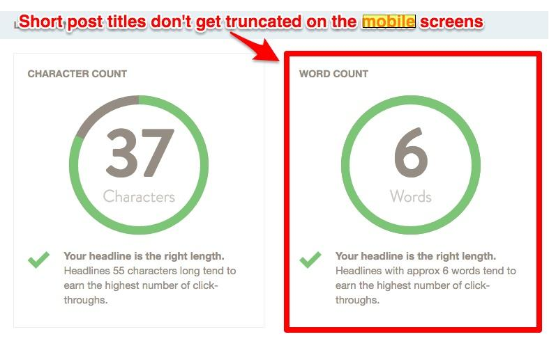
Not only that, I also found that my entire headline could be read because it was just 6-words long:
Go for short, snappy paragraphs
Short paragraphs are easy to follow because they tend to focus on one point, rendering them especially appealing for those who read on a mobile site.
If you develop the practice of writing short paragraphs, you’ll naturally avoid writing long walls of text that can frustrate a person reading on their mobile device.
But short doesn’t mean bland. You don’t have to beat the style and rhythm out of your writing in order to make it mobile friendly. Lots of writers end up writing boring copy in their effort to write short copy.
I’d love to rehash author Marcia Riefer Johnston advice on writing in a minimal style for mobile devices without losing meaning. Marcia says:
Concise does not mean short. Short tells us nothing. Like a piece of string, text should be as long as necessary.
Concise does not mean robospeak, as in “push button” instead of “push the button.” Keep the the.
Concise does not mean gutted for mobile. Don’t think, “Smartphone users won’t need that.” They will.
Concise means minimal: enough to meet your audience’s needs and accomplish your purpose. No more, no less.
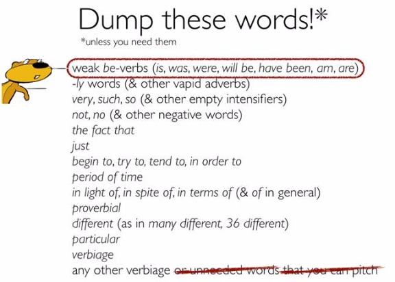
To make your work crisp for a small screen size, Maria suggests looking for and deleting the following words and phrases from your work:
Use small words
It’s all about economy when you want to get your content read on a mobile device.
Remember the fewer (and simpler) words you use, the smoother the reading experience will get.
Lots of people add a lot of flab to their writing by using words that have easier, simpler, and shorter alternatives. Perhaps they feel that using big words will give an edge to their writing or make them sound smarter.
But instead of impressing readers with their intelligence, they end up with flabby content.
The truth is that even the most qualified readers also prefer easy, small words to big, bulky words because they make reading faster.
Here are some common words to simplify in your content:
- obtain / acquire – get
- requires – needs
- purchase – buy
- request – ask for
- subsequent – next
- terminate – end
- utilize – use
- leverage – use
- commence — begin, start
- inception — start
- implement — follow, carry out
- erroneous — wrong
- expeditious — fast
- regarding — about
- subsequently — after or later
- accordingly – so
- discontinue – stop
- eliminate – drop
- validate – confirm
- witnessed – saw
You can find more simple word suggestions here.
To trim such fat from your content, run it through the Hemingway App. I’ve found the Hemingway App to be excellent for finding complex words in a text.
In addition to highlighting complex words, the Hemingway App suggests simpler alternatives too. (I’m pretty sure that Hemingway wrote most of his books with mobile devices in mind!)
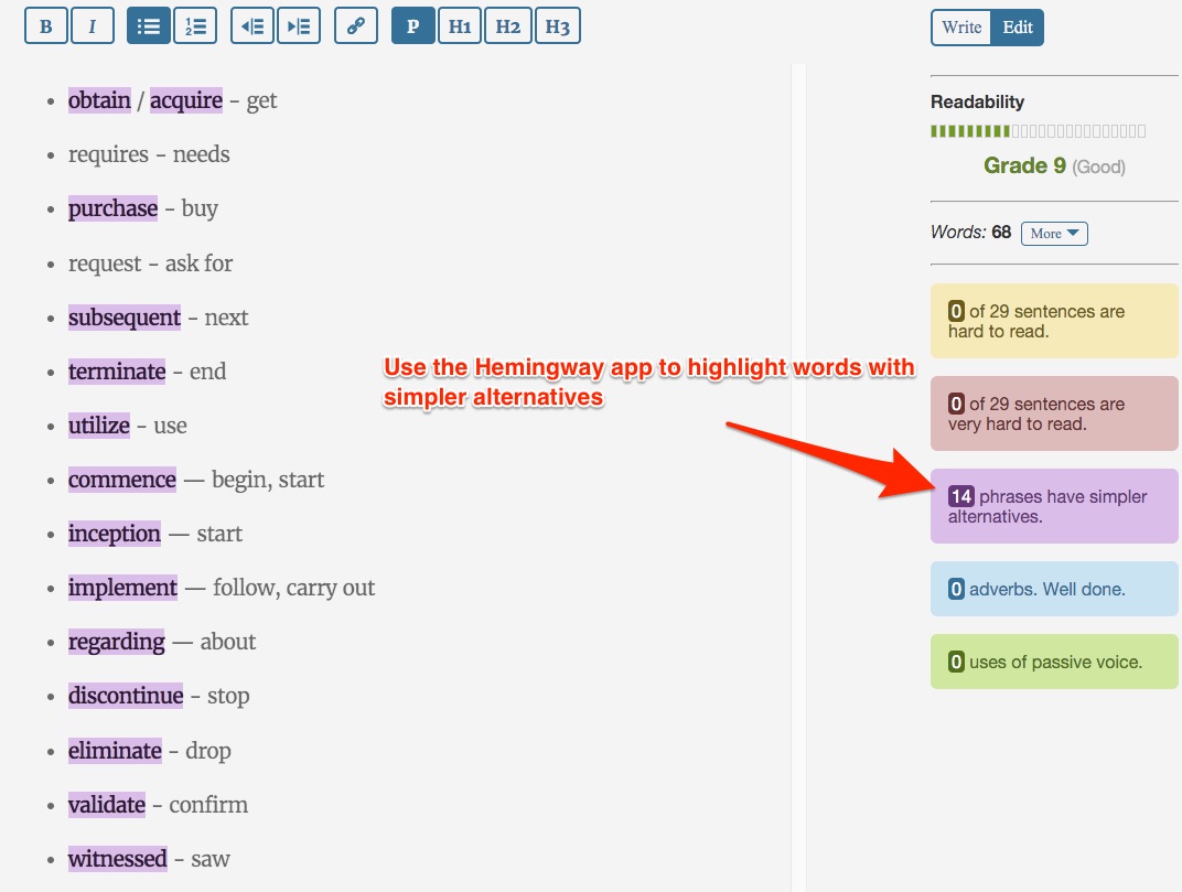
When you look at the above list, you might feel that perhaps you don’t use them. But it’s only when you test your text that you’ll know just how many of these creep into your writing.
A simple editing tool can find these for you and help you make your writing more mobile friendly.
Replace wordy phrases with simple words
Wordy phrases are worse than complicated words because they don’t just take more time for reading but often engender long, convoluted sentences.
Long sentences require readers to unwind their meanings in their heads. This spoils the reading experience. It’s especially frustrating for someone reading on their mobile device during, say, a break.
Here’s a list of some of the most commonly used wordy phrases and their one-word substitutes:
- in order to – to
- a number of – some
- by means of – by
- until such time as – until
- prior to – before
- at this point in time – now
- due to the fact that – because
- with reference to / pertaining to / in regard to – about
- with the exception of – except
- in the event that – if
- in the near future – shortly, soon
- as a means of – to
- reach out – contact
Again, the Hemingway App is the perfect (and free) editing tool to get rid of such wordy phrases in your writing and make your content more mobile friendly.
You must also check out this list of 50 of the most used wordy phrases along with their simpler alternatives from Daily Writing Tips. (It’s safe to say we are all guilty of using them!)
Use images
As we saw in the example of chunked content, images are an excellent means to chunk content and enhance reading on a mobile device.
Relevant images (screenshots/graphics/stock) add visual appeal to content and also break it up for easy reading… the whole key to being ‘mobile friendly.’
But often images like graphs and charts don’t stay legible on the small screens. When using such graphics, make sure that your users are able to interpret their data even on their smartphones.
Also, offer your most valuable information right after an image as eye tracking studies have established that readers notice images.
This is essential to keep in mind in general, no matter the screen size of where your content will be read.
Use whitespace for motivated scanning
Whitespace is the Holy Grail of formatting your content for the web. More so, for the mobile web.
In their study, How People Read on the Web, Neilsen says that
People can be motivated to scan quite lengthy pages, as long as pages have discernible, descriptive headings and content divided into obvious chunks.
To design your content for motivated scanning, whitespace is your single biggest tool.
By using whitespace effectively, you can not only chunk your data but also lead your users to the most important points in your content.
Essentially, whitespace is just hitting the enter key more often and using sentence fragments to create effect. In addition to these, subheads, bulleted and numbered lists, and shorter paragraphs are also elements that create whitespace.
When you just start out with whitespace, you might notice that you introduce abrupt (unintended) breaks in your content. Such breaks will get in the flow of reading and make the readers feel lost and so they need to go.
To detect such abrupt breaks, paste your content into Google’s translate tool and get the tool to read it for you. This trick works great because just like your users, this tool also reads your text mechanically and therefore it catches all the abrupt breaks in your content.
Preview on a mobile device
It might seem like a no-brainer, but the best readability test of mobile-friendly content is its mobile preview.
Before publishing, preview your content on your mobile device and look at it as a reader would. See if your eyes can ‘breathe’ through the different paragraphs. Reading the content out loud will also help you catch silly mistakes that even Grammarly and the Hemingway App might miss.
If you notice that your paragraphs are looking too long, either re-edit them to make them shorter or use styling elements to motivate reading. Or, again, introduce breaks with white space.
Conclusion
When you try to make your site mobile friendly, don’t settle for a responsive site alone because a responsive site is not necessarily reader-friendly.
Your audience wants to read what you’ve got to offer. And they want to do so on their mobile devices.
The popularity of mobile reading apps like Instapaper, Readable and others also hints at the increasingly preference for mobile reading.
With a few simple tweaks to your writing and formatting, you can improve your content’s mobile-readability dramatically while making your website more attractive for today’s modern mobile user.
Have any other tips for making content mobile friendly? And what steps have you taken to join our mobile web era?
Comments (22)