
Your users are mobile. Are you?
Traffic from mobile devices is still increasing. That being the case, your website must be mobile-friendly and optimized for mobile usability.
It’s your responsibility to tap into this huge customer base of mobile users and to do some mobile usability testing to ensure a smooth user experience for your mobile audience and customers. These people are highly motivated and, if you’re smart, you can build your business by leveraging mobile apps.
However, knowing how to acquire leads and customers through mobile applications isn’t enough. You also need to understand how to do continual mobile usability testing and to optimize your pages for mobile so that you can provide a memorable experience for users on a consistent basis.
User experience should not be taken lightly. According to Crazy Egg, “When your user experience is as effective as it could be, your rate of return is sure to rise. This essentially means that you’re putting just enough money into your business to make it a user favorite, and now you’re reaping the rewards with higher profits.”
Mobile usability boils down to people usability. So, if you want your site to be accessed easily on mobile applications, then you’ve got to eliminate mobile usability errors. Otherwise, you can risk being penalized.
Regardless of the mobile device, your users access your site with, they should be able to find the information they’re seeking in a timely manner.
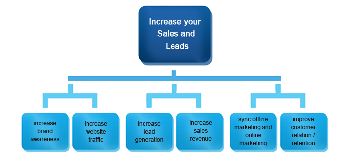
Brands are capitalizing on mobile apps and devices to grow their customer base and revenue.
Here are 6 quick tweaks that you can make to ensure that your website passes the mobile usability evaluation and delivers a favorable experience for your users:
1. Have a single column website layout.
Popular brands that have optimized their sites for mobile usability go the extra mile to put their content first. They get rid of every element that could distract users from their content.
One of those distracting elements is having multiple columns on a page’s mobile layout. In fact, having more than one column could be a conversion killer.
Even Facebook uses a single column for the different versions (m.facebook.com and touch.facebook.com) of their mobile sites.
Take the first step right now. Having a single column website layout for a mobile site is essential.
Start by considering your objective for building a mobile site. What exactly do you want to achieve?
For example, Hyundai has a single objective behind its mobile site: to enable you to view the latest model of a vehicle, followed by other mobile-optimized images.
That’s why you won’t see any navigation menu bar or sidebar on its mobile site – just a picture of the latest vehicle model. Take a look:

After defining your objective, you need to also remember that a mobile screen is smaller than that of a desktop PC. So, you need to be aware of things like your screen and text size.
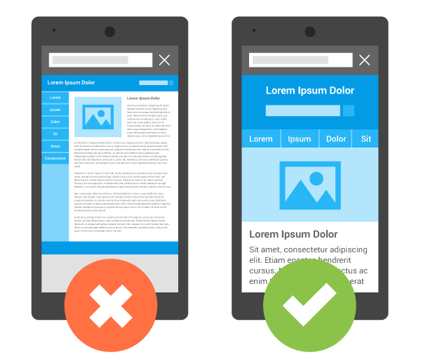
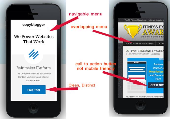
Take a look at the two mobile sites in the picture below. The one on the left has 2 columns. According to Google, it’s not mobile friendly.
The second has a single column and it’s both search- and user-friendly.
If your mobile site currently has more than one column and you want to tweak it, the most effective way is to adopt a responsive design.
According to Brian Casel of Mashable,
Using responsive web design techniques, you can take a multi-column desktop site layout and adapt it to a single-column layout.
Look at how a responsive design transformed Major League Baseball’s mobile site into a single, user-friendly column.

2. If you can, design different versions of your site for mobile users.
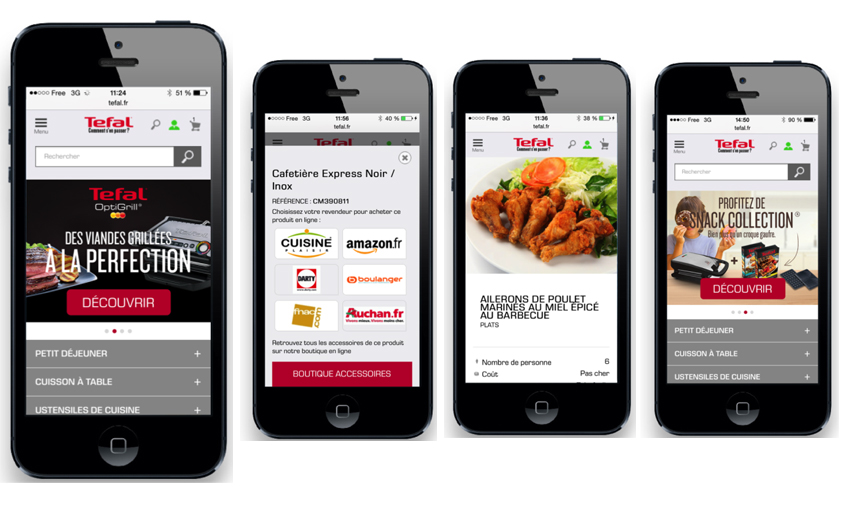
Having different versions of your site, optimized for mobile users, can save you a lot of headache in the long run. Here’s an example from Tefal:
In marketing, providing relevant alternatives can truly boost your conversion rate. It affords your ideal customers the opportunity to enjoy a great user experience and choose the right solution for them.
When it comes to putting mobile users first, one of the essential things that you can do is to design different versions of your site for mobile users or even a specific mobile app.
You already know that the iPhone and Samsung Galaxy aren’t the only mobile devices in use.
With different mobile devices also comes the need for screen adjustment and acknowledging different levels of processing power.
If you check your favorite mobile phone retailers, you’ll notice that phones with resolutions from 128 x 160 pixels up to 620 x 1200 pixels are the most common these days.
Many phones are also not designed to load up full web pages, unlike the most advanced smartphones.
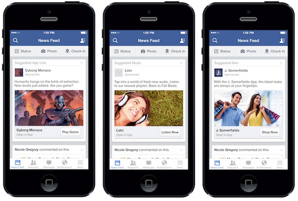
That’s why, just like Facebook and other social networking sites, you should design a scaled-down version of your site for users who don’t have the mobile application usability to load the full version.
Facebook has three different mobile website versions for their mobile users. The “m.facebook.com” version is the main mobile site that most people are familiar with.
Finally, the “touch.facebook.com” version is – as you’d guess – optimized for touchscreen devices like tablets.

3. Design and optimize pages for both touchscreen and non-touchscreen users.
The world is experiencing a mobile revolution.
In fact, worldwide mobile device usage is increasing dramatically. Today in 2019, there are now more mobile devices than there are people on this planet.

When it comes to mobile usability, you want to ensure a terrific user experience so that your users quickly find exactly what they’re looking for.
Remember that if you don’t meet their needs, they’ll leave and visit some other user -friendly mobile site – maybe your competitor’s.
Touchscreen mobile devices are increasingly popular these days and they present unique opportunities for you. For one thing, touchscreen mobile applications help users to fill out a form more easily.
Stiff buttons on non-touchscreen mobile devices can make registration on a mobile site awfully painful.
The majority of the smartphones in use have a touchscreen user interface. They can access the internet much more quickly because of the advanced functionalities they have.
Remember that when optimizing your mobile site for touchscreen users, you should avoid adding more than the required links on a particular page, especially when they’re too close together.
That’s because if the links are too close, it’s hard for users to click on the right one. Users commonly find themselves clicking the wrong link, and their frustration grows.
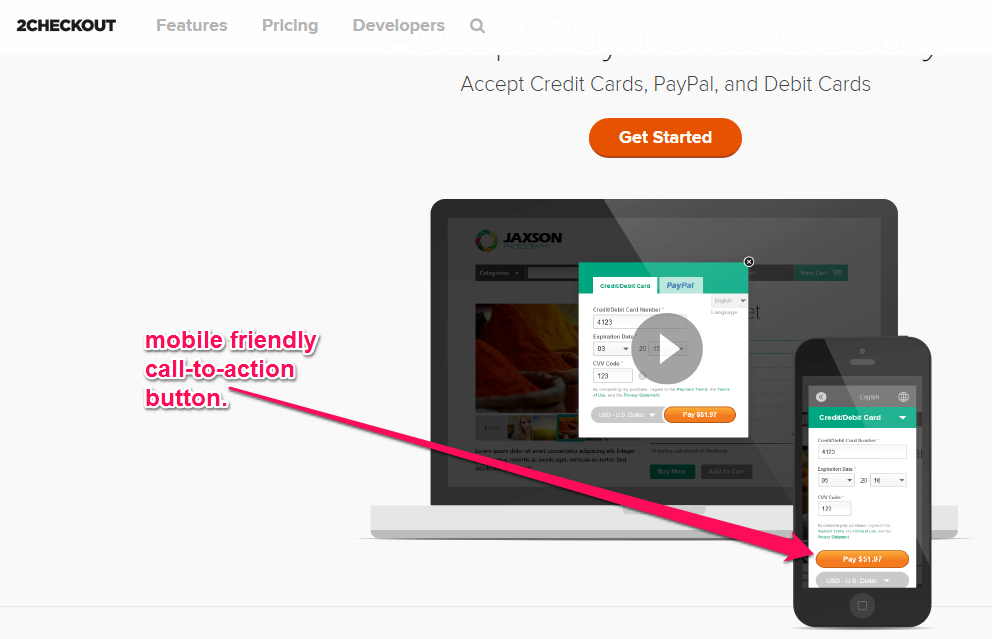
To the extent possible, avoid links altogether in favor of clear and captivating buttons – especially for your call-to-action. On a touchscreen user interface, it’s easier to click on a wide button than a link.
4. Leverage built-in mobile functionality to make your site more valuable.
As a smart marketer, you can take advantage of built-in mobile tools, features, and functionalities to improve your sales and leads.
When designing your mobile site, you need to consider all of the important features of effective mobile usability testing.
As an example, the search bar on your site is important. You may not use it on your general desktop site, but you should definitely include a search bar on your mobile site.
Click-to-call is one built-in feature that you shouldn’t ignore. Listen up: your ideal customers who use mobile devices want to put their thumb on a business phone number and call the phone line instantaneously, instead of having to remember and then separately dial the number.
With modern smartphones, mobile application users can easily find a particular address on a map. They don’t have to search endlessly before they can get the accurate address of a restaurant, for example.
Using GPS, they can detect a business that’s close to them. With the Location-Detection functions on most modern mobile phones, customers can easily detect the nearest store locations on a map.
Moreover, social networking mobile sites (e.g., m.facebook.com) can make it easier for its users to find friends, colleagues, events or places close to them.
5. Use a simple and clear call-to-action.
Crafting a call-to-action for desktop landing pages is hard. It’s even more difficult when you’re targeting mobile users. The best way to succeed is to study successful CTAs from sites that are optimized for mobile application usability.
A high-converting CTA is often the difference between a mobile site that converts users into customers at a high rate and one that doesn’t convert at all.
Knowing how to create a perfect mobile call-to-action can help you stand out from the crowd. It’s a skill that most people (especially mobile marketers) typically don’t have.
The concept of a call-to-action is simple: tell people what to do next. It’s a way to nudge them and (preferably) reward them when they take the “right next step.”
Your mobile call-to-action must be specific, visible and useful. When you put yourself in the customer’s shoes, you’ll begin to see things from their perspective.
Persuasive CTAs will always lead to a higher conversion rate. Every tiny tweak can play a key role in increasing or decreasing your conversion rate and can play a crucial role in effective mobile usability testing.
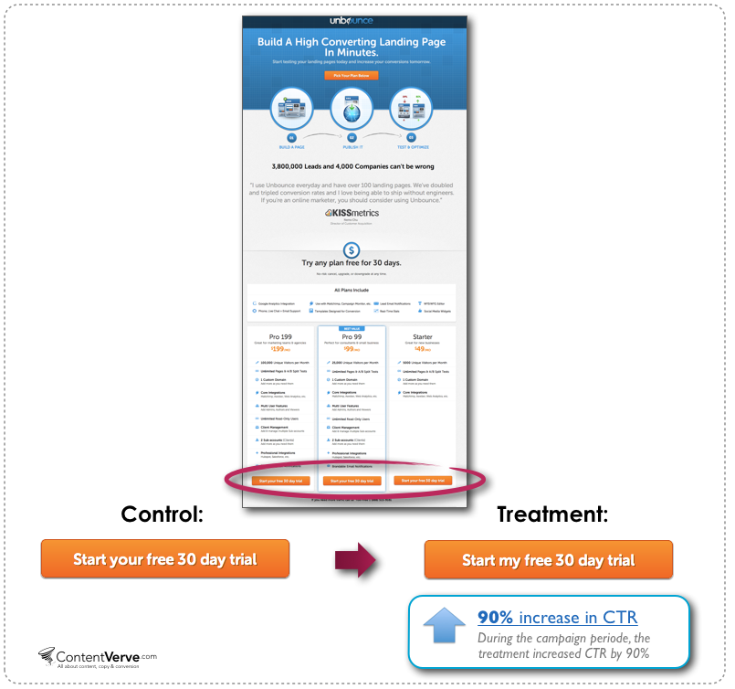
As an example, Oli from Unbounce.com and the team at Content Verve ran a split test on a landing page. They wanted to know how changing a single word could impact the click-through rate.
According to Michael Aagaard, during the split test, they only changed the possessive from “Your” to “My.”
At the end of the 3-week experiment, the CTA text “Start my free 30-day trial” increased the click-through rate to the payment page by 90% over the version that read “Start your free 30-day trial.”
Regardless of whether you’re asking people to sign up to your email list, to download your book or to purchase a product, remember that if you’re too pushy, customers will notice and they’ll run away.
But, by the same token, if you’re too mild, customers won’t be persuaded. Hence, they’ll leave, too.
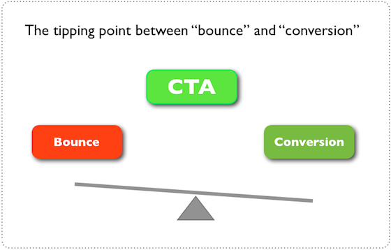
You need to strike a balance. A good CTA is that tipping point where a person either bounces off your site or moves forward to purchase your product (or download your free ebook).
It’s possible to design the perfect call-to-action so that it draws the right people in and gets clicked. This is even more important with mobile users because they’re quick to make purchase decisions.
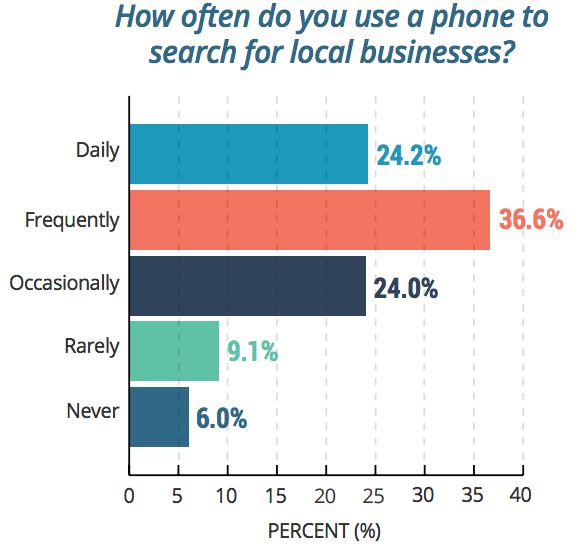
From the chart below, you can see that, during business hours, 54% of users search for information on smartphones. And, 34% of mobile users use their phone to search for local businesses.
If you want your mobile site to become the go-to platform for mobile users, then ditch every advanced technique that you’ve been taught and focus on creating simple, clean and mobile-friendly calls-to-action.
Conclusion
Pay attention to mobile users and become a smart marketer. Don’t be overwhelmed by all of the advice out there. The rules for mobile application usability and mobile usability testing tools aren’t set in stone.
If you’re on a limited budget, consider creating a mobile app or using one of the pre-designed templates out there.
Whatever it costs, in terms of time or money to get your site mobile-friendly and easy to use, it’s a smart investment to make in your brand.
Maybe you have a mobile site but it isn’t converting as well as you’d hoped. Don’t despair. The fact that your site is already mobile-friendly is a big accomplishment – most B2B and B2C marketers haven’t even gotten that far.
I’m confident that you’ve learned one or two things from this ultimate guide to mobile usability. Just keep in mind: the web is dynamic and always changing. What we hold as gospel truth today might fizzle out in a few months’ time.
Get your sites and pages ready for this imminent mobile technology age. Your customers are mobile, so you’ve got to be where they are.
Which other steps did you take when making your mobile site more usable?
Comments (22)