
If you want to capture more targeted leads, then your landing page web design has to convey your message well.
But, the truth is that most landing pages don’t increase conversions, which is why most people complain about low conversion rates.
You can change the story by following 6 steps to create landing pages that capture conversion rate optimization.
No matter what business you’re in, it’s always wise to put up a new, relevant landing page complete with a call to action, social media sharing, and great landing page copy to capture potential customers. According to Marketing Sherpa, “48% of marketers create a new landing page template for each marketing campaign.”
Landing pages contribute to conversion rate optimization and literally run your business when you’re not there.
You want to build a proven system that has the convincing power to speak and appeal to potential customers in your absence.
After all, if your business requires 100% of your effort before money is generated, sooner or later you’ll most likely give up.
Don’t let that happen to you.
What should your audience’s state of mind be when they discover your landing page web design? What first impression do you want to create with your design elements? How will you convince them to commit to your call to action? And how do you increase conversion?
These simple steps have worked for a lot of top brands and businesses. I’m certain you’ll get results, too.
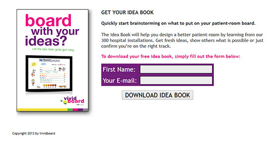
VividBoard increased conversions from 2% to 27% (a 1250% lift) with a simple landing page designed to increase conversion Take a look:
If you’re ready to achieve similar, or even better results for even higher conversion, let’s get started:
1. Understand your audience’s pain points.
How do you satisfy someone that you barely know?
The truth is that it’s hard to do.
To have an impact on your audience, you must understand their pain points.
Your competitors may not be taking this path, which is great – you can take a different path and communicate with understanding.
Picture this: Your audience has a headache and you’re trying to give them medication for a stomach ache.
Will they listen to you? Wouldn’t your solution turn them off?
In the same vein, when building landing page templates that’ll further grow your business, you want to capitalize on their pain points.
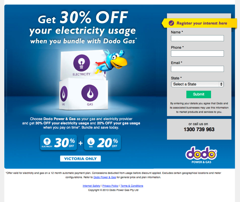
For example, here’s a landing page design that focuses on the customer’s pain point: saving money on their electricity bill.
Here’s my advice to you:
Go the extra mile to find out what’s actually keeping your audience up all night, worrying and looking for a solution online.
Remember that someone with a nagging problem or challenge will look for solutions, one way or another.
Be there when your ideal customers need you most – with your relevant, well-designed landing page geared towards a positive user experience.
If your landing page is relevant both in web design, call to action, and content – you’ll become the go-to expert to somebody who’s been looking for a solution and you will increase conversion.
Consequently, your customers will believe in you and also share your link with others via social media. Their friends and family may also click on your call to action and before you know it – you have been successful with your conversion rate optimization.
It irritates online users immensely when they realize that they’ve been disappointed, yet again. This usually happens when you fail to understand their pain points.
When you solve a customer’s need with your landing page, you can rest assured that they’ll come back again.
2. Be specific.
Your landing page web design has only one purpose: To get people to act, usually with a CTA button or by filling in your opt-in-form.
When there are too many options to choose from in your landing page template, it becomes a daunting task for your audience members.
“The paradox of choice reveals that less is more. Too many options will often hinder people from making a choice.”
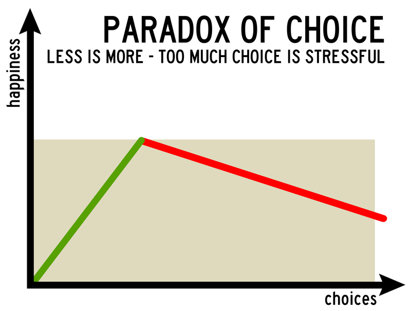
If your landing page design is focused on a single purpose, you’re helping your customers make the right decisions and you will increase conversion rates.
Trying to promote more than one thing on a single landing page template is an ineffective marketing strategy. A few of the questions you need to answer are:
- Does my audience really understand what I’m driving at with my landing page design?
- Is my landing page template focused on one thing (e.g., getting 1,000 email subscribers)?
- Does my audience really need more than one solution or one CTA button (probably not)?
Revise anything that’s generic and make it more specific. Don’t clog up the web design of your landing page, or else you’ll wind up confusing people and this will have a negative effect on your conversion rate optimization.
Tossing out a lot of solutions on a single landing page design will make your audience see you as a person who doesn’t care about them.
Professional specialists are respected, in part because they deal with a specific problem.
When you proffer solutions to many things, you’ll lose more of your audience. For example, if your landing page covers both list building and email marketing, I can assure you that your conversions will be low.
Being specific is necessary. But, you also need the right tool to build your landing page template with ease.
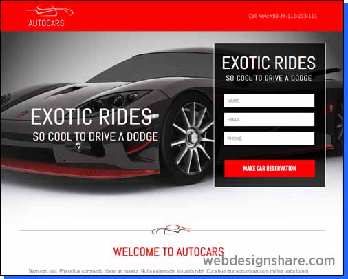
3. Choose the right tool.
What is a tool?
Here’s a simple definition from Businessdictionary.com: “An item or implement used for a specific purpose.”
Get the right tool for the job when it comes to conversion rate optimization. Don’t use a screwdriver to pound nails. It will wreck the tool and it won’t help you get the job done properly and quickly.
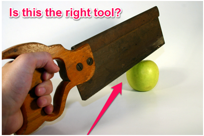
Using the wrong tools negatively impacts your results.
But, all landing page tools are created equal, right?
Actually, they’re not all equal. Some tools are more effective than others. Using these tools will reduce your stress, especially when you’re designing a landing page to increase conversions.
For example, Instapage is one of the easiest landing page tools in the digital space. It also comes with a lot of professional web design templates that are optimized to convert visitors into leads. I use it all the time.
It’s basically drag-and-drop software.
Other tools, such as Unbounce and Leadpages, are equally handy when adapting design elements in landing pages.
In this crowded digital marketing space, you need to automate some of the tasks you otherwise would do manually.
For example, an autoresponder is essential. It helps you capture, connect to and communicate with your audience, even while you’re on holiday and not actively working.
Therefore, try to choose the right landing page tool – and make the work easier.
4. Give away useful materials.
Have you ever wondered how I managed to build 5 successful multi-million dollar SaaS companies from scratch? I’ve written a post on it.
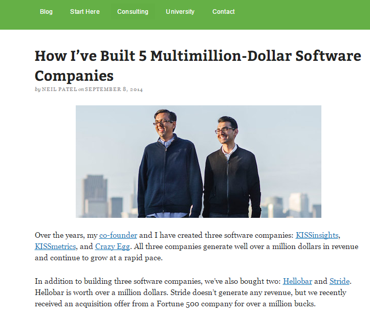
Do you ever think that I have some special skill that others lack? Not really. I’m just like every other person (well, except that I know how to take action and I have the social proof to back it up).
Here’s the truth: I give away valuable, practical and content-rich information for free.
Most marketers would prefer to charge for the same content that I share with you freely. But, at the end of the day, giving away free valuable information is much more profitable because it encourages those CTA button clicks, improves my conversion rates, and boosts my marketing campaign.
Yes, the rewards (e.g., loyal audience, money) may not come immediately, but your brand is being improved all the time.
If you want to build your email list quickly, ensure that your lead magnet is free and valuable.
Have you heard of the term, “lead magnet”?
A lead magnet is helpful content that you give away for free, in exchange for the user’s email address, thereby moving that user into your conversion funnel.
A valuable lead magnet can increase your lead gen quickly.
For example, this little baby generated 28,507 leads in 45 days for DigitalMarketer.com.
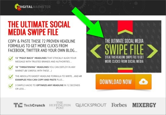
Always give away free and valuable material. It doesn’t have to be a swipe file like the one above. It can be a simple report, ebook, blog post, email course, software, plugin or even your time.
Asking people to subscribe to your email list or click your CTA button without giving away a free gift will send the wrong signal and will probably not grow your list. Read these words from Winston Churchill:
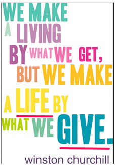
Giving free gifts to your audience is an effective marketing strategy and a great way of upping your conversion rate.
It’s a way of building trust and credibility with customers.
Free gifts have always compelled people to act. Human beings like free gifts.
And, when your free gift (lead magnet) is valuable, you’ll drive referral traffic to your landing page easily, because happy people will spread the news via social media or other means.
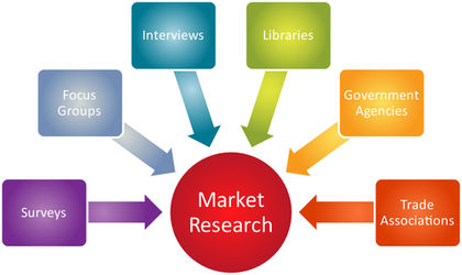
Make sure that it’s in the format that your customers will appreciate. Obviously, this is one reason why you should conduct market research first.
If you can give away 2 hours of your time for free – especially if you’re an influencer in your field – so that people can call you for advice, that’s proven to work, too.
If you give them a free consultation, you’re building relationships that will pay dividends later on down the road when it comes to conversion rate optimization.
5. Make your title captivating and full of benefits.
First impressions matter in the digital world. Being able to draw attention to your landing page is critical for lead gen- and the title helps with that.
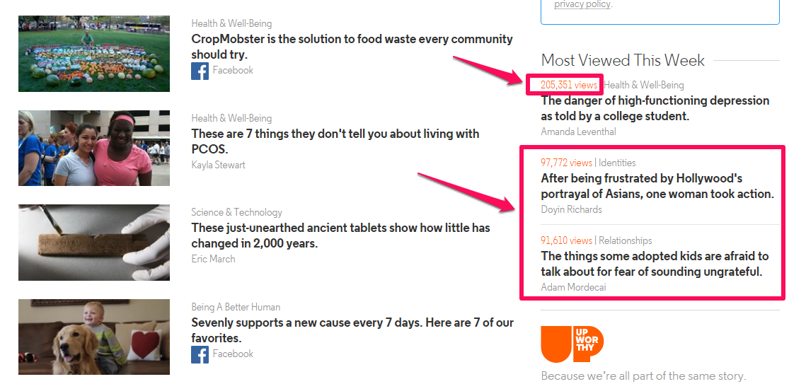
One factor that’s led to the success of news media sites, such as UpWorthy, Buzzfeed and the like, is their titles. I mean, these guys know how to write catchy titles that appeal to people’s emotions.
Look at the attention-grabbing titles for their blog posts and landing pages against their corresponding views in just one week. The social proof is also right here:
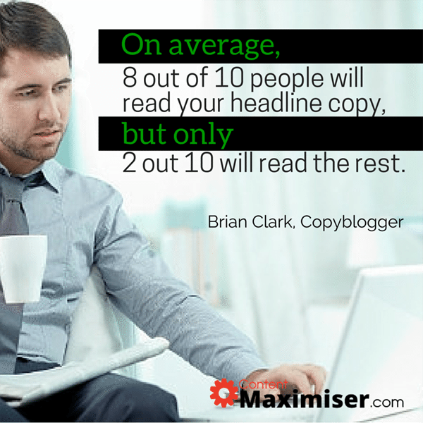
The title is crucial. Brian Clark, founder of Copyblogger Media, estimated that, on average, 8 out of 10 people will read your title. Titles also have an impact on whether your blog post or landing page is shared on social media.
Ted Nicholas, the famous direct response copywriter, also agrees, suggesting that 73% of your buyer’s decision-making process begins at the point of the title.
Landing page design elements that grabs your customer’s attention will make them want to learn more.
Let’s compare two different landing pages. Bear in mind they’re from the same site.
As you can see in this first design, the title is weak and offers no real benefit.
But, after redesign, the title was improved. Take a look:
You can see for yourself that the redesigned page and tweaked copy grabs attention. And, this improved page saw an increased conversion rate of 33%.
You can discourage a customer at first sight with a poorly designed lander and a weak title and odds are you won’t increase conversion that way.
Your page should also be attractive. When you pay attention to landing page design elements, the customers are much more likely to stick around and take the action that you want them to take. Design contributes to lead gen.
6. Use relevant visuals.
“A picture is worth a thousand words.”
The best landing pages I know usually have great-looking visuals — i.e., images and videos.
Here are a few stats to inspire your visual marketing efforts:
- Humans respond to visual content faster than you can imagine.
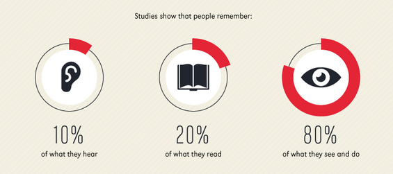
- 90% of the information transmitted to the brain is visual and visuals are processed 60,000X faster in the brain than text.
- 80% of people remember what they see and do.
- Site visitors spend 100% more time on pages that contains compelling videos.
Visuals have taken over social media networks and have a huge impact on marketing campaigns.
In fact, in a real sense, visuals power social engagement and the web is full of social proof to confirm this. Facebook and Twitter have established authority, more than ever before, due to their high volume of images and videos.
Visuals make information clearer to the reader more than text alone. Use visuals that are relevant and compelling to your target audience.
Using visuals as a design element in your landing pages can transform a digital business. For example, Jason Thompson conducted an A/B test on his page to see if replacing a contact icon with his own photo would lead to more people contacting him.
Here is the screenshot of the original and the variation, together with the result.
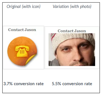
At a glance, you can see that the version with Jason’s photo had 48% more conversions, compared to the generic icon. This shows the power of visuals.
Jason commented on the test results:
People want to connect with other people emotionally, the photo makes that emotional connection so much easier and, as the test is proving, drives people to the contact form more than a nondescript icon.
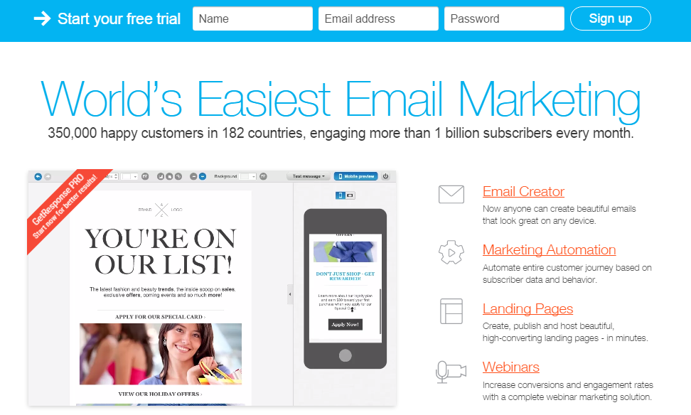
Remember that people respond to different types of visuals in different ways. For example, stock photos may look professional, but your target audience already knows where you found them.
You want to appear real to them if you want to boost your conversion rate.
So, don’t use stock photos. Instead, take photographs of you or your team implementing the marketing campaign or strategy that you teach. Better yet, use screenshots to show how your solution can be applied.
That’s exactly what GetResponse did on their landing page.
Take a look:
Conclusion
You need to invest your skill, time, money and resources, if you want your landing page to continually bring in the desired results.
It’s not advisable to chronically change things in your landing page, but you also want to ensure that you don’t let it grow stale.
The digital marketing space is changing. New tools are being developed. Invest adequate time to learn how these new tools work. Keep abreast of landing page trends – these would guide you when making decisions.
At some point, you may need more landing pages. But, stay focused: start with one.
Even a single landing page with the right design elements can yield impressive results for your business.
For example, Moz generated an additional $1 million, per year, when they redesigned their landing page and used it to promote one of their core products to their email list subscribers.
Are you getting any results with your landing pages currently? Share your comments below.
Comments (71)