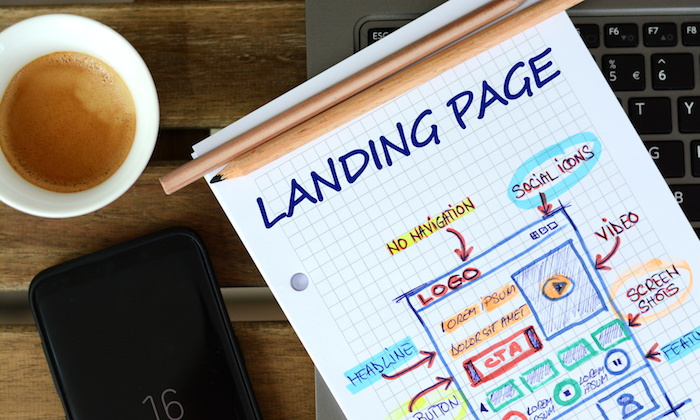
Can I be completely transparent with you?
I used to really hate creating landing pages.
You might think I have no reason to complain because I’ve been so successful. Certainly, all of my landing pages have always worked like a charm, right?
Ha!
It might seem that way, but that’s not true.
For a long time, my landing pages were weak and they barely converted at all.
Some of them were absolute crap.
Even today, my landing pages aren’t anywhere near perfect. Whenever I create a new one, I have to face a new set of challenges.
Maybe my last landing page didn’t convert well enough. Or maybe I’m targeting a new audience and I have to think long and hard about what that new audience wants.
It’s not all sunshine and rainbows. And it’s not all double-digit conversion rates, either.
But I hate landing pages a lot less than I used to.
That’s because I picked up a few tips and tricks along the way that have made it much easier for me to design successful landing pages.
Keep in mind that not every landing page I make is an instant success. But, I do have consistently higher conversion rates than I used to.
What’s my secret?
Years of experience have taught me one main lesson: I learned how to connect with my visitors.
These are the five tried-and-true strategies that I use to make sure my landing pages always connect with my readers. And these are strategies you can use today.
1. Nail the headline
I’m a big fan of this quote from the advertising legend David Ogilvy:
On the average, five times as many people read the headline as read the body copy. When you have written your headline, you have spent eighty cents out of your dollar.

It’s spot on.
The bottom line is that your headline can make or break your landing page.
It doesn’t matter if you have the best design or a top-notch explainer video. If your headline isn’t appealing, your conversion rate will probably be low.
Read that quote again. The headline gets five times the attention that the body copy does.
And even though Ogilvy said that decades ago, it’s just as true today.
Take a look at this heatmap of a SERP. You’ve probably seen an image like this before.
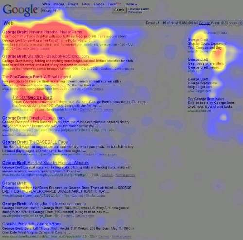
In this case, it’s the page titles that have the most heat on them, meaning they were read the most. The areas in blue didn’t get as much attention.
Even though that’s an image from Google SERPS, it demonstrates the pattern people follow when reading material.
Most people give the majority of their attention to dominant headlines.
Studies from the Nielsen Norman Group and the Poynter Institute have confirmed this idea. Nearly every time, people read headlines the most, more than any body copy or sidebar.
Even though these studies are old, they make a relevant point about human behavior. We pay attention to headlines.
This reinforces exactly why you need to be obsessed with creating awesome headlines.
If your headlines don’t draw people in, those people might leave your landing page.
Enough of the academic study. How do you make great headlines in real life?
I have a few tips.
First, make your headlines short.
Long headlines are a bad sign. They just look like they’re too much work.
Be honest, which headline do you prefer?
Or this one?
It’s an easy choice. The first one wins out. Why? Overall, it’s less intimidating. There’s less verbal clutter.
That’s why you need to keep your headlines short and sweet.
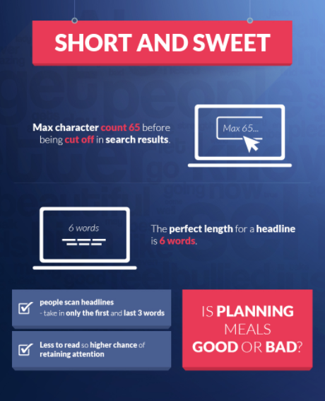
That’s right — six words is an excellent headline length. Just six words. (Okay, give or take one or two words).
The point is that shorter headlines are almost always better headlines. Give it a try the next time you write a headline.
But a short headline isn’t going to do all the hard work for you. You have to create some emotional connection.
An interesting way to do that is to use negative wording.
You may have been told that using negative words in your copy is bad and creates the wrong feelings.
If used right, however, negative words can address readers’ insecurities. You can leverage that fact to help readers understand why they need to take advantage of your offer.
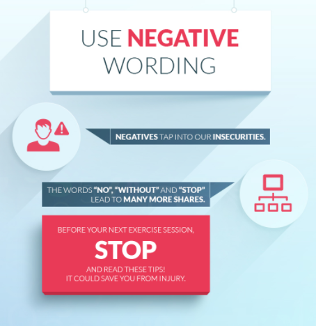
Negative words can be powerful. They grab your attention almost immediately.
That’s because we often perceive negative words as a warning.
If your landing page is telling the reader to “stop” doing something, they’re going to wonder what and why.
They’ll also wonder what they could be doing better, and that’s where the rest of your landing page comes in.
Just don’t overuse negative words. If you keep using them for the same target audience, your readers might get used to the negative phrases and overlook them.
One last tip: Your headlines should be specific.
Vague headlines just don’t cut it anymore. They don’t engage readers because, well, there’s no room for engagement.
When the headline isn’t clear or compelling, there’s no reason to read it.
Look at this headline:

You sort of get what it’s trying to say, but it’s too buzzword heavy to be meaningful. Anyone could claim to “revolutionize marketing.”
This headline is missing the detail that answers the burning questions: How will it revolutionize marketing? And what kind of customer are we talking about?
This is why vague headlines are horrible for landing pages.
Specific headlines, on the other hand, can create a personal connection between the content and the reader.
If each of your readers feels like the landing page was written especially for them, they will be more interested in what you have to say.
Here’s a great example of a specific headline that creates a connection:
This headline is targeting a specific group of people. It addresses the group’s concerns and provides a solution.
This specific headline won’t work for every group of people, but it’s much better to take a targeted approach with your headlines (and with your content in general).
Remember the age-old maxim: If you try to please everyone, you’ll please no one.
With all of that in mind, here’s a concise formula you can try out:
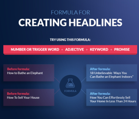
This formula builds on the concepts we’ve discussed and goes into a little more detail. I also recommend checking out the rest of this infographic.
2. Nail the CTA
This is another element of the landing page that most people get wrong: the call-to-action.
That’s because most people “go by the book” when it comes to CTAs. But building a connection with your readers is a dynamic interaction.
You can’t always rely on the same set of guidelines for every CTA. Rather, you need to consider each CTA by itself, and figure out how to optimize it.
So let’s discuss some common CTA problem areas.
First, there’s the actual text.This is arguably the most important part of the CTA.
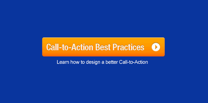
If your text is generic, it can actually bore your readers. Try not to yawn at this CTA:
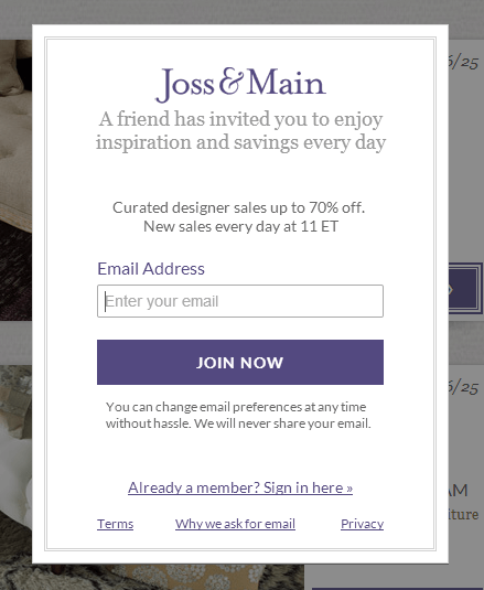
You’ve seen CTAs like “Join Now” a million times before. If it doesn’t interest you, it’s sure as heck not going to interest your readers.
But that’s not the only problem that might plague your CTA button text.
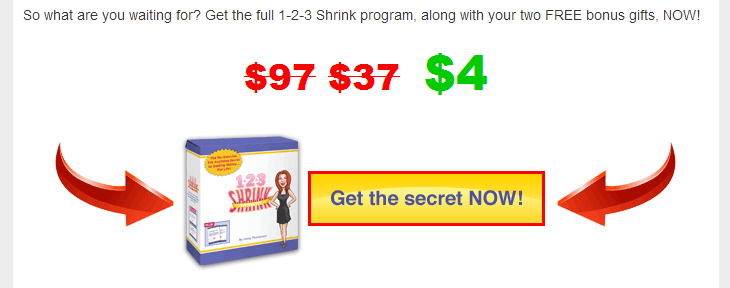
Your CTA text could also be too sensational:
Or it could ask too much of your readers by using high-friction words like “submit.”
Your CTA text needs to do one thing really well. It needs to give the reader a good reason to click on it.
What’s the best way to do this?
Emphasize the value the reader will get by clicking on your CTA.
This is all part of the art of persuasion, as I explain in this video:
What is the specific benefit the reader will receive? You need to sum that up in just a few words for your CTA.
CTAs like “Join Now” or “Submit” don’t communicate any benefits. That’s another reason why they don’t work.
The more detailed your CTA, the better. It should also be unique, so readers can connect it with your landing page alone.
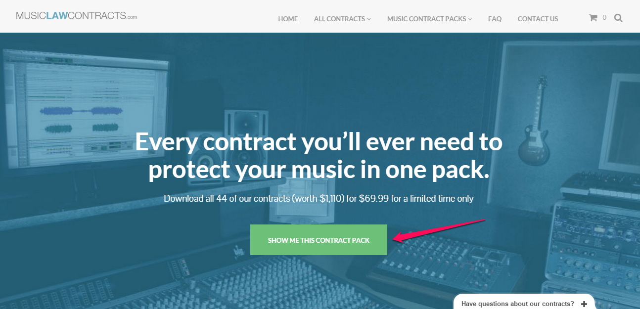
Aquaspresso has an awesome CTA that specifies a benefit:
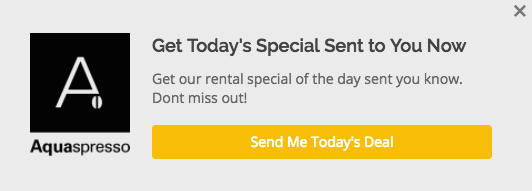
Even if you only read the CTA button text and nothing else, you’d have an idea of what benefit you’ll receive by clicking on it.
Second, there’s the overall look of the CTA.
There are three important elements of CTA appearance: color, design, and placement.
The button color of a CTA has been a hot topic among marketers and growth experts.
The overall conclusion? There is no one “best” CTA color.
For example, a yellow CTA increased my conversion rate by 38 percent, but yellow might not work with your color scheme or web design.
Your CTA needs to pop, so use a contrasting color that stands out from the rest of your landing page.
Next up is the design of the CTA.
This is a little trickier. You have to think about your overall branding. Your CTA should fall in line with that branding.
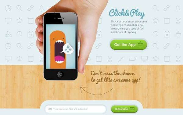
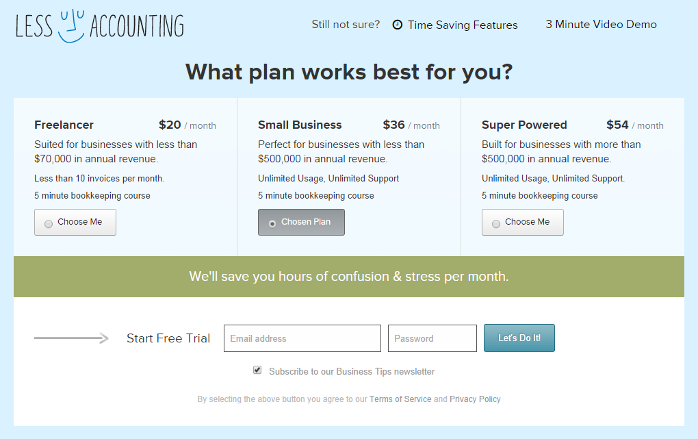
If you have a more minimal, contemporary style, you might want your CTA to look like this:
If your branding is more casual and fun, this might be a good CTA style for you:
Think carefully about how you can extend your branding to your CTAs. Your users will notice, and they’ll be more likely to click on them.
Finally, think about placement and visibility. You want the CTA to be in a prominent spot, and you want it to be immediately noticeable.
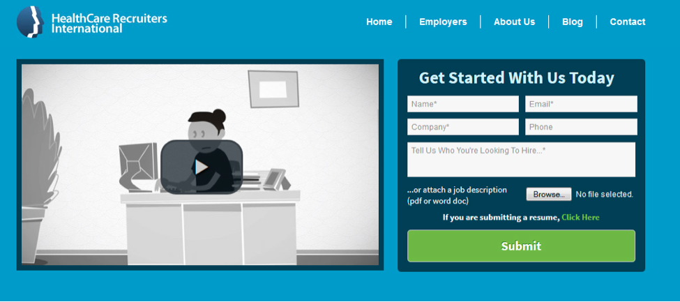
Here’s a CTA that could have better placement:
It’s all the way at the bottom right, a place where many readers will never look.
Think of placement and visibility as two sides of the same coin.
You need to strategically place your CTA and make sure it’s super visible.
This CTA does both of those things extremely well:
I know it seems like a lot to think about, but your CTAs will be much better off if you take the time to think about each element we’ve covered.
3. Leverage the power of interaction
Earlier, I said that building connections with readers is dynamic.
That means you can’t talk at your readers and harass them into taking a specific action. You have to get on their good side and cater to them.
Interaction is one of my favorite ways to connect with readers.
To some extent, your readers are going to interact with your landing page no matter what. But you can take it up a notch and make it more fun for them.
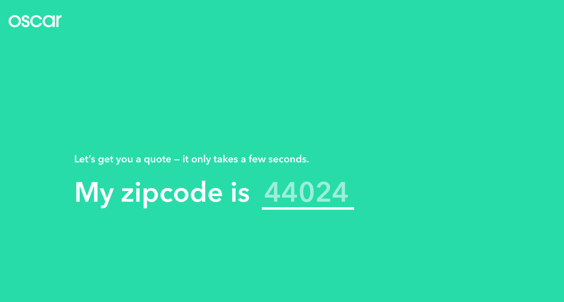
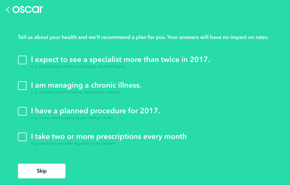
One of my favorite examples is from Oscar Health. To get a quote from Oscar, you go through a series of interactive screens.
First, you input your zip code.
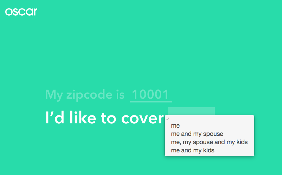
Then you select which coverage option reflects your insurance needs.
Next, you input your age.
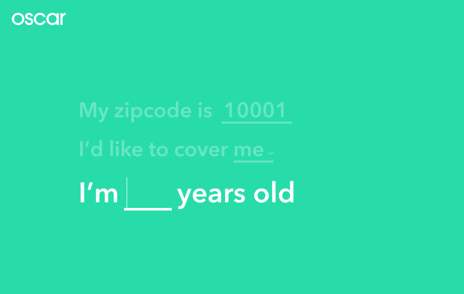
Then your yearly income.
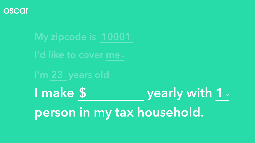
Finally, there are some optional questions that only require you to tick a box.
Finally, you see your personalized quote.
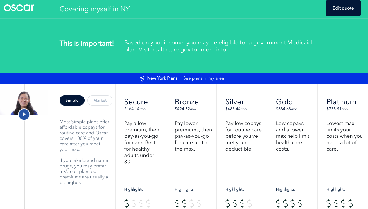
Isn’t that awesome?
It doesn’t feel like a chore at all. It feels more like a Buzzfeed quiz than a health insurance quote.
That’s an obvious example of interaction, but you don’t have to create an entire questionnaire to create interaction.
You can use different types of content to create interaction. If a reader can learn something from the content on your landing page, he or she will be more likely to turn into a lead.
This doesn’t need to be complicated. Even a “How It Works” section, as H.Bloom has, will work well.
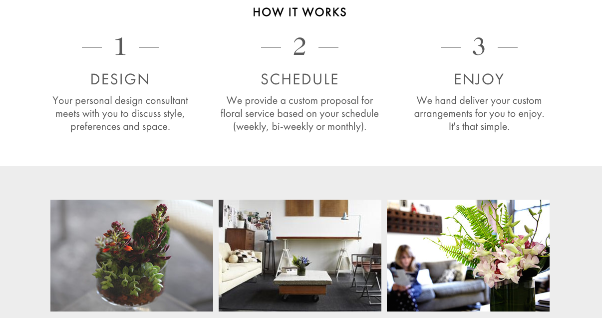
What’s important is that you go into more detail and tell your reader how you can help them.
You can use infographics, videos, lead magnets — the only limit is your imagination.
4. Use the right images
Images can break up a text-heavy landing page and add a lot of visual interest.
And like everything else on your landing page, the images you use must be relevant.
There are also specific types of images that people connect with more than others.
This might not be a surprise to you, but most readers react well to faces. This is backed by neuroscience and it comes in handy for marketing purposes.
A nice trick is to use a picture of a person and place it so the person appears to be looking at a specific section of the content. This should be a section you want to draw attention to.
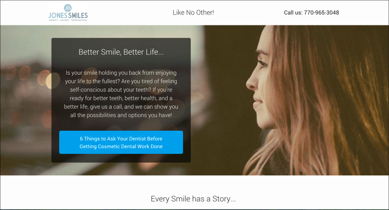
The psychology here is simple: We see someone looking at something, so we also look at it.
In this case, the woman’s gaze draws you to the main block of content.
It’s a super-simple and effective way to direct your readers’ attention.
Another time-tested technique is to use situational images.
These are images that show your product or service being used in one way or another.
Pocket accomplishes this with a minimal photo:
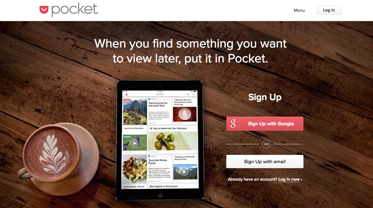
It’s as if you’re sitting down with your tablet and coffee to check out the latest news.
You can also give your readers a look at what they’ll be able to accomplish with your product.
For example, this page from ArtistWorks shows bass guitar instructor Nathan East playing.
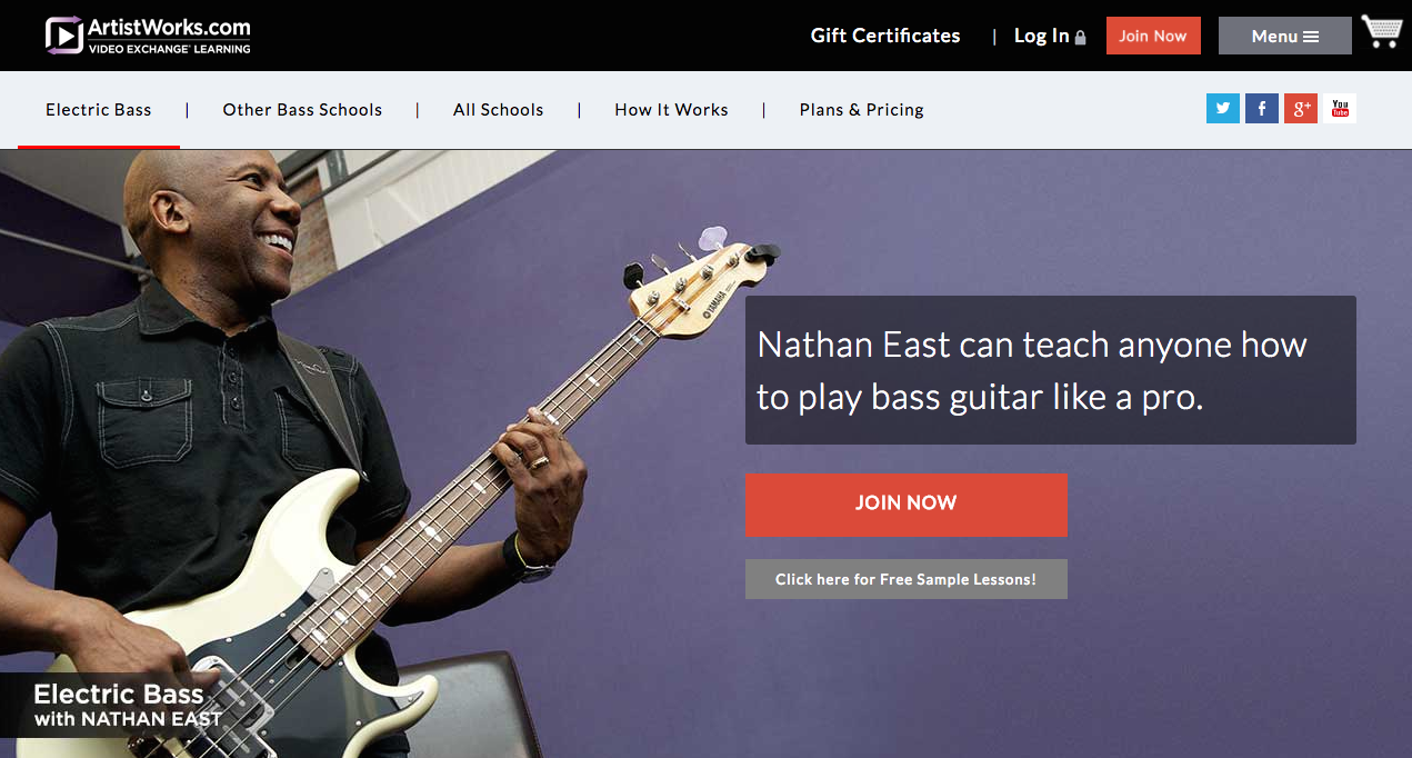
It’s like you’re in the same room with him, about to learn from the best. (Also, notice how he’s looking toward the direction of the text box.)
Whichever approach you take, make sure your image works for your landing page and not against it.
Don’t blindly choose an image just because it’s fancy. It has to have a practical function, like directing attention or showing product usage.
5. Use heatmaps to find out what’s working
Earlier in this article, I mentioned heatmaps.
They’re so useful that I’m going to tell you how you can use them to improve your landing pages.
Heatmaps are simply visualizations that show where your visitors are looking and clicking. In other words, you can see if your visitors are paying attention to what you want them to.
My preferred heatmap service (OK, I’m a little biased) is Crazy Egg.
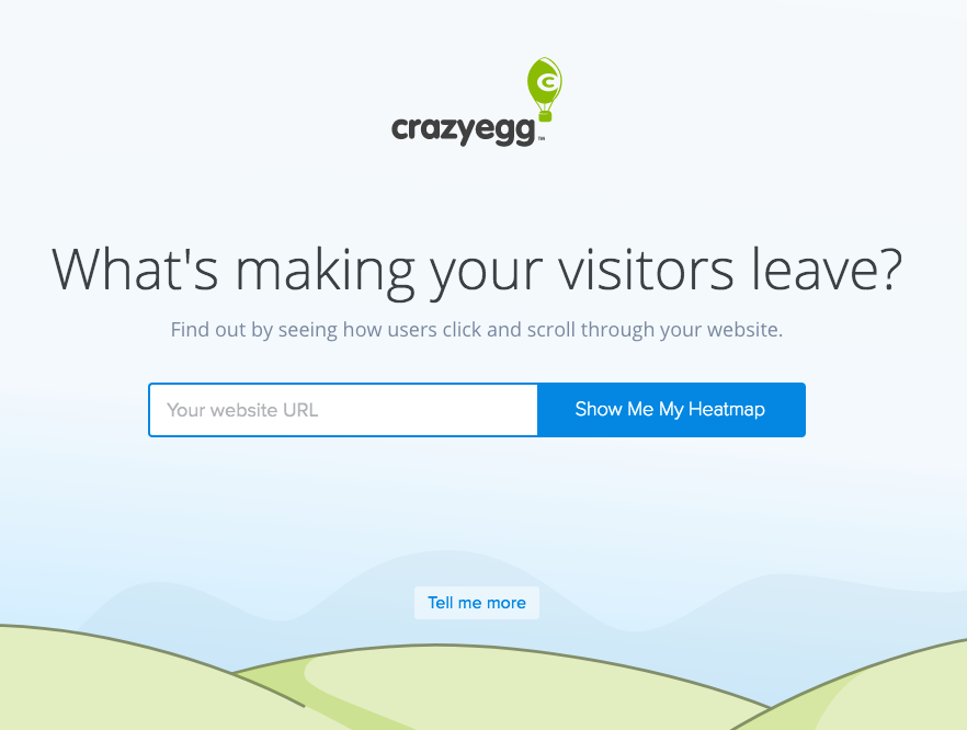
All you have to do is enter your URL, create an account, and view your heatmap.
Here’s an example of a scroll heatmap:
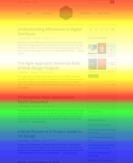
In this example, the navigation menu and the “3 Conversion Rate Optimization Myths Debunked” headline are getting the most attention.
These heatmaps can provide a visual guide to help you evaluate just how effective your landing page is.
If your headlines, content, and CTAs aren’t getting enough attention, a heatmap will tell you. You can easily and quickly see where the problem is and fix it without doing any guesswork.
You can also use heatmaps to see where people are clicking:
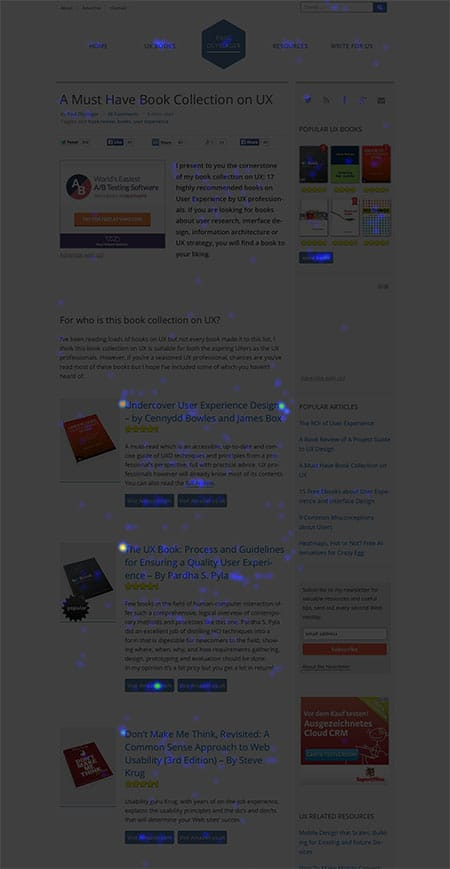
If you’ve ever wanted a behind-the-scenes look at what your visitors are doing (and how they’re interacting with your content), I highly recommend using heatmaps.
Conclusion
Landing pages don’t have to be a pain in the neck. Once you understand that it’s all about making your visitors happy, you can start taking steps to improve your engagement.
I see lots of boring landing pages. About 95 percent of the time, the reason they’re boring is that they fail to connect with their intended audience.
We all crave connection. It’s powerful.
We aim for connections in our relationships, our professional lives, and our hobbies.
Landing pages are no exception. Whether we think about it or not, we want to connect with landing pages.
As a landing page creator, your job is to make that happen for your users.
So try out these five techniques for yourself. You might be surprised at how well they work.
What are your favorite strategies for improving landing-page engagement?
Comments (6)