
Visitors who don’t click don’t convert.
And, without those clicks on your call-to-action buttons, you’re not going to get subscribers, orders or attendees to your live events. Your call to action is the gateway to increasing your conversions on web pages.
Get your buttons clicked and increase your conversion rate by using the right hacks — i.e., tactical steps that will lead to growth.
Crafting the perfect call-to-action is one thing — getting the right people to click it is another.
So, let’s put an end to the excuses. In spite of all the advice out there, a lot of people still struggle to convert visitors into leads. Yet I’ve found that you don’t need magic tricks to get people to click your call-to-action buttons.
All you really need is an understanding of what your target audience really wants, and how badly they want it.
When it comes to improving call-to-action click rates, a little tweak in the copy can go a long way. For example, simply adding the word “like” to your post can get you more likes and comments on Facebook. A text link with an enticing text color is sometimes all you need.
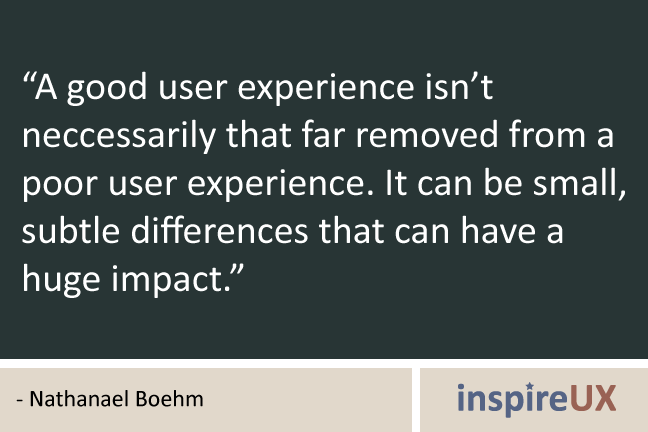
We need to start paying attention to the “small things” in our landing pages, Facebook posts, blog posts, sales pages and everywhere on social media where we use a call-to-action. Those “small things” can make a big difference.
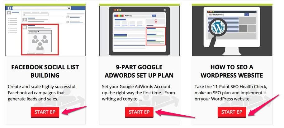
So, without further ado, here are 16 hot-button hacks you can use to get your call-to-action buttons clicked:
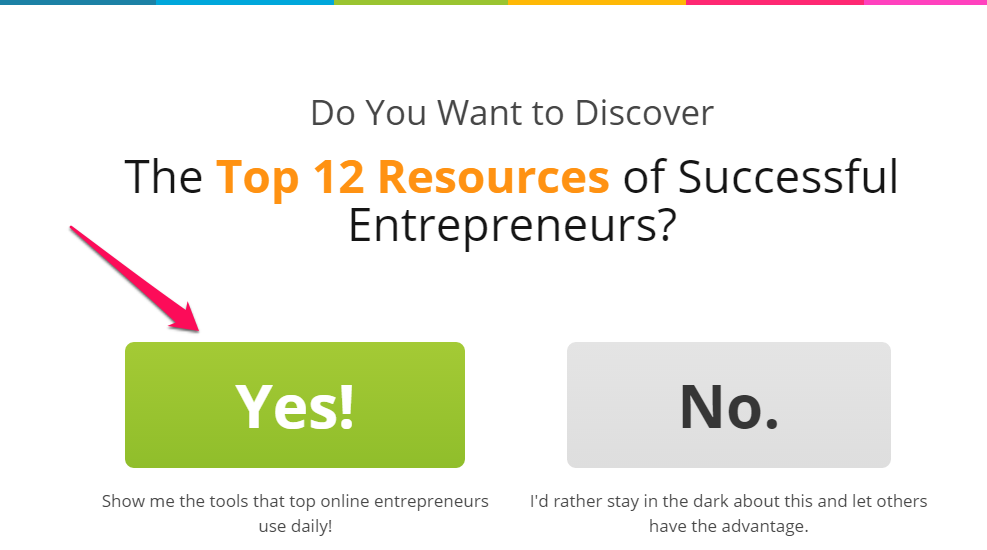
1. Make sure that your CTA buttons look clickable
Little things matter when it comes to creating a great user experience. In the Econsultancy User Experience Survey Report, it was found that “more than [95% of respondents] agreed with the statement that ‘good user experience just makes sense.’”
Every action step that your customers will ever take on your web page is embedded inside the CTA button. That’s why you need to make it look clickable and not be overpowered by other components of your website including the cover photo or too many text links.
A CTA button that looks clickable doesn’t happen by accident. You have to be deliberate about it to develop a sense of urgency.
If you remember what you learned in selling 101, you’ll agree with me that when it comes to selling a product or service, you shouldn’t make the sales pitch obvious. You should pre-sell the product instead – i.e., warm up the prospects.
CTA button is entirely different. Your prospects and customers need to know that it’s clickable.
When you see a button on a web page, what makes you believe it’s clickable? What prompted you to click?
Most of the buttons that I click when I visit landing pages have one or more of these features:
- Clean and contrasting background to text color
- A distinct button text (e.g., “Get free access”)
- Have white space surrounding them
- Rectangular (sometimes rounded) shape
- Complementary border
A typical example of a CTA button with at least four of the features above can be found at Entrepreneuronfire.com.
The fact that people visited your blog and stayed for some period of time is a sign that they’re interested in your offer. So, maybe your content was helpful, your cover photo was captivating or your design as a whole inspired them to stay put.
But, no matter what their reasons might be, you don’t have to lose them at this point. The point of contact between your visitors and your offer is the call-to-action, whether buying, trying or sharing on social media.
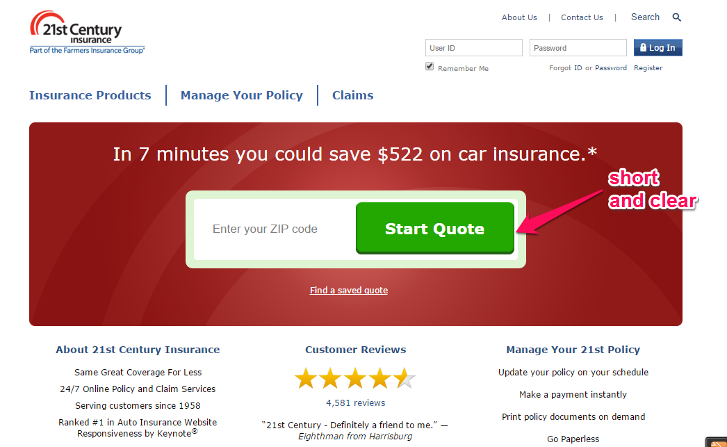
Eliminate every distraction. Have confidence that they’ll click your action button by making your button “look” clickable.
See how clickable the CTA buttons at DigitalMarketer.com look.
Another action button that looks clickable is the one on Jeff Goins’ site. His cover photo is even muted:
2. Positioning matters: Place your buttons where people click
Obviously, where you place your action buttons will determine how many clicks they’ll get from visitors. An eye-tracking study by Nielsen Norman Group found that people follow an F-shaped pattern when reading web pages. Font color is so important to focus their attention on.
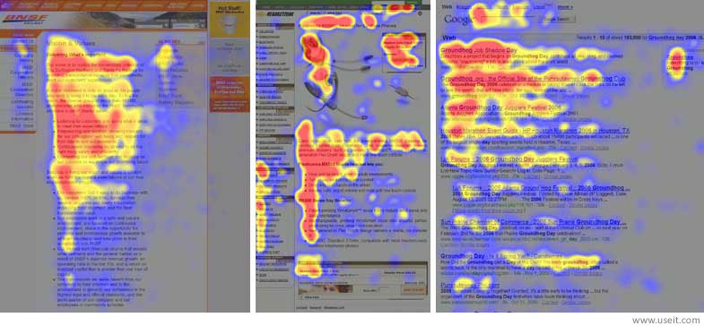
Contrary to what you might have read in school, people’s eyes move at an impressive speed online; especially on a web page when they’re desperately looking for solutions to a problem.
Out of the 232 users who were recorded during the study, Nielsen Jakob observed that user reading behavior was fairly consistent across many different web pages
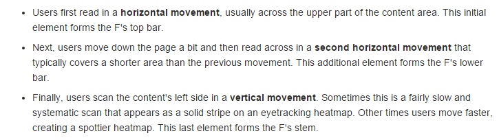
When people visit your site, the first thing they do is to read in a horizontal movement, above the fold. This means that positioning your call-to-action button right there will boost its click rate before you ever worry about the font color or a text link.
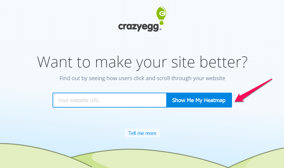
You’ll notice that Crazy Egg’s CTA button is right above the fold. We deliberately placed it there to maximize click rate and it’s working beautifully.
Bear in mind that placing your button above the fold may not always yield the best results. Industries differ, as do landing pages. There’s no right or wrong place to position your button on the web page. While the fold is very good, you may find better results closer to the cover photo. The only viable approach that never fails is to test it.
You could split test between having your button above the fold or below the fold, left or right. The choice is yours. What you learn in the process of split testing CTA button positioning will help you increase conversions in any campaign you decide to launch.
To prove that placing action buttons above the fold isn’t always the best, Content Verve ran a test on a B2C landing page.
For this particular test, one variant was placed below the fold, at the bottom of a very long landing page.
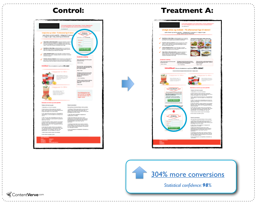
The other variant had the CTA button positioned above the fold. At the end of the test, the variant with the CTA below the fold generated a conversion lift of 304%.
So, how do you determine where to place your CTA button?
Well, as a rule of thumb, the landing page offer will have an impact on this.
On one hand, if your offer is complex and the prospect has to read and digest your information before they can make an informed decision, positioning the call to action below the fold will yield the best result.
For example, when trying to sell new digital cameras, you need to educate the prospect, highlight features, and specify strong benefits that will inspire the prospect to take action. By the time you get them interested, they’ll be ready to place an order.
The CTA placement graphs below show that you should position your CTA button where it’ll influence the decision-making process of your prospects. It should build interest and compliment their decision to take action.
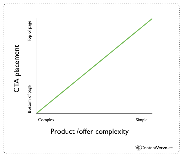
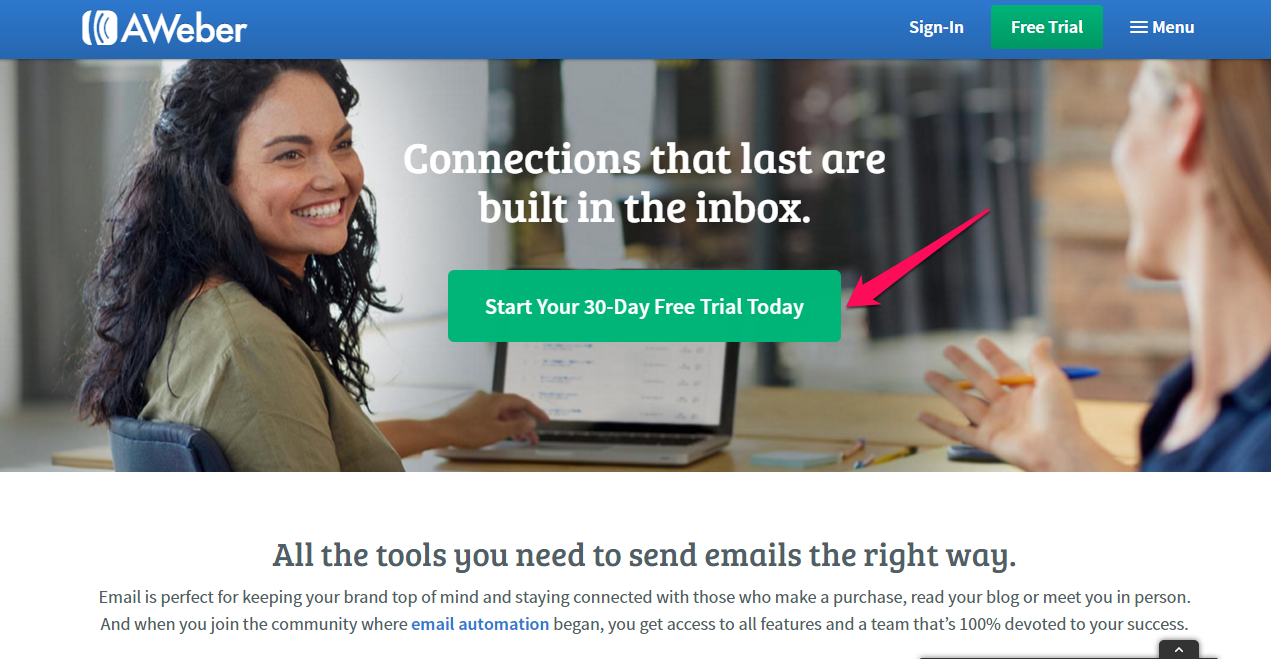
On the other hand, if the offer is very simple and it’s highly likely that your prospect already knows the benefits of it – e.g., an email autoresponder solution – positioning the CTA above the fold will generally yield the best result.
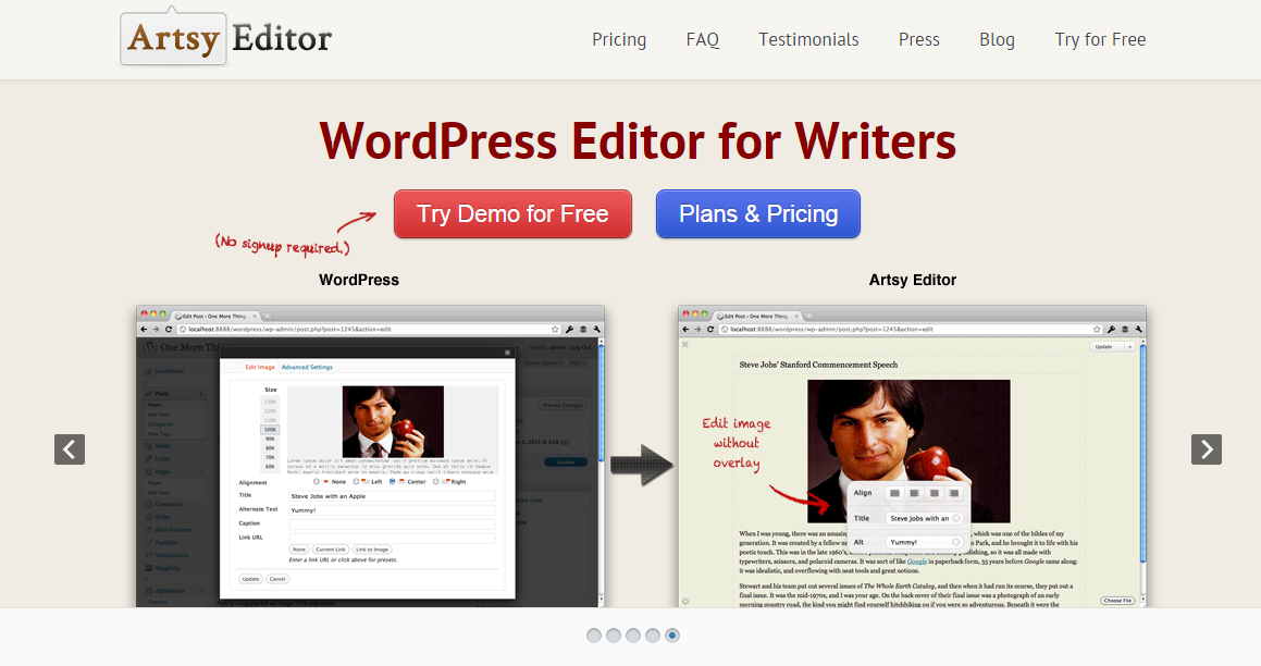
Not too long ago, Artsy Editor, a premium WordPress editor for writers, conducted a study on their landing page.
They updated the landing page a bit (they’re still A/B testing), adjusting the cover photo size and placed the CTA button right below the headline. This generated a 47% increase in click-through rate to their pricing page.
In summary, here are a few steps you can take to ensure that your CTA button yields the best result:
- Understand your audience: When you know what your ideal customers are seeking, especially when they visit your landing page, it’ll give you a roadmap to deliver the right solution by positioning the CTA where they’ll find it easily instilling a sense of urgency with them.
- Be flexible: Have an open mind towards your audience. Be ready to split test, even if your current CTA positioning is yielding a high click rate. There’s always room for improvement and refinement with your web pages.
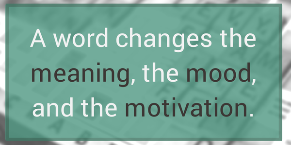
- Set the mood: Words have power. More often than not, if you have the right words (more than a text link) on your button and they stand out from the rest of the elements on your page, you’ll draw people in – because that’s exactly what they want to see.
3. Have a compelling and short button copy
If you want to increase the impact of your button, choose your words and font color carefully. Remember that a call-to-action is the point of decision making, and, as such, your choice of words should compel people to act right now.
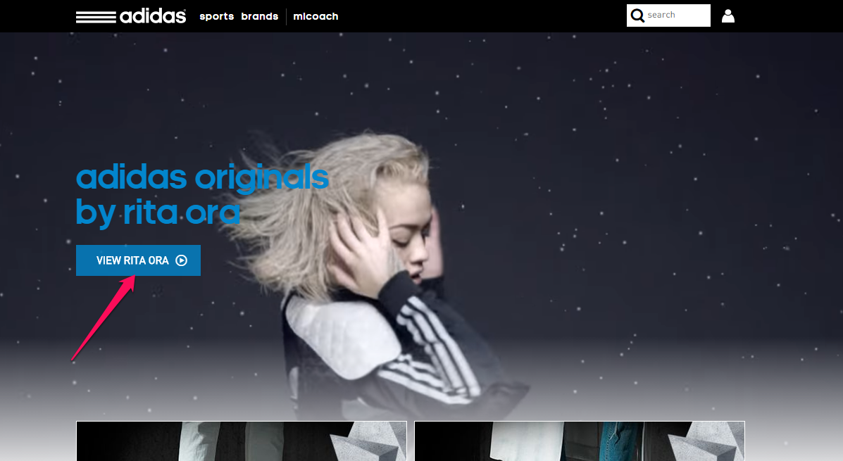
Adidas has the perfect example of a short, compelling CTA button copy.
At a glance, action buttons should be clear, readable and recognizable. Earlier, I told you that making your action button look clickable is a step towards increasing click rate, but the copy should be short as well.
More importantly, when people get to your button, they should have transitioned from a “reading mood” to a “ready to act mood.” It’s time to click – so make it short and succinct to prevent them from going to other web pages
You probably already know that you shouldn’t exceed 60 characters with your blog post titles. If you do, Google will show an ellipsis (…) at the end. That’s no good for SEO or user experience.
In the same vein, I recommend that your CTA copy shouldn’t exceed 60 characters. Otherwise, you lose your chance at a significant conversion on your web pages.
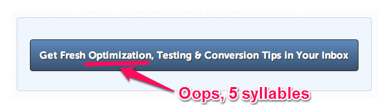
Here’s some CTA copy that contains more than 60 characters. One of the words has more than 5 syllables, which makes it hard to read, let alone click.
Compare the copy above with Chris Ducker’s:
This is short and the words are easy to read. None of the words contain more than 2 syllables.
Remember that even though writing short copy is important, what matters most is that you make it relevant to your audience.
No matter how short and compelling your CTA copy is, if it doesn’t interest the people that you’re targeting, you won’t see good results. Text color should compliment what you already have on your web pages to not overload readers.
To show you how relevant copy generates the best results, Fitness World, a major chain of gyms in Scandinavia, saw a 213.16% increase in conversion by changing the CTA copy from “Get Membership” to “Find Your Gym & Get Membership.”
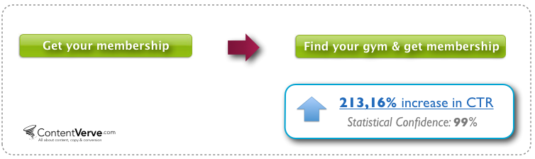
By making the copy more relevant to people who are looking for the right gym, they increased conversions.
4. Use power words in your button copy
Using power words in your CTA copy can help you increase its likelihood of getting clicked. Some of these button text words stir the emotions and influence the user’s decision-making process.
Researchers found that the words you use to describe a car accident (“smashed” vs. “contacted”) give eyewitnesses a feel and view of the event.
In the finance world, a study found that simple stock names that are easier to pronounce lead to quicker gains post-IPO.
According to BufferApp, here’s a list of words that convert.
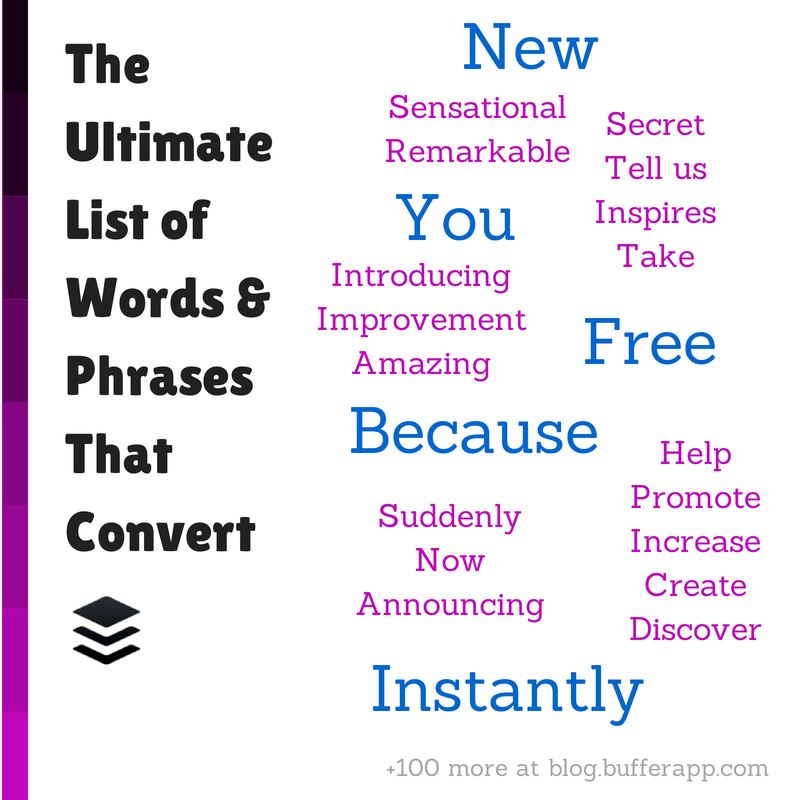
Primarily, button text power words are used to make the audience feel something.
Decades ago, when Britain was fighting for its survival, Winston Churchill had no choice but to inspire his countrymen to valor and greatness.
Of course, he didn’t have social media but he chose power words carefully and used them to deliver an impassioned address. Let’s take a look at one passage, with all the power words underlined:
We have before us an ordeal of the most grievous kind. We have before us many, many long months of struggle and of suffering. You ask, what is our policy? I can say: It is to wage war, by sea, land and air, with all our might and with all the strength that God can give us; to wage war against a monstrous tyranny, never surpassed in the dark, lamentable catalogue of human crime.
Churchill used these power words to inspire greatness and persuade the English people to support the war effort. But, you can use them to craft your call-to-action buttons.
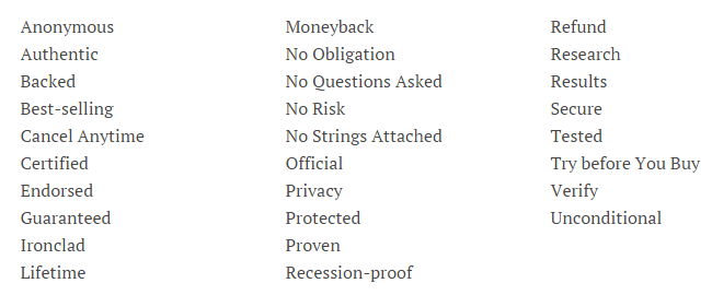
When using power words on web pages to persuade people to click your button, ensure that they’re safe and clear. According to Jon Morrow, here are some of the power words that will make them feel safe when they’re going through your landing page.
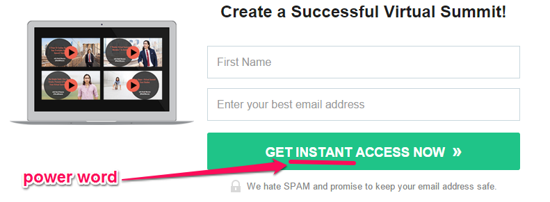
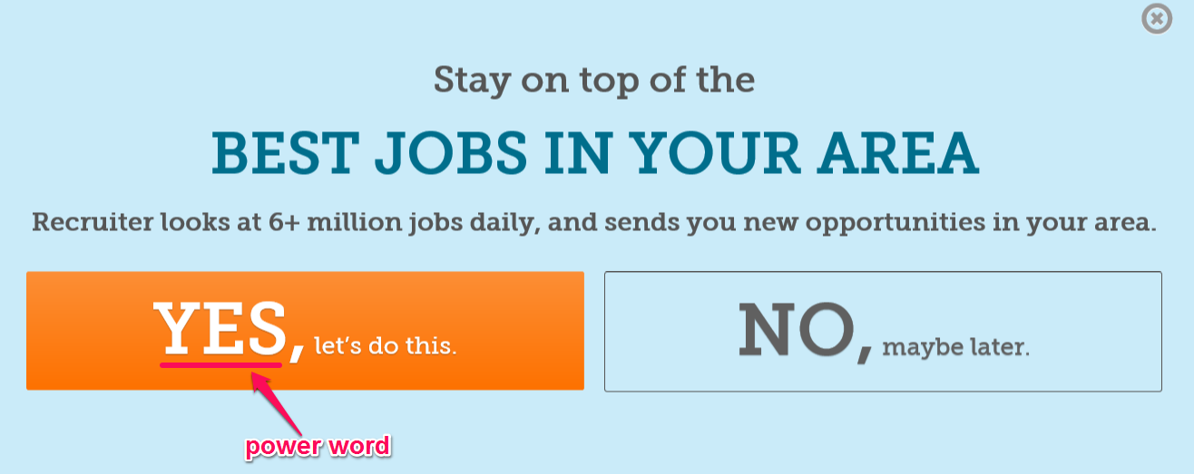
When used the right way, words like instant, yes, access, get, increase, dominate, etc., will spur your prospects into action. They’ll click your CTA button and do what you expect of them.
Navid Moazzez uses power words to get email subscribers. Take a look:
The Recruiter.com site uses power words in their exit popup. In fact, the company made sure that the power words stood out from every other word in the popup box. These is a simple text link within the button.
Is there a rule for using power words?
I don’t think so. Just make sure that you don’t overdo it. The copy must be relevant to the offer. If you’re certain that your target audience desperately needs what you’re offering, you can use power words to draw them in, convert and ideally share on social media.
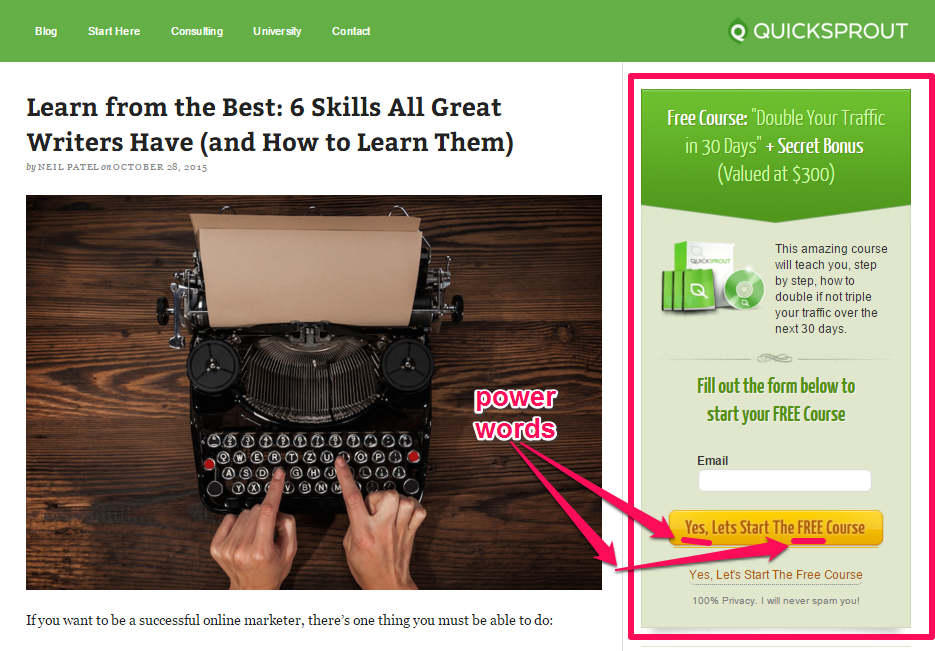
For example, I’m giving away a free course that shows my audience how to “Double Traffic in 30 Days.”
I strongly believe in the value (worth $300) and hope my readers take advantage of it. And, I know they will because over the years, that opt-in box has helped me build my list to tens of thousands of people.
The power words I used are “Yes” and “Free.”
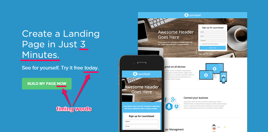
5. Use timing words to create urgency
Time is money. If you can save your ideal customer’s time, they’ll appreciate it. Beyond writing an article that gives an immediate answer to a pressing problem, you should also craft your CTA copy using timing words to create urgency.
Peep Laja increased conversions by 332% using scarcity and urgency.
Urgency is a strong catalyst. Peep Laja recently tested two variations of pricing text on a landing page. The only difference is that one communicates urgency and the number of items purchased, while the other does not. Here’s the original “no urgency” variation:
Here’s the second variation that contains urgency:
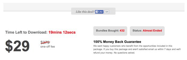
As you may have expected, the second variation which shows timing and “Bundles Bought” outperformed the first by 3x.
When it comes to your call-to-actions, words such as today, now, get started, etc., will help you get more clicks. It rushes people into action, which is exactly what you need on your landing and all web pages leading to the sale.
As long as people feel a little urgency concerning your offer, your goal has been accomplished.
Instapage uses a timing word – “now” – in its button. Interestingly, the landing page copy itself communicated urgency as well. So the word “now” will definitely yield the best result.
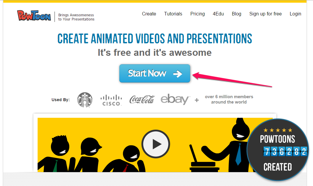
Powtoon creates urgency by using a timing word “now” on its call to action button:
6. Invoke positive emotions around your button
Have you noticed that some marketers ask people not to click their CTA button? That’s a negative emotion. I advise you to use a text link like this carefully, if ever.
Generally, you want to invoke positive emotions that make people eager to click that button and say “yes” to your offer.
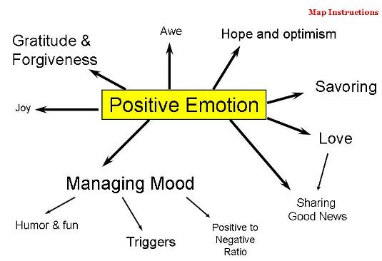
Sure, people may remember negative emotions more than positive ones, but rest assured that positive emotions will connect, increase trust, and get more sales.
Positive emotions (e.g. laughter, humor, awe) will increase the possibility of your content going viral on social media.
CTA copy that contains “get started” will make people feel optimistic and ready for action. The phrase eliminates objections.
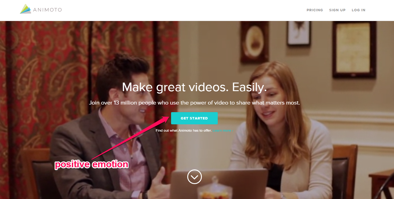
Animoto uses “get started” on its button copy to send a positive emotion to the user – i.e., that an animated presentation or video is easy to create.
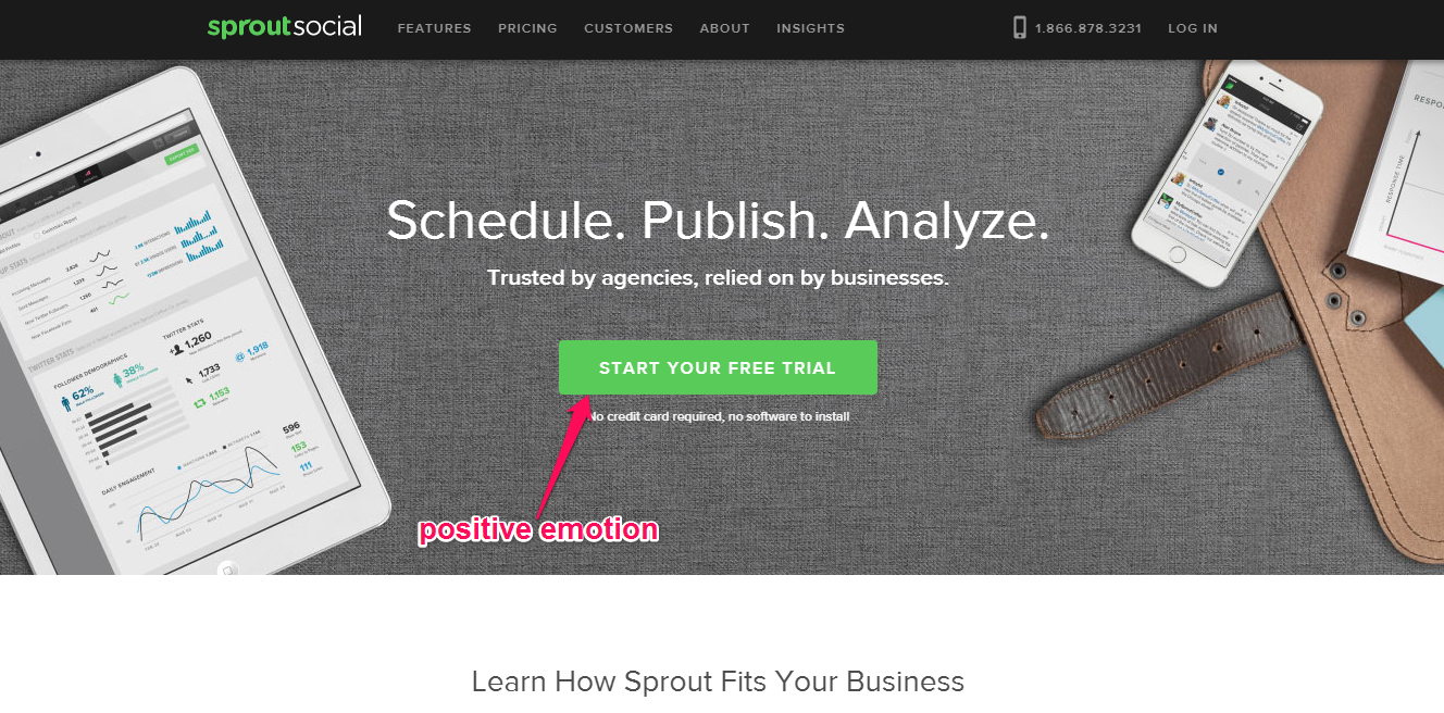
Sprout Social also evokes a positive emotion in its call to action copy, which combines positivity with one of the strongest power words, “free.”
7. Place your CTA button in the strongest position with visitor recording
If your site isn’t optimized, users will leave. When optimizing your site, you want to consider both mobile and PC devices, because your ideal customers actively use both.
A responsive, or mobile-friendly, web page is easy to navigate with easy to read text color. And, of course, you’ll engage users with your content and lead them into your sales funnel.
But you need visitor recording to be able to identify the user’s navigational paths on your site.
Visitor recording shows you how people navigate your site. It also tells you whether or not they clicked a link. You can identify opportunities to improve conversions, such as click rate, engagement, and email sign-ups.
Generally, if you place your CTA button where visitors either start navigating your site or where they stop, you’ll increase your click rate. For even better results, find out which activities engaged them the most and place your action button in that zone.
For example, in the web page below, you’ll notice that the visitor ended their search or navigation below “Available Positions.” This is where the visitor “rests,” and that means they’ll be more willing to click an action button there based on what the specific choice of word on this text link.
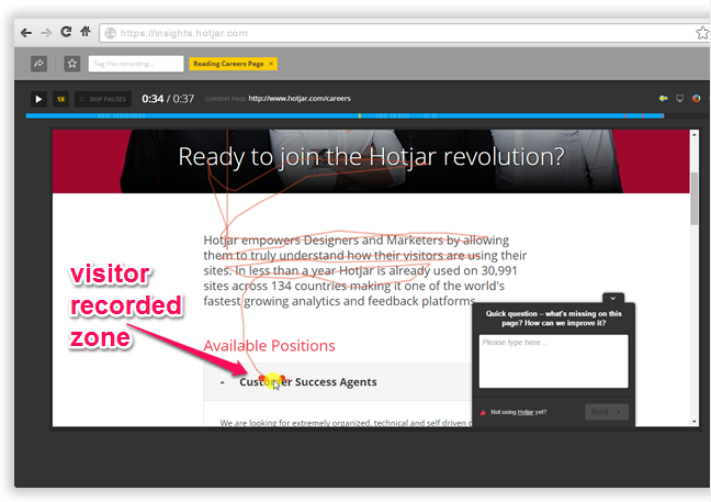
By positioning your button right there with compelling copy and enticing font color, you’ll get these users to click and take action.
8. Use the “Try It Free for [TIME]” formula
The word “try” or “trial” implies little or no risk. Whenever possible, use it in your CTA copy, because it’ll inspire more people to download your software, ebook, or app achieving the goal of your web pages.
Here’s an example from Freshbooks:
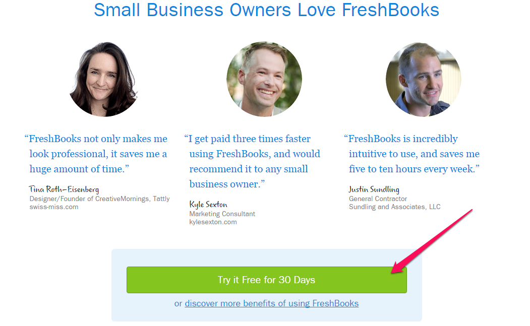
This formula works better for a downloadable product or SaaS since you’re giving people the opportunity to get a first-hand look behind the scenes, to find out how the product works and to use it without paying a dime.
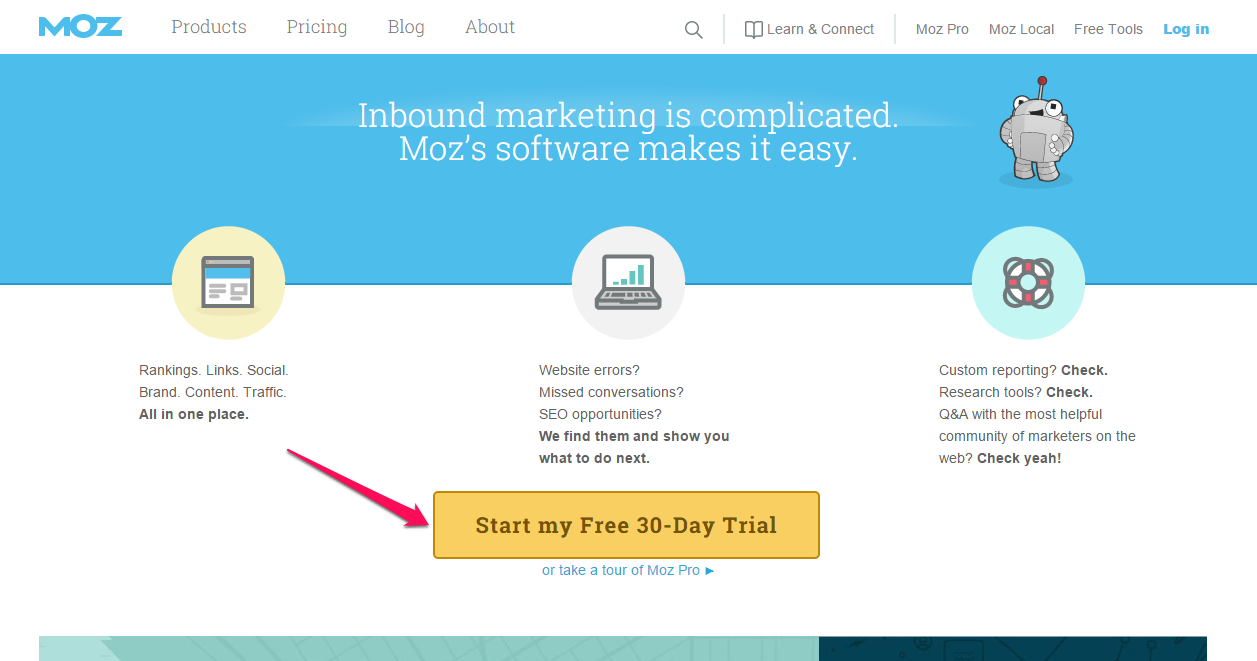
Having co-founded 5 successful software companies, I’ve found that many SaaS products use the word “try” in crafting their button copy. Moz uses a similar CTA button.
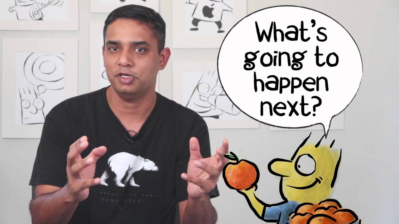
9. Create anticipation in your copy
Using a formula saves you time, but don’t stop there. You should also create anticipation in order to make a clickable button. You want your reader to wonder “What’s going to happen next?”
It’s time to gather stories and memories and to live in anticipation.
It seems that the key to getting people to do what you want – e.g., click a button – is to promise a better experience.
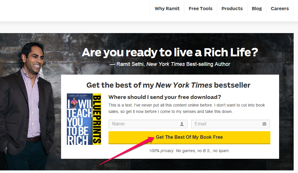
Ramit Sethi makes you anticipate the best from his bestselling book. Ideal customers just can’t wait to opt-in to get what’s on the other end – that’s anticipation. Additionally, it becomes a social media experience.
Anticipation is the act of “looking forward to.” When you write button copy that creates expectation in people’s minds, you can more easily get them to take a specific action.
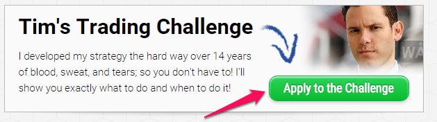
Timothy Sykes promises to show people how to turn $12,415 into $4,333,000 trading penny stocks. And, to participate, you have to “Apply to the challenge,” in anticipation of what’s next.
10. Test and use the right font color
Color matters. In fact, when you understand the psychology of colors, you’ll be miles ahead of your competitors and can adjust your background and text colors to entice more conversions.
Understanding color psychology actually prepares you to launch campaigns, be it on Facebook ads, Google Ads or native advertising and this will show in an increase in conversions.
You need a font color that stands out. Preferably, your background should be white – and your button shouldn’t be gray, but rather a solid color with a gradient.
Your choice of CTA colors must not overlap or clash with the background. Neither the background nor font color must not hurt the eyes. After all, you want people to click it.
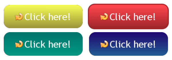
Which of these CTA colors on a landing page would catch your attention and cause you to click? Notice the text color is the same for all.
Colors appeal to human emotions. People can and do make decisions based solely on the color scheme used. You can use buttonoptimizer.com to create buttons and choose the best button color that will suit the overall design of your page. Often, text color is neutral.
Generally, red means danger. But, researchers also found that red symbolizes dominance. So, think carefully before you decide to use it.
The question that a lot of people have been asking is “what color converts better?” Unbounce declared a while ago that the future of the call-to-action is BOB – the Big Orange Button. That’s why you see a lot of landing pages adopting that orange background with the white text color.
A Small Orange, a domain and web hosting service provider, uses orange throughout their landing page. More importantly, the button color is orange.
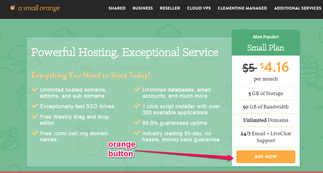
Does it mean that orange is the best color when it comes to call to action buttons? Not necessarily. I recommend that you test it out to be sure.
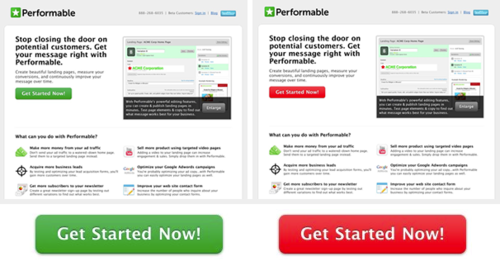
For example, HubSpot ran a test with green and red buttons to determine which color converts better on their client’s web page. They maintained the same text color in the testing to accurately determine which button color worked best.
After a few days of traffic, they got 2000 visits – and the red button performed better than the green one by 21%. The key point is that HubSpot didn’t assume, but rather tested both to be sure.
11. Add the product image above your button
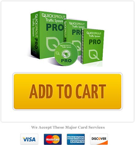
Design plays a key role when it comes to getting your call-to-action button clicked. There was a time when I ran an A/B test on the Quick Sprout Traffic System to see how I could improve the results we were getting.
Initially, the button copy was just “add to cart.”
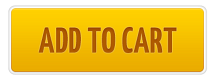
The conversions I was getting weren’t encouraging.
Truth be told, people were confused. They didn’t know what they were adding to the cart.
I quickly tweaked the CTA by adding an image of the product above the button. The new button resulted in a 28% increase in conversion rate.
I learned that if you’re selling a product (e.g., a book), positioning the product image right above the button will likely increase click rate because people can then see a representation of what they’ll get.
12. Delay your CTA from appearing when using videos
Recently, I visited a video sales letter and, oddly enough, there was no call to action throughout the introduction.
Trust me, that product creator was smart. The introductory video was rich and taught me a lot of new things about content marketing.
At the end of the video, the call-to-action button appeared below the video. I quickly clicked and was redirected to the checkout page.
I kept asking myself why I didn’t hesitate to click the “Add To Cart” button the moment I saw it.
The answer is delayed gratification. Here’s how The Study.com defines it:
Delayed gratification refers to the ability to put off something mildly fun or pleasurable now in order to wait for something that is greatly fun, pleasurable, or rewarding later. For example, you could watch TV the night before an exam, or you could exhibit delayed gratification and study for the exam. The latter would increase your chances of getting an A in the course at the end of a semester, which is much more satisfying long-term than a night of watching TV.
Researchers found that when you put off immediate reward for what lies ahead (usually a bigger picture or reward), you activate dopamine, the neurochemical that makes rewards pleasurable.
When you’re expecting something bigger and you’re willing to forego the immediate reward, you’ll literally jump when that reward appears.
The study also found that you become what you think. For example, if you’re an actor who wants to make a performance believable, you can’t simply pretend to be that character – you have to adopt the mindset and disposition of the character.
You don’t become what you think tomorrow, next week or next year – you become what you’re consistently expecting now. It’s only a matter of time before it begins to manifest.
In the same vein, when you delay your CTA button from appearing and just focus on delivering huge value, people will jump on your offer when you ask them to.
Like every new concept, use this with care. Otherwise, you stand the chance of losing your prospects.
13. Tell people not to click
“Don’t click here.”
“Don’t click this button.”
How would you feel if you saw that wording on a button? You might decide to click, just to see what happens.
Without a doubt, negative emotions are stronger than positive ones. Naturally, people will dare to do what you don’t want them to do.
Obviously, you can tell people to click and increase conversions.
If you don’t understand the psychology behind the CTA copy “don’t click this link,” I advise you to ignore it and rely on the opposite tactic – ask people to click.
14. Add special effects to your CTA to draw attention to it
Buttons are one part of the larger conversion funnel flow.
If you get it right, you may as well go to bed and not worry about click-through rate, engagement, and sales, because all of that will just fall into place.
One of the things that you can do to your CTA button is to add special effects. Don’t overdo this, but if you animate the button when users hover over it, that would likely get a higher click rate.
For example, Joanna Wiebe adds a special effect to her call to action. She uses a cartoon-like object that points at the opt-in button. Take a look:
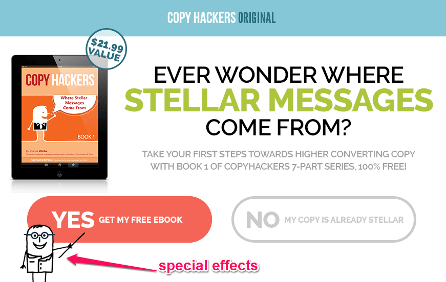
Using emoticons, animated gifs, and gradients give you an advantage over static buttons.
15. Place exit calls-to-action strategically
Exit-intent technology allows you to convert abandoning visitors.
This is critical because a huge percentage of people who visit your landing page will likely not convert on their first visit.
According to statistics, 70 – 90% of visitors will leave your website without ever returning. Baymard Institute reported that 67.89% of all shopping carts are abandoned.
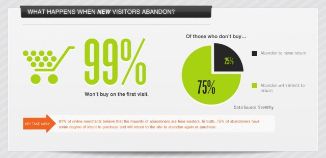
The moment a visitor is about to hit the back button or [x] button, the exit pop-up appears. If you’ve delivered great value to them, they’ll be much more likely to opt-in to your email list.
16. Leave plenty of whitespace around your CTAs
Whitespace is an essential element in web design. Some people may consider it a waste of valuable screen real estate, but don’t believe that myth. I use plenty of whitespace around my buttons.
A UX study (Lin, 2004) found that good use of whitespace between paragraphs, and in the left and right margins, increases comprehension by almost 20%.
You definitely want to use whitespace in your landing page, because of its impact on user experience. Font color, cover photo, and all components stand out better surrounded by whitespace.
In web design terms, whitespace is the space between columns, graphics, images, text, margins and other elements. It’s sometimes referred to as “negative space.”
The reality is that whitespace doesn’t appear by accident. It takes a professional web designer who understands user experience to leave some blank spaces, in order to balance landing page elements and achieve an elegant design.
When it comes to increasing your button click rate, allowing whitespace around the button will help it stand out, directing attention towards that one goal – the click.
People love the site, because of its simplicity. Its primary focus is the content. Copyblogger actually uses a lot of calls-to-action on its homepage, but each of them live within whitespace. This creates clarity of purpose and gets people to click.
Conclusion
Don’t take the power of a call-to-action button for granted. It’s actually the gateway to your sales funnel.
Whether you’re building an email list, developing a social media campaign, offering a discount on your product, announcing an upcoming event, or selling a coaching program, you can use effective calls-to-action to get the job done.
Aside from the hacks above, remember that you can also write button copy in the first person. You’ll likely find the terms “I want to…,” “Give me…” and so forth in examples. You can see how I use it on QuickSprout to personalize the user experience.
When you use a first-person pronoun such as “I” in your button copy, you’re giving control to the user. That’s exactly what people want: to be in charge and choose what they want – whether to click or not.
That said, there’s no one “right or wrong” background or text color, shape or position for your call-to-action button. You just have to find out what works by split testing. Like I often say, “test everything.”
What other tactics do you use to create your call-to-action buttons that have led to a higher click rate and more engagement?
Comments (62)