When it comes to persuasion, emotion is the primary target. And nothing – not even words or images – appeals more to people’s emotions than color to create a positive or negative user experience.
However, the psychology of color is often a subject of disagreement in marketing and website design, because color preference varies widely between individuals. For example, many people prefer red to blue, while even conjoined twins might prefer different t-shirt colors.
Colors impact everyone. It doesn’t matter whether you’re developing software, designing a book, developing web design cover or simply branding your business: colors define mood and influence responses. And the color theory is a very complex subject.
According to NeuroMarketing, “if a good color sells, the right color sells better.” Businesses, top brands, and entrepreneurs are constantly improving their knowledge about the color wheel and how they can lead to increased lead generation and sales. The color may be pertinent to a button, the text or even the background color.
Since so many people use overt and accent color in their online marketing and website design without fully understanding its impact and how it can grow their business, I thought it was time to write this in-depth article.
Remember that understanding color psychology doesn’t mean that you should manipulate or deceive customers into buying what they don’t want or need.
Instead, the color theory suggests you can develop an edge over your competition, letting you convey your message effectively, meet the needs of your target audience and build your brand.
1. Psychology of Color
When you understand color psychology, you can use that knowledge to boost your conversion rate. Psychology of color scheme allows you to predict how your customers respond to your marketing messages, based on the color of your copy, call-to-action buttons and links. It’s all part of understanding customer psychology.
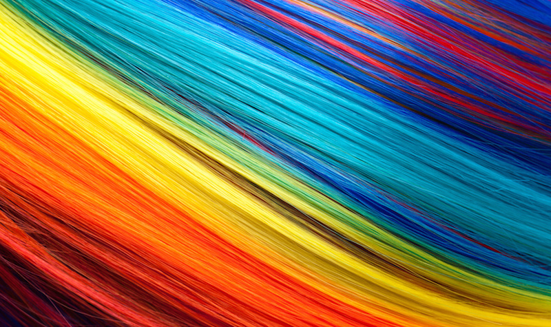
Colors have always made up a huge part of our existence and our history. Even color blindness isn’t without emotional connection to color vibration. All aspects of the color wheel are crucial part of the stories we tell, the art we create and the symbols we imbue with meaning. Think of the story of Noah and the rainbow – caused by reflection, refraction, and dispersion of light in water droplets, resulting in a spectrum of light appearing in the sky.
Psychology, of course, is the study of the human mind. In internet marketing, psychology helps you to predict how the people in your target audience respond to different marketing messages before they purchase a given product. Color theory helps.
Whether you’re selling clothing, digital cameras or your services, it’s important to make sure that your colors work perfectly with every element in your marketing plan.
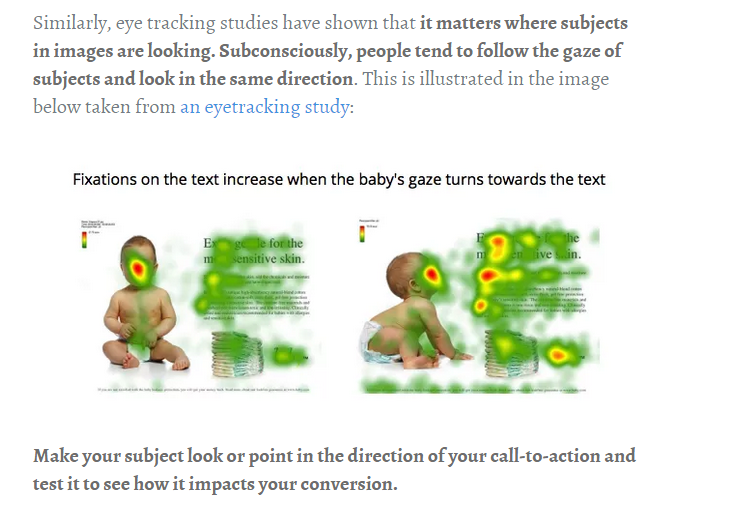
For example, psychology tells us that photos of people can be more effective when we make sure the subject’s mood matches the marketing message. Here’s an example from RainBowShops.com:
Both pure and accent colors can enhance the value of a site and the product that it offers. If the right colors are used and the right customers receive the right message, you’ll get fewer objections to the purchase, regardless of price.
An example is Richdad.com, which offers financial education products. The site is professionally designed, with the perfect colors blending into the product and into key sections, such as the free game box:

If your site caters to women who want to improve their makeup, the image on your landing page should tell the user that you have their solution. Your customers don’t want to see someone looking shabby and unkempt. They want to relate to a vibrant, happy and healthy woman who conveys the impression that she loves your product. Accent colors may work well here.
For example, on the Milanicosmetics.com homepage, that kind of image is coupled with a variety of vibrant colors.

Misconceptions about the color theory
The impact of colors on branding and marketing have unfortunately resulted in several prevalent myths.
If you come across an article that asserts a particular color is “best,” keep in mind that no particular color works best for every campaign. You have to test various color options for yourself. Experiment with pure color, an accent color, or various background colors and combinations until you find one to make you feel good.
Keep in mind, the reason why you’re learning color psychology and how it can improve user experience and thus boost your conversion rate is to understand how color impacts your customer’s response. Whether your customers are aware of it or not, colors affect their decision-making processes.
Printwand conducted a research study and found that using colors and graphics can make a tremendous amount of difference. They advised using a call-to-action that stands out from the rest of the design, by way of a contrasting font, some in pure color and some in an accent color. Remember that color theory is both art and science.
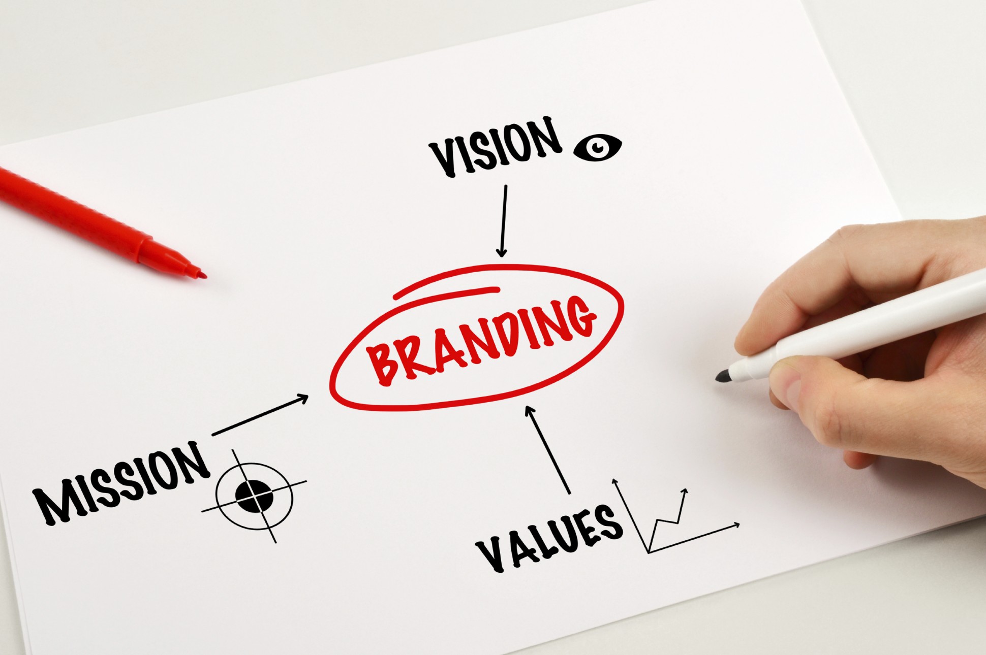
What is branding?
Branding is simply the marketing practice of creating a unique name, identity, and image for a business- one that a customer cognitively equates with the business itself.
Persuading a customer to take any specific action depends on several elements, of course, but color is one of the primary components of your personal brand.
Your personal brand is far more than just your color scheme and logo – it represents your core values, vision and mission.
But, it is absolutely true that colors are powerful brand builders. This is why it’s easy to identify top brands from their logos – not necessarily because of the text or design elements, but because of distinctive colors and color combinations. After all, the brain processes visual information 60,000x faster than plain text.
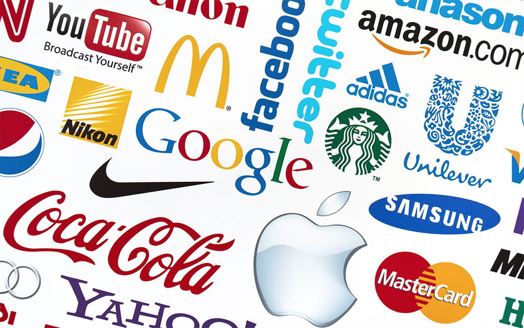
2. The Importance of Colors in Branding
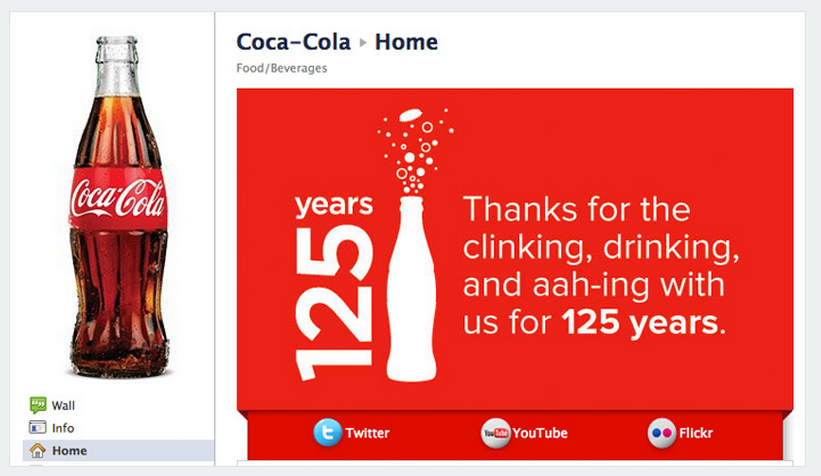
Color theory can be used to communicate value, as well as to sell a product. When the Coca-Cola Company marked 125 years of offering great service, they used their classic, bold red to brand the campaign.
In this section, we’ll explore some of the benefits of using colors in branding. You know that branding represents identity and values, so the next step is examining the effects of choosing the right colors for your business branding.
Your brand personality is of utmost importance. Keeping your color scheme consistent with that personality is possible when you fully understand how colors both reflect and influence emotional states.
The core benefits of careful color selection in branding include:
Clarity of purpose: Your web design or brand voice will be made stronger through the right color scheme.
Until you know and speak the language that your prospects speak, your product may get lost in a sea of competition, no matter how valuable or effective it may be.
McDonald’s is known for its prominent golden arches and red background color. In this image, the primary color is gold, to match the arches, with red used as an accent.

First impressions: You make only one first impression. But, the careful use of colors to create that first impression can captivate first-time visitors to your site, while simultaneously nurturing your loyal customers. And, first impressions count for a lot – they’re rarely forgotten.

When you take advantage of the first opportunity, with the smart use of color, you can boost email sign-up rates, inspire repeat customers and give people a reason to tell others – no matter what your niche or industry is.
3. Using Color Psychology to Persuade
In his classic book, Color Persuasion: The Science of Using Colors to Persuade and Influence Purchasing Decisions, Michael Campbell stated that a colored background can stir the emotions deeply, much like an intense personal encounter.

He also said that most people assume that a white background is always best, but that assumption isn’t true. Even a subtle accent color can provide huge rewards when improving the user experience.
In fact, if you say that about any color, you’re only guessing. You have to test your assumption if you want to be sure. Fortunately, several research studies have been conducted on the effect of color on conversion rate and sales.
Colors can cause people to respond in a certain way to your offers – or ignore them outright. Color can also affect the way you conduct your daily work activity.
Color can even impact your energy level, for better or worse. And, with increased energy levels, you improve the user experience, thus achieving even better results for your business.
When it comes to your business website, your customers may not even register how specific colors of your product package, website design elements or overall site design are influencing them. That’s why it can be difficult to get accurate customer feedback on your color scheme.
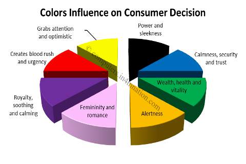
But, we can draw some general conclusions about colors and their psychological effects. For example, green suggests wealth, while blue builds trust, which is one of the reasons why you’ll see a lot of blue-based headers on professional services websites (law firm, etc.).
Persuasion is the art of changing people’s attitudes, in order to get them to take a specific action, by convincing them to find value in your product or service.
Persuasion is not the same thing as pushy or deceptive manipulation, nor is it a light “nudge.” You have to balance your approach, by first giving value and then encouraging your targeted audience to take advantage of that value. That’s the great thing about color theory; you can make it very subtle with accent color or bold with pure color designs.

So, if you want to increase your conversion rate, every element (color, copy, design, speed, call-to-action, offer, etc.) of a landing page must work together. This is important, because color theory isn’t the only thing to focus on here.
Generally speaking, a person will be able to recall the YP.com landing page more so than Wikipedia, for example, because the former is colorful and attractive, while the latter is primarily straightforward text without even so much as an accent color.

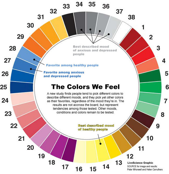
Robert Plutchik’s famous “wheel of emotions” illustrates how variant shades of some colors correspond to variant emotional states. This illustration and the theory that it depicts were aimed at exploring the impact of colors on everyday communications and user experience.
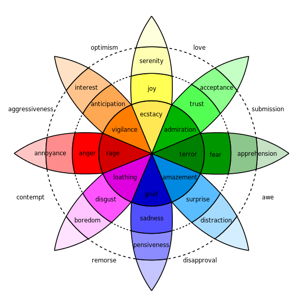
Colors that are associated with happiness, such as yellow, can increase a person’s willingness to share the accompanying content.
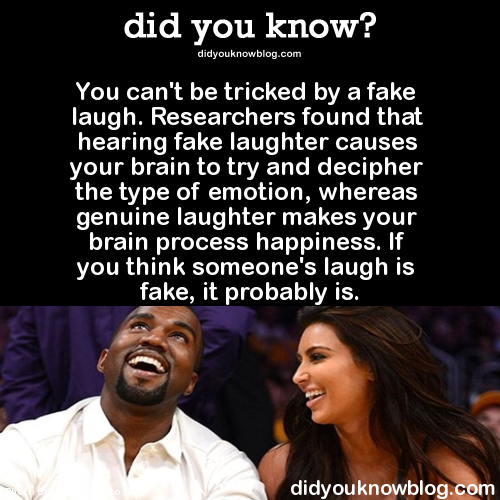
In his research study, Donald Winnicott found that the first stage in an infant’s emotional development is to respond to a mother’s smile. Since laughter and joy are contagious, we often connect to another person’s expressed emotional state. It becomes part of our user experience.
But, fake emotions are a different story altogether. Specific areas of the brain are activated, when consumers are exposed to deceptive advertisements.
Roger Sperry conducted research to examine how the human brain’s hemispheres operate. He found that the right and left hemisphere functions both independently and in conjunction with each other. Here are both brain hemispheres from above:
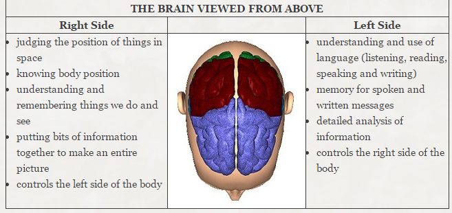
It’s a myth – albeit a commonly-held one – that the different sides of our brains control logic versus emotion. But, Sperry’s research does show how both hemispheres share information with each other to enable the brain’s cohesive functionality. This is how information (sounds, words, colors) is shared and then leads to a decision.
In this way, colors affect purchase decisions. That’s why product packaging affects buying decisions for many household brands.
Individual consumers have different color preferences that will affect their user experience. But, scientists have found that some colors seem to have widespread effects on us. For example, if you’re the type who gets distracted easily while engaged in a task, stimulating colors such as yellow, orange and red can refocus you on the job at hand.
Color preference by gender: A survey conducted by Philip Cohen, a sociologist from the University of Maryland, asked 2,000 men and women the simple question: “What is your favorite color?” The pure color most often given in response was “blue,” for both genders.
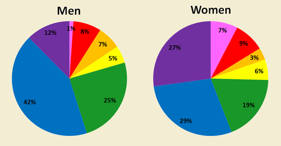
Although the psychology of color affects both male and female consumers, their specific responses can differ – sometimes for a wildly different user experience. For example, red creates urgency and increases heart rate. It’s also suggestive of aggression.
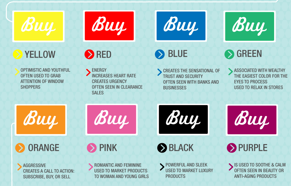
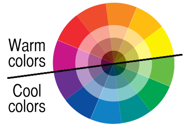
Examples of color psychology in persuasion: Both warm and cool colors can be used to persuade readers and customers. However, you can find great examples from popular brands who have mastered the art of persuasion using colors all across the color wheel.
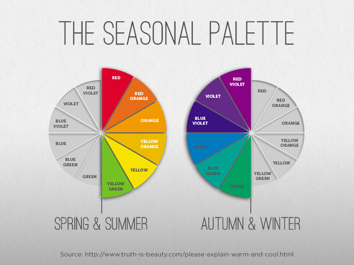
You should also think about seasonal color palettes for specific holidays. You don’t have to choose red and green for Christmas, for example, but doing so takes advantage of affordability clues that are ingrained in most people and they’ll immediately associate your product with the holiday, simplifying the user experience.
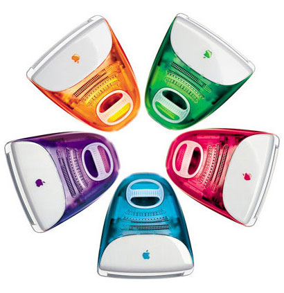
Apple brought color into the marketplace in a vivid way that hadn’t been tried before with computers. The original 1998 iMac was colorful and the first of its kind to combine vibrant pure color, innovation, convenience, and prestige. Apple’s fans and consumers quickly fell in love with the colorful iMacs.
Another product that enjoyed phenomenal success (at least initially) thanks to color psychology is Heinz EZ Squirt Blastin’ Green Ketchup. Over 10 million bottles were sold within seven months. Their factories had to work 24 hours, seven days a week to keep up with consumer demand, which generated $23 million in total sales.
However, sales ultimately softened and the company eventually pulled the line altogether. This only proves the overall point: color is important, but it’s not the sole factor in a product’s success.
4. Conversion Rate Optimization
CRO is an integral part of building a successful website. The goal is to get the best ROI possible and to thrive, no matter how strong your competition might be. Since less than 5% of the population suffers from color blindness, color theory should be explored.
According to Bryan Eisenberg, businesses can spend $92 to increase their site traffic, but only $1 to convert those visitors to customers. “I know that half of my ad dollars are wasted, I just don’t know which half,” says John Wanamaker.
If you’re not testing, you’re probably leaving money on the table. When customers visit your store, site or landing page, what else happened? You’ve set a goal, but if that goal isn’t met, how will you know what to change?
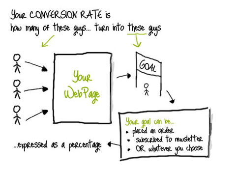
Here’s an example: If 10,000 people visited your site and 100 subscribed to your list or placed an order, your conversion rate is 1%. Optimization simply means improving every element to get better results.
800-847-
In this section, you’ll learn the role that color plays in conversion rate optimization. Everything still boils down to testing, if you want to determine the best colors for your website, product packaging or landing page.
A/B split testing can give you direct answers quickly. One recent study by Marketing Sherpa found that 75% of internet businesses find it a challenge to get the right expertise in landing page optimization projects.
When you become comfortable with A/B testing you’ll soon learn that even a tiny adjustment can make a whole lot of difference.
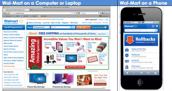
Here’s proof that CRO works. Walmart.ca upgraded to a responsive site and improved their conversion rate by 20%.
There are lots of things that you can split-test on your site, but let’s focus on a few that are likely to have a significant impact.

Right colors for blog homepage elements: Over the years, experts have disagreed about the homepage’s relative importance.
Many marketers believe that the homepage is not as vital as other pages, but I think they’re missing out on something. As Jim Thomas said, your homepage is a peek inside your website and it has to be appealing.
In the blog homepage below, notice how Chris Ducker used matching colors for his logo and Youpreneur tab. With a dark background, he makes sure that his headline is brighter (white) and that the CTA is a bright lime color.

It’s important to align all of the elements of your blog homepage, such as headlines, call-to-action-buttons, value proposition, and positioning, with your marketing goal.
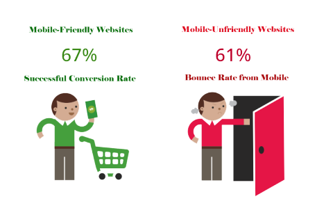
If your site homepage is mobile-friendly, it can exponentially increase your conversion rate. And, Google loves responsive design, too.
Call-to-action colors: Many B2B sites don’t have clear calls-to-action. Having a clear CTA button with an appealing color can make a lot of difference in your conversion rate.
Search Engine Journal found that the color red has the ability to evoke strong emotions and trigger a sense of expectation in the user. And, we’ve already seen how red is used to convey passion and intensity.
For your call-to-action, if you want readers to experience that same sense of arousal and expectation, maybe a red CTA button is what you need.
On the other hand, maybe yellow would work best for you. It puts you in the “limelight” and stands out from every other element on the same page.
Personally, I’ve seen huge success with my green call to action button on QuickSprout.com. I made sure it stood out and had no overlapping elements – thus, it’s clear, attractive and inviting.

Note: Remember, there’s no perfect color for any specific emotional state. You can’t accurately say “red is the best color for CTAs,” or that “green symbolizes wealth and productivity, which means that you should always use it in those niches.” There is no one color rule – you just have to test out options for yourself.
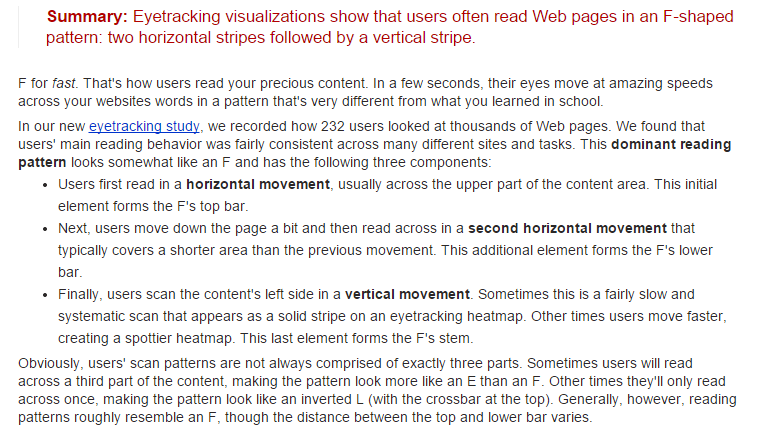
F-shaped pattern: In order to use color effectively on your homepage, you need to understand the “F-shaped pattern.” Once you understand how your visitors will most likely scan and read your page, you’ll be better at choosing and placing the right colors on it.
NNGroup explains it well:
Here’s the heatmap for the F-shaped pattern:
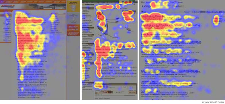
From the pattern, you can see that when users visit a particular site, they’ll first scan the content, then start reading from left to right. As a smart marketer, you can increase conversion rates by taking advantage of the F-shaped pattern.
Positioning is also important to the effective use of color on your page. For example, most people believe that placing the call-to-action above-the-fold will produce the best results.
But, as I said earlier, it’s not always true. In fact, not following the wisdom of the crowd may bring you the best results.
By combining a solid understanding of color psychology and the placement/positioning of elements, you can greatly improve your conversion rate.
Conclusion
My goal for this in-depth article was to show you the various opportunities that colors can bring to your site and how they can help you improve your conversion rate. That requires at least some understanding of the psychology of color and of consumers. Your visitors, after all, are human beings – not robots.
Of course, they’re all individuals with different tastes and backgrounds. But, as a group, they do tend to follow certain patterns while making buying decisions. Pricing, discounts and great customer service are not the only elements that can affect conversions.
We call it conversion rate optimization for a reason – just like SEO, it’s an ongoing process where you’re always working to improve your results.
Here are 7 more cool hacks to boost your conversion rates.
Colors add beauty, meaning, warmth and action to your site. Don’t just use any color and assume that you’ve hit a home run – make sure you test it.
How has the psychology of colors affected your conversion rate?
Comments (80)