
Getting traffic is easy with ad copy. Improving your conversion rates, however – not so easy!
Improving your click-through rate requires improving ad copy that lasers in on your target audience.
If you’re looking for the best platform to reach your customers, then you should consider Facebook for lead gen. It’s a huge, ready-made market, with an estimated 1.39 billion active monthly users, according to B2C. It is the behemoth social network.
Driving customers – not just visitors – to your landing page is the best way to make sales. A great way to start is with a conversion-based Facebook ad campaign.
With Facebook’s advertising platform, you’ve got access to an audience that shows actual interest in your offer. You can bring them to your site by crafting irresistible ads.
Ultimately, your Facebook ad campaign will only be effective if your landing page is optimized for the user. Otherwise, you’ll most likely struggle to generate leads with your Facebook ads and not generate website conversion.
When it comes to raising your conversion rate, you’ve got to thoroughly research your audience. No matter how much you have to invest in your ad campaign, start by making sure that you’re targeting your ideal customers. You need to show up in their news feed otherwise the social network won’t help you.
Without further ado, let me show you how to run a conversion-based Facebook ad campaign that’ll grow your revenue with website conversion.
- Step #1: Interest-Based Targeting
- Step #2: Craft a Compelling Lead Magnet
- Step #3: Build High-Converting Landing Pages for Facebook Leads
- Step #4: Drive Qualified Traffic to Your Landing Page From Facebook
- Step #5: Low-Friction Conversions
- Step #6: Constantly Monitor, Tweak, and Refine Campaigns
- Step #7. Not Working? Check for these Common Problems
Step #1: Interest-Based Targeting
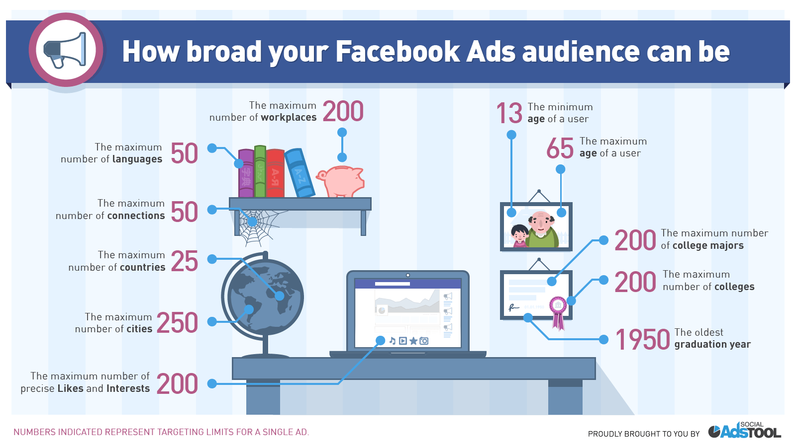
Facebook ad targeting is unrivaled in its versatility. You can target your ads based on user location, age, gender, interest, relationship status, education and more.
For example, Adidas launched a soccer-related (football, to my non-American readers!) campaign, during the 2010 World Cup in South Africa. They used Facebook ads to target social network users, based on their interest in the sport.
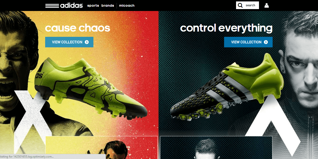
During the campaign, their Facebook page reached over 1 million fans and brand awareness grew between 8% and 21% in different countries. You’ve got a lot of potential when running a Facebook ad to get the conversion rates you dream of- the market is huge.
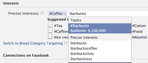
So, let’s say that your organization recently introduced a new coffee brand. You could target Starbucks fans with your ads and maybe entice them to give your product a try:
When you target users based on interest, you’ll notice an increase in the number of email subscribers, Facebook fans, brand advocates and buyers. Overall, you’ll convert more users into customers. Once they are customers, they will likely become your advocates as social proof of the quality of your brand to your target audience.
It makes logical sense. If someone isn’t a college graduate, that person won’t likely be interested in taking a grad-school level online course.
In the same vein, if I’ve expressed an interest in table tennis and I see an ad promoting a course promising to make me a better table tennis player, I’m much more likely to click, than if the ad was pitching a course about basketball.
A non-profit organization can easily target users for a higher click-through rate based on interest:
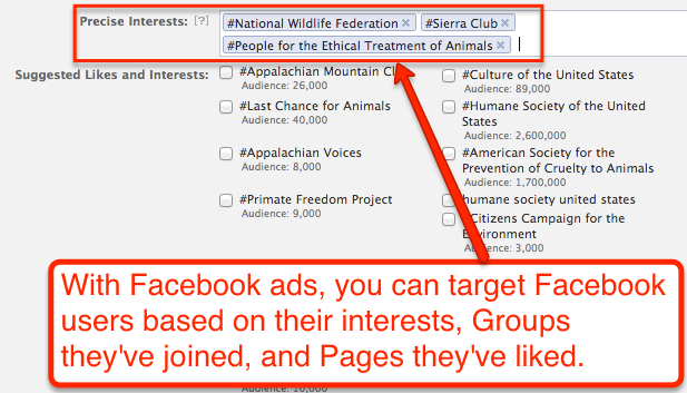
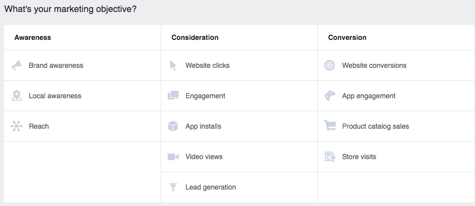
Once you define your ad objective, the next step is to select an audience based on one or more interests. These people are usually pre-qualified leads, because they’re already interested in your topic.
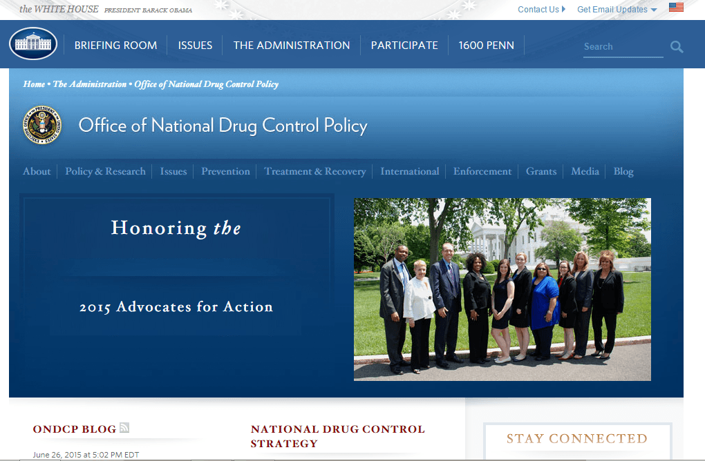
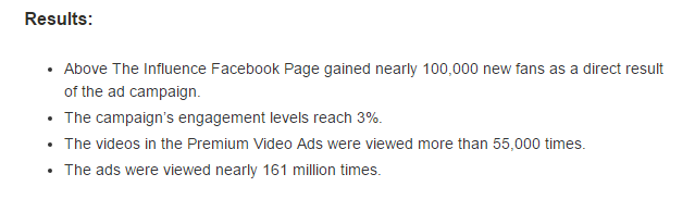
Interest-based targeting is especially effective in increasing a Facebook fan base. Here’s an example: the White House Office of National Drug Control Policy created the “Above the Influence” campaign, in order to educate teens on the dangers of substance abuse.
They used Facebook ads to target users based on interests and age. Here are the results they generated:
Remember to set up a lead nurturing system, if you want to maximize your leads, because the vast majority of them aren’t ready to buy your product, yet. You’ll have to educate and persuade them first before you get the click-through rate to become a high website conversion rate – and, to do that, you need a system in place to communicate with them regularly.
Sounds easy enough, right? And it is… if you know what you’re doing.
Because audience target is the most important aspect to your Facebook ad success.
Don’t believe me?
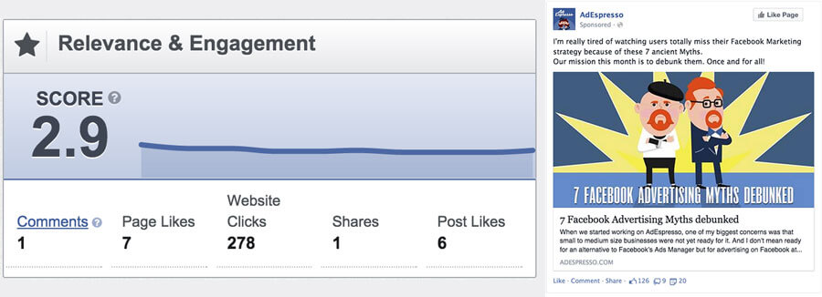
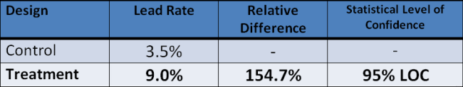
Check out this test AdEspresso ran. They took the exact same campaign with the exact same ad and budget, and ran it to two different audiences.
One had admittedly “poor targeting” (of the audience), while the other was laser-focused with custom audiences.
The result?
The “poorly targeted” one delivered website 278 clicks costing $0.142 a piece.
While the one with good audience targeting delivered 1,103 website clicks at only $0.03 a piece!
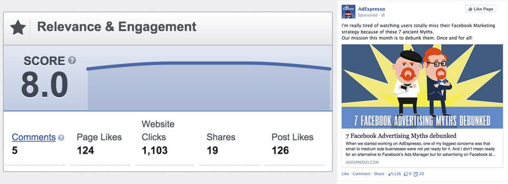
See?! Not even close. The only difference between the two was the audience they were targeting. And that allowed them to basically get free website clicks (c’mon — three pennies?!).
Unfortunately, at the very beginning, you don’t have access to custom audiences like this. You’ll have to build those over time as your get more site traffic. (Keep reading to find out why.)
BUT, there are a few additional tricks to improve your success with interest targeting.
I’ll go ahead and assume you already know the basics here (age, gender, location, etc.). Layering in that demographic data will help you filter out all of the people who aren’t likely to buy.
But let’s say your audience is still too big. You’ve dropped in a few interests, like brands they follow or celebrities they’ve Liked, and you’re still pushing many many millions.
If that sounds familiar, here’s what you should do next.
First, split your audience down into multiple customer segments or personas. This sounds obvious. But it makes a huge difference.
You can start with something as simple as the industry your prospects are in. Like so:
For example, let’s say you’re targeting other business people. You can easily segment those people by industry (like accounting vs. consulting). You can segment them by location (big cities). And you can segment them by job title (middle managers vs. VP and C-level).
So right off the bat, you can add just a few simple criteria like this to help split up one massive group into many smaller ones (that will reduce your costs, too).
After segmentation, you can also use an interest intersection and exclusion feature to further refine who you’re reaching out to.
Going back to our B2B example, let’s say we’re trying to target accountants. But not just any accountants; self-employed ones.
That’s a critical difference.
Because most accountants are risk-averse. Most are happy with their day job and wouldn’t be interested in our marketing or coaching package.
Self-employed ones would be, however.
Except, how are you supposed to find one interest that gives you a nice cross-section of those two almost opposing criteria?
You don’t. You go with two separate ones. And then you use an interest intersection that ties them together.
For example, start with Accountant and then select that it “MUST ALSO” match Self Employed. Like this:
Now your ads are only going to reach a small sliver of your initial audience because we’re looking only for the self-employed accountants.
But wait a second.
What if that’s still too general? What if that’s still too big of an audience?
Not only can you ‘include’ other interests like this, but you can also exclude them as well.
For example, what if you only want self-employed accountants who are not tax attorneys? You can pencil in “legal”, “law”, “lawyer”, “attorney”, and more to further refine who’s gonna show up.
Here’s what it look like when you add the new exclusion for attorneys:
See? These intersections and exclusions actually give you pretty powerful targeting options to find exactly the right people. The ones who’re interested in what you have and are more likely to buy from you one day.
The actual size of your audience should then vary depending on a few things.
For example, if you have at least some basic experience advertising with a good budget, you can probably afford to target up to a million – two million people (assuming your targeting here is good).
And if not? If your budget is small or just getting started? You can go anywhere from the 10,000 range initially on up to half a million once you gain some experience (and read the rest of this guide, of course).
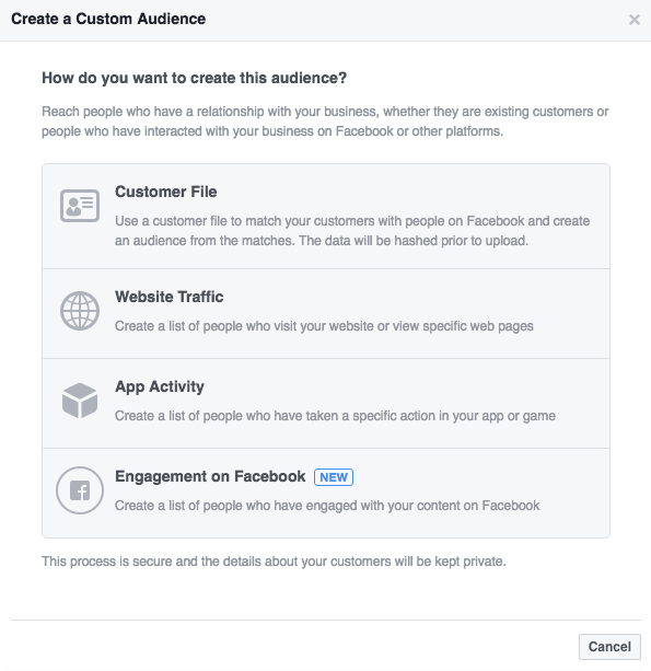
Once you get a steady stream of incoming traffic, you’ll be able to switch over to using custom audiences. These are like remarketing or retargeting audiences that just visited your website, engaged with you on Facebook, or even recently joined your newsletter.
You saw earlier in the AdEspresso example how a custom audience can deliver where it matters: profits. Even KlientBoost has shown that retargeting campaigns can generate six times more conversions with the same ad budget.
Once you find an audience that’s working, you can even create ‘lookalikes’ of it. Basically, Facebook will comb through all of their users in order to find people that are pretty close to who you’re already reaching. (That way you can stretch those ad dollars a little further without wasting money on untargeted people.)
Facebook will give you two controls when you’re setting up a new ‘lookalike’ audience:
- Location
- Percentage of people you want to target (e.g. 1% vs. 5% vs. 10%).
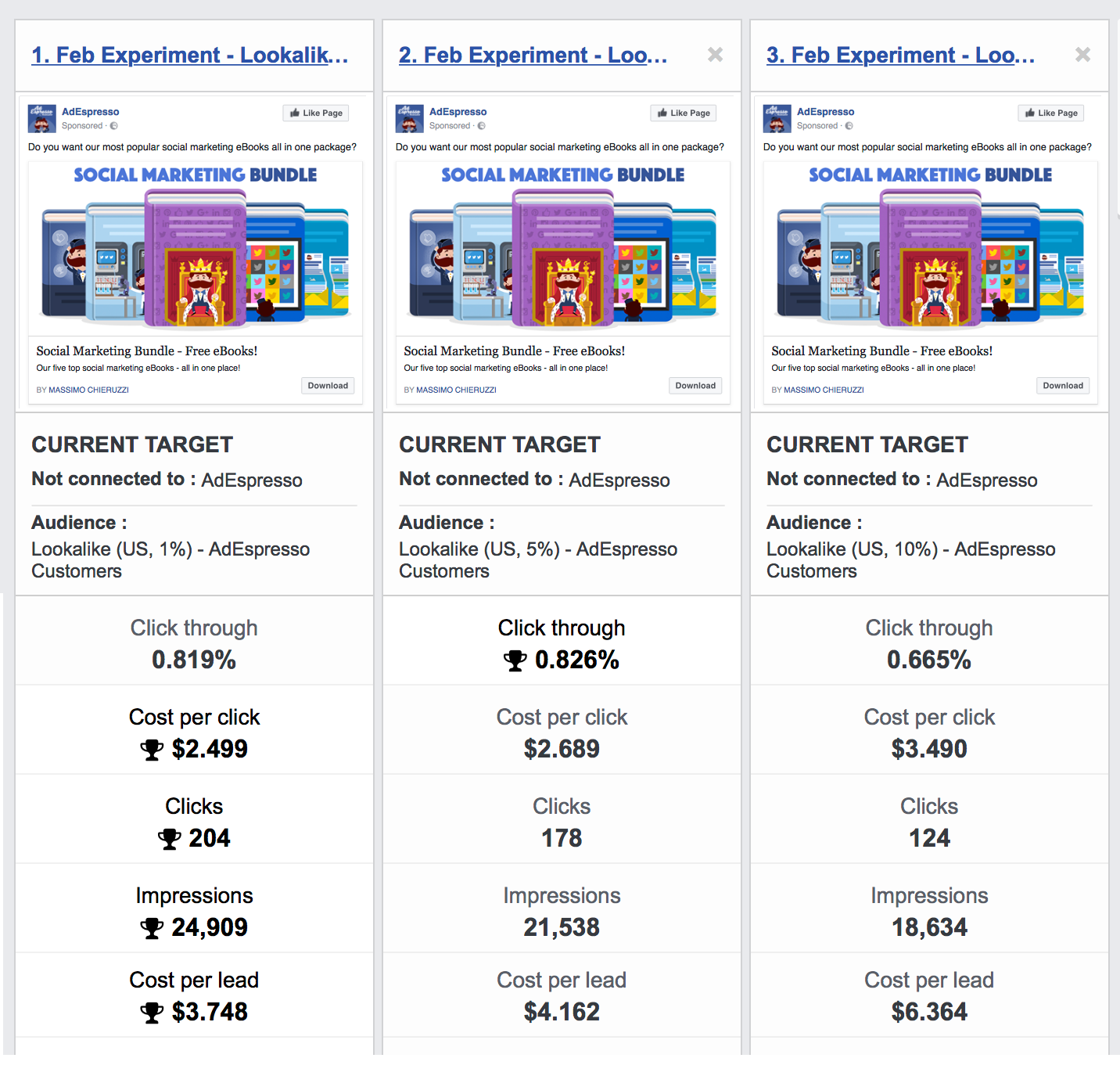
AdEspresso recently ran another test in order to discover which lookalike audience works best.
They found that, “The 10% Lookalike Audience had a 70% higher cost-per-conversion than the 1% Lookalike Audience.”
So start with interest targeting.
Further refine your audience if needed by splitting customers into multiple segments, and using interest intersections or exclusions to rule people out.
Then you can experiment with both custom audiences and lookalikes to when you’re ready to progress further.
Otherwise, the next step is to start generating traffic and your first few leads. Here’s how to do it.
Step #2: Craft a Compelling Lead Magnet
A lead magnet is basically an ethical bribe. It’s what you offer to your leads to persuade them to give you their email address and other contact information.
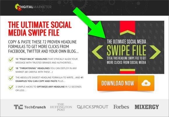
You can choose from lots of options, when you’re deciding what to give away. For example, Ryan Deiss, founder of Digital Marketer, gave away the social media swipe file below. Within 45 days, he had collected over 28,500 leads.
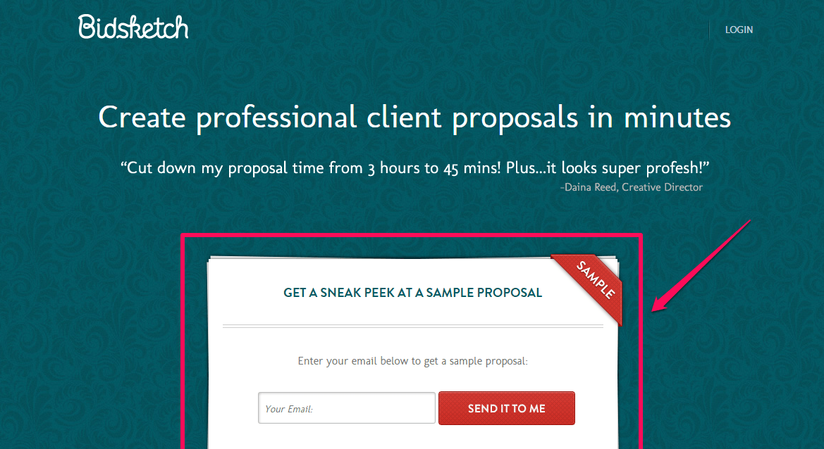
Bidsketch, a SaaS proposal building application, uses a unique style to ask for your email address before you start the free trial:
If you operate an online store, you could give away discount codes or offer free shipping to your customers. Other lead magnets that have been proven to work include:
- Ebooks and articles
- Video training
- Email courses
- Free tools
- Checklists and templates
Why go to all this trouble?
Because most new people aren’t going to buy on the their first website visit. That’s why only a depressingly low ~1-3% end up converting.
An interesting blog post may have brought them to your site. But they weren’t yet ready to punch in their credit card number or sign on the dotted line. That’s a HUGE commitment for someone who may have never even heard of you just yet.
So that means the other 97-99% are going to leave.
Unless you entice them with something. Unless you give them something of value in exchange for their info. Information that you can later use to bring them back.
The key is to dig deep. You have to find out what really makes people tick. What motivates them or scares them.
One trick I use is to comb through detailed reviews. For example, check out the in-depth blog comment this person left about her struggles with weight loss:
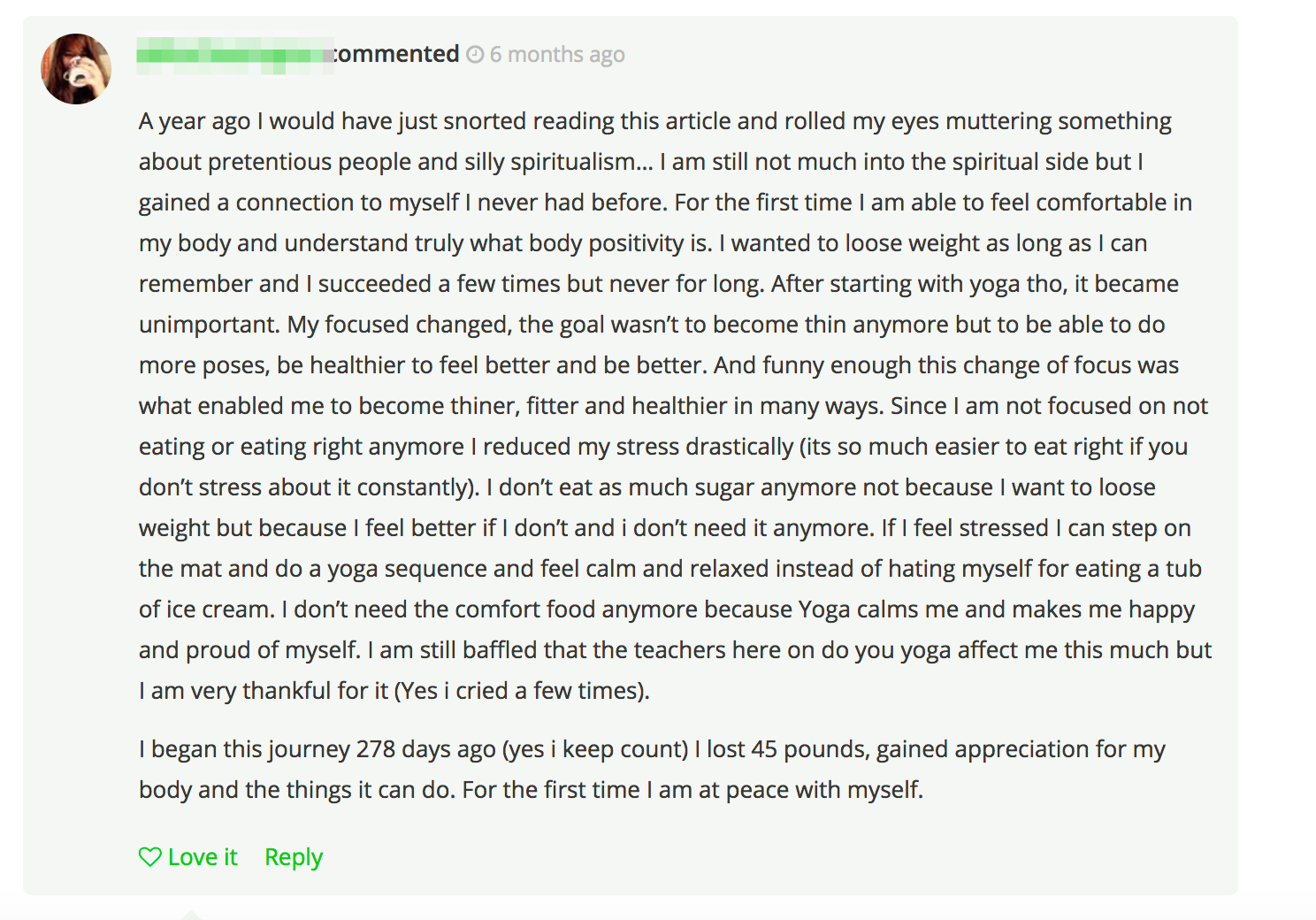
Her experience just became the spark for your new lead magnet. So you know exactly how to take her insight into the struggles and challenges, and begin packaging them into a simple guide or eBook. Ideally, this walks people through the common problems they’re dealing with (and looking for), with a few tips for how to improve it.
For example, this HubSpot eBook (below) is about generating leads on Facebook, with content strategy and lead generation tips. But you can use those motivations you’ve just uncovered to help you frame the tips held within.
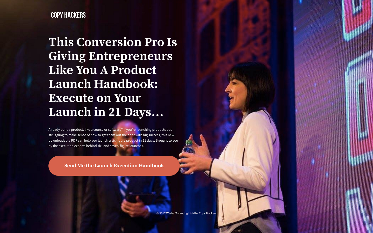
A close cousin on the guide is a cheat sheet. The difference? Instead of being an exhaustive resource on a topic, this one offers more of a straight line in order to fix some problem.
A spin on this would be like the Copyhacker’s 21-Day Launch Execution plan.
Email courses are becoming a popular alternative because you can ‘drip’ out content sequentially over time. A single eBook might be overwhelming for most people. But sending out a few simple emails each day over the course of a week helps to break this down.
For example, Workshop uses a series of lessons to help freelancers grow (and become more profitable).
Email courses are also powerful because you can transition from education (in the beginning) to soft selling your product or service towards the end.
For example, WPEngine combines the power of an email course with the immediate gratification of a free tool. They have a Speed Tool that will give you instant feedback on how fast your site is, or where there are problem areas.
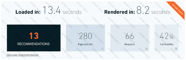
The catch is that they have to email the results to you. After inputting your information, they send out an email sequence that provides details on how to speed up your site. (So you start to gain trust and confidence in who they are and what they say.)
Then towards the end, after you’ve had a chance to become familiar with their offering, they send you a sales offer that’s too good to pass up.
Last but not least, webinars and video are a personal favorite. They’ll quickly become a favorite for you, too, when you see why:
- They’re more engaging for people (as opposed to an eBook that just sits unread in someone’s inbox)
- It’s easier to showcase some products, services, or methods visually
- They’re almost universally loved by people (and your wallet when you see the results)
That’s why this site’s main lead magnet is a webinar. My video landing page converts 56% of the people who visit. And there’s only a single video!
Generally speaking, the type of lead magnet you use depends on the level of commitment required.
For example, if someone just visited your site for the first time, they might not be ready for an hour long webinar. Maybe they just want a simple checklist instead.
But when they visit on the second, third, and fourth time? You know they can’t help but check it out.
That is, of course, your landing page does a good job converting them (instead of scaring them away).
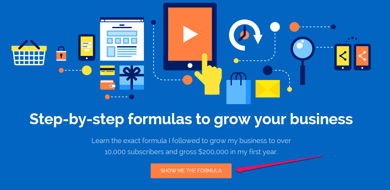
Step #3: Build High-Converting Landing Pages for Facebook Leads
The moment that you create a landing page, your mindset will shift towards conversion rate – which is where it needs to be. After all, that’s all that matters, once you start attracting Facebook clicks and visitors to your page.
Your landing page should have elements – such as the headline, subtitle and call to action (CTA) – that can be tested and improved.
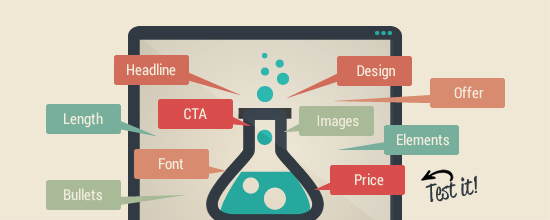
Changing your CTA button color or position can have a significant impact on your conversion rate.
Here’s a perfect example.
Check out the following CTA buttons on a website:
![]()
They’re exactly the same!
Which one should you click? What’s the difference between the two?
You literally have no clue. So you can make a huge impact simply by changing the positioning of these (like placing one above the other to help prioritize it). Or even coloring one of them in with a different background color can help call your attention to differentiate between the primary and secondary options.
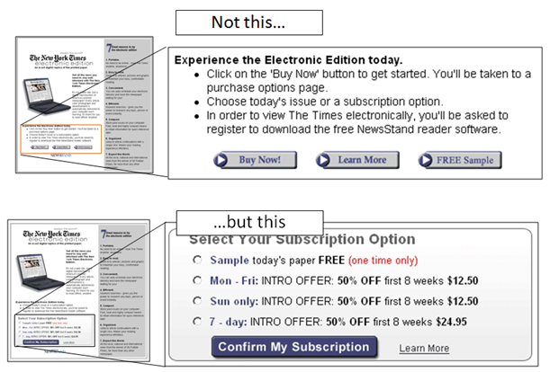
For example, MarketingExperiments ran into a similar problem. There were three, equally-weighted CTAs that basically looked exactly the same.
They consolidated those options, updated the coloring, and were able to increase conversions 64% because the final version was so much easier to understand.
Even switching up your CTA to help it communicate value can have a huge impact. For example, MarketingExperiments.com revamped one vague CTA to better explain the value proposition behind it.
The result was a 200+% conversion increase. Not bad for a few minutes worth of work!

But, it’s just the beginning for building a high-converting landing page. Your page itself needs to be focused on conversions, with persuasive copy that’s relevant to the readers.
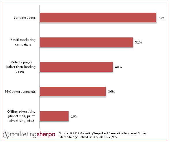
According to Instapage, over 1,000 landing pages are designed with their software on a daily basis and this number keeps growing. This illustrates that marketers are embracing landing pages and understand their importance to lead gen and website conversion.
The bottom line is this: Whether you’re doing search engine optimization or running a PPC ad with Facebook or Google AdWords, you need a high-converting landing page.
You can’t possibly expect people to convert, if you’ve got nothing useful to share with them.
Jayson DeMers said that if you create landing pages properly, you may even enjoy increased SEO benefits, even though your main source of targeted traffic is a social network site like Facebook.
Hiten Shah, co-founder of KISSmetrics, discussed in his newsletter, a few months ago, that more marketers are creating landing pages for reasons other than new product features or releases.
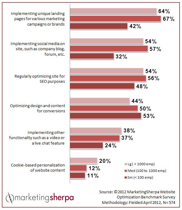
A recent study by MarketingSherpa agrees with Hiten’s assertion – 67% of marketers are creating unique landing pages for various marketing campaigns or brands.
When a new product is added, these smart marketers also create a new landing page, in order to target a different audience and its specific needs.
When it comes to design, there’s no need to reinvent the wheel. In fact, the landing page where you drive your Facebook clicks should look similar to your typical landing page for running a different type of PPC ad. Focus on the anatomy – the elements that make up the page.
When you come to a well-designed page, you’ll notice the headlines, subtitles, bullet points and more. They’re all important elements on any meaningful landing page.
However, the real concepts that produce a high-converting landing page are always evolving.
Your target customers are used to old techniques and advice. They want something simpler, straightforward and interesting. So, how do you ensure that on your landing page?
1). Borrow credibility: The Stanford Web Credibility research project found that credibility is the most important element for any site.
If you don’t have much credibility online, it’ll affect how people perceive your brand, product and advice. If you’re an author, you’ll find it a lot easier to trust Seth Godin’s publishing advice than mine. He’s got more credibility and experience in that field.
On the other hand, when it comes to digital marketing techniques and strategies, such as SEO and building profitable blogs, more people will trust my recommendations, since that’s my speciality.
But, what do you do when you don’t yet have enough credibility to persuade potential customers?
Simply borrow credibility from other trusted sources to positively influence your own conversion rates. Here’s how:
i). Showcase customer badges: This is a relatively new trend in landing page design. To make your landing page trustworthy and professional, leverage other people’s credibility.
An effective way to borrow an expert’s or brand’s credibility is to showcase their badges on your landing page – assuming that you’ve worked with them in the past. A potential customer who’s still skeptical about your brand will be reassured, if they recognize the brands on your page. This can increase your click-through rate.
This is called the halo effect, which simply tells us that one positive association increases another. You’re in charge of creating the first impression that you make on your prospects. Social proof starts to work for you.
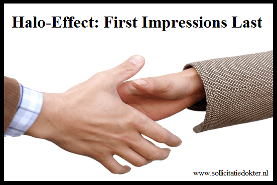
So, if they see a credible brand that you’ve actually worked with (it’s utterly crucial to be honest in this regard), they’ll have a more positive impression of your brand.
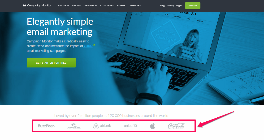
An example of a landing page that showcases other brands’ badges is the one from Getresponse, an email marketing solutions company that displays their customers’ logos.
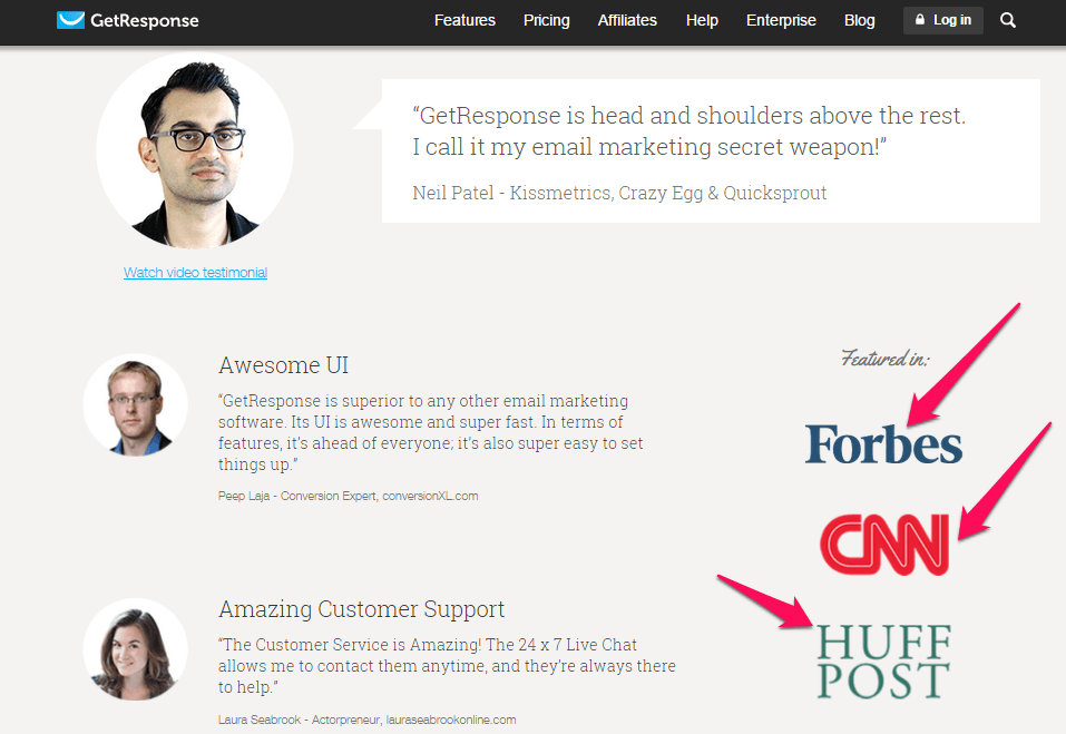
I’m sure that you’ve seen several sites and marketers using customers’ badges on their landing pages. When you see the logos of Coca-Cola, Apple, AirBnB and Unicef on Campaign Monitor’s landing page, aren’t you more willing to do business with them? This increases the likelihood of a website conversion.
ii). Showcase detailed testimonials: You can also build credibility by showcasing the impact of your product or service in people’s lives, through testimonials.
Credibility drives sales and helps you to retain your customers (assuming your services or product are worthy). According to Douglas MacDougall, of MacDougall Biomedical Communications, “without credibility, everything you say to investors, potential partners or even your employees can be questioned.”
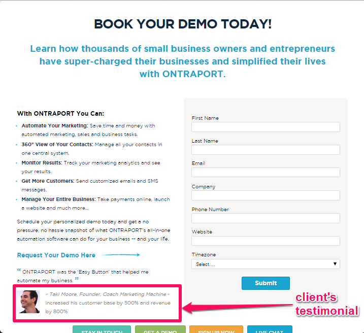
The typical Facebook ad landing page contains at least one client testimonial. Testimonials are how the social network succeeds. Here’s an example, from Ontraport. Note the testimonial below the form:
A recent statistic from Spectoos found that 90% of customers’ buying decisions are influenced by customer testimonials and customer reviews. What’s more, over 80% of consumers admit that they’re more likely to buy from a brand that displays reviews and testimonials on its site. Testimonials can be a good lead gen device.
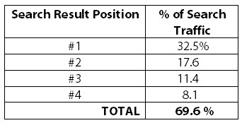
Do you know why Amazon generates more sales than any other brand in the online shopping industry? Take a look at 2013 worldwide figures for online sales:
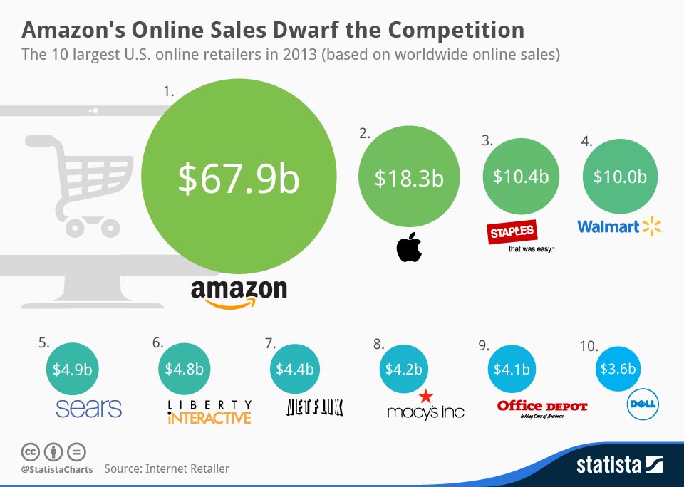
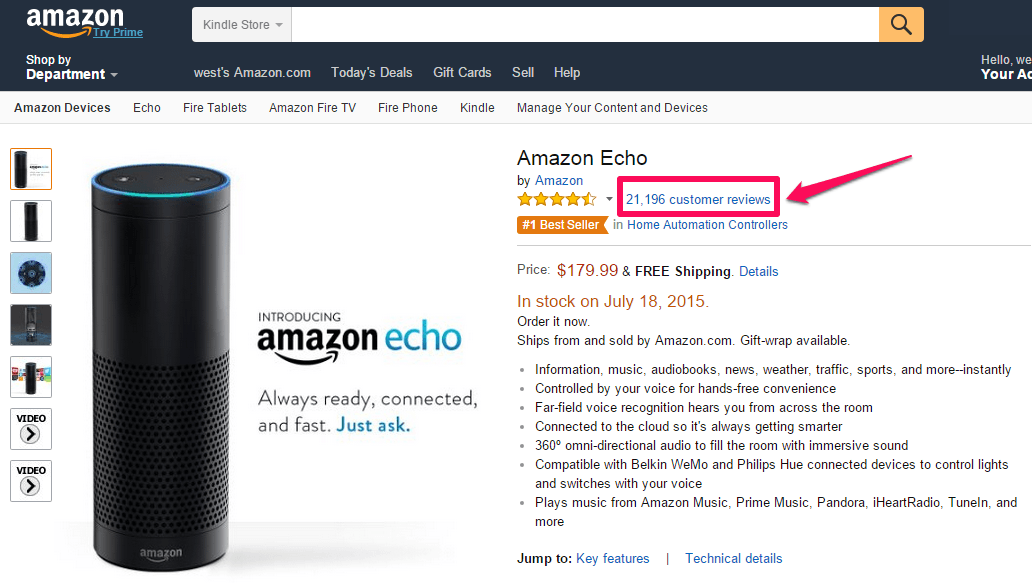
Granted, Amazon is a very popular and highly credible brand. But, another reason for Amazon’s results is its in-depth, thoughtful and clear customer product reviews, like these:
One word of caution: don’t even think about faking a testimonial on your landing page. Trust me on this: your visitors will know. And, they’ll leave without a second thought. Even worse, such deception can destroy your credibility. In short: be honest.
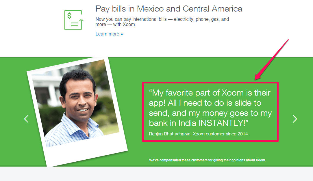
Showcasing detailed testimonials is a great way to boost your credibility. Xoom, a web payment solution, knows how to strategically place customer testimonials to boost conversions:
How have organizations and marketers benefited from your offer? It’s very hard to tell the success story with just a logo or photo. In addition to the testimonial copy, make sure that your images display clearly.
According to Kinsta, publishing testimonials on your web page is one of the best ways to build trust and get that website conversion to buy. Client testimonials are an integral part of social proof – a phrase that simply means “people are more likely to do what they see others doing.”
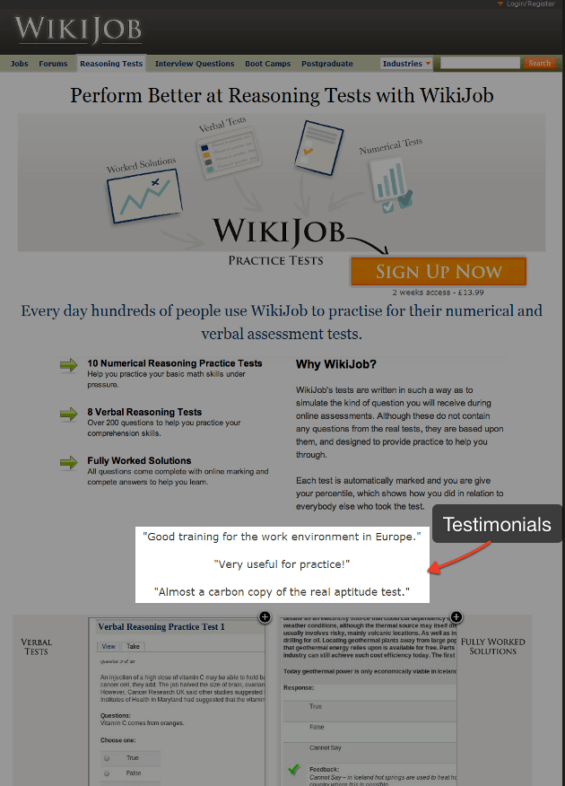
If others in your industry got results with your product or service, proof of those results on your page will stoke more interest, helping your ideal clients to subscribe to your list or buy your product. For example, Wiki Jobs added detailed testimonials to their site and boosted their conversion rate by 34%.
And whatever you do, always get real photos instead of stock ones.
B2B companies make this mistake all the time. They’ve got a GREAT testimonial. But when they pair it with a cheesy stock image, it immediately loses all credibility.
That’s a problem. Because images have the power to increase engagement by 94%! That means they’re one of the biggest factors in driving conversions.
For example, Visual Website Optimizer found that using real customer photos instead of fake, stock ones brought a 161% click through rate lift, along with a 38.4% increase in conversions, too.
They then performed a similar experiment for an online art gallery. You’d think that people would want to see images of the actual paintings, right?
But that’s not what they found.
Here’s what they looked like originally:
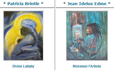
But then they replace those painting examples with an image of the actual artist, instead. And results jumped.
They saw a 95% conversion improvement.
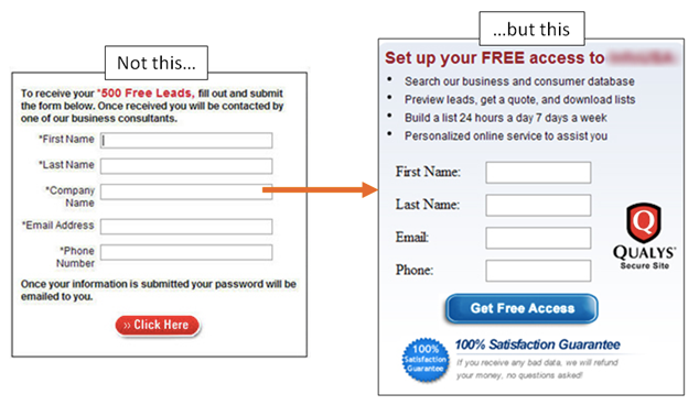
2). Give your landing page a SINGLE purpose: What’s your primary motivation for setting up a landing page for your Facebook clicks? If your answer is “to drive traffic, get email sign ups and make sales,” you’re making a big mistake.
There is no way that you can successfully accomplish multiple objectives with a single landing page. Instead, you should create multiple landing pages, each of which appeals to a select group of your ideal customers.

Another benefit to single-objective landing pages is the relative ease of communicating and testing your value proposition to your target audience. A value proposition is simply a promise of value to be delivered for a given offer, site or brand. MarketingSherpa’s research showed that 64% of marketers find it easier to test value proposition on a landing page.
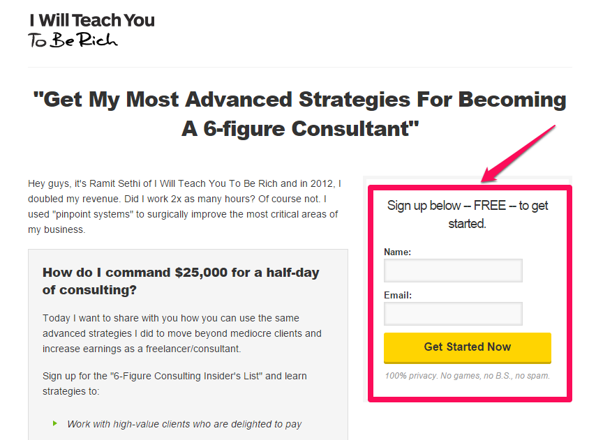
Take Ramit Sethi’s Six Figure Consulting landing page, for example. It has only one purpose: to promote his course on how to become a consultant earning six figures per year. But, before someone can get Ramit’s insider secrets, they have to subscribe to Ramit’s email list, which is the real purpose of the page.
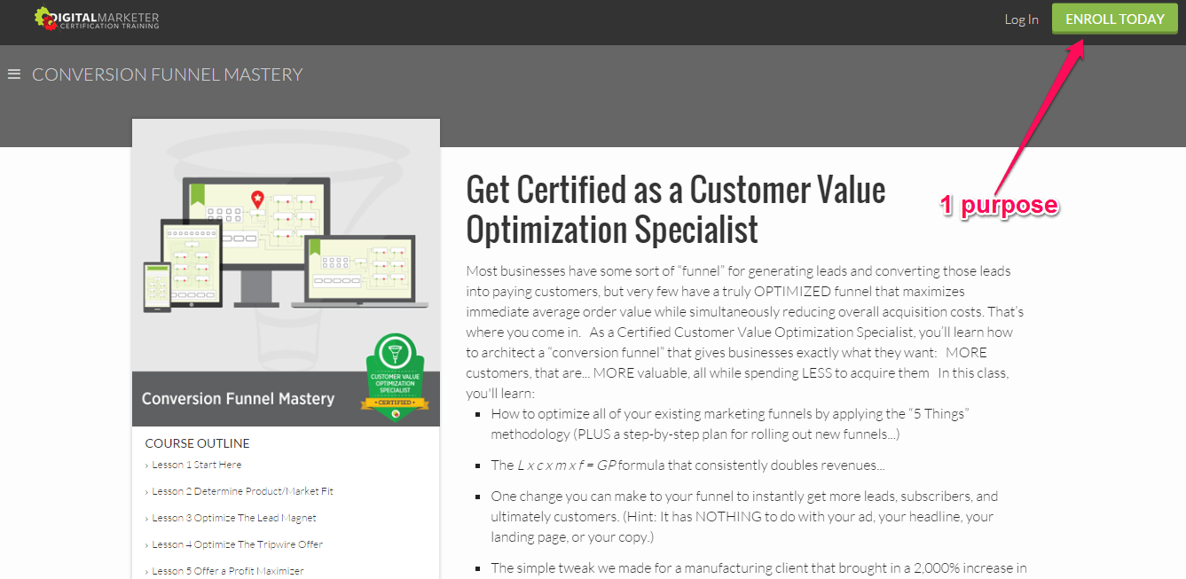
Ryan Deiss, founder of DigitalMarketer.com, knows how to define the purpose of his landing pages. If you want to become a certified customer value optimization specialist, Ryan doesn’t want you to just subscribe to a list. He wants you to enroll, if you’re ready.
Those are all pretty good examples.
Here’s one that isn’t.
For example, can you take a guess what you’re supposed to do on this page?
Yeah, me neither. It’s all over the place. A mess. There’s tons of different buttons and CTAs. There are multiple columns, so you’re not sure what to read first. And as a result, your eyes (and mind) wander all over the place before getting too distracted to move on.
Cluttered pages like this actually force people to multitask. They have to try and take in several different points or options at the same time. And that literally makes your customers “scatterbrained” in the process.
Whereas keeping things nice and simple, reducing both complexity and length, increases results across the board.
Presenting people with fewer options actually ends up improving conversions. You’re reducing the number of decisions someone has to make, and channeling their focus on the one particular goal.
For instance, now compare that earlier example with this alternative version of the same page:
Ah, that’s better. Right?!
The page information has be simplified. And the page’s design has been streamlined. So now there’s only one, big, obvious thing to do on this page.
It’s no surprise, then, that this new variation increased conversions 154%!
This is the same reason why carousel sliders are often a problem on landing pages.
These things are notoriously bad because they violate the rule of focusing on just one thing at a time. Instead, to make sure everyone’s happy, they clutter up a single page.
And as a result, they wreck havoc on your page’s performance.
Don’t believe me?
Carousel sliders have been proven to hurt:
- Usability – Sliders commonly cause problems and have trouble loading on outdated browsers or mobile devices.
- Conversions – By trying to target everyone, carousel sliders end up appealing to no one.
- Speed – Sliders also commonly slow down page loading times by adding unnecessary ‘bloat’ to your website.
But that’s not even the worst part. No, this is:
Less than 1% of people actually click on them.
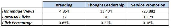
For example, a Search Engine Land study found that people typically use them for one of three reasons:
- Branding
- Thought Leadership
- Service Promotion
But here’s the thing.
When they then studied how well carousel sliders delivered on those three goals, the results were incredibly disappointing (to say the least).
The point?
Keep it simple, stupid. Don’t clutter up your landing pages with a ton of ‘extra’ stuff that distracts people from their primary goal.
And whatever you do, don’t use a carousel slider.
3). Optimize your landing pages for conversions: According to David Masters of Tutsplus, “landing pages are the equivalent of your sales team in the online world.” With that in mind, the purpose of your landing page has be well-defined, from the start.
As a Facebook advertiser, you have to remember that lead gen is the ultimate purpose behind running an ad, no matter what type of ad you’re running.
Even if you’re sponsoring a blog post, you still want to convert more visitors into blog readers. So, conversion is the ultimate by-product of any PPC ad in the social network.
Continually optimize for conversion rates. Many people don’t really know what optimization means. But, it’s actually a pretty simple concept. It boils down to two things:
- Do more of what works
- Quit doing what doesn’t work
There are two ways to optimize your landing page in order to improve conversions:
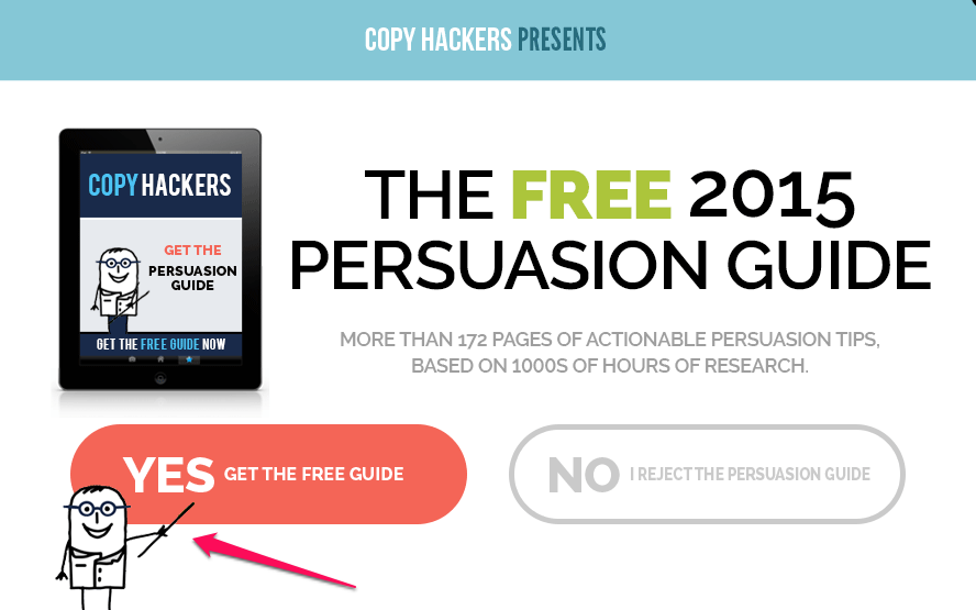
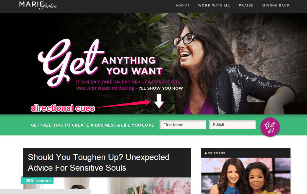
Above all, you should remove every distraction on your landing page. Make it easy for your site visitors to find exactly what they’re looking for. Use explicit cues to guide users to your offer or call-to-action.
Most successful marketers use directional cues on their opt-in boxes. For example, Copyhackers uses a cartoon-like character that points at the opt-in call-to-action button.
Marie Forleo uses a white arrow to direct users to her email subscription box. It helps the visitor avoid getting lost on the page.
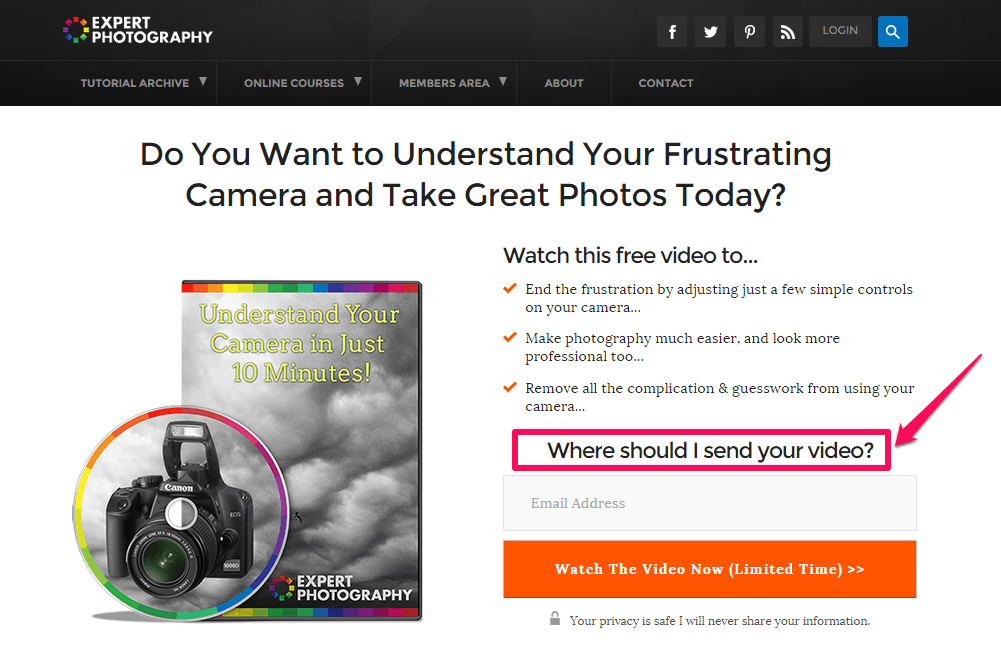
Another way that you can use directional cues is to include a short (one or two sentences) and appealing message, right before your subscription box.
Write the message persuasively. Here’s how Expert Photography crafted directional cues in one sentence:
In the landing page above, you’ll notice that there is a video. Adding a video to your landing page will position you as an expert in your industry. After all, if you can show it, then you’re different from those who can only write about it.
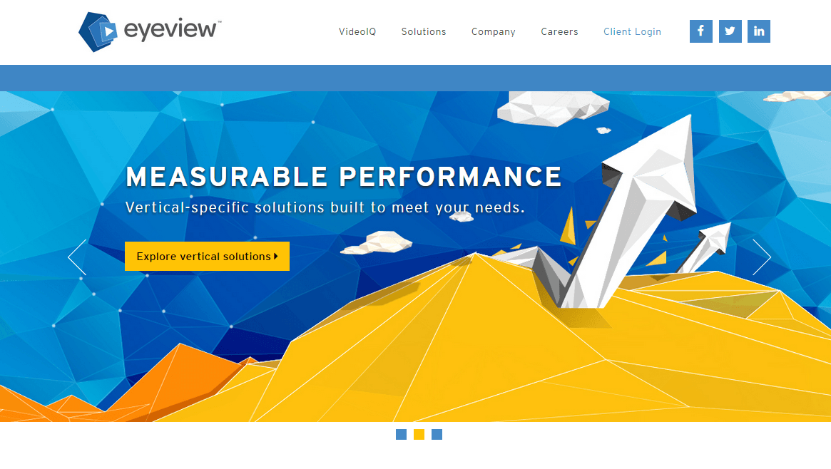
Video is an integral part of visual marketing and the brain responds to it better than straight text. Eyeviewdigital.com saw an 80% increase in its conversion rate, after adding a video to a landing page.
Many people prefer watching videos over reading plain text. The right mix can help your click-through rate and website conversion. What’s more, videos will keep more people on your page for a longer time.
Removing navigation from your page is another way to optimize and achieve higher conversion rates with your landing page.
For example, Career Point College removed the top navigation on its landing page and modified the form layout. The result was an increase in conversion rate of 336%.
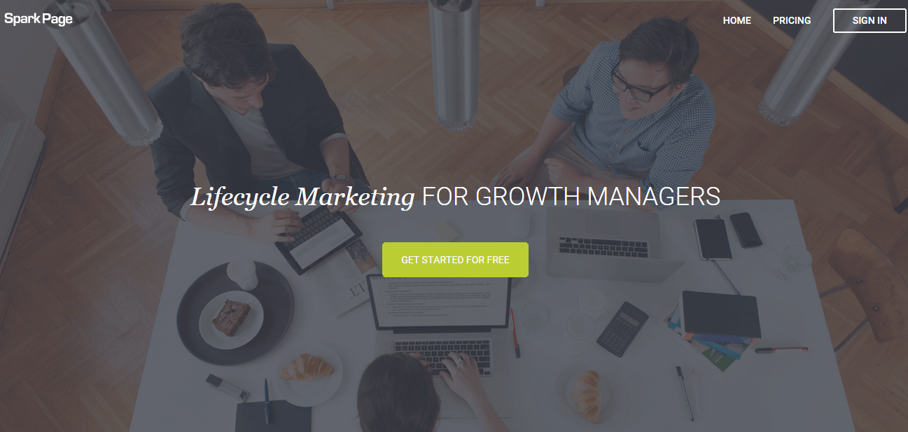
And, SparkPage increased its conversion rate from 9.2% to 17.6% in the month when they ran a test and removed the top navigation.
Removing navigations on your landing page will lift your click-through rate and conversion rates. A lot of authors, information marketers and public speakers are doing exactly that.
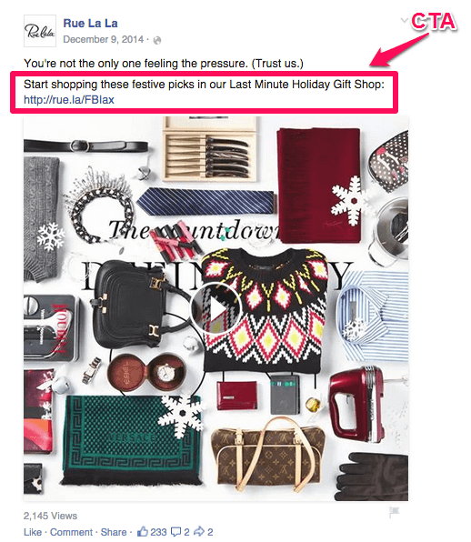
Before we wrap up landing page optimization, we have to address the call-to-action. If you’re using a CTA button on your landing page, the ad copy words you use will either persuade people to act or chase them away. Avoid boring copy on your buttons.
If you’re still using the word “submit” on your button, you’re doing yourself a huge disservice. Instead, clearly describe what your target audience stand to gain by taking the action and improving your click-through rate.
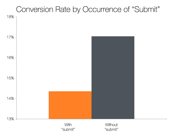
HubSpot recently tested landing page CTA buttons, to compare the effect of buttons that use the word “submit” against buttons that didn’t use the word “submit.”
The “submit” button didn’t perform very well. The button with more descriptive wording got a 17% higher conversion rate.
They didn’t stop there, though.
If ‘submit’ doesn’t work, what should we used instead?
HubSpot followed it up with another test with a few different close variations of ‘submit’ in order to find it.
Turns out, the more specific the better.
For example, ‘click here’ and ‘go’ outperformed it.
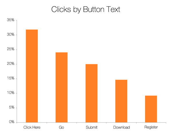
Interestingly, ‘Download’ and ‘Register’ also performed poorly. That might come as a surprise. But they attributed it to the fact that those words tend to make people think there’s a lot more work involved in signing up.
Now compare that to the words that performed best. Those imply immediate gratification, instead. There’s nothing to fill up or sign up for or verify.
Bryan Harris, founder of Videofruit.com, removed the top navigation and sidebar on his landing page and crafted clear copy for his button. Here’s his landing page:
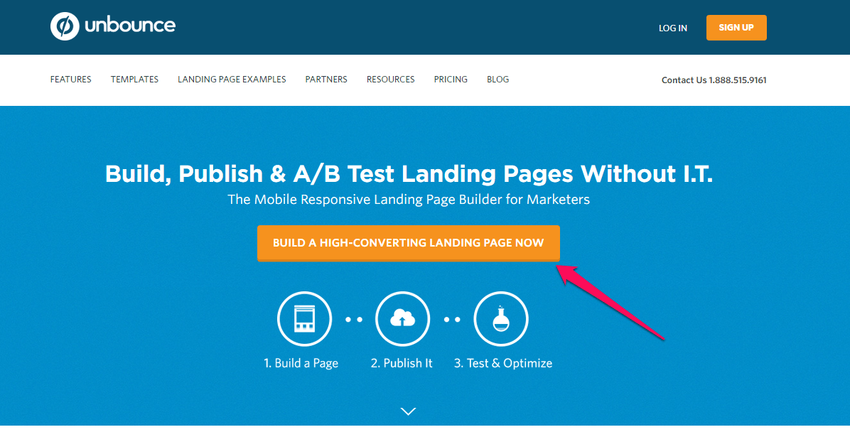
To save time and build professional landing pages for your Facebook ads, you’ve got several options. You could use one of the templates from Leadpages, Instapage or Optimizepress. But, if you want to carry out A/B testing, Unbounce may be the best option for you to test ad copy throughout the social network.
There’s a positive side benefit to using ‘off the shelf’ templates, too.
You can capitalize on conventions. These are basically standardized visual ques and web design aspects that help visitors quickly understand where they can find the information they are looking for on your landing page.
For example, if someone has never visited your page before, and you need to capture their attention quickly to provide the right information before they bounce, you should keep simple things (like “Contact Us”), simple.
Overcomplicating your site with unconventional labels (like “Thought Leadership” instead of “Blog”) only hurts user experience.
That’s because people have certain expectations when they hit your site. Sure, it should look beautiful and creative.
But at the end of the day, things (like navigation or buttons) should be where people expect them to be. ‘Visual hierarchies’ help people to understand what’s prioritized on a page, or where they should look next.
For example, using typeface weight and pairing (e.g. bold, blocky headline with smaller, minimal subhead) can establish a visual hierarchy to direct reading the right content at the right time.
The goal is to help enable people to scan. Yes, you read that right.
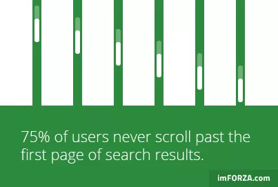
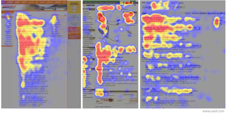
No one will read every single line. Instead, they’ll scan in an F-shaped pattern. So the left-hand side gets the bulk of their attention, and they’ll occasionally gaze over to the right to see if something catches their eye. A Nielsen Norman Group study confirmed this years ago.
One reason nobody reads?
Because they’re distracted!
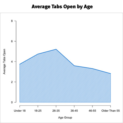
Be honest: How many browser tabs do you have open right now? Because most people have at least four to six open at any given time. (They’ve got multiple screens and devices in front of them as well.)
There’s a reason the paragraphs on this massive guide are short. (Like less than four sentences each.)
Even the sentences themselves are short.
Ideally, the least words to describe something, the better. That way, that short attention span goes where you want it: CTAs.
That’s why only offering one or two per page usually results in better, well, results. You’re helping to prioritize and focus a visitor’s attention for them. (Because according to the stats, they’re unable to do it themselves.)
You can also use visual cues — little devices or tricks — to call their attention to your CTAs.
One of my favorite examples is on the Unbounce blog.
In-line CTAs (inserted into the content) are pretty standard. You’ve already passed a few on this post while reading.
But many times they’re easy to miss. So adding motion or highlights can help re-focus someone’s attention on them.
So as you’re reading one of Unbounce’s posts, you’ll see a giant inline CTA:
It’s massive, right?!
But that’s not the cool part.
When you scroll over that section, they use a ‘hover effect’ to highlight the CTA in a deeper, darker blue.
Now you can’t help but pay attention to it.
This little trick helps divide the page content so that visitors can see what’s next. And the new color change when you hover over it subtly tells you to click.
You immediately realize it’s a clickable design element. Like another button or blue underlined text link.
The last thing you want people to have to do when they hit your page, is to think.
So if you want them to click something, use these visual cues to let them know that’s exactly what they should be doing.
Step #4: Drive Qualified Traffic to Your Landing Page From Facebook
Facebook PPC advertising is a great source of traffic for your landing page. Smart content marketers leverage the #1 social media platform to generate high-quality traffic with website conversion of visitors into customers.
If you’ve got the requisite marketing budget for both organic and PPC traffic, you’ll see better results, compared to using one platform alone (such as PPC or organic search).
Glen Allsopp, founder of Viperchill.com, received thousands of qualified clicks, at a cheaper rate, using Facebook ads instead of Google AdWords.
He spent $2 with Facebook to acquire a customer, whereas Google took $40 to get the same client to his site. Of course, there are ways to get a cheaper CPC on Google AdWords, but many marketers and PPC advertisers prefer Facebook for more a more cost-effective click-through rate.
More importantly, the Facebook team will usually approve your ad within 15 minutes and start sending traffic to your landing page. Google AdWords can take 10 – 15 hours.
In a recent test to determine the effect of PPC on a landing page, compared to free sources of social network traffic, Melissa Mackey saw a 17% increase in site visits after setting up a PPC campaign. Her sales increased as well.
Of course, you need to know the cost per acquisition (CPA) when running a Facebook ad – that’s how much a particular click-through rate will cost you for your lead gen efforts.
This means that if Facebook deducts $1.43 from your account for every click, your cost per acquisition (CPC) is $1.43. Assuming that you’ve got the same budget for both organic search and PPC, this research shows that PPC will yield the better ROI for you.
Your success (or failure) in Facebook advertising hinges on this cost per acquisition. So you literally cannot afford to get this wrong.
For example, an old school study from Bain & Company found that most people spend too much on acquiring new customers. What does that mean? It means that new customers tend be to unprofitable for the first few months (or even years in some cases) until the company effectively ‘breaks even’ on what they initially spent.
But when you get this right on your own business, magic happens.
Just ask Spearmint Love, who was able to grow 991% year over year by obsessing over decreasing their cost of customer acquisition. At one point, they were reportedly pulling in anywhere from $5 – 10 dollars of revenue for each single dollar spent in advertising. That’s extremely good!
And it highlights the key difference between those that use advertising to scale their business, from everyone else who claims it “doesn’t work”:
Keep your cost of customer acquisition as low as possible, and your break-even point as fast as possible (like within a month if possible).
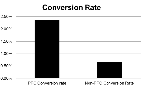
If you’ve got a high-converting landing page, a compelling offer and clickable Facebook ad copy, PPC traffic will convert 3.5 times better than non-PPC social network traffic.
1). Set up conversion tracking: Since conversion is the ultimate goal, you’ve got to set up website conversion tracking properly.
From your Facebook ads set up environment, you can optimize and track conversions, by placing a conversion pixel on your site and then adding it to a Facebook ad. This is a simple and effective way to know exactly which ads are converting the most in lead gen.
If you use WordPress, you can download and install the Facebook Tracking Pixel plugin, which adds the Facebook conversion pixel code to your WordPress landing pages to determine the conversion rates.
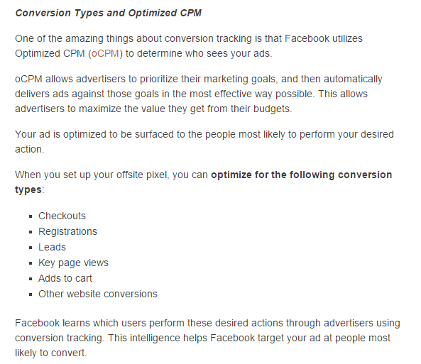
You can also use optimized CPM to target your ads to the right audience, so that you don’t waste your clicks or your money. Optimized CPM (oCPM) is an integral aspect of conversion tracking best practices:
Here are the simple steps to set up a Facebook conversion pixel:
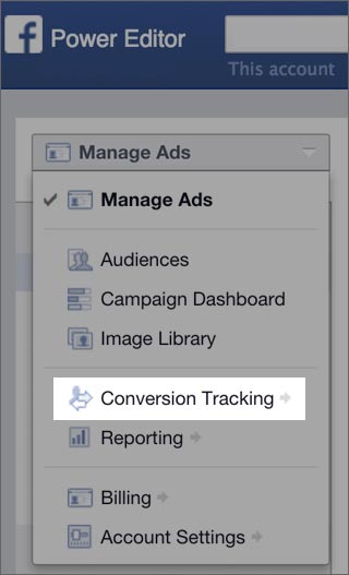
Step #1: On your Facebook Ads manager, click the Conversion Tracking tab on the left side.
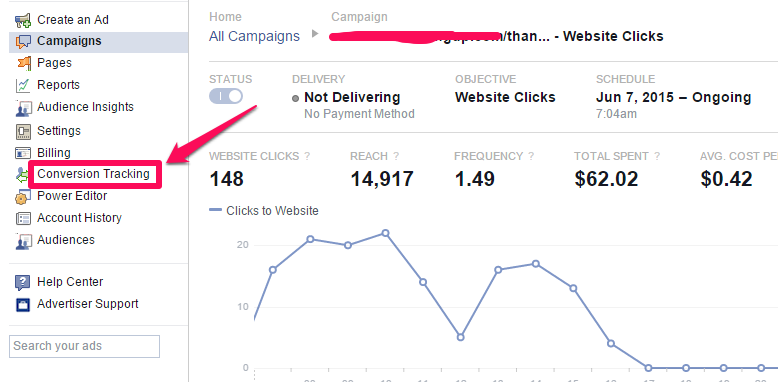
Step #2: From the drop-down menu, give your conversion pixel a name that’s easy to remember. Then, select a category that best describes the type of conversion rates you want to see.
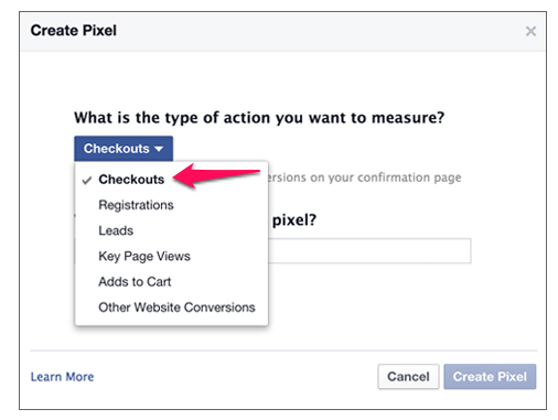
Step #3: Click Create Pixel.
Step #4: Copy the code that appears.
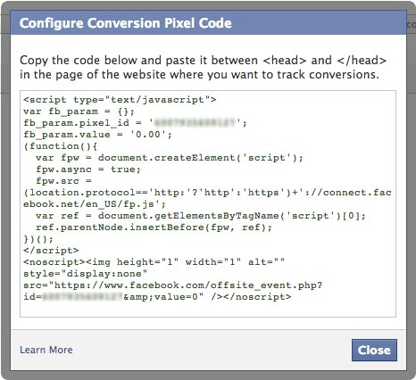
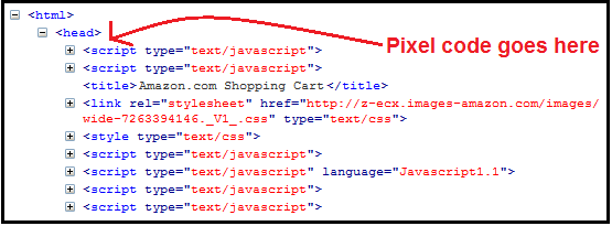
Then paste it within the opening and closing <head> tags of your web page:
You could also use the Power Editor to create a conversion pixel that will help you track conversion rates on your Facebook ad clicks. Follow these steps:
Step #1: Go to Power Editor.
Step #2: Click the Manage Ads drop-down, in the top-left corner and select Conversion Tracking.
Step #3: Click Create Pixel.
Step #4: Select a category from the drop-down menu and give your conversion pixel a name.
Step #5: Click Create Pixel.
Step #6: Copy the code that appears and add it to your web page, as above.
Got it all setup? Good!
One word of caution, though.
Conversions can be confusing. Here’s a common scenario that plays out as an example.
You setup conversion tracking and early data starts rolling in. So far so good!
Then you start reading some blog posts about how to improve that conversion rate. Maybe you start by reducing form fields on the landing page in order to drive conversions.
And they immediately shoot up at least 11%. Awesome! All it took was a few minutes of work.
But here’s the thing.
That conversion rate is lying to you. Sure, that little tweak just brought in a bunch of new leads or subscribers. However, that doesn’t mean they’re going to pay you anything. And your leads-to-sales conversions might have just gotten worse.
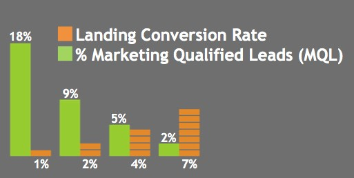
Larry Kim and WordStream found this problem in real life after analyzing conversions for over 100,000 companies.
Specifically, their data showed that a “CRO increase in quantity typically lowers quality.” Crazy, right?!
Their data showed that conversion rates can backfire when you least expect it. Those tweaks and changes you made to bring in more people only ended up resulting in more unqualified leads. So your ultimate conversion rate to sales dropped like a rock.
The point?
Be careful. Tracking conversions. Optimize in order to improve results.
But be careful not to over-prioritize the wrong metrics (like leads) at the expense of letting in unqualified people who might ruin the metrics that matter (like sales).
2). Craft a powerful Facebook ad design: Is it the job of the landing page or the Facebook ad to convert clicks into leads? Well, I think they both play a vital role.
When you’re creating an ad design, consider the experience of the user. Here’s a recent comment from Filip Galetic:
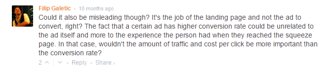
What the person making the comment needs to understand is that none of these elements (landing page, cost per click, click-through rate, amount of traffic, conversion and ad) will function independent of the other. They should all work together to generate the best lead gen results.
Throwing money at Facebook to drive visitors to your landing page will only work if you’re smart. I know a lot of people who have lost money running Facebook ads in everyone’s news feed. Yet others, such as Ryan Deiss and Jon Loomer, are seeing great results from Facebook advertising.
When writing your Facebook ads, be clear and concise about your offer. You won’t come off as being too promotional in news feed social network environments, if your ad itself delivers value. Save fancy introductions for later.
This means that if your brand is not yet known by your target audience, you should not use it in your ad copy. Amazon, Ebay, Seth Godin and Guy Kawasaki can use their brand names, because you and I (their target audience) are familiar with those names.
When writing your Facebook ads, make sure that you include the four elements below:
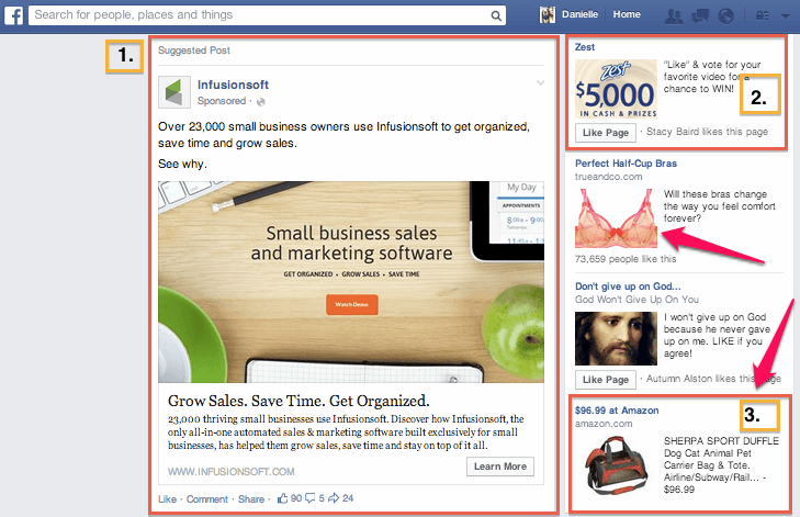
i). Visual: Visual information is valuable in the Facebook algorithm. In the ever-evolving News Feed, visual information will engage your target audience’s news feed more than straight text.
But, you also have to know the difference in picture quality and composition.
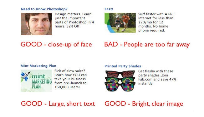
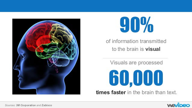
Since the brain processes visuals 60,000 times faster than plain text, include clear, professional and relevant visuals (e.g., image of objects, humans) to entice your audience.
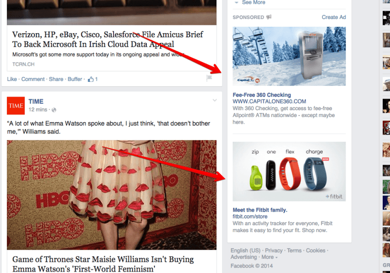
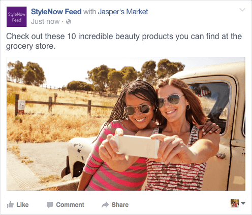
Here are great examples of clear & relevant visuals used in different Facebook ads:
Since your Facebook ad is going to appear on the right side of a user’s homepage, make sure that your images and photos are attractive, easily understood at first sight and aligned with the ad copy. See examples below:
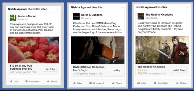
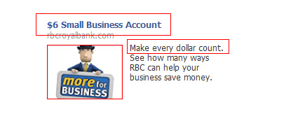
ii). Relevant ad: Your ad headline, visuals, ad copy and call-to-action must all be relevant. Depending on your settings, you’ll be spending money when someone views or clicks your ad. Make each view count in the click-through rate.
An example of a relevant Facebook ad is below:
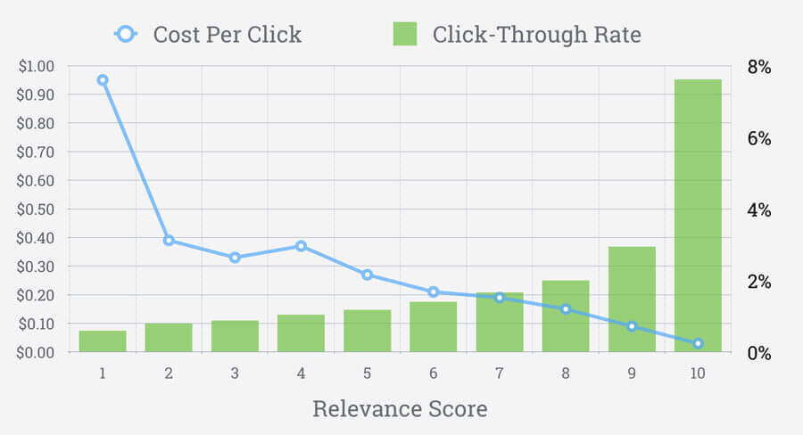
Facebook recently launched a feature that’s similar to Ad Rank in Google AdWords. This Facebook feature will give you a relevance score, after evaluating your ad.
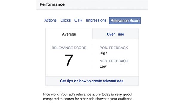
Work to increase your Facebook ad relevance score. Make your headline, ad text, ad image, copy and destination page relevant and appealing to your audience for lead gen.
If you can do that, Facebook will give your ads higher priority, which ultimately means more highly-targeted users being sent to your landing page increasing the chance of website conversion.
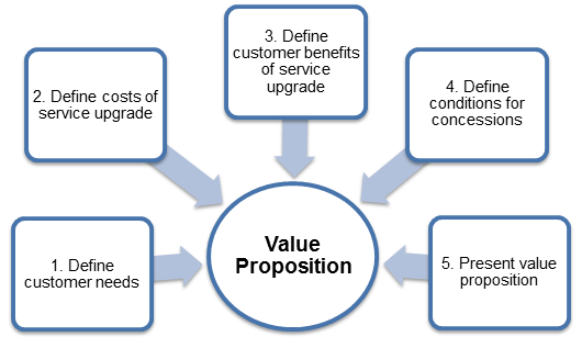
iii). Value proposition: Make a promise of value in your ad. The value proposition will set your product or offer apart from the competition. This chart explains it better:
If you claim that your latest book is useful, not many people will simply give you the benefit of the doubt on that point. But, if you give away a few chapters for free, it’s easier for people to draw their own conclusions and then offer you the social proof to increase the click-through rate.
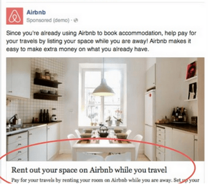
In the same vein, offering a 30% discount on your meal plans, if you’re a fitness trainer, will quickly boost your credibility and change how people perceive your ad. Here’s a powerful value proposition from a recent AirBnB Facebook ad.
iv). A clear call-to-action: There is no shortcut to getting people to act – you have to include a call-to-action.
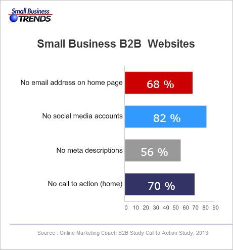
Unfortunately, most marketers aren’t doing it. According to SmallBizTrends, 70% of small business B2B sites don’t have a CTA.
You need a call-to-action button, on both your ad and your landing page. Without it, your best headlines, professionally-looking and relevant images and compelling ad copy will be wasted.
Yet, many Facebook advertisers totally ignore that ad CTA.
Here’s a Facebook video ad with a strong call-to-action:
Whether you’re running a video ad or photo ad, what matters is that you persuade users to click and visit your landing page. From there, you can follow up with the leads who indicated interest in your ad and persuade them to buy.
Step #5: Low-Friction Conversions
Improving your conversions is the ultimate goal of every PPC ad campaign. It’s little wonder that 85% of search marketing experts will pay more attention to conversion rate optimization (CRO) this year.
Many people are using Facebook advertising the wrong way. If you haven’t created a way to capture and nurture your audience, you’ll waste a lot of money.
Low-friction conversions are the best approach, when running a Facebook ad campaign. Smart Facebook PPC advertisers don’t come to Facebook to make sales. Instead, they offer a high-quality lead magnet to their users, in order to get them to subscribe to an email list.
From there, it’s a lot easier to offer great value, eliminate push back and give users exactly what they’re asking for: education.
Of course, if you’re an ecommerce store owner, you could simply send people to your product pages and convert them to sales there.
But, for information marketers, business consultants, freelancers and others who aren’t selling a physical product, you’ve got to get people onto your email list, first. That’s why autoresponders exist.
Your landing page visitor didn’t come to buy a product, but to learn about you. What matters is the environment that you’ll create for them. Will that environment inspire them to buy from you, or repel them from your offer, due to excessive pressure or greed?
Your Facebook ads will yield the best results, if you set up a conversion funnel, then create useful content that your leads will benefit from. Then, nurture your leads on a regular basis, before asking for the sale.
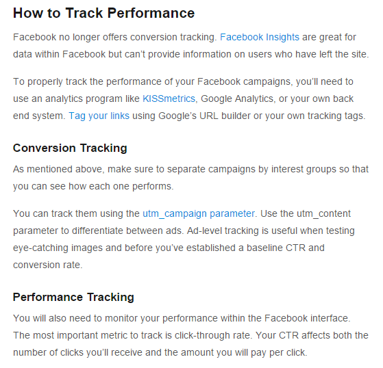
Remember, you need to continually test your performance to determine what’s working for you and what’s not. The Facebook ad terrain is always changing and you’ve got to adapt to it.
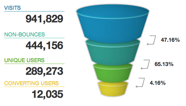
Here’s an excerpt from KISSmetrics on testing and tracking your metrics:
Step #6: Constantly Monitor, Tweak, and Refine Campaigns
Facebook advertising isn’t hard per se.
But that doesn’t mean it’s easy, either.
It takes a lot of hard work (as you’ve already seen). And there’s a lot of moving pieces to organize in order to transform complete strangers into loyal customers.
So… where do you start? We’ve covered a lot of the ‘tactical’ stuff already. Let’s take a look at the ‘big picture’ now to make sure you’ve got all the boxes ticked before spending a single dollar.
For example, each Facebook ad campaign you run should have a singular purpose. That means it’s either going to bring in brand new visitors, nurture those people you’ve already made contact with, or convert them when they’re ready and willing.
That starts by making sure you’re using the proper audience targeting (you know, that stuff we discussed ALL the way at the beginning of this guide).
For example, that should look something like:
- Awareness: Brand new people you’ve reached through interest-based targeting. You can also use interest intersections and exclusions in order to further refine that audience.
- Consideration: Now you can target previous website visitors or people who’ve engaged with your brand on Facebook (e.g. liking one of your posts) in order to bring them back and show them lead magnet offers.
- Conversions: Custom audiences of people who’ve visited your website or already downloaded a lead magnet previously. If you’ve got a high priced product or service, start with a tripwire in order to give them a low-priced alternative with little-to-no risk.
These Facebook campaigns don’t have to exist on their own, however.
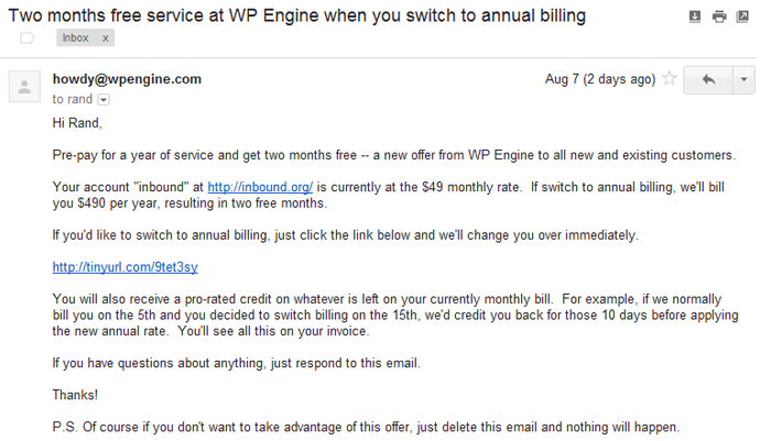
For example, remember WPEngine earlier? After someone downloaded their lead magnet, they received automated emails afterwards. Combining your ads with marketing automation techniques like this is a powerful way to follow up in multiple channels until someone takes the action you’re looking for.
Customers today don’t buy in the first visit. Instead, they will typically interact with you in multiple channels before they buy. That’s why it takes people a dozen ‘touches’ in some cases before they become a lead or purchase.
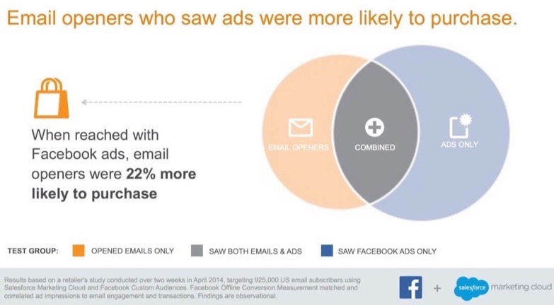
There’s also been some compelling evidence from Facebook themselves about combining ads with email.
Facebook teamed with up Salesforce in order to run a test. They took a list of 565,000 subscribers and split them into the following groups:
- Email-only
- Ad-only
- Email and ads
The results should be obvious.
The last group that saw both ads and emails were 22% more likely to purchase.
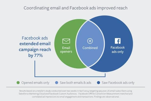
They also reported that you can “extend email campaign reach by 77%” just by linking them with ads like this.
The results impressed Blake Chandlee, Facebook’s VP of Global Partnerships:
“The combination of CRM (customer relationship management) data and Facebook targeting truly powers targeted reach at scale to create effective marketing campaigns. We expect to see great results as marketers continue to pair Facebook custom audiences with both email marketing and direct-mail campaigns.”
Beyond the standard ad types we’ve already covered (like basic photo or video ads), Facebook has introduced a few new concepts that might be worth a try, too.
For example, their Canvas ads are built on their Instant Articles infrastructure. So they delivery beautiful, interactive ads in fractions of a second. These are the perfect alternative if you’re trying to reach people on mobile devices, but your own website’s mobile experience isn’t up to par.
When these first came out, Facebook told TechCrunch that, “53% of Canvas users view at least half of it, while the average time on site is 31 seconds.”
Branded Content is another ad type alternative that lets you work directly with influencers.
Here’s why this new development is so important.
Incredibly, the vast majority of consumers today (83%) trust recommendations from other people instead of brands themselves according to Nielsen.
If that wasn’t bad enough, most people suffer from ‘banner blindness’ too (which refers to how people ignore anything that remotely resembles a display ad). And then you have the fact that more people than ever before are installing ad blocking technology.
All of that is bad news for advertisers.
But Facebook’s branded content offers you a solution. You’re able to partner with influencers in order to have them promote sponsored message on your behalf.
So that when the post goes live, it resembles a typical post that people have become accustomed to seeing already.
Typically, tracking the ROI on your influencer marketing spend is tough to identify. But Facebook’s platform makes that easy because they treat it like a standard ad unit. So you’re able to look back at the results generated from each sponsored message through their Branded Content ad unit.
All of these tips so far have been designed to deliver a steady stream of traffic to your site.
Once you’ve got that ‘pipeline’ up-and-running, we should turn our attention to message match.
Picture this:
You’re browsing around Facebook, commenting on friend’s posts, when something out of the corner of your eye catches your attention.
You click on it and are immediately met with a landing page that features the some of the same exact elements (like the headline, image, and value proposition).
That’s message match. It’s making sure that the same thing you used to get someone’s attention (and click) is repeated seamlessly on the page they’re taken to. That way, they’re not distracted or feel like their expectations were broken at the last second (like a classic bait and switch).
There’s more good news, though, too.
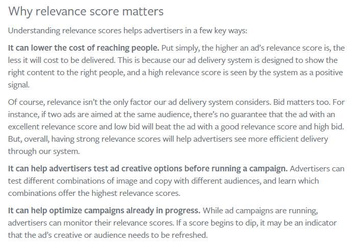
Not only does message match help customers know they’re in the right place. But it also perfectly aligns with Facebook’s own Relevance score.
That means the better relevance score you have (by better aligning your own message match with the audience you’re targeting), the better performance you’ll see and less costs you’ll pay.
Let’s get more specific now that we’ve got some of the other big picture stuff out of the way.
Hootsuite brings us a perfect example of what your Facebook ad creative should look like:
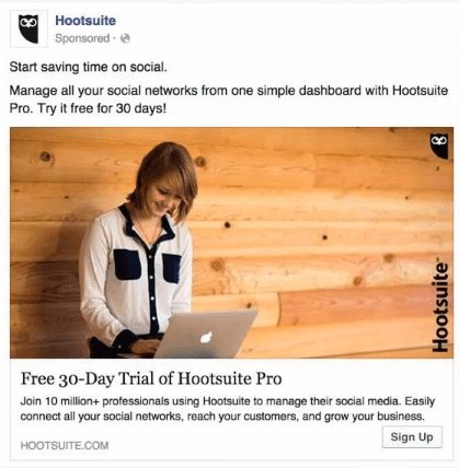
Here’s why this one rocks:
- The messaging is simple and specific at the same time (“free 30-day trial”)
- The image doesn’t have any words, but instead immediately conveys the emotion that you should have while using their product (i.e. fun, enjoyable, etc.)
- They manage to incorporate social proof into the ad copy (e.g. 10 million+ professionals) that immediately adds credibility to their claims.
- And last but not least, the CTA is perfect (“Sign Up”)
See? Advertising doesn’t have to be hard. That Hootsuite ad is pretty straightforward. But it nails the essential ingredients perfectly. And that’s why it works.
Step #7. Not Working? Check for these Common Problems
Successful ad campaigns can start off great.
Only for results to fall off a cliff after a few weeks. What’s happening?
The first thing to look for is ad fatigue.
Showing the same exact ad to the same exact audience for too long can result in them ‘tuning you out’ after awhile.
Facebook even recommends you switch up ad creative every week or two!
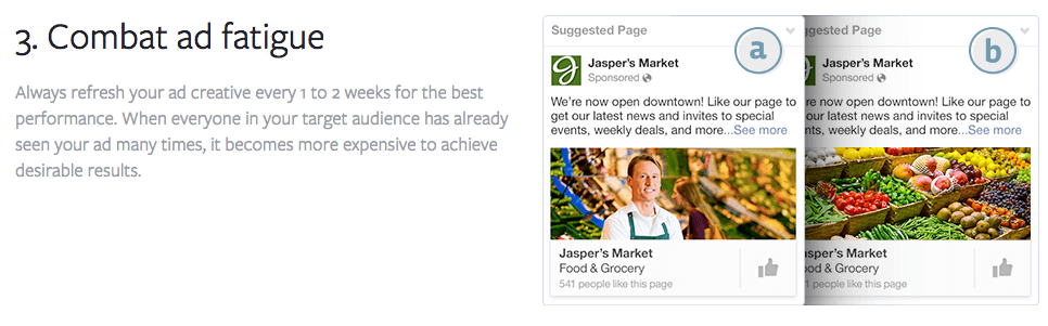
The good news is that you don’t have to go crazy with tweaks or changes.
We’re talking simple, easy changes.
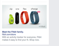
For example, you can take the same basic ad template and merely switch up the images you’re using like Shopify does:
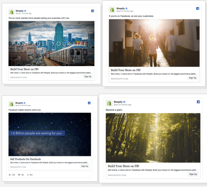
That’s easy enough, right? In this case, all they’re doing is finding a new stock image to slide in.
Another perfect example is this one that simply changes the background image from white to gray.
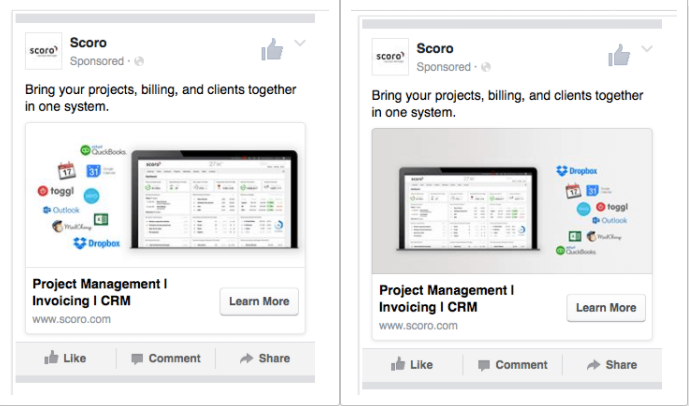
(You’ll also notice that the graphic is flipped, so that the logos appear on the opposite side.)
Ad fatigue is a real problem. But fortunately, it’s pretty easy to fix (or avoid by continually testing new subtle ad tweaks).
The next issue to look for is a problem with your frequency. This is closely related to the last problem, where people are basically seeing the same offer too often.
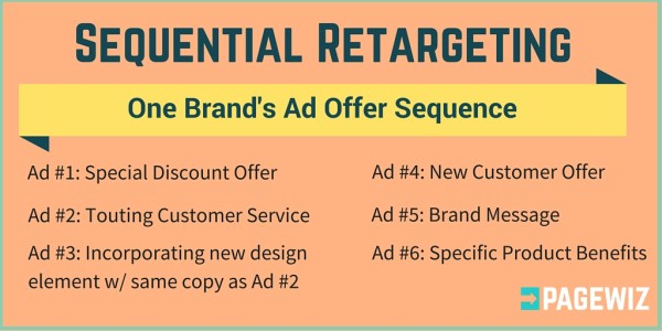
In this case, try sequential retargeting. This is where you try a few offers, one after the other, in order to eventually appeal to everyone.
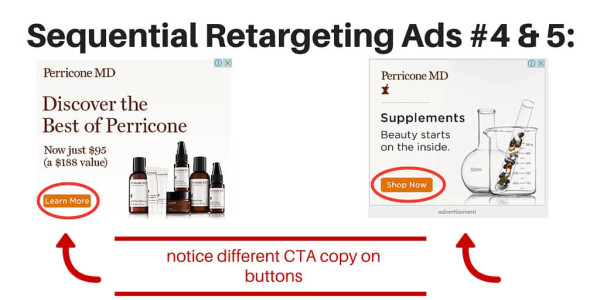
For example, start things off with a nice and easy discount. They you can even start cycling through all of the different lead magnets we discussed earlier (like an eBook, then checklist, tool, email course, etc.).
Again, your goal is to promote different benefits of your business to hopefully catch their attention.
You can (and should) layer a time component onto this, too.
For example, dayparting can help you identify what days and times work best. So you can see if you’re overpaying during certain hours of the day (or over the weekend for example) when not enough people are converting.
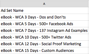
AdEspresso used a retargeting structure like this when testing different lead magnets. For example, they switched up the offer based on a specific number of days after being added to a specific list.
So they saw one lead magnet the first three days after joining. But then that offer changed for the next few days, and so on.
Why go to all these lengths?
Two reasons.
First, because you have no idea what’s going to work until you test it. So you need to cycle through a few ideas in order to start seeing what works (from what doesn’t).
The second reason is because you’re bound to have a big audience of potential customers. Remember all of that interest-targeting at the beginning?
You can narrow this down by splitting people into groups of different customer segments. And when you do this, you’re bound to have these people respond to different offers or incentives.
One group might like an eBook rather than a checklist. They wanted detailed information on a specific subject.
Or another might be interested in hearing about Twitter ads instead of Facebook ones.
Once again though, you’re not sure until you try and test it. That’s the only way to see what works and what doesn’t.
Or identify which audience is profitable. And which one isn’t.
Conclusion
If you create Facebook ads, you need to set up an ongoing system to review and analyze your ads. Then, you can effectively make tweaks to your campaign. This is how you pin down what works best for you.
But, if you abandon your ad and lose focus, you may end up driving the wrong people to your blog and waste your money in the process.
So, what’s the most important factor of every Facebook ad?
As I said earlier, the landing page offer, the landing page itself, the ad copy, the image, the call-to-action – they’re all vital. They all work together to help you reach your target audience.
What other strategies do you use, when running a Facebook ad campaign to improve your conversions?
Comments (165)