
Your brand’s message isn’t limited to the word choices that you make. The environment under which you present your message is equally (perhaps even more) important. Particularly in encouraging user interaction and media engagement.
Subtle aspects, such as color, line, shape and font, matter. I’ve already shared details about typography, color and a few design mistakes that ruin your SEO. But, most people believe that design is a creative talent. And, they think that you’re either born with it or that you can’t develop a knack for it.
I beg to differ…
People respond to visual stimuli subconsciously. For starters, you need to ditch the notion that your website has to be elegant. Beautiful websites that don’t function well have high bounce rates. And, they don’t convert well.
You just need a functional website that’s easy to use and loads fast. But, learning a few psychology principles will help you to improve the usability of your website and thereby increase the user engagement that you receive, including social media engagement.
So, in this article, I’ve compiled five psychology-based design tips for improving user engagement. As always, with theory, I’ve included practical examples and actionable strategies that you can implement in your design straightaway.
Let’s get started with the first tip.
1. A recap of how colors and fonts evoke emotion
I’ve written in detail on both of these subjects. But, let’s revisit the key pointers.
First, let’s talk about color.
Color has a key influence in evoking emotion. If you’re a regular visitor to my website, Quick Sprout, then you’ll associate green with my brand. All colored sections are predominantly green.
Similarly, Coca-Cola is associated with the red color that matches their bold and energetic brand image.
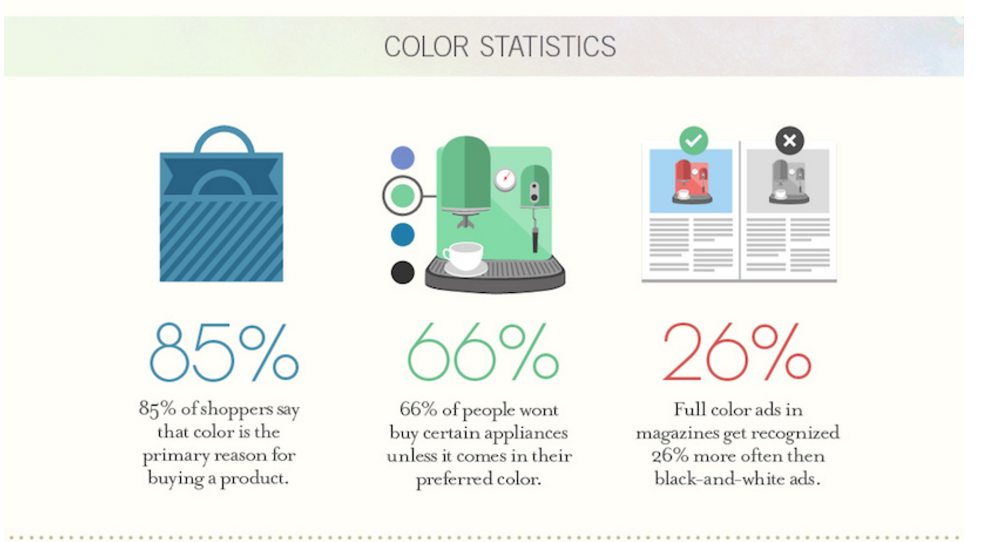
Color has been found to increase brand recognition, by up to 80%. Here are some more surprising stats about how colors affect conversions.
Now, the preference of colors might differ by the gender and shopping habits of the consumer. Even the culture and nationality of your prospects can affect color preference. For example, in the US, most people associate white with marriage. But, in India, red is the marriage color.
An important point to remember is that no single color will convert the best, across all marketing campaigns.
So, don’t get all cozy when you read that changing a CTA button from red to green increased the CTR by 21%. You may or may not get similar results. No single universal best color will work for all websites. A/B testing is your best friend.
Yet, at the same time:
Choosing a color palette that matches your brand personality and that resonates with your target audience is important.
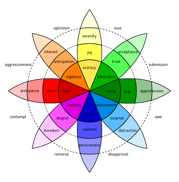
Here’s a color wheel, by Robert Plutchik, that show the emotions that various color shades evoke.
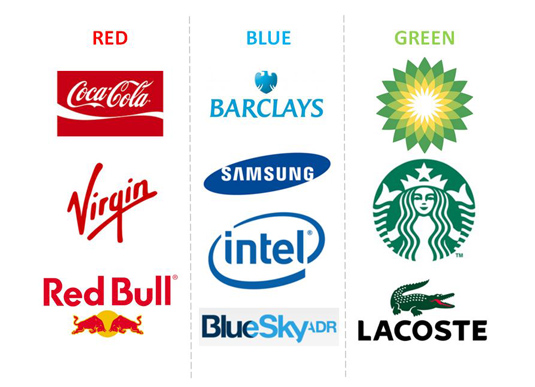
You’ll need to pick the colors for your logos carefully. Here’s an example of some brands that you might clearly recognize, due to their color choice.
Overall, the colors on your website should accentuate your brand’s values.
Most brands and bloggers go through a lot of design changes and rethink their colors. So, if you haven’t considered colors seriously, then now is the time. An excellent example of a blog that has drastically changed its colors and design is Leo Babauta’s Zenhabits.net.
Here’s how his website looked, back in 2009.
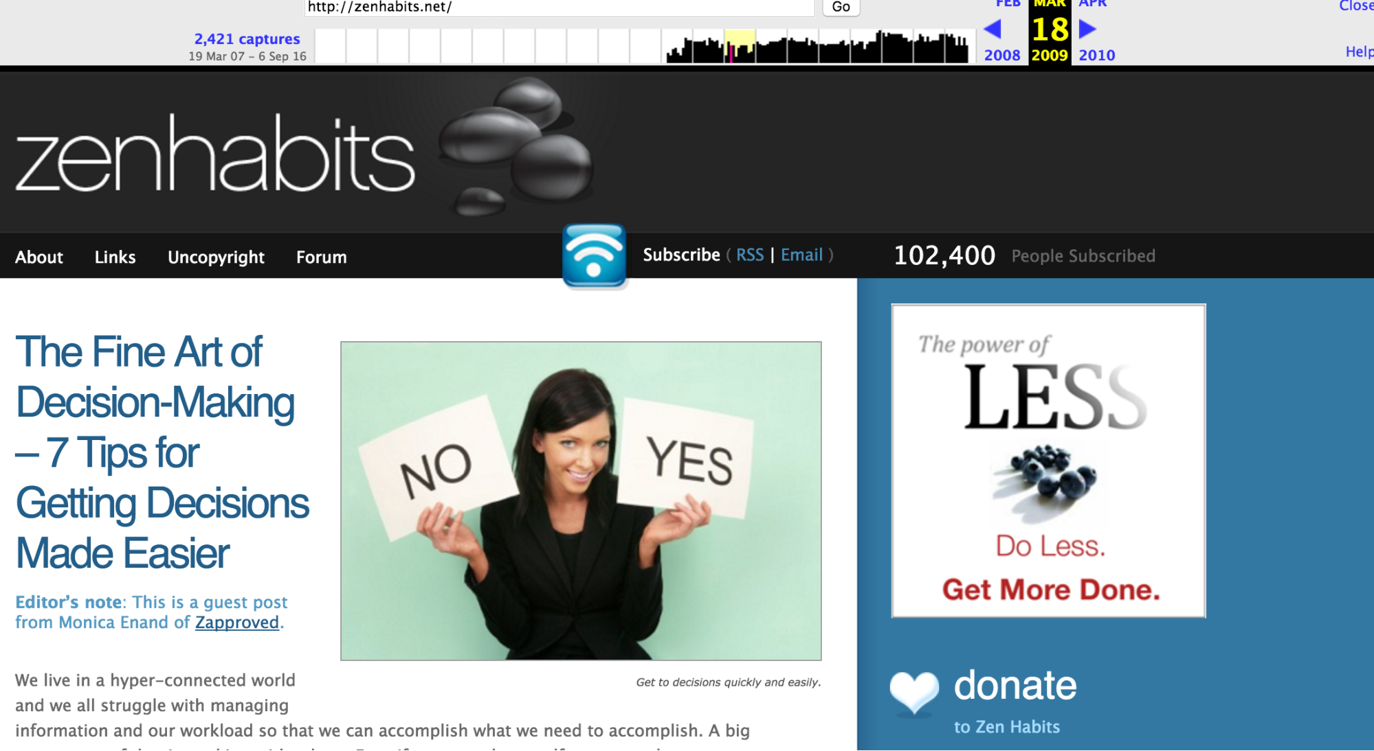
If you’ll head over to zenhabits.net now, you won’t find shiny colors and opt ins asking for your email. It’s plain, black and white, minimalist design is free of any distractions.
Leo has literally adopted Zen on his blog. And, he has found great success, as his blog now receives close to 20 million monthly visitors, proving the success of media engagement.
If you need help choosing a color scheme for your website, then you can refer to this article, written by me for Huffington Post.
Next, let’s talk about choosing fonts for your website.
Remember that it’s harder to read on a computer screen, as compared with print.
Clearly legible fonts aid the readability of content. And, they induce moods that people associate with your website forever. Choosing the right fonts will ensure that you evoke the right emotions in your target audience.
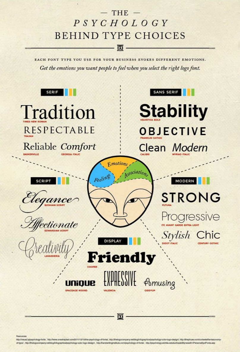
If you’re using a popular theme template on a CMS, like WordPress, then your website might appear similar to many others that use the same theme. Here, the right fonts can be your way to differentiate your site from others.
Start your font search by looking at hundreds of font combinations that Google has compiled here. You can also refer to this article, by Creative Bloq, for more tips on choosing a font.
2. Leverage the Gestalt principle of symmetry. Use asymmetry to draw attention
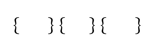
If you’re like most people, you don’t like disorder. So, you perceive all objects with a symmetry around their center.
For example, in the figure below, you’ll see three pairs of brackets and not six individual brackets.
So, how you can you leverage this principle in design?
Your target audience will quickly comprehend information, when you convey it in a symmetrical and orderly manner. On the other hand, when your composition provides a sense of imbalance, then the user might find it difficult to concentrate.
But, you can leverage asymmetry to draw attention towards important elements on your website – like the CTA buttons.
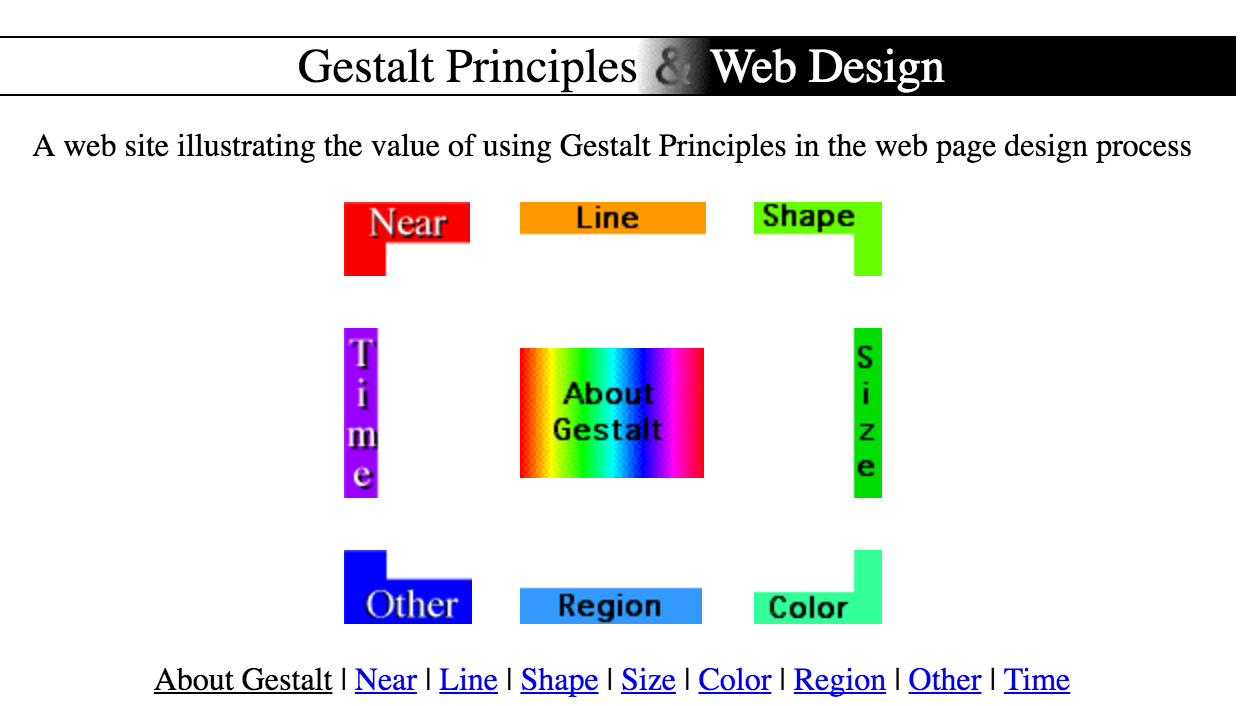
I’ve only shared one principle of the Gestalt psychology in this article. You can read the other principles on the Canva blog.
You can head over to this website, for a brief illustration of how to leverage Gestalt in your website design.
3. Evoke a visceral reaction
I didn’t share complete information, when I said that beautiful websites don’t get good conversions.
Occasionally, you can win over people and get them to love you by directly triggering their central nervous systems. People just feel that your website is great and can’t get enough of it.
What am I talking about?
Visceral reaction.
We all react, subconsciously, to certain things.
How we are subconsciously affected is relatively consistent, across genders and demographics, because these reactions are rooted in our old brain.
So, how can you evoke a visceral reaction on your website and make people want to experience it again?
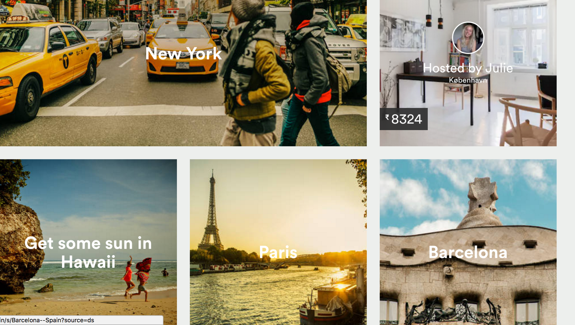
One simple way to evoke user engagement like this is by leveraging colorful pictures. AirBnB uses beautiful images to please its visitors and make a great first impression.
I’ve already discussed the importance of colors, fonts and shapes in your design. Choosing them carefully will help in gaining instant trust from your target audience which can also encourage social media engagement.
Similarly, you can also consider going deeper, to create memorable and fun experiences around the elements of your website. A great example is the Photojojo’s “Do not pull” button on their product pages. When pulled, a hand comes from the top and scrolls the page down to the page description area.
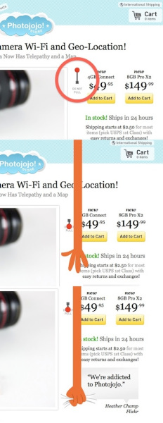
Not only is it a great incentive to read the product description, but it has also resulted in successful social media engagement. The experience has been shared widely on social networks and has been covered extensively by bloggers, because it provides user interaction worthy of media engagement.
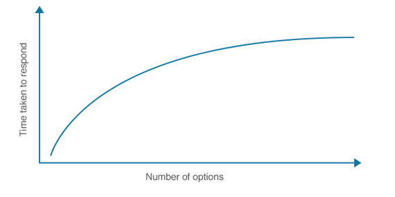
4. Apply Hick’s Law to your design
Psychologists William Edmund Hick and Ray Hyman conducted choice reaction experiments to assess cognitive information capacity. They found that increasing the number of choices increased the time that it took to make a decision logarithmically.
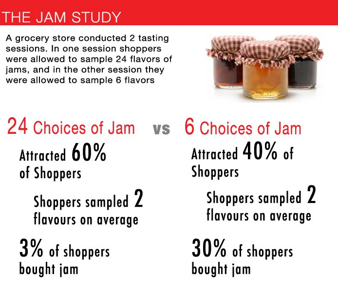
A common application of this law is the jam study that you might have read. When the number of choices at a grocery store was decreased by 18, the sales shot up from 3% to 30%.
So, how does this law apply to your website design?
Instead of providing 10 choices to your visitors and overwhelming them….
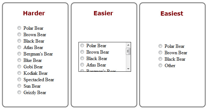
You need to cut down the options that you provide to the absolute, bare minimum.
A consumer is bombarded with a lot of information, every day. So, when they visit your website, value their time and present your most compelling and relevant offer to them.
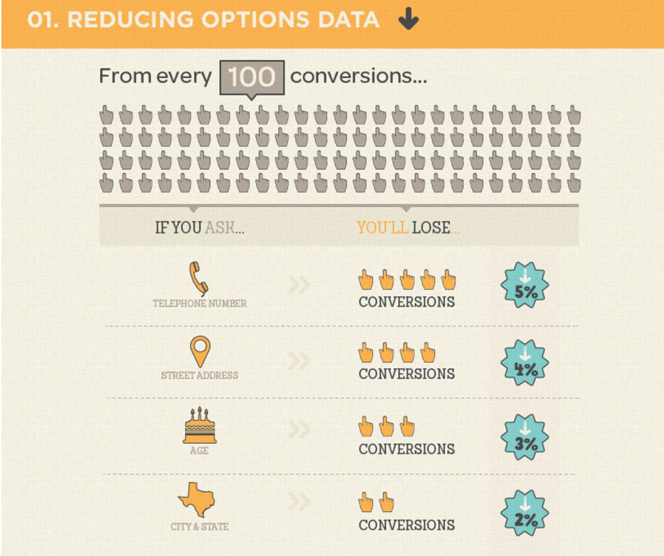
Here are the specific elements that you need to focus on:
1. Keep the number of form fields to a minimum. Here’s an estimate of the conversions that you might lose, upon increasing the number of form fields.
2. Every additional social network share button on your website contributes to increasing the loading time. So, find the social networks where your audience hangs out. Only show those sharing buttons on your blog, not 10 other options.
You can also use scroll maps to find the buttons that are getting clicked.
3. Remember the landing page principle of, “One Page. One Goal,” wherever CTA buttons are involved.
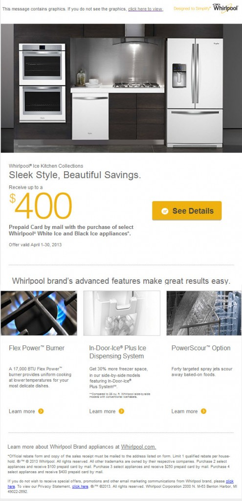
Whirlpool increased the CTR in their email campaign by 42%, after they eliminated 3 secondary CTA buttons and resorted to a single, focused CTA.
Here’s their original email with a lot of options.
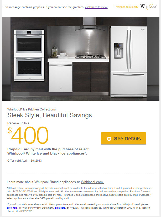
And, here’s the version that they tested, after eliminating all secondary CTAs.
4. The number of elements on the navigational bar of your website must only serve the most relevant items.
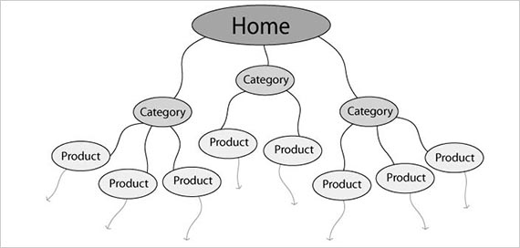
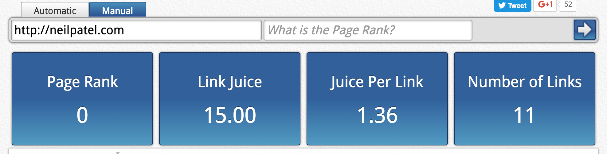
Your homepage, in particular, must not contain a lot of clickable items. My homepage has a focused CTA above-the-fold.
And, it has only 11 clickable links.
When I checked Amazon, they had 141 links.
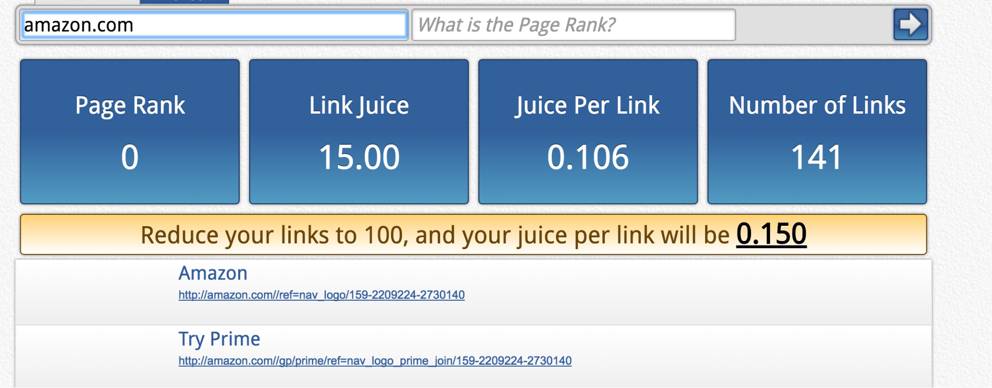
A concise navigational menu will also help your website’s SEO. A lesser number of links from the homepage will lead to its authority flowing well to the internal pages. More links mean a dilution of link juice.
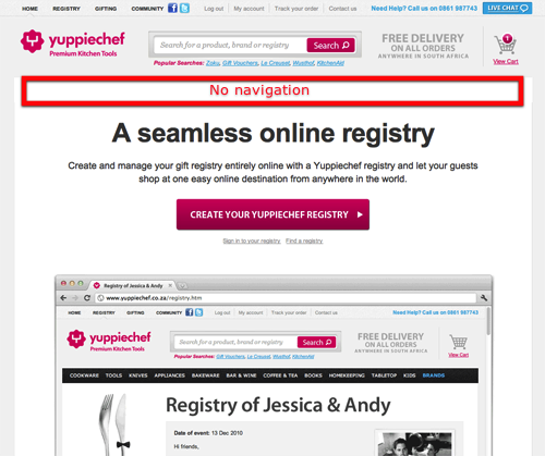
Pro Tip: How about experimenting with removing the navigational menu from the top of your homepage? You can directly focus the user attention on your primary CTA. Yuppiechef removed their navigation and managed to increase their conversions by 100%. Indeed, this is the foundation of the conversion-focused, upside-down homepage by Bryan Harris.
5. Put your users first and attempt to make a personal connection with them
Ultimately, it’s all about connecting with your audience emotionally. If you can’t communicate a relevant offer for the user at the moment when he visits your website….then you’ve failed.
Here are a couple of ways to ensure that you take care of user interaction.
1. Conduct interviews and user experience tests for qualitative insights
While data about your users from analytics is a good way to make decisions, it isn’t the best. Because it doesn’t tell you ‘the why.’
Yelp leveraged a series of five tests, to analyze user behavior and derived valuable insights on the specific elements of their website.
For example, the search bar was one of their major features and it was easy to use. They also found some elements, like the ‘Events’ tab, that weren’t particularly noticeable.
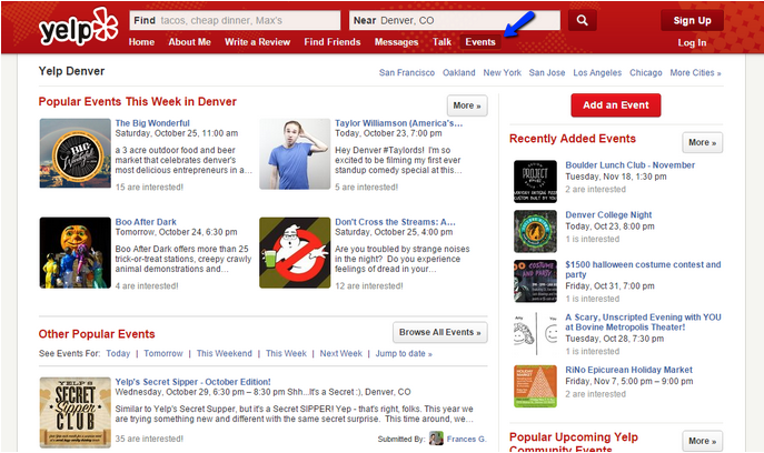
They share six other insights here. Overall, Yelp found that although their site was usable and effective for the visitors, there was room for improvement.
The guys at UXPin created personas, after they reviewed their usage data. They segmented users, based on their behavior (looking at events inside KISSMetrics). And, this is how they ensure that people feel like they are a part of the design and that it’s easy to use.
2. Storytelling
A classic and powerful technique for an emotional user engagement is by telling stories. Your design tells a story, but is it a compelling and memorable one?
I would recommend starting with my article on brand storytelling, to assess your visual story.
Don’t underestimate the power of storytelling. Ecommerce brand Raven + Lily was able to ramp up their sales by 150%, by incorporating product storytelling and doing a site redesign.
Conclusion
Your website design should reinforce your brand’s personality and the central message that you want to convey in a situation.
I’ve shared 5 tips to help you craft a compelling website design. They are all rooted in powerful psychology principles and will be effective in increasing engagement on your website.
If you’ve leveraged other psychology principles in your website design, then please share with me in the comments below.
Comments (65)