Long-form sales pages have recently become more popular. Marketers have realized that the short-and-easy capture forms may not be enough to encourage a conversion. Lots of content is powerful and compelling. Big landing pages can mean big conversions.
But how do you organize this content? For example, the sales page for Marketing Bullets has nearly 30,000 words. It’s like the War & Peace of landing pages. (All that copy boils down to a conversion action that costs $5,000.)
It’s not just lots of content that matters. It’s how the content is organized that truly matters.
This article explains how you can organize the content — an approach to structuring a long-form landing page that will deliver maximum conversions.
There are eleven basic elements of a long-form landing page. I will go through each one in order of its appearance on the page.
Note: As we discuss the structure of long-form landing pages, we’re going to start at top of the page and walk you through the different sections — eventually ending at the bottom of the page.
1. Headline
This is the most obvious feature of a long-form or short-form landing page. You need a headline, and it needs to come first.
The size of the headline is critical. It should be larger than any other font. But don’t assume that size and position are the only factors. The copy itself is equally, if not more, important.
Unbounce explains it this way:
Now, the reason this new version has so strongly outperformed the original likely has more to do with the words in the headline than the physical positioning of it. But the takeaway here is that if people are able to find and read your most important message (i.e., your headline), they are more likely to consume it and make decisions with it. If a visitor can’t find your key message, they can’t consume it … and conversion could be negatively impacted. Hence, test physical positioning.
Their example includes two landing pages with two different designs, including a headline rework.
This landing page was converting at 3%.
The redesigned landing page converted at 18.7%.
The headline leads the entire long-form page that follows. It’s your first and only chance to engage the user enough to stay on the page and be persuaded by the rest of the content that follows.
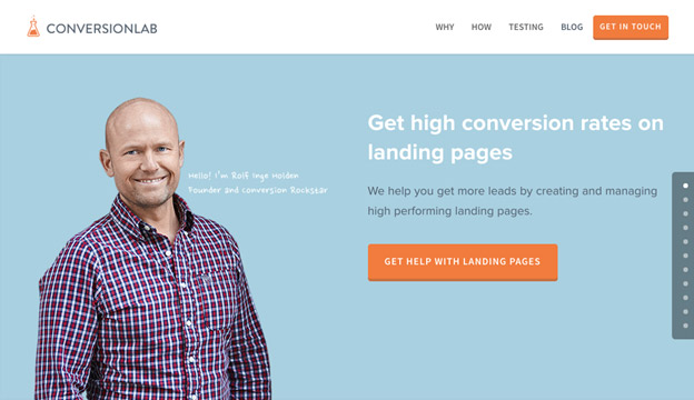
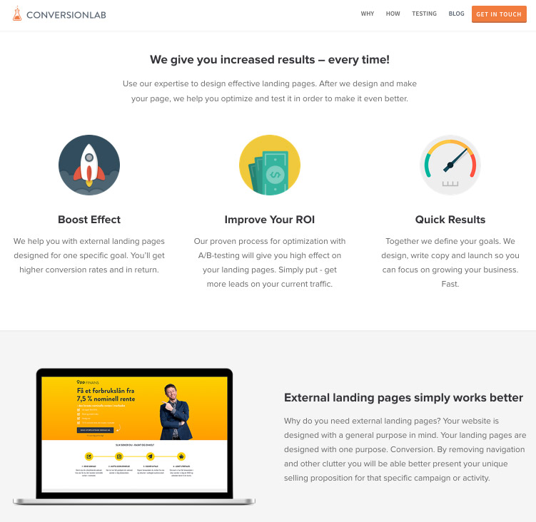
ConversionLab’s landing page has a headline surrounded by a lot of negative space. The headline and CTA are sufficient to convert some visitors, but other visitors may want to continue scrolling to see the entire long-form page.
2. Subheadline
Every great headline is followed by a subheadline. The subhead serves to clarify the attention-grabbing power of the headline and highlight its benefits.
The subheadline should always be positioned in close proximity to the main headline. They go together.
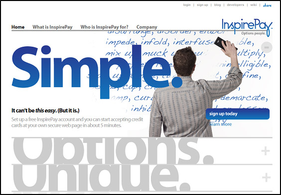
3. Image
Every long-form page most likely needs images, and these images should come above the fold. However, testing is required on your part. Test the absence of images as well as the placement. Images can affect where the visitor’s eyes go.
In the example above, the image serves to personalize the landing page and maintain user engagement. While most landing page advice proposes placement of the CTA on the left side of the page, this page defies the conventions and maintains excellent conversion rates.
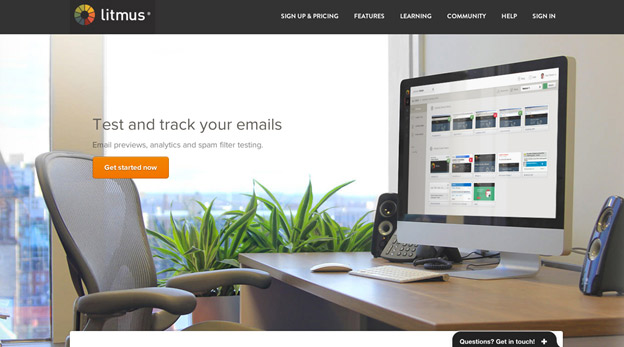
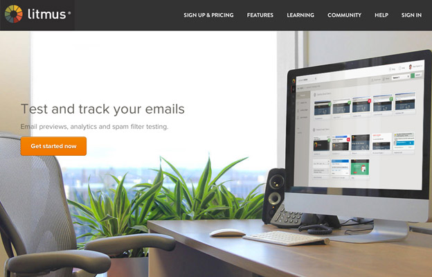
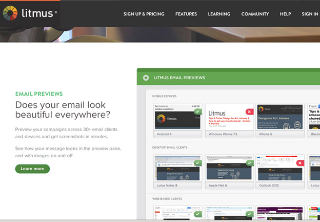
Many landing pages use full-screen images with great success. Litmus’s long-form landing page is a great example of this. In this case, image position is irrelevant since the image covers the entire screen.
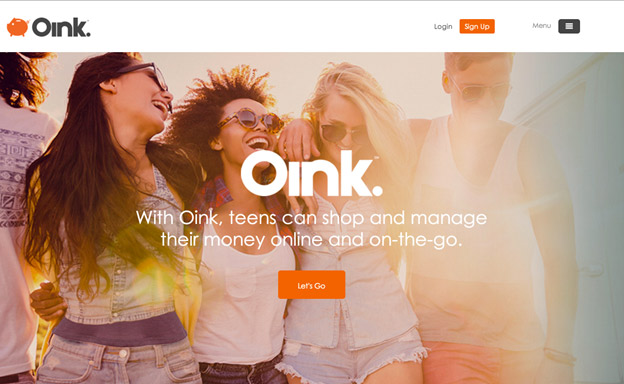
Oink does the same thing. The image dominates the screen, which effectively accomplishes its attention-grabbing intent.
4. Video (if applicable)
Video can be powerful. It can improve your conversion rate. But it should not be the only thing on a landing page.
Video-only landing pages are correlated with lower conversion rates. In order to improve your conversion rates, videos should supplement the copy.
The best place for videos is above the fold, where users can see the video and choose to play (unless the video is auto-play).
Dollar Shave Club uses an autoplay video on their landing page. Typically, the video should come after the headline, yet it should still be one of the first things a user sees on the page. But Dollar Shave Club keeps the headline in front of the video (which plays in the background) with great results.
5. Brief copy
So far, we’ve only discussed some of the short features, none of which makes a long-form page actually long.
This point is where you unleash your copy. But again, it’s not going to be anything lengthy at this point. Here, you want to simply explain what the product or service is, and why it’s awesome. Four sentences, maybe five or six. That’s it.
6. Call to action
Place your call to action as early on in the process as possible. There will be some users who will convert early. You need to accommodate those users by giving them the opportunity to convert.
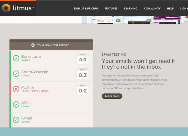
Litmus’s landing page did this effectively by giving users a chance to convert without scrolling.
7. Trust signals
So far, your long-form landing page has gained the user’s attention and curiosity. We’re still only just beginning the process of advancing toward a long-form page, but this buildup is important.
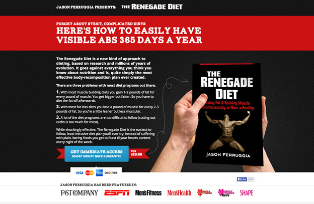
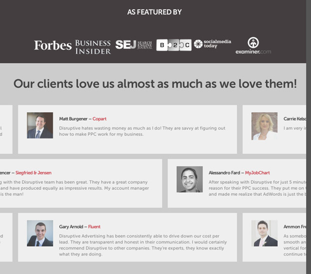
Now, it’s important to gain their trust. Trust signals come in a variety of ways, but one of the most compelling forms of trust is attestation from other sources.
The Renegade Diet displays a list of publications that it has been featured in:
Crazy Egg takes a similar approach to trust signals with a box that displays logos of some of Crazy Egg’s customers.
![]()
8. Explanation of the product or service
At this point, it’s time to start diving into the long of long-form. Much of your copy will be given over to explaining what the product or service is all about.
The users who are interested in your product will be eager to read this copy. Litmus’s long-form page begins with a discussion of how Litmus creates email that is optimized for any device or display.
Renegade’s diet book explains some of the most important findings that the book reveals.

This section can be as long as you want.
9. Benefits of the product or service
Customers aren’t just interested in what the product is. They also want to know how it’s going to help them.
It’s time to discuss the benefits and features of the product or service. Keep in mind that benefits and explanation need not be discrete sections. You can blend the two.
Notice how Litmus uses the following benefit explanation using negative reality: “Your emails won’t get read if they’re not in the inbox.”
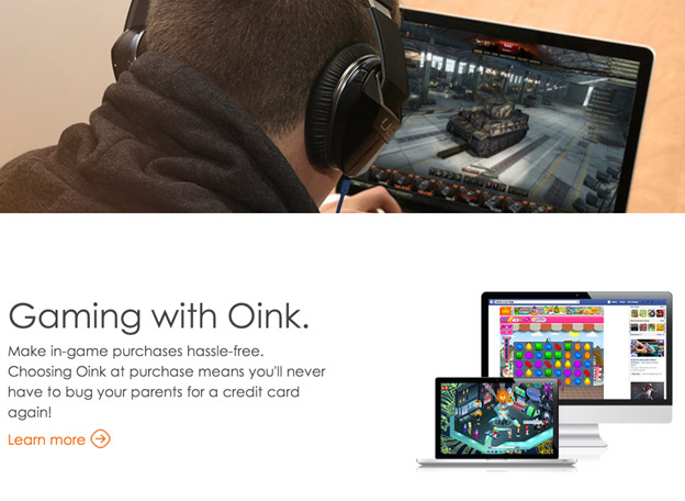
Oink, a money management service geared toward teens, points out the following benefit on their long-form landing page.
ConversionLab structures their benefits section with lots of white space and adds in images for extra visual appeal.
Like the explanation section, your benefits section can be as long as necessary.
10. Testimonials
The exact position of testimonials on the landing page is up for debate. I suggest putting them closer to the end because they are one of the most compelling persuasive features in conversion optimization.
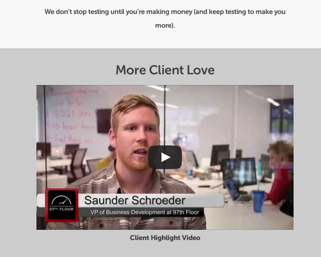
Disruptive Advertising has a spread of customer testimonials in two sections. Written testimonials are at the top, and video testimonials are near the bottom. Here are their written testimonials.
And here are the video testimonials:
And explanation of features and benefits always helps to persuade, but testimonials have the most profound impact upon a user.
It’s important to put the most compelling form of persuasion where it matters most — right at the last chance for a conversion.
11. More CTA
Always close with another call to action. Ideally, you will sprinkle calls to action throughout your page. But whatever you do, give the user a chance to convert.
12. Test and iterate
It’s important that once you’ve launched your landing page, you start testing it. The entire point of landing page optimization is to try to beat your original landing page with an improved variant. Start by hypothesizing what would help your visitors convert more. It may be a stronger headline, or maybe you have too many distracting images. Whatever your hypothesis is — create variants and test them!
Conclusion
The general structure of a long-form landing page looks like this:
- Headline
- Subheadline
- Image
- Video
- Brief copy
- Call to action
- Trust signals
- Explanation of the product or service
- Benefits of the product or service
- Testimonials
- More CTA
- Test and iterate
There’s room for flexibility and creativity, of course. Be aware that a truly successful long-form landing page is designed strategically. It’s powerful, not because it has lots of content, but because that of content serves a purpose.
What strategies do you have for structuring a long-form landing page?
Comments (7)