
Congratulations! If you’re considering working on conversion optimization for your website, then I’ll assume that you’ve built healthy traffic to your site. Most websites never get past a few hundred visitors a day.
But, after giving yourself a pat on the back, let’s get back to the task at hand. You’re worried that your website is underperforming. And, you want to fix the places where money is leaking. A/B testing is the first obvious step. It helped President Obama raise an additional $60 million.
Indeed, I’ve increased conversions by 250% for Timothy Sykes and help him make an additional $1.2 million every year.
The subject of A/B testing and conversion optimization has been extensively covered by various internet marketing blogs. I’ve written numerous posts related to these subjects myself.
This might put you in a bind, because you’ll find many posts sharing simple A/B tests that you can run. Like this one.
Where should you start? Since businesses glorify the minority of tests that went successful, but you don’t know the tests that might fail.
In this article, I want to take a different stance. I’ll show you a list of factors that probably won’t affect your conversions.
1. Placing all the important elements above-the-fold
I get it…
The immediately viewable space for a new visitor has to be engaging and persuasive.
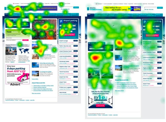
We focus on this, because the average human’s attention span is merely 8 seconds. And, users spend 80% of the time above-the-fold and only 20% below-the-fold.
But, these statistics must not encourage you to follow along the typical web design path:
- a headline with your value proposition,
- a supporting headline and nice background image,
- a form field(s) and a CTA button.
Indeed, this is the design that we follow at CrazyEgg.
Users are so used to such website layouts that they might subconsciously ignore your above-the-fold CTA. “Stuff everything important above the fold,” is such a repetitive and generalized advice, that it appears to always hold true.
Now, let’s evaluate the truth, by going to the root of the advice.
“Above-the-fold” was the mantra that originated in the print publication industry. When a newspaper is folded, the immediately visible space must capture the reader’s attention. So, publishers placed the most compelling pieces of news and images in this section to make more sales.
In the earlier day of the internet, this fold notion applied. Indeed, a 1994 study by Nielsen said that scrolling was a usability disaster for navigation pages. But their 1997 follow-up usability study found that web users are getting used to scrolling.
A major reason scrolling was a headache for users was that the act of scrolling was actually painful. You had to rely on keyboard shortcuts and, later, use the scroll wheel.
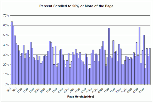
Fast-forward to today and scrolling has become second nature. An easy swipe with your fingertips will get you access to the information below-the-fold. Heat Mapping software, Clicktale, found that the length of the page has no influence on whether a user will scroll down.
Second, the fold position is no longer a simple vertical pixel (traditionally they were the 570 px, 590 px and 600 px lines). You can post content and market your website for a 1024×768 monitor resolution. But, your audience might access it from their tablets and Smartphones.
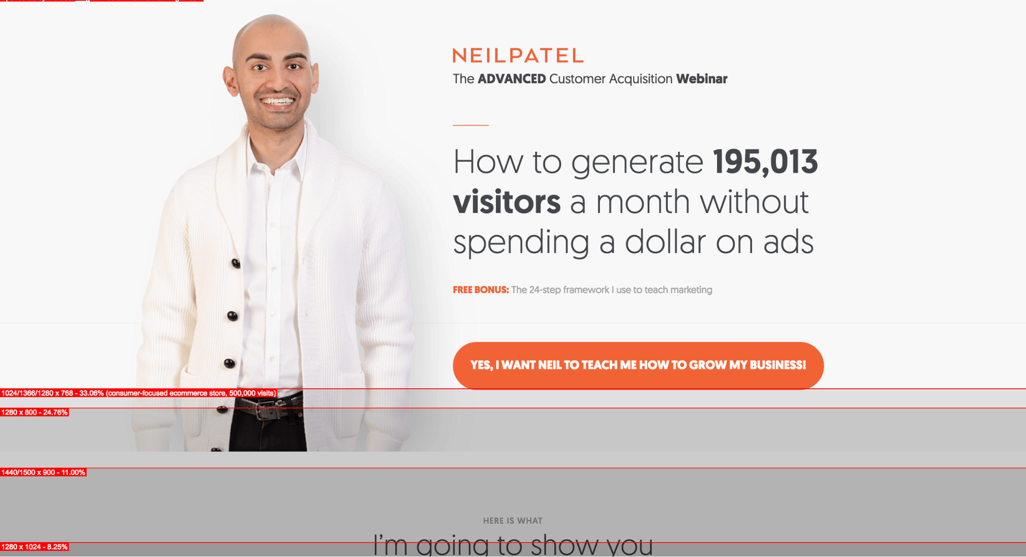
Here are the fold positions of my homepage, for a few common resolutions (as per the Whereisthefold tool).
So, when you talk about the fold:
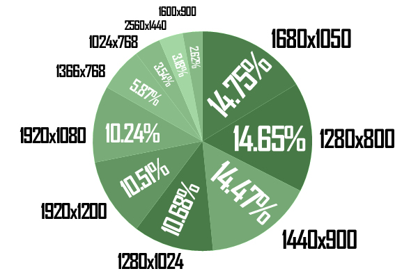
Do you mean the iPhone 6S in a vertical orientation? Or, are you talking about a 5.5 inch Android device in a horizontal orientation? The fold position will change for devices of different sizes and orientations. For example, here are the resolution statistics for the Webdesign.tutsplus site.
That’s why most websites now use a responsive design and a fluid layout – which means that their content will flow into screens of any size.
So, Neil, do you mean to say that the fold is dead?
Not so fast.
A 2015 study by Nielsen found that there’s an 84% difference between how people treat content above vs. below the fold. What’s visible to a user on the first visit influences the user’s behavior and will determine if the user will scroll (an extra action that you expect from the user).
Here are 3 actionable strategies to make the most of the fold:
1. Encourage visitors to scroll
Don’t cram too much info above-the-fold. In an eye tracking study, CXPartners found that less info above-the-fold actually encouraged user exploration below-the-fold.
Ideally, you shouldn’t need prominent directional cues to suggest that content is available below. Instead, the visitors should feel compelled and intrigued with your value proposition. The cues for encouraging scrolling could be based on your content, type of business and overall site design.
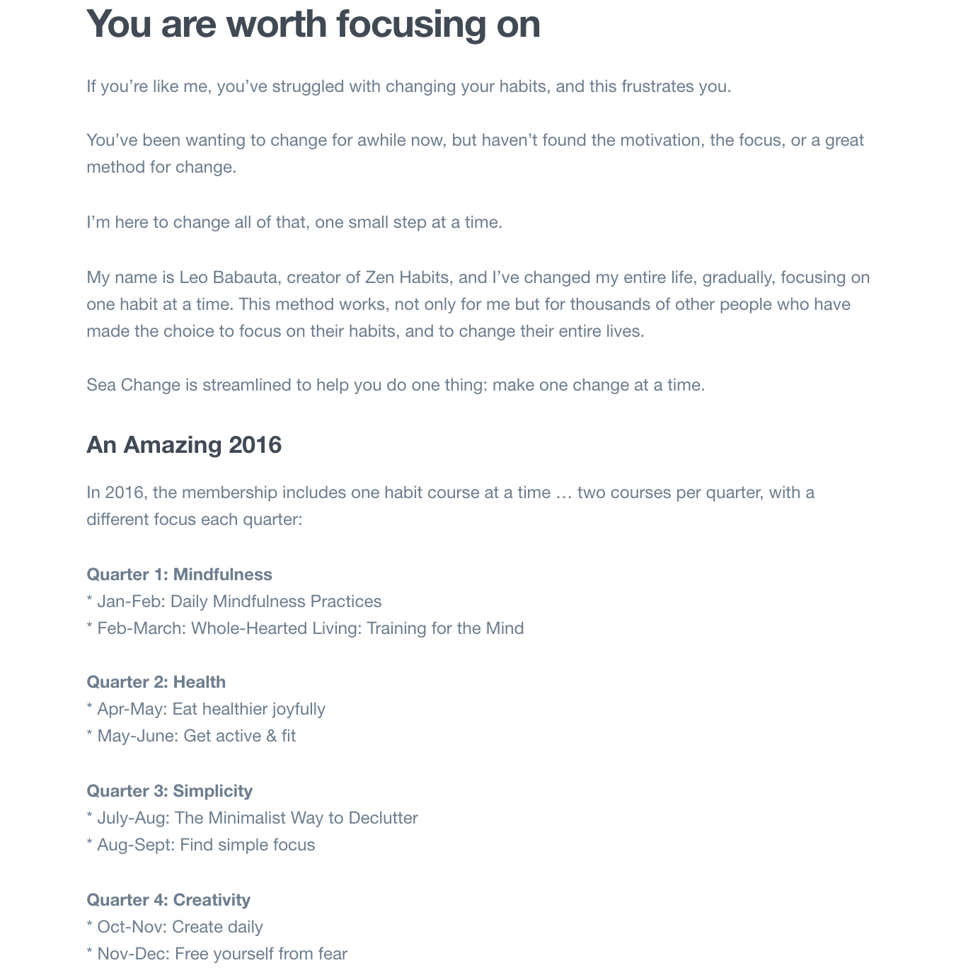
Look at the landing page of the Sea Change program, by blogger Leo from Zenhabits.net. It has a beautiful image that suits the context. The value proposition makes me curious to find out how the program can help me find a path.
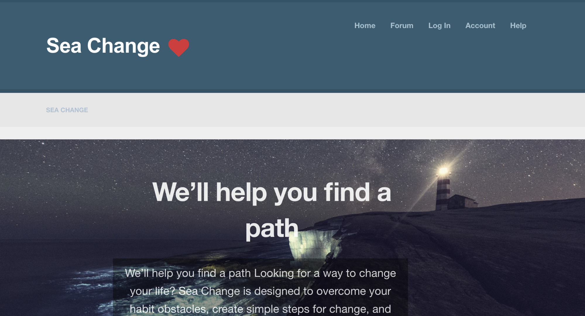
Then, Leo emphatically encourages the visitor to change. His voice is relatable and the membership plan clearly lays down the habit modules that you’ll get to work on.
Overall, the content and design encouraged me to continue scrolling. And, the buying offer was presented to me only after I was ready to make a decision.
2. Let the ASK be based on the complexity of your offering
If you’re a new business with a complex product, then placing the CTA above-the-fold is probably a bit pushy.
First-time visitors will probably need more details about your offer and more convincing before they give you their email address. Michael Aagaard moved the CTA of a long B2C landing page from above-the-fold to right at the bottom. And, it contributed to increasing the conversions by 304%.
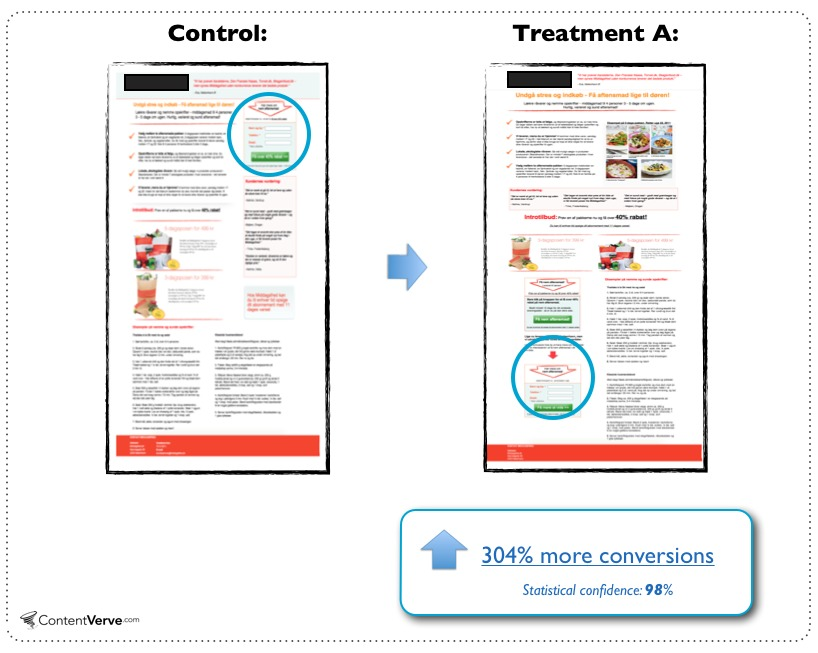
This case study should only encourage you to fearlessly consider testing a below-the-fold placement of your CTA. Within reason and for certain kinds of businesses, I’ve found that long-form copy can convert better than short form.
3. Ensure that content above-the-fold loads quickly
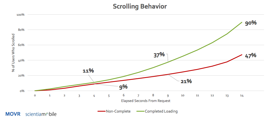
In a Q2, 2015 study by Scientiamobile, 50% of the users had moved down more than 250 pixels, if a page didn’t load within 9 seconds.
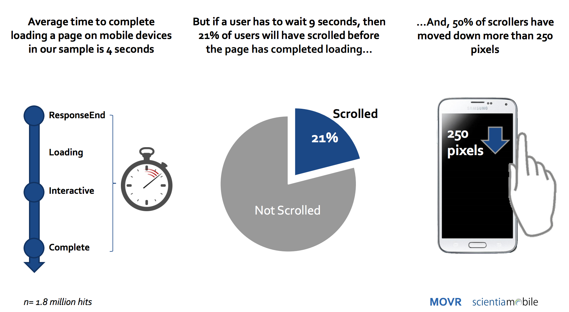
So, even if you’ve got a compelling story and elegant design to hook a first-time visitor, you’ll need a fast loading site. Otherwise, a visitor will scroll past them, even before they load.
The bottom line is that visitors are quick to act. Get on their good side, with a relevant and persuasive value proposition and they will click the CTA or continue engaging with your site. If you don’t convince them, then the visitors will bounce off.
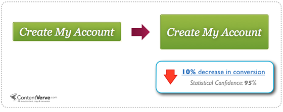
2. The color and size of your CTA buttons (in isolation)
Red is the ‘secret’ color that will guarantee an increase in your conversion rates. It evokes a feeling of urgency, excitement and passion. It guides the visitor to stop and consider your offer. So, make all of your CTA buttons red.
Right?
You’ll find many articles that spit out such generalized advice.
The truth is that there’s no consistent color that will apply across websites, industries and campaigns. I am sorry to break it to you, but you won’t find the “perfect” color for your audience by scouring through theoretical articles on the web.
Here are excerpts from one such article. Particularly, look at the highlighted text.
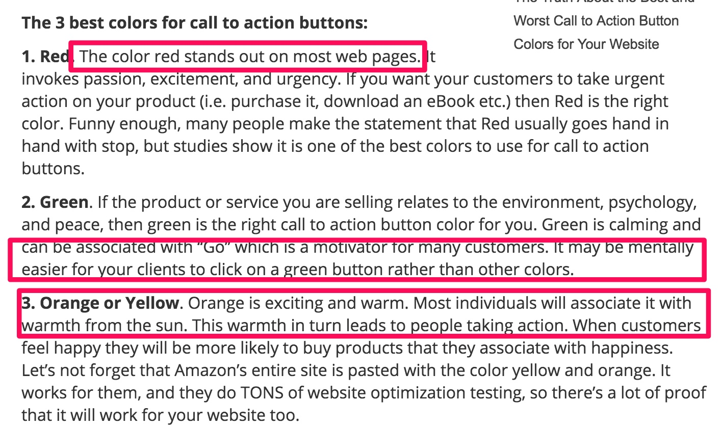
Ah! It hurts to read such advice.
Colors (or for that matter any page element) don’t work in isolation. They interact with your overall design and content to evoke feelings in the visitors. The only thing that we know about good visual hierarchy is that your CTA button must contrast with the surrounding elements and stand out on its own.
HubSpot shared their test results and they only contribute to the red vs. green color CTA debate. They found that a red color CTA outperformed the green button by 21%.
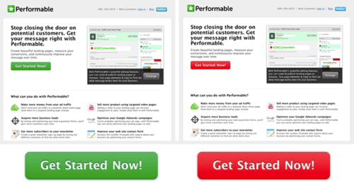
But, HubSpot carefully worded the results to be valid only “for the conditions in which they occurred: in this page design, on this site and with the audience that viewed it.”
Similarly, a large-sized CTA button is recommended, so that it sticks out as a clickable element. But, going overboard with your CTA size can also decrease your conversions. Michael Aagard shared a case study where a large CTA button on the payment page negatively affected conversions.
3. The number of elements in your form field and the number of steps in your checkout process
A general best practice that’s repeatedly shared in marketing circles is to, “keep the number of form fields to the minimum.” It makes sense, because more fields equates to more physical effort from the user.
At NeilPatel.com, I’ve run tests reducing the number of form fields from four to three. I removed the ‘revenue’ field altogether. And, it helped me raise my conversions by 26%.
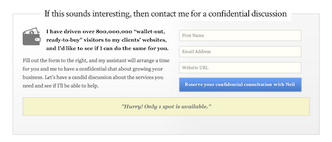
But guess what?
If you want to weed out non-serious visitors from your website, then more form fields might help.
Design Pickle offers a free custom design to businesses (without even asking for a credit card number). Here’s the Facebook ad that they’ve used for driving leads.
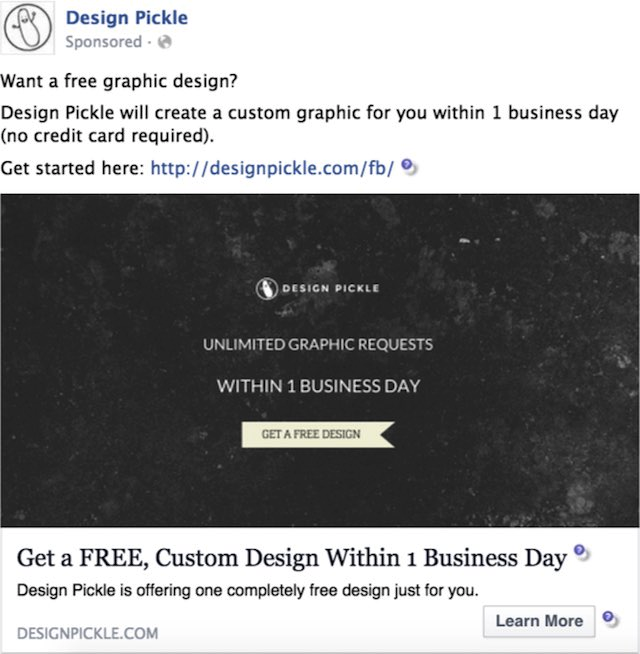
But, Design Pickle knew that there will be many people interested only in the “FREE” stuff and not in working with them long-term. So, to qualify the leads from the ad, here’s the long form that they requested the visitors complete.
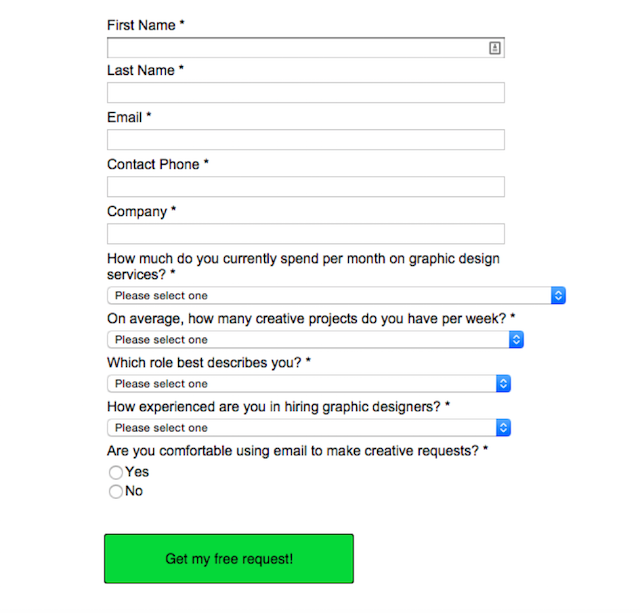
This way, they ensured that the people who filled in the form are more likely to convert. Through this form, Design Pickle was able to generate 500 leads and converted 30 of them for their $200/month service.
Overall, it resulted in a sweet 633% ROI.
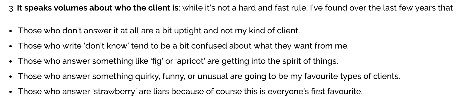
You can also add weird form fields, to filter the right kind of prospects for your business. Kate Toon runs a copywriting business. She asks her prospective clients a range of questions on her contact page. Still, she was overloaded with 10 inquiries a day and wanted to qualify the clients. Here’s the question she used:
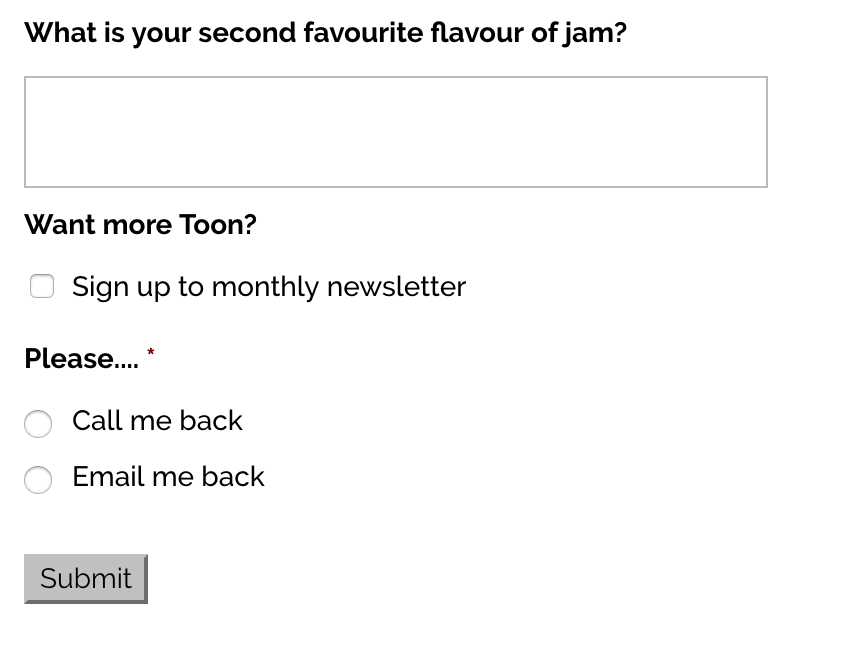
As much as it sounds weird, Kate’s now able to find ‘her kind of clients,’ through the answer to this question.
Another example of generic conversion boosting advice is ‘lower the number of steps in your checkout pathway.’ But, I was surprised when I tested a three-step checkout against my two-step checkout at CrazyEgg. After 817 conversions, we concluded that the additional step increased conversions by 10%.
4. Social proof (for the sake of it)
People trust the opinion of influencers and other individuals over marketers. So, testimonials are a default on most landing pages and websites.
But, if you’re just starting out, then you won’t have anyone vouching for your brand’s credibility and the awesomeness of your products.
Now you have two options:
- create fake social proof,
- use generic and vague praise made by a visitor.
Both of these options can be dangerous. Because genuine love for a brand can’t be faked.
Ideally, you want the testimonials to support your offer and address reader objections. They must not be generic phrases like, “Neil is awesome.”
For example, look at the testimonials that Brian Dean uses on the Backlinko homepage. They aren’t generic phrases, like “Brian creates brilliant content.”
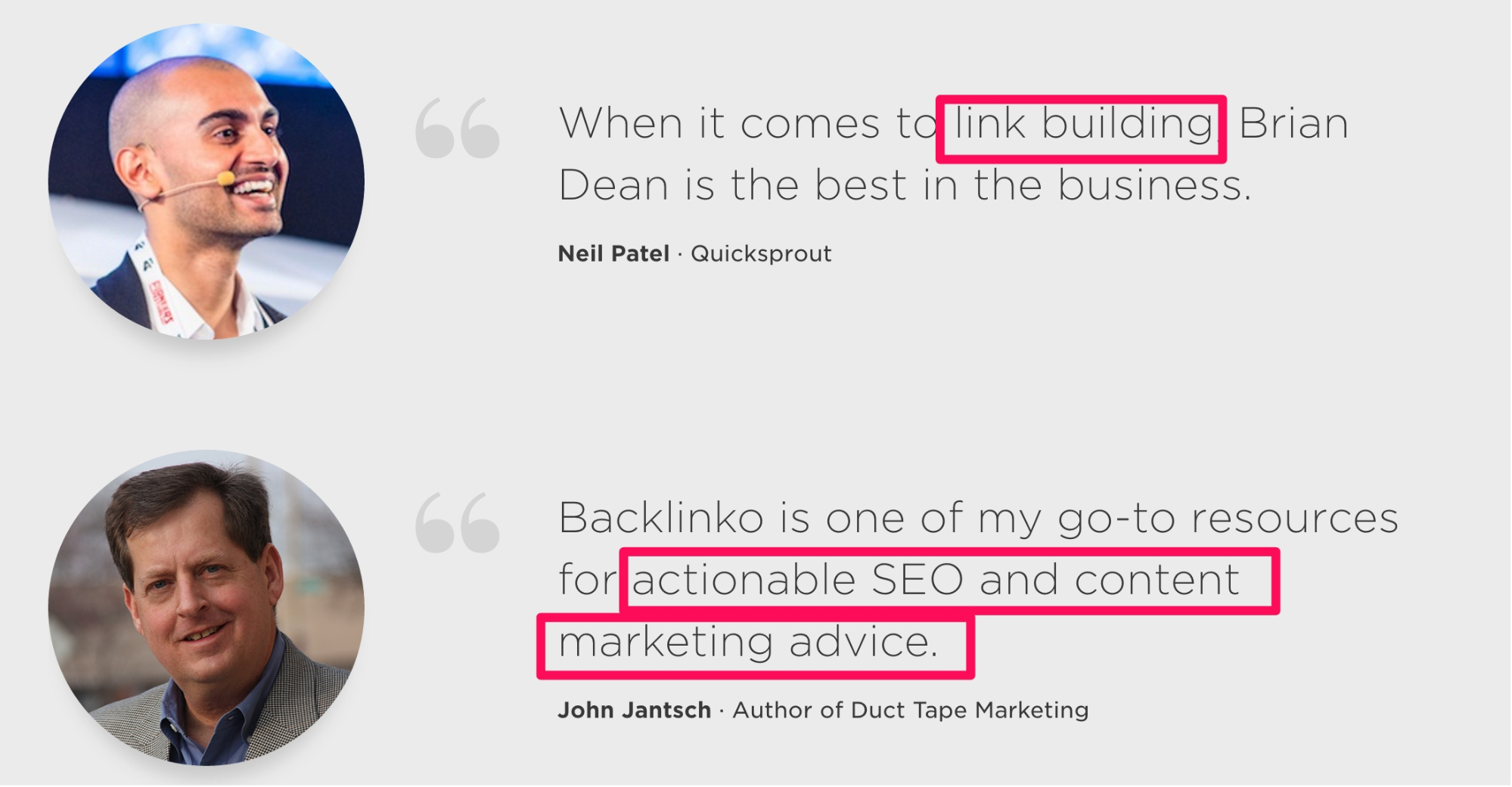
My testimonial builds Brian’s credibility in ‘link building.’ And, John Jantsch established Brian as an expert for ‘actionable content marketing and SEO advice.’
You can learn about the science of social proof in more detail at CrazyEgg.
Conclusion
“Best practices.”
If they are anything in conversion optimization, they are only starting points. You’ll never see conversion experts declare a generic color, CTA size and number of form fields as ingredients guaranteed to lift your bottom line.
Conversion optimization is an iterative cycle of hypothesizing, testing, learning, concluding and testing again. Always observe the environment under which successful testing studies were conducted. You’ll have better context, reasoning and learning from the positive results.
I shared a few conversion myths in the article. I am sure you must have failed many conversion optimization “best practices,” in your tests. Share them with me in the comments below.
Comments (32)