
For online businesses, landing pages are the revenue gatekeepers. They are lifelines for improving lead generation.
It’s simple…
You need to create as many landing page designs as possible for your marketing campaign, to produce a stronger lead generation from your web site visitors. Businesses that have over 40 landing pages get 12 times more leads than those with under 5.
But, multiple landing page designs aren’t just sufficient for businesses (although only 48% of marketers believe in creating a new landing page design for every marketing campaign). Rather, they are a necessity.
With incessant information bombardment, it has gotten tough to attract the user within his limited average attention span of 8 seconds.
So, you need to grab the attention of your target market with a lip-smacking delicious landing page design.
Every. Single. Time.
Only then can you expect your prospects to take your desired action from a marketing campaign.
I’ve written a lot about landing page optimization techniques and crafting high-converting landing pages before.
But, in this blog post, I want to get back to the basics. If you feel confused with the plethora of (conflicting) landing page creation information, then you’ll be happy to read this simplified 10-step recipe.
Let’s begin with step #1 for designing high-converting landing page design.
1. Carefully define your target market
When we created KISSmetrics, we didn’t define our target market. I committed the blunder of thinking that every company that has a web site is our potential customer.
Duh.
Your business shouldn’t try to sell to everyone.
I recommend that you clearly define your target market and ideal, potential customer, for every product/service that you offer. This will ensure that you spend your time, money and other resources strategically.
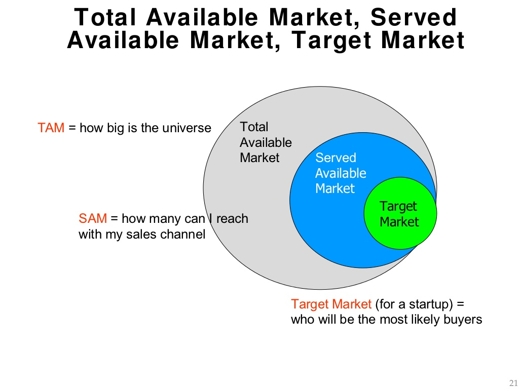
If you have launched multiple products that solve a variety of problems, then you’ll have a diverse, potential customer base. And, you’ll need to create multiple buyer personas, to tailor your marketing campaign efforts for every segment.
I’ve written about creating a reader persona before. The process of creating a buyer persona is similar.
All of your landing page design elements – including your headline, CTA, supporting images and even your sub-headlines should take your target market and buyer persona into account.
2. Prepare a relevant and enticing prize for your subscribers
What do you plan to give, in exchange for personal data from a potential customer?
Your target market (defined in step #1) must feel elated to receive your gift. Ensure that it’s a relevant and valuable resource for them.
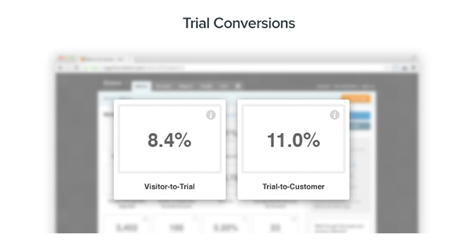
If you sell premium products, then a free/low-cost trial of your product will work well.
In their study of 712 small businesses, GrooveHQ found an 8.4% of visitor-to-trial conversion rate for trials.
Alternatively, you can offer a downloadable resource, course, report, webinar or presentation.
Contently found that the average length of a downloadable document is 13.4 pages. And, 35% of readers spend less than 30 seconds engaging with such lengthy blog posts.
So, you need to ensure that you find an appropriate subject for your resource, one that deeply interests your target market and can produce better lead generation results and conversion rates.
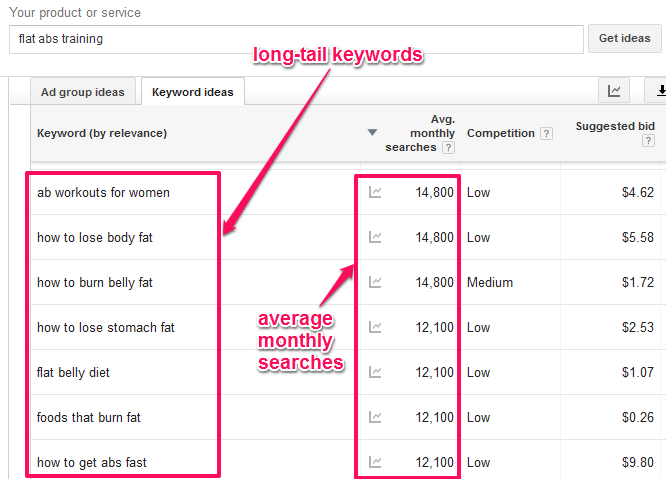
Brainstorm on the major pain points of your target market. Then, plug one into the Google Keyword Planner and ask it to deliver its number magic.
Let’s suppose that I’m a fitness trainer and want to develop lead generation for selling a digital product.
For help with finding the right subject for an eBook, I turn to the Keyword Planner. I enter ‘flat abs training’ and find long-tail keywords that I can use as subtopics for my PDF. Then, I offer it to my visitors and it should lead to improved conversion rates.
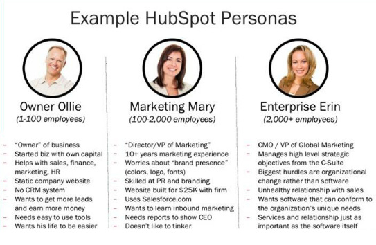
Again, if you target a wide customer base with varying interests, then you’ll need to create separate prizes and dedicated landing pages.
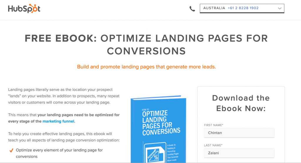
HubSpot has a variety of eBooks and other lead generation magnets for attracting different types of customers that they target.
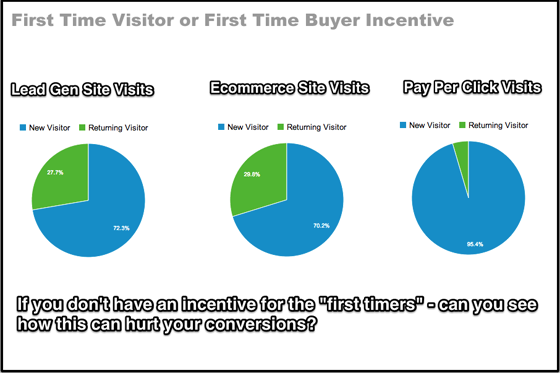
People reciprocate kindness. Plus, they are more likely to stay consistent in their association with your brand. So, they are more likely to buy your products, once they get a FREE taste test. And, that’s the goal – to get the first time visitors to come back and stick with your brand.
3. Craft an attention grabbing headline and a persuasive CTA
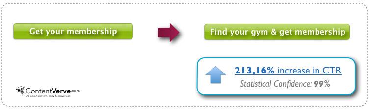
These are the only two elements that will make or break your landing page design. Simply changing the font size of your headline from 10 point to 13 point can increase your conversion rates by 133%. And, adding 5 relevant words to your CTA button can lift your CTR by 213.16%.
If you fail to grab the attention of the prospect with a clear, value-adding and persuasive headline, then you’ll lose him. Further, your CTA button should be prominently visible, its copy should create urgency and prompt action from the user.
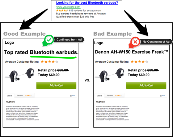
One of the most generic mistakes that’s made while crafting landing page headlines is not maintaining scent from the ad. If the visitor feels lost, as soon as he lands on your web site, then he will instantly press the back button. And that feeling will be visible in low conversion rates.
For further advice, you can read specific tactics to improve your CTA and headline.
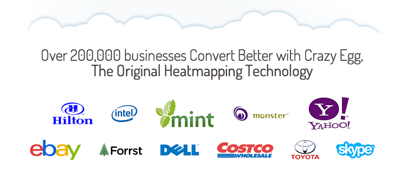
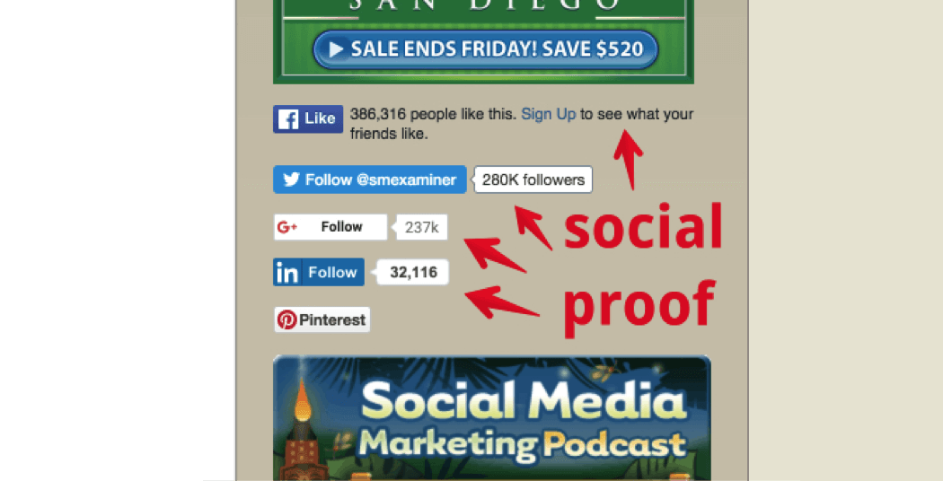
4. Ensure that you feature relevant trust signals on your landing page
Social media proof is one of the most powerful marketing campaign techniques that you can have under your belt.
Since you’re asking people for their money/information, then you need to make them feel safe. You can win over the prospects, by showing how useful your product has been to your past customers. Maybe just mention the number of past customers, to show your popularity.
If you have industry celebrities or Fortune 500 companies as customers, then definitely feature them. A new prospect will be glad to be in such esteemed company.
If you’ve been mentioned in major media publications, then show it. It breeds trust in a prospect.
While social media share buttons are a debatable entity within a landing page design, they can also act as a great trust signal, by showing your social media following.
I discuss the science of social media proof here. And, I further recommend that you explore 10 effective social media proof strategies in this blog post.
5. Write a benefit-oriented introduction that hooks the reader
You impressed a moving prospect with your headline.
Great job!
Don’t kill the momentum now.
Your introduction should reinforce the key benefits of your product for your potential customer (preferably in bullet form). Remember to state how you’ll improve the lives of your potential customers, rather than telling them the shiny features of your product.
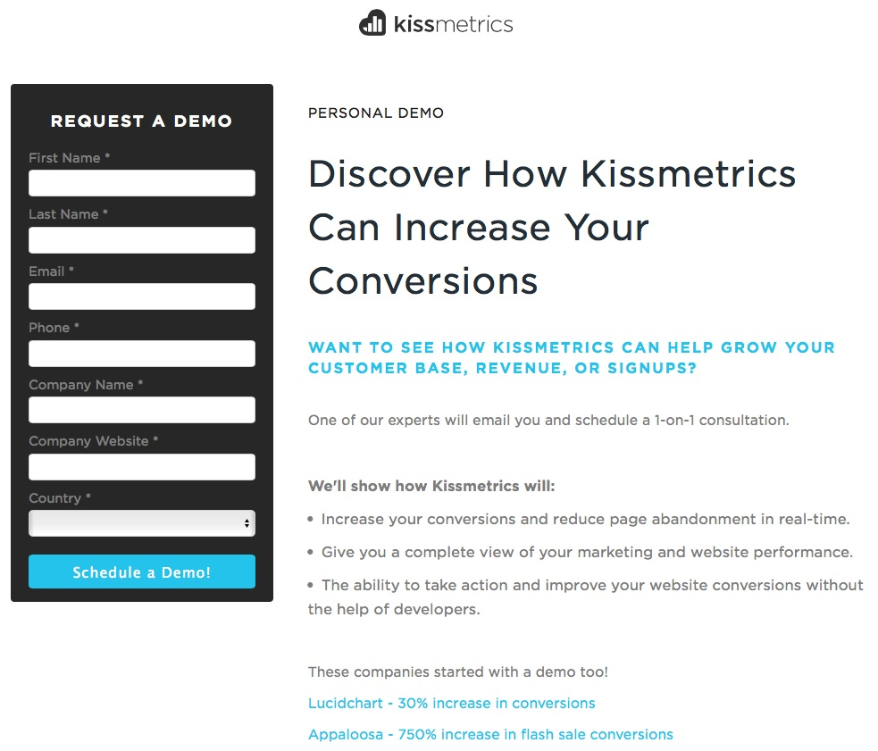
KISSMetrics increased sales by a staggering 213%, simply by changing their copy from what the reader would get from the company to the following benefit-oriented copy.
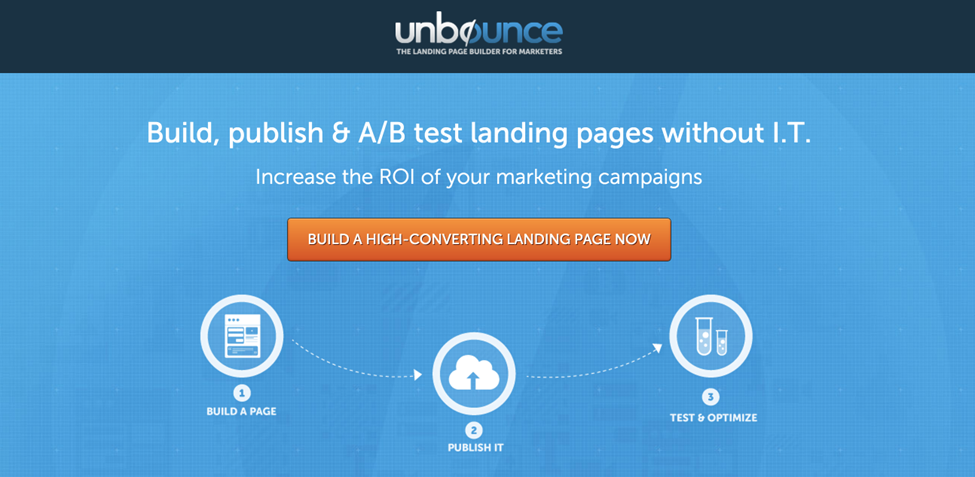
Occasionally, you can get rid of this introduction copy altogether. By eliminating choices, you make the reader focus on your headline, supporting image and CTA. So, they should present your value proposition clearly and persuasively.
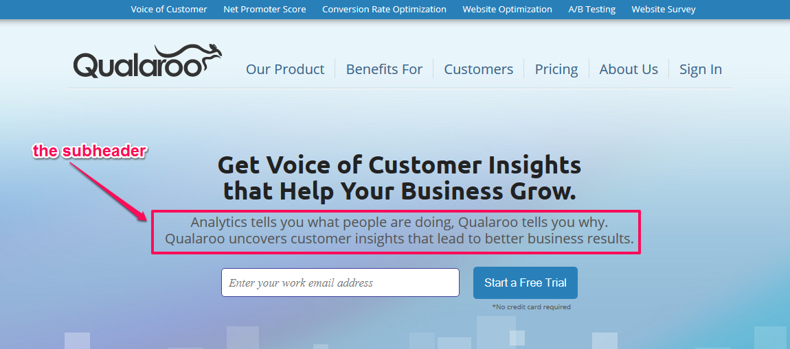
This is a bold, yet compelling design that all you minimalism fans might like. Landing page building tool, Unbounce, shows you the correct way to pull off such a design.
6. Ensure that your landing page design works flawlessly on mobile
Unless you’ve been living under a rock, you must be aware of the importance of optimizing your web site for the smaller screen. 60% of your users might be browsing your web site through their mobile devices.
A bad landing page design has a nearly illegible font, with too much text and other distractions.
Unoptimized pages will simply be ignored, because of higher perceived and physical friction for the user. If you want to charm a mobile user, with the average mobile session lasting 72 seconds, then follow the 5-point framework that I shared previously.
7. Create urgency and scarcity
It’s a human tendency to seek momentary pleasure, in order to save yourself from uncertainty/discomfort. In his book, Mastery, Robert Greene writes that you can even learn to love this internal resistance.
Since the behavior affects most of your prospects, you’ll find them mulling and procrastinating over your offer. This happens even if you’ve addressed their objections and promised life-changing results, along with proof of your authority.
People simply need a little push, to get out of their comfort zone and perform your desired action.
To marketers’ credit, you’ve got a lethal combo that people value highly…
Scarcity and Urgency.
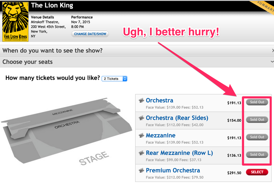
See how The Lion King persuades its visitors to take action. If you’re interested in attending the performance, then you better buy the ‘Premium Orchestra’ tickets to save your spot, NOW.
Similarly, you can create urgency with discount coupons, available inventory and the recent bookings that have occurred on your web site.
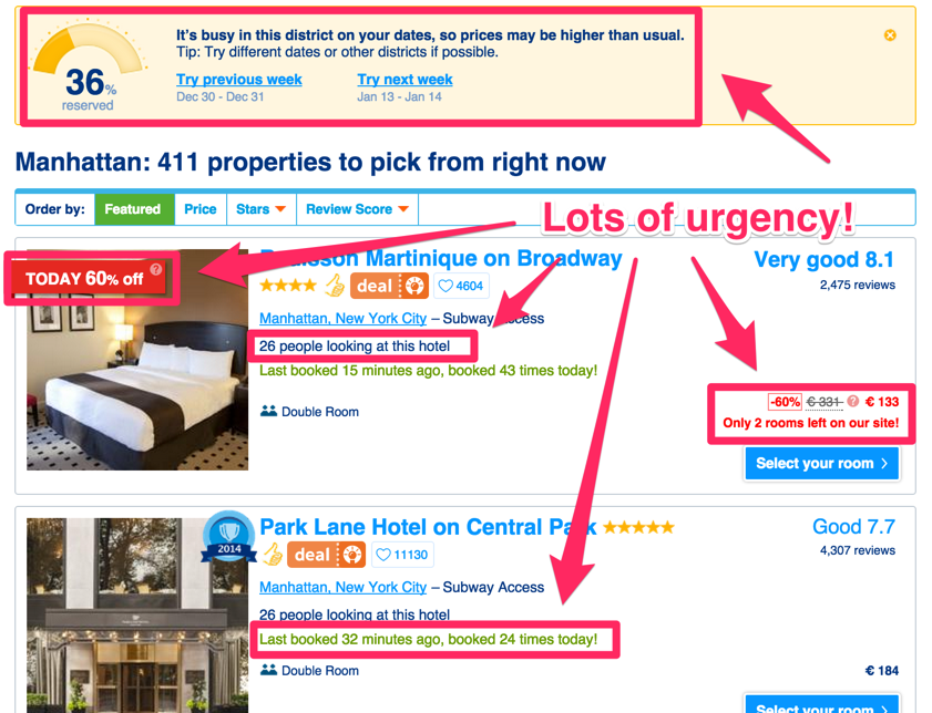
You can create urgency for your webinars, by offering limited registrants. Or, offer time-bound bonuses, along with your main offer.
8. Produce a relevant video to demonstrate your offer
Alright, now you’re entering optional territory. You can skip this and the next step altogether, if you want. Or, read through and see if these steps are worth your time and risk.
Eye View Digital found that using videos on your landing page design increase your conversion rates by 86%. It’s a loved media entity (as are images), especially by mobile users.
I’ve personally leveraged video at CrazyEgg to add $21k to my monthly revenue numbers. But, most people get video wrong – it’s all about the script and you must not hand the writing task to the company that produces the video for you.
Your video story must be memorable, engaging and emotion-driven. Once your target market feels the pain, they are more likely to act.
Clickfunnel shows an interesting dialogue between two people in a video on their homepage. It hooks me and, by the end of the video, I am sold on their product.
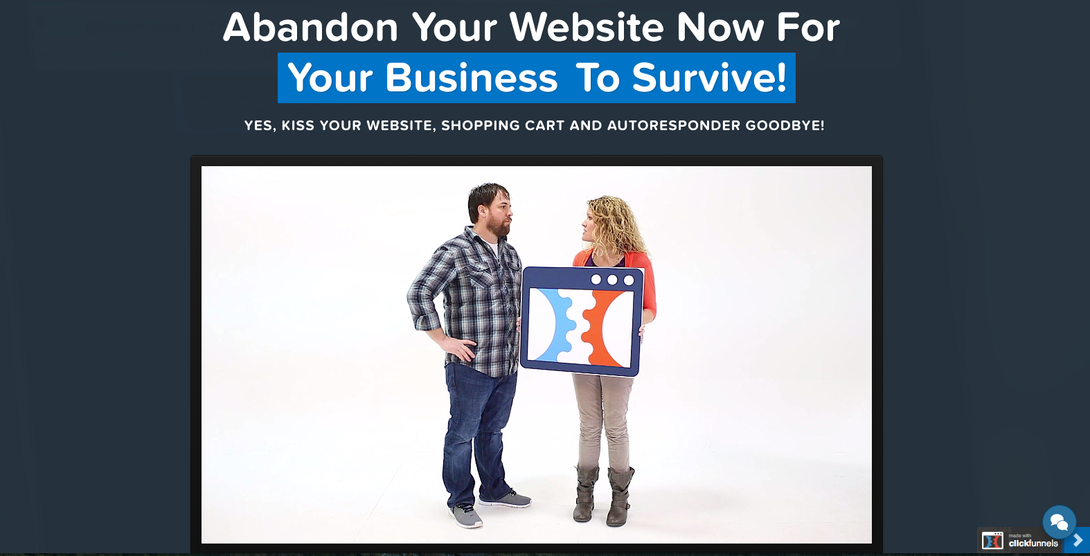
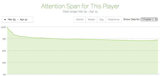
Tracking your video analytics is a great way to find out how your potential customers like your videos. Look out for your video attention span rate, CTR on the landing page and the percentage of people that follow through to the CTA.
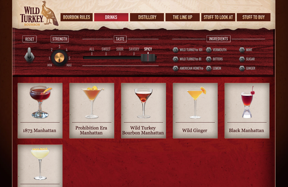
9. Interact with the customer
This is the second optional step in your landing page design creation, but it can do wonders for your conversion rates.
If a prospect engages longer with your web site, it radically increases the chances of that engagement leading to a successful conversion rate. Offering interaction opportunities to your visitors is a great way of increasing engagement, and conversion rates, in turn.
A great example is Wild Turkey – a beverage company. They personalize your drink choices, based on strength, taste and ingredients.
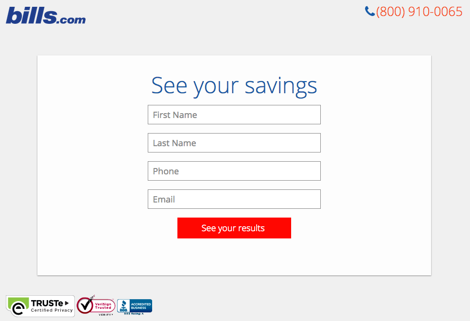
Another great example is Bills.com. They ask you 3 relevant questions,
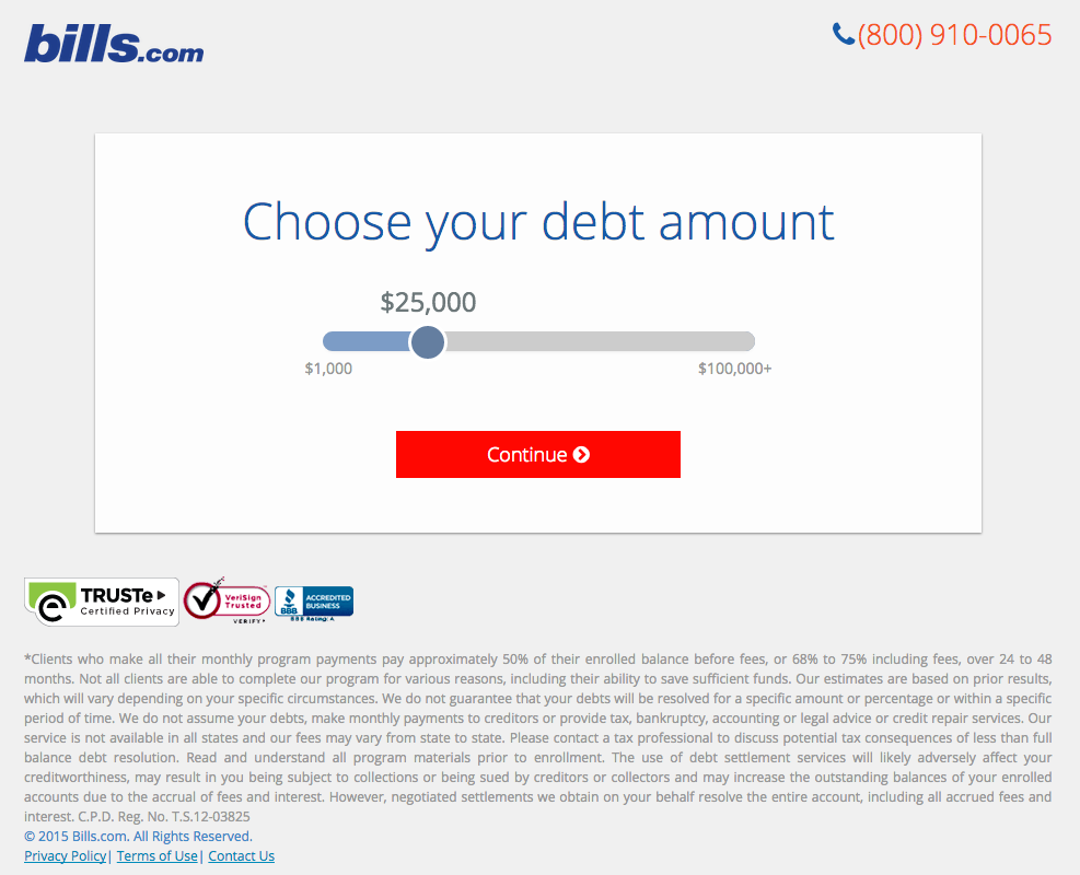
before showing their final landing page design with the form asking for your personal information.
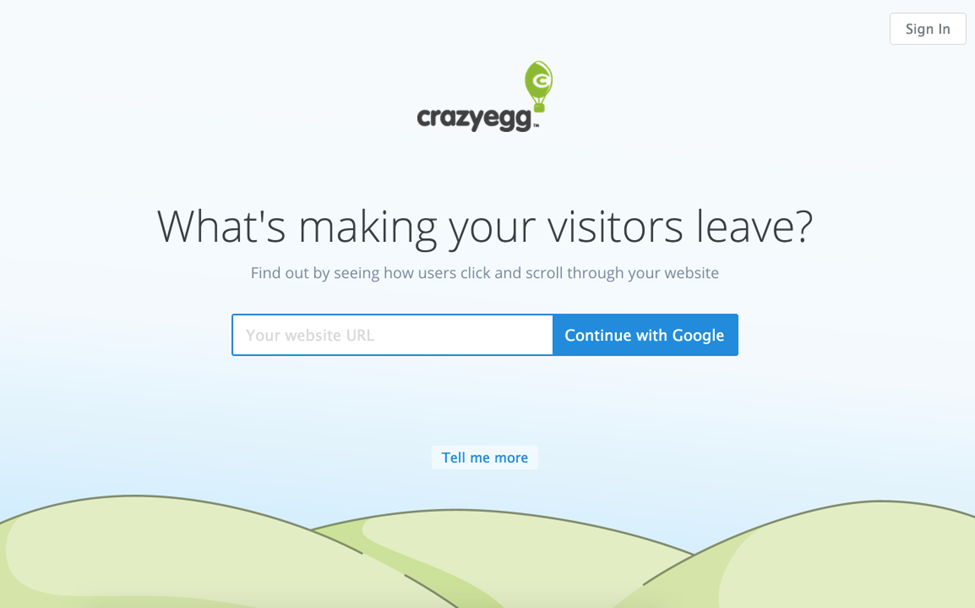
Even my company, CrazyEgg, interacts with you directly, asking if you want to see a heatmap of your web site by plugging in your URL.
10. Perform an A/B test
Your landing page design shouldn’t remain a static entity. It needs to regularly improve, through user feedback and data from split tests.
Obviously, you first need to drive a good amount of traffic from PPC, social media, search engines and other sources. Only then will you get statistically significant conversion rate results (each page should get at least 100 unique visitors).
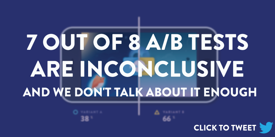
Also, remember that most A/B test conversion rate results are inconclusive. But, you’ve got to keep learning and conduct multiple tests to see those 100% improvements.
When you conduct an A/B test, let go of any previous beliefs that you have about your audience and their preferences. Two great tools to gather visitor insight and run effective tests are Qualaroo (for conducting visitor surveys) and ClickDesk (for chatting live with your potential customers and finding their objections).
Conclusion
You can create a sizzling landing page design by taking into account all of the elements that I mentioned in this blog post. Many marketers complicate the steps for building their first landing page design and end up messing with the basics, and ruining their conversion rate results in the process.
I hope to have cleared the process for you and inspired you to create stunning landing page designs.
Once you’ve built a landing page design, I encourage you to keep testing and improving it. Give landing pages the attention they crave (with the same love and detail as a well crafted blog post) and you’ll end up generating a much higher number of lead generation.
I would love to hear how you go about creating a landing page design. Have I left out any critical elements in this blog post that you regularly use? Let me know in the comments.
Comments (22)