Of B2B companies that use landing pages, 62% have six or fewer total landing pages.
I can understand the underlying thought behind this. Businesses want to focus only on the essentials for their conversion rates and weed out inefficient assets.
That’s why only 48% of marketers build a new landing page design for each marketing campaign. In my opinion, when it comes to landing page best practices, the more the better for businesses.
Why?
Because having more landing page designs equates to more lead collecting opportunities for your website and an even better chance for conversion rates. It also makes it possible to test and optimize for better results.
Every marketing campaign is different and might target different audience demographics and interests.
So, how can the same landing page appeal to all kinds of different audiences that span across different age groups, genders, locations, and interests?
Moreover, a potential lead might log into your website from various platforms (including mobile or tablet) and hence will have varying mindsets.
Here are 3 stats that prove why a large number of personalized landing page designs are great for your business.
- HubSpot in its analysis of 7,000 businesses found that companies see a 55% increase in leads when they increase their number of landing pages from 10 to 15.
- Companies with 40+ landing pages get 12 times more leads than those with 5 or less.
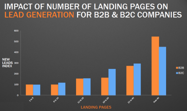
- Here’s the correlation that HubSpot found between lead generation and landing pages for both B2B and B2C companies:
The message is clear: lead generation is positively impacted by having more landing pages.
Now, let’s move on to the next question…
What are the different types of landing pages your business could (and should!) create?
In this article, I’ll show you 5 different types of landing pages and some landing page best practices. You might choose to create any of these, based on your business and campaign goals.
Let’s get started!
1. The upside-down homepage
Do you know the most visited page on your website?
Most likely, it’s your homepage.
You need to ensure it has a compelling landing page design and that you put your most important information front and center.
Is your navigation bar concise? Is it formatted for mobile?
Why not treat your homepage like a landing page?
With this mindset, you’ll try to fix your leaks and retain maximum users while stimulating potential leads.
If that makes sense, then I would like you to meet serial entrepreneur Bryan Harris. He was embarrassed by his homepage design and would shy away from sharing the website URL with anyone.
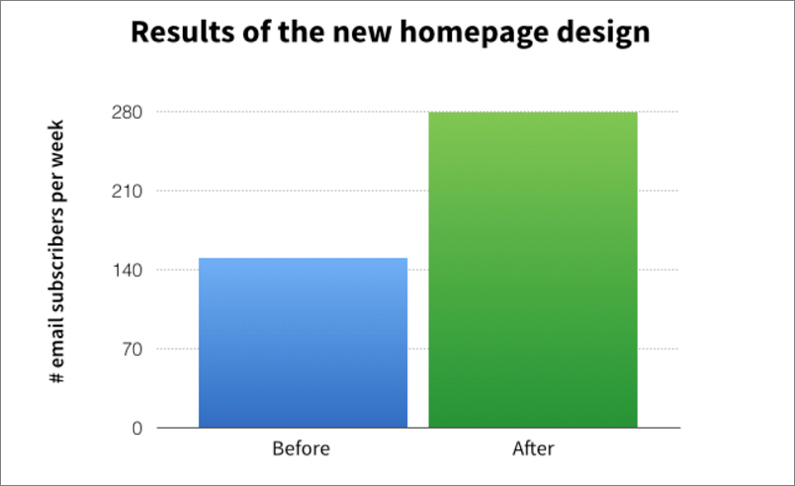
Then, he made the decision to fix his design and ended up crafting a high-converting homepage. He named it the upside-down homepage and it generated 35% more subscribers to his blog.
He also shared the design with Jeff Goins.
Jeff ended up getting 2,500 new subscribers. Andrew Warner of Mixergy also got 1,200 new subscribers.
So, what’s unusual about this upside-down design?
1. Navigational links at the bottom – When a visitor arrives on your website, they can choose to walk down so many paths and seek certain calls to action. It’s not clear that they’ll take your intended conversion rates-focused pathway.
But, there’s a solution…
Guide your visitors with a story about you before presenting them with the option to jump on your website using a navigation bar.
Put your navigation links at the bottom of your homepage.
That’s what makes this design truly upside-down.
Bryan Harris found that his bounce rate decreased by 83% after he moved the navigation links to the bottom.
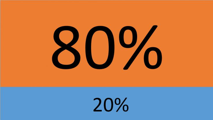
2. A CTA above-the-fold and social proof – The website portion immediately visible to a new visitor is the most precious piece of real estate for your business. Peep Laja, from ConversionXL, found that content placed above the fold still gets 80% of our attention.
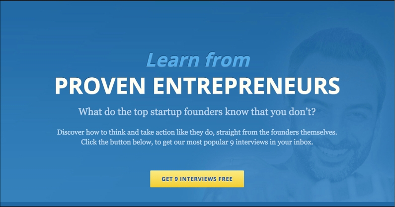
Bryan advises that you should immediately present the option of signing up for your list to a new visitor. Don’t push it to the sidebar, navigation bar, or footer.
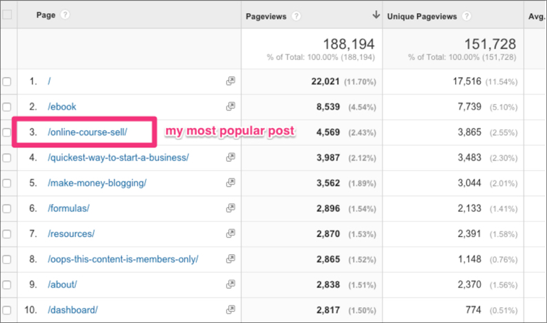
For the call to action headline, he advises that you find your most popular blog post that would be relevant to a beginner on your website. He then uses that as bait for the CTA button.
Social proof is nothing new. It’s function is to establish your work’s trust and credibility in the eyes of a new visitor.
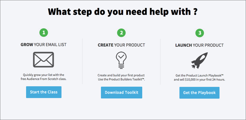
Additionally, you can insert a road map as an alternative to a navigation bar (offering relevant content pieces as lead magnets) to let the visitor choose his current stage in your funnel.
3. Do this before asking them to opt in for the second time – You’ve got the visitor interested and cannot mess up your potential lead now by cluttering your landing page with navigation bars and other CTA buttons.
You just need to keep the momentum going. And, the best way to do it is by presenting your best post. You can pull the data from Google Analytics by navigating to Behavior > Site Content > All Pages.
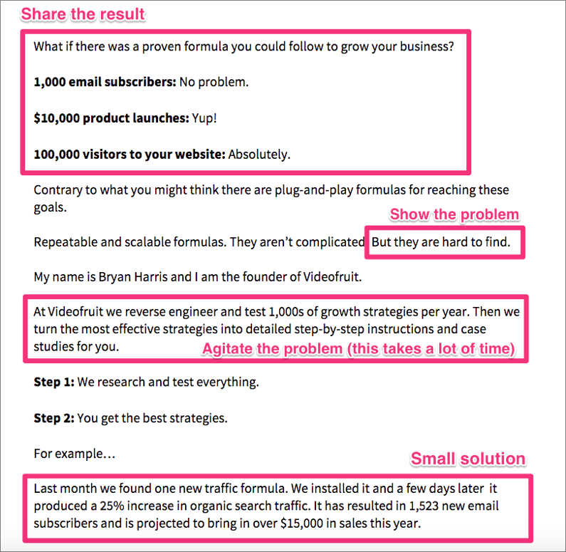
Now, you need to format this most popular piece in the four-part framework that grips the reader: result, problem, agitate, and solve.
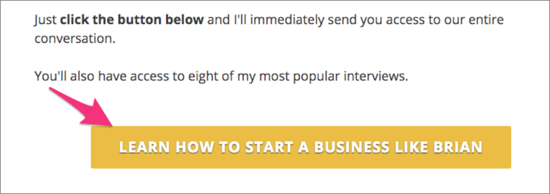
Now is the time to conclude your story and ask the reader to join your list for the second time.
Note: Although the above homepage design is a terrific lead generator, I wouldn’t advocate that you direct visitors from all of your campaigns to it.
Personalization is key when building a compelling customer experience. Customers are more likely to buy with a personalized experience.
You can customize the experience for the guest post readers interested in you.
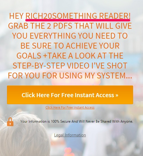
Robin Hanna, in his guest post at Rich20Something, offered a bonus resource at the end of his article. Here’s how he addressed this to visitors:
2. Capture’em landing pages
The motive of these pages is to gather personal info about your potential customers.
Unlike the upside-down design, these landing pages don’t have any navigational links. Ideally, they have just one CTA button allowing the visitor to submit their info before moving on.
As you know, a great way to build buzz about your product is by conducting a webinar.
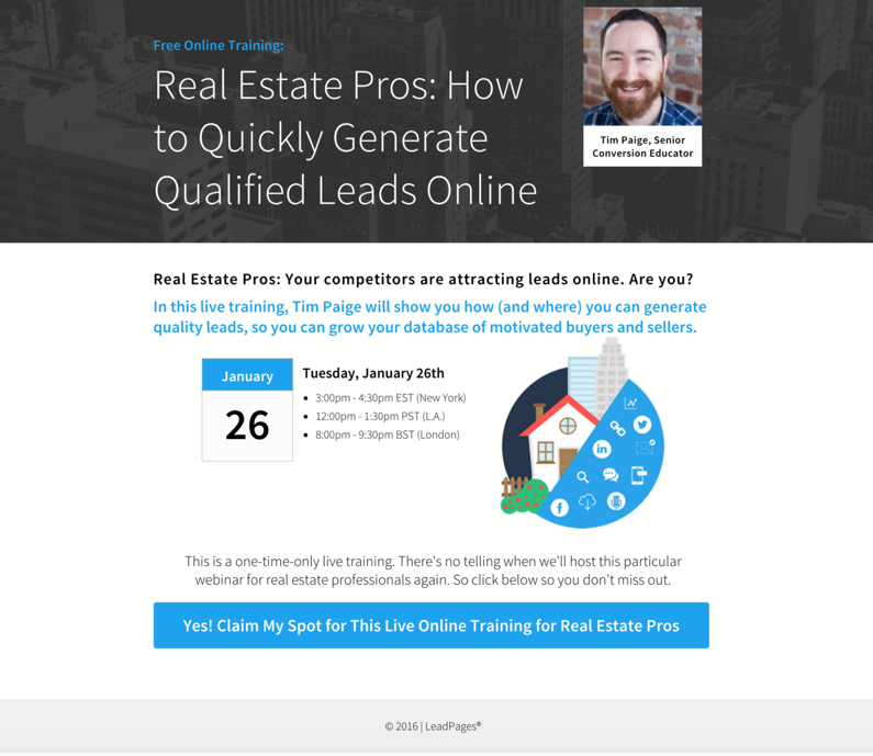
You can use a capture’em landing page for gathering potential leads and webinar registrations. You just need to write a compelling headline and share the webinar details on the landing page. No fancy stuff. No navigation bar. Simple web design.
Here’s an example of a webinar landing page by Tim Paige.
You can also collect details about your potential customers via a call to action in exchange for a resource or offer.
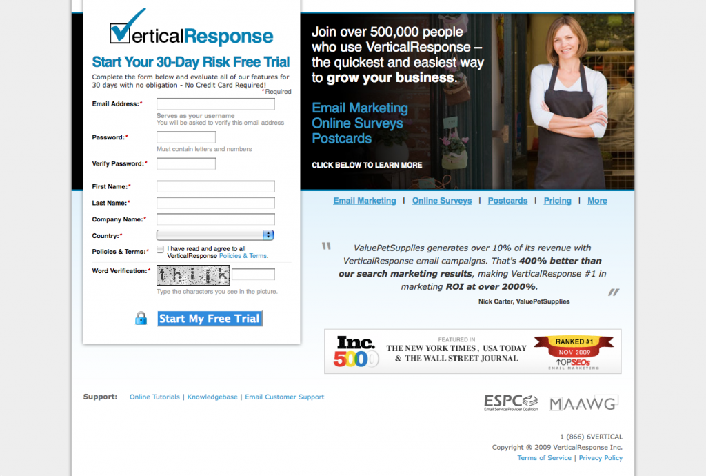
For example, email marketing provider Vertical Response used to offer a 30-day risk free trial to prospects in exchange for their personal info.
Generally, fewer form fields and call to actions will lead to higher conversions of potential leads. They are helpful in driving qualified leads, though.
3. The landing page with a sharing loop
This kind of landing page typically used in case studies usually build awareness by using subtle branding elements inside creative content.
Note that it’s only possible to integrate loops (like social sharing call to action buttons) in your page to get your page going viral. But, there’s no guarantee that it will.
For example, Sumazi attempted to add a viral loop action button to their launch page. It asked the users to share the product on social media and register through Facebook.
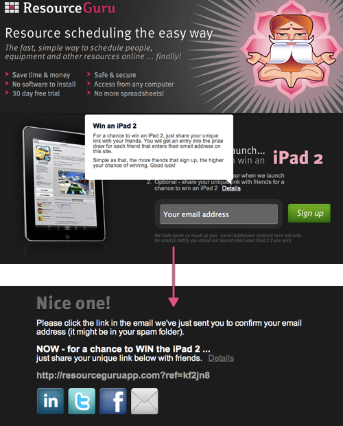
You can also give away prizes to increase the chances of sharing and following your call to action.
In the example below, Resource Guru offered an iPad to close to its launch date, which added an element of exclusivity to it.
You can also create brand awareness and curiosity about your products through flash games or entertaining videos geared toward mobile devices.
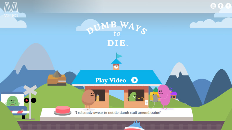
In the example below, the video “Dumb Ways to Die” was part of a public service announcement by Metro Trains in Melbourne that was designed to promote rail safety.
The video went viral on YouTube, with over 184 million hits (as of December of 2019) and $50 million in “global-earned media value”.
After becoming a global phenomenon, the game also rose to the top of app stores on both iOS and Android mobile devices.
4. Just for clicks landing page
Do you want to introduce your customers to the key benefits of your product/service and get their micro commitment?
Then this landing page and simple call to action is a great fit.
You show the prospects a summary of your offer and convince them to click-through to your website.
This baby step warms the leads, builds momentum towards the point of purchase, and encourages them to complete the transaction.
This type of case study page is a non-intrusive way of maintaining the attention of your visitor and helping them in the purchasing process.
If you’re looking to get consultation appointments, then this case study page adds an incredibly useful social proof step to get your prospects to say “yes.” Then, move them to the page where actual conversions happen.
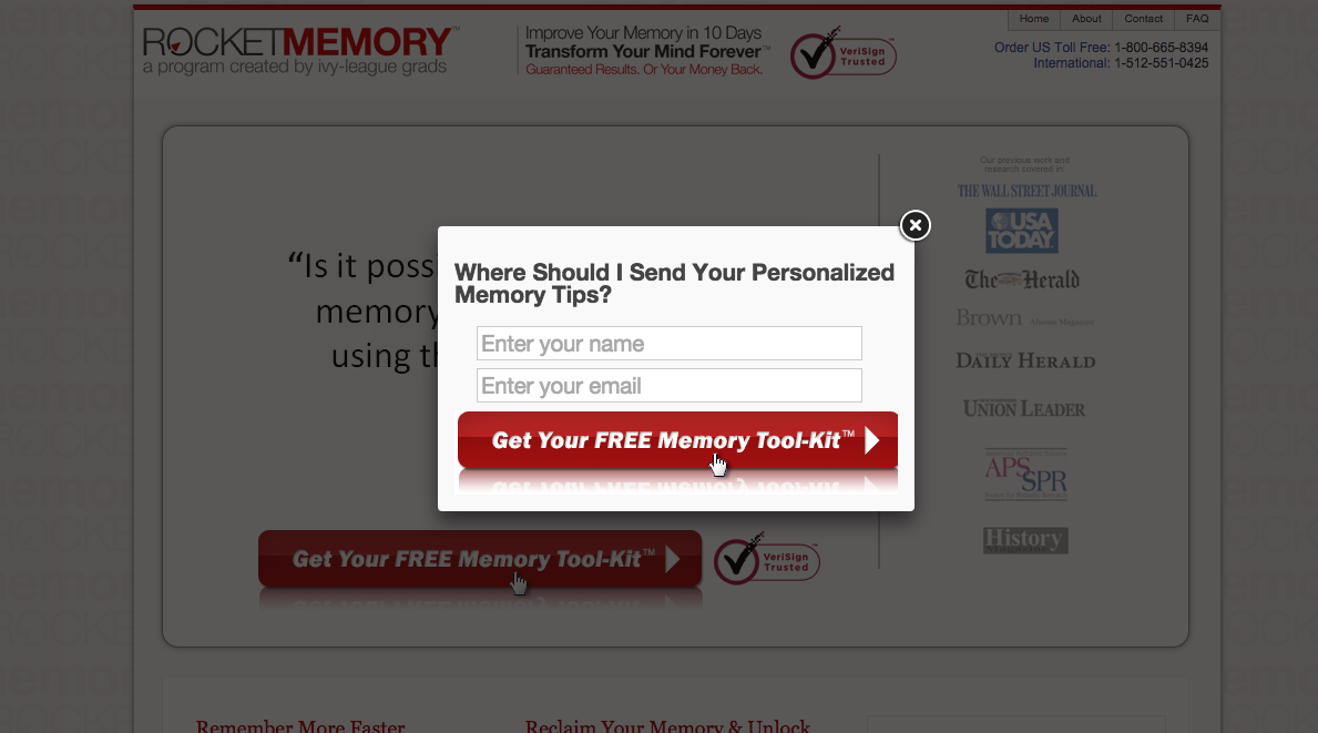
Based on this principle of micro-commitment, Rocket Memory was able to increase their opt-in rate by 271% and drop their cost per lead by 76%.
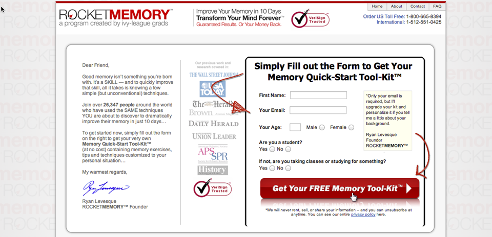
First, they had a landing page offering their free memory toolkit through an opt-in that looked like this. The opt-in rate was about 5%.
Ryan Levesque thought of breaking the questions into smaller steps so that the visitor didn’t feel threatened. Rather, the visitor felt curious.
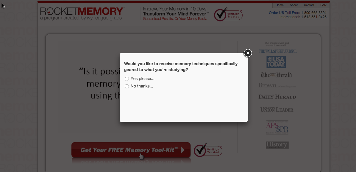
They start with a pop-up asking if the visitor if they would like to take a quiz using a call to action button. Then, they’re presented with more simple questions that take the site visitor deeper.
And, once the visitors have answered the important questions and finished the quiz, they are finally presented with the opt in.
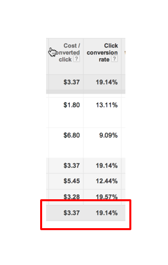
The result of putting the users through the series of survey questions was an astonishing 19.14% optin rate.
If you want to design such a click-through landing page, then I recommend that you explore this case study: 4 winning examples.
They were hand-picked by Oli Gardner, author of the book, Attention-Driven Design.
5. The “please-don’t-go” landing page
Suppose you’re holding a big industry conference or a webinar. You market the sales page of your event in your guest posts and on your social media platforms via mobile landing pages.
What happens when your offer ends?
The publicized links to your sales page on blogs and social media aren’t going away. So, why not leverage this opportunity to generate buzz about the next version of your event?
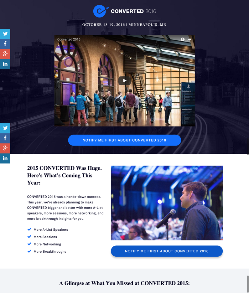
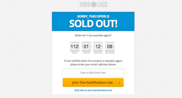
In this case study from a few years back, here’s what LeadPages did on the sales page of their first Converted conference.
That’s right…they are building interest and collecting signups from people interested in getting notified about the following Converted conference.
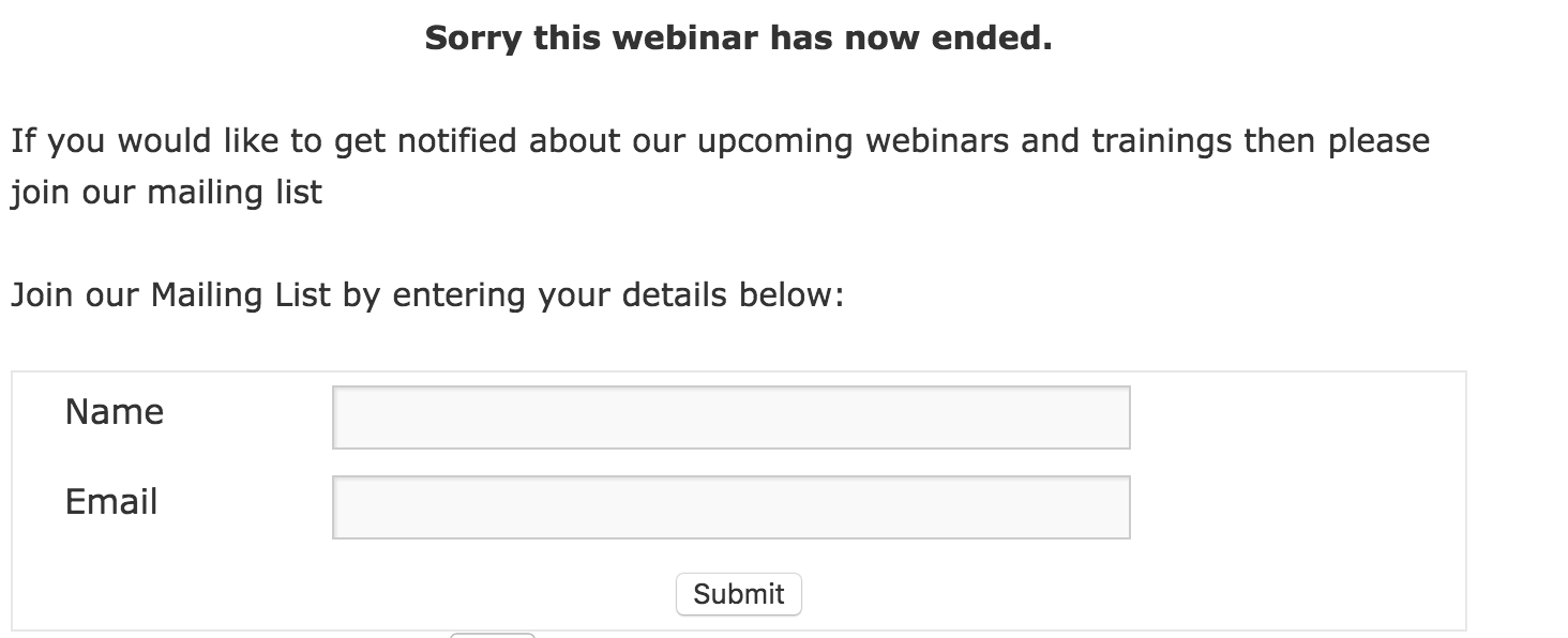
Similarly, you can collect emails of people who land on your previously conducted webinar pages.
Or, grab lost traffic from your product pages when the products have sold out.
Landing page creation tools like LeadPages also give you the option to redirect all of the visitors from your existing event page to an ‘offer ended’ page.
While we’re on the subject of retaining users from your expired pages, let me show you two more case studies using similar lead generation opportunities.
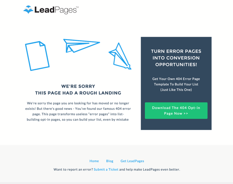
The 404 error page and the email unsubscription page.
Suppose a potential lead user mistypes a URL on your website or a webmaster links to an expired page on your website or mobile landing page.
The visitor who lands on your website won’t get the information that they’re looking for. So, what can you do to retain them on your website?
Start with an apology for the mess-up in a creative way on your 404 page.
Additionally, you can include an email opt-in on the page to make the visitor feel special.
If your offer is good enough, then users will not mind sharing their email with you. Consider mobile landing customers and their ease of sharing email details using a mobile device.
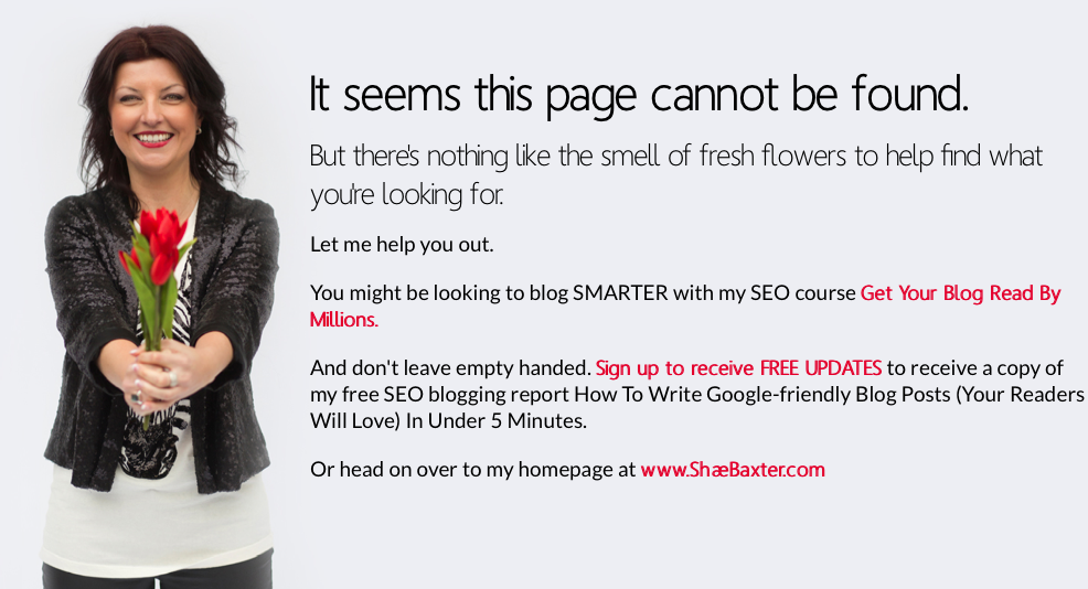
Shae Baxter does a great web design job on her error 404 landing page by offering her free SEO course and free updates.
Similarly, your email unsubscription landing page doesn’t need to be the usual ‘sorry to see you go’ page.
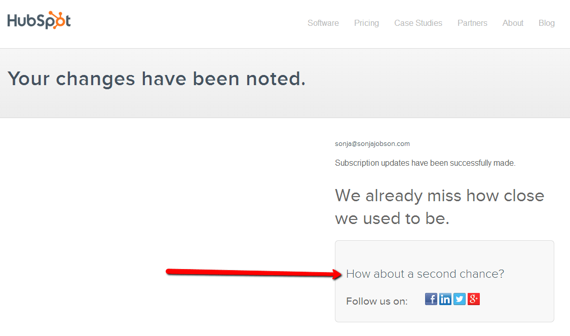
Look how HubSpot creatively requests a second chance once you’ve unsubscribed from their list.
They understand that their excessive emails might be cluttering your inbox. So, maybe you’ll have interest in following them on social media.
Conclusion
As you keep generating more traffic and potential leads from your content marketing and paid marketing efforts, you’ll need to create more landing pages with call to actions, including mobile landing pages.
The layout and web design of these landing pages will depend on your unique marketing campaign goals, your target audience, and your source of traffic.
But, hopefully the 5 types of landing pages mentioned above got your creative juices flowing and helped you to understand landing page best practices.
Try to create one new landing page type with your favorite tool based on these case studies and tell me how it affected your lead generation efforts.
Besides the above five, you must surely have created other kinds of landing pages for your business. Tell me about the most successful web designs in the comments below.




Comments (45)