
Ideally, you could predict what every person wants when they hit your site.
Giving the user what they want, even before they realize it, can help solve a ton of issues.
It would eliminate the need for extra searches.
It would give the right content to each visitor so that they could make a decision to act and convert.
This is the biggest reason why I tell people to never redesign their websites.
The last thing you want to do is completely overhaul what’s already working.
Instead, you should roll out new updates and improvements over time.
This way, you can watch how people are already interacting with your website.
You can pay attention their behavior to pinpoint the exact problem areas to fix.
In this article, I’ll teach you how to save that hard-earned traffic and preserve those conversions by giving users exactly what they want.
Here’s how to read your visitors’ minds by watching their on-site behavior.
Start by analyzing how users flow through your site
The first step to tapping into the minds of your website visitors is understanding “user flow.”
User flows are exactly what they sound like.
They’re the visual ‘paths’ or ‘funnels’ that people take while navigating your site.
You can see how a person lands on your site from an ad, search result, email, or social update. You can also watch the actions that person takes while on the site.
Connecting those two dots can help you influence how users should behave on your site.
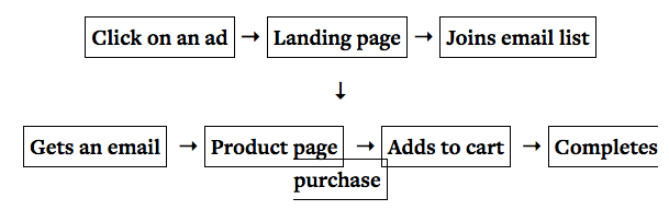
For example, here are a few scenarios that might already happen on your website:
- Person A clicks on a banner ad, hits a landing page, converts, and then receives a new email.
- Person B clicks on a link inside an email, hits a product page, buys the product, and receives an upsell email for a related product.
- Person C searches for a long-tail keyword, clicks your search result, reads a blog post, and signs up for your email newsletter.
Each one of those is a different user flow. And each one is a distinct conversion path you can optimize.
Obviously, a website needs to be aesthetically pleasing. Your content should be visually stunning.
But ultimately, you need to drive as many conversions as possible.
What’s the difference between a five-figure website and one that you could build yourself on Wix?
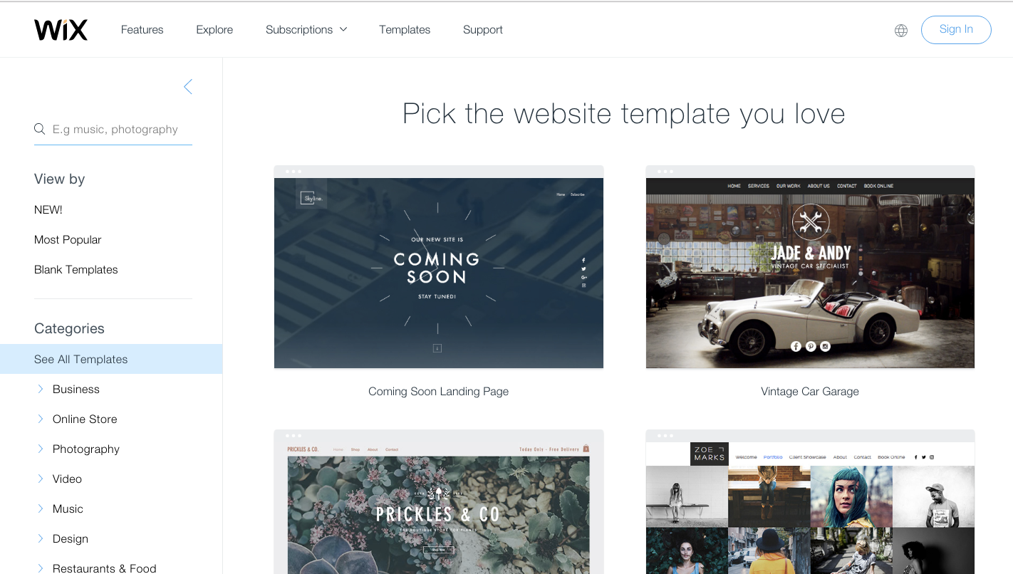
I mean, those templates are beautiful. They look like a custom site.
Ultimately, what you’re paying a top-notch designer to do is to think through all of these potential website interactions.
Your site won’t just be pretty — it will also perform well as visitors peruse it.
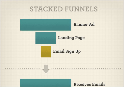
The tricky thing about user flows is that they’re usually ‘stacked’ on top of one another.
Someone completes one user flow, only to begin another one.
Over the next few sections, we’re going to break down this concept into each component.
But here’s the simplest, most actionable tip you can take right now.
Put yourself in your customer’s shoes.
Start all the way at the beginning. Visit your homepage and landing pages. Sign up for your own email program. Experience your website the way a newcomer would.
Take screenshots of each and every step. Document each piece of the puzzle.
Get a grasp of the overall sequence. Then let’s dive into the points of entry at the beginning.
Now analyze how people are getting to your site
One of the first steps I like to take is to jump straight into Google Analytics.
The goal is to uncover all of the various ways people are getting to my site.
Basically, I want to analyze which channels are driving the most traffic.

Immediately, we see tons of traffic from Direct and Organic Search. There’s even a little Referral traffic thrown in there, too.
Next, let’s see where that traffic is going.
The Behavior Flow report inside Google Analytics will give you a hint.
It will overlay your incoming traffic data with different user flows to give you an idea of what people are trying to do.

This Behavior Flow report will tell you which paths are leading to conversions. And it will point out the roadblocks that force people to leave your site by the dozens.
Essentially, there are two types of traffic from our previous example:

Audience #1. Organic Search: Most of the visitors here are problem-aware.
That’s a key difference. They’re looking for ‘unbranded content’ like “SEO Guide 2017” and stumbling upon your site for the first time.
“Great! Now what, Neil?”
Now you read their minds.
You secretly watch their every move, scroll, and click. Here’s how to do it.
Audience #2. Referral: By definition, referral traffic finds your site from links on other sites.
That means they’re brand-aware and know exactly what you do.
Spy on your users with heat maps and scroll maps
All it takes is 50 milliseconds for someone to register a first impression.
That means you have the blink of an eye to get your point across.
And according to this study, 94% of those first impressions are based on design.
Design, of course, isn’t just how a website looks. “Design is how it works,” said Steve Jobs.
All it takes is a subtle visual cue to throw people off the “conversion scent.”
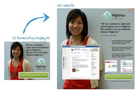
For example, let’s say that you see a banner ad for the CRM tool Highrise.
In it, you see a woman who looks like a customer, a short testimonial, and the company logo on a blue background.
Now people should see those exact elements replicated on the landing page to maintain “conversion scent” and keep people on track.
A design-based first impression isn’t just about how much parallax you use.
It’s about matching the visitor’s expectations. Then it’s about giving them a clear path toward conversion.
Even small, subtle visual cues can throw people off this “scent.”
Here’s what I mean.
ConversionXL ran an eye tracking study that analyzed where a user’s attention went based on the page’s design.
The first example showed a person looking away from the form field.

People loved the headline and bullet points.
But, most importantly, they ignored the form! Nobody looked at it.
Putting the form above the fold sounds like a good best practice, right?
You want to get visitors’ attention and focus immediately.
However, sometimes you want to be a little more explicit.
They fixed this issue by replacing the image of the person looking away from the form with a simple arrow that now pointed toward the form.

That arrow isn’t necessarily elegant. But it is effective.
Heat maps work the same way.
They literally highlight where people look and interact on a page.
Ideally, you want them to interact with your primary CTAs. You don’t want them to interact with random page elements that distract them from those CTAs.
Here’s an example of an extremely useful heat map that we used for QuickSprout:
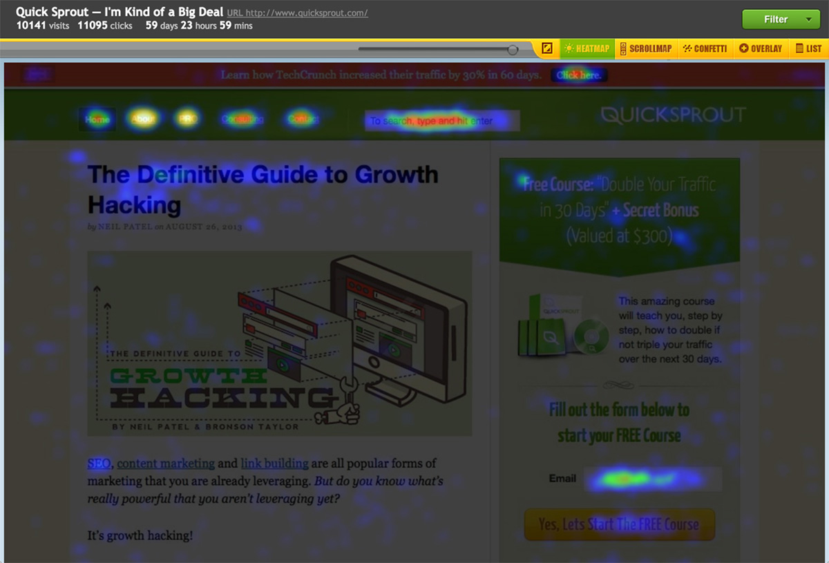
Look at all that heat!
This provides a ton of insight behind how our visitors are interacting with the QuickSprout blog.
Our navigational menus at the top are helping users find new, relevant content after reading posts.
Our search bar is extremely popular to help people find exactly what they’re looking for.
Our case study CTA at the top is simple, yet effective. It’s doing its job.
But look over to the right-hand sidebar real quick.
Do you see what I see?
There is tons of heat in the “email” field.
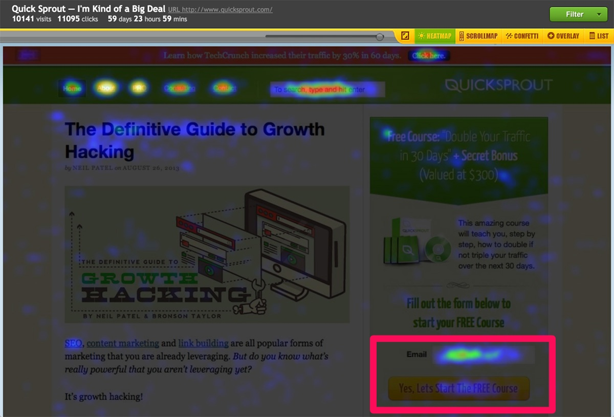
There’s just one problem: The CTA button isn’t as hot as it should be.
Think about what that means for a second.
Let’s say that you look up your conversion rates in Google Analytics and are unhappy with them.
However, you look at this example and know that people are at least somewhat interested.
There are a lot of people getting halfway to converting. But then they read the CTA button and back out.
Now, we can start to draw up split-testing ideas to address that issue.
Maybe we can A/B-test new button copy. Or maybe we can put a line of copy below the button that tells people when we’ll send emails.
The point is that you’re jumping into the mind of a typical site user to understand what they like and don’t like.
You’re not basing those conclusions off of a random survey. You’re taking it from real user behavior!
Here’s another example to show you how this works.
One of the best ways to focus attention on your CTA is to simplify everything else.
I’m going to blur out everything else on this page so that you can only see where the CTAs and heat maps line up.
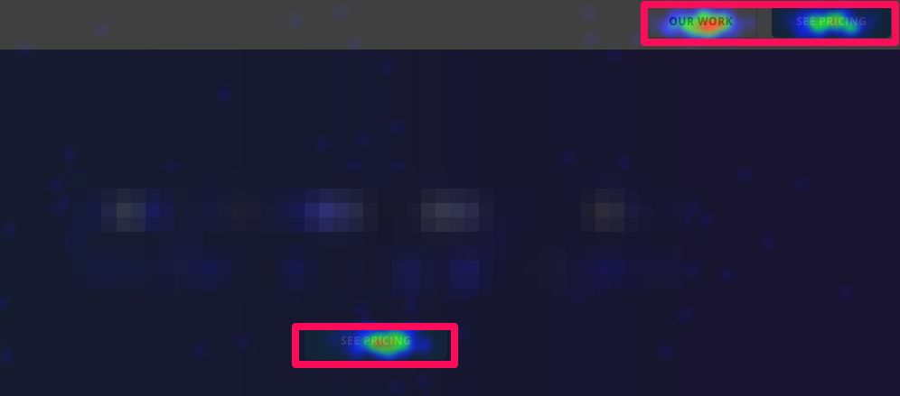
What do you gather from this heat map about the page’s design?
It’s doing its job!
There are three buttons with only two options.
You want people on this page to click on one of those options. You don’t want them clicking on other places on the site or hitting the back button.
Here’s another trick I like to use.
If there’s a mismatch between how people are interacting with your page and where the CTAs are, simply move your CTAs!
For example, eye-tracking studies will tell you how someone will naturally browse your site.
You can build off that information with scroll maps that tell you how much content people are consuming.
Then you line the two up. Move your CTAs and buttons into the ‘line of fire’ so that more people see them.
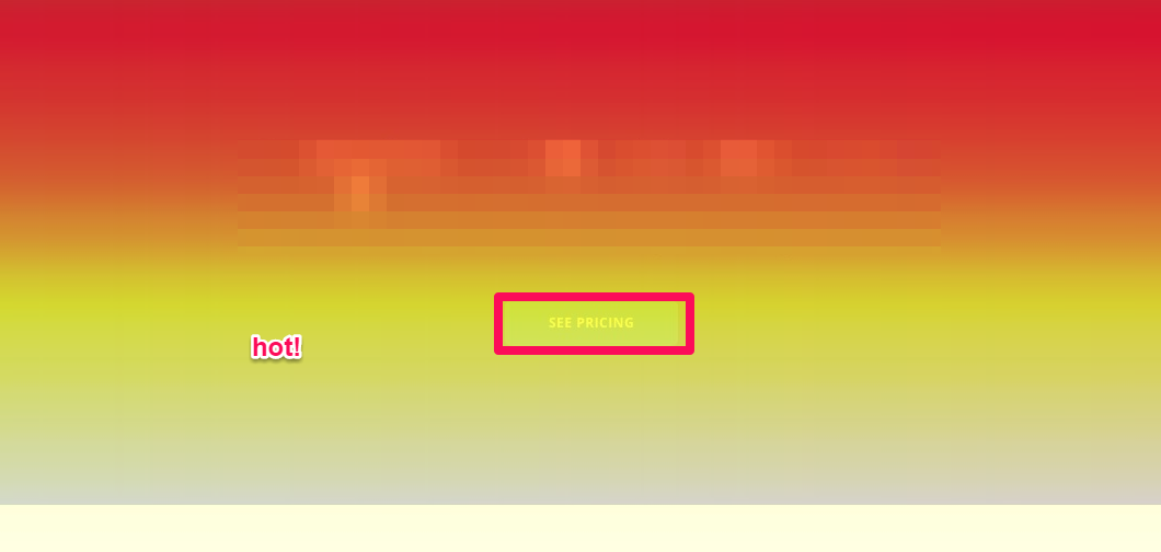
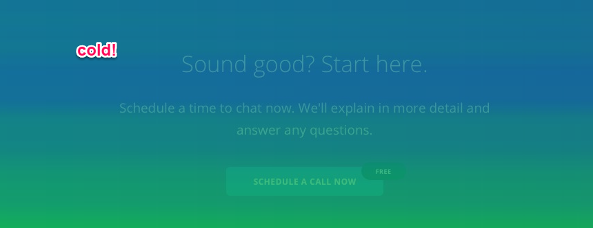
It’s red, molten-lava hot.
That’s near the top of the page. People are staying there, reading the headline, and getting hooked.
Now compare that to what happens when you scroll down the page a bit.
Traffic down here goes cold.
You lose that interest you had near the top.
Heat maps and scroll maps give you the opportunity to determine whether your design is working.
They can help tell you where people are engaging the most. And they’ll shine a spotlight on what’s failing to resonate.
Then you can cross-reference quantitative data to confirm your suspicions.
Look for popular pages with high exit rates
On-site behavior is key to producing pages that convert.
If people don’t like your pages, they won’t convert. It really is that simple.
Here’s a perfect ‘low-hanging fruit’ example.
Take a look at your most popular pages in Google Analytics. These are the ones that routinely pull in the most visitors.
Now, zero in on those that also have high exit rates.
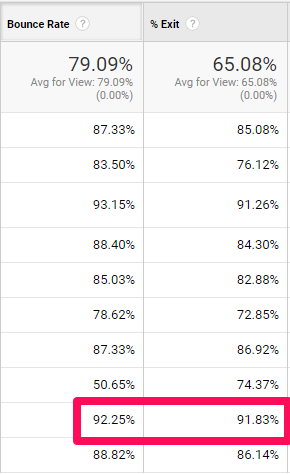
Yikes! A 92% bounce rate with a 91% exit rate. That’s not good.
So let’s do what we did earlier to figure out what’s going on. Let’s click on the page and check it out.
Many times, you’ll find a few obvious mistakes that are literally staring you in the face.
Here’s an example, once again, shaded to protect the innocent.
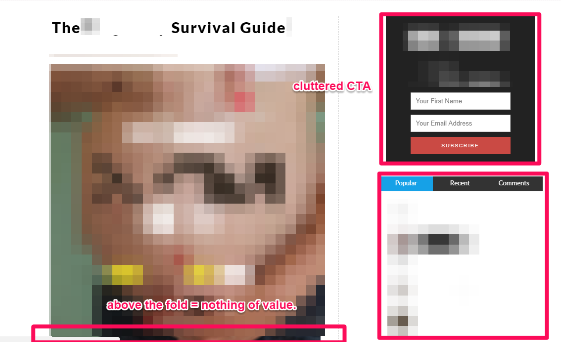
The content here is amazing.
However, the content gets pushed way below the fold. And the sidebar noise becomes distracting.
What do you want a new user to do here?
Should they read this article? Click on related articles? Sign up for a CTA immediately before even read the first paragraph?
Where is the first paragraph?
You get the point.
You want to figure out what people are looking for. Then you want to make it easier for them to find it.
If you can do those two things, visitors will convert. You don’t need to overwhelm them the second they hit your site.
Now reverse engineer goal paths and conversions
Hopefully, people are already converting on your website.
That gives you some historical data to reverse engineer.
That’s OK if it’s not a product purchase.
Micro conversions still provide helpful clues as to what’s working versus what isn’t.
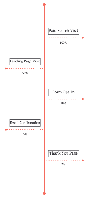
Google Analytics has a report called the Reverse Goal Path under your Conversion Goals that will show which pages people used before converting.
And, with a little luck, this will help you connect the dots to some of the earlier steps we’ve already analyzed.

Here, you’re looking for a logical progression.
You’re looking for the patterns that are already working. You’ll see the same pages people use, in sequence, just prior to converting.
If you have multiple conversion actions set up for each stage of the funnel, you can also analyze how these conversions led to the next conversion.
For example, a certain percentage of those visits will drop off at each step along the way.
I feel like a broken record now, but you want to figure out what’s working.
For example, are people successfully completing your check-out process?
Here’s why that seemingly simple question is important.
Your conversion rate might be right in line with industry averages. You might be hitting the ~2% benchmark comfortably.
So conversions aren’t necessarily your problem.
It might look like they are to your client or boss. However, after doing this quick-and-dirty analysis, you see that the problem is further up the funnel.
The problem might be that people are hesitant to add the product to their carts from your page in the first place.
Now, you have to find out how many people are looking at the product features page and what the majority did next.
- Did they click to learn more?
- Did they want a free sample?
- Did they need to see more images or videos?
So re-run the exact steps for yourself!
Take Michael Kors website for example.
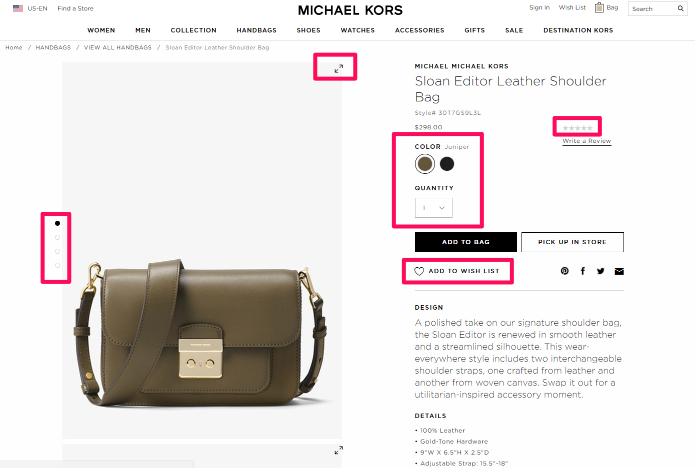
You can immediately see that micro conversions are everywhere. That’s great!
They even use a contrasting color for “Add to Bag” in black to highlight its significance.
Now compare that to Bonobos.
Run through the site experience to understand where a potential customer might have problems. Here, we’ll add a new shirt to our cart.
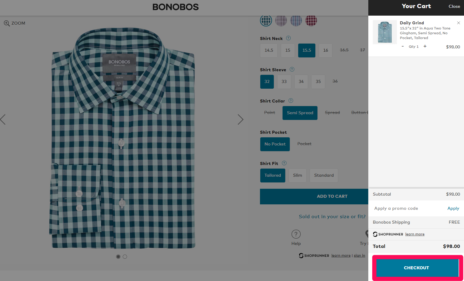
Let’s say you’ve found a big drop off before people click “Checkout.”
So you might have a lot of people entering the conversion process. However, only a few of them get through to purchase.
Look for distractions and potential pitfalls that jump out at you.
For example, Bonobos asks for your full personal information before you can even start the checkout process.
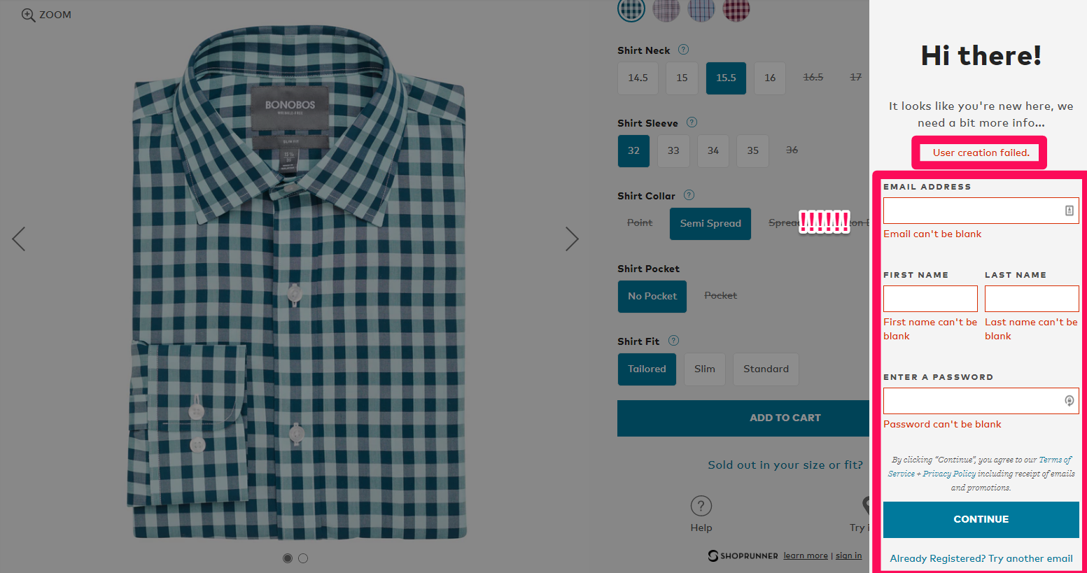
Many check-out flows don’t require account information until the very end.
So if your problem is getting people to complete the checkout process, and you have one obvious ‘barrier’ that adds friction, test it!
There’s no right or wrong answer here. Each scenario is going to have its own results.
The key is to run through the typical progression yourself (without bias), and understand what elements might be preventing people from doing what you want.
You’re looking for clues that hint at what they’re thinking.
Then you can test, iterate, and improve on each little step until they all add up to a big payday at the end of the line.
Conclusion
The best websites give users what they want before they even realize it.
That’s not easy. Especially considering that you only have fractions of a second to make a first impression and keep them around.
That’s why a new website design is never done. It should constantly be evolving and improving.
Fortunately, you can read your visitors’ minds by watching their behavior.
There are clues everywhere if you know where to look.
Analyze the ways in which visitors get to your site. Pay attention to the pages they flow through, the design elements they click on, and even to the barriers preventing them from achieving their goals.
The only way to fix these issues is to put yourself in their shoes.
You can recreate the entire experience they’re going through to see the issues in black and white.
You’ll never get it “just right.” It’s never going to be perfect. You have to constantly test and make changes to see what sticks.
But the good news is that even 1% increases over time add up to substantial performance improvements.
What’s your favorite mind-reading technique to see how people are using your site?
Comments (12)