
When it comes to split testing, ideas might sound like one of the last things that you need, right?
But, I bet there has been a time when you started to run out of meaningful tests to run, which is why you are seeing little to no gains. Multivariate testing, simply called split testing, is a good way to see what marketing campaign will increase conversion rates.
To help you solve this problem, I’ve created 50 different testing ideas that you can implement today. These tests will get you real, actionable results. And, to make it easy, I’ve broken the 50 tests down into 10 categories:
- PPC
- Email marketing
- Social media
- Load time
- Graphics and video
- Mobile
- Calls-to-action
- Website navigation
- Content and copywriting
- Landing pages
So, depending on where you need testing ideas, you can just scroll down to the relevant heading.
PPC Ad Testing
This should be your first stop if you’re struggling to get enough traffic to test with.
When researched, targeted and segmented well, PPC ads can deliver the right kind of customer right to your digital doorstep. But, how do you get that coveted click?
Let’s take a closer look:
1. Split Test the Who/What/Why/How – If you’re struggling to get visitors to your blog post who go beyond a cursory glance and exit, maybe you should be asking some basic questions about them.
Now, I’m not talking about demographics (age, sex, education, income), or even psychographics (attitudes, beliefs, opinions), but rather about the core basic questions:
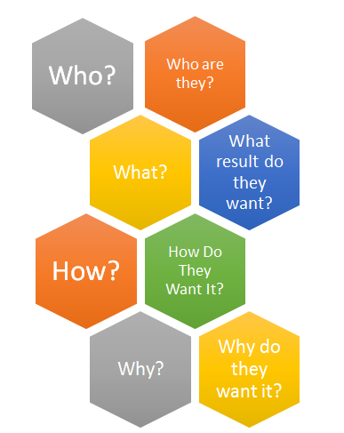
Search Engine Watch has a great example of people who search for “motorcycle pants” – they could be seasoned street riders, first-time motorcycle owners or looking to take up motocross.
Therefore, your multivariate testing ads and subsequent landing pages would each reference things like looking good while you ride, leg protection and so on to increase open rates.
This will help you to determine more precisely who your demographic is and what appeals most to them.
Where most people struggle is at the “how” – and again, split or A/B testing here can reveal a lot of the answers.
- Would they rather choose from a large selection or have just a few recognized brand names that they know and trust?
- Would they prefer free shipping or overnight delivery?
As you continue to refine your ads and landing pages, you’ll be able to target these users with better focus and precision for a higher conversion rate.
2. Test Quality, Selection, and Pricing – How do you test things as esoteric as quality and pricing in your ads? Here is an area where micromanaging a multivariate test can lead you to wonder about things like “50% off or half off?” in your ad copy – but right now, we’re still getting the big picture of things.
So, ask yourself, what appeals most to your customers to encourage them to click? Are they concerned about quality? If so, an ad like this might just be enough to convince them:
Lose Weight at the Fat2Fit Gym! Lose 15 lbs in 30 days. New equipment. Dedicated personal trainers. Open 24/7. www.thefat2fitgym.comOr, are they more focused on selection?
Lose Weight at the Fat2Fit Gym! Dozens of personal trainers on staff. Find one who fits your needs. Open 24/7. www.thefat2fitgym.comWhat about pricing?
Lose Weight at the Fat2Fit Gym! Memberships starting from $15/mo Tell a friend and get 1 month free. www.thefat2fitgym.comYou’ll want to segue these ads into landing pages that are also focused on those core elements to make the transition from click to increase conversion as seamless as possible.
3. Use Social Proof – Social proof can make or break a sale or conversion – particularly in ultra-competitive markets. It can also demonstrate to potential customers that you really do “walk the walk,” rather than just “talk the talk.”
Whether you have 1,000 exclusive members or 100,000 subscribers, you can take advantage of social proof. You don’t even have to mention numbers, as Ramit Sethi of I Will Teach You to Be Rich does:
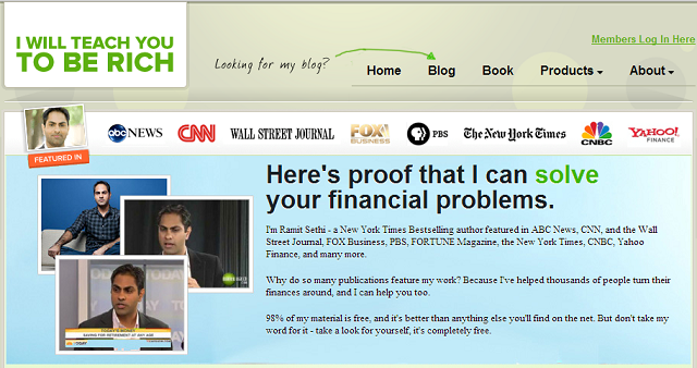
Ramit Sethi uses his media mentions as social proof.
4. Word Order – Even small changes can make a big difference in your ads – such as word order and the use of power words. Again, this is another way for your customers to essentially qualify themselves from the moment they see your ad. For example:
Buy a Home in Townsville Zero down. Low loan rates. Beautiful neighborhood & great schools. Buy a Home in Townsville Great neighborhoods and schools. Own a home w/zero down.Both of the ads are correct, but each one’s word order reinforces the things that each member of your target audiences finds valuable, whether they’re approaching buying a home for financial or family reasons.
5. Power Words in the Headline – Using power words in your headline positions it in a more active voice rather than passive (and able to be lost in a crowd of “me too” ads). For example, which ad would you rather click, if you needed a mechanic in Houston?
Auto Mechanic in Houston Car making weird noises? We can fix it! Emergency mechanic on staff. Houston Emergency Car Repair Car making weird noises? We can fix it! Emergency mechanic on staff.Words like “emergency,” “cheap,” “easy,” “fast” and “new” can all get more clicks than a simple business card-style ad in a blog post.
Email Marketing
Split testing your emails is crucial to not only increase conversion rates but getting clicks and conversions as well. Here are a few multivariate testing ideas that you can use to increase those numbers across the board.
6. HTML vs. Plain Text – It’s the age-old debate of the 21st century – which gets more response? The answer is – it depends. For example, your email marketing provider may allow you to design a page with both plain text and HTML elements, but it also may insert its own proprietary code.
This, in turn, can cause rendering problems in both browser-based and software-based email programs alike. This is problematic for an email campaign.
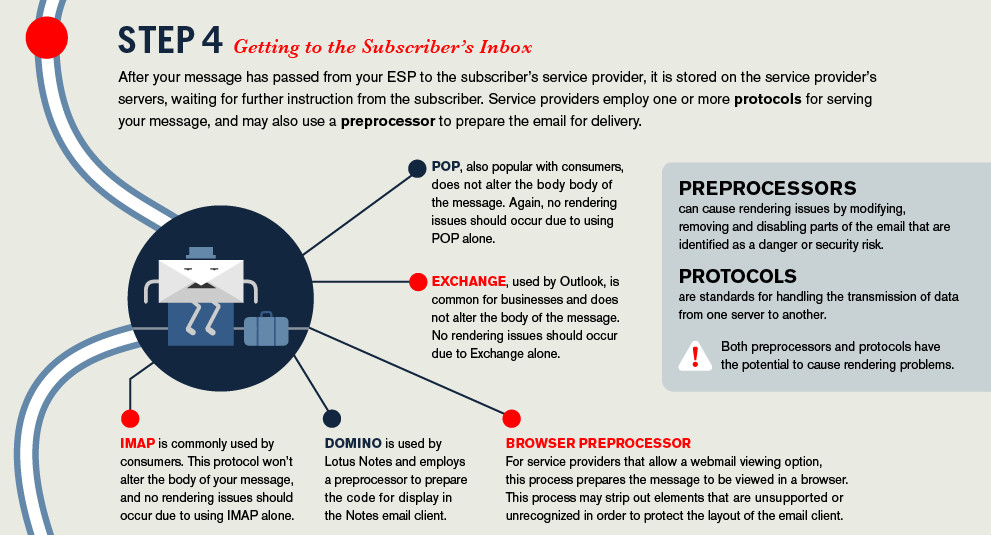
Litmus created a thorough infographic that illustrates the process an email must go through and all of the flaming hoops that your message must jump through in order to be received, much less loaded by the recipient.
Things like spam filters and mobile email devices look specifically at HTML emails as potential problems and filter them accordingly.
By the same token, don’t just copy and paste from your word processing program, as many of them insert their own code that makes no sense to browsers or email software. This is another potential problem for an email campaign.
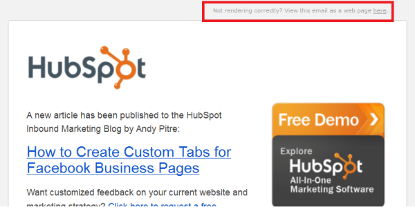
Instead, test your email marketing messages by giving the user a choice, presenting the plain text version with a web-enhanced version:
7. Test Dynamic Content in Your Emails – People react differently to personalization. Some see it as a marketing gimmick, others look at it as a welcome change from the “Dear Customer” messages they get. As an example, you could A/B test the following in your messages:
- Using the subscriber’s first name versus no name at all.
- Including the company name in the From: line, versus the name of an employee at the company who’s in charge of customer relations.
- Test sending out messages specifically to users who follow you via Twitter, Facebook or both.
8. Calls-to-Action in Email – Calls-to-action should follow the same processes as the HTML vs. Plain Text test. For example, does an image-based call-to-action perform better than a text link? What about including both (for those users who have images turned off in their email)?
Where do users click in your message?
Test a button (or text link) above-the-fold or at the bottom of the message. Your email marketing open rates might see an increased conversion ratio just by moving the link.
This might be a bit of a test monkey in multivariate testing since you won’t know what works best until you try random variations.

Where do your email subscribers click?
9. Day of the Week and Time of Day – Testing your own email message open and conversion rate based on the day of the week and the time of day is a common test, but many people just blindly charge ahead and proclaim “THURSDAY!” based on what others have done.
Don’t be that person. Do your own tests.
Here’s a great article on Buffer about what times they found (based on various studies) were the best for opens and clicks across email and social networks.
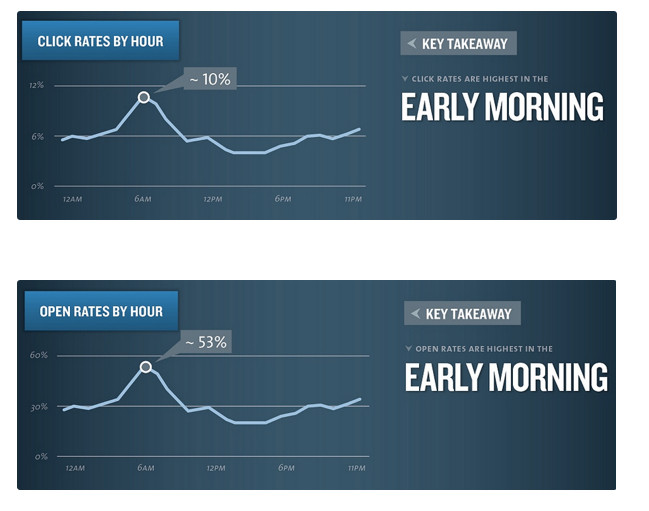
Email click-throughs and open rates based on certain types of emails.
To make matters more complicated, different types of emails increase conversion rates depending on the time of day, such as from noon until 2pm, when news and magazine-style emails are most popular, compared to consumer promotions, which are popular during and after dinner.
10. The Subject Line – Many test monkey variations can be done using just the subject line. Do you go for a more playful or professional tone? Even President Obama got into the email multivariate testing game with some cryptic subject lines, like “Hey” or “Join me for dinner?”
In fact, one of those emails, with the subject line “I Will Be Outspent,” generated over 2 million dollars in donations:
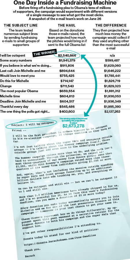
While staffers were tight-lipped during the election, once it ended, they opened up their box of secrets and revealed a few nuggets of inspiration for marketers’ own email test monkey ideas.
For example, even when they found a winning email subject line, the novelty of it would eventually wear off and they’d be right back to the drawing board.
This means that while it may be tempting to reuse the same types of subject lines over and over again, people will eventually get tired of the stale messaging and send your emails straight to the circular file.
Social Media
Social media can be a tricky beast to tame. On one hand, people don’t want to be sold to – they come to social media to have conversations.
On the other hand, they let their opinions be known about the brands that they follow and the companies that they’re loyal to.
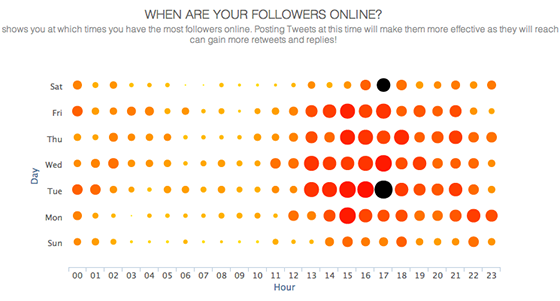
11. Date and Time – Again? Didn’t we just do this for email? Can’t I just duplicate that across social media?
Yes, we did and no you can’t.
Using tools, like Audiense, you can see precisely when your Twitter followers are online and when your tweets can get the most exposure and reach to increase conversion:
As for other social networks, a lot of studies have been done on the best/worst times to post.
But, like with all of the “best” anything, testing is what will reveal that sweet spot for your own business and audience.
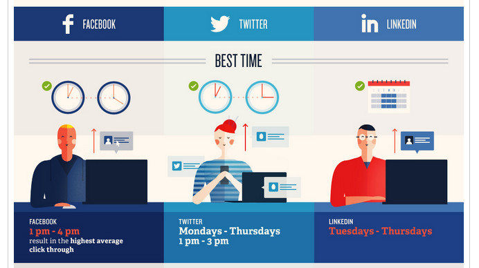
Schedule tests during these dates and times to see if they really are as strong as everyone claims
12. Content Length – Studies have shown that content length matters for likes and shares. A couple of years ago, I analyzed content length versus average ranking and its correlation to social shares and likes.
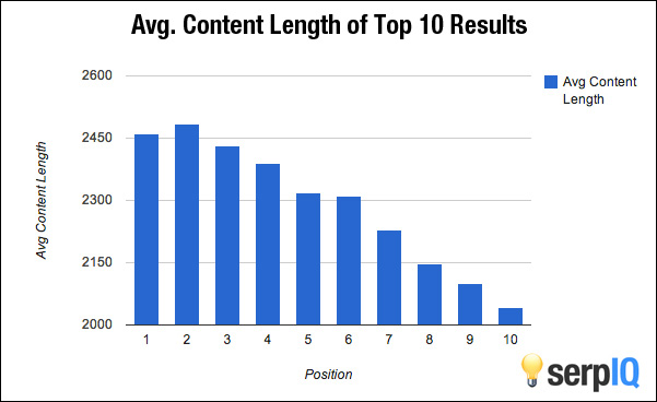
The highest ranked articles had nearly 2,500 words
There comes a point when your content brings you diminishing returns – so testing content length (one 2,400+ word article) versus frequency (two 2,000 word articles) is worth doing, just to see how it matches up to the likes and shares that you get.
This is a good multivariate test that might lead to an increase conversion rate and make you more efficient at the same time.
13. Do You Really Need Social Buttons? – Nearly every website has them – those like, share and email buttons right under the title of the article. A content experiment was done on Venture Harbour to determine if the sidebar position of social icons worked better than placing them below the headline.
These were the results:
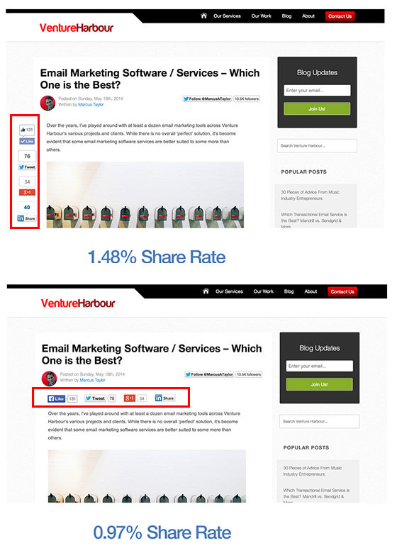
Of course, this kind of test also begs the question – why have social media buttons at all?
Smashing Magazine removed their Facebook “Like” buttons and saw a greater increase in readers who shared the post directly on their timelines.
14. Using Heatmaps with Content “Blocks”
It’s a common practice in web copywriting to write your content in scannable blocks or chunks for easier reading. This is particularly true for a social blog post where people are actively scrolling and looking for something interesting or worth engaging with.
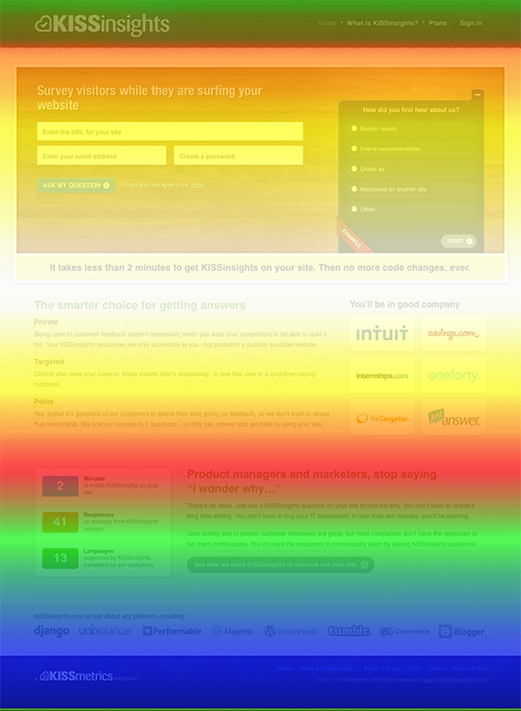
An example of a CrazyEgg scrolling heatmap being used on KISSmetrics.
Combine this chunking with heatmaps to see just how far your social readers are scrolling and where their attention drops off.
Then, use this information to add in some sub-headlines, images or other relevant details that will perk up their interest at the most common drop-off points.
15. Split Test Your Headlines – This should come as no surprise to those of you who have been split testing for some time – but I’m going to put a slightly different spin on this very common multivariate testing advice.
Adam Mordecai, former Editor-at-Large for social sharing behemoth Upworthy, was asked how they come up with their headlines.
His response is one that everyone involved in writing for social media should read. A few key points:
- Don’t make obscure pop culture references. 90% of the American audience has never seen half of the shows that you are referencing. Instead of Jennifer Lawrence Talks About What It’s Like To Be Judged, it’s “That Lady From The Hunger Games.” Nobody knows who your favorite character is played by.
- Don’t oversell. We’ve worked hard to tone ourselves down, as occasionally our headlines would veer toward THE BIGGEST THING EVER, when it was actually THE PRETTY INTERESTING BUT NOT BIGGEST THING EVER. It’s not worth dragging people to your site if they feel ripped off after they get there.
- Don’t be shrill and judgy. Let the facts speak for themselves. Anytime I’ve made that mistake, the content dies a horrible death.
16. What Should I Split Test on Facebook? – Social Media Examiner has some great ideas on split testing for Facebook, including how to properly use images, text, and call-outs.
Facebook Ads can be relentlessly tweaked and refined for maximum results, so don’t be afraid to try things out and see what resonates most with your core audience.
People also respond to different images in different ways – an image of a shocked baby (see below) will grab people’s attention because we’re instinctively hard-wired to pay attention to other people’s faces:
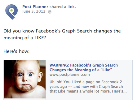
An example of a Facebook ad test
Loading Time
Can you really multivariate test speed?
Absolutely.
And, if you don’t, you’ll never know what elements are worth removing from your pages in order to decrease that load time.
17. Do Split Tests Affect Loading Time? – If you’re serving version A to 50% of your site’s visitors and version B to the other 50%, does that slow down your site?
It’s a good question and the answer is “it depends.”
Without getting too technical, it depends on whether or not you’re using server-side or client-side scripts to load the split testing functions.
Server-side would be things like WordPress, Magento and so on.
Client-side would be web-based split-testing services.
Oftentimes, client-side scripts will use Javascript plugins and other programming instructions that might add a little to your load time.
In particular, changing certain elements that are optimized for mobile sites can cause split test pages not to render correctly or affect the results that you get.
Remember that with mobile-optimized sites, different elements on the page are prioritized based on the size of the user’s screen, so loading time is even more important.
For this particular experiment, prioritize which areas of your site are most needed by mobile users and split test a version of your site where you remove any superfluous elements, like large image carousels/sliders or even smaller images that might be dragging down the load time on your pages.
You may not notice it on your laptop or desktop, but there are many users who are still browsing the web on 3G or slower connections and capping their bandwidth is not a wise idea.
18. What to Cut…What to Save? – It can be a challenge to determine what’s worth keeping on your pages and what’s worth cutting out to improve and test load time.
Studies tell us that the overwhelming majority of users expect a website to fully load within 2 seconds or less and they abandon sites that take 3 seconds or longer to load.
The good news is that you can use some built-in compression algorithms and caching plugins to make your site load faster and reduce stress on the server.
Be ruthless about your editing.
Test cutting out anything that isn’t 100% relevant to getting the user to click or act. That can even mean things like that beautiful slide show or even your navigation menu.
Tablet users are in the middle of this “less is more” battle, so what about them?
One company, Shirtinator, decided to redirect its tablet users to its desktop site (optimized with HTML5). Before, their mobile site (which also catered to tablet users) looked like this:
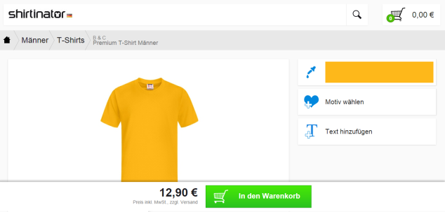
From the outset, it looks like your normal, mobile responsive website.
But, what happened when they redirected tablet users to this site?
Would you guess that conversions tanked? Not at all.
In fact, this version outperformed mobile for tablet users by over 70%, bringing in an extra 32% in the number of orders completed.
19. Shave Off Seconds with Tag Management – Tag management is one of those things that most people plan to “get to” when they have some time. But, doing it now can help you carve off those precious seconds of load time to improve speed and encourage better multivariate testing results to increase conversion.
So, what exactly is it?
Essentially, tag management lets you take all of those third-party apps and services and combine them all into a single Javascript container for faster loading.
It’s a bit technical, so grab your web developer and have them look over all of the instances being called in your <head> tag before you jump right in.
But, the end result will look something like this:
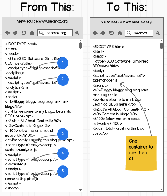
Split test a version with a single container versus your current setup to see how much time you could be carving off your server load. If it’s a considerable amount, make it permanent.
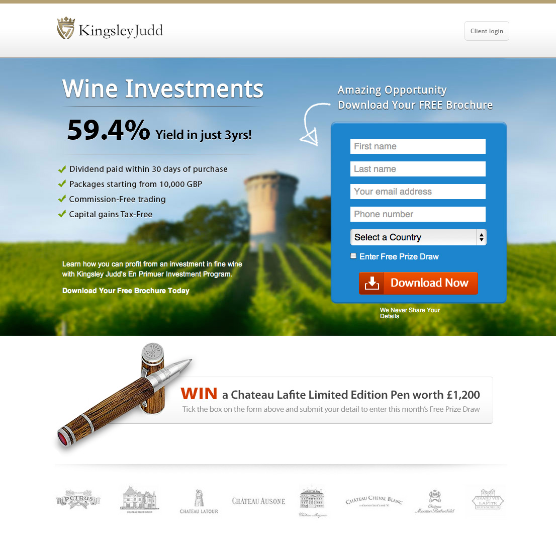
Graphics and Video
You can really get creative with your split tests here.
Don’t feel limited by these suggestions, but rather use them to springboard your own ideas. A test monkey often succeeds because of the random element involved. As long as you monitor multivariate test results, randomness can be an asset.
20. Images of People vs. Products – Humans by nature are hard-wired to recognize faces. It’s in our genes. But, what would happen if you swapped out images of your product for images of people using your product (or vice versa?) Which one would attract their attention?
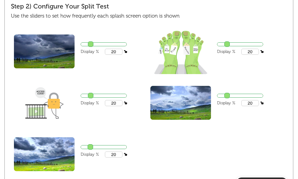
21. Video Thumbnails – If your goal is to encourage more people to watch your video, why not split test your video thumbnails? Video marketing site Vidyard allows users to split test their video thumbnails easily (known on site as “splash screens”).
Below is an example of Vidyard’s video thumbnail split testing section.
22. Do Professional Photos Always Win? – Author and entrepreneur Carl Taylor wanted to test two variations of a landing page that he created to invite users to subscribe to his webinar.
Since the focus of the webinar was all about revenue and increasing cash flow, you’d think that a professional suit and tie would be appropriate, right?
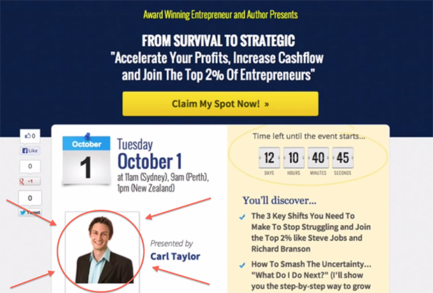
Looks like a winner!
But, appearances can be deceiving. When he replaced it with a more casual, laid-back version of his photo:
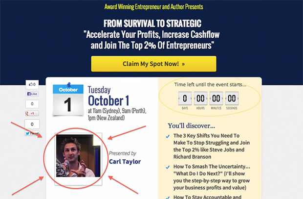
His response rate jumped over 75%.
Now, before you rush off to grab your sweatshirt and jeans to shoot a new pic, remember that this was for his particular audience.
The only way that you’ll know for sure if it will help or harm your conversion optimization initiatives is if you test everything from the picture to the blog post length.
23. Fonts and Typography – Numerous studies have been done regarding the legibility of fonts on-screen — a fact that’s even more important when you consider the proliferation of mobile devices.
Sans Serif (Arial, Helvetica, Verdana) seems to be a longstanding favorite on many websites, but even increasing the size of the font by 30% or the line height between fonts can encourage readability and make visitors stick around on the page longer thus increase conversion.
24. Split Testing the Header – The items in your header may have been left to the designer’s decision. Things like:
- Address
- Phone number
- Email address
These elements all make the header the digital version of today’s letterhead. But, is that really the best use of all of that space?
What would happen if you put the search box or a live chat option up there?
Make solid use of that valuable above-the-fold real estate! This is all about an increase conversion ratio.
25. Product Video versus Demo – When split testing videos, some people like a more passive introduction to a product through an informational video.
They’ll watch it and determine if the product is right for them based on what they see and make a decision accordingly.
They don’t want to be “pitched” to by a salesperson, which is what they think they’ll get by requesting a demo.
Others will want to jump right in and interact directly with the product through a hands-on (or virtual) demonstration. They don’t mind a little sales pressure, but they need to be actively involved in using the product before they can decide.
Again, a test monkey here can help hone in on your target audience’s intent.
Which audience are you catering to?
Split test a more informational approach versus an interactive one and see what they prefer defined by an increase conversion or click percentage.
Mobile Optimization
Responsive, Retina-ready, UltraHD—there’s a world of mobile jargon out there and we’ve only just begun to “tap” the potential of this market.
So, what kinds of layouts and shifts are already making a big impression on mobile users, and what should you be testing to secure their loyalty?
Let’s take a closer look:
26. Blinds, Buttons, and Blocks, Oh My! – True to their name, blinds are a type of easily-tappable navigation system used for mobile-optimized sites. They encourage more interaction than your typical drop-down menu.
True to their name, buttons are easy for mobile users to tap and are the most common navigation option for mobile devices at this time.
If you have a lot of content like regular blog post topics, buttons may not be the best option, since they’ll force you to cut out a lot of that extra content to make way for a more short, concise, and streamlined option.
Blocks allow you to segment content for mobile users in a way that lets them see a lot of information in a small screen space
Because they’re large and tappable, they help prevent the issue of clicking the wrong icon or text link. The problem comes with, again, the limited space and the need to scroll.
What’s more, some users may perceive them as third-party ads and may feel like they’ve landed on the wrong page.
The truth is, you’ll never know how your mobile users interface with your site unless you use a test monkey with a variety of navigation options to see which one they prefer.
Depending on your target audience, they may find blinds the most welcoming option. Or, they may prefer the larger, more easily viewable blocks.
Split test each option to see what works for your customers.
27. Icons or Text? An automobile detailer ran an interesting split test to determine if icons or text were a better navigation option for his mobile users. When using icons in a layout, the most important consideration is “can the user tell what this is about at a single glance?”
Here were his options:
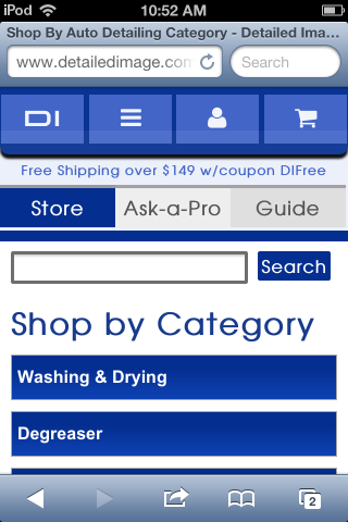
Two of the most unusual icons showing there are the DI on the left (for Detailed Image, the name of the company) and the “hamburger icon” for the overall navigation menu.
They then split tested this option with plain text in the navigation bar:
(The cart icon remained the same throughout the test)
Text ultimately won over icons, but there were many other findings made during this multivariate testing process that only a solid split testing environment and a keen understanding of analytics could demonstrate.
Try split testing your own text versus icons on your mobile and see which ones your customers prefer.
28. The Hamburger Icon – Speaking of mobile navigation, one of the most common themes you’ll see throughout mobile menus (and even some desktop versions) is the hamburger icon.

The famous “hamburger icon” is actually from the 1980s.
Website Caffeine Informer set out to do a variety of split tests to learn whether or not users identified with (and used) the hamburger icon, versus the “Menu” text, versus both – with and without a border.
What they discovered was that the version with the “Menu” text AND the border outperformed all of the others by nearly 13%.
Now before you take down your hamburger icon entirely, you should know that the website owner had run a previous test that showed that the bordered hamburger icon had a higher click rate compared to a version without a border or the word “Menu” below it.
As to which one your users would prefer – that all depends on how mobile and computer savvy they are (not to mention hungry!).
29. Filtering versus sorting – It’s common on shopping websites for you to automatically filter and sort options until you find exactly what you want.
But, what about your mobile users?
No one’s going to realistically squeeze and zoom and pinch their way across checkboxes or drop-down menus.
Remember that your mobile shoppers (and all shoppers for that matter) are looking to get in, get what they need and get out.
So, split testing your results pages according to their needs and letting them filter or sort items in just a tap or two will make the process remarkably simpler to increase conversion purchases.
30. Responsive or Standalone Mobile Site? One of the biggest issues for many website owners is the time and cost associated with creating a truly responsive site.
Does it conform to multiple devices and prioritize elements accordingly?
Do you even have enough mobile traffic to warrant a redesign?
For some smaller businesses, the answer is no – and that’s OK.
In those cases, you may want to split test the option of a standalone mobile site.
The downside here is that you effectively would have two sites to update instead of one — but, for specific promotions and time-limited sales, a standalone mobile site may be a less expensive alternative.
Here again, it’s best to weigh your options and rework your site using your baseline analytics data to make a concrete decision.
You can always restructure at some point in the future if your mobile traffic experiences an uptick due to the popularity of your standalone site.
Calls-to-Action
One of the most critical and under-tested areas of your site is the call-to-action section.
So many buttons are haphazardly labeled “Learn More” at the last minute. Why not experiment a bit with more personal options to see if it will increase conversion?
31. My vs. Your Button Copy – If your sign-ups or subscriptions are lagging, consider changing the pronouns on your button copy. ContentVerve did a variety of call-to-action case studies, including button copy:
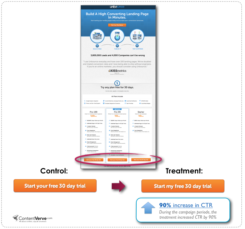
In this example for Unbounce, changing “your” to “my” caused the click-through rate (CTR) to increase by 90%, but…

This multivariate test had the opposite effect, which is why it always pays to test, rather than blindly following the best practices you read from case studies on the web.
32. Call-to-Action Button Color – You’ve likely seen the split test from a few years ago where a red button outperformed a green one, much to the surprise of the tester. But, button color goes much deeper than that.
You can actually enhance and detract from your buttons through the colors that you use.
For example, let’s assume that you have two call-to-action buttons. You really want people to buy your product, but you wouldn’t be the least bit disappointed if they downloaded a trial first. Still, you want to make the buy option more attractive.
What do you do?
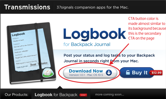
In this case, the download now option is less prominent, even though it’s the first CTA on the page. They want the eye to be attracted to the more prominent “Buy It” button instead.
Try enhancing the color of the button you want users to click and muting the color palette of the one you want to give less emphasis to and see what happens in your own tests.
33. Arrows and Navigational Cues – Notice on the example above that each call-to-action button leverages small navigational and visual cues, rather than having just a plain button?
These little visual enhancements have a purpose. Directional arrows (such as “down” for download) make it clear at a glance what the intended action should be.
Often times, buttons that want you to get a quote or take some other action beyond downloading will have a right-facing arrow, symbolizing forward movement.
One mistake that I noticed in the Logbook screenshot above was the unsecured icon for “Buy It.” Perhaps that’s not the best impression that you want to give to people who are trusting you with their credit card details!
34. Positioning is Everything – Many call-to-action buttons are wedged in between blog post content, headlines, and slideshows, to the point that it can be overwhelming for first-time users.
Split testing gives your buttons some breathing room, similar to how Paypal does with their CTA:
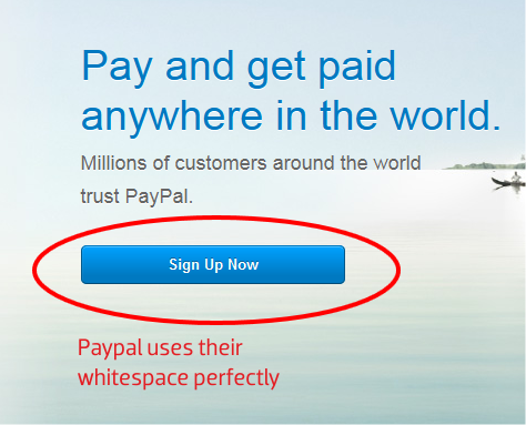
All of that empty space is not an invitation to fill it with stuff. Good use of whitespace allows you to focus the eye and attention more clearly than a page packed with information. You can use a test monkey here because it is sometimes hard to determine that fine line of what is too much on a page.
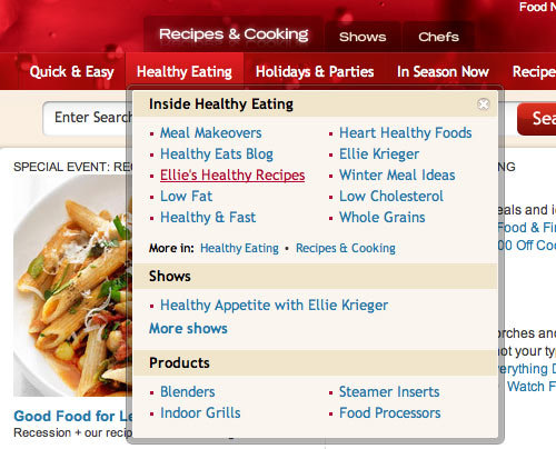
Website Navigation
Another area that can be vastly improved with split tests is your website navigation. Chances are, you’ve thought long and hard about how to organize and structure your content, so you’re leery about upsetting that balance.
Well, don’t be. Some of the best split testing results have come as a result of making tough decisions when it comes to website navigation.
35. Primary vs. Secondary Navigation – On many sites, you have two sets of navigation menus:
- The primary, which is for your main categories.
- The secondary which is typically reserved for things like About Us, FAQ, Contact, etc.
However, in many cases, it’s easy to overlook the primary navigation, because it blends in so well with the main site:
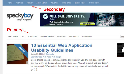
What if you were to run a multivariate test turning your secondary menu at the top of your pages into your core menu with drop-downs?
This would bring your other content further above-the-fold while letting you highlight the most popular and important options right at the top of the page.
36. Less is More – Let’s say you’re selling advanced software and equipment and that you have very specific areas where customers should go. Like this:
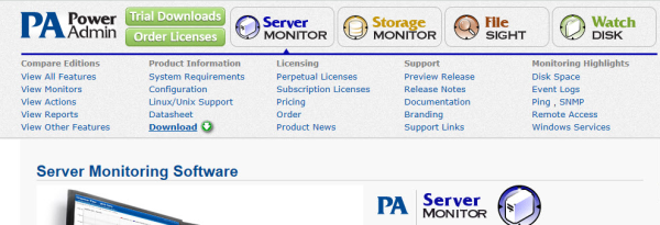
According to the “Jam Test,” when people are presented with too many options, they simply abandon the decision-making process.
So, with this in mind, you could split test removing the navigational sub-links altogether, as Power Admin did on their site (which subsequently experienced a 12.3% conversion rate increase).

What would happen, in the case above, if you removed the navigation bar altogether and placed that information on the subsequent page?
Analyze your own navigation and determine which pieces are truly needed and which can be reserved for areas beyond the homepage.
37. Drop-down Boxes vs. Text Links – Following on the heels of the test above, what if you replaced those text links with drop-down boxes? You don’t have to settle for plain, uninspiring HTML form elements either. Some of the most beautiful drop-down menus actually enhance navigation by incorporating the best of both worlds, like these:
38. Using Icons in Navigation – Remember the Hamburger test? Icons on your site can either guide users visually or make them stop and question what the page is about.
The last thing that you want to do when split testing is to create confusion. Confusion won’t increase conversion.
Try some multivariate testing your navigation menus with and without icons to see if more attention is drawn to them (heatmaps are a great way to measure this!).
See how Narwhal Co. does it below:
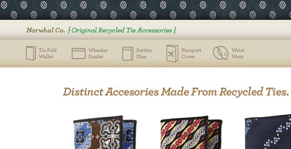
Each icon is meant as a visual indicator before you even read the text. Even if you don’t know what a “Sattley Slim” is, you can tell by the styling that it’s a cover or some kind.
39. Remove Navigation Entirely – What?! Don’t panic.
For some sites, actually removing the navigation gave the user fewer choices and focused their attention wholly on the call-to-action button. Take a look at YuppieChef for example:
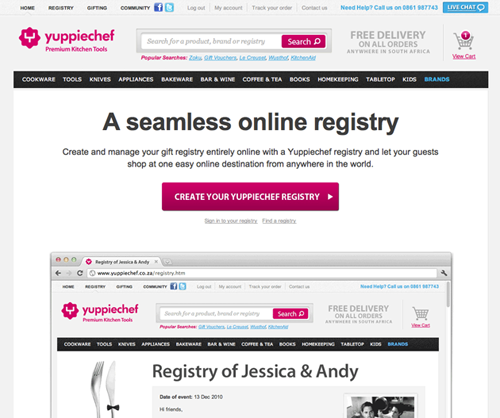
There’s a lot of important navigation options there — all kinds of choices for registry gifts. But, when they removed it:
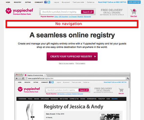
Their conversion rate went up from 3% to 6% – effectively a 100% increase. Try split testing the removal of your navigation so that users are focused squarely on the call-to-action.
Content and Copywriting
Perhaps the most important facet of your split test is not in the flashy graphics or slick offer but in the words that you write.
On the web, people don’t have the time (much less the attention span) to read every single word. But, that’s no excuse to be sloppy about your writing.
Split test your content using these examples and see how your site performs.
40. Free Samples – We all know the lure of free samples and this retail mainstay has enjoyed even more popularity on the web. But, how can you actually split test this without diminishing the quality or muddying the test’s accuracy?
Try split testing your sample alongside an offer.
For example, if you were selling a weight loss supplement and you were giving out free samples of your metabolic shake powder, why not split test your offer with a month’s worth of supplements for just $1 plus shipping?
Sometimes, people are willing to pay for an offer that’s more closely aligned with what they’re looking for, rather than a freebie that isn’t.
41. Short Copy or Long? – It has been the rallying cry of copywriters, blog post creators, and marketers for ages.
Which copy sells better?
The answer is “it depends.”
It depends on not just who you’re engaging but also on what market you’re in and who you’re serving with your offer. Marketing Experiments created a short vs. long copy matrix some time ago that used empirical data and various case studies to arrive at their conclusion:
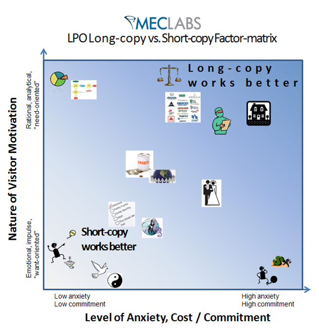
In a nutshell, if you’re selling “want-oriented” products that don’t require a large investment or commitment, you’ll do better with short copy.
More need-oriented points, particularly medical, housing, travel insurance or other types of offers do well with longer copy. Not sure where your market falls on the spectrum? Split test both and see which works best.
42. Broad or Segmented Offer – If you’ve studied sales funnels, paths-to-purchase, and other online behaviors, you’ll know that a broad offer isn’t always the ideal choice, particularly if a customer returns to a site or spends an inordinate amount of time looking for something.
In these cases, segmenting your offer to appeal to that particular searcher may be worth testing.
Dell did this on their support pages.
On the first page (version A), visitors saw the default support page with common topics and FAQs.
On the second (version B), the page was automatically triggered and included a live chat option if the user had been on the support page for a specific length of time or had visited other topics within the support page.
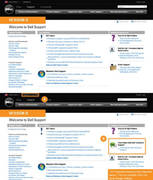
Dell’s reasoning for this segmented test monkey was that if the user wasn’t finding what they were looking for by browsing FAQs or searching support articles, they’d be more open to starting a live chat session with a technician.
Including different options based on user behavior is a smart split testing strategy that can not only help you close the sale and earn that coveted conversion, but can also provide you with invaluable details about your potential customers as well.
43. Don’t Always Follow Good Advice – You’ve probably heard the same advice when copywriting headlines: Don’t use humor. Don’t be clever. Funny doesn’t get sales.
But, sometimes it’s worth testing, just to see how your audience will respond.
Case in point, an iPhone repair company posted this gem:
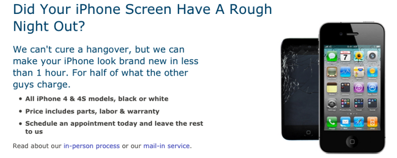
This test breaks down the assumptions that most people have when they’re trying to play it safe with headlines — sometimes a bit of humor can connect you even further with your audience.
Try multivariate testing a clever or more light-hearted headline to see what it brings you. You may be surprised at the outcome!
44. Personal Story or Review – We’ve talked a lot about copy tests that you can run on your own site. But, what if you’re an affiliate for another product?
Why not split test the option of sharing your own personal story with the product (how did it help you? Did it meet your expectations? Why or why not?) or a critique/review of it, as is common on many affiliate sites.
Just because a review is the way it has always been done doesn’t mean it’s the best way.
Landing Pages
Many split tests are initially started on landing pages, which is why I saved them for last.
That’s not to say they aren’t important, but it should remind you that they aren’t the only element worth split testing. If your landing page conversions are starting to stagnate, try jump-starting them with these split tests to increase conversion stats:
45. Radical Redesign – Sometimes you don’t need a few small changes to spice up a website’s conversion rate, but rather a major shift in the way that you approach the design of the page itself.
Marian University consistently tests radically different versions of its landing pages to some astonishing results:
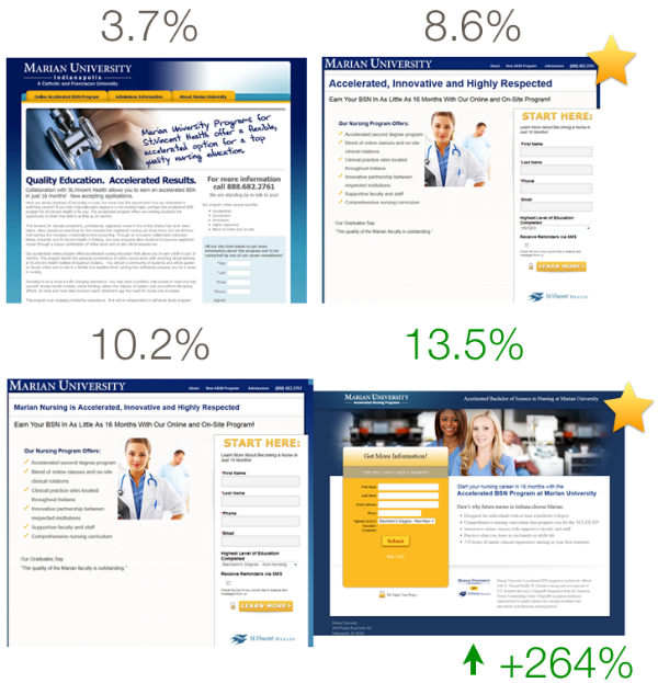
Don’t be afraid to experiment with your pages and think outside the template.
Sometimes, the biggest changes yield the best results.
46. Generic versus Geo-targeted – Originally popularized by local daily deal sites, like Groupon, geo-targeted content has taken on a life of its own to appear in everything from car part ads to apparel.
Geotargeting isn’t just limited to physical location, though — things like currency and language can also be considered geotargeting.
So, will your prospects be drawn deeper into your site if you know where they’re from and mention it on your landing pages?
Test and see.
47. Video versus Copy – According to some studies, video can outperform written copy. But, there are still instances where copy is better.
Even if you decide on using video, it’s worth testing the type of video that you use.
For example, will you use a whiteboard-style “explainer” video or a more personal one-on-one style?
48. Forms with or without Photos – Landing pages often contain a call-to-action form for a free download, demo or other offer.
But, it’s worth multivariate testing the inclusion of a photo with your form. It could be a photo of the product, a photo of you (or a customer) using the product, or even a landscape shot that references your product — like this one:
Who said landing pages have to be bland, boring forms?
49. Should You Include a Countdown? Page countdowns are incredibly popular on landing pages for marketing products but seldom seen elsewhere.
This type of test won a Gold Award in the Which Test Won marketing awards of 2014 and for good reason — countdowns, when used realistically, can add a sense of urgency that few other methods can bring.
This simple test monkey can increase conversion because people fear time is running out for the deal.
A countdown can also be used to generate excitement and anticipation of receiving the product.
To our brains, the thrill of anticipation of owning something releases good, “fuzzy feeling” chemicals as if we already own it – and a countdown can set the perfect stage for that type of emotion.
50. Social Proof and Trust – Can trust logos, such as transaction-safe or hacking-safe logos and social proof/guarantees improve the conversion rate on your landing pages or will they distract potential customers?
Some studies say they help, others say they don’t impact the bottom line.
Test adding a few recognizable, reputable seals on your site and see what your own audience thinks.
Conclusion
Now you have no excuse for not knowing what to test. You can put any one (or several) of these 50 different split testing ideas to work on your site right away and discover what your audience prefers.
And, even if you do one a week, you’ll still have almost a year’s worth of actionable knowledge that brings you that much closer to putting your finger squarely on the pulse of what your ideal customer wants, thus increasing conversion rates.
Do you know any additional split testing ideas?
Comments (27)