The first step of your checkout sets the tone for the entire checkout experience. It’s when you’re supposed to put your best foot forward. Yet this is where we see the largest drop-off of customers in the checkout funnel. No matter the size of the store. No matter the price of the product.
The best e-commerce websites create an online experience that makes visitors fall in love with their products. The shopping experiences are emotional, guided, and clearly encourage visitors to add a product to their cart.
But once they get to the checkout, something just doesn’t feel right. There’s a break in the experience from cart to checkout, and it causes a disconnect for the customer. It’s this disconnect that leads to the highest level of cart abandonment at the very first step of the checkout. We’re not the only ones who notice it.
We’ve identified four UX (user experience) fixes that will reduce the number of visitors who abandon their cart before they really even get started. We’ve seen improvements of up to 5% in overall conversion rates as a result.
1. Tear down the “sign-in” barrier
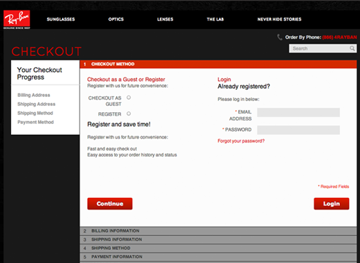
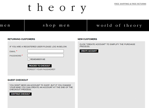
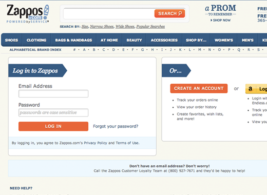
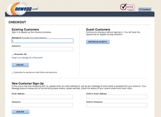
Most checkouts start with a potentially jarring question: Are you new here or a returning customer? Don’t remember? Follow this hyperlink.
If your user is a returning customer, you’re asking them to remember which email they registered with and the corresponding password. If your user is a new customer, you’re asking them to decide whether they want to register (i.e., go through a set of additional steps) or checkout as a guest. Each option creates an unnecessary disconnect between the user and their goal – buying the product.
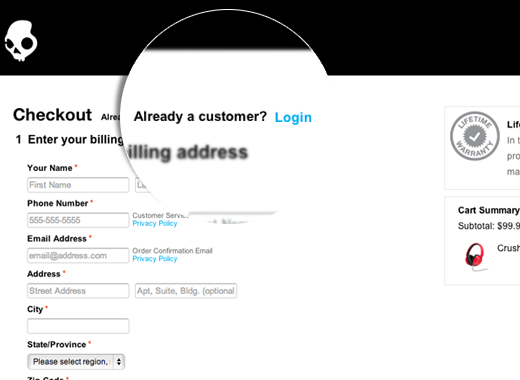
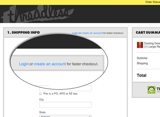
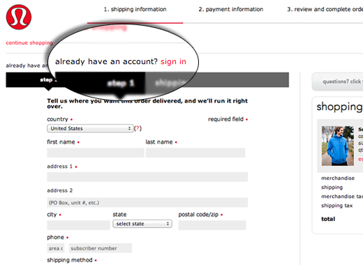
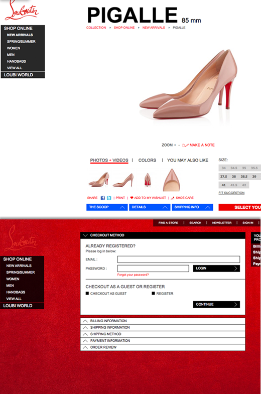
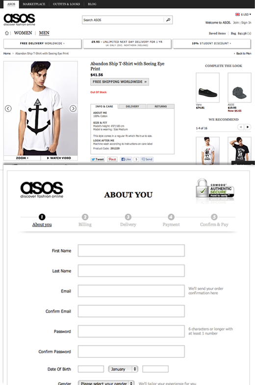
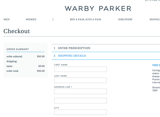
But even the best are guilty of this:
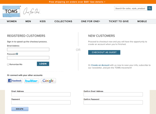
With a few programming tricks, some stores figure out who the customer is based on their email address. They recognize a returning customer from the email address registered in their system.
Then, they offer the user a way to login if it helps them checkout faster. Or, they offer a way for returning customers to login, while allowing the rest to continue into the checkout. This does not interrupt the shopping process and asks less of customers.
Checkout usability expert Christian Holst found 30% of users abandoned their cart (scroll to point 10) when asked to register upfront.
2. Provide a progress indicator
Checkouts come in all shapes and sizes. Some have one step, some have three, and some go up to six steps. Customers want to know how many steps it will take to get to the finish line. In many checkouts, there’s absolutely no indication at all when the customer gets started.
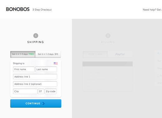
Again, even some of the best don’t use progress bars:
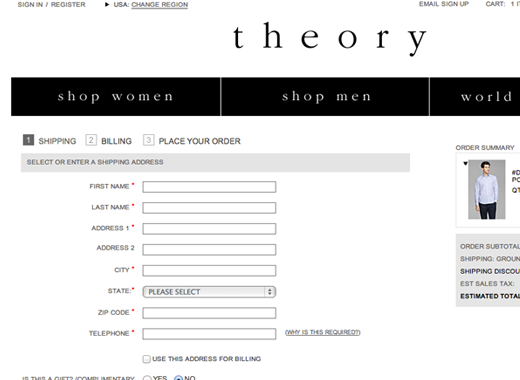
An uber-simple solution is to take the unused space on the page and put in a progress bar. As a step gets completed, it is clearly shown, and there’s a way to go back to edit it in case of a mistake.
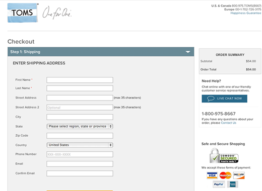
3. Match the checkout with your site’s look and feel
When there’s a visual disconnect between the checkout experience and the rest of your site, it can contribute to abandonment at the first step. A slightly different background color, a varied font type or size, or even a new “next” button can throw off the experience.
A sharp change in page contrast can alarm the customer.
Even changing the font can throw a customer off.
The transition from My Cart or Product page into the Checkout has to be seamless. By maintaining exact styles and keeping an identical look and feel, your site can prevent visitors from feeling visually alarmed. So, they will continue on as if everything is a part of one experience.
4. Don’t get ahead of yourself
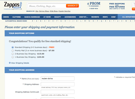
A majority of e-commerce checkouts jump the gun by asking customers to fill in their billing information first, even before they are asked for their shipping information or preferred shipping method.
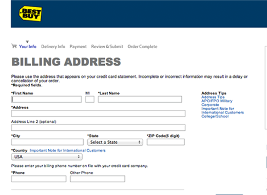
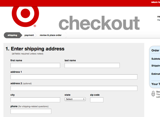
Best Buy puts billing before shipping…
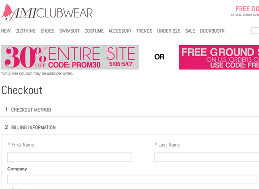
And so does Amiclubwear. This screams at the customer: “We want the money NOW”.
Though billing information is most important to retailers for collecting payment, shipping information and method are more important to customers. Customers care about when and where they will be receiving their product and want to know those details before providing payment details. By aligning with your customers’ priorities, you can make them feel their needs are the most important.
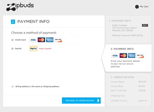
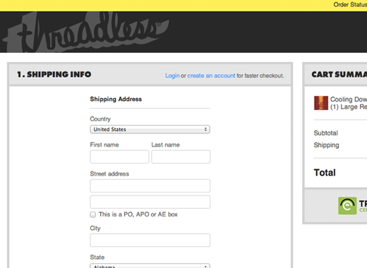
These retailers do it right:
How to Test
Testing is easy when utilizing either Google Analytics. We suggest you follow this tutorial.
Both tools provide reports that identify how many users abandon and at exactly which step.
Too Big to Ignore
When the abandonment rate at the first step of checkout is the #1 drop-off point, it’s an important user experience to tunnel in on. When done right, conversions can increase anywhere from 2-3% all the way up to 5%.
What is your most frustrating checkout experience?
About the Author: Nirav Sheth is the creator of Awesome Checkout, a Magento checkout extension that guarantees higher checkout conversion rates. He also is the founder of Anatta Design, a Magento and WordPress development shop that builds online businesses.
Comments (45)