Sometimes even the best-laid plans don’t get us the results we want.
That can often be the case with website conversions.
You’ve put in the work of polishing your content, fine-tuning your SEO, and launching your marketing campaigns.
And still, you don’t see the numbers you’d hoped for.
Sure, you’re getting traffic.
But they aren’t buying or signing up.
Which means all that time and work you put in doesn’t amount to much.
The average conversion rate for e-commerce businesses in the U.S. is eight percent.
For AdWords, the average conversion rate hovers around 2.35 percent.
Are your numbers woefully lower than that?
If so, it might be time to take action.
Luckily, there are quite a few hacks that will up your conversions, all while saving you time and money.
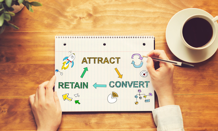
But before I get into the details, let’s make sure we’re on the same page about the definition of conversion.
A conversion rate is the number of actions divided by the number of visitors to your site.
Actions are whatever you want your visitors to do, or your calls-to-action (CTA). For example:
- Donate or buy a product that funds a donation.
- Buy a good or service.
- Sign-up for a newsletter.
- Reserve your spot for a webinar or podcast.

Still with me? Great.
When visitors come to your site and don’t click on your CTA, the visits are pretty much worthless, except in terms of traffic numbers for SEO.
But that’s a subject for another day and another post.
Let’s take a look at a few conversion hacks to save you money, and make sure all that hard work doesn’t go to waste.
1. Create a sense of urgency
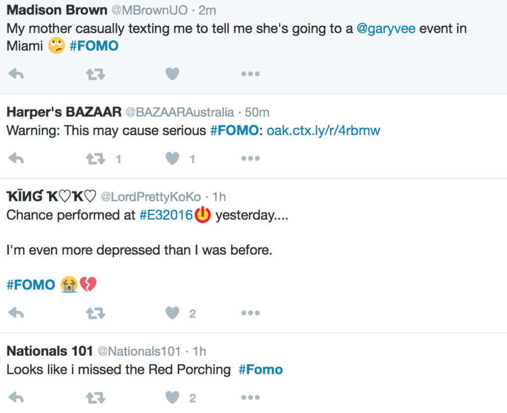
Make your customer feel the FOMO (fear of missing out).
This is doubly helpful if you have a large millennial audience.
And you likely do, since millennials are spending $600 billion every year in the U.S.
A recent study found that nearly 70 percent of them have the dreaded FOMO.
For them, and the rest of the world who react to urgency, creating a sense of “now” works.
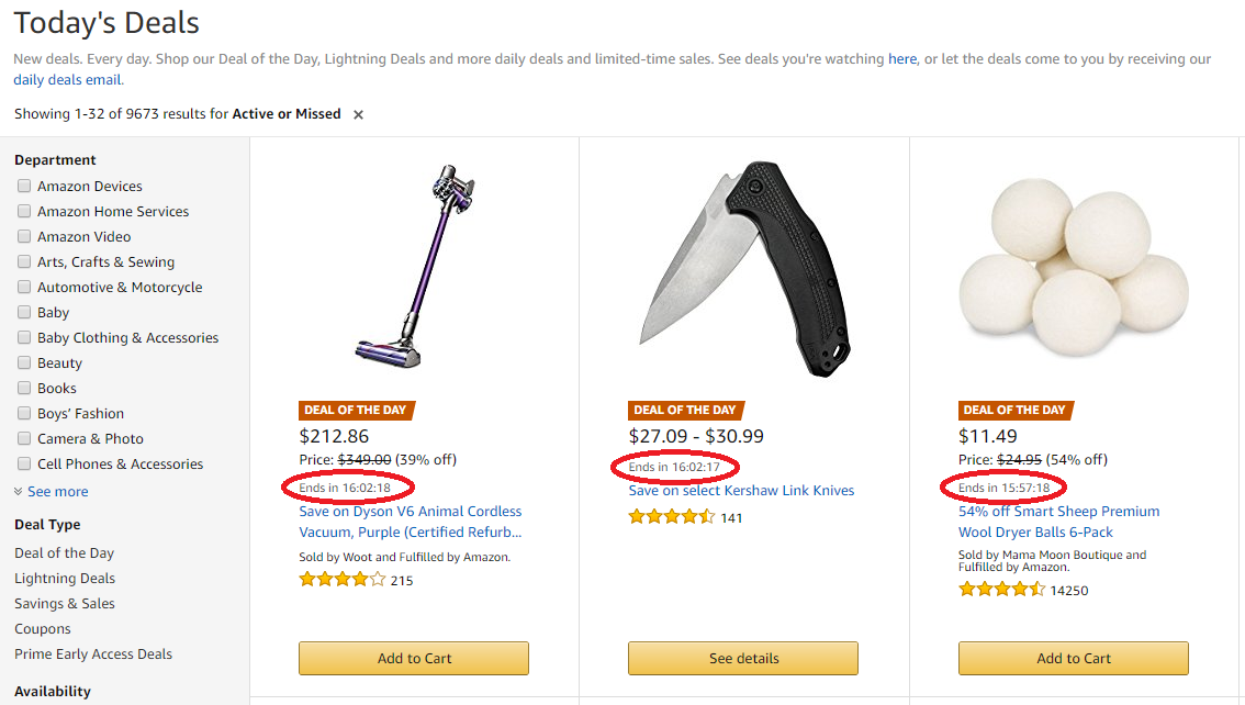
CTAs offering limited-time sales are not new, but they are effective. That’s why everybody uses them.
The most recent manifestations of FOMO tactics are flash or lightning deals at retailer marketplaces like Groupon, Wayfair, and Amazon.
They are making a fortune by offering must-buy-now deals. We’re talking $2.5 billion every year.
Researchers at Northwestern University Kellogg Insight teamed up with Washington University to figure out why flash sales are so successful and found that sales grow quickly as more people buy the item.
The reason isn’t hard to figure out.
Plenty of people rate the deal as soon as they buy, adding to social proof, and lots of them are so excited about it they post it on social media.
Word gets out, and more people buy before the deal ends. Mystery solved.
The researchers also found that as the supply decreased, or more deals were claimed, sales increased.
Their findings can be boiled down to: Time Limit + Increasing Scarcity + Social Proof = +3 percent more sales per hour over the base rate.
If you sell 10 percent more in the first hour, you’ll sell 13 percent more in the next.
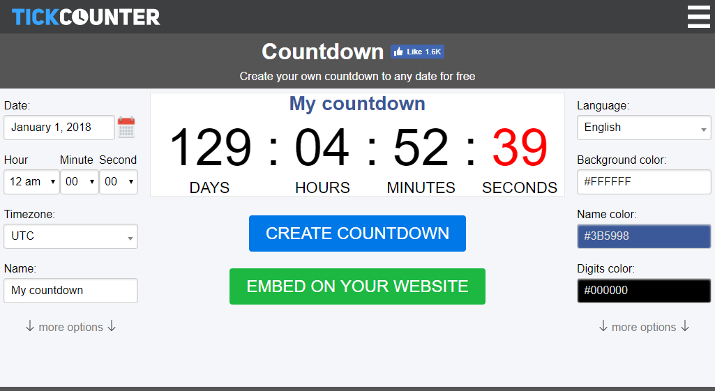
You can countdown a sale by time or number of units sold, or until your next podcast, like I do.
TickCounter lets you generate your own countdown timer. Check it out.
The latest FOMO buy-now marketing tactic is a first-time visit sale, and we’ve seen it a lot around the web.
If you order right now, you get a special deal. Some websites use a countdown clock to put a time limit on the offer, and others just use the first-time deal without a catch.
Here’s Overstock.com, with a pop-up, sign-up overlay for an additional 12 percent off:
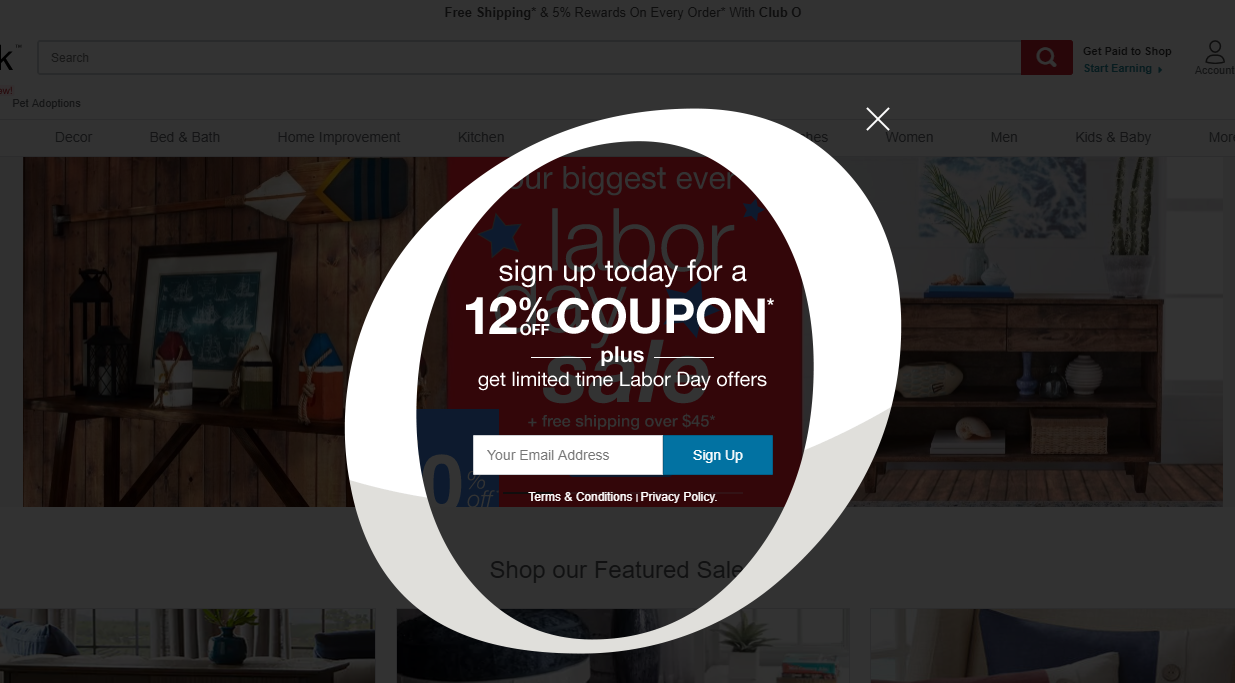
90 percent of consumers use coupons when they shop. This is a no-brainer.
2. Offer a tangible reward
Consumers are savvy.
When you ask people to sign up for something (newsletter, join a community, attend a podcast), they usually know they are being added to some type of leads list.
Which means they know you’ll be emailing solicitations.
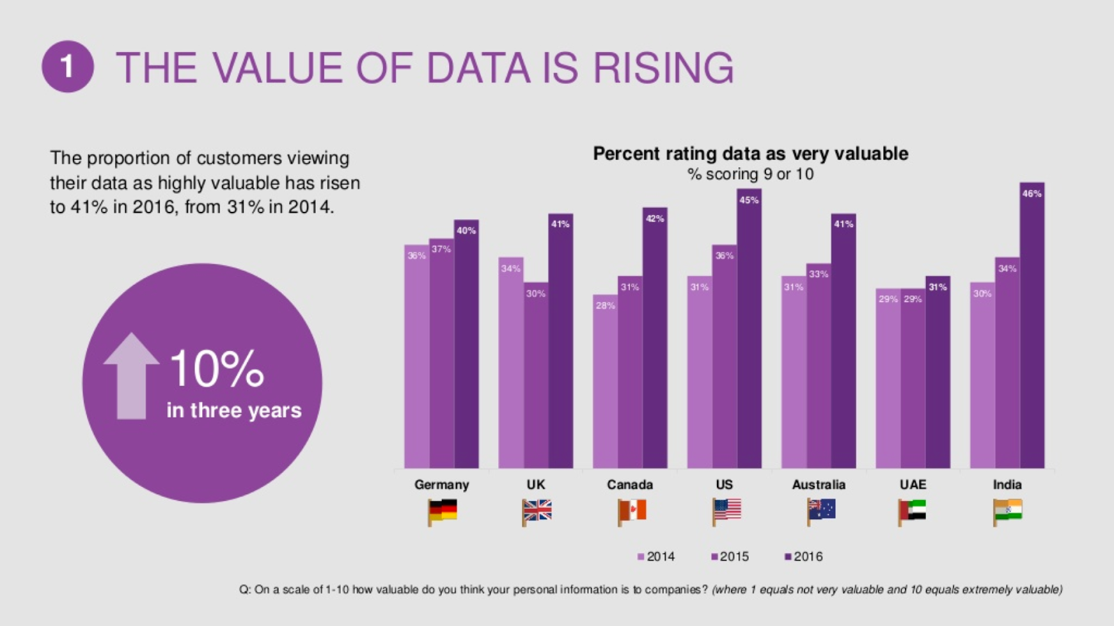
In 2016, Aimia polled global consumers about the value of their data.
As it turns out, they know quite a bit. And they expect value in return.
If you want them to respond to your CTA, there needs to be a reward at the other end.
What kind of reward? In my case, I offer valuable information.
Like how to increase your traffic by an extra 195,013 visitors a month.
Oh, and you also get my SEO analyzer tool for free.
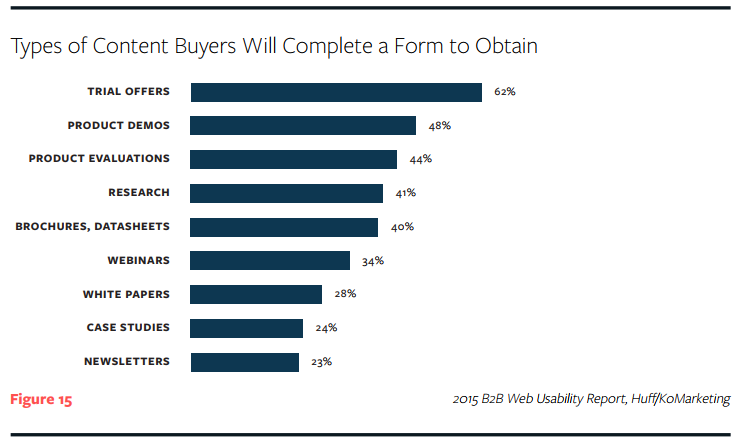
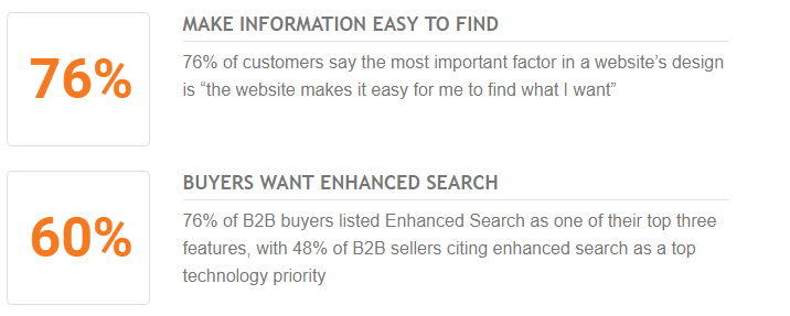
What do people respond to best?
Here’s a chart from the 2015 B2B Web Usability Report, Huff/KoMarketing:
What value can you offer in return for personal information and engagement?
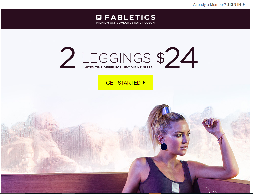
Kate Hudson’s Fabletics site has a great deal for first timers. You get your first order at a huge savings.
$24 for two pairs of leggings is dirt cheap.
You can offer anything in exchange for their email, as long as it has value for the customer.
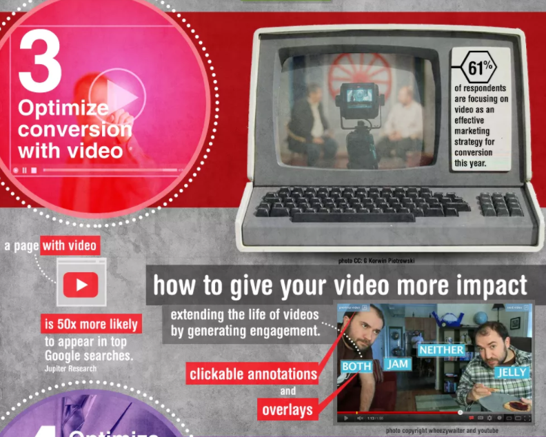
3. Add optimized videos to your landing page
Adding videos to your landing pages makes them 50 times more likely to show up in Google searches.
Syndacast reports that even using the word “video” in an email subject line boosts open rates by 19 percent, click-through rates by 65 percent, and reduces unsubscribes by 26 percent.
Research by Animoto found that one-of-four consumers actually lose interest in a company if it doesn’t have video.
In Vidyard’s latest research report, marketers using video reported 49 percent faster growth in revenue and 35 percent higher web-conversion rates over marketers who don’t.
If that sounds incredible, check this out:
Using videos created for national brands, Eyeview added local information to create personalized versions of the video for regional TriHonda dealers.
To customize the national commercials, the company added screens with local deals and a geofencing option that identified the nearest dealers and invited users to click for more info.
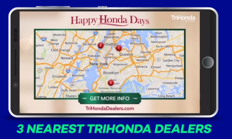
The campaign generated a 29-percent increase in sales and sold an additional 912 vehicles across 62 locations, resulting in $1.5 million in incremental profit.
That breaks down to a $7.83 return on every dollar spent on the campaign.
A nearly 800-percent ROI? Sounds pretty good to me.
4. Optimize for mobile
If a user can’t easily make their way around your site, they’re leaving.
A Stanford web study found that 75 percent of consumers will judge a company’s credibility based on their website design.
And this doesn’t just mean your desktop web design.
Of all the online retail buys made every year, 34 percent happen on mobile.
Retail giant Target reports that 98 percent of its customers shop digitally, and three-quarters of them use a mobile device at some point in their shopping experience.
Today’s consumers expect to move seamlessly between mobile, desktop, and in-store experiences.
Unfortunately, that’s not exactly the offering from most business.
Mobile conversion rates are still pretty dismal.
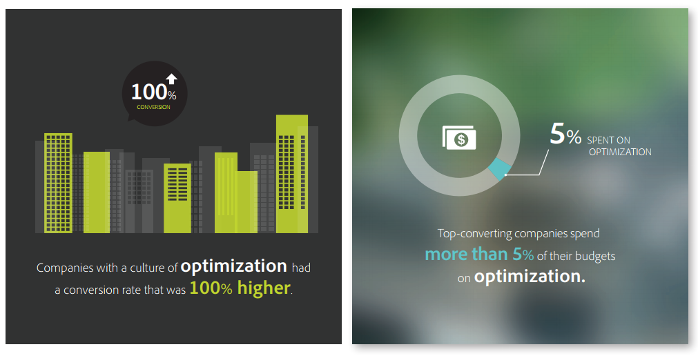
Why? An Adobe report lays it out pretty clearly: companies with a culture of optimization had conversion rates 100 percent higher.
If you want those conversions, it all has to mesh.
Make sure your website is findable, searchable, and easy to navigate on any device.
5. Upgrade your content
If you want to keep converting, you need quality content for your audience.
Offering valuable content in exchange for filling out a form or CTA results in higher conversion rates for 57 percent of marketers.
Showing users why they should pick your company should be front and center on your homepage.
Take MailChimp, for example.
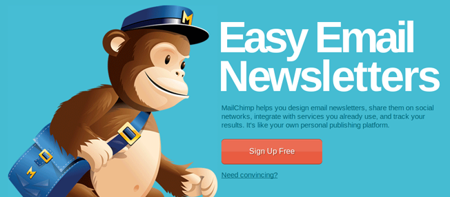
I’d say that’s a pretty clear message on what they offer.
You also want to make sure your headlines grab the reader’s attention.
More than half the people will only read your content for up to 15 seconds.
This means you have almost no time at all to hook the reader.
Try out some headline tips to create one that gets it right.
You should also focus on tried-and-true copywriting formulas that have been working for years.
There’s no need to reinvent the wheel when it comes to compelling copy.
Use methods that have been proven to convert.
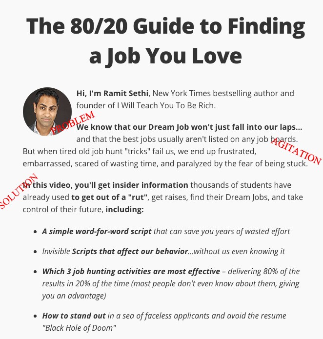
Like problem, agitate, solve — or PAS.
It’s pretty simple, really.
Explain the reader’s problem to them (hey, maybe they don’t already know).
Talk about the pain points the reader might be facing.
Then agitate that problem by really driving the message home about how bad it is.
Beat the dead horse.
Finally, come in like a knight in shining armor with a great way (your service or product) to solve the problem.
Trust me. It works.
Here’s an example from Ramit Sethi:
6. Fix site search errors
I mentioned before that navigating your site should be super easy.
Did I mention that adding onsite search to your website increases conversions by 480 percent?
Especially if you’re a business with a lot of different products or services, an onsite search function is crucial.
It would be hard for users to easily navigate through all your offerings without it.
A recent Frost and Sullivan study confirms the importance of search.
About 76 percent of those surveyed said that the ease of finding something on a site is the most important design feature.
So if you’ve already got the traffic to your page, make sure to create a site that’s easy for them to use.
Use broad categories at the top and narrow selection by criteria so customers can drill down to see exactly what they came for.
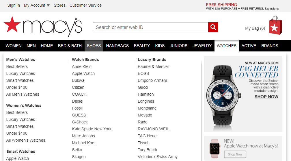
For example, Macy’s certainly has a lot of offerings for potential customers.
And they have broken down their search and categories to match all the different choices.
If you’re shopping for a watch, you can quickly drill down to be more specific.
You can select watches by gender, brand, style, cost, and more.
On mobile sites, the options need to be even easier for small screens.
The “fat finger” problem can cause accidental clicks on banner ads and other parts of the page.
Accidental clicks are frustrating for the user and useless for the website owner.
Make your navigation so easy it’s fat-finger-proof with big buttons and plenty of whitespace.
7. Write clear, compelling CTAs
When you visit my page, you see one very simple question: Do you want more traffic?
And I’ve asked it twice.
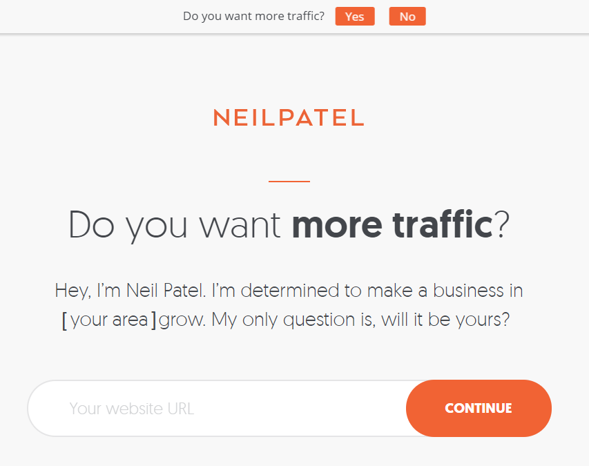
And who doesn’t want more traffic?
Notice how your eye is drawn to the CTAs on the page.
You can’t miss a big, bright pop of color on a neutral background.
As a bonus, I threw in localization and a reminder of competition.
I’m determined to make a business in [your area] grow. You could miss out.
Customers respond to personalization, and there are a lot of cool ways to use it without spending a lot of money.
When you only have one service or product, you can make your call to action super simple.
If you have an e-commerce site, it’s a little more tricky, but the principle is the same.
Display what brings most people to your site in the middle of the page, and make navigation to other parts of the site easy.
Zappos is a great example of clear search and effective CTA.
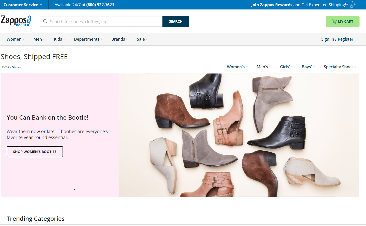
With thousands of products to offer, they showcase the trendiest selection (at the moment, booties for fall) with a can’t-miss CTA.
Their most popular company feature, free shipping, is clearly stated, and navigation to other areas of the site is easy.
By limiting the number of choices and thoughts the user has to make, you place more attention on the CTA.
8. State your unique selling proposition (USP)
What do you offer that your competitors don’t?
Something makes your business unique. What is it?
At MeUndies.com, you can buy matching undies with your significant other.
That’s certainly unique.
You can even sign up for a subscription service for new pairs every month.
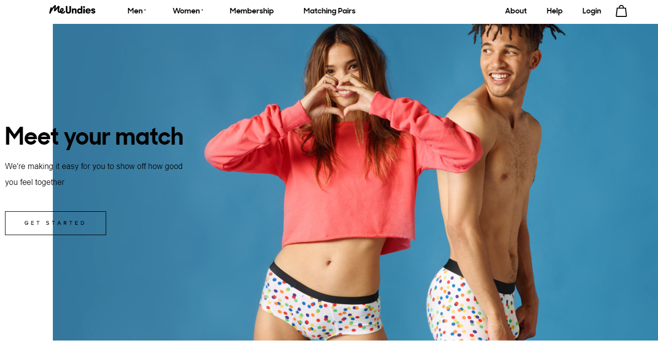
Your unique selling proposition might be something more common, like sale pricing or free shipping, or something as unexpected as polka-dot boxers.
Whatever it is, it should be specific, desirable to your audience, and easy to communicate.
Your USP isn’t always the most obvious feature of your product.
Zappos didn’t build its reputation on shoes. Thousands of websites sell shoes.
Zappos built its reputation on amazing customer service.
Your USP will make you stand out from the countless other companies likely doing the same thing.
You’ll make more conversions if you can communicate what you do differently (and better) to your visitors.
9. Loyalty perks
You know what loyalty programs are.
You see them all over the place at restaurants, brick-and-mortar stores, airlines, etc.
Kohl’s Cash is a prime example.
For every $50 you spend, you get a $10 certificate that spends like money at any Kohl’s store.
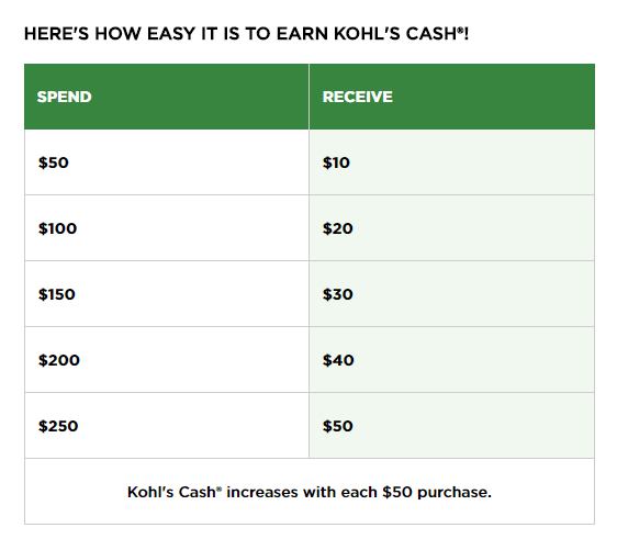
Twenty percent back on every $50 spent storewide is a pretty powerful incentive.
You see loyalty programs everywhere because they work for retaining customers.
In fact, three-quarters of the U.S. companies that use a loyalty program see a return on investment.
And this kind of retention should matter to you.
For one, these loyal and repeat customers will spend a third more than a new buyer.
And to acquire a new customer, it will cost you 500 percent more than keeping a current one.
What can your business offer to you customers?
Discounts or special sales? A rewards program for every time they spend?
Loyalty perks are a great way to make the first sale and keep customers coming back for more.
When you join Virgin America’s mileage club, you can earn miles and elite status.
The more you fly, the more perks you qualify for, and the more you save.
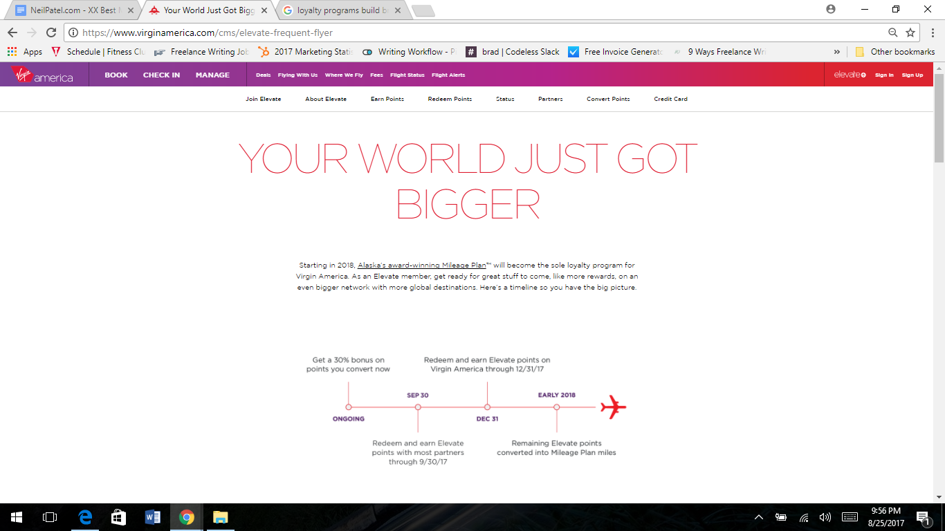
The program rewards Virgin’s most loyal customers with real, tangible value.
Rewards designed to grow as you spend more or use the service for a longer period have the bonus of helping build brand loyalty.
10. Use psychology to your advantage
We’ve been studying consumer psychology and behavior for nearly 80 years.
In short, it’s the study of why we buy what we buy, when we buy it.
Consumer psychology expert Sean D’Souza explains his theory of seven red bags.
Before consumers decide to buy from you, he says, you have to deliver:
- Target profile
- Problem
- Solution
- Objections
- Testimonials
- Risk reversal
- Uniqueness
In other words, you have to target the right customer, figure out their problem, provide an answer, overcome any objections, demonstrate social proof, minimize risk, and show your USP.
Sound familiar? You’d be right if you’re thinking that a lot of what I’ve been talking about relates to consumer psychology.
Many of the nuts and bolts of achieving better conversion rates fall into one psychological category or another.
While D’Souza outlines a marketing-psychology strategy, I often recommend psychology in other areas as well.
It’s a critical way to influence conversions.
Nearly every detail can be enhanced with psychology, even the colors you choose for your website.
When Hubspot used A/B testing for CTA colors, for example, they found that red outperformed green by 21 percent.
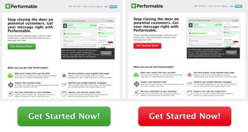
Could you get 21 percent more conversions with a simple color change? Why not try it and find out?
Conclusion
The internet is full of new content every single day.
It’s not enough to just continue doing what you’ve always done and expect different, or better results.
Effective conversion methods are all about the details.
Good marketing can bring in some traffic, but they’ll bounce if everything else isn’t in place.
Take a good look at your landing page right now.
What can you tweak to make it easier to use or more aesthetically pleasing?
Are you offering something that is truly useful and targeted to your ideal customer?
It’s not enough to just rest on your high-traffic rates.
You need to get your users to take action, tell their friends, and remain loyal customers.
What other conversion-rate hacks have you found successful?
Comments (2)