More of something is always better, right?
That’s easy to assume if you ever buy something online, read a long-form blog post, or get coupons in the mail.
“20% more chips!”
“64-ounce soda for only 99 cents!”
“3-million word SEO guide!” OK, that one might be a slight exaggeration.
But you get the point I’m trying to make.
We’re taught through “shock-and-awe” marketing that more is always better.
If there are more features or more content, you’re getting a better deal. Every single time.
However, that’s not necessarily the case.
Have you ever eaten at a restaurant where the menu looks like a phone book?
If so, I bet it took you at least twice as long to figure out what to order.
Having too many choices often leads to indecision. And indecision leads to no conversions.
I’ve personally made the same mistakes when growing my businesses.
When I first started Crazy Egg, I thought that a long-form page including every minor detail was going to get me the most conversions.
It turns out I was wrong.
Simplicity wins at driving more conversions.
Here’s why and how you can “do less” to drive more conversions.
Why “doing less” can drive more conversions online
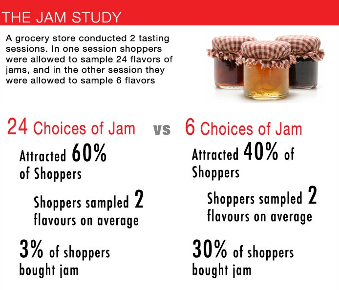
One of the best ways to explain how less is actually more is with the jam study.
This nearly 10-year-old study proves exactly how less drives more conversions.
Here’s what happened.
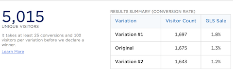
The researchers first offered 24 different varieties of jam. It attracted more people, but only 3% of the shoppers ended up buying.
Next, they tried something different. They decreased the number of available jam varieties to only six.
Fewer shoppers came over, but 30% of them ended up buying!
In other words, reducing the number of choices actually drove more conversions.
That’s pretty incredible, right?
We’re so used to thinking that more is better.
Everyone wants to get more products or more content.
However, that’s not what always works.
Giving customers too many options can backfire. It forces them to overthink the decision.
Have you ever heard of analysis paralysis?
People spend so much time thinking through the choices that they end up not deciding at all. They leave without buying.
That’s why it’s often better to reduce the available options.
Make your website simpler. Focus your product or service on the main thing it provides.
I’ve had to learn this lesson the hard way several times.
How I increased conversions by doing less
Early on with Crazy Egg, I thought a content-packed homepage would drive conversions through the roof.
It made sense to me.
I could answer almost every objection imaginable by writing a long-form style homepage.
I could compare my product to the competition and show exactly how it’s better.
Every single friction point in the conversion process was answered on my homepage.
Conversions were good for a while. But they weren’t excellent.
So I wasn’t satisfied!
I decided to run a test and remove the excess “fluff” on my homepage.
I removed unnecessary marketing speak and technical points that didn’t add value.
Instead of telling a long, drawn-out story, I got straight to the value proposition.
After I cleaned the homepage up, it was 60% shorter than the original.
I removed more than half of the content crowding my page.
And the results were incredible.
There was an immediate 13% increase in conversions with just the split-test group.
Removing all of that fluff and useless content helped me drive more conversions!
I wanted to see if these results would stick. So I even tested this out with Kimberly Snyder.
She had a long-form marketing message on her homepage that was dense and cluttered.
So we shortened all that text and included a video message instead.
That took all of the necessary efforts off of the customer’s back.
Now, instead of having to read the entire page, they could simply watch a short video and get the gist immediately.
And conversion rates increased by 40%.
Every time that I’ve implemented a “less-is-more” strategy, I’ve found higher conversion rates.
The best part is that this is pretty easy to replicate.
You can do it right now.
Here are some tips to help you minimize unnecessary stuff and drive more conversions.
Show your credibility instead of talking about it
Credibility and trust are everything.
Nobody is going to convert on your products and services if they don’t trust you.
In fact, 84% of people trust online reviews for a product as much as a personal recommendation!
That means you need to establish credibility without overdoing it.
Nobody wants to read 1,000 words of testimonials.
Then it starts to seem fake or forged.
Instead, you can often cut out all of the filler content. Add in client logos or other forms of social proof.
For example, Visual Website Optimizer used to have a long-form homepage like I did on Crazy Egg.
We always think that homepages are the perfect spot to bombard the customer with tons of information.
It’s tempting to explain every little detail to get them to convert, right?
Unfortunately, that’s the wrong approach.
Visual Website Optimizer also switched up their long-form homepage to an uber-simplistic one:
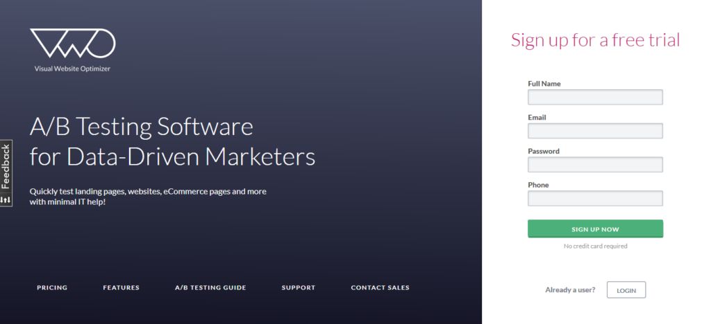
And they saw a 16.3% increase in free trial signups.
This isn’t some far-fetched outlier in the data.
Short-form landing pages are known for converting!
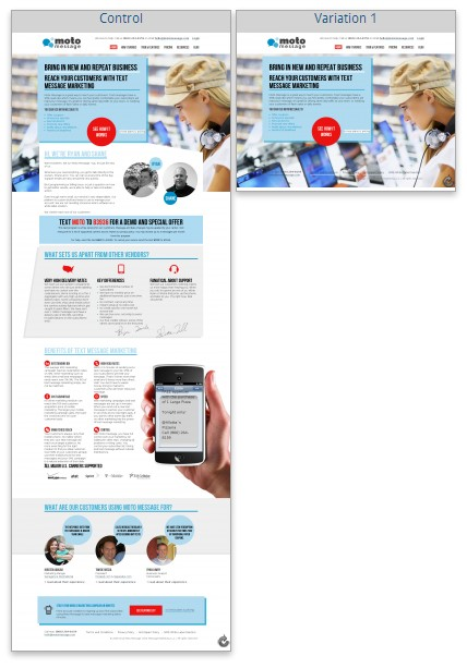
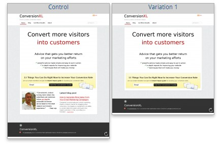
Just ask the conversion experts at ConversionXL.
They worked to increase clicks to a client’s pricing and features pages.
ConversionXL concluded that there was too much stuff. There was too much to read.
So they cut it way down to just the bare essentials:
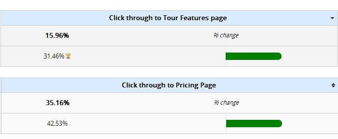
And the result? They saw a huge increase in clicks to the pricing and features pages:
ConversionXL didn’t stop there, though.
The results were so promising that they decided to put their own website to the test!
Their page already converted well.
However, they again cut down on their content and unnecessary filler that they had thought were driving conversions.
And the result was another massive boost:
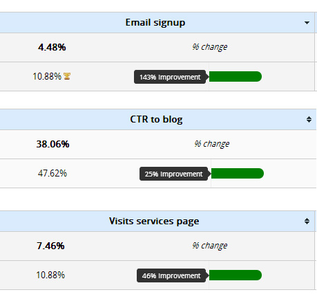
Email signups, clicks to the blog, and visits to the services page all increased.
The lesson here is simple.
Get to the point faster. Use social proof to establish credibility so your pages don’t ramble on and on.
Another technique to shorten landing pages is placing the content you would have talked about in a video.
Declutter your page with videos
Videos are one of my favorite ways to declutter landing pages and homepages.
Instead of making a customer read your entire landing page (which won’t happen), say it all in a video.
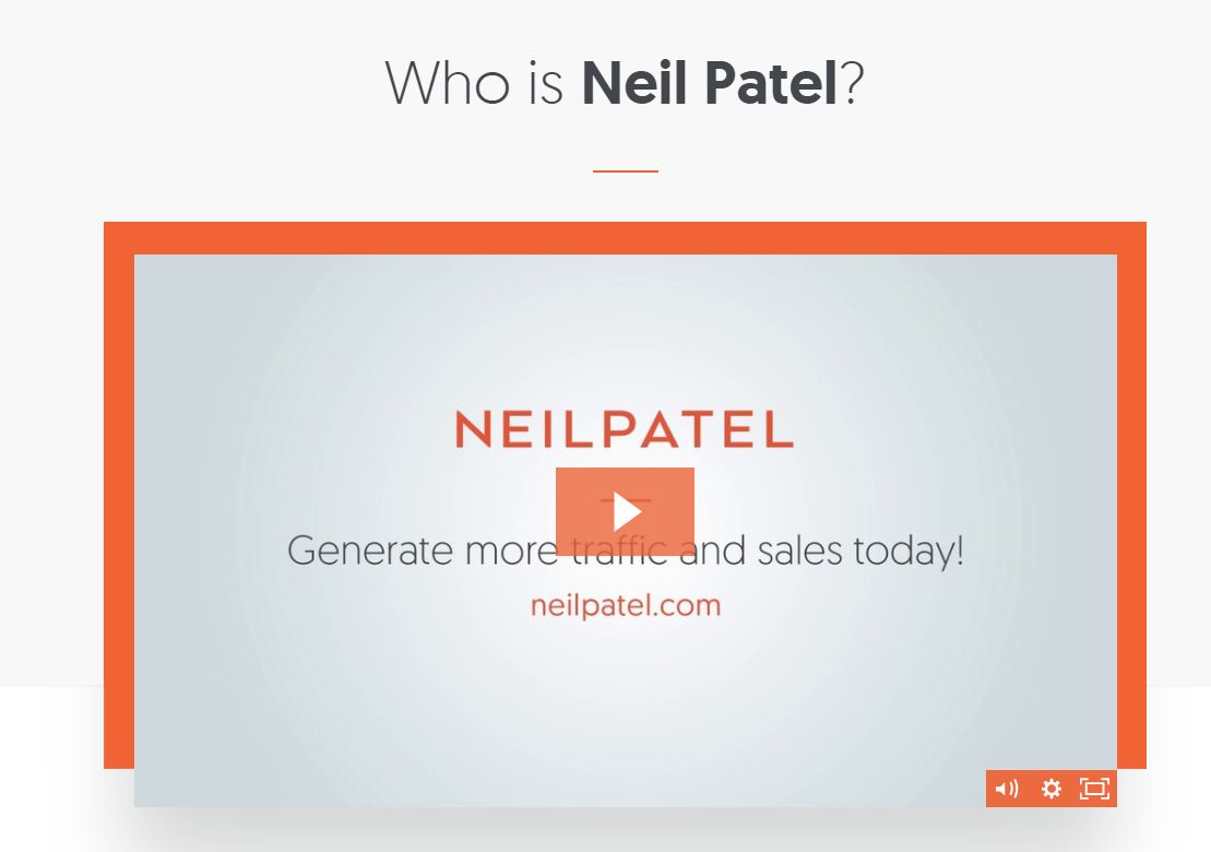
That’s why I use videos all throughout my website.
There is so much I want to talk about. Marketing is evolving so quickly.
But I know that overwhelming my site’s visitors can only backfire.
That’s why I use this proven formula to create videos that convert.
Here are a few elements that all of your videos should have:
- Start your video by explaining simply what your product or service does.
- Explain the pain point you solve.
- Explain the benefits that your features give to users.
- Urge/nudge people to buy or sign up.
- Answer the most common objections or questions that arise.
- Close the sale with testimonials and credibility-boosting data.
If you’re still not convinced on video, consider this:
We are wired to process visuals quickly, with one MIT study suggesting the brain can process images the eye only sees for as little as 13 milliseconds!
Another way you can use videos is to increase lead generation.
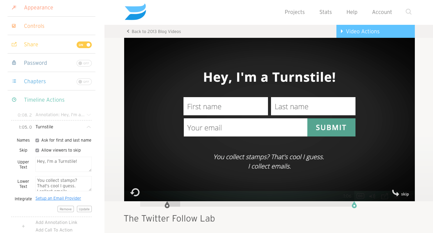
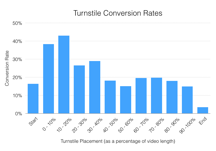
For example, Wistia has a powerful tool called Turnstile. This allows you to capture leads after a certain portion of the video is watched.
These Turnstiles work.
Wistia analyzed over 15,000 videos with this software and found that some Turnstile settings had conversion rates of over 40%!
Here I’ll show you how to set these up for free with Wistia and start capturing more leads with less content.
First, create a free account on Wistia.
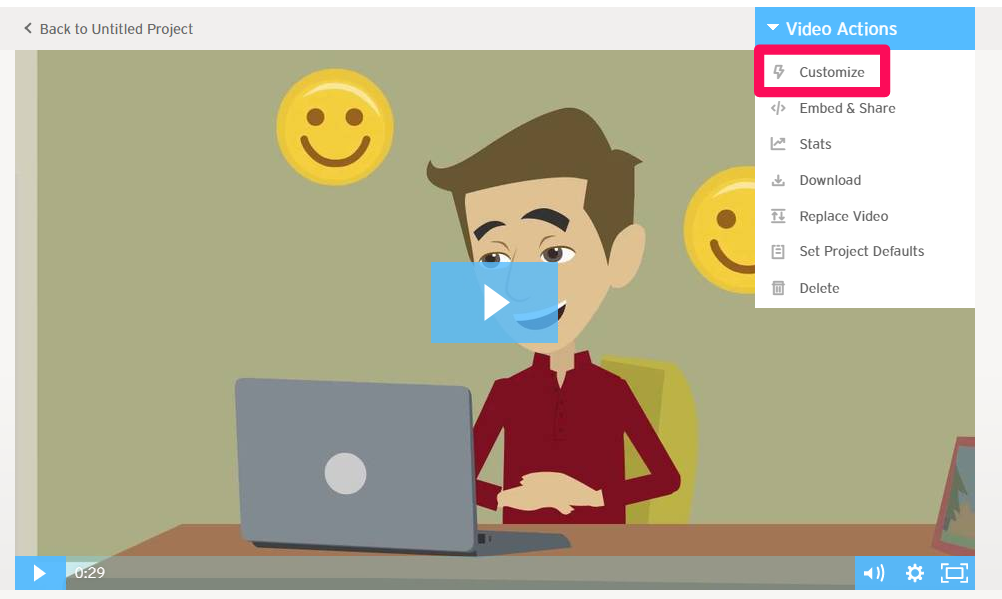
Once you’ve created a free account, upload a video of your product or service.
The editing and lead-capture techniques will be available after uploading.
Now, head over to your newly-uploaded video and select “Customize.”
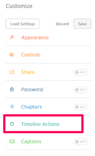
Here you can customize everything from CTAs to appearance. You can even add a video index.
The options are nearly limitless.
But the key to collecting leads here is focusing on the Turnstile.
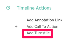
Click on “Timeline Actions” to get started.
Here you can customize things like annotations, CTA, and the lead-capture tool.
Next, click “Add Turnstile.”
Then customize the settings to fit your preferences.
For example, you can select when you want these to show up.
You can allow users to skip without converting. And you can automatically add these new people to MailChimp.
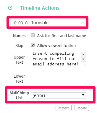
For best results, make sure that the Turnstile appears in the timeline of 10-20% of your video length!
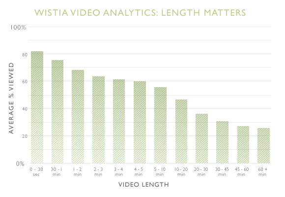
Pro tip: Short videos are best.
Don’t just take my word for it. Once again, Wistia’s data proves it to be true:
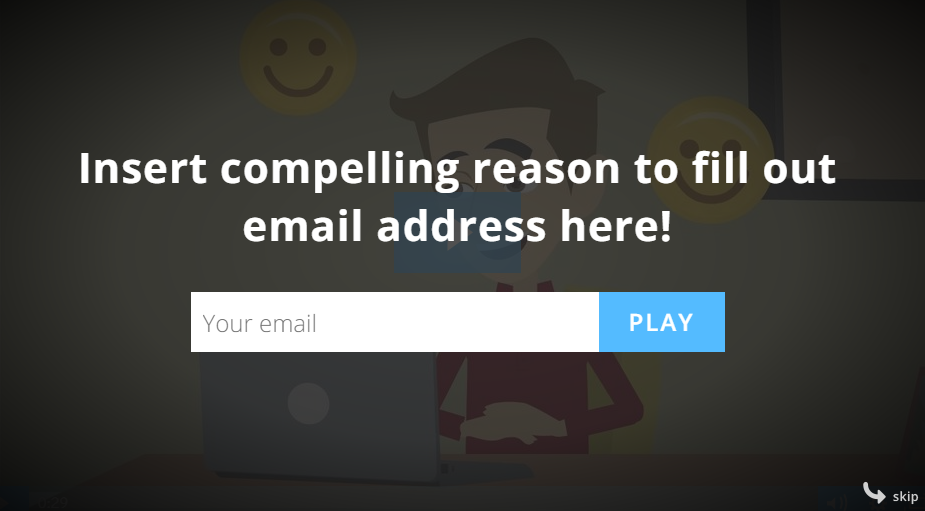
Also, make sure to provide a compelling reason for someone to give you their email instead of simply skipping the prompt.
Your final product should look like this when the video viewer hits the specified timestamp:
Videos, along with Wistia’s detailed features, are a great way to declutter your page and drive more conversions at the same time.
Videos allow you to summarize tons of information in a fun, interactive way.
Make it easier for visitors to convert
There can be a danger in focusing on high conversions.
High conversions don’t always lead to more sales.
Let’s assume you are targeting the right people in the first place. Now what?
When building out your landing page, it’s easy to fall into the same old trap.
You feel the need to say everything about your business on that page.
You include every last detail, feature, and reason for why someone should give you their money.
I’ve been there before, trust me.
The temptation to cram everything onto the page is tough to overcome.
But, the truth is, the content doesn’t matter if it isn’t converting.
So, focus on conversions.
If your current long-form homepage or landing page isn’t converting, change it ASAP.
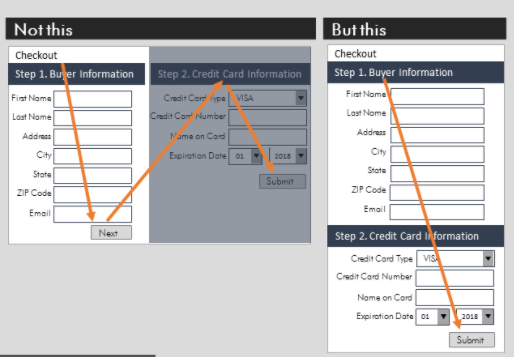
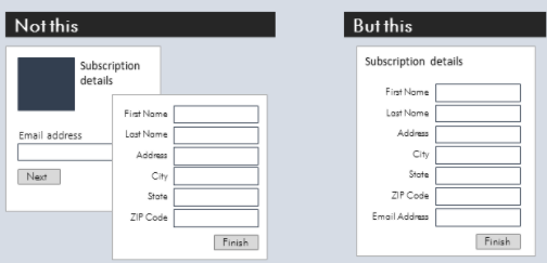
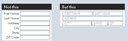
If you have too many form fields, reduce them!
MarketingExperiments even has a proven formula to reduce friction by simplifying content and “doing less”:
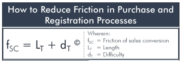
That formula looks intimidating. I’ll break it down for you.
- Friction on a landing page = length of content + difficulty of achieving the intended goal.
In other words, the more stuff you put on a page, the more friction you’re creating for a user.
The more friction, the less likely they’ll convert.
For example, the more content you put on your landing page, the more difficult it is for a user to understand what they’re supposed to do on that page.
They start reading every last detail instead of simply converting.
There are countless ways to make the conversion process smoother by doing less.
One of the best ways is to make your page flow better. If you’ve got too many form fields, simplify them into one streamlined option.
Remember that fewer choices often translate into more conversions.
Do you have a bunch of unnecessary content or steps that you can eliminate?
If you can remove sections that aren’t adding value, do it.
You can even make forms or content feel shorter by rearranging elements to adjust the visual flow.
One of my favorite techniques is to focus people’s attention. If you have a busy landing page with multiple moving parts, it becomes hard for a user to convert.
They’re not sure what to do next. The opt-in form, button, or product fades into the background.
Try to focus a visitor’s attention by highlighting action items, like your pricing structure.
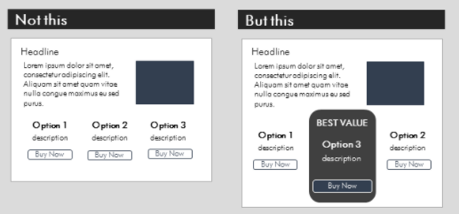
This will help you grab the user’s attention much faster.
For example, just look at how Slack perfects the simple homepage to drive conversions:
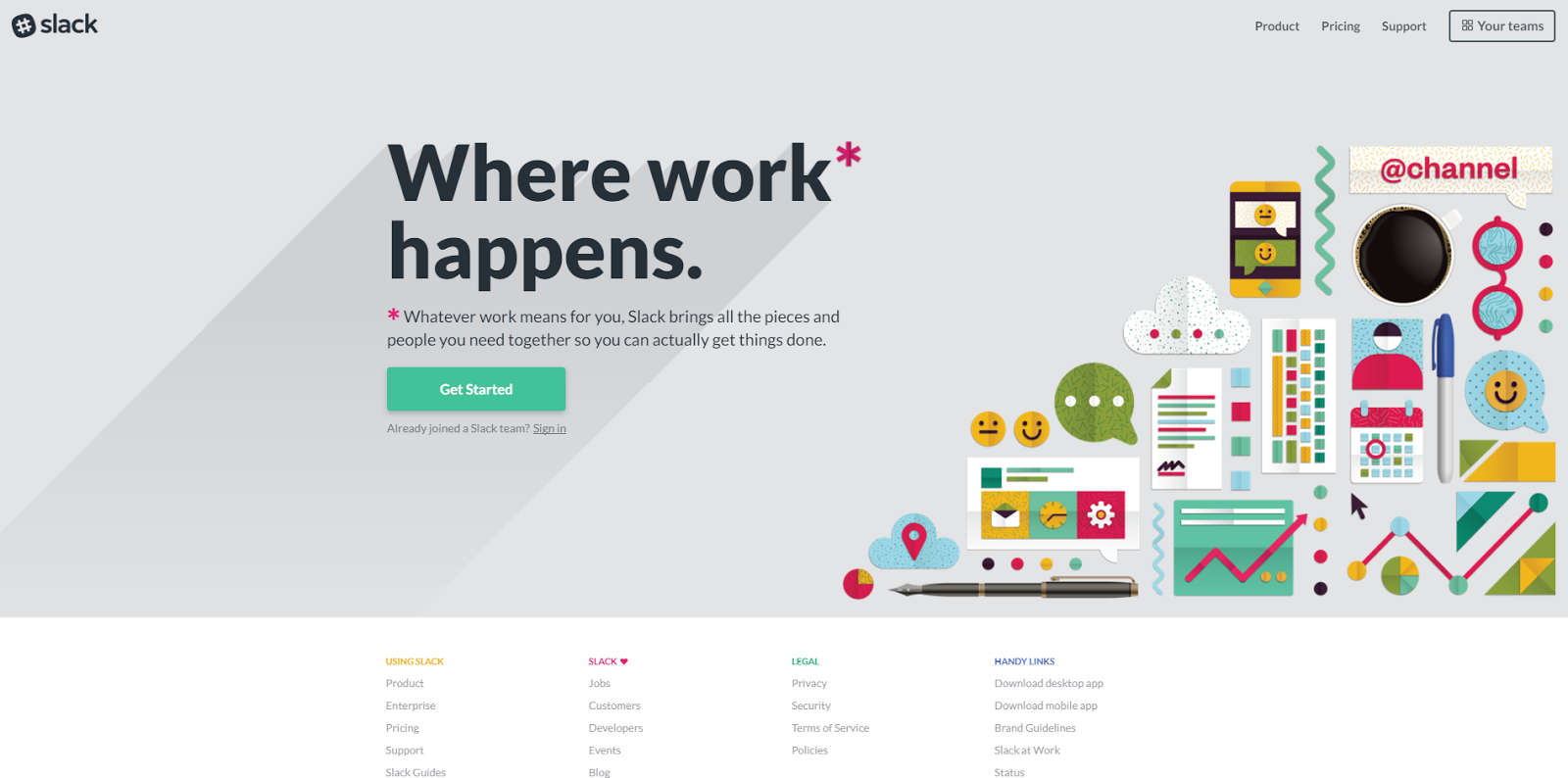
That’s it! That’s the entire homepage.
You literally can’t scroll any further because there isn’t any more content!
But it still perfectly sums up the benefits of their application and drives action with a vibrant green CTA button.
Evernote is also a prime example of reducing options to focus your attention on the CTA.
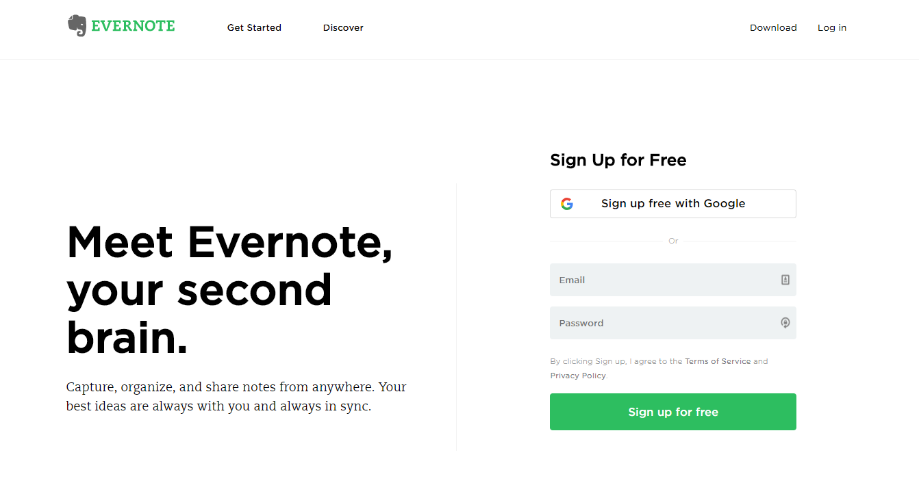
They jump straight to the point: signups.
They use minimal text and images to give you only what you need to make the initial decision.
Scale back on everything. Reduce form fields, conversion actions, CTAs, and content length.
One of my favorite homepage examples comes from Mint. Here’s why:
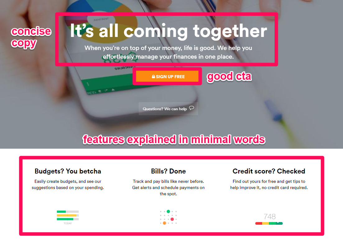
The page is pretty simple.
The headline and copy explain the primary benefit of using the service.
It focuses on what you’re going to get, instead of rambling on about extra stuff.
The “Sign Up Free” CTA button is obvious.
And they reserve a little space at the bottom to highlight the primary benefits you’ll get from the service.
The page describes the entire experience perfectly without spending 1,000 words to get there.
The design and white space keep people focused on the next action to take: Sign up!
Conclusion
You know what people always say.
The bigger, the better. The more, the merrier!
That might work in some cases. No one will turn down a bigger, juicy steak.
However, this approach can only backfire when it comes to conversions.
When we try to explain everything about our products and services, we lose people.
It’s too much, too soon. They get overwhelmed by the amount of information, and they leave without converting.
People don’t want to spend 20 minutes on your landing page trying to decipher the value they’ll get.
Instead, they’re making a split-second decision. It should take less than ten seconds for people to understand what they’re going to get.
That’s why you should focus on reducing content. Spend more time on the results or benefits they’ll get, so it takes fewer words.
I learned this lesson the hard way by going into too much detail with Crazy Egg. When I changed it to short-form, I increased conversions.
Now, I put this into practice on this very website.
I use videos, for example, which help you shorten landing pages.
Videos convert because they’re easier to understand and digest.
Last but not least, help each visitor focus on what matters most.
That starts with removing unnecessary clutter. Streamline forms and use more white space on a page so people know exactly where to look.
Long-form landing pages can work well in some cases.
Paid, cold traffic might need the extra information. If you’re selling a product without talking to someone personally, they might need to understand all of the nuances.
But for the most part, your goal is to simplify as much as possible.
Focus on the most important aspects of your offer, product, or service. And get rid of everything else.
What’s your best tip for driving conversions from a short, simple landing page?
Comments (2)