
Websites that make me jump through hoops drive me nuts.
I don’t know about you, but I prefer to get from point A to point B via the shortest path possible — especially when I’m shopping online.
If I had to click back and forth, look up information on different pages, figure out whether the merchant ships to my location, or scroll up and down to look for a call to action, I’d probably just close the browser and move on.
And I’m pretty sure it isn’t just me.
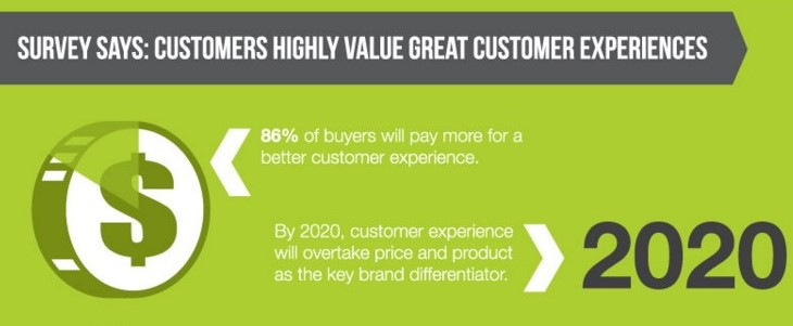
Great user experience has everything to do with high conversion rates, and making your website intuitive to use is an important criterion for creating an excellent customer experience.
The Why And How Of Intuitive Website Design
An intuitive website is easy to use. It delivers a seamless experience toward achieving desired outcomes.
Your visitors can find what they need and take the desired actions in the most efficient way possible. They can focus on the task at hand without thinking about how they’re doing it.
An intuitive website is “attention-saving” by delivering an experience with the least friction through incremental improvements and radical shortcuts.
An unintuitive design, on the other hand, forces your visitors to take notice of what’s not working and causes them to become frustrated with your brand.
An easy-to-use website design is instrumental in increasing your conversion rates.
Here’s what you can do to create an intuitive website experience.
Understand your visitors
Different target audience segments have different habits, expectations, and cultural conditionings that affect how they interpret and interact with content.
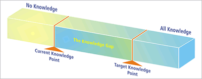
Your visitors also come to your website with a preconception about “how things work” — including how to navigate websites to get the outcomes they want.
Your website design and content have to address the expectations and behaviors your target audience brings with them so you can meet them where they’re at.
However, that’s not always possible.
If there’s a “knowledge gap” between where they are and how your website works, you need to provide the steps so they can learn, adapt, and close the gap:
Before you start designing your website, you need to first define who your visitors are because what’s intuitive for one audience may not be so for another.
Then you need to find out what they expect and how they respond to copy and page layout by doing your homework. Conduct usability and A/B testing, survey your customers, and monitor content from industry influencers.
After you have an understanding of their behaviors, expectations, and knowledge gaps, you can then design a website that’s easy to use for them.
Work with the brain
The human brain is conditioned over the centuries to register and process information in a certain way. It won’t change overnight, and you’d be better off working with it rather than fighting against it.
Many studies have been done to understand how people read and process information visually. Use this knowledge to inform the placement of content and graphic elements on your pages.
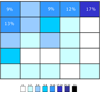
For example, people in the western culture exhibit an F-shaped pattern when reading web content:
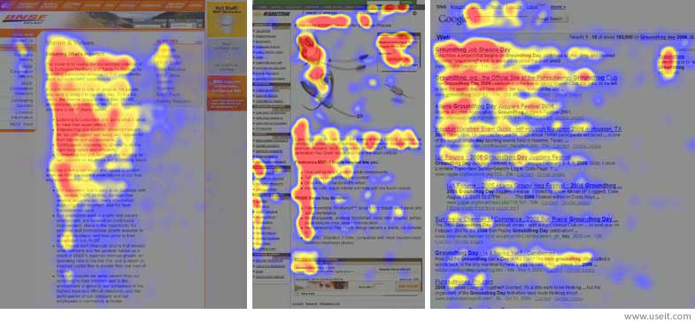
As you can see in the heat map, the most attention is given to content closest to the left and the top, reflecting the way we read (from left to right and top to bottom).
In addition, most attention is given to the first couple of paragraphs. Then it trails off further down the page.
However, if the text is broken up by an image, the reader’s attention is renewed right below the image. Now you understand why we have so many images on this blog. See, you’re still reading!
An intuitive website needs to work with your visitors’ brain:
- Use an F- or Z-pattern to guide the placement of your elements to work with natural eye movement:

- Put the most important content in the first two paragraphs
- Use images with bold colors and good contrast at regular intervals to reinforce the reader’s attention
- Use white space strategically to create a rhythm
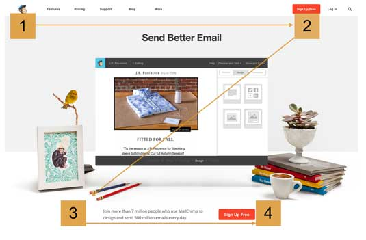
- Apply the “rule of thirds” to draw attention to important elements, such as a call-to-action:
Give your visitors what they want right away
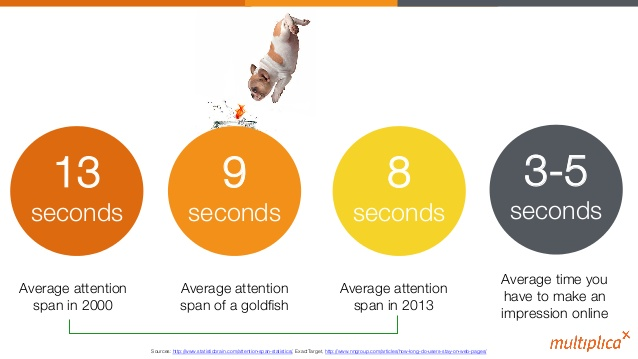
In a study conducted by Microsoft, most people were found to have an attention span of eight seconds (that’s one second shorter than that of a goldfish!)
That means that if visitors land on your website and can’t find what they’re looking for within the first few seconds, they’re likely to click away and never come back.
They won’t spend the time to hunt and peck.
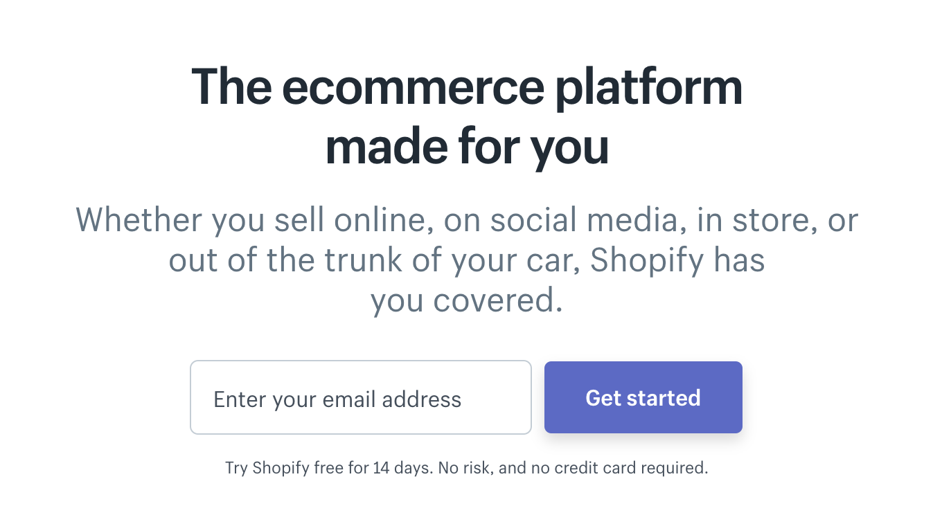
You have to show them what they need to know about your business and what they need to do next right off the bat.
Shopify’s homepage doesn’t beat around the bush — it tells you what exactly the platform does, why it’s relevant to its visitors, and what they need to do in just a couple of seconds:
Use simple instructional text to bridge the knowledge gap
Remember the “knowledge gap” we talked about earlier?
If there’s one between your visitors’ current online habits and how your website works, then you need to help them close the gap.
Nobody wants to read a full page of instructional text on how to use your website, but visitors will welcome snippets of instructions — often called microcopy — to show them what they need to do:
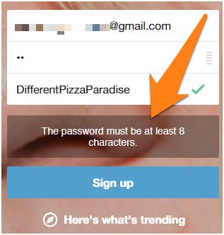
By incorporating simple instructional text, tips, and microcopy throughout your website, you can help visitors have a better user experience by making the interface more intuitive for them.
Make all information available on one page
You need to consider all the questions a visitor may have when making a purchasing decision and have the answers located conveniently on the page.
If visitors have to divert their attention to think about how to get the additional information, their experience with your website is disrupted.
Not only is it inconvenient for them to look for the information somewhere else, but the added friction could also decrease your conversion rate.
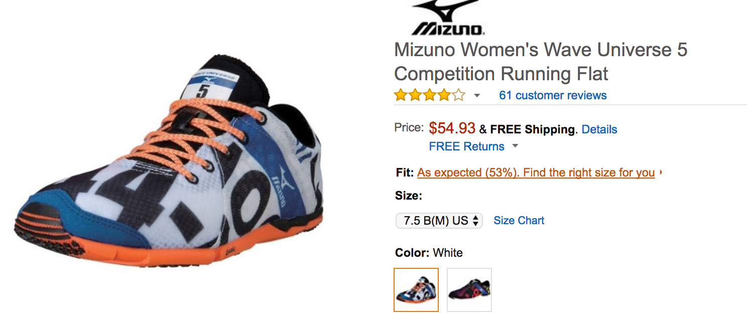
For example, when shoppers are looking for running shoes, they’d probably wonder how a particular model will fit them.
Amazon preempted the question by putting a “find the right size for you” link right above the size selection drop down:
When visitors click on that link, a lightbox appears to display a sizing widget:
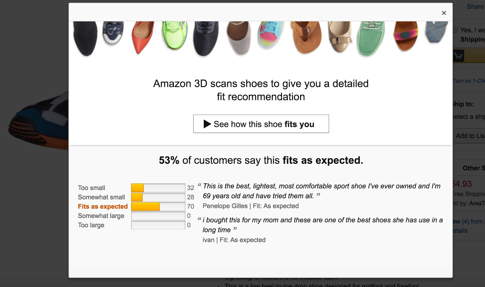
Once the widget has found the ideal size through a series of questions, the page refreshes to show that size in the dropdown:
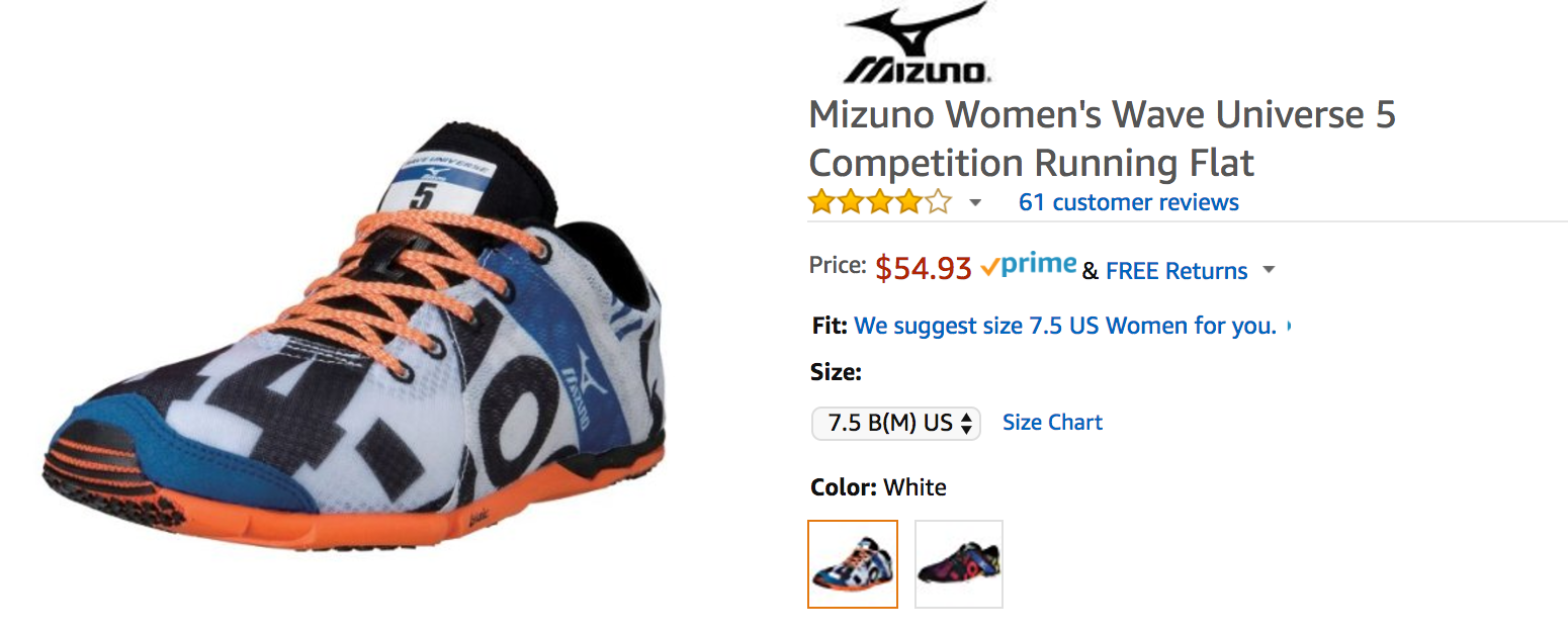
Not only does the seamless experience reduce friction and keep visitors on the product page, but it also improves customer experience and lowers costs by reducing return rates.
Help visitors find what they want
76% of consumers say that the most important factor in a website’s design is that “the website makes it easy for me to find what I want.”
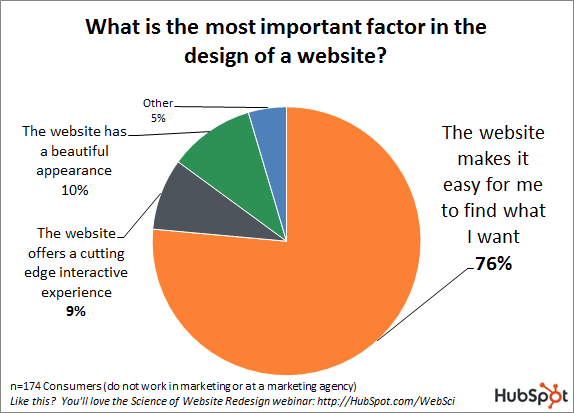
In addition, 50% of all users don’t buy because they can’t find what they’re looking for.
Therefore, you need to make it easy for visitors to find what they need with as few clicks and as little detective work as possible:
Clear navigation
Most of the time, your visitors will look for a specific product or information on your website’s menu bar.
But don’t expect them to study every single link there.
The average prospect spends just 6.48 seconds interacting with a navigation bar.
Everything — from naming to navigations structure — needs to make sense to your visitors at first glance.
Use labels that are commonly understood and obvious. Your menu bar is not the place to be cute or clever.
Unless you have a 4-page website, you can’t jam everything into the primary navigation bar. Categorize your pages and use sub-categories or secondary navigation menus to effectively organize all the pages on your site.
Robust Search Function
A search function is particularly critical if your website has a lot of products, offers a service through information delivery, or provides bookings for flights, vacations, and deals.
If a visitor comes to your website knowing exactly what he wants — a scenario that represents 30% of shoppers — a well-designed search feature is the fastest path to conversion.
However, not all search functions are created equal. Here are a few ways to make them user-friendly:
- Position your search box where visitors expect to find it. In most cases, it’s at the top right corner of the page.
- Make the “search” button look clickable and allow users to submit their searches using the “enter” key.
- Use placeholder text to show visitors what they can search for.
- Make the search box a consistent element on all pages.
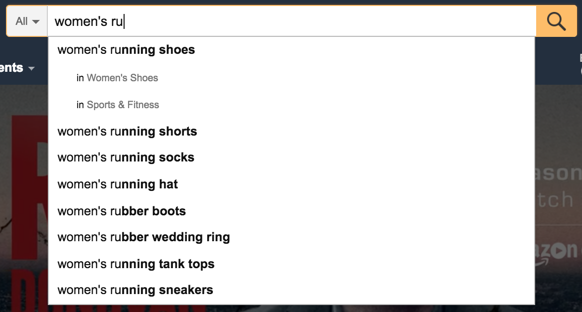
- Use auto-suggestion mechanism to speed up data entry. It can help visitors pinpoint what they’re looking for or discover related items.

Use visual design to simplify decision-making
Nobody wants to run into a wall of text and have to spend the next three minutes trying to figure out what they’re supposed to do on your website.
A study by CEB shows that a 20 percent increase in simplifying the decision-making process results in a 96 percent increase in a customer’s likelihood to purchase, repurchase or recommend a particular brand.
An intuitive website design simplifies decision-making by helping visitors take the desired action quickly and easily.
Use visual design to give hierarchy to your content so that the most important information and the call to action are front and center:
Don’t mess with convention
Your visitors don’t spend most of their time on your website. They spend most of their time on other websites.
That means that they bring with them a set of expectations, or “current knowledge,” on how websites work. Intuitively, they’d look for specific functions or information in certain locations:
- Logo on the top left corner that will take them to the homepage on click
- Contact information that can be found in the footer
- Navigation, search box, and other important elements will be located in the same place on most pages
- Descriptive instruction or help text is available to guide them through specific actions (e.g. the checkout process)
- Live-chat function can be found at the lower right corner
It’s possible to “break the rules” once in awhile to introduce an element of surprise or to draw attention to a particular page element. However, it should be done sparingly and intentionally to deliver an on-brand experience.
Adopt Omnichannel Personalization
If an intuitive website means visitors will experience the least friction in getting what they want, then what’s a better way than to serve up the products or content they’re most likely to be looking for based on their interaction with your brand?
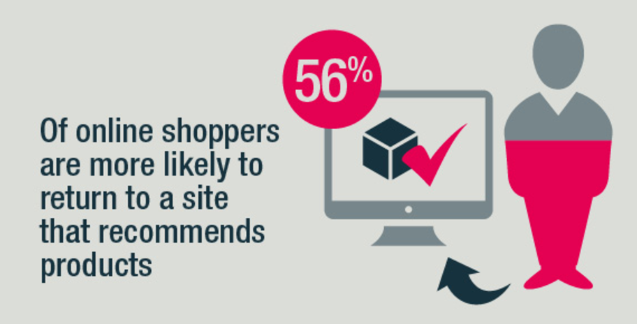
Offering a personalized customer experience on your site will help you attract and retain more customers by making it easier for them to find products most relevant to them:
Personalization can be applied in many ways to augment the website user experience.
- Offer product recommendations based on past purchases highlight the most relevant items for the visitors. This is particularly useful for sites with a large product selection.
- Use additional assistance based on visitors’ behaviors. Brooks Running reduced return rate by 80% by offering support to shoppers who put different shoes in multiple sizes in their carts so they could find the right size and fit.
- Employ different functionalities based on context. For example, you could show a link to a customer-only knowledge base only to logged-in customers.
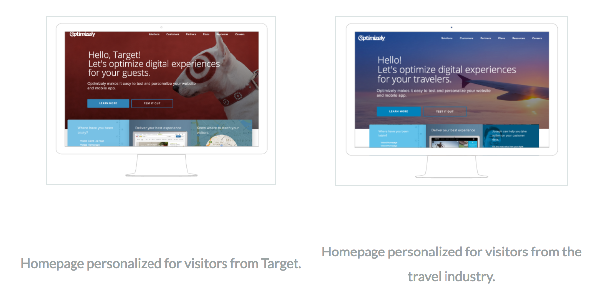
- Show different content and messaging based on traffic source. When the content is relevant, visitors can navigate the site more intuitively.

If you interact with your customers outside of your website (and I hope you do,) you can bring in customer data from all touch points to inform the customized view they see on your website.
In other words, you can use the data you collect via social media, email, phone support, and events to inform your website design.
This will require the implementation of a unified platform that allows you to personalize web experience, emails, and targeted content or offers. You can also personalize mobile, in-store, and contact center experiences.
Streamline the mobile experience
A mobile-responsive website experience is more than just cramming everything into a small screen. To create an intuitive mobile user experience, follow these best practices:
- Prioritize content and put the most important information at the top of the page.
- Put your call to action close to the top and at regular intervals so visitors don’t have to scroll forever to look for the link.
- Design a mobile-specific menu to offer clear and uncluttered navigation.
- Make it easy for visitors to get in touch. Don’t bury your contact information, and leverage mobile-specific features such as tap-to-call.
- Minimize the amount of information that users need to type into forms.
- Ensure that the sizes of all buttons are thumb-friendly.
Bring location into the mix
Your customers shouldn’t have to jump through hoops only to learn halfway through the checkout process that a particular product is not available for their geographic locations.
You don’t want your prospects to disappear because they can’t figure out how to convert your pricing into their local currencies.
Streamline the website experience by only displaying products that can be shipped to your visitors’ locations. Prioritize the content that’s most relevant to their countries.
- Determine your customers’ locations based on their IP addresses.
- If you have localized sites for different countries, ask visitors to select a country to proceed.
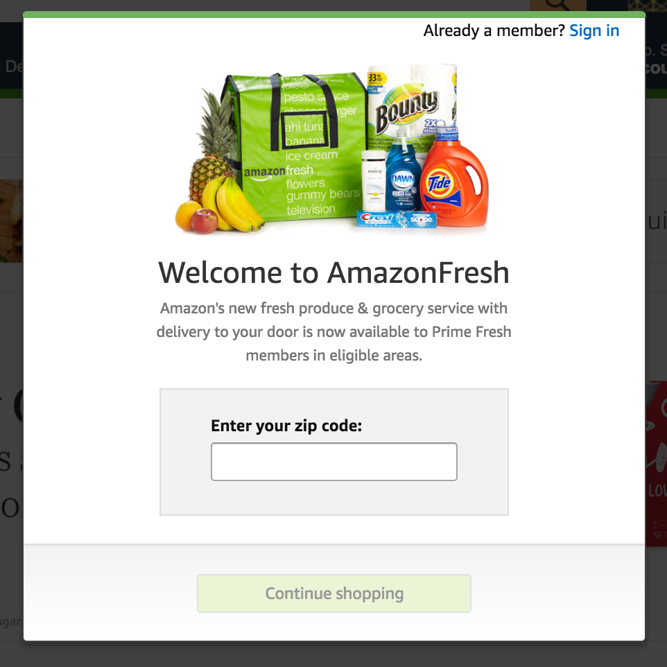
- Ask visitors for their zip codes to determine relevant products to display.
- Use geolocation on mobile devices to auto-fill forms.
Cater to your repeat customers
Before you get too excited and start overhauling your website, remember the 80/20 rule.
A small segment of your customers is responsible for a large portion of your revenue, and these top buyers will be most affected by a website redesign.
These loyal customers are used to the way your website works right now, and if you dramatically change the design, you could negatively impact their user experience.
When you shift things around, you need to consider your most valuable customers.
Make sure they can apply their “current knowledge” when adjusting to the new “target knowledge,” and still easily and quickly find what they need on your new site.
Such a transition may not be easy if there’s a big gap between what they’re used to and where you want to be. Instead of launching a dramatically different website, you can take a page from the “build-measure-learn” playbook.
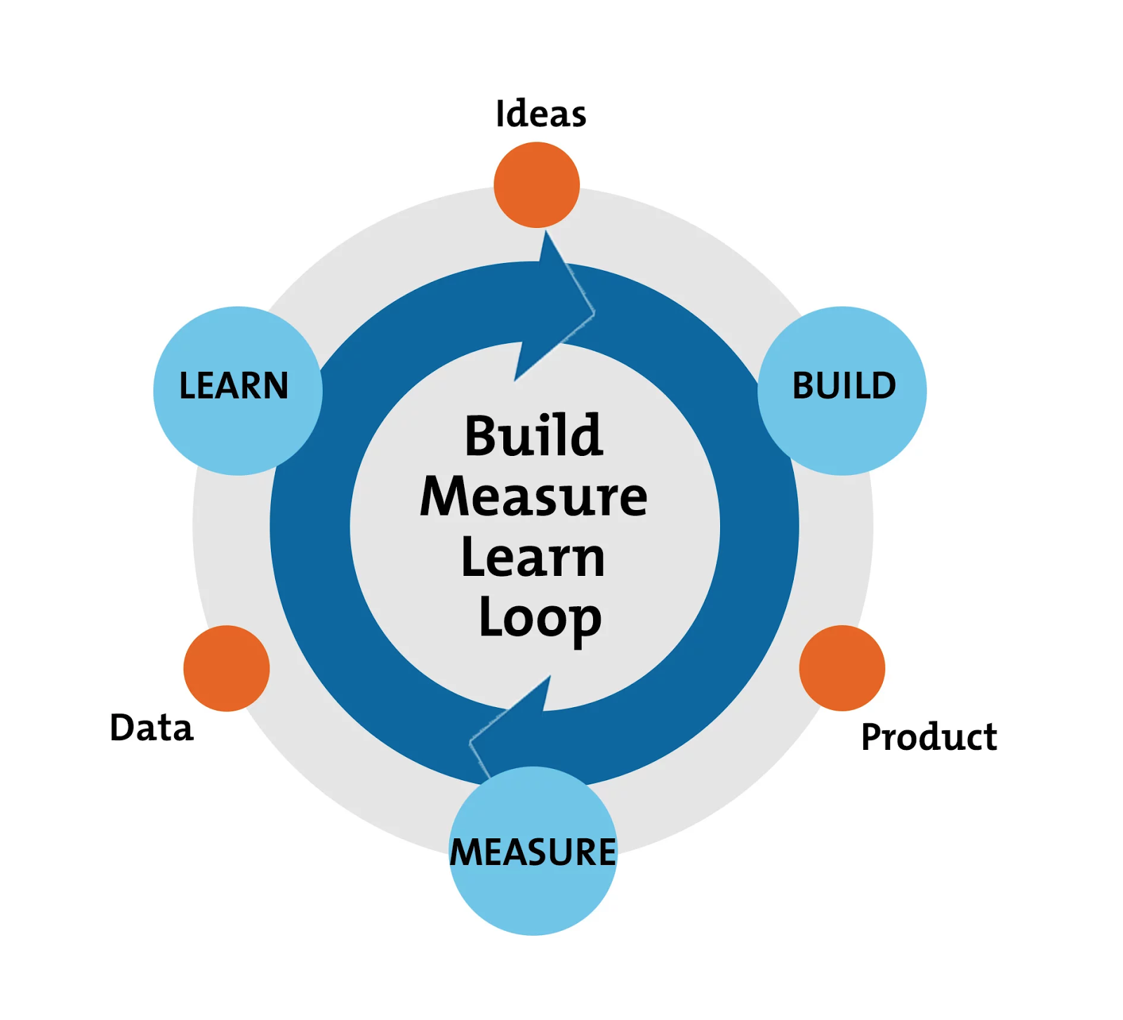
Simply put, you make small, incremental changes to your website. Not only does it help ease your loyal customers into a new user experience, but you can also take the opportunity to measure and learn whether a change is improving results.
Of course, this only applies if you have a large repeat audience. If you have little recurring traffic and the current design isn’t working, a complete overhaul might be in order.
Conclusion
New technology and consumer expectations are constantly reshaping what “intuitive” means as online marketing evolves. You need to stay current by constantly testing and measuring how your visitors interact with your website.
Keep in mind that the goal of an intuitive website design is to help visitors find what they want quickly and perform the desired action with the least amount of friction by:
- Creating a streamlined user experience
- Reducing clutter on your website
- Increasing the relevance of content and products that are shown to each visitor
- Designing the shortest path to purchase
- Conducting A/B testing to figure out what customers like best
- Reducing the amount of disruption during customers’ interactions with your brand
What are some tips and tricks you use to design an intuitive website?
Comments (0)