
Does a red CTA convert better than a green one?
Or is blue the best color?
What if I told you that it doesn’t really matter?
When people talk about CTA optimization, they tend to home in on a few specific things: location, copy, and color.
They will tell you to keep your CTAs above the fold or to use simple, action-oriented words, for example.
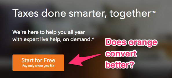
Or that an orange CTA button will drive more conversions:
There have been numerous tests and studies done on the perfect CTA.
You can draw conclusions about which ones work better than others.
Yes, these little elements (such as color) are important in a general sense (I’ve talked about them before. A lot actually. Here, here and here).
But they’re not everything.
There’s more to creating a memorable and high-converting CTA than color.
Shocking, I know. But true.
Here are a few things that you can do to create a really effective CTA that don’t revolve around button color.
1. Use personalized copy for your CTA’s landing page
As I’ve said, people like to talk a lot about the words you use for your actual CTA.
There’s even a list of words you can use that have been shown to improve conversions.
Action words like “Start,” “Join,” “Get,” and “Download,” for example, work well for getting clicks.
But the copy of your CTA button isn’t the only copy that matters.
Sometimes your CTA is only as effective as the rest of your landing page.
In one case study for Open Mile, for example, they found that reducing clutter around their CTA increased their conversion rate by 232%.
So the landing page is just as important as the CTA itself.
Take this example from Square:
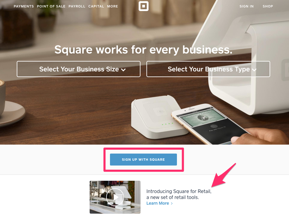
They do a couple of things really well here.
First, they have an explainer video prominently displayed above the fold but below their CTA.
The video isn’t an obvious list of benefits like you will see when you scroll down the page, but it’s there in your face. And video explainers work well for conversions.
So you get the best of both worlds.
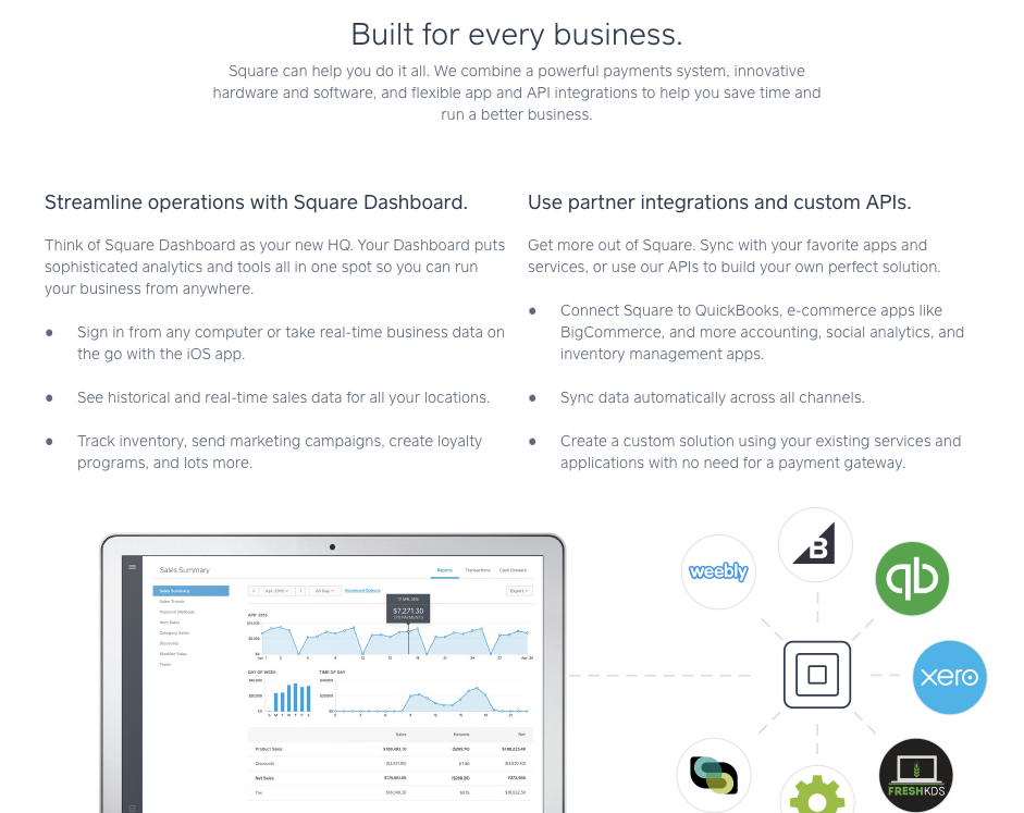
If you scroll down the page, you’ll see more benefits listed as well:
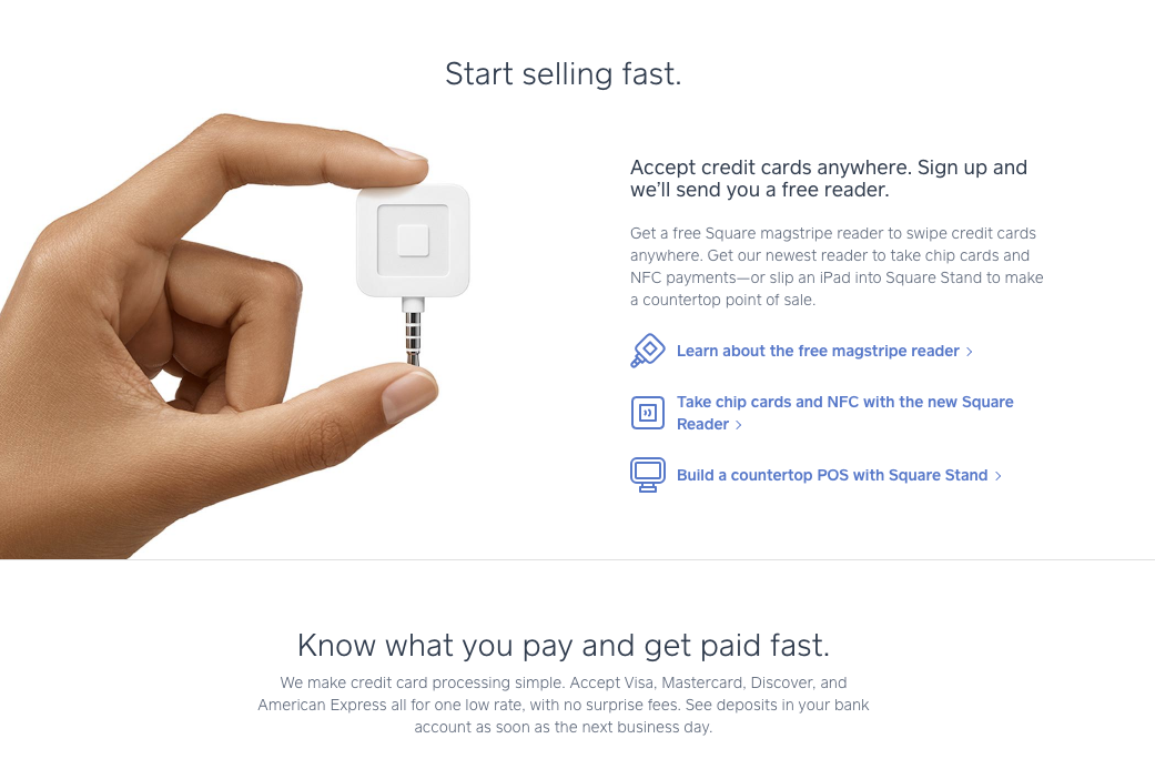
All of this is easily scrollable and scannable.
So if you’re not ready to follow the CTA just yet (signing up with Square), you have the information you need to make a decision readily available to you.
But another thing they do well is that they make their CTA personal.
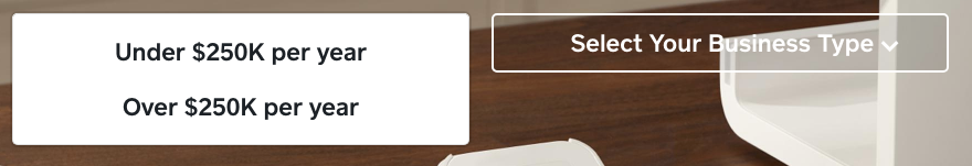
You’ll notice the two dropdown buttons above the CTA:

You can select two different business sizes and five different business types:
If I select “Over $250K per year,” I get a whole different CTA:
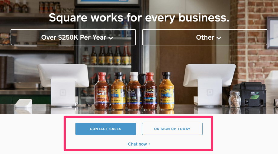
The benefits listed below the CTA also change:
This use of personalized CTAs is clever and effective.
Personalization like this converts 42% better than generic CTAs.
While you don’t necessarily need all the fanciness that Square uses, you can still optimize your landing pages to reflect your CTA.
Explain the benefits in a clear and easy-to-read manner and make it personal to your audience.
When it comes to the type of landing page you’re using, less is more on homepages, and more is more on landing pages.
Landing pages with specific offers or that come from PPC ads should probably include more text.
Like this example from DigitalMarketer:
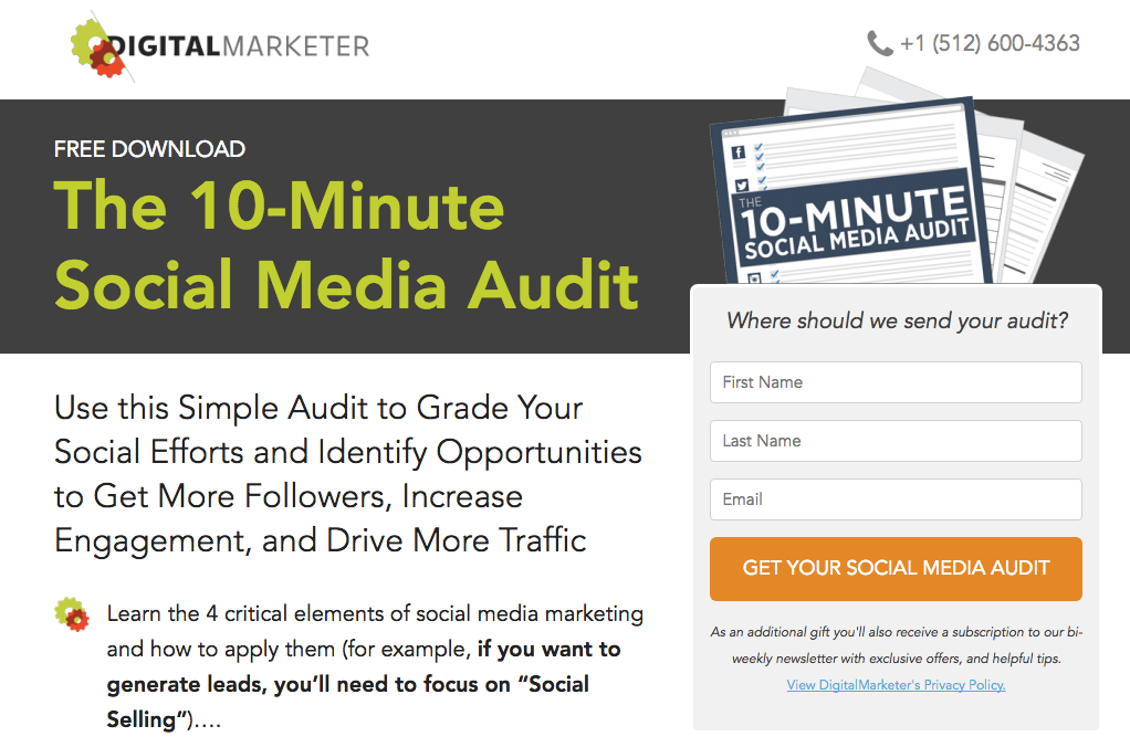
You want all of that text there to sell your CTA.
But for homepages or other landing pages, all that text might clutter things up.
So keep things simple, if possible, but include information that allows the user to make an informed decision.
If you can do something cool and include different versions of your CTA, definitely give it a try.
The more personal you can make it, the better your conversions will be.
But even if you can’t do something cool, explain the benefits anyway.
If they know why they should care about your CTA, they will be more likely to click it.
2. Make your CTA bigger
People talk a lot about CTA color, but they don’t always talk about size.
But buttons aren’t one size fits all. They do come in different sizes.
Personally, I love big, bold CTAs.
They tell you exactly what you need to do once you come to a site, and they’re hard to ignore.
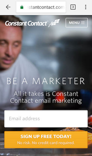
Take this CTA from Constant Contact, for instance:
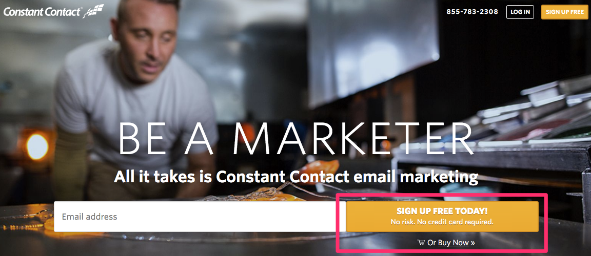
It’s so big that it takes up the majority of the above-the-fold space. And the button itself has more explanatory text.
I could keep scrolling down to find out the benefits of the service, yes.
But honestly, the button tells me what I need to know, too.
I’m also a big fan of the popup CTA, even though some may argue that they can be distracting.
And marketers have found that 35% of lost visitors will convert on an exit popup offer.
Another reason that I like big CTAs is that they’re mobile friendly.
The average CTA button is around 47.9 pixels tall, with the smallest at 20 pixels tall.
Apple suggests that any touch point should be at least 44 pixels tall.
This is because a small button is much harder to click when you’re on a mobile device.
Check out the Constant Contact mobile homepage:
Their button is still big enough to fit more text, and it’s easy to click.
Even if you don’t want to make your actual button very large, you can still draw a lot of attention to it through your surrounding text.
Take a look at the MailChimp desktop homepage:
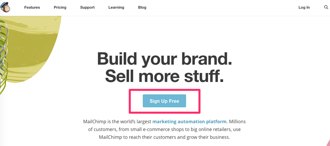
The button itself is pretty averagely sized, but it stands out because the text above it is distinguishable.
And there isn’t a bunch of stuff on the page to distract from the CTA, either.
Their mobile site takes advantage of this, too:
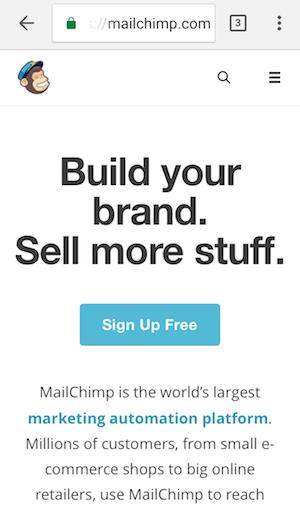
In fact, it stands out a little more on the mobile site.
By increasing the size (or the size of the surrounding elements), you can draw a lot of attention to the most actionable item on your page.
And you know what they say: go big or go home.
3. Improve the value of your CTA offer
Conversions aren’t all about what your CTA says or what it looks like, though.
Sometimes it’s about what’s on the other side.
The value of your offer can make or break your conversions.
If that “free downloadable guide” isn’t something I want to read, I’m not going to click your CTA no matter how bold and beautiful it is.
So the best thing you can do is create something worthwhile on the other side of the click.
This includes your CTAs on your homepage and elsewhere on the web.
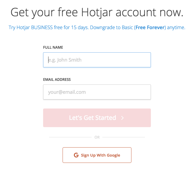
Take this Facebook Ad from Hotjar, for instance:

The value proposition here is a 15-day free trial with no credit card required.
If I’m interested in knowing more about tracking my website visitors, this is a really good deal.
It’s a good idea for them to include the “no credit card required,” too.
If I’m sold on using the service based on this ad, then I click. It brings me here:

I have the same offer with more information if I need it.
Clicking that CTA leads me here:
It’s a quick and easy form where I can get started.
The value from each of those CTAs was clear. I knew I was getting something worthwhile on the other side.
If you want your CTAs to get higher click-through rates, you have to have a value proposition.
This is particularly true if you have gated content.
Here’s an example of a gated offer from Fat Guy Media:
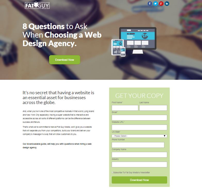
The CTA is simple enough (“Download Now”), but because it’s asking me for personal information, I need more.
In this case, there’s a whole landing page full of explanation as to why this is valuable to me.
Without that, however, I might be hesitant to download anything.
But offering value for gated CTAs can also work on a homepage without all that miscellaneous text.
Take this example from Shopify:
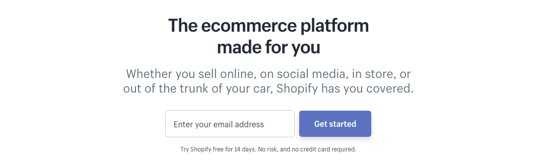
You have to give an email in order to click the CTA.
But there is some value listed on the site around the homepage and underneath the CTA itself, so while it’s gated, there’s still enough value to drive clicks.
This type of gated CTA works well if your business revolves around creating an account or even trying a demo.
Here’s an example from Kissmetrics:
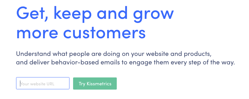
The CTA is a trial of the service.
Even though you have to type in content to fulfill the CTA (it’s not an email, though, so there’s less commitment), there’s an immediate payoff.
Immediate payoffs are good for CTA conversions.
If you’re not sure if your CTA offers enough incentive, consider not gating it at all.
Free trials, demos, and account signups shouldn’t have a gated CTA, even if the content itself is technically gated.
You could do what Canva does and create a CTA that’s just a signup form.
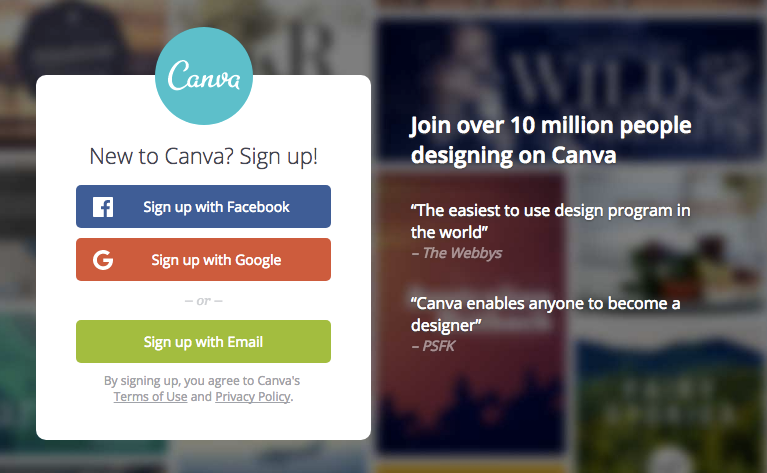
There are only two actions you can take here: sign in or sign up.
Testimonials are used to bolster that value proposition, but it’s still a gated CTA that works well.
You can also gate CTAs that capitalize on search engine traffic (like the Fat Guy Media offer from above) and use a separate landing page for it.
But otherwise, as long as your CTA has obvious value, you can leave it as is.
Just make sure that it does have some obvious value.
4. Use anchor text CTAs in your content
Start thinking outside the “button.”
Because “button” is not the only style of CTA.
While button CTAs perform better than other types of CTAs, that doesn’t mean it’s the only type you can and should use.
Anchor text CTAs are another form that can boost conversions depending on your strategy.
Here’s what they look like:
It’s a simple, unobtrusive, maybe even too-modest CTA.
So why would you want to use something small and out of the way like this?
Because anchor texts can improve your conversions.
When HubSpot introduced anchor text CTAs as a part of their historical optimization project, they doubled the conversion rates of posts that included them.
For every post they tracked, between 47% and 93% of their leads came from the anchor text CTA alone.
Putting a CTA in the body of a blog post makes it more accessible and visible.
As long as it’s relevant, of course.
You don’t have to limit anchor text to your blog posts, though.
While anchor texts traditionally do better when used in content, you can also include anchor-text CTAs alongside your button CTAs.
Let’s go back to another example on this list from Constant Contact. You can see it in action here:
It’s just a small piece of text underneath the button, but it’s still a CTA.
It leads to a different and much more direct conversion point, too.
Here’s another example from Typecast:
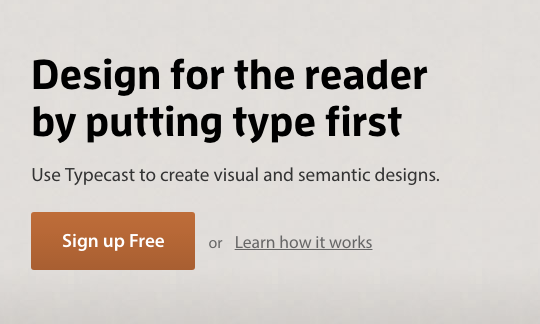
The main conversion point is a signup, but the anchor text acts as more of a secondary CTA.
It’s not necessarily there to draw attention to itself, but it does provide additional value.
So anchor-text CTAs are great.
They add value and offer a different point of conversion.
What you don’t want to do is use anchor texts as your main CTA, though.
Like I’ve said before, button CTAs typically do work better for overall conversions.
But an anchor-text CTA can be a subtle way to get conversions in locations that might otherwise go unnoticed.
So if you find that your end-of-content CTAs aren’t performing that well, try an anchor text in your body copy.
If you find that your main CTA needs a little more content (but you don’t want to make it bigger), you can use a smaller anchor text around it to give a boost.
Just make sure that your main CTA is noticeable, and you should be fine.
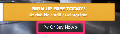
5. Include a secondary (muted) CTA
I know that they say you should only have one CTA. For the most part, they’re right.
But in some cases, more than one button can actually be a good thing, as long as you have an emphasis on your main CTA.
Here’s an example of what I mean:

There’s a main CTA (“Find out more”) and a muted CTA (“View products”).
Both are actionable, but the company clearly wants to highlight one over the other.
It’s not a bad idea if you have a site where information about products or services is key but also have a lot of products or services to browse.
If I click on the main CTA, for instance, it takes me here:
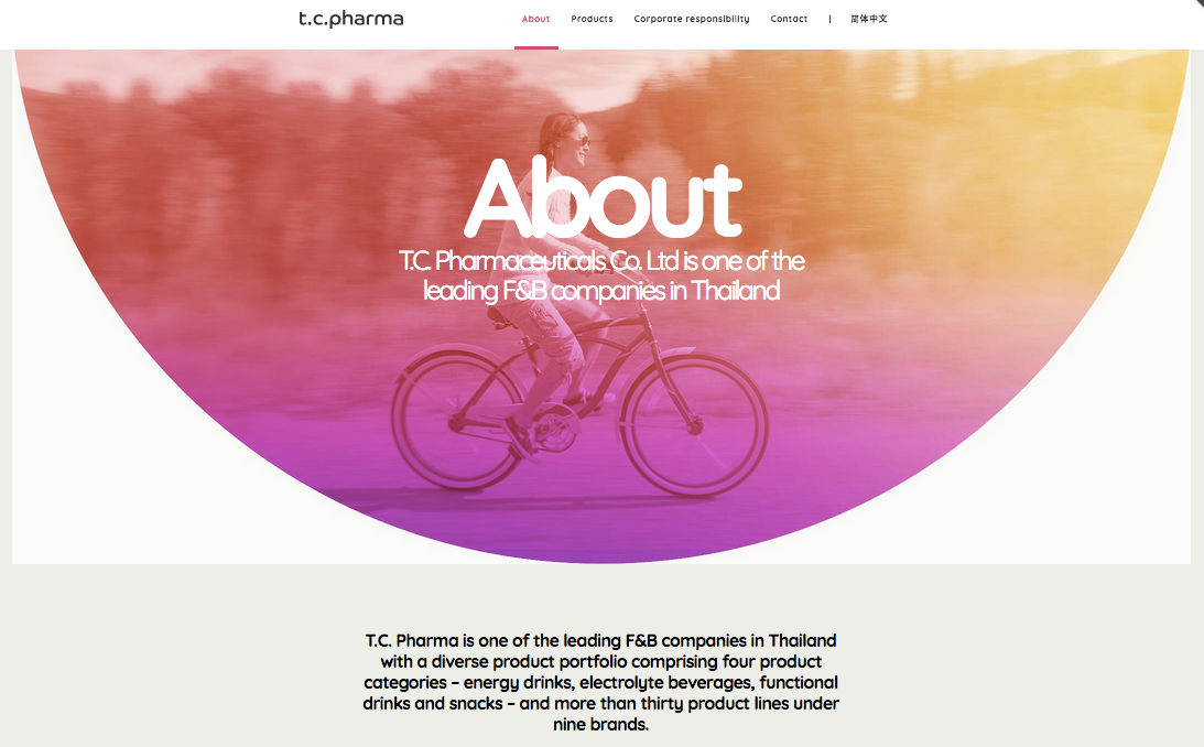
This site is mainly a corporate site and not an e-commerce site. So it makes sense that an “About” page is the first CTA.
Their consumer base will want to know more about working with the company.
If I click the muted CTA instead, I’m brought here:
It’s an overview of products, but there’s nothing really actionable on this page.
It makes sense that it’s muted.
People will still want to know what products they make, but because it’s not a store, there’s less incentive to browse.
Here’s another great example from Dribbbox:
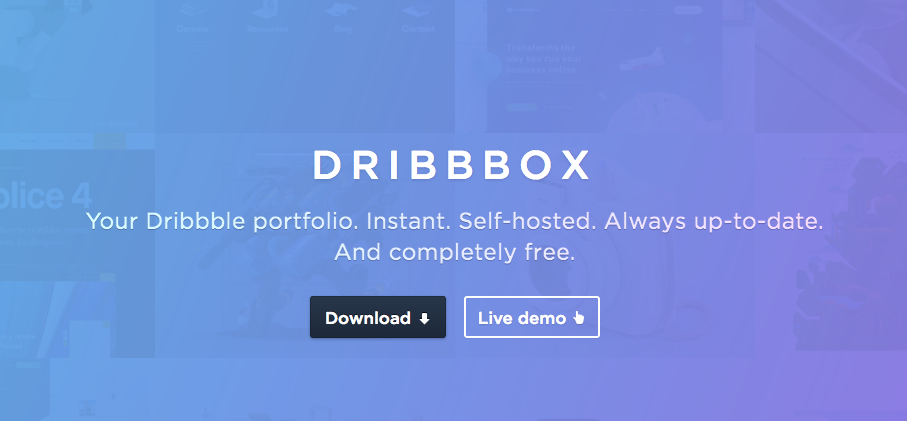
There are two actionable items that target customers from two points of the funnel.
The first box is most likely for those near the bottom of the funnel who are already familiar with Dribbbox and are ready to download it.
The other is for those who may be at the top of the funnel and want to learn more.
It’s a smart strategy for a homepage that’s targeting different conversion points.
Or if you run a SaaS company where you have something to demo but also want to give information about your product, try something like what Diffbot does:

The key is to make sure that one of the CTAs is muted.
You don’t want the buttons competing against each other for attention because then neither will win.
Conclusion
There are plenty of ways you can optimize your CTAs without relying on color.
Focus instead on two things: noticeability and value.
Can people clearly see your CTA? Do they know what’s in it for them?
Those are the questions you want to ask when optimizing for conversions.
People want to know exactly how to take action. That’s the whole point of the CTA.
So make it big. Make it bold.
But surround it with value.
Include copy on your landing page that sells it.
And make sure the CTA itself leads to something truly valuable.
Do those things, and you should become a master of the art of creating a killer CTA.
What CTA optimization strategies have worked best for you?
Comments (2)