Most marketing blogs go on and on about how some A/B test increased conversions 10x.
I hate to break it to you, but here’s the honest truth:
Those are the exception, not the rule.
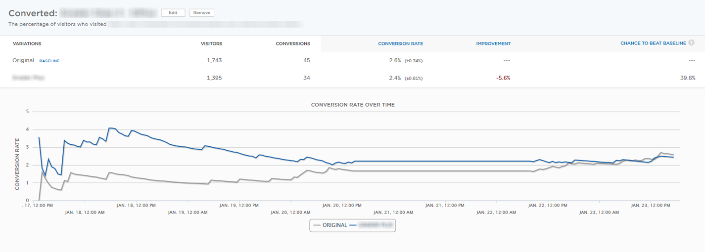
A/B tests fail more often than they succeed. And in many cases, the results you see aren’t worth all the effort or attention you’ve been paying.
So forget about A/B testing for now.
Because I’m going to show you three techniques to drive conversions more consistently (even though no one talks about them).
I’ll even pull back the curtain on some techniques that I use on this site to convert as many people as possible.
Let’s do it.
Hack #1: Test ‘Big’ Elements Instead of Small Ones
Every day you see the same articles across Twitter or Facebook.
“How Company XYZ Doubled Conversions with this Button Color Change.”
But let’s be honest with each other for a second.
The color of your CTA button doesn’t matter as much as you think it does. In fact, in most cases, you should almost never waste time A/B testing something so tiny.
Why?
Small changes only net you small improvements.
And that’s the best case scenario!
Otherwise, the worst case is that you end up spending all your time and energy on something that produces zero results for you.
WordStream proved this in their analysis of over $3 billion in annual ad spend. They wanted to figure out what separated the highest converters (often converting 2-3x the average) from everyone else.
Was it small button color tests? The answer was a resounding: No.
Instead, what they found with these smaller tests is that any short-lived improvements “often regressed back to the mean.” In other words, they were temporary and wiped out in a matter of time.
The biggest contributing factor to high-converting campaigns came down to ‘big picture’ things like your offer, messaging, customer segments, etc.
For example, no button color test can save your site if it’s already suffering from:
- Flat design with no interactive elements (too minimalistic)
- Unclear page navigation or overly complicated (multi-tiered) menus
- Carousel sliders that don’t show all the important content up front
Even ‘beautiful’ websites can kill conversions if the experience confuses audiences or keeps them in the dark.
High converting sites don’t just focus on optimizing single landing pages or obsess over tiny design elements.
Instead, they focus on having a site-wide conversion strategy (which we’ll see over and over again throughout this entire article).
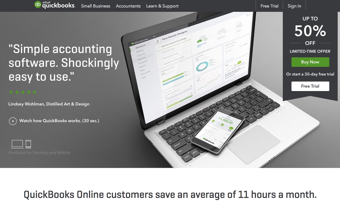
Take QuickBooks, for example:
Their homepage leads off with the benefits of using their software. Even their navigation tells you exactly who their product is for and where you can go to learn more.
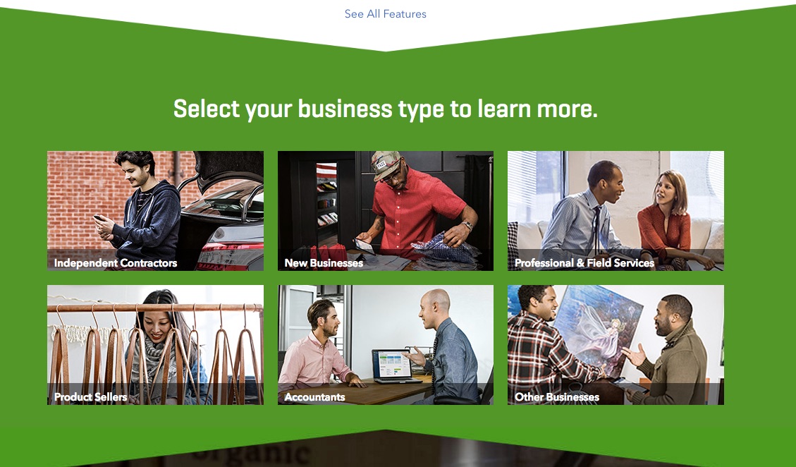
If you scroll down further, they even give a list of their key audiences with links to their more actionable CTAs.
Their site is clear, interactive, functional, and beautifully simplistic. The entire thing is designed to point users in the right direction (to sign up!). Not for any generic offer, either, but down a path that’s tied to your business.
So they’re already segmenting you, ‘funneling’ you down a path where every piece of content is hand-selected for who you are and what you’re interested in (more on this later).
The whole point of A/B testing is to find out what ultimately drives your audience, right?
It turns out you can already get a lot of those same insights from Google Analytics in less than five minutes.
Here’s what plays out on your site right now.
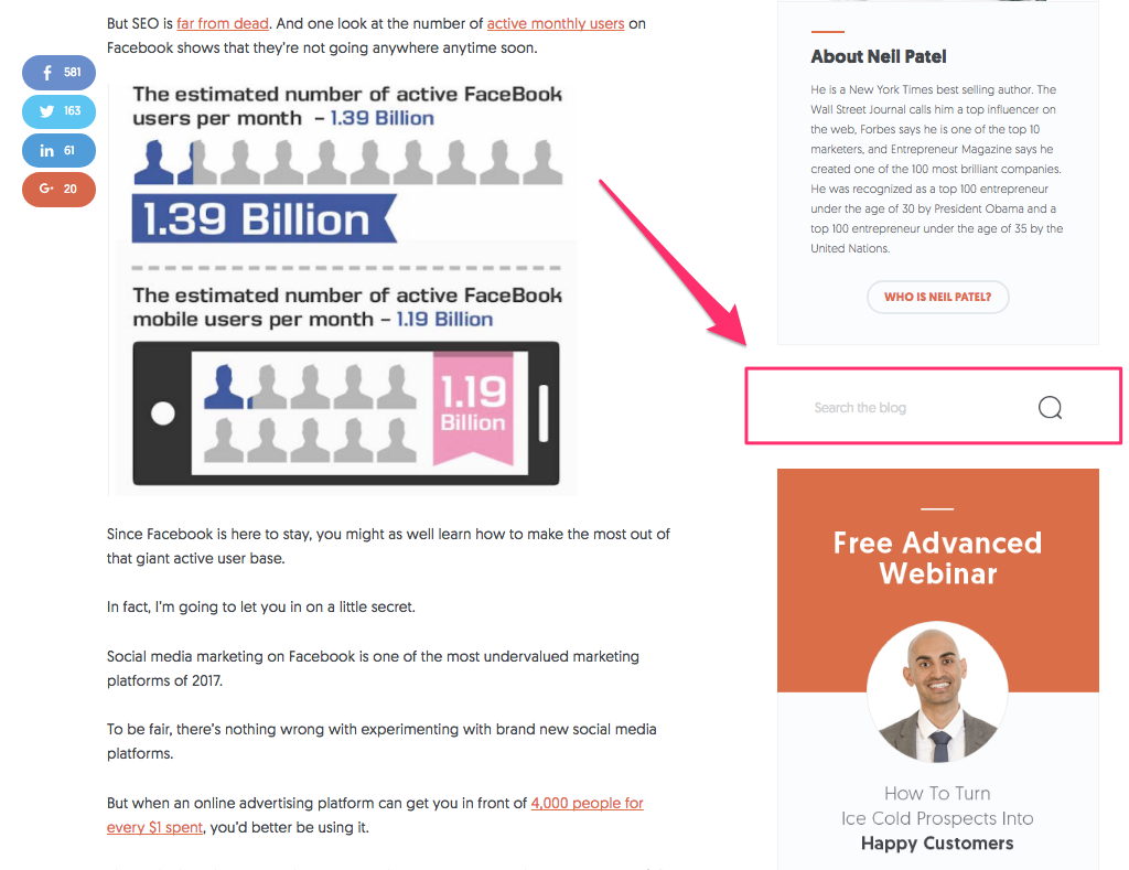
People are reading a blog post about Facebook.
They like what they see so far and want to keep reading related info.
So they look over to your sidebar and start searching based on topics just like they might in Google.
Wouldn’t it be nice if there was a nice, simple report that told you what people were searching for? There is!
Inside Google Analytics, look under “Behavior,” “Site Search,” and “Search Terms.”
Not only can you see what’s searched, but also how often.
So this even prioritizes your work for you. There’s no guesswork. The answers are already sitting there for you to peruse.
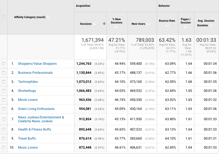
Google Analytics can also tell you the interests of your audience (above and beyond what they’re searching for). Look under “Audience,” “Interests,” and “Affinity Categories.”
These are broader categories that provide you with a better idea about your audience: what their interests are, what their hobbies are, and how they self-identify.
Now you have some insight to make better decisions.
You can reorganize your site to better match and segment these interests. And you can run new tests on these big actions you’re taking.
No, not A/B tests. But A/B/N tests that compare things like which segments convert best or does positive or negative messaging work better.
If you can pull valuable data from your analytics first, you may not need to test at all.
Hack #2: Create a Sense of Urgency to Drive Micro-Conversions
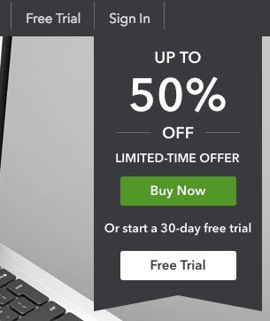
Earlier, we saw Quickbooks using a “Limited-Time Offer” to get you to convert.
What they’re really doing here, underneath the surface, is creating a sense of urgency to get you to take action.
Let’s be real again: Most people don’t need things today.
They might want it or enjoy it.
However, the vast majority of us are selling stuff that isn’t life or death.
That makes our job tricky. How on Earth are we supposed to sell something if people don’t feel a burning desire to care about our widget as much as we do?
The trick is urgency. You have to create a feeling that makes people sit up, take notice, and want what you have.
This does something magical for conversions: It switches the conversation from, “Should I buy this product?” to “If I’m going to buy this, I need to buy it soon before it’s too late.”
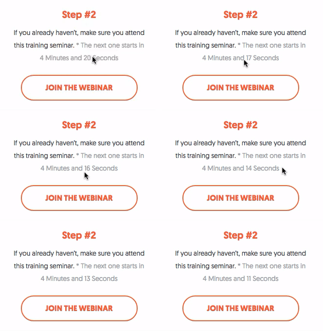
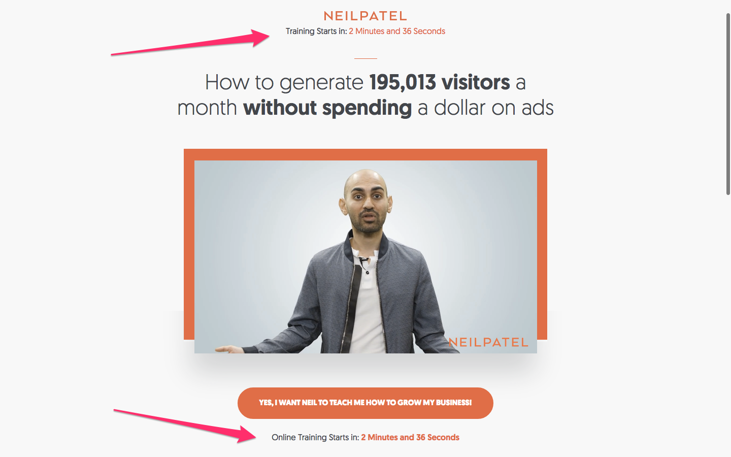
One of my go-to urgency building tactics is a countdown timer that I use for my webinars that are starting soon:
Remember, though, that we’re not going for a tiny one-off tactic. Instead, we want to continue reinforcing this feeling of urgency again and again throughout the site.
That’s why countdown timers are one of the first things you’ll see when you hit my homepage:
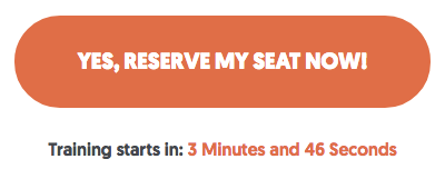
And then you’ll see them again underneath CTAs because this is the moment when someone has to make a critical decision whether they’re going to take you up on that offer (or not).
The nice thing about using urgency for conversions is that you rarely have to test for it. Adding more ways to motivate people to take action almost always increases results across the board.
Here’s why.
Nobody is going to sign up for high-priced products and services on their first visit.
It’s just not going to happen.
But, you also don’t want to have people leaving without giving you something to follow up.
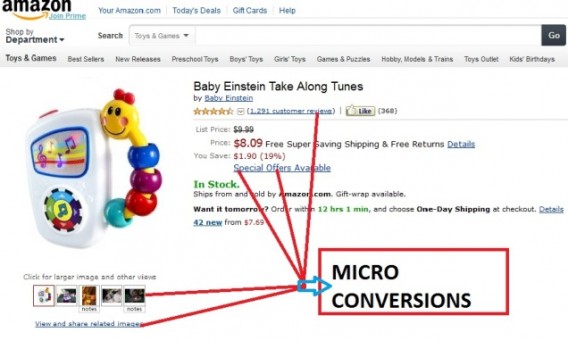
That’s where micro-conversions come into play. They break up the big purchase into small, bite-sized commitments.
They keep you clicking around the site longer, diving a little deeper, until you hand over your email address – at the very least.
Kipp Bodnar, the VP of Marketing at inbound HubSpot, often advises new startups to invest more of their time in driving micro-conversions (like email subscribers) rather than on A/B testing.
“Too much A/B testing is a waste,” he says, “because you end up testing things that are too small to be worth the time.” What’s better is getting emails. “Email sharing is still king.”
That’s why I push so hard for email addresses on my website.
Nobody is going to sign up for consulting right away. The price isn’t cheap, and they need to understand what they’re going to get out of it.
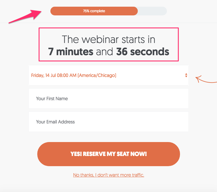
So before even discussing the price, I focus on delivering value (in the form of a webinar) in exchange for that initial email address.
Do you notice something else on that example at the top of the screen?
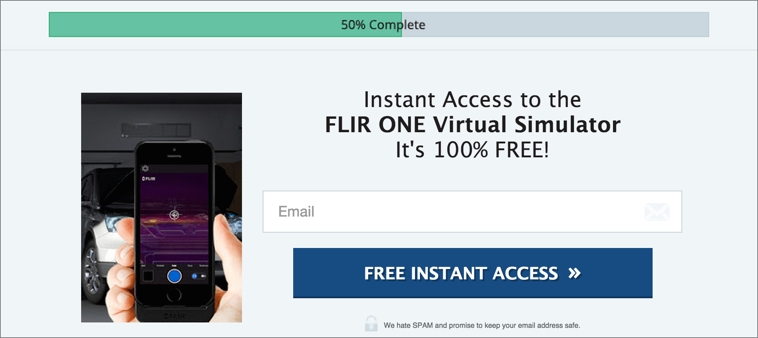
There’s a progress bar that shows you’re 75% of the way there. Here’s why that’s important.
LeadPages saw a 28.29% conversion lift when they started using a progress bar on their forms.
These work because they play to our psychology.
Think about how you feel when you see a huge form to fill out online. The chances of you taking that next step and filling out all the requested information drops.
It sounds like a lot of work!
And yet the progress bar reverses this idea. By showing that you’re already 50-75% of the way towards accomplishing what you want, it drives up the likelihood that you’ll stick around for the eventual payoff.
There’s always ‘friction’ in a conversion sequence that might throw people off the rails before the sign-up.
Reducing the perception of ‘friction’ is a simple way to increase urgency and make people stick around long enough to commit.
Hack #3: ‘Funnel’ People into Your Opt-Ins
People are already flowing through your site.
They’re going from one place to the next, trying to find specific things (or simply continuing to browse after finishing their first blog post).
We call this ‘user flow’ or the user journey. People complete various steps before converting (or leaving).
And the good news is that you can influence these user flows by redesigning how people get from point A to B.
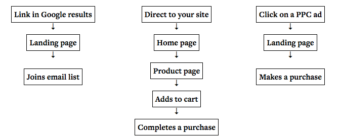
Here’s what a few of these user flow examples look like:
So let’s say someone clicks on an ad to get to your site.
Chances are, they’re going to bypass the homepage entirely and go instead to a landing page. They might even go through an entire conversion process without ever hitting your homepage.
Then you have others who might come from organic search and go directly to a blog post first.
And then there are others still who might type in your site directly to start at the homepage.
Ideally, you want them all to end up at the same place: your primary point of conversion. (Which is typically a micro-conversion as we just learned.)
But to get everyone to that ultimate destination, you’re probably going to have to ‘funnel’ them into the same path.
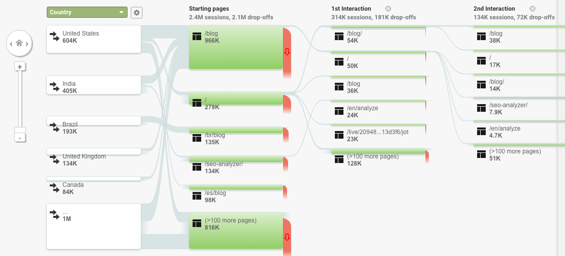
The “Behavior Flow” report inside Google Analytics, while not perfect, can help you piece together some of this information.
For example, it will show you where people are coming into your site, what pages or posts they’re reading, and where they’re trying to go next.
So you can start by making this process easier for them. Or conversely, look for the ominous red drop offs where a conversion roadblock might be sabotaging your visitors.
These big red waterfall-looking things show you where large droves of people are leaving your site. That way you can go inside and replicate their journey to figure out where the disconnect is and what it is that is causing them to bounce.
Here are a few examples of how you can ‘funnel’ people. Let’s start with incorporating many different CTAs (even on your own site) that send people to the same place.
For example, one might be a button while another might be a text link. That way it’s subtle and appeals to different people for different reasons.
That’s exactly what I do on my navigation, with the “Consulting” and “Start Here” links that send people to the same exact page.
Why?
I want more people going to that page to convert!
I want to maximize the number of visitors that page sees (because I know, based on data, that it works).
Some people might have an interest in the consulting angle, while some are looking more for in-depth information. So the different options and links appeal to different interests and quirks (see #1 above).
But ultimately, I want them going to the same place regardless of how they get there.
That’s one side of the coin.
The other is to take away options from people.
Here’s what I mean.
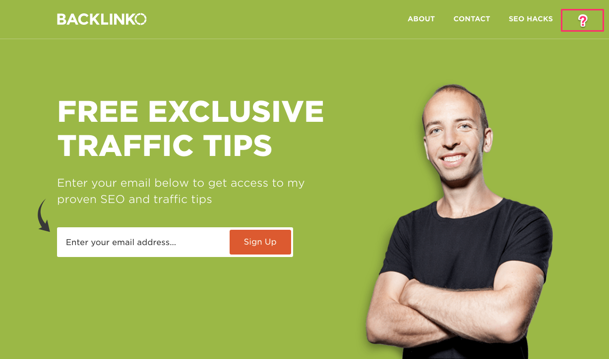
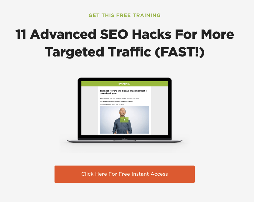
For example, Backlinko is primarily famous for their content. But when you visit the homepage, there’s no simple blog link or ‘latest posts’ section found.
There is an “SEO Hacks” link. But that one takes you to a landing page instead of throwing you into content.
And it’s not until you get all the way down to the footer do you see a blog link.
It’s not that he doesn’t want you to read his blog. He just wants you to convert, more!
Besides, many of Brian’s readers are coming into his site through content (which you can verify with the Behavior Report) and then bouncing back to his homepage afterward (when they’re ready to opt-in).
Giving you easy access to the blog would have meant you’re spending all your time getting distracted with consuming content instead of handing over your email address to him.
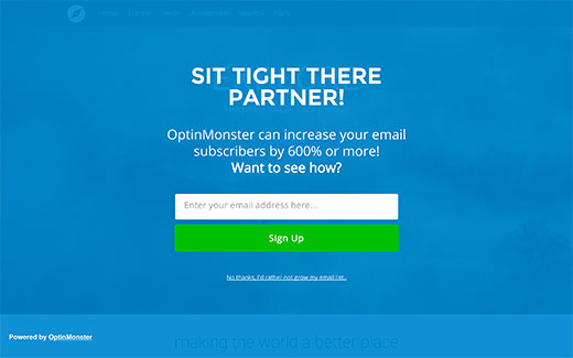
One workaround that literally popped up for this is the Welcome Gate. No matter where you came into a site, they would attempt to show you the same exact thing initially:
Many websites, like Groupon, just started changing their homepage to be a stand alone welcome gate, so it was the default page you hit when you visited their site.
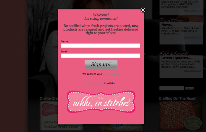
The welcome gate was a variation on overlays and pop-ups. You also have the top bar that would drop down (like Hello Bar) and now the slide-in box that suddenly appears.
In each case, you’re being ‘funneled’ to the primary offer.
Why are these pushy techniques proving so popular?
Once again, it’s because they work.
“Websites with pop-ups consistently outperform websites with no pop-ups,” according to CrazyEgg.
OptinMonster says by as much as 2100% in some cases!
Let’s compare the results.
Take your passive email opt-in areas like placing an email form on the blog sidebar. These only convert a measly 0.4% of visitors, while the more aggressive, pushy ones convert at several times that rate.
Now, how about those ‘pushy’ lightbox pop ups? These can convert at 5.5% which means you stand to gain 1,375% more subscribers.
See! The results aren’t even close.
Conclusion
A/B testing is only helpful to a certain point.
It’s not that’s it’s bad necessarily. But you can often find a better bang for your buck (and time spent) doing other tactics, instead.
You should start with testing ‘big’ elements on your site, like which customer segments or personas convert better than others. Because too often, small tests like the button color only produce tiny results (if any).
Your next step is to drive up micro-conversions. Get people to make little commitments before asking them for the big one at the end of the day (pay day).
You do that through ‘funneling’ your site traffic. You can add multiple CTAs for the same key pages and even take away some competing sections so that people don’t get distracted from their goal.
Then seal the deal with assertive pop ups, slide ins, and drop downs that give your readers offers that they can’t refuse.
What is your favorite technique to drive conversions (besides A/B testing)?



Comments (2)