
Did you know that 85 percent of shoppers base their product purchasing decisions on color?
It’s true.
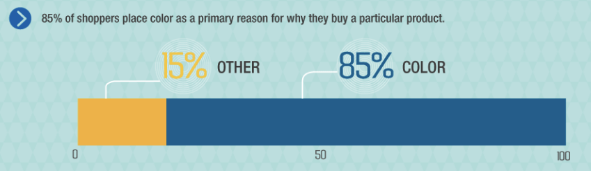
At first, I found that stat to be amazing.
But after considering just how visually-driven we are as humans, it made total sense.
Visual stimuli guide nearly everything we do.
So why would it be any different when it comes to buying?
And just think about some of the world’s biggest brands.
Most tend to have a distinct color scheme associated with their brand identity.
For McDonald’s it’s red and yellow.

For Dell it’s blue.

And so on.
Color and branding
As we all know, establishing a solid brand identity is vitally important.
It’s a key ingredient in building trust, making consumers feel comfortable, and creating long-term brand advocates.
And what’s an integral part of a brand?
Its logo.
The color scheme that a company chooses for its logo is forever entwined with its brand identity.
According to research, “Color increases brand recognition by 80 percent.”

So I think it’s fair to say that color scheme is pretty important.
There’s something else to keep in mind. Brand color has a correlation with brand value.
Sure, there’s some cause/effect tradeoff, but take a look at these stats:
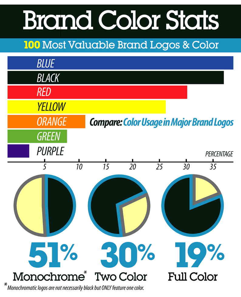
Valuable brands care about their colors. A lot!
If you were to go and mess with the colors of an existing brand, it would completely change how that brand is perceived.
Take a look at these examples from TheLogoFactory.com


You can instantly spot the artificial logos, and you feel something different surrounding that brand!
Website color scheme
Just like it’s crucial to choose the right color for your brand logo, it’s equally as crucial to choose the right color scheme for your website.
You don’t want to pick your color scheme at random or base it on “whatever looks cool” to you.
Of course, you want awesome aesthetics and to “make it pop,” but color scheme is something that you want to give plenty of thought.
Why?
“People make a subconscious judgment about an environment or product within 90 seconds of initial viewing. Between 62 and 90 percent of that assessment is based on color alone.”
If you choose the right color scheme that’s naturally geared toward your demographic, you’ve already won half of the battle.
I would now like to offer 12 essential tips on how to pick the perfect website color scheme based on research and my own personal experience.
1. Understand how color affects emotion
The first thing I recommend is familiarizing yourself with how color affects humans on an emotional level.
Here’s a breakdown of how various CTA button colors affect shoppers in North America.

Note that the impact of color can vary depending on geographical location.
For instance, a color that appeals to American shoppers may not necessarily appeal to Indian shoppers.
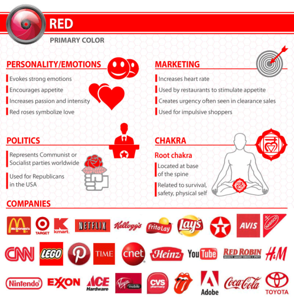
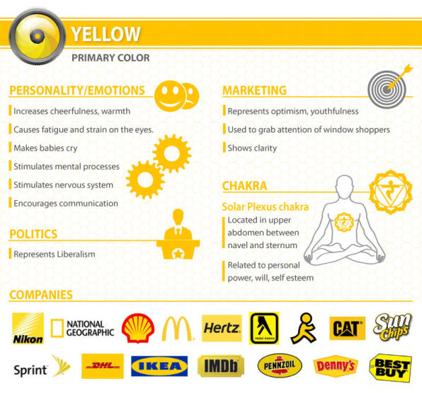
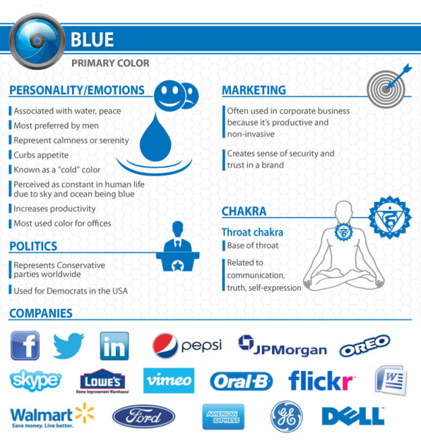
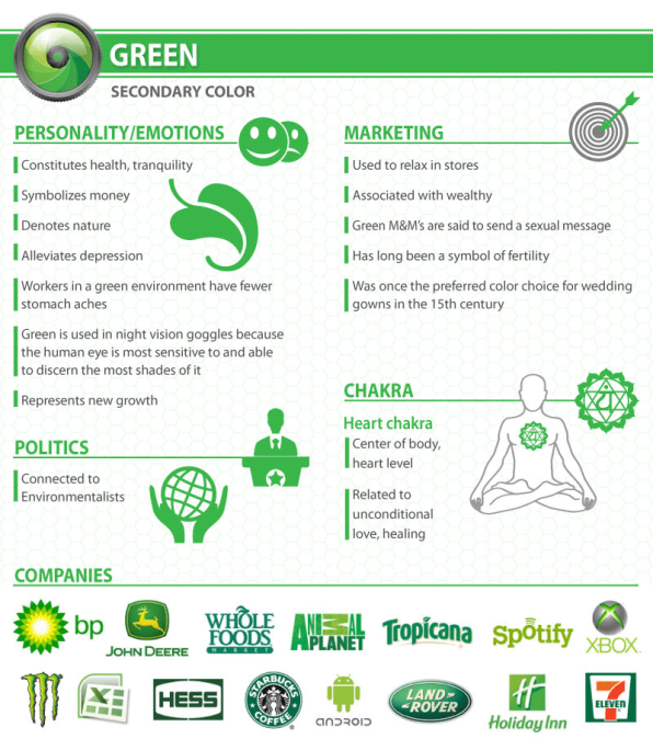
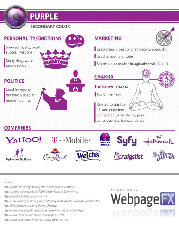
I also came across the Color Emotion Guide that explains the emotions we associate with colors and provides some examples of brands that use each color.

I suggest spending some time looking at these examples and thinking about the psychological implications of the various colors.
2. Consider your overall demographic
Now I’d like you to think about your target demographic.
Who is it you’re trying to reach and sell to?
What types of emotions are you trying to arouse?
These are extremely important questions to ask yourself.
I recommend checking out this information from Fast Company that explains the emotions and psychology behind common colors.

Consider the personality and emotions of your target audience.
Then choose the best color to serve as the primary color for your website color scheme.
For example, if you’re an organic food company, your best bet would probably be green because it’s associated with nature and health.
3. Consider gender
Although this won’t apply to everyone, some companies mostly cater to a specific gender.
If you’re one of these companies, you’ll want to know what are men’s and women’s favorite and least favorite colors.
Research from Joe Hallock’s Colour Assignments found that on average each gender has definite color preferences.
Here’s what I mean.
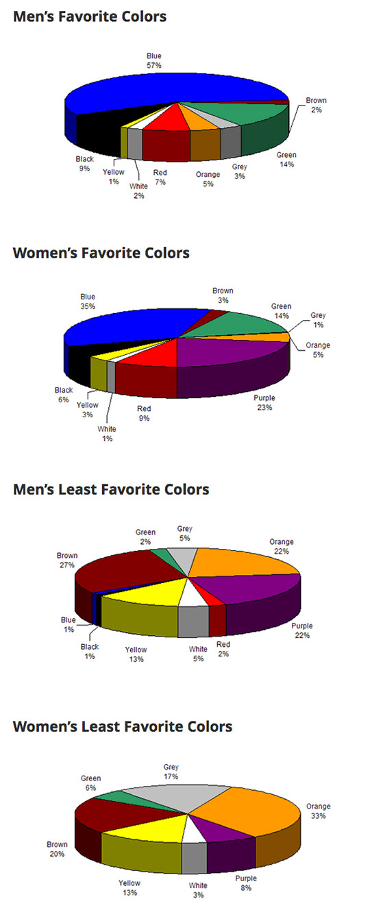
As you can see, men really like blue and dislike brown and purple.
Women like blue and purple and dislike brown and orange.
This is just another factor to keep in mind.
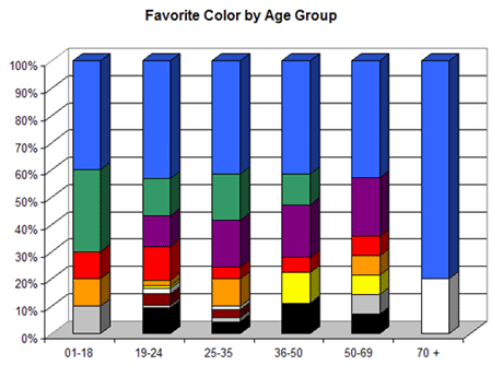
4. Consider age group
Here’s something to think about that may not be obvious — age group.
Did you also know that a person’s color preferences can change with age?
According to research from Joe Hallock, it’s true.
Here are people’s favorite color by age group.
Here are people’s least favorite color by age group.
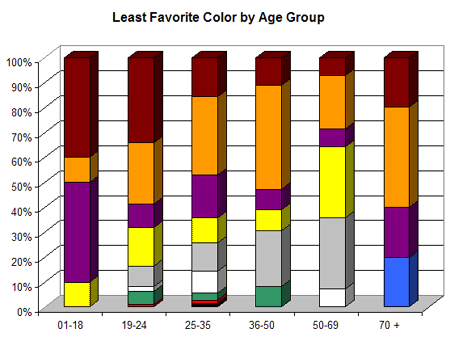
If a certain age group dominates your demographic, then this too will be a factor to consider.
5. Take “the color quiz”
If you need a little help deciding on a primary color, you may want to take this quiz from Grasshopper.
It will ask you things like “what best describes your customers” and “what type of product you offer.”
It’s quick and easy (only seven questions) but can point you in the right direction if you’re a little confused about which direction to take.
6. Let go of your biases
Here’s a mistake that I’ve seen many businesses make when choosing a color scheme.
And that’s basing it on their personal preferences rather than psychology.
If your favorite color is blue, it’s very tempting to make blue your primary color.
But if you’re a cosmetics company targeting a female demographic, this would be a mistake, and you would usually be better off going with purple or pink.
This is just something to keep in mind because you don’t want your own personal preferences to end up costing you sales and potentially diluting your brand over time.
7. Decide on how many colors to use
So at this point, you should have a primary color in mind.
Now it’s time to figure out how many colors you want to use in total.
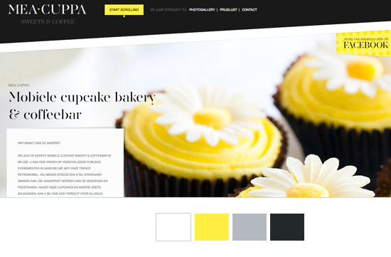
While there’s no one-size-fits-all formula for this, I would like to point out something that’s called the 60-30-10 rule.
Long story short, this rule is used to come up with a color scheme in areas like interior design and fashion and involves dividing three colors into percentages to create a “perfect harmony.”
Here’s how it all breaks down.
- 60 percent of a dominant color
- 30 percent of a secondary color
- 10 percent of an accent color
This means that the primary color will account for roughly 60 percent of the space on your website, the secondary color will account for 30 percent and the accent color will account for 10 percent.
If you want an example of the 60-30-10 rule, look no further than Quick Sprout.

Notice how green is the primary color, white is the secondary color and black is the accent color.
So when you boil it all down, this means that the ideal number of colors to use would be…drumroll please!
Three.
Now I’m not saying that you have to go with three colors, but it’s a good number to shoot for.
Using any more than four colors can make things complicated and downright ugly.
8. Choose your set of colors
What you want to do now is determine which set of colors you want to use.
Now I’m not a design expert, but one thing you’ll definitely want to achieve is contrast.
I personally prefer sites that have a light colored background with darker contrasts in the foreground.
This should make it easier on your visitors’ eyes and creates at least a certain amount of aesthetic appeal.
Here’s a good example.
However, there are sites that can pull off a dark background quite well.
Take Wonder Bread for example.

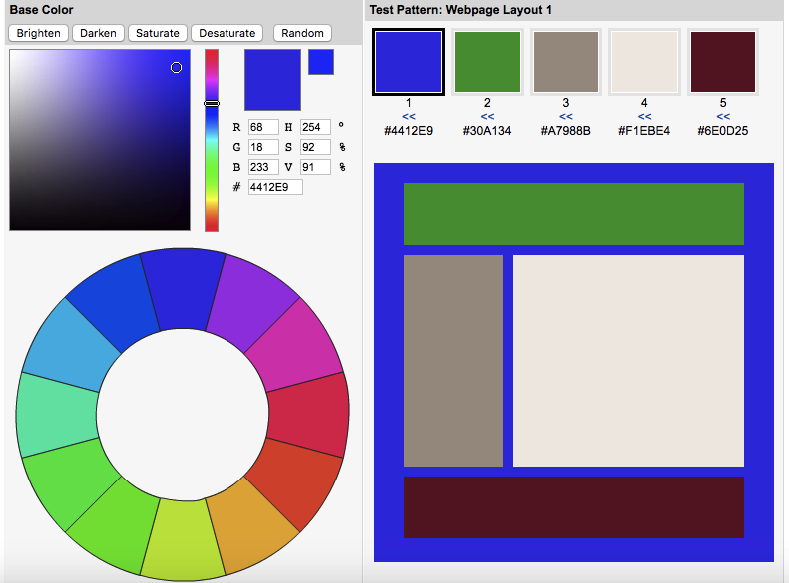
9. Consult the color wheel
Remember back in art class when you learned about “the color wheel?”
Well, it can be a huge help for choosing a website color scheme.
What you want to do is choose either “analogous colors” that are similar and next to each other on the color wheel or “complementary colors” that are directly opposite each other on the color wheel.
Here’s what I’m talking about.
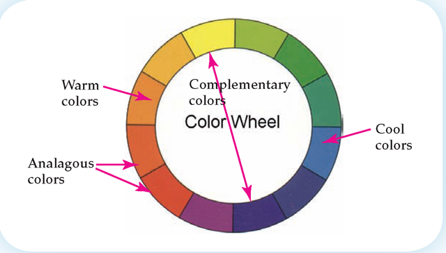
One choice for complementary colors would be yellow and purple.
Another would be green and orange.
One choice for analogous colors would be orange and red.
Another would be green and blue.
10. Use tools for help
Here’s a tip for streamlining the process.
It gives you a quick and easy way to test out different color combinations to give you a better idea of how they would actually look on your website.
This can save you a lot of time and should help you find the color combination that’s just right.
Or if Colorspire doesn’t tickle your fancy, I recommend looking at this list of awesome tools for choosing a website color scheme.
11. Check out the competition
You can also learn a lot from competitors in your industry.
I recommend checking out at least three websites of direct competitors and looking for overarching patterns in their color scheme.
This should give you a sense of what types of tones they’re using.
From there you have one of two choices.
- Create a similar color scheme that fits the conventional mold
- Go the opposite direction in order to differentiate yourself from the pack
I’m personally a proponent of the second choice if you’re looking to establish a distinctive brand.
12. Compare a few different color schemes
Here’s the thing.
You don’t need to commit to the first color scheme you come up with.
In fact, that can be very limiting.
What I suggest is coming up with three or four different color schemes and compare each one side-by-side.
Have your colleagues or business partners do the same to get a sense of what works and what doesn’t.
Then narrow it down until you find the color scheme that fits your brand to a T.
Conclusion
You don’t need to be a world renown artist to come up with a workable website color scheme.
It’s just a matter of understanding the psychology behind color and the emotions that various colors conjure up.
You’ll also want to have a basic understanding of the 60-30-10 rule and how the color wheel works.
With a bit of experimentation and trial and error, you should be able to come up with the optimal website color scheme.
In the long run, this will enable you to make an emotional connection with more visitors and can contribute to a lower bounce rate, more time spent on your site, and a higher conversion rate.
All of which can have a tremendous impact on your business.
What factors do you take into consideration when choosing a color scheme?
Comments (46)