
You’ve seen it before on thousands of websites.
The pricing page features three plans lined up horizontally. One is highlighted and declared the “most popular.”
But why?
Is it that this type of pricing page converts best?
Or have we just been doing the same old thing because “it works.”
It doesn’t make sense to go with the flow without fully understanding which pricing-page features actually drive conversions.
Losing out on sales due to lack of research is not an option. Neither is blindly following the industry-standard design.
In this guide, I’ll teach you the ways to hack your pricing pages to actually produce conversions.
Start by improving your CTA
Why should someone buy right now?
The idea of spending money now fills some people with fear.
In most cases, nobody actually needs what you’re selling.
And they sure as heck don’t want to give you their hard-earned cash.
That means you need to adjust your perspective.
One of the main reasons most pricing pages don’t convert leads into customers is a weak call to action with no urgency or too great of a request.
Your CTA has to communicate the value potential buyers will receive when they click.
If someone isn’t sure that their problem will be solved after purchasing your product or service, you can kiss that sale goodbye.
I’ve tested countless CTA variations, and I’ve found that communicating the benefits in CTA copy is key.
Just check out my website’s main CTA:
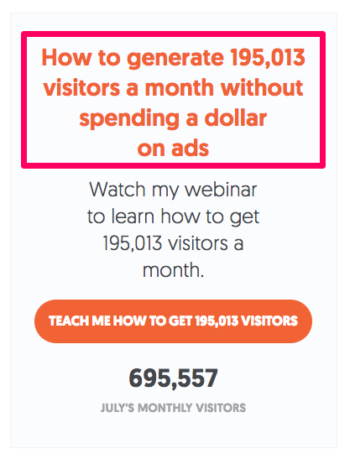
It’s specific. It communicates value without directly asking customers to give me their money.
And, ultimately, it’s intriguing.
Just talk to Paul Boag (UX designer) at Boagworks.
According to him, a call to action provides these three things:
- Site or topic focus
- A measure of success for your site
- Direction for users to follow
Before people interact with a CTA, they have to recognize their need for the product.
You can’t jump into a business relationship without getting to know each other first.
This is why infomercials are still around.
They use the classic PAS formula of copywriting adapted for an infomercial:
They identify the problem. (You keep spilling on your carpet.)
They agitate the problem by illuminating struggles and pain points. (It’s tough to clean up, and professional cleaners are too expensive.)
And voila, they provide the solution. (Behold, the Carpet Cleaner 4000!)
Next, you have to communicate the outcome of clicking on the CTA.
What will I get by clicking on this button? A free trial?
Or does it just say “sign up now,” leaving your customers to think, “sign up for what”?
Believe it or not, the color of your CTA matters too.
Google (GMail) tested over 50 shades of blue for a CTA to find the highest-converting shade.
Yes, 50 shades of blue.
What was the end result?
More conversions!
Now, for most of us, that’s taking A/B testing too far.
But you’ve probably got time to test a few different colors.
SAP found that orange CTAs lifted their conversion rates by 32.5%.
Performable found that red boosted theirs by 21%.
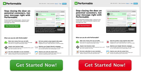
The takeaway?
Colors hold weight. They mean different things to different people.
They can drive action and inaction.
In this case, Performable found that the color red drove urgency.
The main goal here is to make sure that your CTA stands out.
It needs to communicate a benefit that customers will get if they buy now. It needs to clearly communicate that consumers won’t want to miss the opportunity.
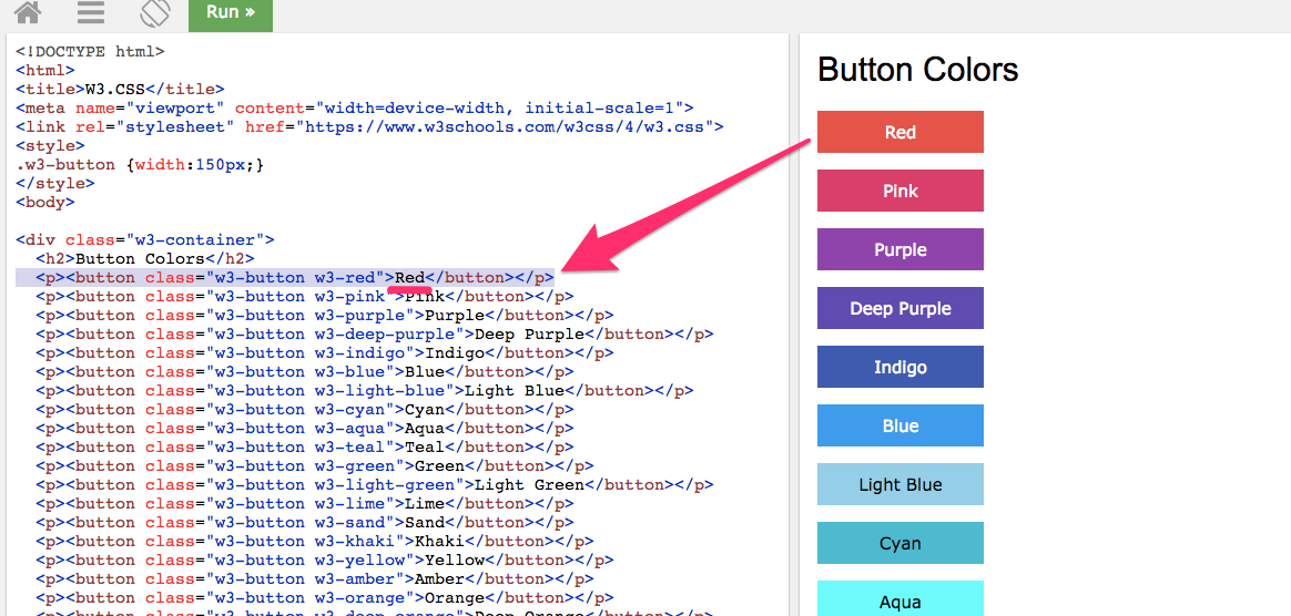
You can use the Tryit Editor to see how different colors work with your CTAs.
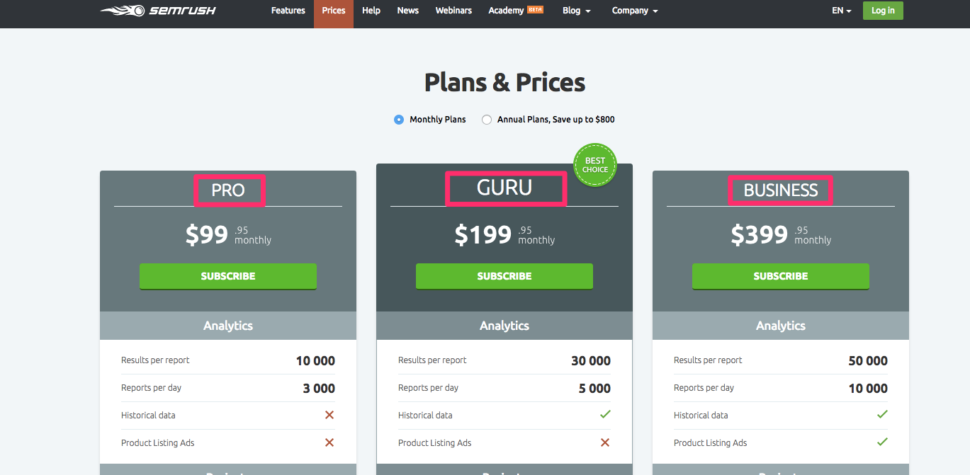
Give your plans a name that means something
Naming your plans is crucial.
But I’m not talking about the “Gold,” “Silver,” and “Bronze” names that you’re thinking about.
If you looked at a pricing page like this:
You’d be a little lost, right?
You don’t want to make potential customers work to find basic information.
Instead, give it to them ASAP.
How is anyone supposed to know what plan could fit their business, niche, or purpose if you don’t provide context?
The short answer is that they can’t.
So, you have to name them something that means something:
Adding names and context to your pricing plans aids in memory retention.
It helps people connect the dots and choose the best-suited plan for their needs.
So try to be descriptive, but don’t make it more than 1-3 words.
Be able to summarize perfectly which plan is best for what use.
Here’s an example:
You’re selling a live-chat software program with tons of integrations and features. You could call the plans Starter, Basic, and Pro.
But nobody knows what you’re talking about.
Nobody can derive the meaning from those names. That means they won’t know which plan is best-suited for their needs.
Instead, you could call them Startup, Small Business, and Fortune 500.
You’ve just removed an extra conversion roadblock with a few lines of text. Now, visitors know that the lowest tier serves startups, while the highest tier serves enterprise customers.
Plus, you’ve just tailor-made plans for the three most common buyer personas in your business. They now know exactly where to look, and they’ll convert without hassle.
Even better, you can use graphics to aid your plan names like MailChimp does:
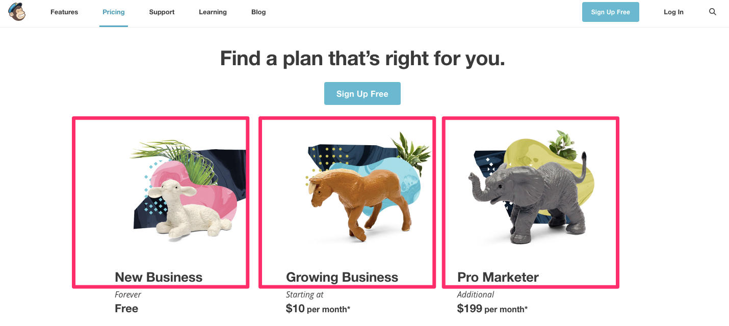
Now customers can self-select which plan is best for them.
And with a little luck, you can ‘guide’ people to a more expensive plan because “that’s who they are” by name.
Use price anchoring to make expensive plans look cheap
Harvard defines the psychological anchoring effect as a cognitive bias.
Basically, it describes our human tendency to rely heavily on the first piece of information we’re given when making a decision.
In other words, the very first price is the anchor. And then we compare any subsequent plans or prices to the first.
Here’s an example of how this works in real life.
Let’s say you’re researching jewelry for your significant other for Valentine’s Day.
You find a retailer, and the store’s blog tells you that the typical, high-end bracelet you’re looking for will set you back around $800.
Then the store directs you to a pricing page for a similar bracelet that only costs $600.
That $600 may have seemed steep initially. But now, because it now falls under $800, it seems like a bargain.
Do you get the gist?
You set an anchor ($800) and then deliver your product at a lower price ($600) so that people act now before that price goes away.
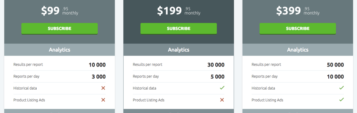
The Crazy Egg pricing page does exactly that:
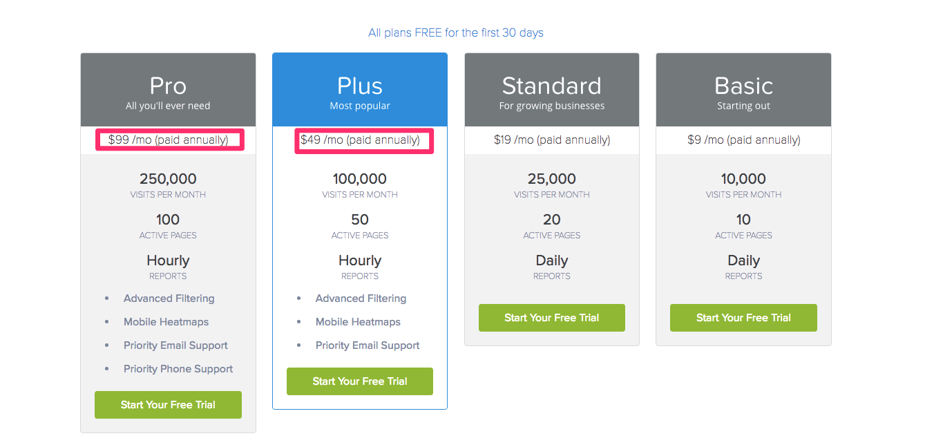
First, you’ll notice there are four plans laid out side-by-side.
When you start to look at the pricing, you see that the two most expensive plans are shown first.
So, while the $99 seems reasonable, the Plus plan next to it costs only $49, which makes it feel like a steal.
On top of that, the Plus plan is highlighted in blue, which makes it stand out amongst the rest as the one that is recommended.
Don’t believe that it works? Check the data for yourself:
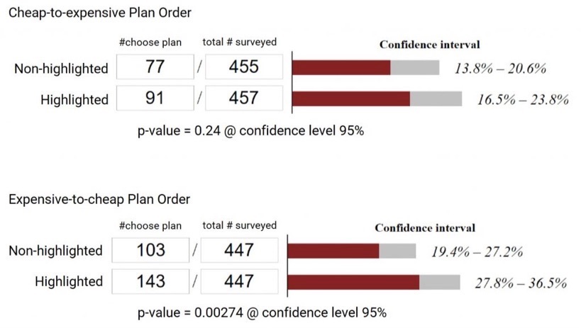
This is the easiest takeaway you’re ever going to get.
Go change your pricing plans ASAP to see a quick jump in profits.
Avoid page clutter like the plague
Pricing pages should be simple.
They should communicate value and benefits, and then drive a conversion action.
Visitors don’t click on “pricing” to read a 2,500-word screed.
In fact, most only read 50% of the posts they click on anyway.
Basically, people are more likely to convert when you create minimal barriers to entry.
Giving a clear, concise direction helps users focus on the one and only goal that should be on this page: signing up!
Don’t get me wrong: Providing multiple plans and options is good.
However, be careful with this tactic.
Avoid adding too much information on a pricing page. Otherwise, you risk putting users into analysis paralysis.
What’s that?
It happens when there’s too much information to make a decision.
It literally makes people freeze. Then they avoid making any decision at all.
It’s like when you go to a restaurant and the menu is 25 pages long.
You sit there. And sit there. And eventually, you go stir-crazy trying to figure out what to order.
With too much clutter, you risk halting conversions and putting up more roadblocks.
Putting too many options on your pricing page can drive users away.
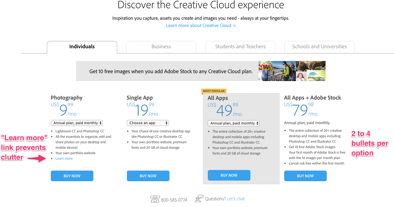
Here are a few rules of thumb:
- Limit feature and benefit bullet points to four max.
- Simplify how you’re displaying monthly versus annual costs.
- Ditch “learn more” links that only add more content on the page.
- Reduce license variations if possible to avoid further complicating the user’s options.
Take advantage of loss aversion to create urgency
FOMO is the fear of missing out. It’s one of the most powerful principles of persuasion in existence.
People hate losing out on a deal. They felt like it was rightfully theirs. And it drives them crazy to see it slip through their fingers.
Studies show that losses are 2x more powerful than gains.
For example, if you earn money, you might feel happy. However, if you lose money, you’ll feel twice as disappointed.
Here are a few tricks to help you capitalize on this fear when you design your pricing pages.
Step #1. Start by offering a free trial.
A free trial mitigates the fear of losing money and, by extension, suffering buyer’s remorse.
A good free trial gets the user hooked. It gets them to become dependent on your product.
They become so dependent, in fact, that they can’t go back to their original process without you in their life.
Here’s how Unbounce does it:
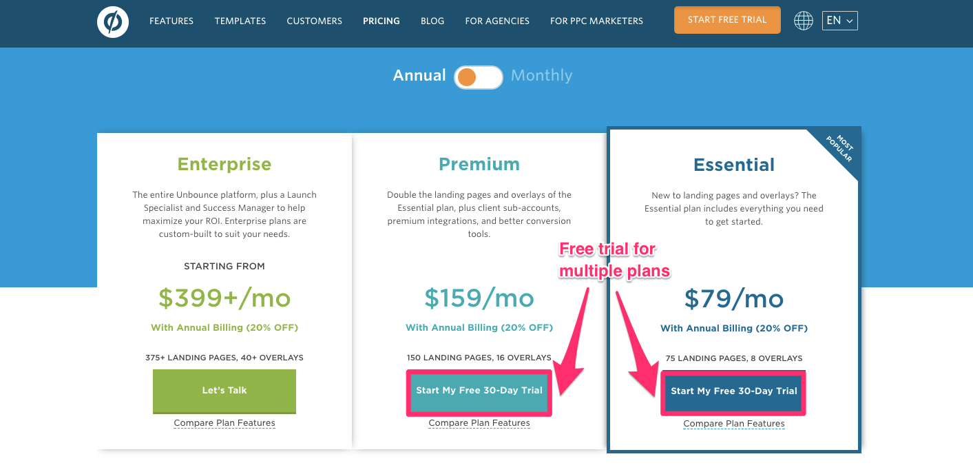
It offers free trials for ⅔ of their plans to give you a taste of their product, hoping you’ll never want to lose access.
Step #2. Timing is everything.
20% off! Limited time! Hurry, hurry, hurry!
We’ve all seen it before. And most of us know that it works to one degree or another.
Don’t lie. You’ve been suckered into it, too.
A limited-time offer that expires in the near future triggers loss aversion and creates unparalleled urgency.
It forces people to buy now before it goes away.
Just check out how Pingdom uses this method:
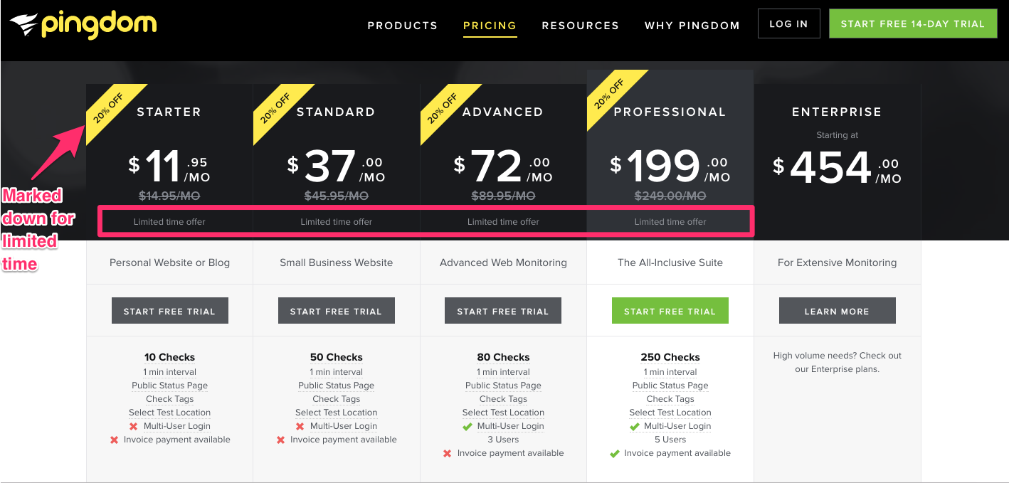
All of their plans are 20% off, and they all say “limited time offer.”
Now that’s urgency.
Step #3. Use loss-inducing messaging.
Messaging can help you quickly flip the script on the typical customer expectations.
For example, this example is merely OK:
“I will buy this product, and it will help me do X, Y, and Z better, faster, and cheaper.”
However, this next one is light years better:
“If I don’t buy this product, I will not be able to do X, Y, and Z, and I’ll lose money.”
Instead of focusing on the benefits of becoming a customer, focus on the loss they may feel by not becoming one.
Show them what they’re missing!
Officewise does a great job at this:
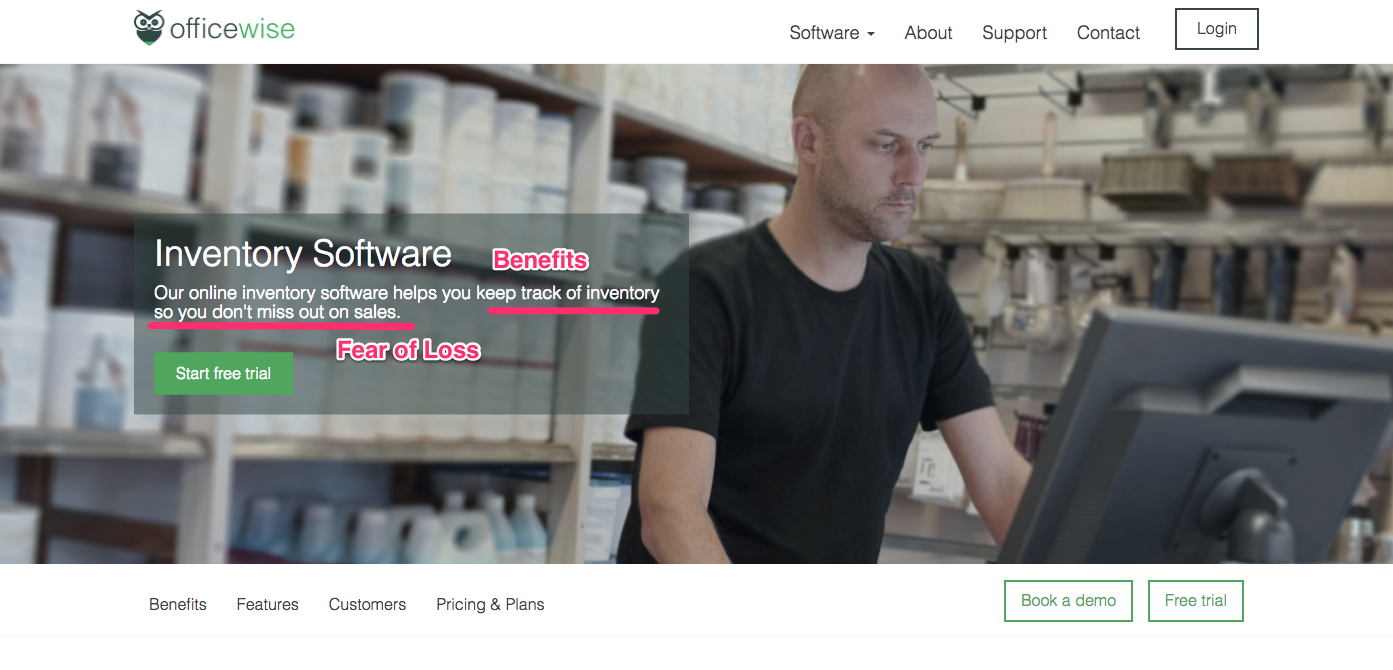
If you don’t buy this inventory software, you’ll miss out on sales.
It’s that simple.
There’s money sitting there on the table for you. Don’t let it slip through your fingers because you won’t invest a few bucks on yourself.
Include testimonials to overcome potential objections
Roadblocks are everywhere.
There’s always a reason not to buy.
It’s always too expensive. Then there’s also the self-doubt that slowly creeps in.
Will it be helpful? Do I really need it?
Probably not.
Here’s where testimonials come in.
They help users get past those thoughts and feelings by seeing real-world success stories.
The best testimonials overcome objections. They create a bridge of credibility that allows for hope and trust.
Showing that others have succeeded with your product is a selling point that can quickly bring more people on board.
And, the facts don’t lie.
84% of people trust online reviews as much as a personal recommendation.
That’s pretty amazing if you think about it.
Personal recommendations are trusted sources that often lead to a purchase or that “next step.”
Reviews serve the same purpose.
Check out the Pagevamp pricing page:
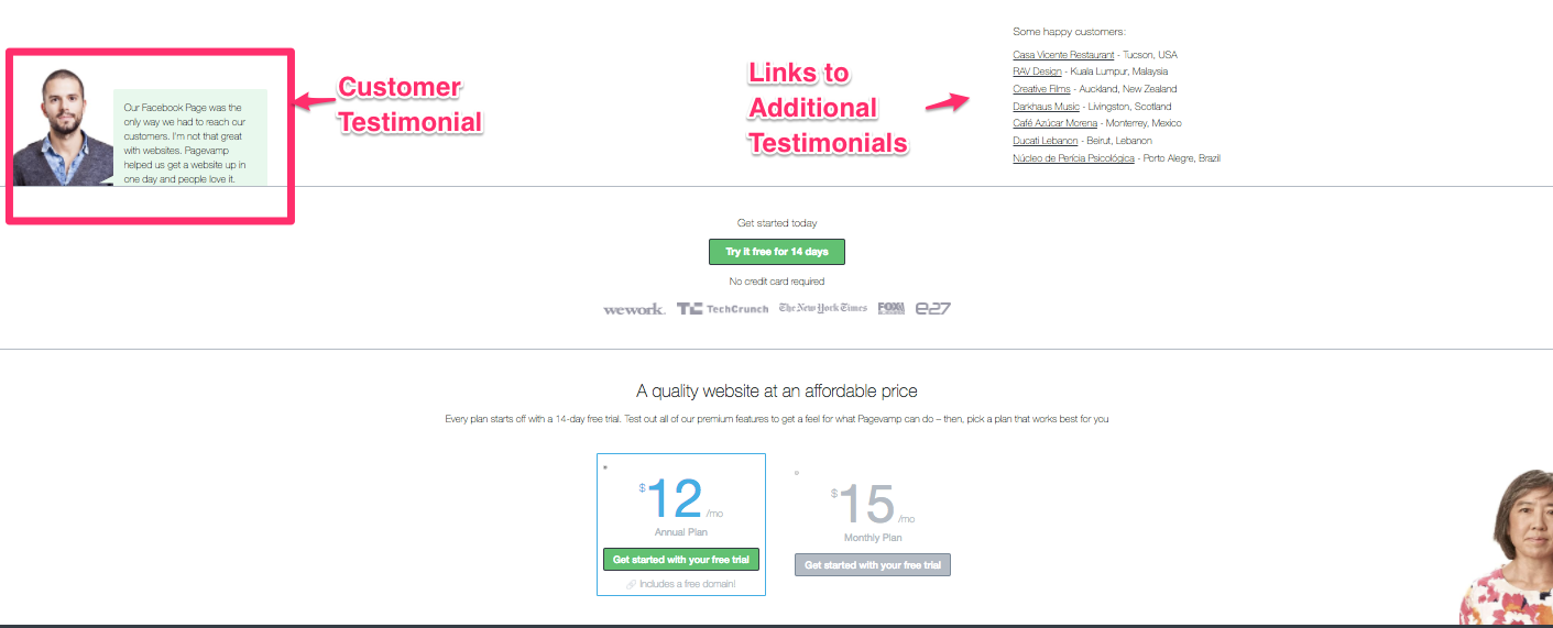
Now that’s trustworthy.
It shows real people in the real world using the product and sharing with others how it helped their business.
Pro tip: Use detailed testimonials from real customers.
On QuickSprout, we found that longer, more detailed, more authentic testimonials actually exploded sales by 11.3%.
Give it a shot. You won’t be disappointed.
Include an FAQ beneath your pricing options
If you don’t have an FAQ anywhere on your product site, kiss those would-be conversions goodbye.
The reason is that a simple FAQ is one of the best ways to prevent bounces and conversion-rate hits before they strike.
In fact, 66% of the best pricing pages on the web will answer FAQs before they arise. You often see them under the pricing plans themselves.
The goal is to eliminate objections fast.
You want to stop them before they even arise.
Now the goal is to create a pricing page that doesn’t actually prompt any questions.
Check out how Zendesk does it:
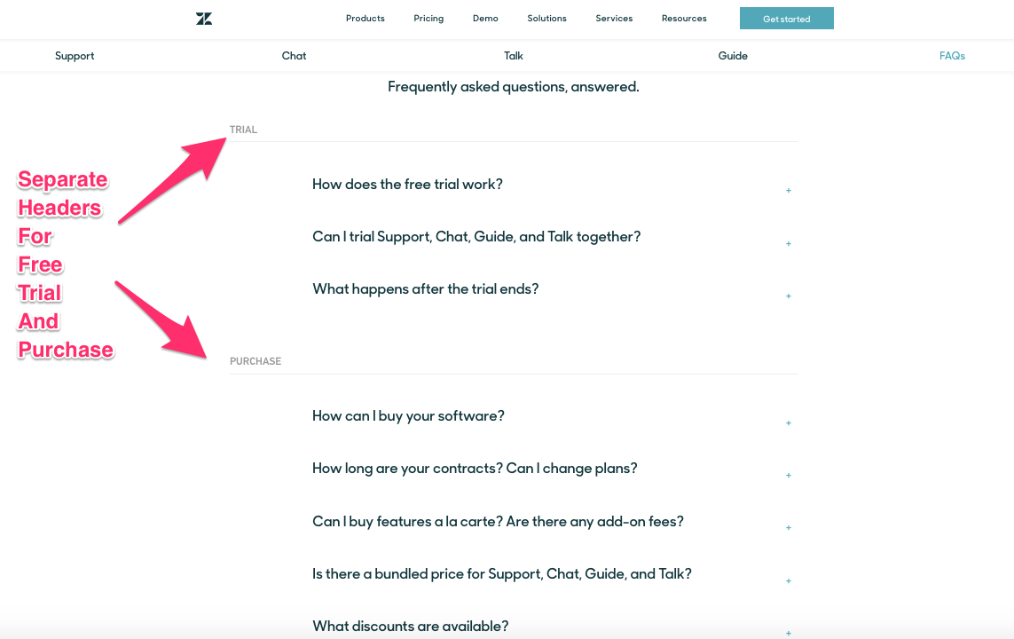
The company effectively communicates the most common questions they get about their plans.
It splits up FAQs based on trials and full plans.
The end result is that the FAQs stop questions dead in their tracks before they have a chance to sabotage the company’s sales.
Add live chat messaging to your pages
The key to more sales is through reducing friction as much as possible.
There will always be some, of course.
However, the fewer potential issues, the better.
Another excellent way to eliminate conversion problems is to provide real human interaction.
What a crazy concept, right?!
According to this study, 76% of companies have only one support option. And only another 13% have live-chat popups.
In today’s age of immediate gratification, that’s shocking.
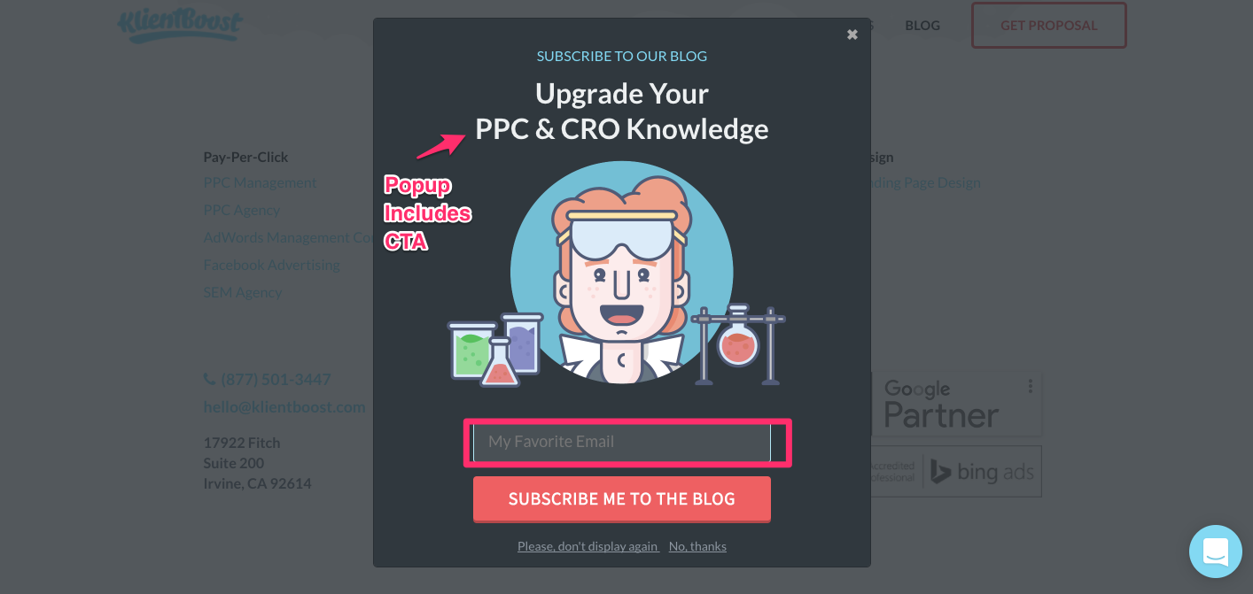
Here’s an example of how Klientboost uses Intercom on its site:
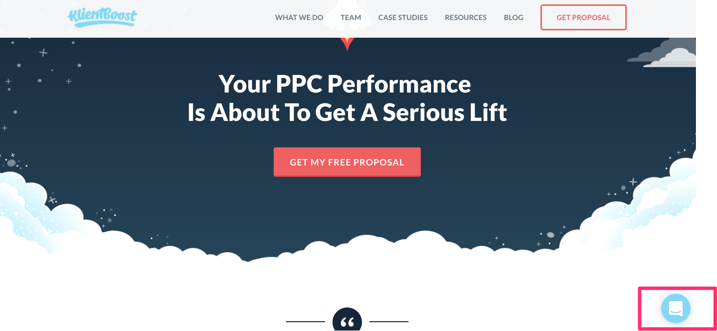
It’s a simple chat icon that’s accessible everywhere on the site. There are real employees who are waiting to help.
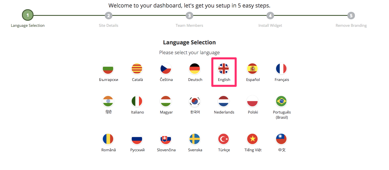
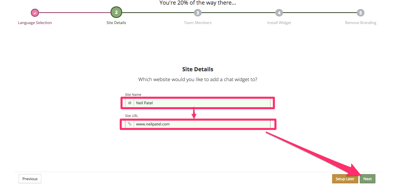
If you’re on a budget, you can also set up a free version of tawk.to. Here’s how to set up an account in under 60 seconds.
First, select your primary language of choice:
Next, enter your site name and URL:
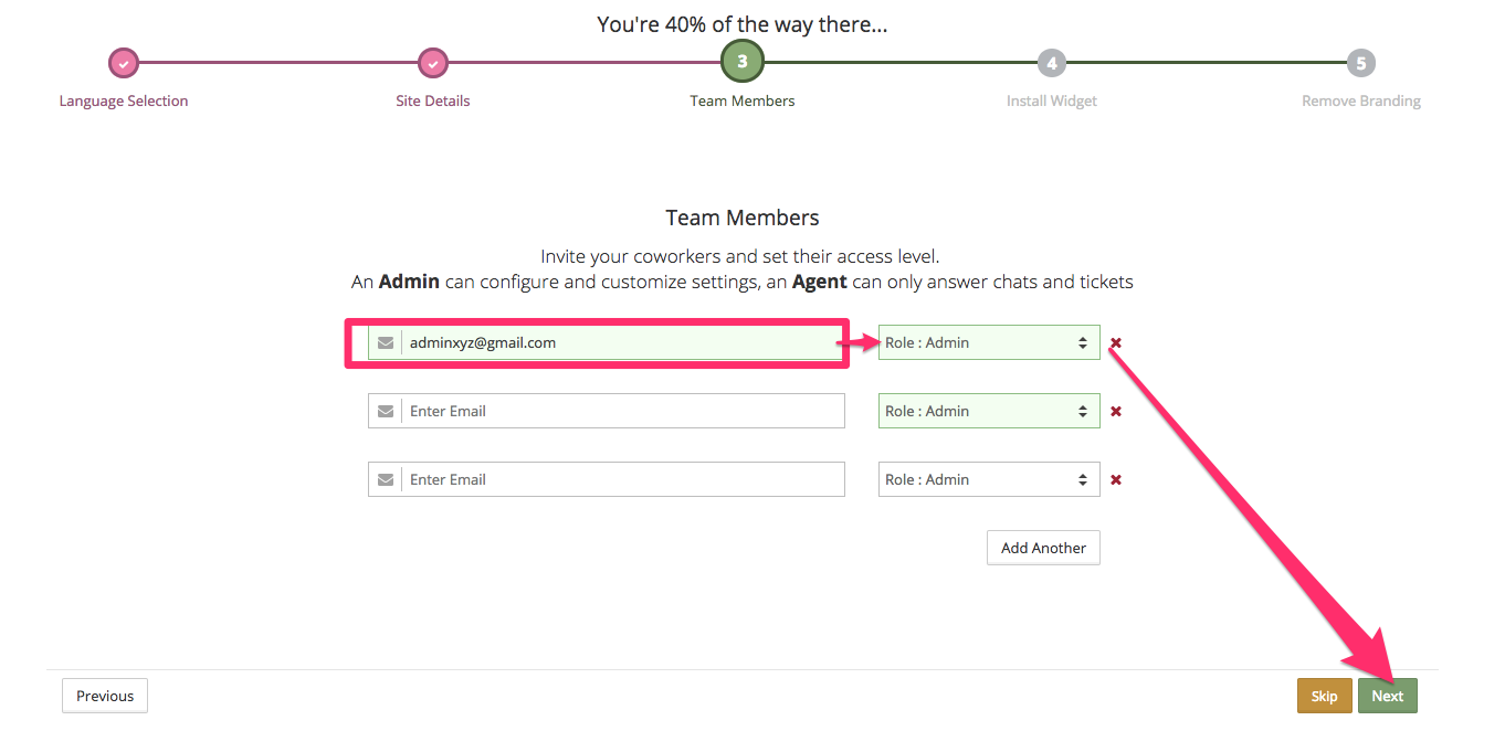
Enter the email addresses of any employees you want to be available to chat and choose their roles:
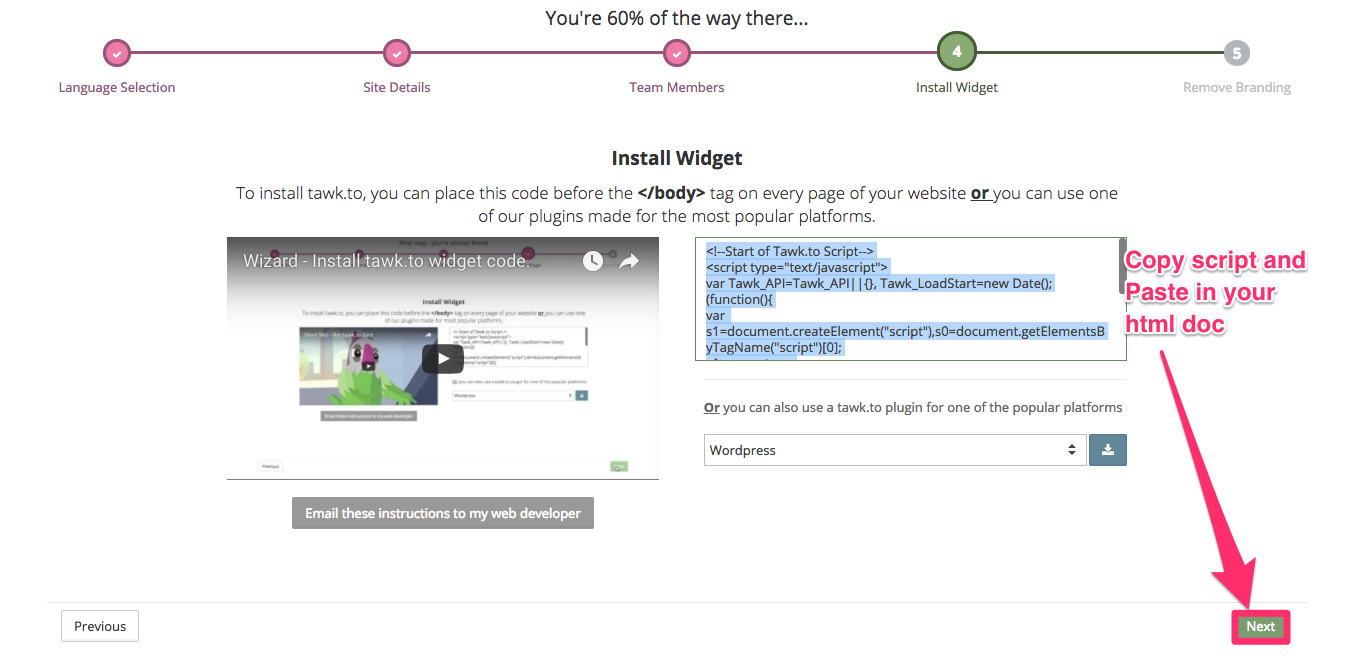
Next, you’ll receive a script to add to your site.
You can either highlight the entire thing and paste it. Or you can use one of the ready-made plugins for a content management system, such as WordPress.
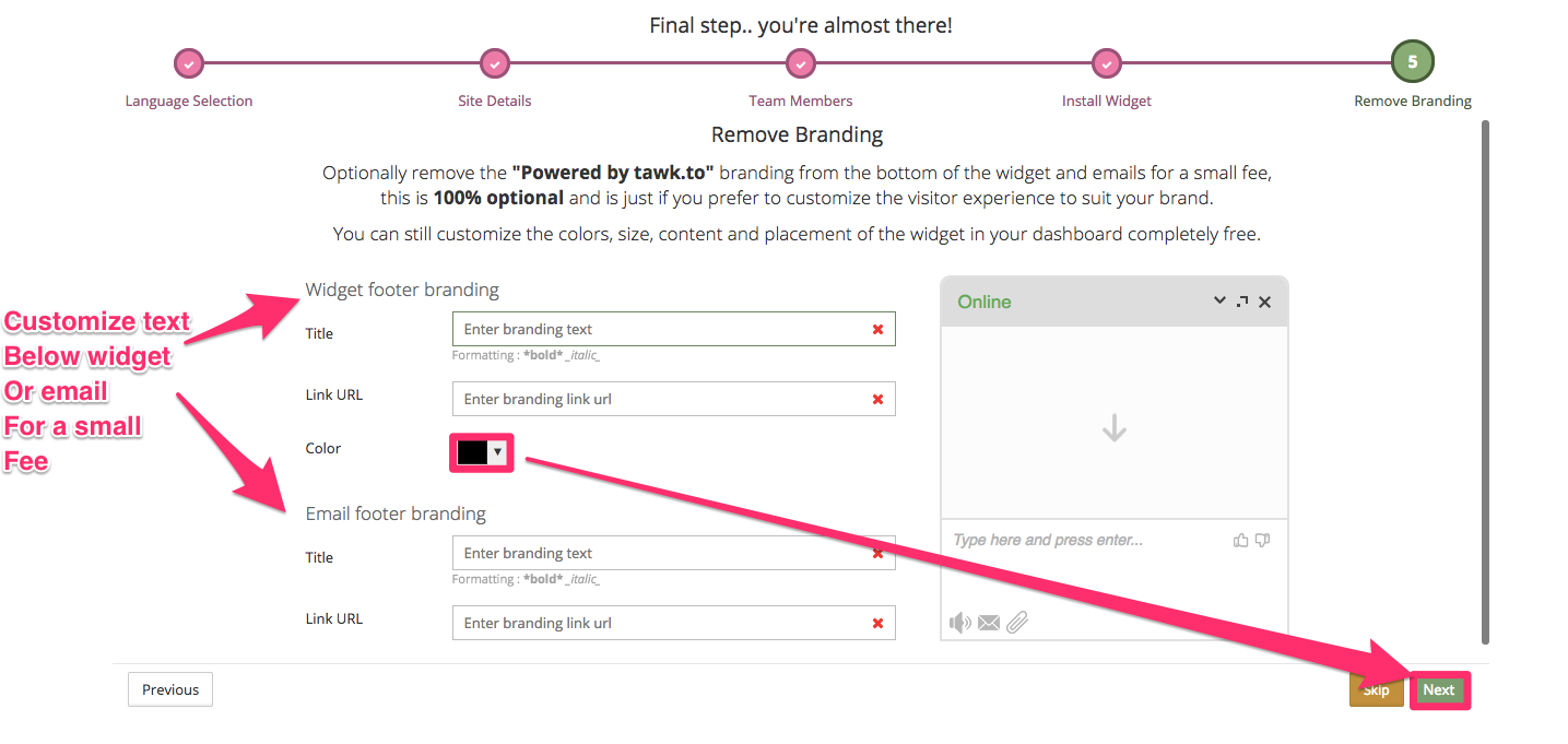
If you want, you can also customize the live-chat widget for a little extra fee. You’ll also be able to get rid of the branding.
Plus, you can change the color to match your own site’s branding.
Use exit intent overlays to catch people before they bounce
Look, I get it.
Popups don’t always offer the best user experience.
However, there’s a reason I use them. There’s a reason everyone uses them.
They work extremely well. They also convert well on mobile devices, too!
“Exit intent” overlays are a little better for users.
These popups are triggered just before someone attempts to exit your site.
It’s an incredible tool for a last-ditch conversion effort to get someone to stay, to sign up for your email list, or to keep browsing related articles.
You can use exit-intent popups to offer a deal, too. For instance, your popup might offer customers 20% off if they buy now.
You can also use them to showcase extra content and frequent updates.
If someone’s staying on your site and reading all of your posts, it only makes sense that they would be interested in getting updates.
Two exit-intent options include WisePops and Unbounce.
Here’s how to set up quick, high-converting exit-intent popups with WisePops.
First, create your account and get the free 14-day trial.
See! Who doesn’t love a good trial?
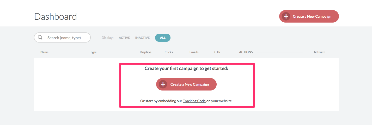
Next, create a new campaign by clicking on the “Create a New Campaign” button.
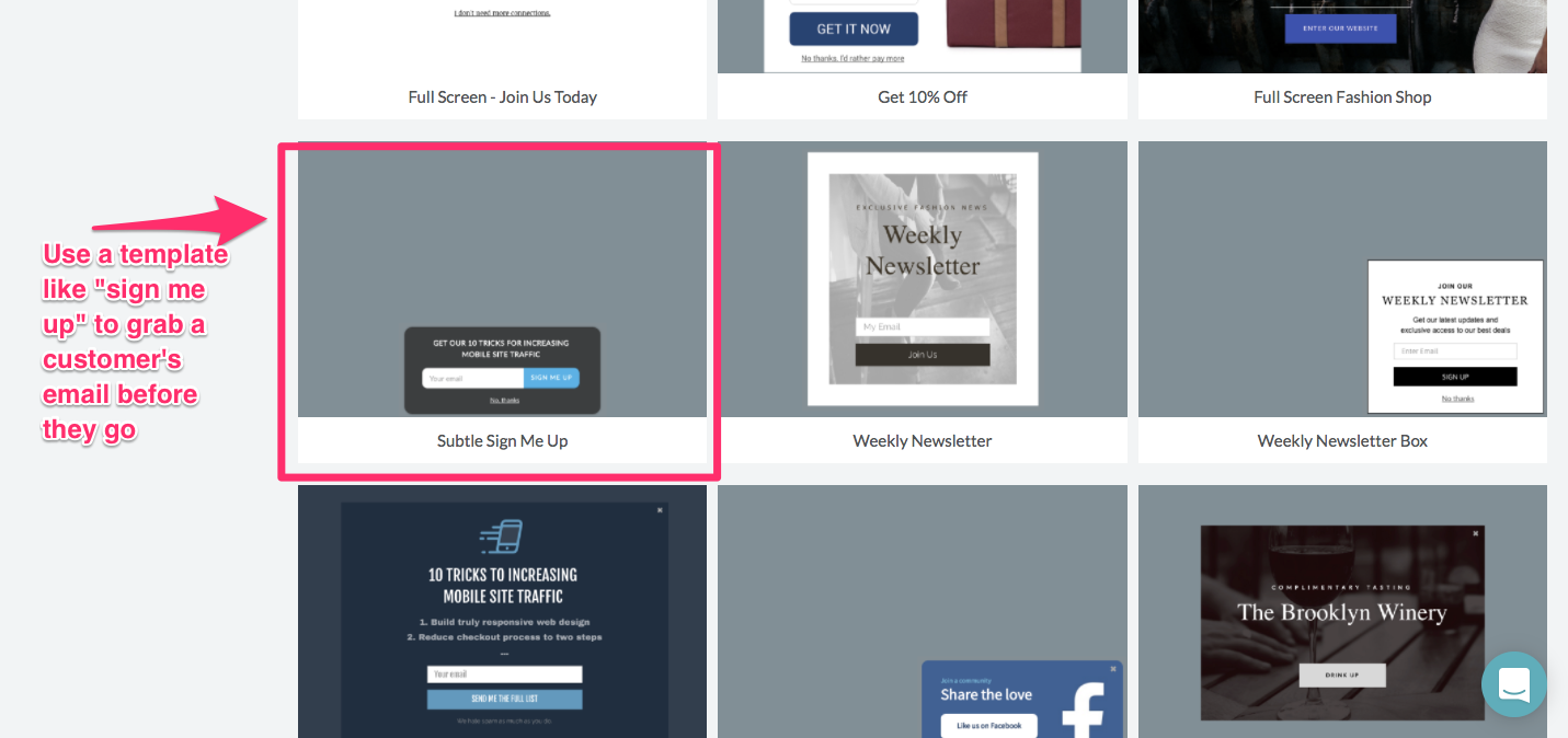
Select a design template for your exit intent.
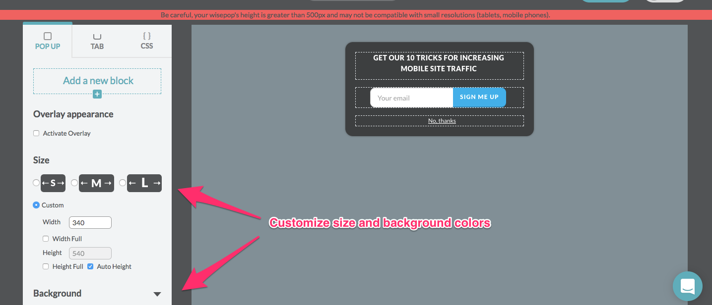
Customize your overlay, blocks, sections, and custom backgrounds.
Lastly, save it, or view a preview for fine-tuning.
And that’s it!
You’ve got a new way of capturing users before they bounce and possibly never return.
Conclusion
Let’s all just collectively admit it.
We marketers have a problem.
We get stuck doing the same old things. The same “industry-standard” practices that everyone else follows.
We see that a company uses the three-plan, horizontal-pricing page structure and we think:
“Bingo! That worked for them, so it’s a conversion-inducing, genius-level formula!”
Before you fall for this again, take a step back. Analyze the data first.
Colors, button copy, plan names, loss aversion, FOMO — they matter more than you might think.
Instead of following the status quo, rethink how your pricing page is structured.
Declutter the page to reduce choices and the potential to overwhelm your customers.
Test CTA copy and colors to see which drive emotion, response, and intent.
Tweak your messaging and flip the script from what the user will gain by purchasing to what they might lose if they don’t.
Then you can sit back and watch the conversion rates climb!
What’s your favorite conversion-boosting tactic to drive more pricing page sign ups?
Comments (0)