
Psychology is the magic bullet of conversion optimization.
Well, maybe that’s a tad bit idealistic.
But psychology is arguably the most important weapon you can have in your arsenal.
That’s why I write about psychology all the time.
Understanding the underlying thought processes of consumers is your ticket to grabbing their attention, eliminating any friction that may be hindering them from buying, and breaking through both conscious and subconscious barriers.
The thing that I personally love about marketing psychology is its universality.
Even though consumers come from all walks of life, their minds all work in a similar, predictable way.
Of course, there are a variety of demographics out there, but at the end of the day, we’re all wired virtually the same.
In fact, the National Human Genome Research Institute reports, “All human beings are 99.9 percent identical in their genetic makeup.”
Understanding the habits, tendencies, preferences, etc. of your audience and what makes them tick can be incredibly advantageous.
And if you construct your homepage with psychology in mind, it’s going to have a positive impact on your conversion rate.
Let’s discuss what I think are 19 of the most effective psychological principles that will take your homepage conversion rate to the next level.
Here we go.
1. Visual salience
Let’s start with the absolute basics.
Visual salience is defined as “The distinct subjective perceptual quality which makes some items in the world stand out from their neighbors and immediately grab our attention.”
Here’s an example.
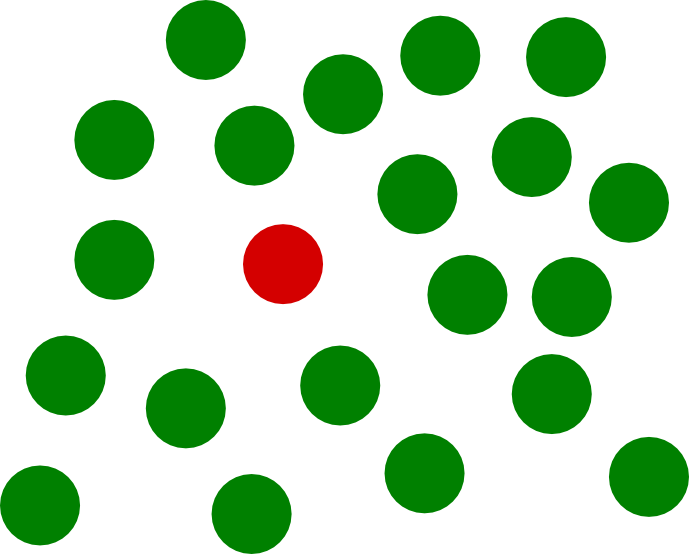
Even though there are several dots in this image, our eyes are naturally attracted to the single red dot.
This principle is interesting because it’s incredibly primitive.
Back in the day when humans were far less evolved as a species, it was extremely important for our ancestors to spot contrasts in their environment.
This was useful for both identifying predators and for hunting game.

Without visual salience, we might not have survived and evolved into who we are today.
But how does this relate to designing a homepage?
It’s simple.
You want the most important elements of your homepage to stand out from everything else (e.g. your CTA).
One way to boost conversions is to experiment with different colors and formatting options via A/B testing.
For instance, many marketers find that visitors respond more positively to a red CTA rather than a green one.

The bottom line is that you want to ensure that the most critical element(s) of your homepage stand out from everything else.
2. Cognitive fluency
If you’re like me, you probably find Apple’s homepage and landing pages to be aesthetically pleasing.
But why is this?
It’s largely because they implement a psychological principle known as cognitive fluency.
Also known as cognitive ease, this is “the ease in which our brain processes information; this level of each impacts how positively (or negatively) we feel about something.”
In other words, Apple doesn’t overwhelm our brains with excess information.
Instead, they use a style that embodies simplicity with elements of minimalism.
Their style is crisp and clean.
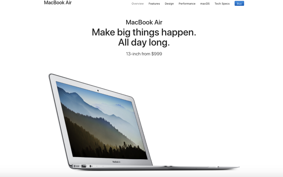
See what I mean?
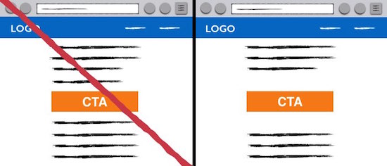
You too can incorporate cognitive fluency in your homepage by following one very simple trick.
Include plenty of white space.
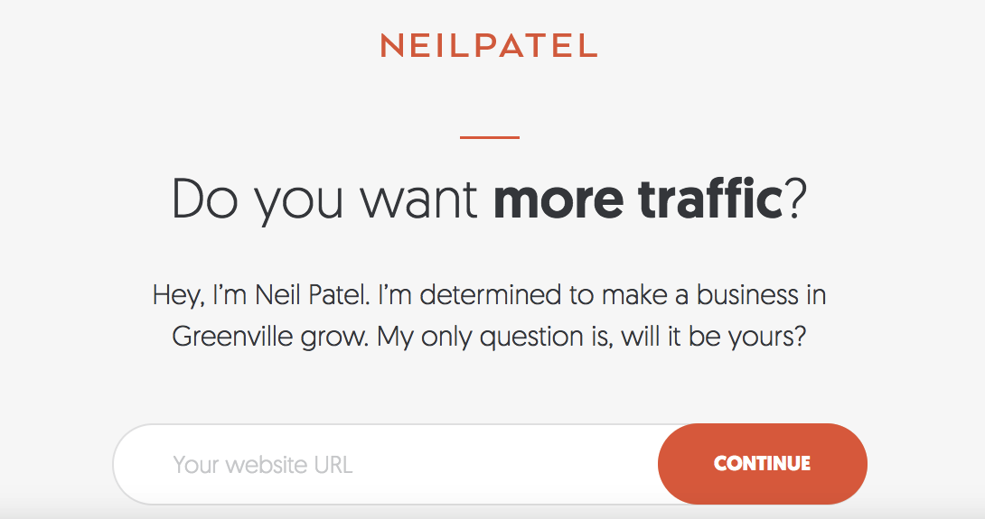
If you’ve checked out any of my sites or have read my blog posts, you know that I love white space.
Just look at my homepage on NeilPatel.com
By keeping your homepage relatively sparse and not overwhelming visitors with extraneous content, you’re creating cognitive ease and visitors can focus more easily on your CTA.
Here’s a really simple example.
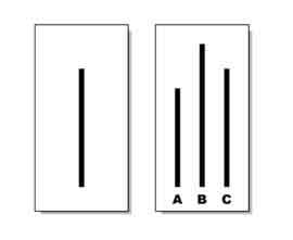
3. The Law of Pragnanz
This principle piggybacks off of the previous one.
The Law of Pragnanz is also known as the law of simplicity and is a central idea behind Gestalt Psychology, which “is an attempt to understand the laws behind the ability to acquire and maintain meaningful perceptions in an apparently chaotic world.”
There’s a really great quote that I found on Smashing Magazine that encompasses the Law of Pragnanz in a single sentence.
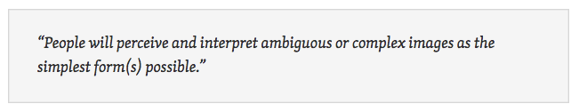
In other words, humans prefer things that are simple over things that are complicated.
It’s much easier to process information that’s presented in a simple manner and prevents “cognitive overload” from occurring.
Here’s a nice example.
When we’re presented with complex shapes like the one on the left, our brains naturally reorganize them into more simplistic shapes like the ones on the right.

When it comes to your homepage, you can do yourself a big favor by minimizing the number of choices you present to your visitors.
I even wrote an article on Quick Sprout about how reducing options can increase your conversions and share an infographic featuring specific case studies.
Here are a couple of the highlights.
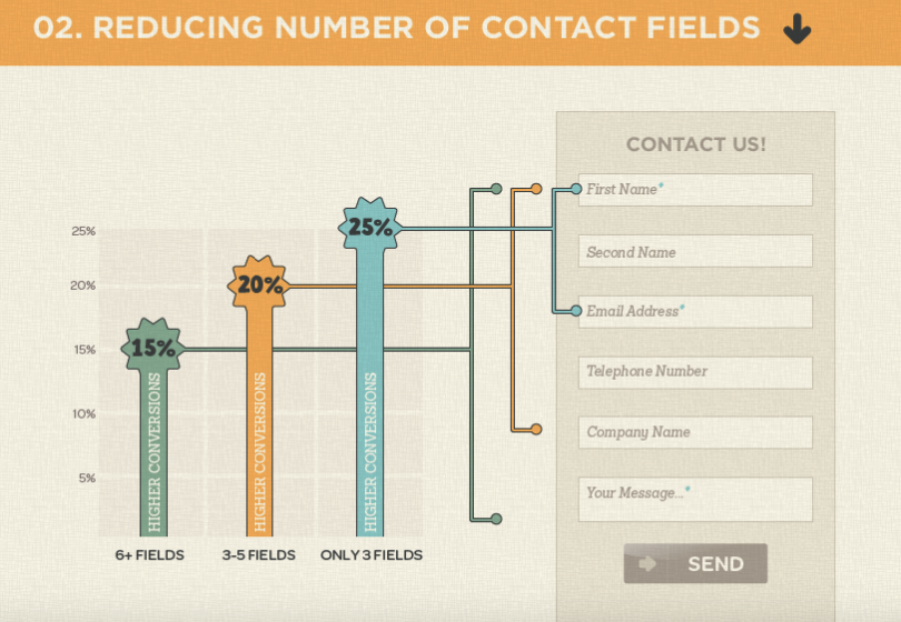
Just look at how there’s a 10 percent increase in conversions when there are only three fields rather than six or more.
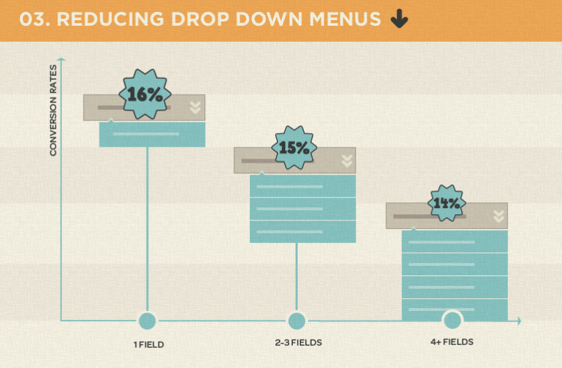
And look at how the more fields you have in a drop down menu decreases conversions.
The point here is that having too many options on your homepage overwhelms most visitors and diminishes conversions.
This creates analysis paralysis, which is “the state of over-analyzing (or over-thinking) a situation so that a decision or action is never taken, in effect paralyzing the outcome.”
Have you ever been shopping for a particular product and found an absurd number of choices and variations?
You then find yourself standing there scratching your head trying to figure out which product you should choose.
If so, you’ve experienced analysis paralysis.
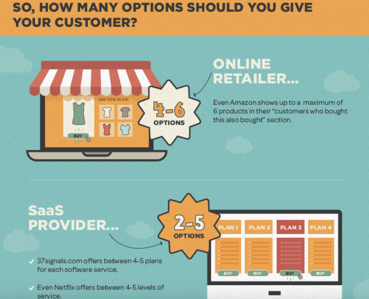
What you want to find is “the sweet spot” and reduce the number of options.
So what exactly is the sweet spot?
Generally speaking, you should have an absolute maximum of six options.
4. Slash through “action paralysis”
Sometimes people just need a little nudge to get them to take action.
All it takes to get them over the buying hump is simply providing some motivation.
A while back, professor of psychology and marketing at Arizona State University, Robert Cialdini, conducted an experiment on persuasion.
It was simple.
He sought donations for the American Cancer Society and tested out two different requests to determine what the impact would be.
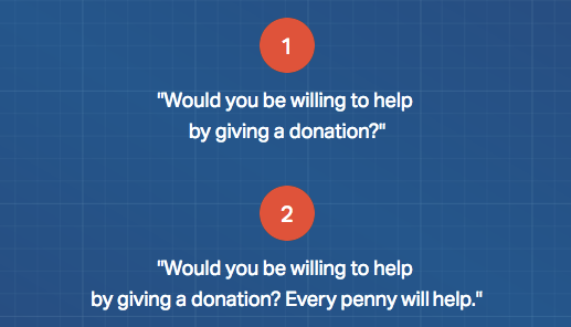
Although the difference between the two requests is subtle, the second one received far more donations (22 percent more).
Here’s how it all broke down.
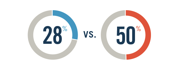
In other words, 28 percent of people donated with the first request while 50 percent donated with the second variation.
What this means is that “people are more likely to take action when minimal parameters are set.”
By setting minimal parameters, you can help visitors break through their “action paralysis” and increase conversions.
For example, you might mention that there’s a free trial subscription with no obligation to buy or customers will receive free shipping on their first order.
5. Instant gratification
People hate to wait.
I know I do.
I feel like all of the technology and information that’s constantly at our fingertips has rewired our brains to a certain extent.
I know that I personally feel more “ADD” now as an adult than I ever did as a kid.
The bottom line is that consumers want it and they want it now.
There have even been scientific experiments performed using Magnetic Resonance Imaging (MRI) that prove the power of providing instant gratification.
According to Help Scout, “Several MRI studies, including one on nicotine addiction, have shown that our frontal cortex is highly active when we think about waiting for something. On the other hand, our mid-brain lights up when we think about receiving something right away (and that’s the one we want to fire up).”
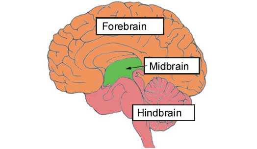
So how can you make your average visitor’s mid-brain “light up?”
It’s quite simple.
Use words like “instantly” and “immediately.”
Here’s a good example from Amazon.
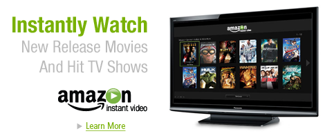
This can be incredibly persuasive and should have a positive impact on your conversion rate.
6. The Milgram Principle
Stanley Milgram was a psychologist and professor at Yale University.
He is known for conducting a famous experiment on the concept of authority to see what lengths people would go to in order to obey authority, even if it conflicted with their personal conscience.
I’m not going to get into all of the gory details, but here’s a screenshot of the premise of the experiment.
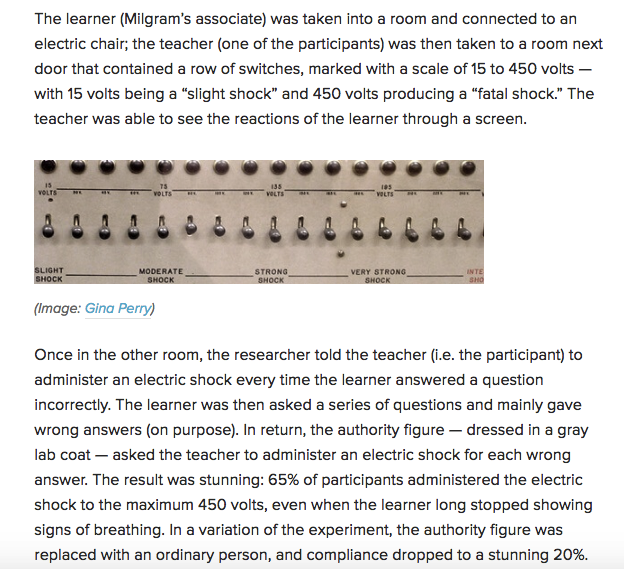
So what exactly does this tell us?
It tells us that most people will obey individuals who they deem as authorities.
So if you can get an expert or authority to endorse your brand, you’re pretty much guaranteed to see a spike in conversions.
This relies on the same principle as social proof such as this.
Whether it’s a testimonial, icons of companies you’ve worked with, or a direct endorsement, you can leverage the authority of others to get your customers to take action.
7. Principle of Reciprocity
There’s an old school experiment that was done on the use of candy to increase restaurant tipping.
Here’s what happened.
Customers were given after-dinner mints along with their checks.
Some customers were simply given mints and that was it. No explanation. No reason.
In this scenario, tips increased by three percent.
Not bad, but it’s nothing overly substantial.
However, other customers were given mints but the waiters stopped for a moment. They looked at the customers and explained that the mints were specially for them.
Guess what happened.
The tips increased by 20 percent!
Now that’s significant.
You too can take advantage of the principle of reciprocity by offering something of value for free on your homepage.
This could be a free eBook, a PDF, discount code, etc.
Many of your visitors will want to reciprocate and will be more likely to make a purchase.
8. Loss aversion
In the wise words of 80’s hair band Cinderella,
You don’t know what you got (till it’s gone).
All jokes aside, loss aversion is one of the most fundamental principles in psychology and basically means that humans work harder to avoid losing something than they do to gain something.
In other words, people hate to lose.
Here’s an example.
Say you overhear your boss saying that you’re going to receive a $500 monthly raise. That’s great.
Now let’s say that you overhear your boss saying that you’re going to take a $500 monthly pay cut.
That’s infuriating and could quite possibly lead to a major incident.
The point is that people tend to take losses very harshly and will strive desperately to avoid them.
Hence the name loss aversion.
You can utilize this psychological principle on your homepage by explaining what people will miss out on rather than what they’ll gain.
9. Facial recognition
Now let’s take things in a completely different direction.
There’s a particular study from 2011 that I still find to be extremely interesting.
It involved A/B testing on the landing page of a marketing company called Highrise.
What happened was researchers examined different landing page styles to see which resulted in the most conversions.
Long story short, they found that including a picture of a person smiling increased conversions by 102.5 percent!
Here’s the before and after.
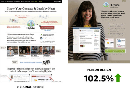
This shows the power of facial recognition.
It’s powerful because it attracts attention and humans are naturally skilled at reading emotions on other people’s faces.
If your homepage lacks this visual element, it’s definitely something worth experimenting with.
10. Mimicry
Here’s the thing about humans.
We tend to like and trust those who are most similar to us.
Just think about it.
Would you be more likely to become friends with someone with similar behaviors and who uses the same jargon or someone who’s your polar opposite?
For most people, they would opt for the former.
Mimicry is another important psychological principle that can help you build rapport more seamlessly with visitors and gain their trust.
There was even a study performed in The Netherlands on the concept of mimicry and how it impacted tipping.
It involved two waitresses where one used mimicry by repeating a customer’s order.
However, the other waitress generically said, “okay” or “coming up.”
What they found was, “Mimicry increased the number of customers who left a tip from 52 percent in the non-mimicry condition to 78 percent in the mimicry condition.”
By “speaking the same language” and using the same jargon that your audience would in your copy, this can help you close the gap and win over more of your visitors.
11. The anchoring effect
Harvard Law School defines the anchoring effect as “a cognitive bias that describes the common human tendency to rely too heavily on the first piece of information offered (the “anchor”) when making decisions.”
It involves starting with a higher price point than what the product is ultimately listed as.
For instance, you might initially explain that a particular product typically costs $1,000.
But later on, visitors find out that you’re only charging $800.
While $800 might seem a little high on its own, it may seem like a bargain when $1,000 was the first price point.
Steve Jobs was amazing at using the anchoring effect, and this was a strategy he implemented when introducing the iPad.
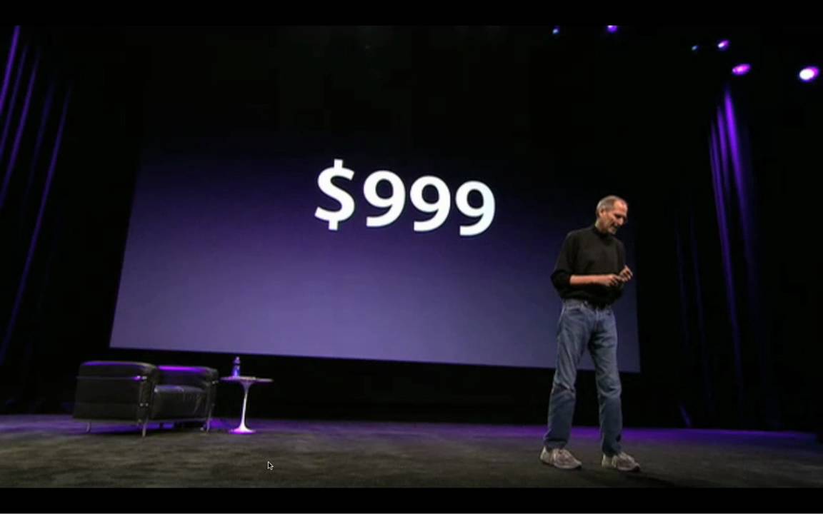
Here’s a screenshot of how he used it.
The point here is that starting high and working the cost down can be the catalyst for higher conversions.
12. Point out the success of others
Have you ever found yourself interested in a product but unsure if you should take the plunge and buy?
But then you’re presented with information like this that shows how much the product is helping others.
This can have a tremendous impact and serves as solid motivation to get people to take action.
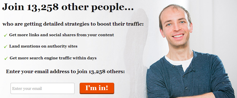
You also see this a lot when brands ask you to sign up for a newsletter.
Take Pat Flynn of Smart Passive Income for example.
The point here is to show how others have been positively impacted by using your product.
Often, this will be the deciding factor in persuading visitors to convert.
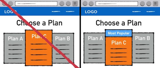
13. Conformity
Like it or not, many people have a “sheep mentality” where they have an intrinsic tendency to follow the crowd.
In the 1950’s, Solomon Asch performed a study to determine what the effects of social pressure were and how likely people are to conform to the majority’s viewpoint.
It revolved around a line judgment task where participants had to state aloud which comparison line was most like the target line.
What were the results?
“75 percent of participants conformed at least once.”
“32 percent even conformed with the clearly incorrect majority.”
This goes to show that a good chunk of people will conform to at least some extent.
One way to incorporate conformity is to identify the product you want customers to buy most as being the most popular like this.
14. Scarcity
Using scarcity in marketing is nothing new.
It’s actually one of the more widespread strategies and for good reason.
It gets results.
Here’s a great example.
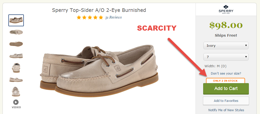
If a person was really interested in this pair of shoes, the odds are good that they would be more likely to purchase right away when they found out that there are only two more pairs available.
You too can use this psychological principle as a way to persuade customers to take action.
15. Use trustmarks to alleviate consumer fears
It’s safe to say that consumers have a healthy amount of skepticism these days.
And why wouldn’t they?
With so many scam artists and charlatans who take their money and run, it can be quite difficult to establish trust.
But this obviously presents a problem because failing to build trust is going to hurt your conversion rate.
One of the best ways to quell your visitors’ fears is to incorporate trustmarks on your homepage.
According to Econsultancy, a trustmark is the number one factor that helps people decide whether or not to trust a website.
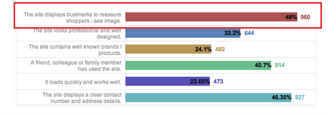
So for instance, including the BBB’s logo on your homepage can be huge for building some initial trust and getting visitors comfortable with the idea of buying from you.
It’s also a good idea to include an “about” page and thorough contact info.
16. The Ellsberg Paradox
This is a psychological principle based on an old experiment (1961) done by Daniel Ellsberg that still has plenty of relevancy today.
The premise is simple.
Participants are presented with two different jars containing red and black balls.
The first jar has exactly 50 red balls and exactly 50 black ones.
The second jar also has 100 red and black balls, but the ratio is unknown.
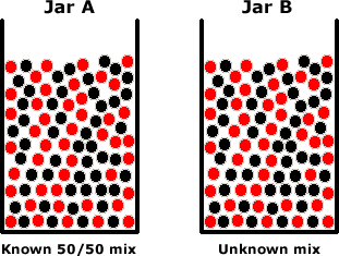
Participants are then asked to decide on a jar and bet on a color (red or black).
If they draw the color they bet on, they receive $100.
If not, they get nothing.
By and large, participants chose Jar A with the known 50/50 mix over Jar B with the unknown mix.
What this tells us is that most people prefer a known ratio rather than one that’s unknown.
So on your homepage, it’s a good idea to explain specific details that could influence the buying decision.
For instance, be clear about any product guarantees or warranties, and leave nothing to the imagination.
The more transparent you are, the better your odds of making a conversion.
17. Visual cueing
Looking for a simple yet effective way to get eyeballs on your CTA?
Try using visual cueing like this.
Notice how the red arrow leads your eyes to the submission form.
ConversionXL has performed extensive testing using eye-tracking studies on visual cueing and found that above all else, using an arrow is the best way to get visitors to look at something.
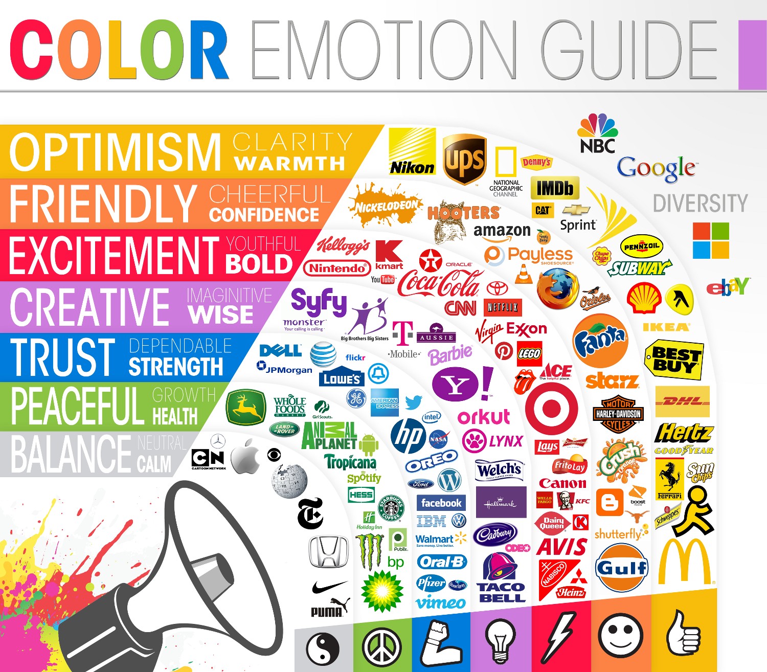
18. Using colors as emotional triggers
You might have read another post I wrote on the psychology of color.
In it, I discuss how different colors conjure up emotions both good and bad.
Understanding what types of emotions your audience will feel because of a color is critically important because it dictates the color scheme that you should use on your website.
Targeting the right colors is your ticket to winning over your visitors and motivating them to take action.
Just take a look at the color emotion guide for help when choosing a color scheme.
19. The 8-Second Rule
Did you know that you have a shorter attention span than a goldfish?

Believe it or not, it’s true.
According to a study from Microsoft Corp., “People now generally lose concentration after eight seconds, highlighting the effects of an increasingly digitalized lifestyle on the brain.”
The amazing thing is that this is actually one second less than your average goldfish who has an attention span of nine seconds.
Pretty crazy!
By following the “eight-second rule,” you can grab visitors’ attention faster while increasing the odds of moving them through the sales funnel.
Here are some specific ways to do this:
- Have a clear unique selling proposition (USP)
- Use an H1 tag to make your USP easily identifiable
- Use power words (you can find an extensive list here)
- Incorporate high-quality images (stay away from cheesy stock photos)
Conclusion
Don’t freak out if your conversion rate isn’t what you’d like it to be.
Do something about it.
All of these different psychological principles are proof that a little tweaking and experimentation can improve your conversion rate significantly.
I know from firsthand experience that these strategies work and can turn your homepage from being so-so to a lean, mean conversion-making machine.
I will admit, however, that there is a fair amount of trial-and-error involved.
But once you find the right recipe, you’re good to go.
Can you think of any other psychological principles that I forgot to mention?
Comments (72)