Your homepage is one of your best tools for driving conversions.
When someone searches for a niche keyword and your page shows up, you can rightfully expect conversions.
But unfortunately, that’s not usually how it works:
According to AdRoll, 98% of your first-time site visitors won’t convert on your homepage.
All that organic traffic you worked so hard to get is leaving your site without giving you anything in exchange for your content.
Getting first-time site traffic to convert takes years of conversion optimization experience.
But you don’t have the time or money to pay an expert.
You need conversions ASAP.
But now we know that the majority won’t convert. It seems nearly impossible.
So what can you do to make your homepage actually convert?
Thankfully, there are a few ways to drive more conversions on your homepage.
There are amazing, free tactics that you can implement today.
I’ve made a few of these changes to my site over the past five years and have seen much higher conversion rates.
I’d even say that some of them have saved my businesses.
Today I’m going to share with you how I turned my homepages into conversion magnets and how you can make your homepage convert, too.
Focus on one call to action
Run through your site right now just like a new, organic visitor would do if they were landing on your site for the first time.
Click on it from a Google search and act like you’ve never been to the homepage.
Once you’ve done this test, tell me one thing:
How easy was it to understand the end goal of your homepage?
What was your call to action?
In other words, how easy was it to find the call to action and see what the website wants you to do?
If it’s too hard, or there were multiple options, you need to focus on a single CTA.
You need visitors to understand almost immediately what you’re asking of them.
Do you want them to sign up for a free trial? A newsletter? A webinar?
And you can’t expect them to do all three of those, either.
CTAs are critically important. Unbounce calls them the “tipping point” between a bounce and a conversion:
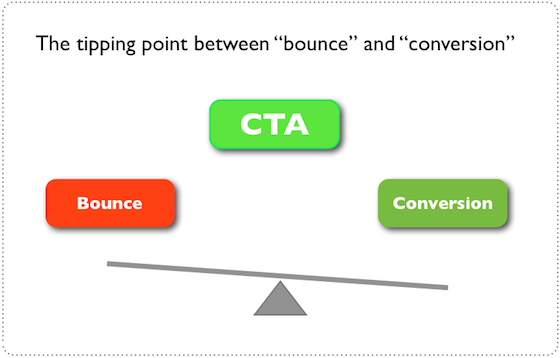
That simply means that a great call to action can produce a conversion, while a mediocre CTA can cause someone to bounce.
CTAs are critically important in determining the next action of a user.
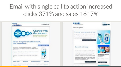
In one case study from Ellie Mirman, the VP of marketing at Toast, using a single call to action increased clicks by 371% and sales by 1,617%:
A single CTA helps focus users’ attention on the specific action you want them to take.
If you have multiple CTAs, you risk confusing the user or overwhelming them.
Unbounce also found that reducing the links and CTAs on your landing page or homepage can increase conversions dramatically:
After reading a bunch of studies about single CTA-based homepages, I never went back.
Here’s what my homepage looks like right now:
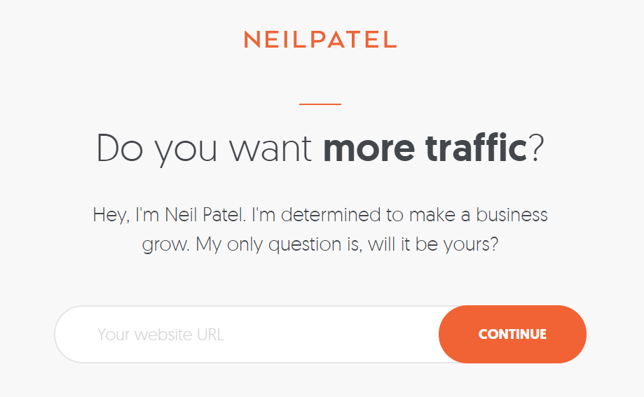
It has a single CTA and nothing else.
Why? Because simple, straightforward CTAs work!
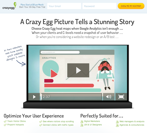
Check out the CTA tactics I use on Crazy Egg , too:
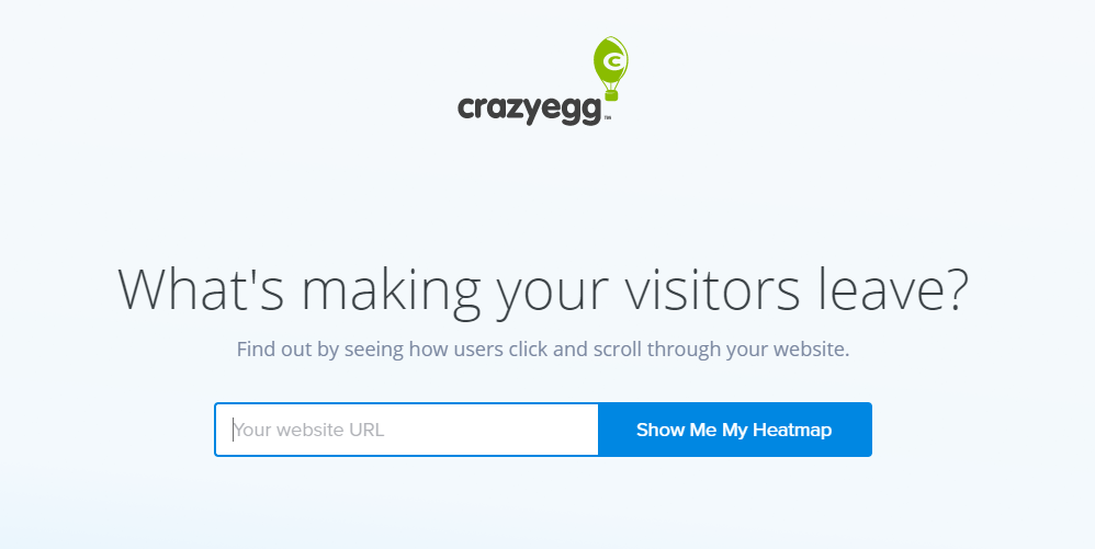
I’ve used this style of CTA on all of my business sites for one simple reason:
They convert better than multiple CTAs or anything I’ve used in the past.
One of my favorite examples of this strategy comes from Slack:
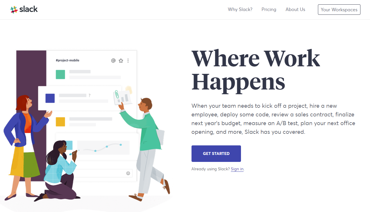
They have one large, simple call to action:
Get Started.
Research and data show that one call to action drives more conversions than multiple CTAs.
I’ve personally found better CTA success doing this, too.
If you want more conversions on your homepage, you need to simplify the user journey on your site by reducing the number of CTAs.
Keep it short and sweet
You’ve heard me preach the conversion power of long-form content.
The longer your blog post is the more traffic and more conversions you can expect.
I currently only write blog posts that are 2,500 words long or more.
There is no denying that long blog posts convert better than short ones.
HubSpot and Backlinko found this by analyzing millions of searches:
They found that the longer the content was, the better the rankings that companies got.
But what about your homepage? Does a long-form homepage convert better?
Not necessarily. It’s not an instant guarantee.
In fact, there are tons of case studies showing the opposite:
Shorter homepages can increase conversions.
I found this out the hard way on Crazy Egg when I was trying to optimize it for conversions.
At first, I wanted to include just about everything and anything on my homepage.
I thought that explaining every detail was necessary for driving conversions.
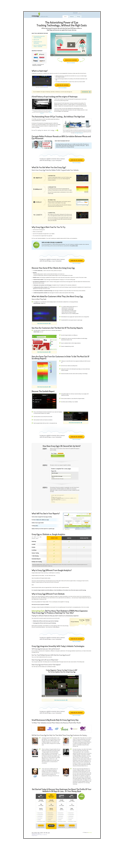
Look at how long my homepage was on Crazy Egg:
I reduced the content on the homepage by 60% because it was just too long.
People weren’t scrolling down to the bottom. They didn’t care about 60% of the information I was sharing!
And if something isn’t working, you need to make adjustments fast.
If you don’t, you are likely costing yourself conversions.
Here’s what it looked like when I ditched the long-form approach and took away tons of content:
And guess what happened? I increased my conversions by 13%.
Less was indeed more on my homepage.
And I’m not alone. ConversionXL, a conversion rate optimization company that I’ve worked with, has found that short-form homepages can increase conversions dramatically.
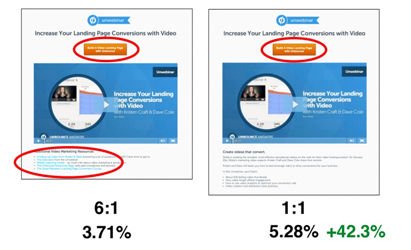
In one study, they A/B tested a long-form vs. short-form homepage for a client:
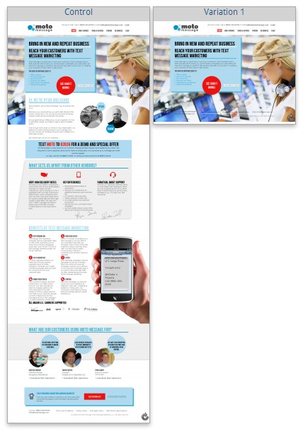
They significantly reduced the content, taking away almost everything except the headline and call to action.
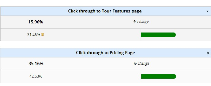
And here’s what they found:
The short-form page drove 97% more visits to their features page and 21% more visits to their pricing page.
This study wasn’t just a one-time thing, either. They also worked with multiple other companies and found similar results.
In another case study, they took the same approach and reduced homepage content to see if it would drive more conversions:

As expected, the results reflected the first case study. Everything increased positively:
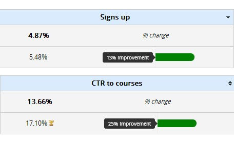
Sign-ups increased by 13% and CTR to their courses page improved by 25%.
Short-form homepages have been known to convert well.
They’re effective because first-time users won’t be overwhelmed by the content.
They will get a short and quick idea of what your company does. Because they simply don’t want to spend 10 minutes reading your homepage.
If your homepage isn’t converting at the rates you want it to, try A/B testing a condensed version to see if it increases your conversion rate.
Craft a stellar headline
It’s no secret that headlines have the power to increase your CTR on organic search results.
If your headline is boring, people won’t click on it.
If your headline is shocking, mesmerizing, and captivating, you can bet that more people are going to click.
Your headline is the one shot you have at instantly communicating value.
And that same rule applies to your homepage.
According to the latest data, you have two-tenths of a second to communicate value before someone forms their first impression of your website.
And then it only takes 2.6 seconds after that first impression for them to either confirm or disprove it.
This data shows that your headline is one of the quickest ways to capture your visitor’s attention and keep them around. Or it can drive them away.
It’s a 50-50 shot, and you need to push those odds in your favor.
Some of the best SaaS products on the market succeed because they communicate value in just a few words on their homepage.
For example, take a look at Instapage’s homepage:
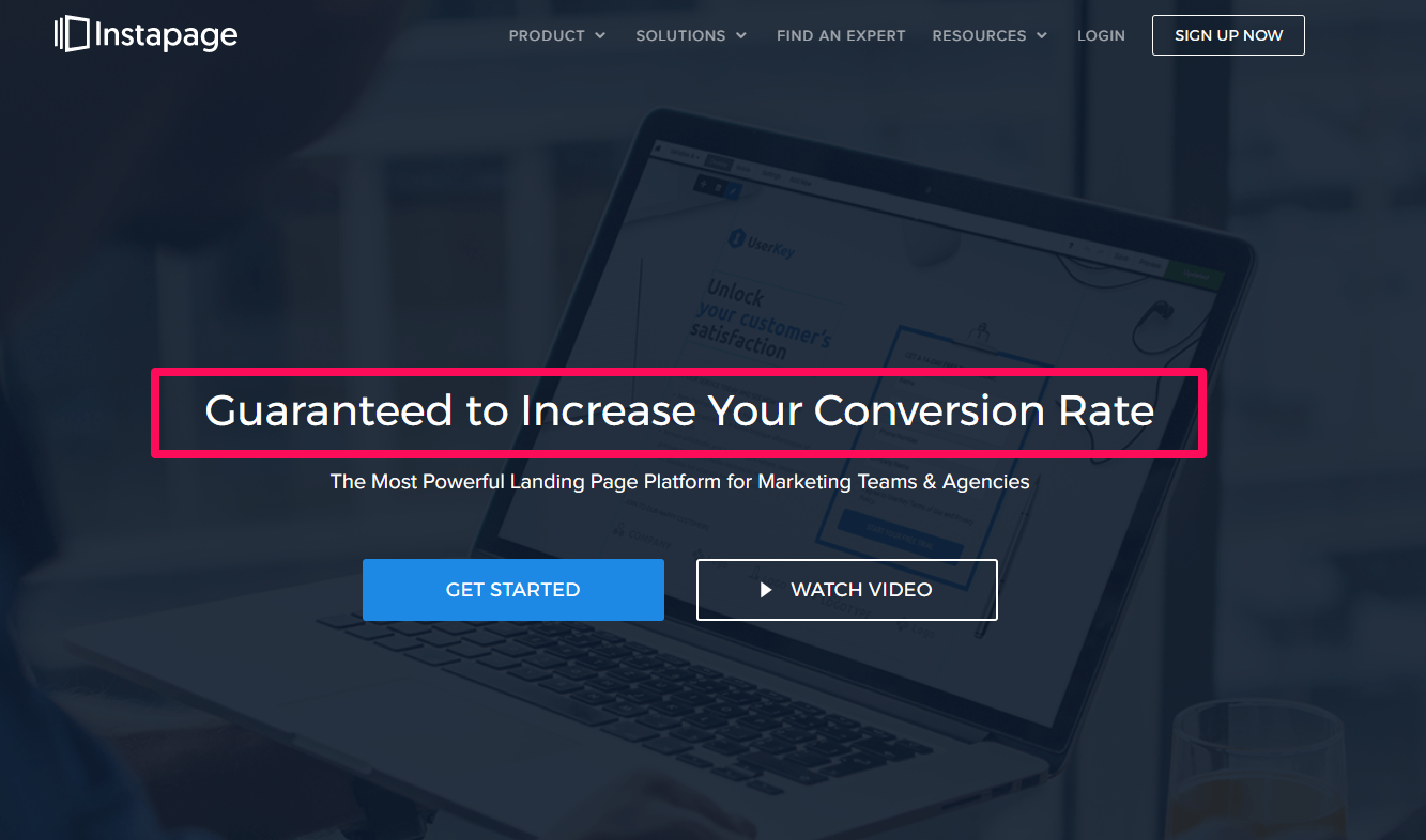
They literally guarantee a conversion rate increase with their product!
The value derived from this headline is almost unmatched by any other homepage I’ve seen.
It tells the user exactly what they need to know:
Will this product improve my business and, most of all, help produce a better return on investment?
If you can answer those questions in your headline, you’re telling the user exactly what they need to know and want to hear.
If you can’t, they probably won’t buy from you.
The truth is:
People don’t need your product or service until you make them need it.
You have to prove to them why they can’t live without it.
And that’s exactly what Instapage does.
Another amazing example comes from Drift, a messaging-based marketing and sales product:
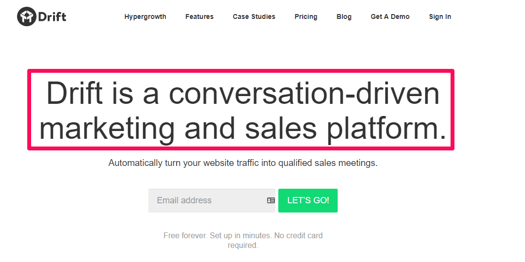
Notice how they get straight to the point?
“Conversion-driven. Automatically turn your website traffic into qualified sales meetings.”
It only takes a second for you to read that headline and understand the value that this SaaS product could bring to your business.
If you take any longer than that, you risk losing customers.
Now that you’ve seen a few examples of some of the best homepages on the Internet, you need to start tweaking yours.
Here are a few templates that I’ve used and picked up on throughout years of copious competitor research.
These are some of my favorite headlines to communicate value fast.
Headline 1: *your product* is a *common use of product* that will *value proposition*
This would read out like: Crazy Egg is a heat-mapping tool that will show you why your conversion rate is suffering.
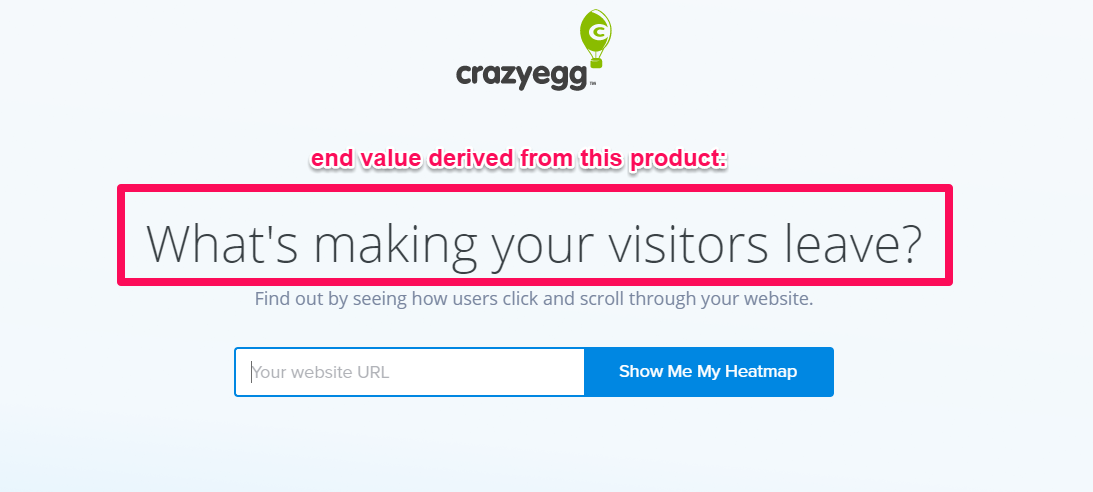
Headline 2: *end value*
That’s it. Simply tell them what they want to know. Toss out the fluff and features.
It should look something like this (again, with as a Crazy Egg example):
Find out why your visitors keep leaving and how to fix it.
Simply describe the end value that users get with your product. What is the main problem that your product solves?
It could be anything: increased conversions, better CTR, higher sign-up rates, etc.
The goal is to keep it simple and state the most popular end value derived from your product or service.
This second strategy is exactly what I use on Crazy Egg:
Try jumping the gun and skipping straight to the good stuff.
Use a video explainer
Video content is steadily increasing.
People are watching video content at unprecedented levels.
According to Engadget, users watch one billion hours of video every single day on YouTube alone.
Video is quickly taking over the web and becoming the future of online marketing.
People don’t want to read anymore. They want to follow along with your videos, webinars, and live content.
And this can come in handy if you decide to shorten your homepage.
If you focus on creating a short and sweet homepage, you might struggle to condense content without leaving key information off the table.
Video is an excellent way to pick up the slack and still communicate value.
Homepage videos are great for conversions because the majority of those who watch business videos will view them from a desktop computer:
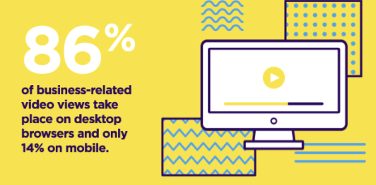
That means that most B2B buyers will easily be able to view your videos on your website.
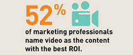
And according to ReadyCloud, 52% of marketing professionals name video as the best ROI producer for content marketing:
If you want better conversions, start implementing video.
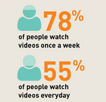
On top of that, 78% of people watch videos once a week and more than 50% watch daily.
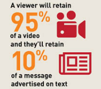
And the best part of all is the difference in content retention between video and basic text.
In fact, most viewers will only retain 10% of text-based content. In contrast, they’ll retain almost all of the information from videos you show them.
You can effectively communicate more value and drive more memorability with videos than with simple text.
It’s safe to say that video can increase your conversions dramatically too.
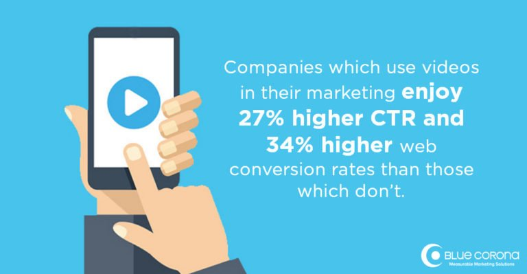
According to Blue Corona’s 2017 data, companies that use video find higher CTRs and better conversion rates:
Thankfully, there are tons of free tools on the Internet that can help you create homepage explainer-style videos in just minutes.
In fact, I’ve used them countless times before.
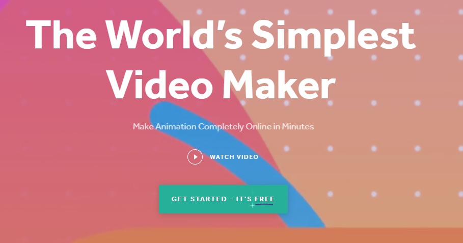
One of my favorite tools is Biteable.
It’s a 100% free tool with diverse customization options that can help you save money on typical video production costs.
To get started, head to the Biteable homepage and create a free account:
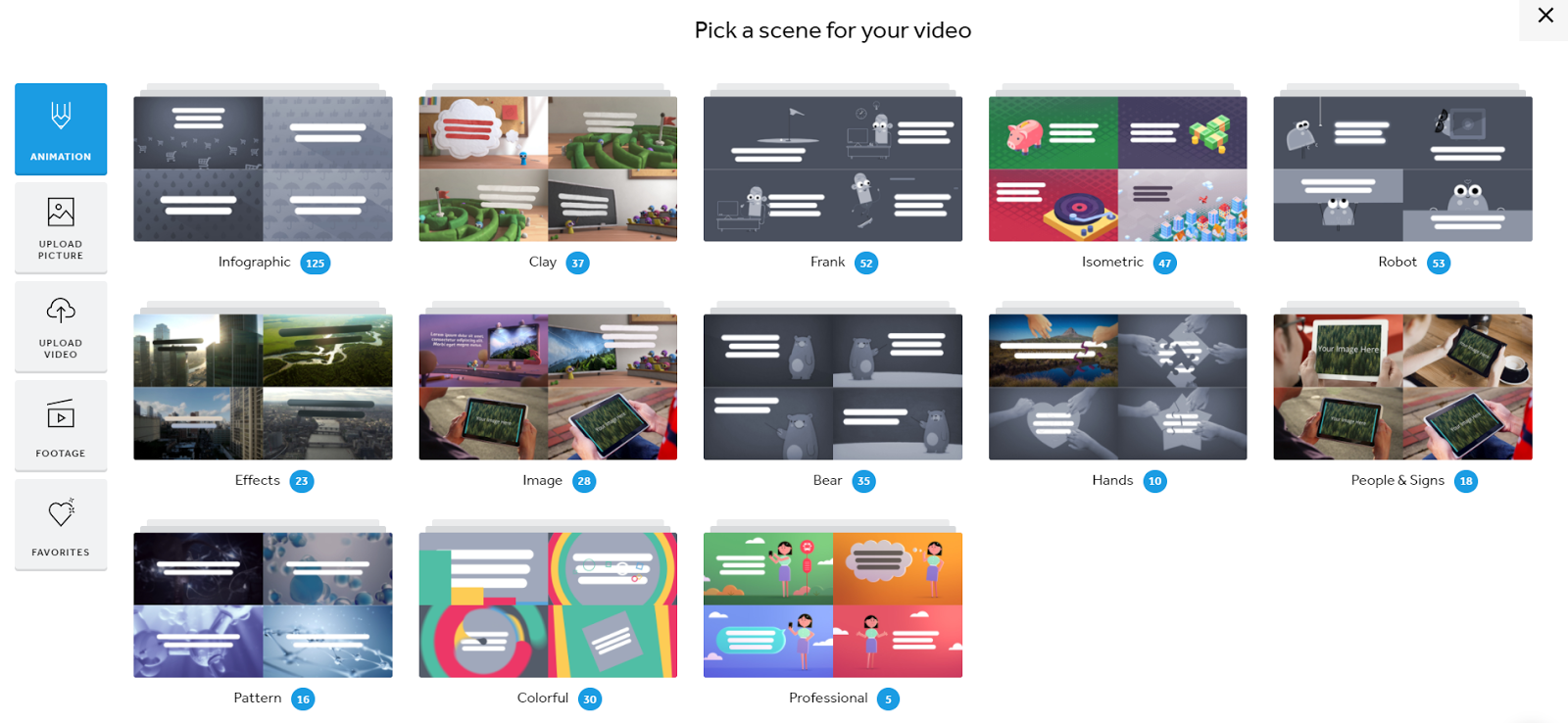
Once you’ve created an account, you can pick between different template styles.
You want to choose the “Business Explainer” option for homepage videos.
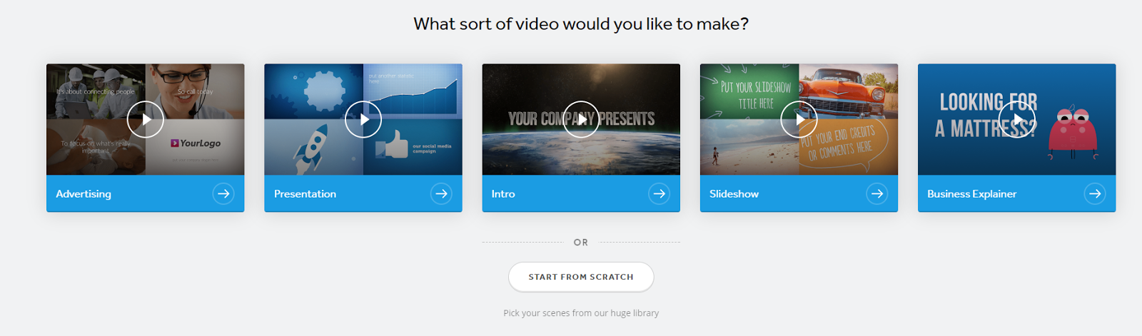
It’s a great template that they made for this exact purpose.
To get started, click on the business explainer template to head to the dashboard:
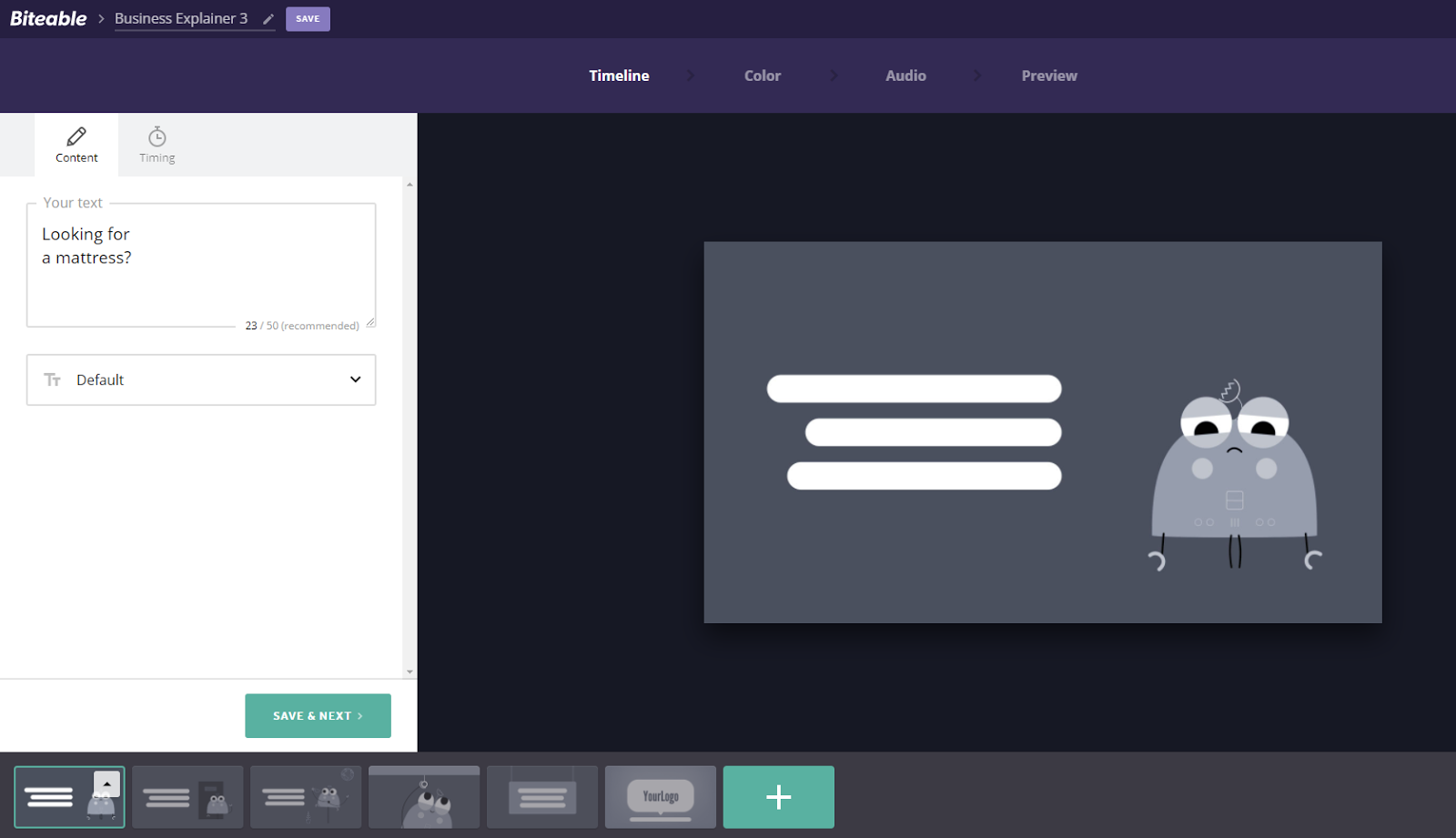
From here, you can edit the text on each video slide.
You can also add tons of different templates that match up with your business type:
If you don’t find any that you like, you can also upload video clips and even product photos.
All of the templates are video-based or animated, meaning they aren’t simply static slide show-style shots:
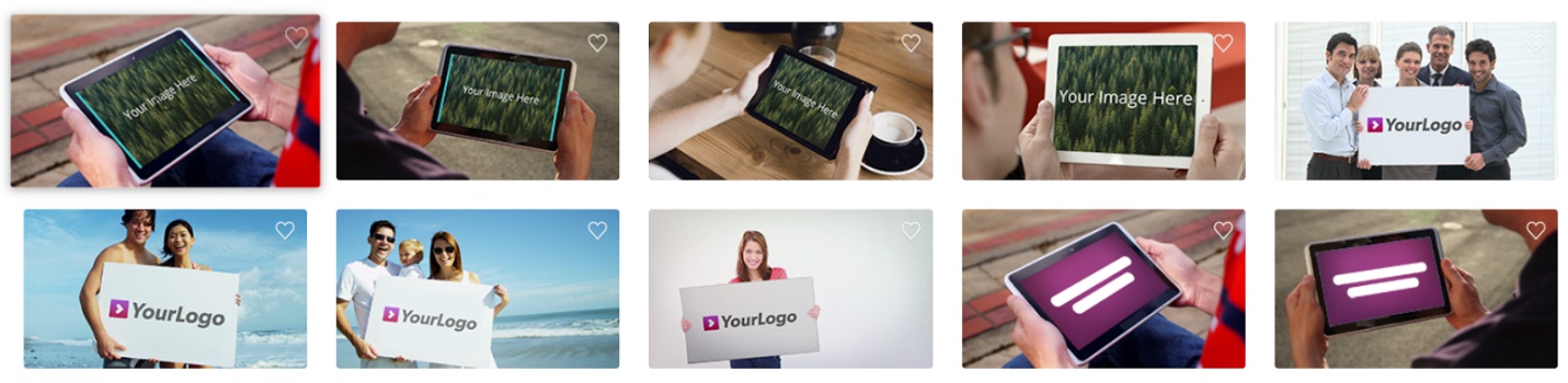
You can easily import graphics and customize explainer videos that are perfect for your business.
Try using Biteable to create video explainer content in just a few minutes.
Place these videos directly on your website to capture attention fast.
Some of the best SaaS sites in the business are using this strategy.
Look at how Wistia uses video on their website to bypass the need for text:
You simply click the video CTA and you get to see an in-depth video describing what Wistia is all about:
Optimizely does the same thing on their sales page to communicate value and drive sales:
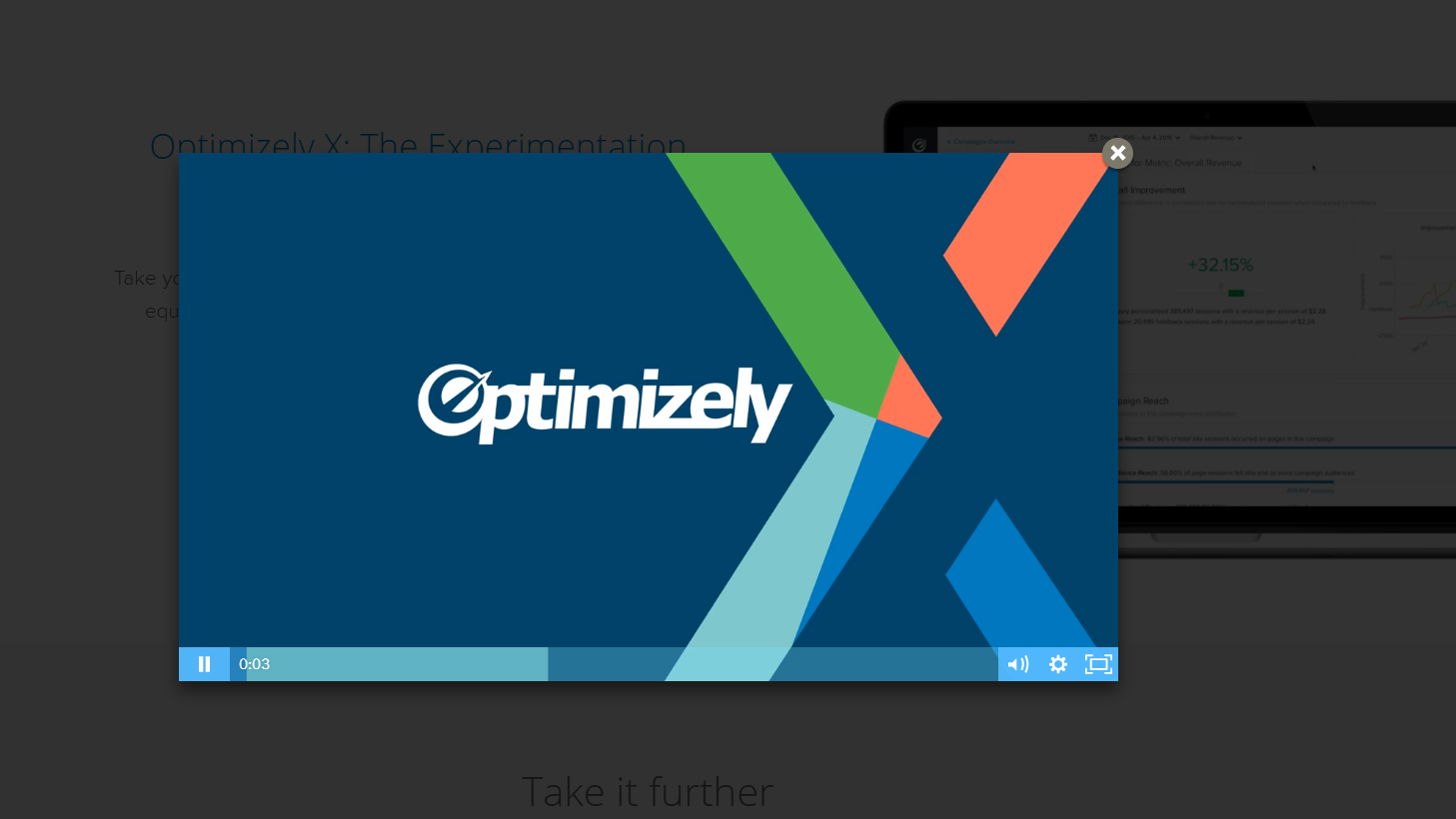
Video can be a powerful way to drive more conversions on your site.
Give it a shot today and watch those conversion rates climb!
Conclusion
Using your homepage to drive conversions is standard in the marketing community.
They drive conversions well and allow you to explain your product in detail to people who visit your website for the first time.
But unfortunately, most of us don’t see that.
AdRoll’s data found that 98% of users won’t convert on their first site visit.
That means that only 2% of visitors are converting on your homepage.
And you need those conversions if you want your business to stay afloat.
But you also don’t have the money to spend on conversion experts or the time to implement those tactics.
Thankfully, there are a few quick fixes that you can use to drive conversions on your homepage.
I’ve used these tactics myself to get more conversions and boost my homepage effectiveness.
Start by focusing on a single call to action.
This approach will direct the user’s attention to the specific action you want them to take.
Next, keep it short and sweet.
Keeping your homepage concise will help users move to a conversion faster.
Instead of being bogged down with text, they can get a condensed version of your brand.
Be sure to use a stellar headline. Headlines will help you grab attention and convey value immediately.
Finally, try using a video explainer to reduce text and simplify your page.
This will allow users to understand your product in a fun, interactive way rather than reading through 2,000 words of text.
Follow these tips and you can start to drive more conversions with your homepage today.
What are your favorite ways to produce more conversions on your homepage?
Comments (34)