
I once spent $252,000 on Conversion Rate Optimization.
I learned a lot from the process, but the biggest takeaway was pretty simple: conversions are complicated.
Achieving conversions means tons of trial-and-error.
They take time, energy, research, and testing to get right.
But don’t let that freak you out.
Don’t think that you have to spend a quarter of a million (like I did), either.
Because I’m here to share my secrets on how you can get the conversion job done.
And it doesn’t take a massive website redesign (like I did!) to do it.
You don’t even have to be an expert at CRO. You just have to be consistent.
In fact, there are little things you can do on a daily basis that can lead to big results.
Here are some of the small tasks you should put your energy toward to increase conversions and save time (and money).
1. Shorten your copy and refine your message
One of the most simple things you can do? Nothing at all.
Ok, not nothing, but something that requires very little work.
What do I mean?
I mean it’s time to remove the things that just aren’t working for you. Less is more.
When I first started Crazy Egg, I thought that having more content meant easier conversions.
We had conversion-rate experts tell us that people were confused by our homepage, so we made it longer.
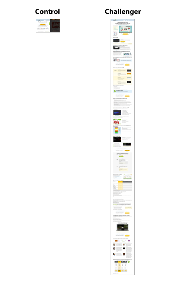
Our long-form page got 30% more conversions.
But that wasn’t the end of our experiment.
We went back to the experts and told them to beat our score.
We did a lot of research to find out which messages worked and which didn’t.
The results gave us four different variations of a shorter site.
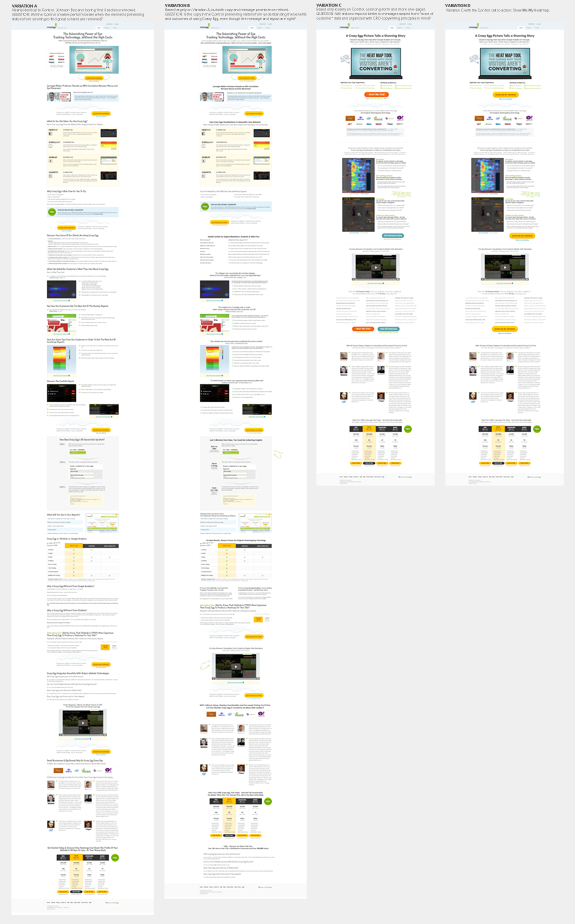
After all the work of beefing up the other versions, guess which site was the winner?
The shortest one (all the way on the right). Surprising, right?
As it turns out, people want explanations. But they don’t want long explanations. They want them to be short and sweet.
Too much information to comb through can cause analysis paralysis.
People spend so much time trying to decide whether or not to choose your product or service that they end up choosing nothing at all.
You can prevent this by streamlining the process for them.
Make your website simpler and take out the excess content bloating your pages.
Focus on your core message (your products or services) and nothing else.
Remove the superfluous information on your homepage and landing pages that aren’t going to convert.
It’s one of the easiest things you can do to improve conversions, and it takes almost no time at all.
2. Add social proof to your landing pages
Social proof is the new word-of-mouth.
Why does it work? Because people like to be in with the in-crowd.
If they see that one of their friends has liked your Facebook page, for example, they might be more inclined to like your Facebook page, too.
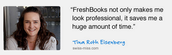
I’m sure you see testimonials used all the time in social media advertising.
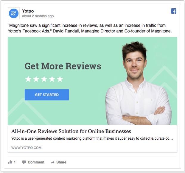
But including testimonials on your site can improve your conversions, too.
There are plenty of ways you can do this, like including awards you’ve won, companies you’ve worked with, or actual testimonials and reviews you’ve received from customers.
These will provide proof to potential customers that you are a trustworthy company to purchase from.
Take a look at Bizzabo, for example. They feature several forms of social proof on their site.
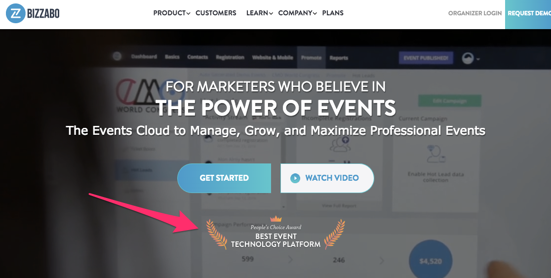
They have an award on their homepage shown right above the fold, and below the CTA, so they provide proof of their worth right from the start.
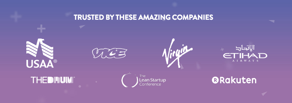
They also have a list of companies that trust them.
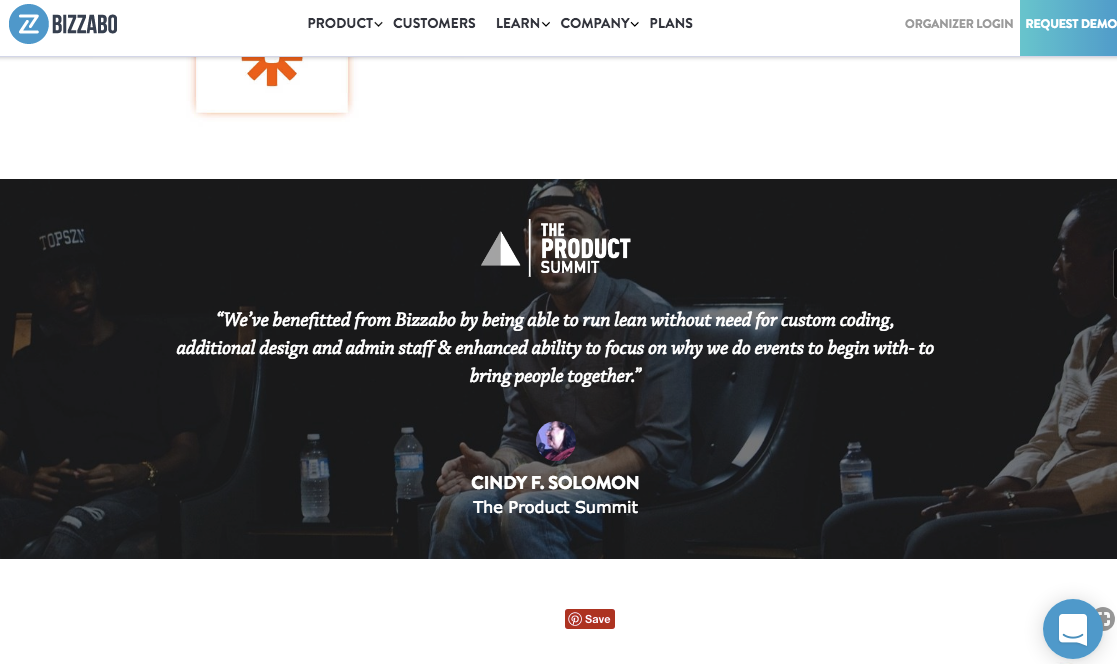
And if you keep scrolling down the page, they list customer testimonials between features.
Showing testimonials on landing pages has been shown to drive validation, a major component of conversion optimization.
They work because they build credibility.
And they can be obtained quickly if you already have customers.
You don’t have to spend hours a day building case studies or testing.
You only have to ask your customers what they already like about you. Easy, right?
One of the things that Bizzabo does well in this area is use images of their customers alongside their testimonies.
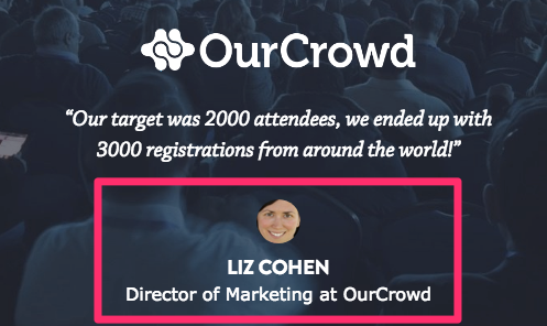
Studies show that the use of pictures increases the perceived trustworthiness of a statement.
So if you’re going to include testimonials, be sure to include pictures alongside them.
They don’t necessarily have to be pictures of customers, however.
They could be easily-obtainable company logos or stock photos, too.
Zendesk is another example of using social proof on their site like this. Similar to Bizzabo, they provide social proof in the form of trusted, well-known companies.
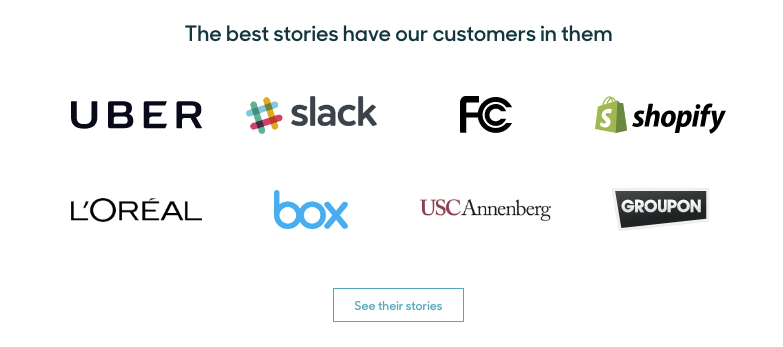
There’s no guesswork that these brands are powerhouses, especially with logos included. If they trust Zendesk, that must mean you can, too. Right?
But that’s not all Zendesk is doing right.
Just above that part of their page is another conversion point with images of people alongside a downloadable lead magnet with even more social proof.
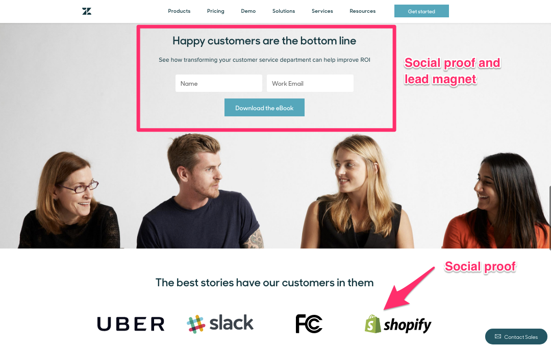
The beauty of what Zendesk is doing here is threefold:
- They’re using images of companies to promote trust
- They’re using images to point out “happy customers”
- They’re using a lead magnet
That means they’re doing more here than just building brand loyalty: they’re capturing emails.
And that leads to my next piece of conversion advice.
3. Add lead magnets to your site
A lead magnet is an offer that gives your visitors relevant value in exchange for their email.
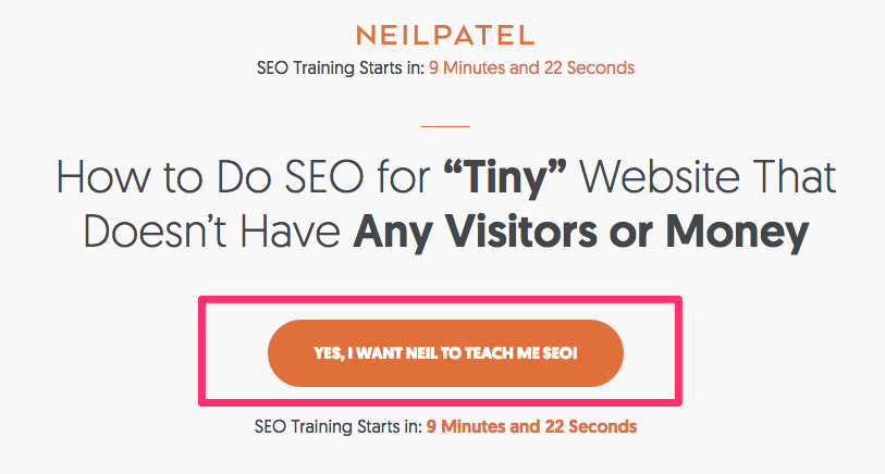
I use one as the first thing on my site:
When you click it, you see a pop-up that allows you to enter your name and email:
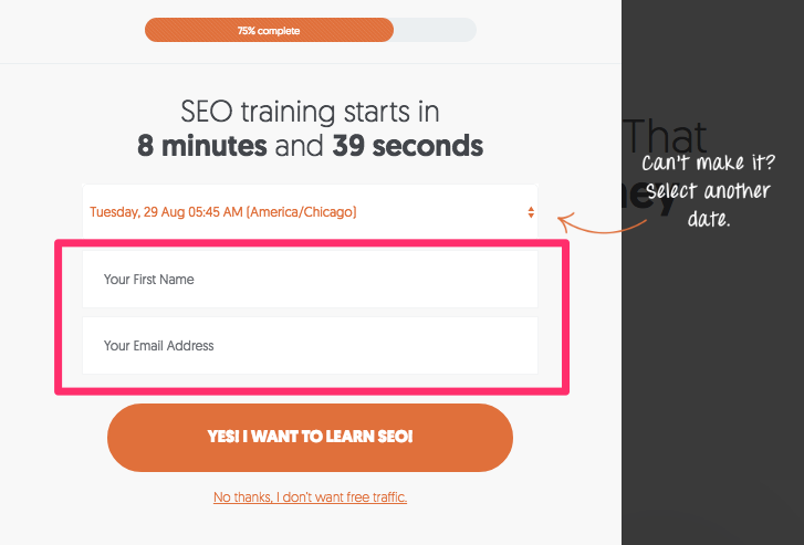
Which then gives you access to my free SEO webinar.
What I like about using lead magnets is that they’re built for middle-of-the-funnel visitors.
The reality is that 98% of your traffic isn’t ready to buy when they land on your site.
Maybe they already know about you, maybe they don’t. But they need a little coaxing before they commit.
If you use testimonials to build trust, there’s more of a buy-in.
But, you still need a conversion.
Lead magnets are a great conversion-point because they are non-committal.
Customers are willing to give you the information you want to access something valuable.
You get an email, and they get something for free. It’s a win-win.
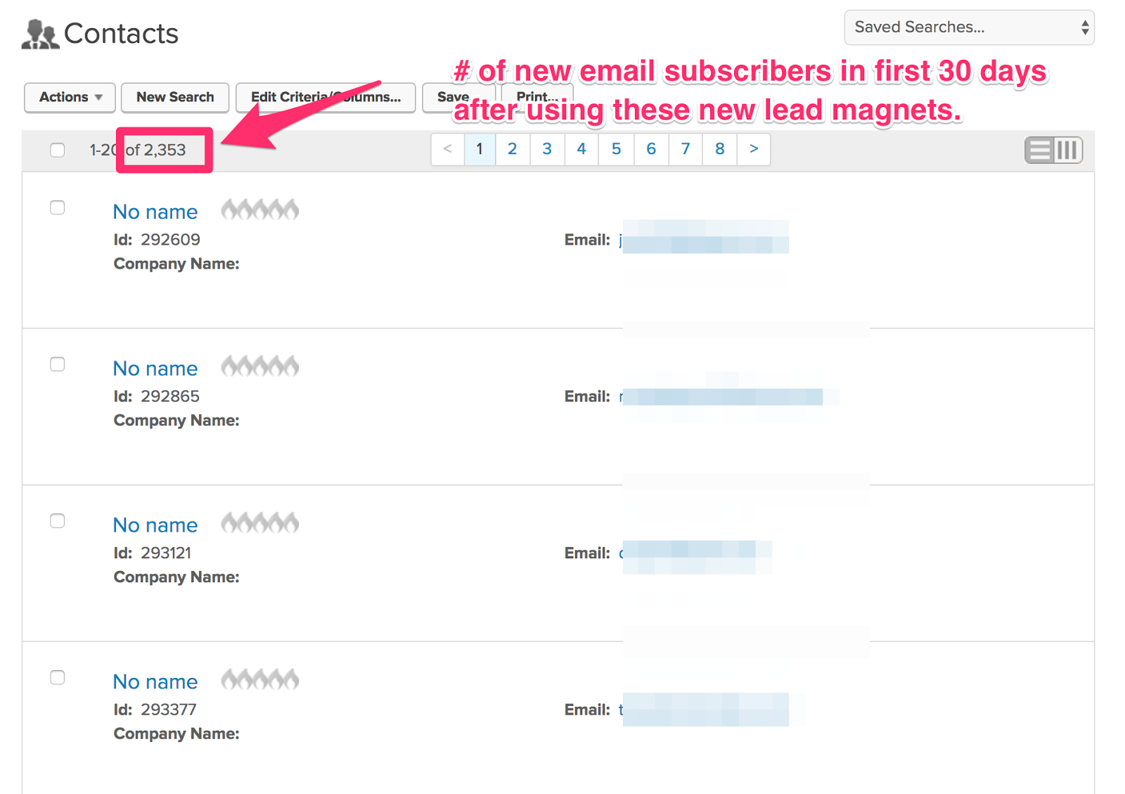
In one case study by Bryan Harris of VideoFruit, he boosted his email subscriber list from 15 signups per day to 75 just by using a simple lead magnet.
His ideas were fairly simple, too.
For one, he took a popular article and turned it into a checklist, and for another, he created a package of links that he thought people might find helpful.
Nothing too complicated. Nothing that took him very long to put together.
You can use these methods for your lead magnets in a few minutes a day.
You could turn your testimonials into a downloadable PDF like Zendesk, or do what DigitalMarketer does:
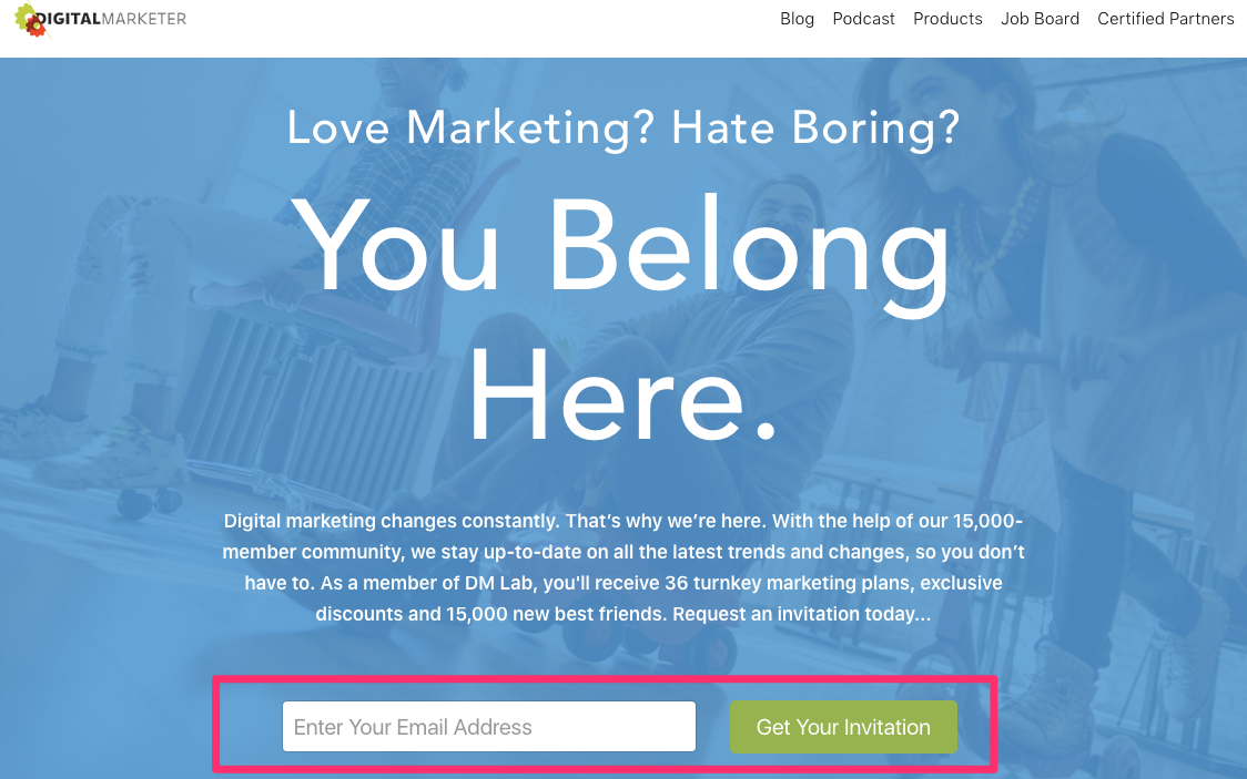
They have a simple sign-up to be a part of their online community.
There’s no commitment required to receive instant access to exclusive discounts, content and a community of like-minded people. It’s perfect.
Another good lead magnet is an actual demo of your product.
Here’s an example of a free-demo lead magnet from GrooveHQ that also includes something really smart:
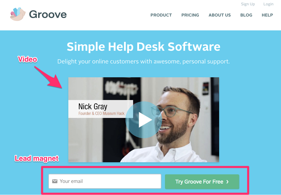
They have an explainer video in front of their lead magnet that explains what you’re getting when you sign up, so there’s no guessing for the customer about what’s in it for them.
Which, once again, leads into the next thing you can do.
4. Include a short explainer video
Explainer videos are great.
I’ve spoken about them before as a way to boost conversions.
Videos are an easy, quick way for you to convey your value proposition clearly, and they can also help increase page engagement and time spent on site.
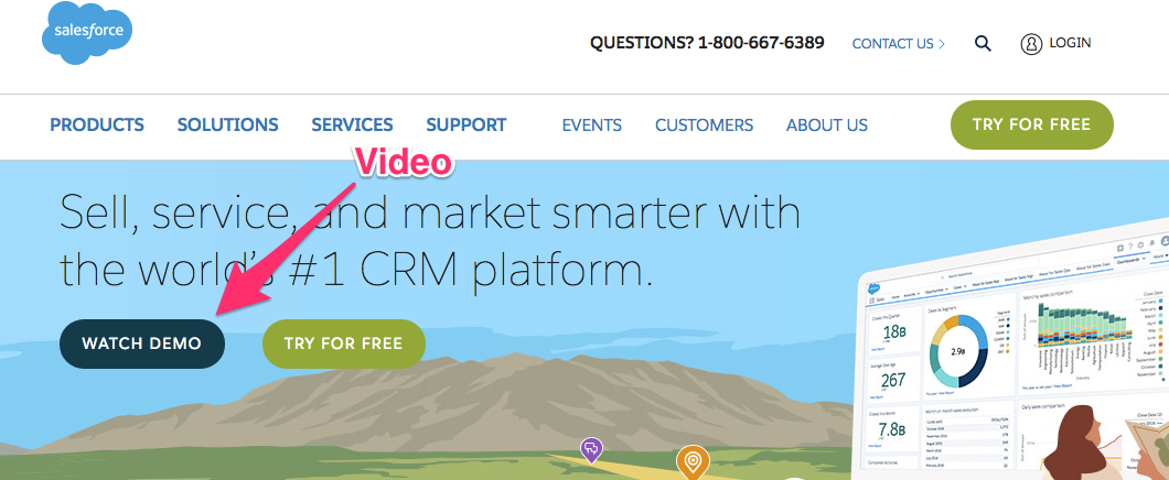
Salesforce loves explainer videos. And why not?
They increase conversion rates by an average of 20%.
They include them in several places now. One is their homepage’s CTA:
They scattered others in multiple locations throughout their site:
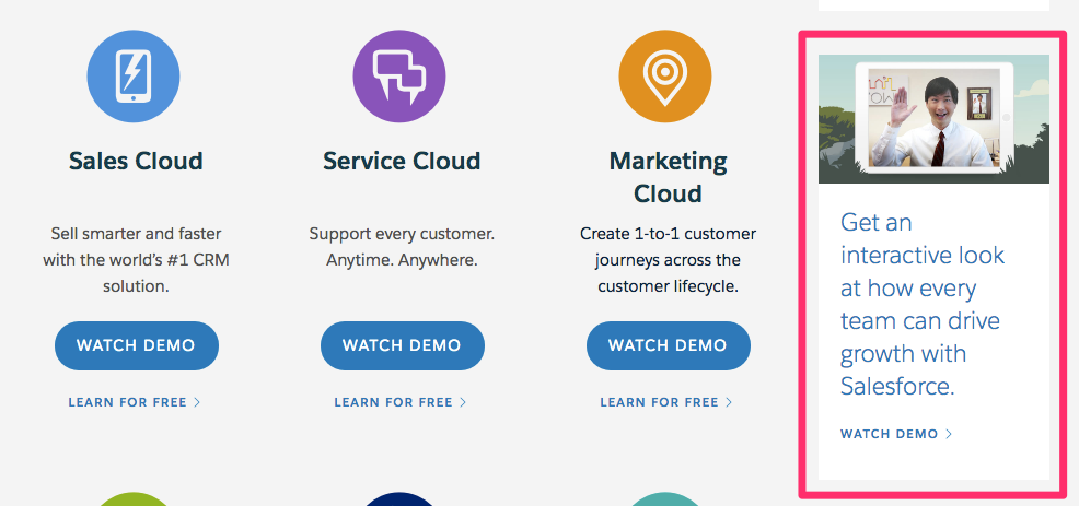
Even the links to their products (seen in the image above) have video demos.
They lead to a separate landing page that looks like this:
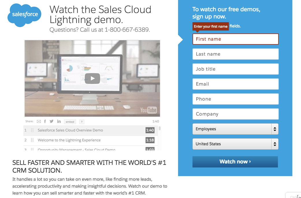
This is where they capture information that will continue to drive their marketing efforts.
30% of their website visitors watched the video, and 50% of those viewers watched the video in its entirety.
You can use the same tactics to convert leads, too.
But you don’t have to make it a multi-step process in the same way that they do.
Even a video without an email capture can work.
Dropbox increased conversions by 10% when they added explainer videos to their offerings.
If you go to their homepage, you can see that they link to one of their services:
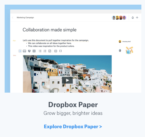
That link brings you right to their Dropbox Paper explainer video, which you can watch for free.

The video is a little over a minute and a half long and covers some of the basics of the service.
One thing that I like about this video is that it’s well written.
That’s the key to using explainer videos for conversions. You have to have a good script, or people won’t watch.
When creating videos like this, make sure to spend some time honing your message and writing something that really sells.
Hopefully, at this point, you’ve already refined your message (from point #1).
But if not, this is where you’ll really need to focus your energy.
Think about how you’d sell your product or service in a quick elevator pitch-style message.
Who would your audience be?
What’s the overall tone you want to convey?
And what’s the call to action you want to include?
The good news is that when it comes time to build the video, you can outsource.
Many hear the word video and immediately think of all the dollar signs that go with it.
But it doesn’t have to be that way.
You can go through a professional video company, or you can use freelancers. I typically recommend freelancers.
Big companies will charge anywhere between $5,000 to $25,000 for a simple video, and it will take them a while to complete it (trust me).
A freelancer can usually create a simple video for you in a few days or weeks and might charge you anywhere from $500 to $2,000.
If you’re in a pinch and you need a video quickly, you can always use a service like Fiverr.
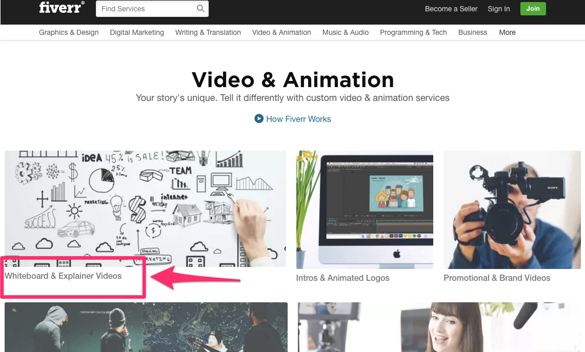
If you aren’t familiar with Fiverr, it’s an online marketplace where freelancers from all over the world offer to complete tasks beginning at $5, hence the name of the site.
This will save you a lot of time and money if you have a lot of videos to produce. You can usually hire a Fiverr freelancer and have your finished content delivered to you within 24 hours.
Remember to track your video-engagement stats using a tool like Wistia so you can really maximize your conversions.
Speaking of maximizing, there’s one more thing you can do to really see conversions:
5. Cater to your mobile users
There will be 6.1 billion smartphone users by 2020.
And in the U.S., and nine other countries worldwide, more Google searches take place on phones rather than on a desktop computer.
People are using their phones to look at your site.
You might even be reading this on your phone right now.
This means your website needs to be mobile-responsive, so they don’t click off of it.
If it’s not mobile-responsive, move this up to step one in increasing your conversions.
A mobile-responsive site is one that gets smaller when you shrink it left to right.
Depending on the device it’s being viewed on, the site layout and content may change to accommodate a smaller screen.
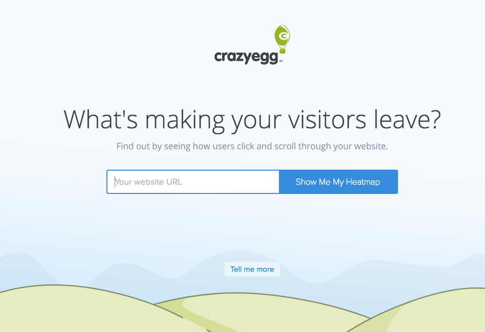
For example, here’s the homepage for CrazyEgg:
And here’s the mobile version:
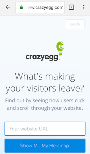
Everything stacks and some of the design is minimized, but the overall look and feel are the same.
Google really loves mobile-responsiveness.
Responsiveness means easier usability, quick load times, and a lower bounce rate, all things that Google looks for when judging the value of a site.
And you can take advantage of Google’s affinity for responsiveness to improve your conversions.
Aside from having a responsive layout, you can also leverage Google’s AMP framework.
Accelerated Mobile Pages (AMP) is an open-source initiative platform that can improve the speed and readability of your mobile pages for any user.
During initial tests of the AMP framework, they found that it cut down load time between 15% and 85%.
One of the biggest troubles that mobile users often struggle with is connectivity.
They might have a high-speed connection at home, but lose signal once they travel out of town, for example.
With AMP, Google will push your web-frame higher, so your site loads faster in any situation.
And I probably don’t need to tell you this, but mobile speeds can really impact conversions.
However, that’s not the only way you can cater to mobile users.
Think back to the first point I made about refining your message.
It’s a good idea to eliminate some things from your mobile site that you have on your desktop site.
Your desktop site might have ads, sidebars, navigation, etc. that can slow down your mobile site.
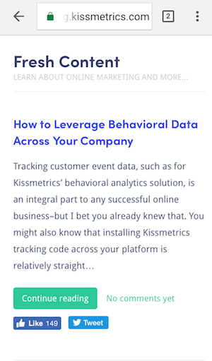
Kissmetrics’ blog page has a sidebar, for example:
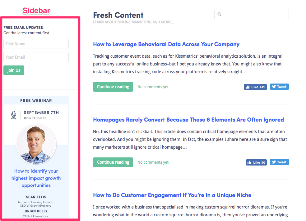
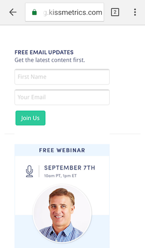
But the mobile site is a bit different. There, you only see the content first. Nothing else.
This is then followed by the “sidebar” content at the very bottom of the page:
Ideally, your mobile site should have less content than your desktop site.
Or at least less obvious content. You should hide as many things as you can, if possible.
You also want to be careful of other “desktop” elements that can affect mobile users, like pop-ups.
Google is cracking down on interstitials that affect the mobile experience.
So if you want to include pop-ups in your mobile site, use a tool like Hello Bar to create them.
Set your ads as exit ads to appear after 20-30 seconds.
This will prevent Google from penalizing your mobile site and keep your visitors happy which will lead them to convert.
Conclusion
Even though getting the conversions you want can sometimes be a complicated process, you don’t need to spend hours and hours to get it done.
Best of all, you don’t need a full website redo to get the job done, either.
Small changes, tweaks, and adjustments to your site can improve conversions just as well as a complete overhaul.
If you spend a few minutes each day focusing on the essentials, you can see results.
Start by shortening and refining your core message.
Add in social proof with testimonials, reviews, information about credible brands that support your company, or any awards/official seals your business has earned.
Create ways to showcase that message with lead magnets and other media.
Use short explainer videos that demonstrate features of your product or service that users can easily find.
Put that message in front of mobile users and optimize your loading speeds.
All these things can be done as you go, and without the help of expensive CRO experts (unless you want them, of course!).
What daily strategies have you tried to increase your conversions?
Comments (6)