
People have been predicting the “death of the homepage” for years.
But the homepage will never go away.
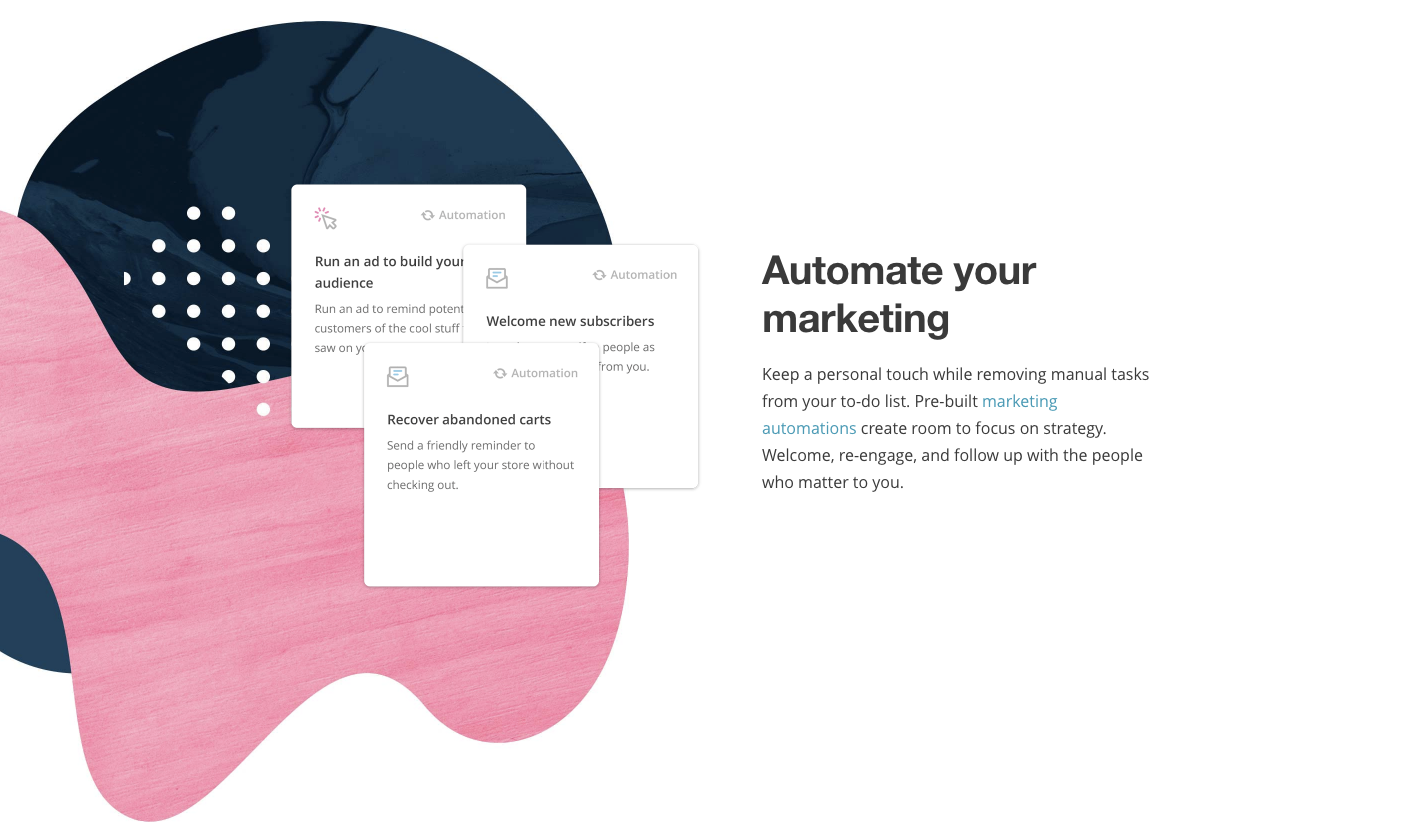
Each site needs a front door to welcome its new users for the first time and give them the lay of the land.
However, the homepage is evolving.
Even just a few years ago, homepages contained tons of different information about every aspect of the company.
They were jammed full of links and places to go. The company wanted to highlight all of the various aspects of what it did.
The problem is that it backfired.
There were simply too many options. It was overwhelming and distracting for users.
One of the best ways to quickly improve website design conversions is by ditching the features that detract from the user experience.
Carousel sliders are a perfect example. They’re commonly used to showcase multiple different things at once.
But that versatility often comes at a cost. Tests have shown that they hurt conversions, SEO, and page loading times.
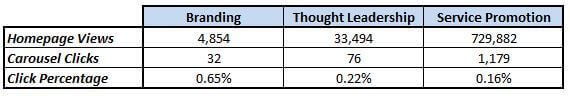
See that low click percentage in the above image? That’s not a good sign.
In fact, that’s the entire reason I created Crazy Egg. If you can see that users aren’t clicking on what they’re supposed to, you can change the design before it’s too late.
The best homepages take user experience into account.
Here are some of my favorite homepage designs. You can start copying them to get similar results.
1. Bills.com
The first major trend to highlight is the ‘homepage as a landing page.’
It makes a lot of sense when you think about it.
Your ultimate goal is to drive up leads and sales. The ‘online brochure’ website has been dead and gone for years.
The tricky part is knowing the best approach to generate leads on the homepage so that you don’t scare everyone away and force them to bounce.
For example, it’s a lot to ask brand new visitors who’ve never even heard of you to purchase some big product.
So instead, you need a simpler, less invasive approach to ultimately get what you want.
And that’s why I love what Bills.com is doing.
For example, head over to their site, and you will see the following slider:
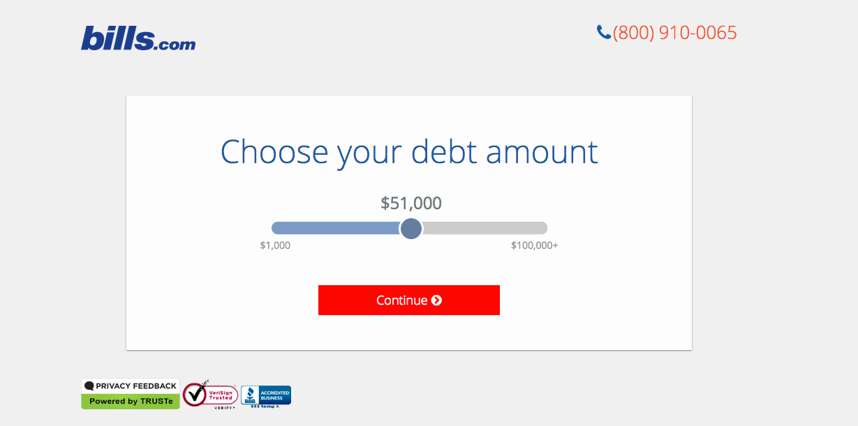
Now you can interactively slide back-and-forth to choose the debt amount you might owe. It’s so simple that a child can do it.
It’s also the only option they give you so far! That way you don’t feel overwhelmed or get distracted.
After clicking on “Continue,” they ask you if you’re behind on payments or not (and if so, for how long).
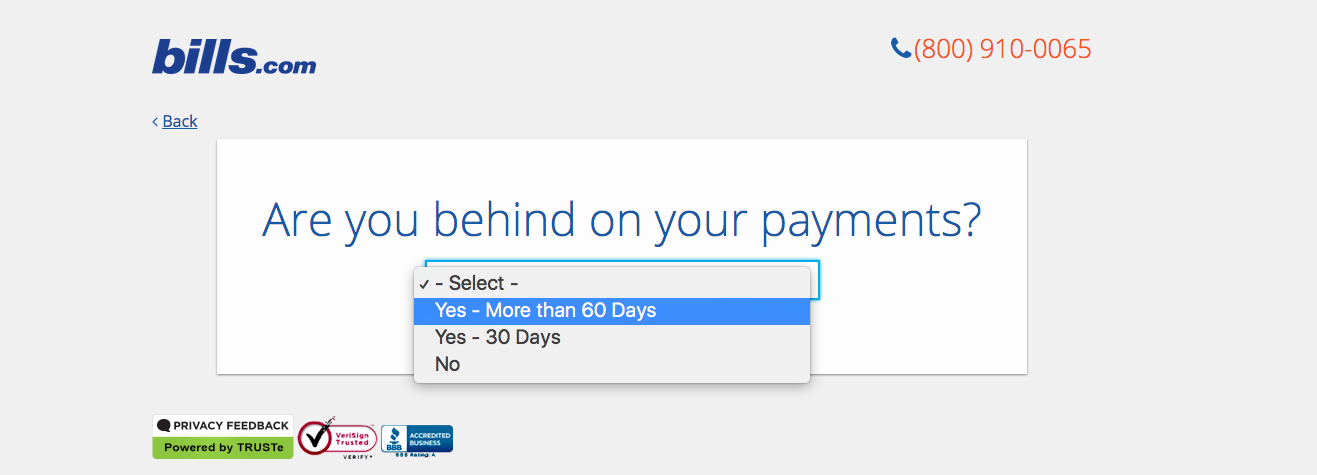
They’re qualifying you here. If you’re not behind on payments, they might not be able to help you much (read: make money from you).
They can use this question to personalize the response they’re eventually going to give you. That can even help internally split up which person or department will be best to handle your case if you become a customer.
The next step is to select which state you live in:
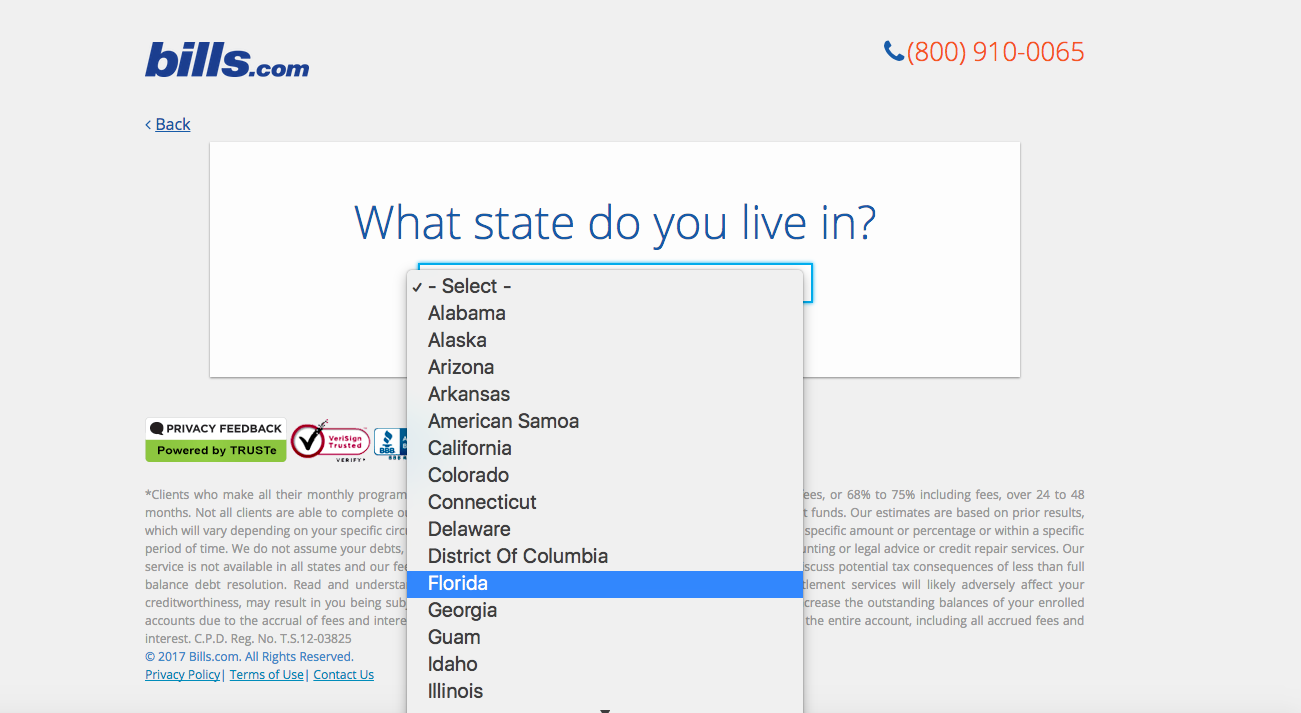
Once again, this further qualifies you and also raises any potential issues with state restrictions (that they might have to deal with later).
The very last step is the one they wanted all along: Your personal information!
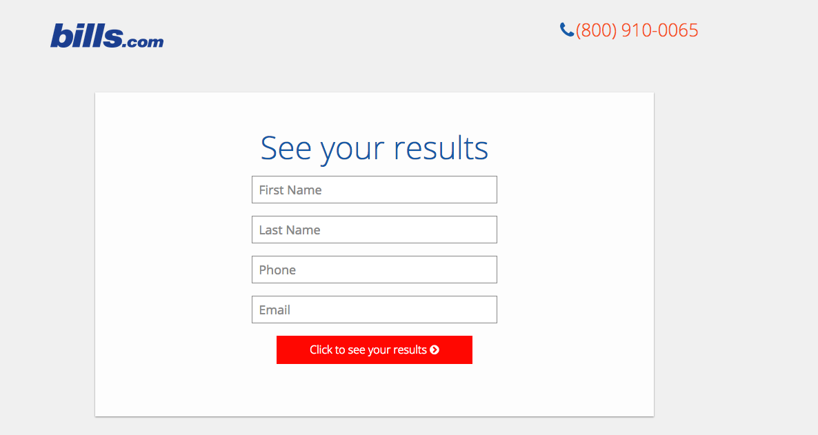
KlientBoost calls this the “Breadcrumb Technique,” because instead of scaring people away with the initial form, you’re getting them to make little micro commitments.
Each micro commitment takes them a little further along until they’re already so invested that they have to finish the process.
For example, if they would have asked for your name and phone number up front it might have scared you off.
However, by getting you to commit to those other steps first, they give themselves a better shot at eventually converting you to a new customer.
KlientBoost has successfully used this technique to increase conversion rates from 1% to nearly 20%.
The trick with these multi-step landing pages is to start off with the least threatening question possible.
It needs to be related to how you’re ultimately going to help them. However, it should be incredibly simple for someone to provide.
Obviously, there should be zero mention of price or their personal data at this point.
It could even be as simple as asking for a zip code.
The next step gets a little more specific, hinting at the level of service they’re going to need.
After getting them to commit to those first two steps, you can bring up a few more personal questions to follow up with them afterward.
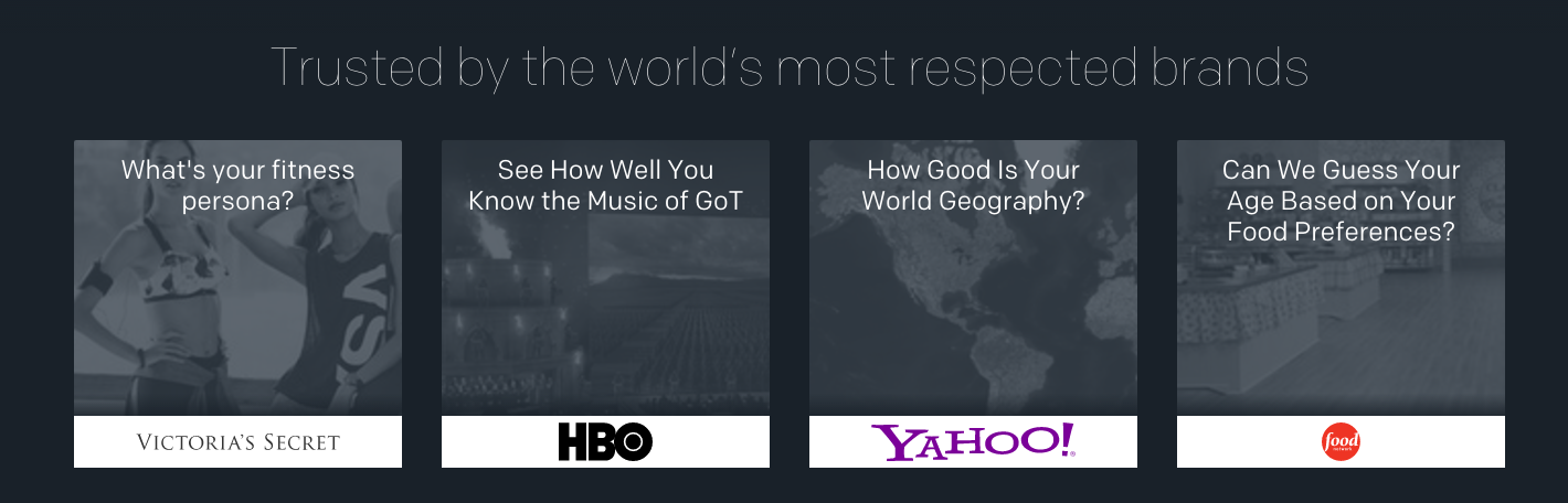
You’ll notice that Bills.com also uses interactive content to keep you engaged on their site.
Qzzr is one tool that you can use to make this happen on your own site. They already have pre-built ‘widgets’ that can be setup in a few minutes (as opposed to paying a developer to custom make it for you).
Victoria’s Secret uses one that asks “What’s your fitness persona?” The Food Network asks, “Can We Guess Your Age Based on Your Food Preferences?”
In each case, these brands are using a fun question that gets you engaged. There’s zero threat in answering those questions initially.
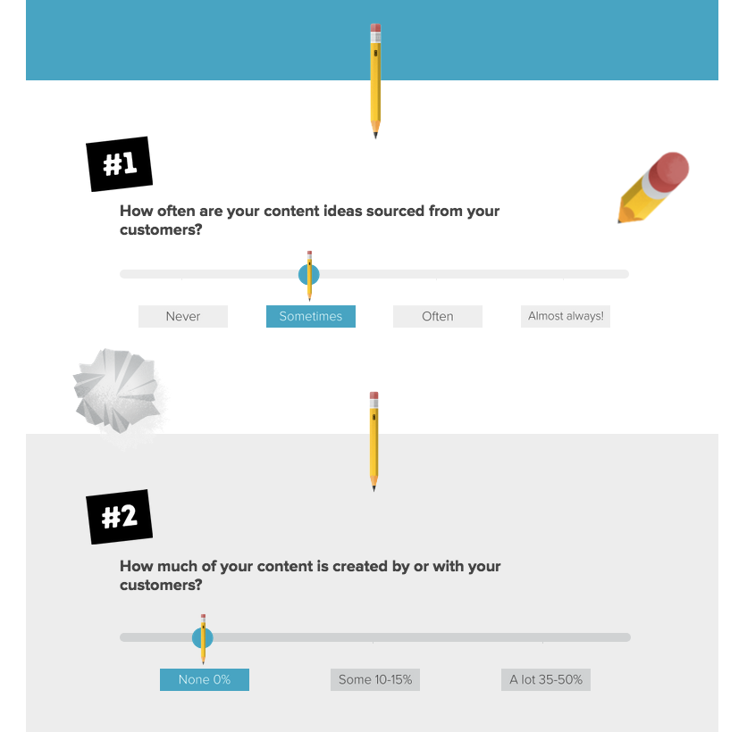
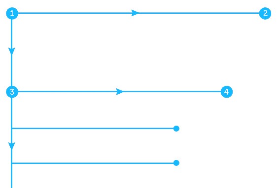
Another alternative tool is SnapApp. They also create interactive calculators and even infographics that people can point, click, and adjust to see new results.
Here’s a funny example of how vain your marketing is that gets you to answer questions in a flowchart fashion.
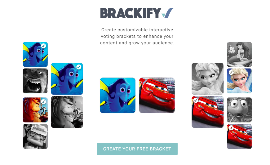
One final tool recommendation is Brackify. That name sounds like “brackets,” right?
Well, that’s exactly the point! You can create interactive brackets or competitions for almost anything, and let customers or site visitors get in on the action.
Here’s what that might look like if someone asked what your favorite Disney movie is:
2. Kiva
Kiva is a microlending platform.
They connect entrepreneurs in third world countries with donors and sponsors from other parts of the world.
For example, let’s say an entrepreneur in India needs $1,000 for a new commercial sewing machine so that they can produce and sell twice as many products.
So people from all over the world can donate in small quantities and then get paid back over the course of a year or two out of the new cash flow this entrepreneur is able to generate.
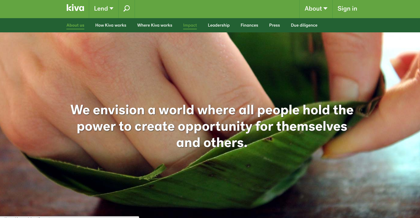
Kiva’s homepage is relatively basic, to be honest.
However, as we’ve seen, that’s OK!
Simple and direct can keep people focused on what’s important (giving you their info in exchange for something of value).
The problem is that while people might visit your homepage and be interested in what you do, there’s not always a compelling reason to kickstart that process.
Sometimes, you have to be a little more aggressive or assertive to let them know about the amazing value they can get.
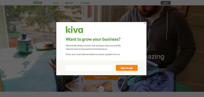
In this case, Kiva decided to use a popup overlay to simply get email newsletter opt-ins.
They wanted to start small (and not use something threatening like we learned in the last step).
So Kiva went with a simple email option to at least get something from somebody before they bounced and left the site.
Here’s what the new offer overlay looked like:
Overlays like this are tricky to pull off.
Some audiences hate them, obviously. But it can pay huge dividends if you position your content and offer well.
You can also control how or when it shows. For example, you can decide to only trigger it to new visitors (vs. returning ones) and only when their cursor begins to move out of the window.
These will often create a ‘lightbox’ effect that de-emphasizes everything else in the background so that people look straight at your new offer.
Here’s another example of the one I use for upcoming webinars:
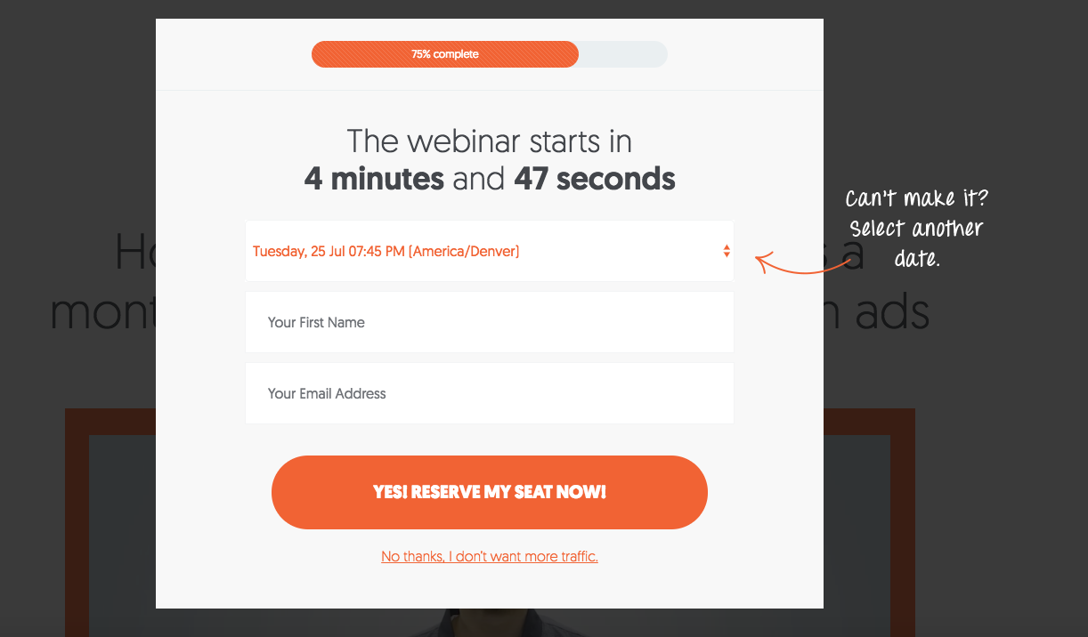
There will always be a percentage of your audience that hates these things.
So you need to be careful about how you use them. (You also need to watch out for design mistakes that will ruin your SEO as well.)
However, the results can often be worth the risk.
Kiva decided to split test this overlay to see how their own audience responded.
They hooked up Unbounce with MailChimp (for the eventual email opt-ins) and decided to show the new overlay to only 50% of the traffic initially. That came out to about 5,000 visitors.
Just that single overlay captured an extra 3-4% of visitors right off the bat.
Encouraged, Kiva kept iterating with better designs and different options to double that number to 6-7%.
Not bad for an “annoying” pop up, right?
3. H.Bloom
What exactly is H.Bloom?
They’re a luxury flower delivery service. You can go on, punch in your preferences, and they’ll take care of the rest.
So they’re perfect for the overworked entrepreneur to never forget about their loved ones.
Let’s take a quick look at their homepage, and then I’ll tell you why I like it so much:
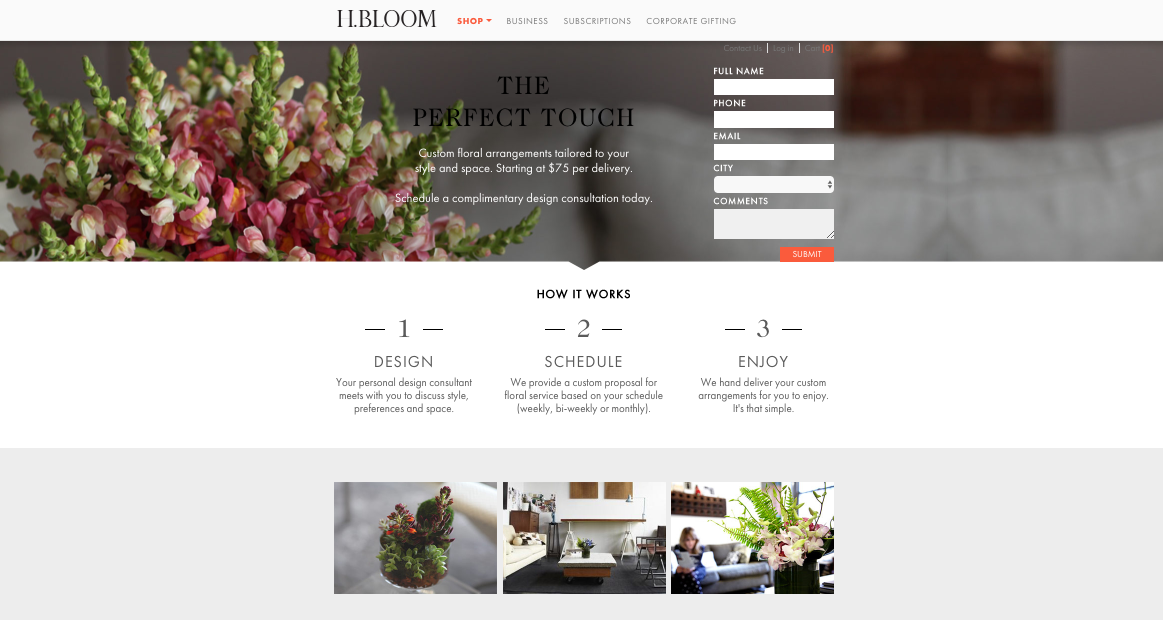
First and foremost, they have their form above the fold.
That makes the goal of this page clear right off the bat. Your customers hit this page, and they don’t need to guess about what they’re supposed to do next.
The form that’s front-and-center keeps things nice and clear.
Most website visitors tend to concentrate most of their attention above the fold still (even though they are becoming more accustomed to scrolling down).
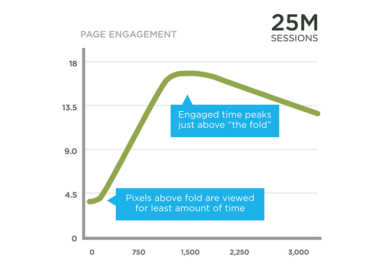
The easiest way to improve your lead generation form optimization is to keep your CTA in the normal eye pattern that people already use.
For example, a study was done years ago that tracked how and where people’s eyes tracked when they hit your page. They found that people tend to scan your website in an “F” shape.
So the first section of H.Bloom’s homepage immediately tells the reader what they’re supposed to do on the page.
And then the next section in the middle explains exactly how their process works.
The logical, step-by-step progression helps people understand what’s expected of them and how difficult or time-consuming something like this is about to be.
That’s critical because it’s immediately setting expectations and overcoming the potential objection that it might be too time-consuming to get started.
It works along the same lines as a progress bar.
For example, progress bars have the power to increase conversions by 28%, because they quickly assure the viewer that there’s not a lot left for them to do to get their ‘reward.’
My final favorite piece of this page is the subtle arrow used as a visual cue to help transition viewers from one section to the next.

It’s a tiny detail, but it helps give users the message to continue reading down the page, especially if they aren’t yet ready to fill out the form and get started ASAP.
4. Basecamp
Before Basecamp was “Basecamp,” they were 37Signals with multiple different software products.
And over the years they’ve constantly iterated to see what works best for driving new free trial signups.
Here’s one of their current homepage variations that use a classic copywriting technique that’s been around for decades:
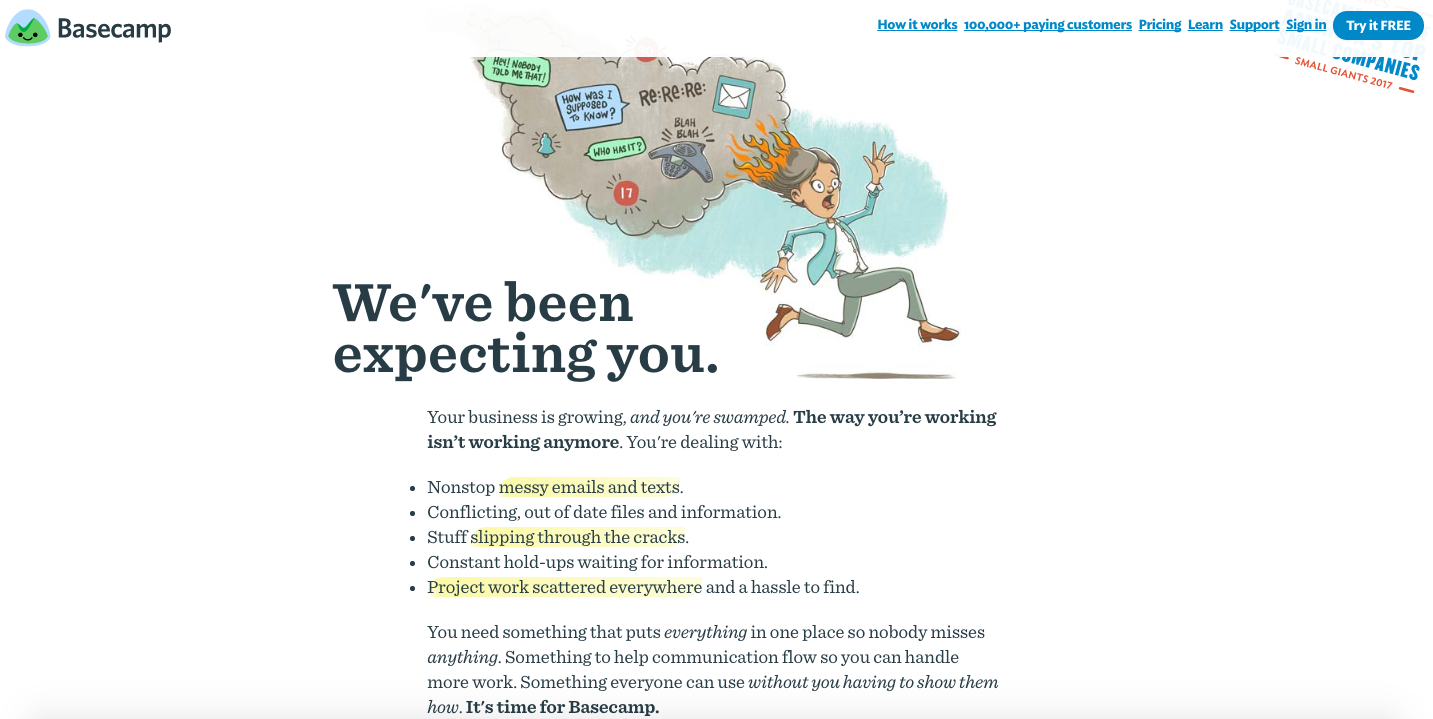
Read the first line of that page real quick.
“Your business is growing, and you’re swamped. The way you’re working isn’t working anymore.”
They go on to list a few of the various problems and issues that you (overworked business owner) are probably expecting.
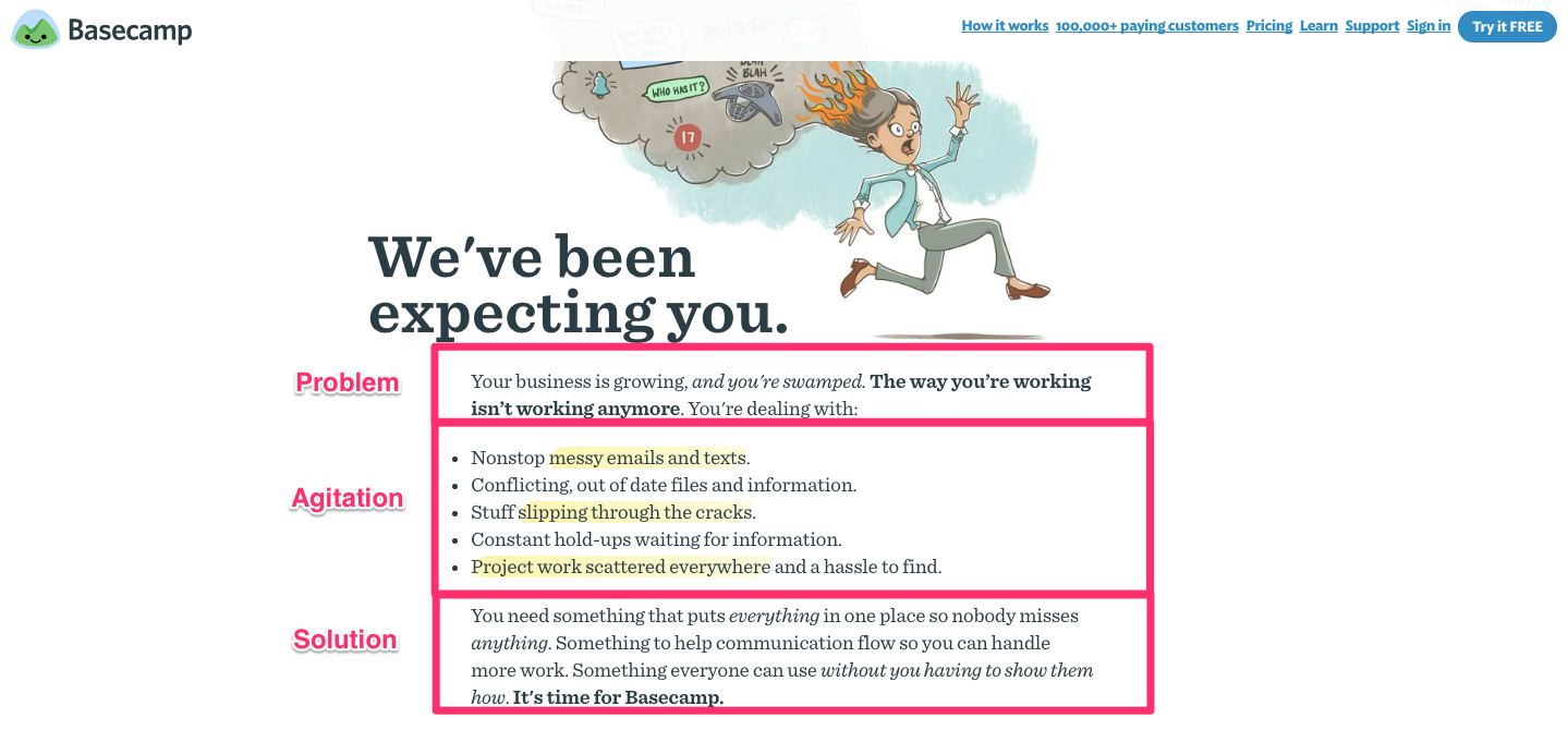
This is a textbook example of the PAS copywriting technique. Here’s how it works:
- Problem: You quickly cut to the heart of the matter by clearly confirming the main issue your prospect is up against (e.g. “You’re swamped.”).
- Agitate: Then you transition into naming all of the various pain points and symptoms they’re currently experiencing as a result of that problem (e.g. “messy emails and texts,” “stuff slipping through the cracks,” etc.).
- Solution: Now you present your solution as the savior that will take away all of these problems for them (e.g. “It’s time for Basecamp.”).
Here’s another quick look at that homepage now that you can identify the formula they’re following.
Too many companies want to launch straight into the features and benefits of their product on the homepage.
However, the problem with that is your site visitors aren’t quite there yet.
These people may not recognize the same problems in their life, so the ‘solution’ you’re selling them doesn’t resonate with them. They leave your site without converting as a result!
You’ll also notice that this homepage is text-heavy, which is unusual compared to some other software websites.
That’s another trick they’ve learned after testing different versions over the past few years.
Years ago, they tested a classic long-form landing page and initially saw a huge leap in conversions (37.5%).
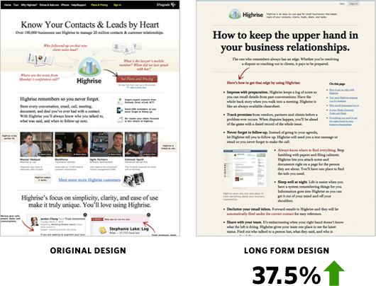
However, they still weren’t satisfied and thought they could do better.
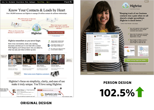
So they tried another test, but this time using a customer testimonial against the original design.
The customer one came out on top with a 102% conversion increase.
They then followed this up with one more test to see if copy length had anything to do with the results. (Answer: It didn’t.)
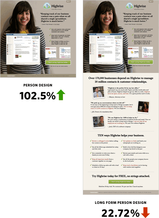
So you can see that they still stick to a text-heavy format overall. However, it’s not necessarily the length of that copy which makes a difference.
Instead, it all comes down to the specific words used and the clever formula to make sure their customers know exactly which problems Basecamp solves.
5. MailChimp
The homepage of the email marketing software company, MailChimp, presents one of the best lessons in how to design a homepage that converts.
However, at first blush, it doesn’t look like much:
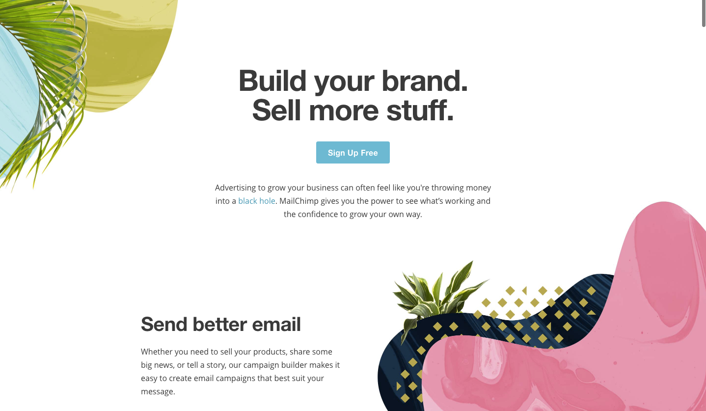
One of the first things you’ll notice is that there’s a single button above the fold.
There’s literally nothing else to click here!
Decreasing options and choices has been shown to help improve conversion rates. The idea is that the more decisions you force visitors to make, the longer it takes them to decide what to do (if anything).

MailChimp’s homepage also offers a lesson in white space (or negative space).
For example, we’ve all tried to read a blog post on a website, only to feel like it’s too ‘cramped’ or cluttered. That’s one massive red flag that your blog design stinks!
Instead, a well-designed page should be open and airy like MailChimp’s.
The negative space around your primary CTA helps increase its significance on the page. So people are almost forced to pay more attention to it.
Let’s scroll down the page a little bit and see how they play with horizontal spacing to also monopolize your attention.
They’re using a photography trick called the “rule of thirds” that says you should place the most important page elements in the middle of your crosshairs.

The content in that section of the homepage is off-centered for a reason! It ends up shaping or controlling how they want you to view page content in order of importance.
That way they can help you subtly prioritize a page hierarchy that says “This is option #1, this is option #2, etc.”
Conclusion
The best homepages on the web today might have different objectives.
However, there’s always one big one they come back to. Lead generation.
All websites today need to sell.
That doesn’t mean they have to get people to purchase right away. But it does need to get to that point eventually.
The best homepages use various factors, from interactive features to design, to subtly instruct the user what to do next.
Believe it or not, this should be in the visitor’s best interest, too.
It helps simplify their life by making fewer decisions, while also getting them to the intended destination faster (so they can resolve the problem or pain point they’re experiencing).
What’s your favorite homepage example and what do you love about it?
Comments (10)