Starting a blog that readers love depends on two important things: user-friendly responsive design and useful content in your blog posts. Once you can focus on those elements, everything else falls into place.
But, the question is: How can you make users happy – even if you have insanely useful and interesting blog posts- when your blog design stinks? You can’t. It’s just not possible.
Understand that blogging is here to stay for both small businesses and large. It’s no longer a side project that a successful business can dabble in, from time to time.
It’s also not something to take lightly. Many entrepreneurs give up blogging because they don’t see immediate results. That’s the wrong way to go.
As a small business owner, you know that deciding to start a blog creates more leads, more indexed pages and authority links, improved search rankings and social network shares, and an increase in traffic of 206%.
But, to get those benefits, you have to pay attention to these blog design tips.
Does your blog design stink? Well, no one can say that definitively – it’s largely a subjective question. However, there are some clear indicators of bad design that you should look out for when you choose to start a blog.
Listed below are 13 warning signs that highlight the key areas that you may not be getting right when it comes to your blogs responsive design and how to fix them. Take a look at our blog design tips:
1. Slow Loading Web Pages
Make no mistake: If your blog is not loading quickly, then your responsive design needs to be fixed. Speed matters when it comes to websites and blog posts. If you increase your site speed, you’ll instantly increase its search performance. You also need to consider this fact on different platforms with different screen sizes.
A recent statistic tells us that the average user’s attention span is about 8 seconds and that probably reduces when it comes to social networks. You may be able to solve your reader’s problem. But, that won’t matter, if they’ve already moved on to some other site or someone else’s blog post. Time is precious and being constantly mindful of that fact is critical to your success as a small business.
Site speed affects Google rank. In fact, sites that load quickly enjoy more search traffic than slow sites, even if the slow site has better content. Google is obsessed with site speed.
A slow site will drive away users. In fact, 40% of site users will abandon a site if it takes more than 3 seconds to load. The average load time for a typical blog or site, regardless of size, is 2 seconds. If your load time exceeds 2 seconds, you’ve got to speed things up and get faster responsive design for your site.
The easiest way to reduce your bounce rate is to speed up your blog’s load time with a more responsive design. The moment your blog starts to load faster, you’ll notice higher engagement in areas, such as comments, repeat visits, leads generation, social network shares and so on.
When that begins to happen, you know that you’re building a blog audience that will stick to your brand, participate in your free course and buy your product. One of the best blog design tips you can get – is to speed things up and invest in speedy responsive design.
First things first – find out your blog’s load time, with these steps:
Step #1: Visit Pingdom’s speed test tool. On the homepage, plug your blog url (e.g. quicksprout.com) into the search box. Click the “Test Now” button.
Step #2: Analyze your speed.
From there, follow the outlined steps to improve page performance. For example;
- Compress components with gzip
- Add Expires headers
- Avoid URL redirects
2. Too Many Typefaces
“Right and wrong do not exist in graphic design. There is only effective and non-effective communication.” — Peter Bilak – Illegibility
The typeface used by your design is an important part of your overall visual branding. Unfortunately, some bloggers and website designers fall prey to web design mistakes with typefaces. Consequently, they kill their conversions and the chance to look like a professional website.
One of the most common mistakes is using too many typefaces so pay heed to this blog design tip. The “use fewer fonts” rule of desktop publishing also applies to custom website design.
Brian Hoff said that mixing too many typefaces and type weights can drown your message and discourage engaged readership. Remember this when you decide to start a blog.
Generally, having more than two or three different typefaces for your headlines, subtitles and body text can give your blog design a cluttered look. It gives the user the same feeling as leaving no white space or breathing room in your design.
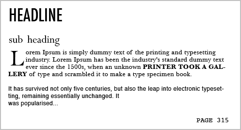
If you’re using a Drop Cap for your custom website or blog design, which I’m beginning to see as the latest trend in web design, you would want to use a different typeface that is legible and bolder. This delivers a more responsive design that customers can get on board with.
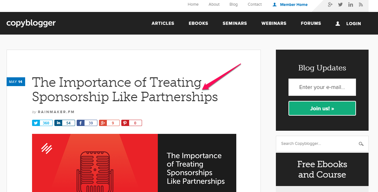
Jacci Howard Bear, a desktop publishing expert, recommends using no more than four fonts. Copyblogger uses 2 – 3 stylish, yet legible fonts:
3. Lack of a Clear Value Proposition
A value proposition is a promise of a specific value that you’ll deliver to your customers. Copywriters know that the first thing people see both on blog posts and social networks – the headline – is what motivates them to either read the copy or leave. Consequently, smart copywriters spend a lot of time on that headline. The same care should be taken with your value proposition statement.
A research study by MarketingExperiments found that one of the biggest challenges marketers face is crafting the right value proposition for their businesses.
Your customer is on the lookout for what value you can offer them. Unless the value you’re offering is a colorful design or visual inspiration, putting too much focus on aesthetics and beauty is just a waste of time. In addition to a solid design, you need to focus on content and positioning.
The headline may not be your value proposition. It might be placed in some other element, such as the subtitle, a short video or bullet points in your copy.
Remember that a value proposition will not bring instant sales for your business. That’s not its purpose. Instead, what it does is provide a strong foundation on which you can build a loyal customer base.
In turn, it gives the customer the perception that you’re the right person for them. And, for that reason, they’ll stick around, so that they can learn more from you.
Ecommerce sites often use free shipping as a value booster. Sellers of products that require installation can boost the value of their products by offering free installation.
Campaign Monitor has a clear, descriptive and persuasive value proposition. The first time I saw it, I was intrigued. I wanted to learn more about this email marketing solution and what competitive advantage it has over Getresponse and Aweber.
See also: Useful Value Proposition Examples (and How to Create a Good One)
4. No Visual Hierarchy
Visual marketing is the new trend for landing page design. Visual appeal now transcends responsive design and extends into the social networks as well.
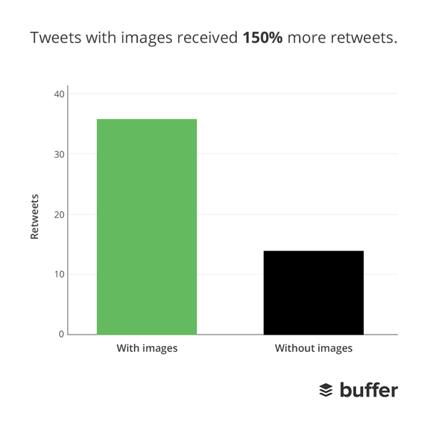
This statistic tells us that Twitter accounts with tweets shared on with images receive 18% more clicks, 89% more favorites, and 15% more retweets.
These days, you see lots of authority blog posts using pictures of people on their home pages. A typical example is Chris Ducker, who uses his own photo to create a positive impression and get readers to subscribe.
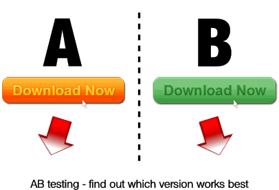
If you look closely at the screenshot above, you’ll notice that Chris’ photo appears on the left and the copy appears on the right. Should you do the same? Well, there’s really only one way to know: A/B testing.
When you start a blog or create a landing page, no one can definitively tell you where your picture, opt-in form or value proposition should go. Every industry differs, as do your users and their preferences.
Visual hierarchy deals with how you organize elements or groups of items on your site. Hierarchy is used to determine the importance of items on your blog.
If you didn’t include your own picture on your site or your blog posts and want to do so now, you have many options – including your header, your sidebar, and the main body. And, should you place your bio above your subscription box or below it?
Only you can answer this question with certainty and the best way to tell is with split testing. And, that’s true for all of the major elements of your visual hierarchy and responsive design.
5. Blog Doesn’t Look Trustworthy
What makes a user trust you? There are lots of factors, of course, but this much is certain: If you want users to recommend your blog to others, you have to make it look trustworthy.
Trust is a key component in the purchase decision-making process. Your prospect needs to feel confident that you’ll deliver on your promise.
When users trust you, they can surrender their challenges to you, because they feel sure you won’t let them down. That trust begins the second you decide to start a blog.
So, what makes a blog look trustworthy? Well, lots of factors can contribute to it. In totality, though, it’s all about emphasizing your personal brand.
This doesn’t mean that you should flagrantly flaunt your achievements and make your copy nothing but personal praise. Doing that would actually be counter-productive and would likely destroy the trust that people already have in you.
Instead, let other people do the talking and sharing on the social networks, while you focus on delivering results.
If you’ve ever been featured on a trusted authority blog, mention it. Even better, get a testimonial from key influencers in the company or, if you can, directly from founders and CEOs.
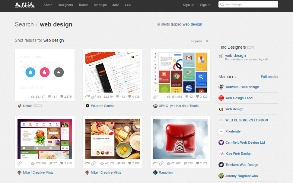
Above all else, have a clean, professional web theme. Consider buying a premium WordPress theme or get a professional designer from dribbble or UpWork to help you with a custom website theme specifically to your brand.
Remember that the rules of building trust are not set in stone but should be considered when you start a blog. While it’s important to be creative with your blog posts and your responsive design, it’s more important to understand your users. Nothing infuriates first-time visitors to a site more than unearned hype.
Instead, introduce yourself and your product better. Connect with users on a personal level. Educate, entertain, build a strong rapport and see the world from their perspective.
Once trust is established, you can then recommend your product/service to them.
6. No Author Biography
Since your blog posts shouldn’t be about you and your achievements, you need some other way to let users know who you are. Don’t hide your face. Transparency begins with personality.
If you want to connect deeply with your readers and prospects, start by adding an “About” page to your blog if you don’t already have one. Make sure that the copy uses storytelling to convey your personality, the way that the About page for Chris Garrett does.
Or, take Google – yes, Google also has an “about” page, which plays the same role. It highlights what Google believes in, along with the founders and the culture behind the search engine.
See more: How to Create the Perfect About Page You can also use the same copy for your social network sites.
7. Cluttered Pages and Not Enough White Space
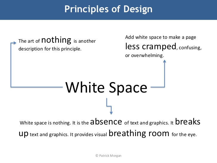
A research study conducted by Wichita State University found that white space in a design or publication furthers reading comprehension. Web design isn’t complete, without the proper use of white space or breathing room.
White space, also known as “negative space,” is an integral aesthetic tactic used in graphic design, illustrations, print, and web design and publications.
White space helps you to communicate ideas more clearly, thus leading to a great customer experience.
As a blog post writer, you should recognize that when users are looking for information, they’re very precise and usually know exactly what they want. If the page is cluttered, no matter how useful the information is, users will miss it.
Do you want readers’ attention on a particular area of your blog? According to StackExchange, white space can draw their focus exactly where you want it. White space also improves legibility and visual balance.
Big brands understand that white space can increase conversion rate. That’s why they’re now trending towards simple web designs that incorporate lots of white space.
Look at Apple’s homepage, where they showcase the new iPhone X:
When you clutter your pages with text, images, banners, and ads, you’re risking an increased bounce rate and a decreased conversion rate. Consequently, Google could penalize your site.
What’s more, a cluttered page with little or no white space could cause your page to load more slowly, thus risking lower search rankings.
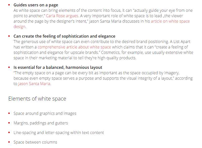
Here are some more important things that white space can do for your blog:
You already know the science behind user experience (UX design). Unfortunately, 97% of websites fail at UX design, says Hilary Little, a usability architect.
While most of these websites fail because they didn’t consider other areas of user experience – information architecture, visual design, functionality, typography and so on – white space is an important component of UX design.
If you’ve ever had a bad user experience while shopping online, you vividly understand why incorporating this aspect into your blog design is critical. According to Gears and Gifts, 72% of all lost customers are caused by three factors:
-
- Price of the product
- Poor integration
- Poor user experience
Bill Gates was right when he said that content is king. But, I’d add that attractive and responsive design is the crown.
Blog design, which is one aspect of web design, is critical to your success. Use white spaces to build trust momentum and bridge the gap between your content and the message behind it.
Derek Halpern, the founder of Social Triggers, made sure that there was plenty of white space in his recent blog re-design, to convey a message of possibility to his users.
I discovered that having lots of white space on my blog appeals to my readers and yields higher engagement rates (social shares, comments, links, brand mentions, loyalty, email subscribers and so on). White space or visual breathing room is a great blog design tip. In the modern world with so much on the internet and social network sites demanding our attention – white space gives customers room to relax and trust your product.
8. No Opt-In Email Box
Do you take email marketing seriously or is it just something you do, whenever you have time?
You may have heard that “the money is in the list,” but, what I believe, based on years of building and managing a sizable email list, is that “the money is in the relationship that you’ve built with your list.”
When your subscribers trust you, they’ll spend money on your product. But, just collecting email addresses will not make you money. You’ve got to do more.
If you don’t have an opt-in box or the box is not visible enough, it’s a clear warning sign that your blog design stinks. A hidden or poorly designed opt-in box means that you’ll convert fewer visitors into subscribers.
Ideally, your visitors should easily be able to locate the opt-in box in or near the header. A good example of this model is MindTools.com. Notice how clear their form is:
If you want to get more visitors to join your email list, you’ve got to get creative and write a persuasive call-to-action.
The CTA lies at the tipping point between when your customers bounce and when they decide to subscribe/buy your product. A persuasive CTA weights that decision in your favor, so make sure it’s the right one for you. The only way to know which CTA to use is by testing.
For example, instead of using “subscribe” on your call-to-action button, change the wording to something more specifically relevant to your list, such as “Get the free ebook,” or “watch free video here.”
A study by HubSpot revealed that “Click here” gets the highest percentage of clicks over “Go” and “Submit.” To verify that this holds true for you, make sure that you set up an A/B testing campaign.
Every element of your call-to-action counts. The wording, font style, color, button placement, size, and graphics are all fundamental factors for converting more visitors into email subscribers. Start by understanding the role that each element plays.
See also: Click Here: 11 Was to Improve Your Call-to-Action
The harsh reality is that if you’re not building an email list, you don’t really have a system that you can fall back on when the going gets tough – and that definitely happens, at some point, to every entrepreneur.
9. Using Too Many Colors
Most designs – graphics, illustrations or publications – use a healthy dose of color on their websites, blog posts and social networks.
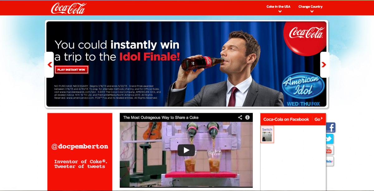
Take this example, from Coca-Cola. The design below uses red, light grey, and white in the background to offer better contrast and visibility.
In the book, The Secret Language of Colors, Joanne Eckstut expands on several questions about color that people struggle to answer. For example, why is the sky blue? How do you react when you see the color red, even when it’s not human blood?
Of course, you’ve got to stick to your brand. You probably already have specific colors that are prominent in your brand. For example, Coca-Cola uses its distinctive red in their designs, online and offline.
Likewise, when it comes to your own blog site and blog posts, you also have to stick with your brand and choose colors wisely as soon as you choose to start a blog. If your brand color is blue, your blog design should have a dose of blue in it. But, don’t let different colors overwhelm or disrupt the free flow of your message.
I recently wrote a lengthy article, entitled “The Psychology of Colors: How to Use Colors to Increase Conversion Rate.” That article explains what different colors mean and how they can increase your sales and email subscription rates when you use them strategically.
Baylor Cherry explained, in her article “5 Elements of a Modern Website Design,” that if your website is crowded, it’ll be difficult to direct your visitors to a particular section. All the more reason why you should have plenty of white space in your blog design.
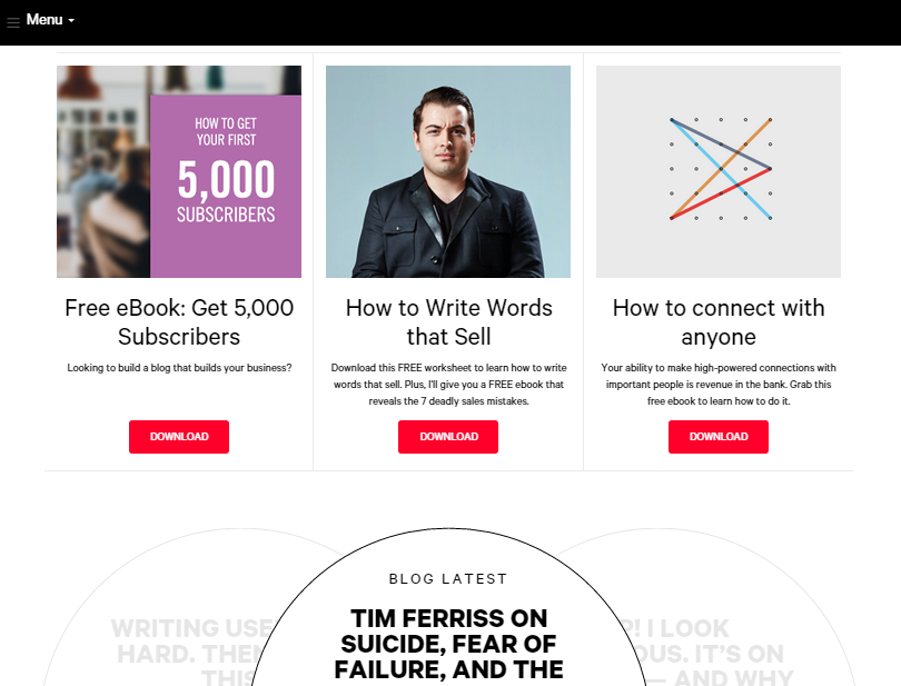
Several authority blogs use lots of white space, but, at the same time, use the right colors to engage their target audience. A typical example is the HubSpot blog:
Financeglobe.com uses blue for their blog header, with plenty of white space as well. I like how simple their design is:
More tips for using color in your blog post design:
- Use colors that will improve your brand.
- Design your blog with colors that will appeal to customers.
- Don’t use too many colors.
- If you’re going to place multiple colors around each other, they should be solid vs. light (e.g. red and white or blue and white) and not solid vs. solid (e.g. black vs red).
- Allow plenty of white space – it’s hard to have “too much white space” in a design
10. Poor Readability
We’ve talked about white space, having a prominent opt-in email box and choosing the right colors – those things are incredibly important. But, if optimizing those elements comes at the expense of readability and legibility, you’ll have a much bigger problem on your hands when you start a blog.
Does your blog’s responsive design, colors, and layout aid readability? Are your words legible? Do your readers struggle to read your copy?
The web is primarily powered by content and the majority of that content is in written text. To that end, some bloggers turn to readability testing tools – but that might not be enough.
Bottom line: You should design for readability, not for aesthetics.
This means that you have to account for the majority of users who simply scan and skim your copy, by making it easier for them to extract relevant and striking points. You can do this by using larger fonts on subheadings and creating bulleted or numbered lists, where appropriate.
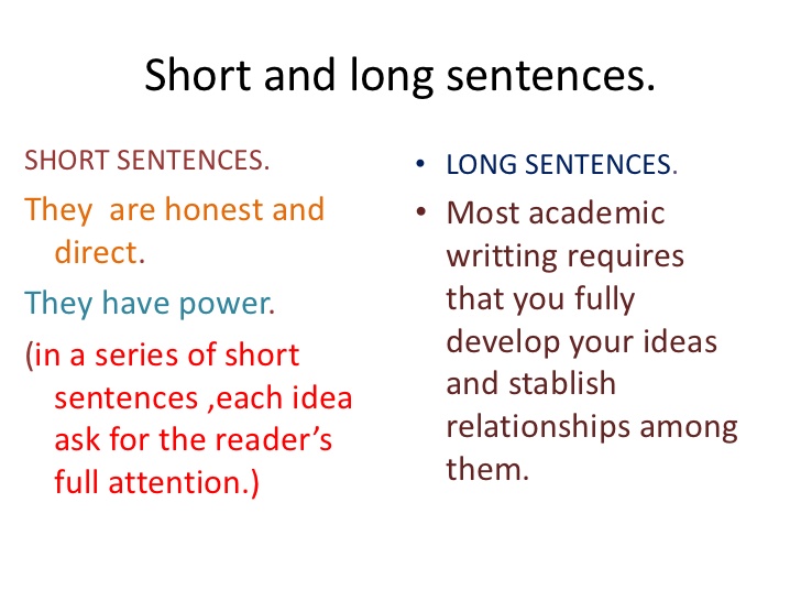
As you write your articles, use short sentences and don’t try to cram too many words and phrases into a single paragraph. Sentence length and paragraph size both significantly impact readability:
Professor Eliécer Díaz says you should use short sentences because they’re honest and have power. The same is true for headlines, which should be about 50-60 characters in length, ideally.
In the same manner, keep your paragraphs short and free of jargon. Remember, your goal as a blogger is to solve problems in a simple, easy to understand manner.
11. Blog Design Not Mobile-Friendly
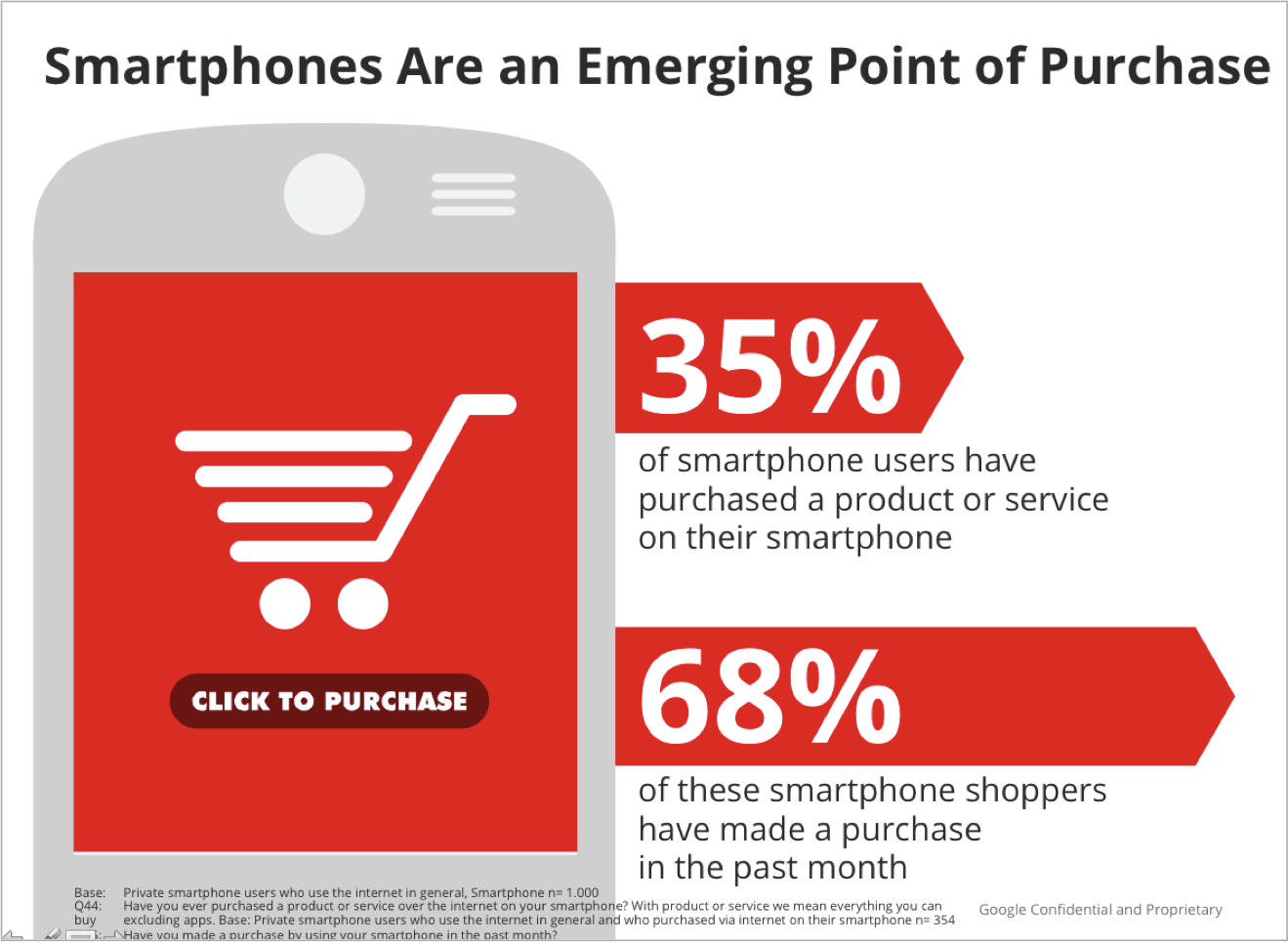
Mobile usage is on the rise. A full 4 out of 5 consumers use their smartphone to shop online. These statistics should be important to you, whether you’re a B2B or B2C content marketer.
Marketers are embracing mobile marketing because it’s more than just a trend. When it comes to blogging and internet marketing as a whole, you’ve got to ensure that your blog design is responsive – that is, mobile-friendly.
The good news about mobile targeting is that users can find and read your content, subscribe to your list, share your content with others via the social networks, and buy your product, no matter where they are and all from their handheld mobile devices.
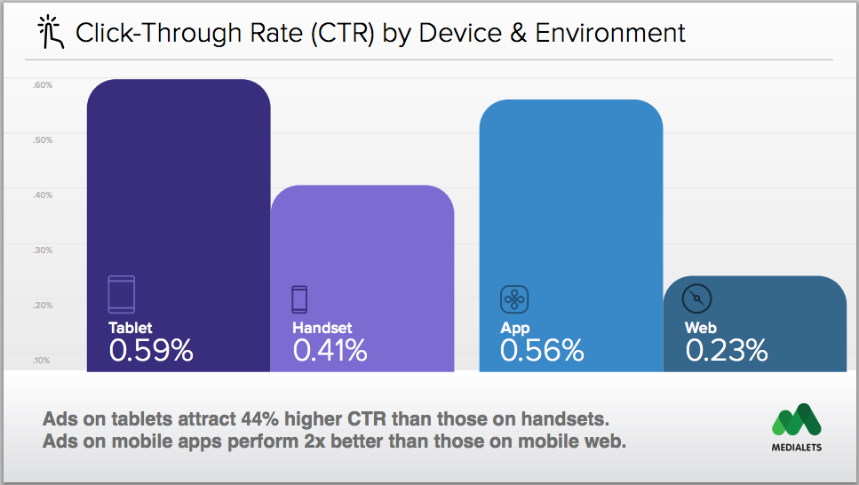
With a responsive blog design, you’ll see a higher click-through rate on your mobile campaigns than on desktop PCs. This is why it’s critical to ensure that your blog design is responsive.
If that wasn’t enough to persuade you, this might be: Google now uses mobile-friendliness as a ranking factor. This means that if your blog design is not mobile-friendly, you could watch your search engine rankings and traffic plummet.
Check for responsiveness, by heading over to Google’s mobile-friendly test tool. Simply plug your site URL and click “analyze.”
Many current premium WordPress themes are designed to display well on mobile devices. If your theme isn’t, you can install the WPTouch WordPress plugin, to instantly optimize your site for smartphones, tablets and handheld devices.
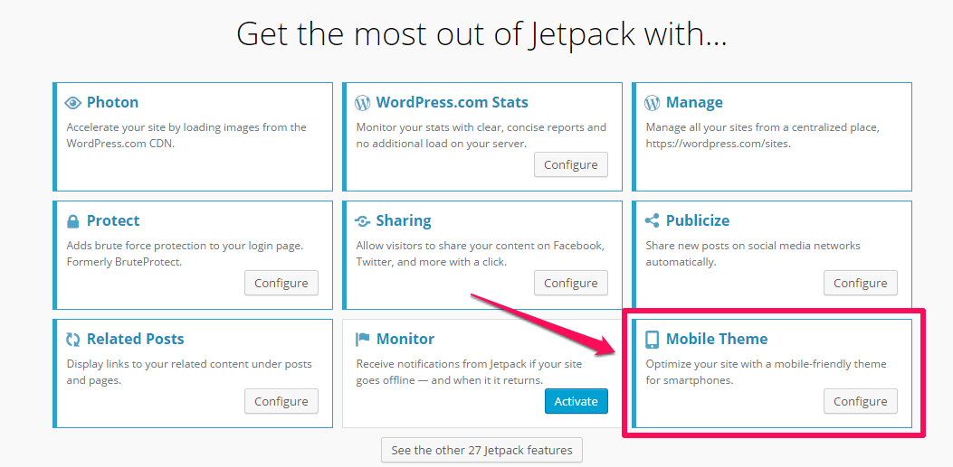
Alternatively, you can use the JetPack WordPress plugin, which has capabilities for mobile responsiveness. Just activate the “mobile theme” for your blog and your blog design will instantly become responsive. I currently use it on one of my blogs – it works.
O’ Neill Clothing also experienced impressive results, after making their site mobile-friendly. The company’s revenue increased by 591.42% for Android devices and conversions increased by 65% for iPhone/iPod targeting.
12. Bad Navigation
Good navigation is the lifeblood of a great website. Yes, white space and legibility are core elements as well, but users must be able to navigate your site easily.
In practice, however, it’s not always easy to organize and display information in the right way for users, because different users have their own preferences.
The first navigation mistake that people make is having too many menu items. This can be daunting, especially to a first-time visitor.
The best approach is to limit the items on your navigation bar. I recommend five main items, while Quick Media Studio says seven. There is really no set rule, but whether your items appear in the site header or the sidebar, don’t clutter the area.
The only caveat is that if you do use more navigation items, make sure that they all stand out. Additionally, make sure that there’s a strong contrast between the menu bar background color and the items themselves.
Make sure that your menu items are optimized for search engines. If you’re a graphic designer, having a menu item that says “services” would do you no good, because your customers aren’t searching for “services.” Make your navigation items descriptive.
Instead, you should take advantage of keywords that your customers are using to search for you – e.g., graphics designer, graphics packages, graphic services, hire a graphic designer, etc.
EntheosWeb.com is a great example of a site with descriptive menu items. They used Joomla templates, WordPress templates, landing page templates, and ecommerce templates because people are searching with those keywords.
I see a lot of blogs with menu items labeled “what we do,” “who we are,” “our latest jobs” and so on.
As far as search engines are concerned, this is almost meaningless. No customer or potential buyer comes to a search engine and types in “what we do.” So, those labels don’t help users and aren’t search-friendly.
Make sure that your navigation menu doesn’t slow down your blog. If you use buttons, they must be optimized and compressed. The better approach is to have your text on top of a solid background color.
13. Using a Free Domain Name
Many people start off with Blogger.com or WordPress.com – two popular free hosted blog platforms. I believe that this is the deadliest mistake that a beginning blogger can make.
Sure, you save the money that it would cost to register a domain name and get a reliable web hosting solution, but it’ll cost you much more, down the line.
Imagine waking up one morning, plugging your blog URL into your browser and seeing this:
You then realize that you wasted precious time and creativity to start a blog and build something that you didn’t even own.
I may sound harsh here, but, in my opinion, if you are serious about your business, you simply must register your own domain name and get reliable web hosting. It will give you peace of mind, as you run your online business.
That’s the only way to have total control over what happens to your content and your site.
Of course, when you start using self-hosted WordPress, you’re still not in control, 100% of the time, but the risk of losing your blog is greatly minimized. And, you can access free WordPress plugins and tools to help secure your blog from hackers.
The worst that may happen, when your web host doesn’t live up to expectations, is that you’ll transfer your files and database to another hosting company’s server.
Yes, WordPress.com is free, but WordPress.org is the right choice for business people who want to build a long-term and successful online business.
Conclusion
Great blog design is the product of creativity, plus logical thinking. It’s how you bring your ideas to the world and make them want to pay attention. Nothing inspires blog visitors more than a site that leads them seamlessly from point A to point B while solving their problems.
Whether you’re a part-time content marketer or you’re into this full-time, there is no exception. Blog design is the crown of your content.
You may not be a professional website designer. But, since your goal is to attract an audience, you either have to learn some basic web design skills or work closely with a professional website designer to build a platform that will help you accomplish that goal.
Remember that action beats perfection. Don’t wait until your blog design is perfect because it probably never will be. After redesigning my blog, I found something I wanted to add that my designer hadn’t included. Should I have waited for him to fix it or just moved on with my business? I moved on.
Remember that colors matter in blog design. Typography is equally important. But, content is the only element that will inspire, entertain, educate and help you build a loyal blog audience.
Which of these warning signs have you noticed on your blog design?

















Comments (72)