Running your first Facebook Ad campaign isn’t very tricky.
No, the tricky part is running several of them at the same time.
The best Facebook Ad ROI kicks in when your campaigns work together.
So some ads will drive attention. Others will generate leads.
But that creates a problem.
The image that works well for one ad might not work for another.
The same happens for the offer you’re using.
This issue then trickles down to the ad placements you select and the copy you write.
Your high-ROI ad creative on one campaign might totally fail on another.
But where should you start?
Pause your campaigns right now. Yes, you heard me.
Read these four unstoppable Facebook ad creative tips before you go any further.
Then go back and fix your campaigns. It’ll be worth it when you see the new results pour in.
1. Get started by selecting a recognizable, credible image
People don’t read today.
So even though your ad copy might be brilliant, the very the first thing your target customers look at is the image.
There’s a good reason why.
It only takes 13 milliseconds for our brains to process images. We can understand every little nuance in fractions of a second.
For this reason, Facebook instituted a hard 20% rule.
When you created a new ad years ago, Facebook would have rejected it if you covered 20% or more with text.
Thankfully, Facebook has loosened the leash a little bit.
However, the same result remains. The more text on an image, the less effective it becomes.
So here are a few other tricks you can try to avoid text-heavy images.
Tip #1. Piggyback off of other popular brands.
Adding text to your images is like cheating. You’re able to add extra context or use attention-grabbing words.
That helps people better understand your images even if the images are weak.
It’s much more difficult, in comparison, to use images with zero words because the image has to do all the talking for you.
An excellent way to sidestep this problem is to use an image that’s already instantly recognizable.
The image below features a new OnePlus phone. Except it’s technically not from Samsung at all.
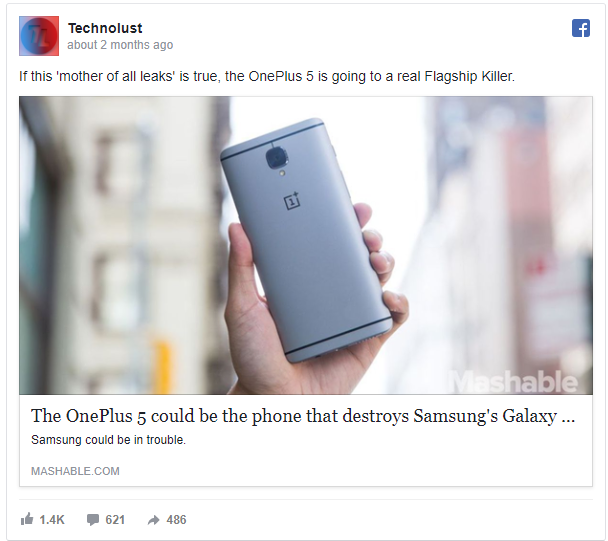
Instead, this is an example of how you can piggyback on someone else’s brand that’s already more established and widely known.
That gives your ads extra credibility. But more importantly, it makes them instantly recognizable by a much wider audience.
Think about it for a second.
How many people already know who you are?
Even if your brand has been around for awhile, it’s probably a tiny number compared to the brand recognition of a behemoth like Samsung.
Here’s another similar example from Apple.
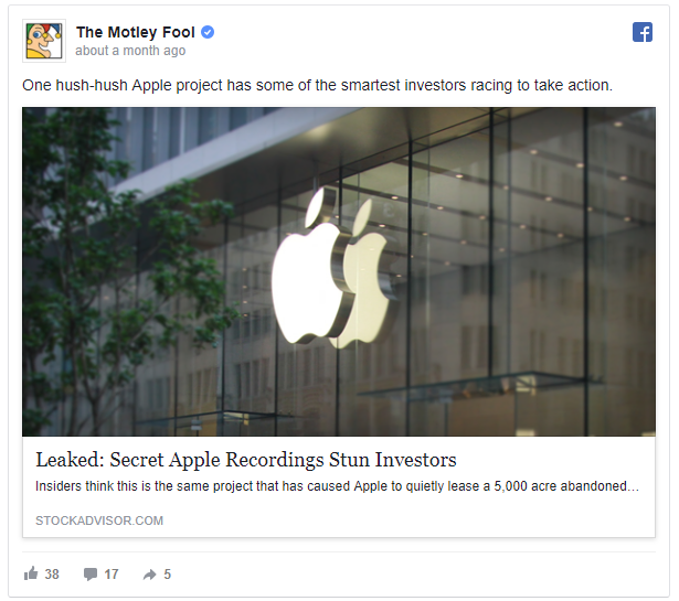
No, wait! It’s actually from The Motley Fool.
But everyone on the planet knows that logo and all-glass retail storefront.
The Motley Fool follows the image up with a strong headline and copy.
However, it’s the image that immediately grabs your attention in the beginning.
The next best image type to use besides a recognizable brand is real images or photos. Here’s why.
Tip #2. Always try to use real images instead of stock photos.
Visual Website Optimizer ran a test to see which type of images had the greatest impact on conversions.
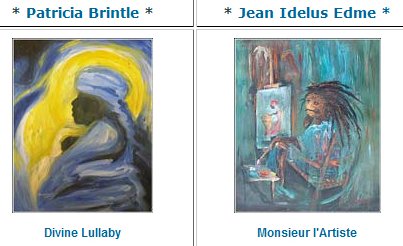
One case study showed an artist’s work under his or her name. That makes perfect sense if you think about it.
If you’re in the market to buy new art, you’ll probably want to see what each artist’s work looks like!
Here’s an example:
Next up, they tested the difference between showing the artist’s paintings and showing the artist themselves.
So here are the same two artists, but this time with their actual faces.
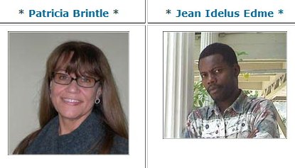
Incredibly, the click-through rate lifted from 8.8% to over 17.2% when showing the artist’s faces. That’s a 95% improvement!
What’s the lesson here?
Ditch the stock photos in favor of real images if possible.
The problem is that stock images often lack any emotion. People see them but don’t feel the same connection as they do with something more realistic.
Don’t believe me?
Take a look at the stock image in the next example.
It’s not bad by any stretch. But it’s tough to feel any emotion for it.
Especially considering the reasons people are on Facebook in the first place.
Check out this example from Virgin America below:
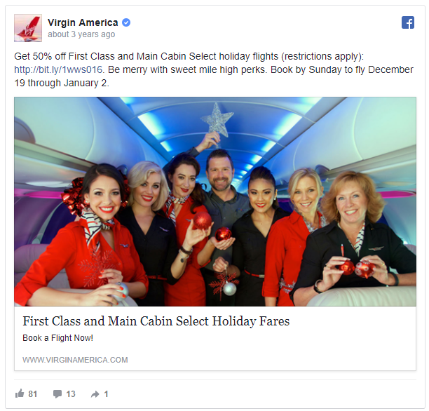
Obviously, those might not be real flight attendants in the Virgin America example. They might be paid models for all I know.
However, it still feels more realistic.
Now, consider the greater context of where these posts are going.
People are going on Facebook to see what their family and friends are up to. In other words, they’re wanting to interact with real people.
That means this Virgin America example is a perfect fit alongside the other content they’re scanning.
2. Give the right people the right offer at the right time
What conversion test has the biggest impact on results?
Is it a red button vs. a green one? Or is it a negative headline vs. a positive one?
The true answer is neither.
Instead, the biggest impact on conversions is your audience and offer fit.
What does that mean?
Your Facebook sales funnel can be broken down into three groups of people:
- Top of the funnel: These people don’t even know who you are or why they need your widget.
- Middle of the funnel: These people are now brand-aware and looking for help from different options.
- Bottom of the funnel: These people are ready to talk about how you can specifically help them and what it’s going to cost.
The trick with Facebook ads now is to make sure each of those three groups gets their own offer. Here’s what I mean.
- Your goal with the first group is to get people to see, click on, and read your interesting content.
- Next, you can send e-books to hack your lead generation and get new email addresses.
- Last, but not least, you can send product offers to purchase or tripwire alternatives.
Does that make sense now?
Let’s start at the very top.
You want to get people to know who you are and what you do. However, nobody is interested in your products or services just yet.
Think about it from their point of view.
Some people might not even realize cargo shorts aren’t cool anymore. That’s OK! But you’re not going to get them to buy your new pair until they do.
That was a dumb example, but you get the point.
Instead, you should lead off with some interesting content to catch their attention.
You can talk about “XX Dad Trends that Make You Look Dorky” or something similar.
For example, let’s say you want to target marketers.
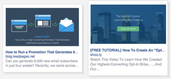
Most are already overwhelmed with staying on top of every channel and tactic today. So while infographics might increase their results, they don’t have the time or energy to create more of them from scratch.
That’s why this HubSpot example is a perfect fit.
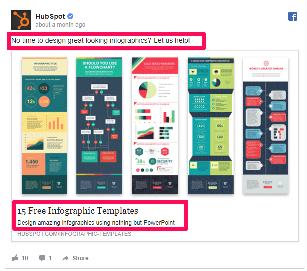
Infographics also require a designer or expensive software.
The fact that they’ve already ‘done the work for you’ makes this incredibly valuable.
The next step is to promote a new offer to the people who just checked out your initial content piece.
For example, start using custom audiences to track both people who engage with your page and those who visit your website.
Let’s say someone just read a blog post about converting traffic.
Your next ad offer can now ask for their email address in exchange for more insight into better-converting traffic. And don’t forget about highlighting real people!
Do you see how powerful that can be now? It’s like you’re reading their minds.
Now that you’ve got the basics down, let’s get a little more advanced.
Let’s say you’ve had custom audiences running in the background to track everyone who clicks on your Facebook page posts.
You can further refine these groups by their demographics to send them even better offers.
For example, segment out all those living within a few miles from a specific location and send them ads for an upcoming event.
Here’s a HubSpot example I saw that’s focusing on an event in Amsterdam.
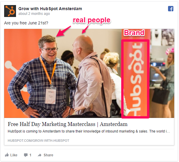
People outside of Amsterdam wouldn’t care about this ad. It would be completely irrelevant.
So they would ignore it. And even start ignoring you if this trend kept happening.
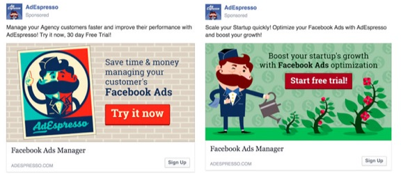
You might also have different types of customers on these lists.
For example, both startups and agencies might buy from you.
In that case, each one might be interested in a slightly different benefit.
Agencies are probably more worried about handling multiple clients. But startups are probably more interested in getting customers faster.
AdEspresso expertly switches the messaging to focus on each benefit for the right audience.
Obviously, this extra effort takes some time and nuance to get right.
Start with narrowing down your audiences first. Then create better offers for each one.
Do those two things, and it almost doesn’t matter how amazing your headline is or isn’t.
Here are a few more advanced tips when you’re ready to dive deep.
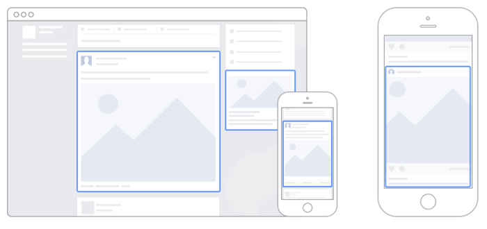
3. Put the right ad in the right place every time
Facebook has three major ad placements:
- Desktop news feed
- Right-hand column
- Mobile news feed
Why does that matter?
Each one offers different pros and cons.
And if you use the wrong placement at the wrong time, you’ll sabotage your results.
Here’s a quick rundown on when to use each to keep your costs from driving through the roof.
Tip #1. Use mobile ads for driving new awareness.
More people are browsing the Internet on mobile devices than desktop computers.
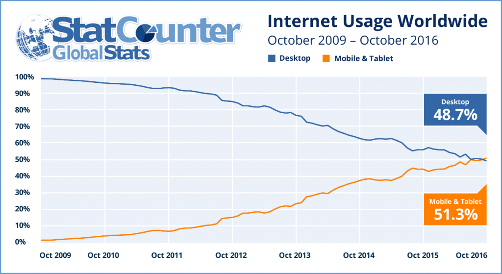
More people are also searching for stuff on their mobile devices, too.
The problem is that mobile conversions still lag behind desktop. Most people would rather buy on their computer than on a tiny phone screen.
Use Facebook’s mobile news feed to generate new attention at the top of your funnel. Send these people content so all they have to do is click.
Don’t waste your money on sending them product ads because they likely won’t go through a checkout process on their phone.
Tip #2. Now use the right column placement to follow-up.
The right-column placement on your desktop is small. There’s no way around that fact.
Many advertisers ignore it for that reason.
However, I’d argue that you can see awesome results from right-column placement ads.
But that’s only if you’re retargeting people who already recognize your brand.
So they’re great for people who’ve already visited your website and recognize your logo out of the corners of their eyes.
There is one problem to watch out for, though.
Make sure you’re creating ads specifically for that small space.
A common problem that pops up when using your desktop news feed ad, for example, is that it will be squished and distorted.
That brings us to the final spot.
Tip #3. Drive conversions with desktop news feed ads.
Your desktop news feed ads tend to be the most popular ad placement option.
That’s a problem because it means they can also be more expensive.
Use this ad placement for where it’s worth the extra cost. It’s most effective when you’re ready to start driving conversions!
Facebook’s advertising platform can be difficult to figure out. But stick to some of these simple guidelines to limit your decisions.
You should also see a better ROI as a result.
4. Now it’s time to write the perfect ad
Remember that old 20% rule I talked about earlier?
That applied specifically to images.
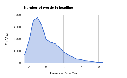
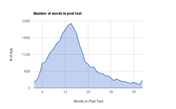
Data has shown that you should also limit words around the image.
For example, one study showed that the ideal headline length on a Facebook ad is only five words.
The trick is to keep things simple. Focus the headline on the ultimate value your prospect will derive from your offer.
Take a look at this Kissmetrics ad.
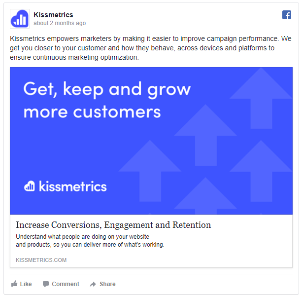
Pretty simple, right?
Remember all of the steps you’ve already accomplished. The image, offer, audience match, and ad placement will make the biggest difference.
That’s why the headline can just re-iterate the primary benefit someone is going to receive.
The same study also showed that your ad post text around the headline should be kept between 14 and 18 words in length.
Here’s a perfect example from Car Next Door that nails the description length.
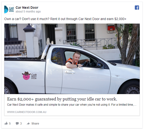
Once again, simple and straightforward works best.
Especially when you can combine a strong benefit with the actual dollar amount someone will get.
If you don’t have a dollar amount, the next best thing can be a list post.
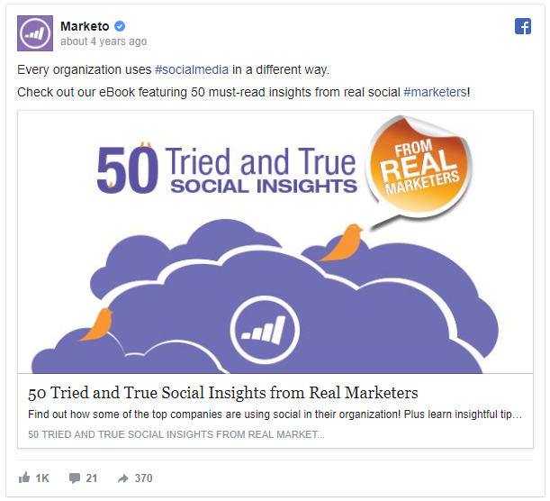
Lists are ranked as the most popular headline style. They give people a step-by-step shortcut that simplifies their lives.
The Marketo example does that in two ways. It uses a big list number, which attracts attention.
It pairs that big number with the phrase “tried-and-true.” That last phrase implies that there won’t be any guesswork on the consumer’s part.
The ‘cliffhanger’ headline is an effective Buzzfeed favorite. It teases you with a tiny bit of information.
But it pulls back before revealing everything. You then have no choice but to click.
Here’s a perfect example of an irresistible social media headline.

Start a cliffhanger headline with, “This Is,” and you can almost never go wrong.
That’s why “This is Your Brain on Drugs” was one of the most popular ad campaigns of all time.
It used vivid language, implying a cause and effect, to create an impulse that stole your attention from the get-go.
Last but not least, Slack brings everything together.
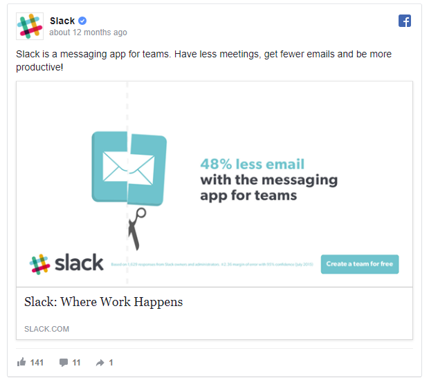
The headline and copy are extremely simple. There’s barely any text in this ad!
The description is also straight to the point. Everyone wants less email.
Even though they use text in the image, the stat immediately conveys the main benefit consumers can get by using their service.
And the scissors cutting an email icon is a perfect way to illustrate what they do.
Then they follow it up with a free trial.
Your offer is going to have the biggest influence on conversions.
Slack’s value proposition is strong. But teaming it with a free offer makes it too good to be true.
There’s no reason not to try Slack now.
See? It’s not just a clever headline or an amazing image.
It’s everything. You need all of these ingredients to work together.
But when they do, it’s magical (for your bottom line).
Conclusion
There’s more money spent on Facebook ads than any other social platform.
There’s a good reason for that.
It’s because they offer you the most sophisticated DIY tools to reach customers.
However, with that power comes great responsibility.
And with that responsibility comes complexity.
There are so many different types of ads, placements, and options that it quickly becomes overwhelming.
Where should you get started? How should you put it all together?
My advice is always to keep it simple.
Start with a compelling image that’s instantly recognizable. Make sure you’re sending the right offers to the right people.
Choose the best ad placement for your objective. And then follow it all up with simple, effective copy.
What Facebook ad creative have you seen work best, and why did it perform so well?
Comments (2)