Have you ever had a mind blowing “wow” moment about yourself?
I’m talking about that moment when you realize something that you hadn’t thought about ever before.
For me, that moment came recently when I thought about how many ads I’ve seen.
I wanted to write an article on how to boost conversions with ads, and it got me thinking. I knew I’d seen quite a few ads in my time, but I wanted to know just how many.
I’ve been in marketing for about ten years now.
I started to wonder how many ads I’ve seen over that time.
I researched it and found out that the marketing firm Yankelovich says we see as many as 5,000 ads per day.
And since I’ve done almost nothing but marketing every day for these last ten years, it’s safe to assume I’ve seen at least that many on a daily basis (if not more).
So let’s do the math.
Ten years is 3,650 days. Multiply that by 5,000 ads per day, and you get an unbelievable number:
18,250,000.
My jaw dropped when I realized that.
I’ve seen over 18 million ads in the last decade.
In all that time, I’ve learned a lot, especially about conversions.
And that’s what I want to talk about today. I’m going to distil everything I’ve learned from those 18 million ads and break it down into bite-sized, actionable tips for you.
To make things as relevant as possible, I’m going to address display ads specifically. Display ads are among the most popular and widely used digital advertising methods today.
1. Be interesting
I know this sounds like a generic tip, but hear me out.
So many ads are just plain boring. They’re not exciting.
Would you respond to an ad like this?
I’m not convinced that it’s truly captivating.
That’s why my first tip is to be interesting.
Look, most ads just aren’t interesting, creative, or effective.
Google itself released an article in 2015 with this wait-what-was-that-again title: “Banner Ads Can Be Creative and Effective.”
The assumption is that banner ads and display ads in general are boring! “Banner ads can be creative,” because they normally aren’t.
Here’s how Google’s Bob Arnold explained the issue:
So, why [do banner ads have such a] bad rap? As with any marketing campaign, the success of a banner campaign comes down to creative quality. The best banner ads are eye-catching.
That’s why any conversion-boosting banner ads needs to be, first and foremost, interesting.
Take a unique angle and use compelling ad copy. Create an ad that’s worth responding to.
2. A/B test your ads
I know, this also sounds like basic information.
But you wouldn’t believe how many people don’t do this.
Split testing can literally mean the difference between success and failure.
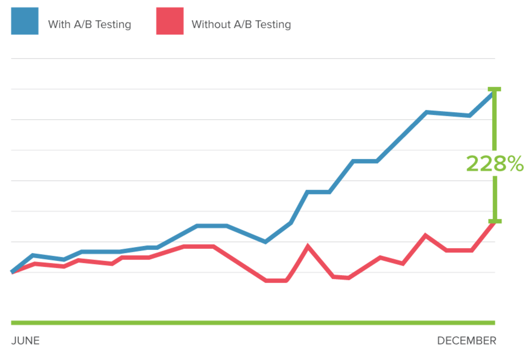
Take a look at one study from Optimizely.
Conducting some simple A/B tests produced a 228% conversion rate over not testing.
And what’s the most important place to introduce split testing? In your display ads.
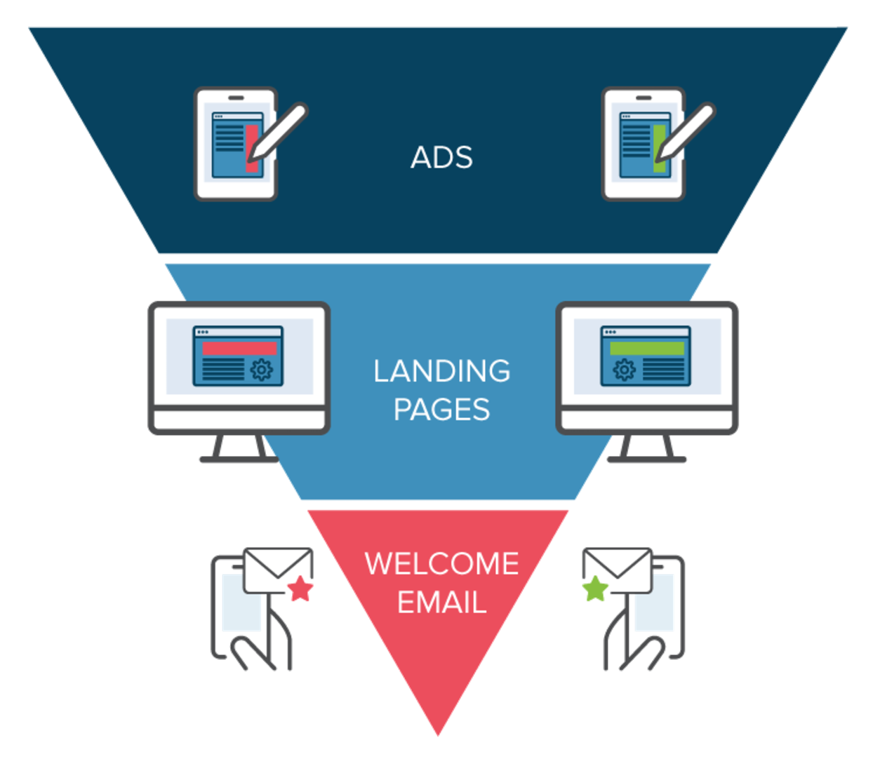
Since display ads are at the top of the funnel, they have the greatest likelihood of boosting conversion rates across the marketing campaign.
So don’t wait any longer to properly A/B test your ads.
3. Strategically track your metrics
When you think of tracking metrics for ads, you probably think sales, right?
That’s a good place to start. But sometimes you should track other metrics (like email signups or site visits) in addition to sales.
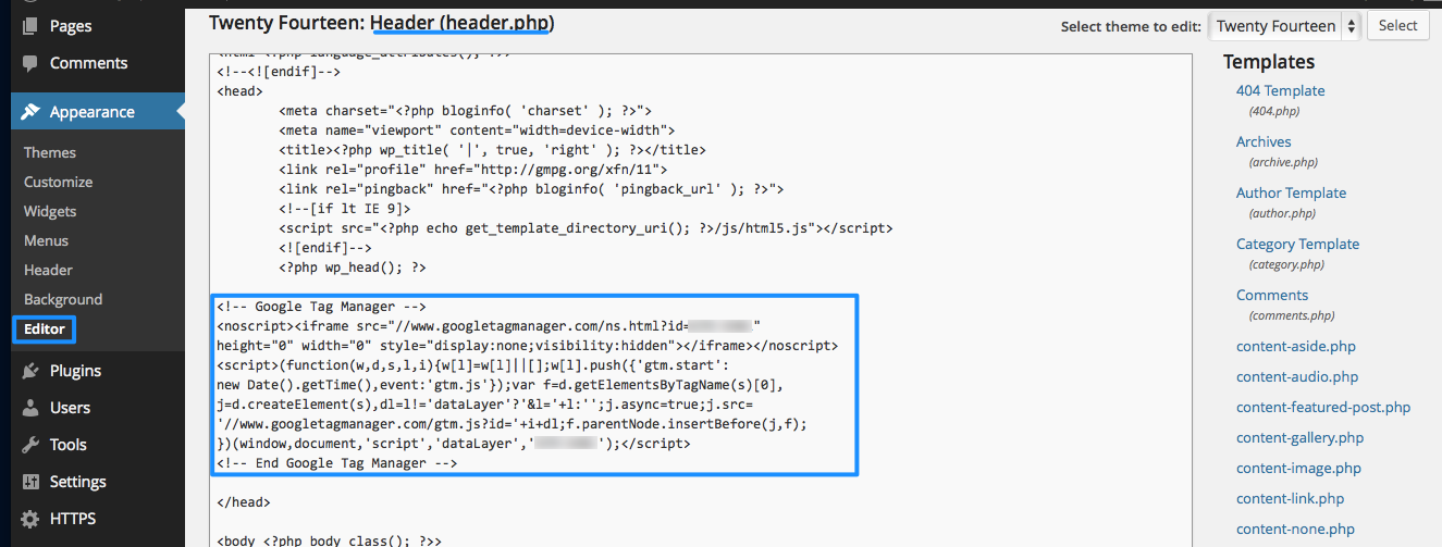
Google Tag Manager is one of the best methods of tracking multiple metrics.
4.Start at the end
Most marketers start the ad creation process with the ad itself or maybe a landing page.
But that’s the wrong way to go about it.
The smartest way is to reverse engineer the customer journey.
Think about the end result you want, then work backward from that. Choose your keywords and copy based on that result.
5. Make your ad copy consistent
If your ad copy is all over the place, your users will be confused.
It’s best to paint a clear picture that uses consistent wording and ideas.
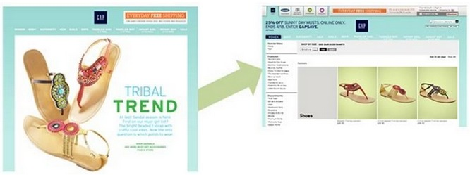
Check out how Gap does it:
The ad primes users for the page and the page delivers on the promise of a sale the ad made.
I’ll touch on visual consistency in point 28.
Consistency like this is super important. Your copy should sound similar (but not boring) throughout the customer’s journey.
6. Experiment with keyword match types
This is a simple and quick tip that will help you get more conversions.
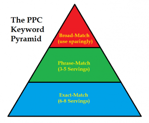
If you’re only using one keyword match type, you’re only casting your rod in one part of the sea. But if you use a huge net, you’re bound to catch a lot more.
Broader keywords are ideal for reaching more people:
More specific keywords have a higher clickthrough rate:
Both have a place in your strategies, so know when to use each type.
7. Use close variants
Since we’re discussing keyword match types, I want to especially recommend taking a look at close variants.
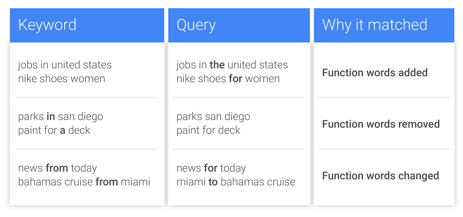
Close variants are variations of your focus keyword that are similar to the keyword, but they’re not exactly the keyword.
These can come in handy, especially if your keyword has natural variation (think “mens” vs. “men’s”).
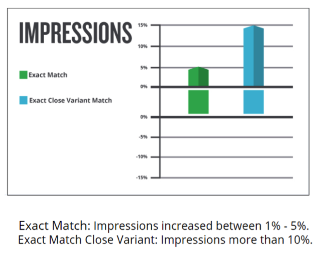
And it’s not just that they’re “handy.” Close variants also increase impressions.
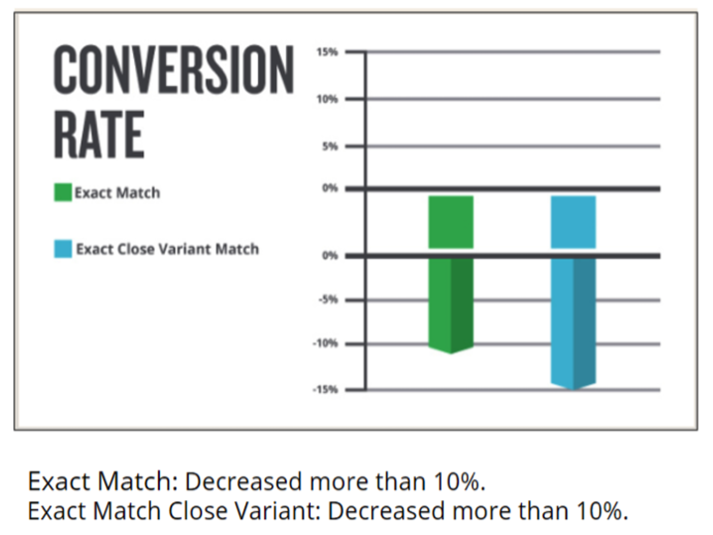
Be careful, though. Some studies show that conversion rates can decrease when using close variants.
Why would the conversion rate drop? Possibly because variant queries aren’t as relevant as the exact match.
But who knows? Conversion drops aren’t necessarily going to happen with your campaign. There are tons of variations that can affect whether or not your conversion rates rise or fall.
My suggestion? Test close variants, measure their performance, and determine what is best for your brand.
8. Use negative keywords
If you want to run a killer ad campaign, you need to think about the little things that other people don’t think about.
For example, negative keywords. These help you refine your campaigns by omitting certain keywords.
Here’s a scenario in which negative keywords would be useful:
Essentially, negative keywords ensure that only people interested in your exact type of product will find your ads.
This will not only increase your conversions but also keep your spending budget to a minimum.
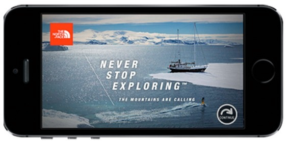
9. Make your ads mobile friendly
You’d think that with all the mobile devices in use, more marketers would focus on mobile. But many don’t for whatever reason.
Optimizing your ads for mobile devices will make a world of difference.
It’s an easy step to take, and it’ll get you way more clicks and conversions.
10. Segment, segment, segment
The more you segment, the more you’ll be able to specifically target micro audiences within our audience. That often results in much better conversion rates.
Segmentation often scares marketers away, because it sounds like a lot of complicated work.
It doesn’t have to be.
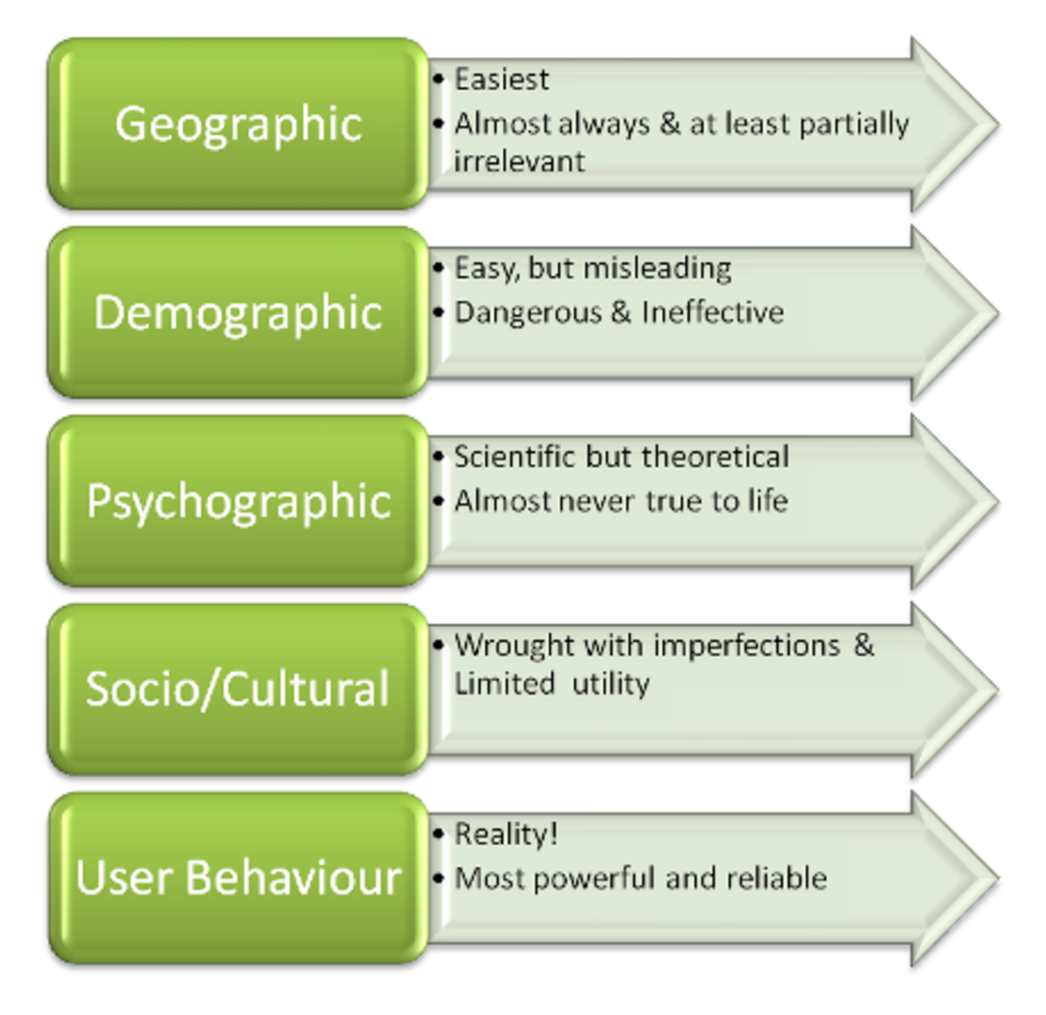
You can start with a few basic segments, such as segmenting your audience according to geography. Simple, right?
The more you segment, the more powerful you realize segmentation can be.
11. Consider adding prices
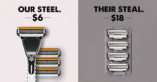
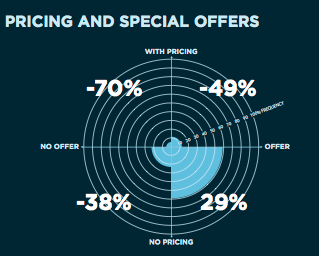
This tip comes straight from Google. If part of your business model is based on an appealing price, consider including your price right in your ad.
Take a look at how Dollar Shave Club uses this approach:
It’s not right for every business, but if you take pride in your pricing, give it a shot.
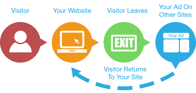
12. Use remarketing
When you remarket, you show the same ads to users more than once. You might think this is redundant, but it’s proven to raise conversion rates.
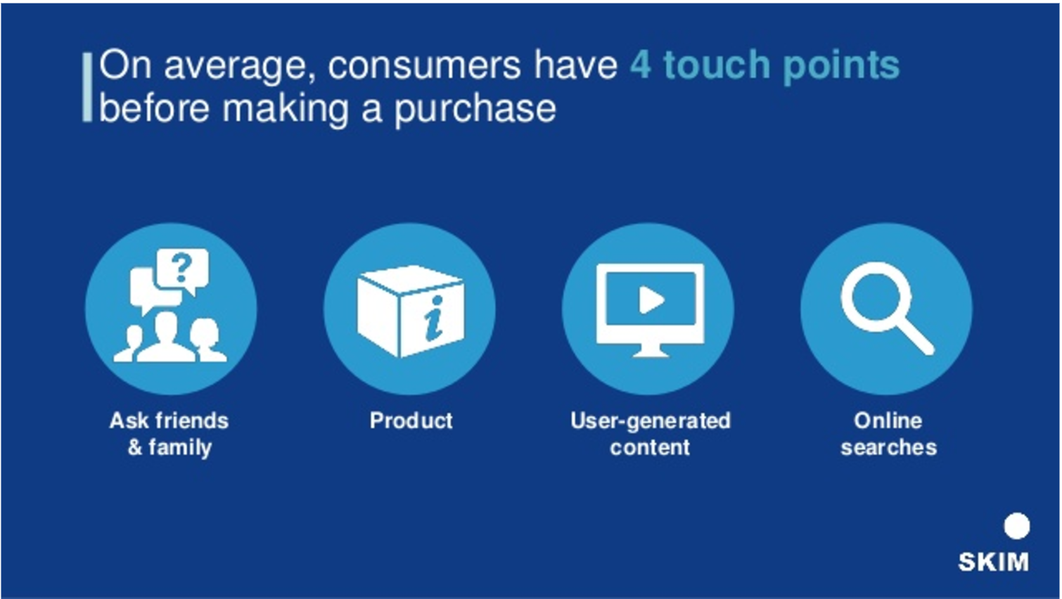
According to research, consumers need to experience at least 4 touch points with a brand before making a purchase.
In other words, by not retargeting you’re letting potential customers slip through your grasp.
13. Meet ad standards
Starting in 2018, Google Chrome will block ads that don’t meet its standards.
This is part of a larger trend that the Coalition for Better Ads is setting forth to make the web a better place.
Your best bet is to familiarize yourself with those standards and watch out for any changes.
No one’s going to be shutting down your ads if you don’t abide by them, but it’s likely going to be a best practice in the near future.
14. Mention a benefit and make it big (literally)
You need a big benefit to make your ad stand out.
And by big, I mean literally big.
I’m talking about font size. You want the main benefit to take up a good amount of space (but not too much). In other words, it should be the visual center of the ad.
Here’s a great example of banner ads from Amazon:
There’s no mistaking what Amazon Prime Video will do for you. It’s as clear as glass.
If your users don’t understand what benefits you’re bringing to the table, they likely won’t convert.
Spell it out in plain language for your audience. Spend some time asking yourself, “Could this be misunderstood?” If so, spend a little more time working on it.
15. Make your color scheme intentional
I know this isn’t a graphic design blog, but I have to mention how color seriously affects the buying process.
In fact, 85 percent of customers base their purchasing decisions on color.
It sounds crazy, but it’s true.
That’s because we have certain psychological associations with color. For example, green is the color of money in many cultures.
Color associations vary across cultures, but if you understand what certain colors mean to your audience, you can use them to boost your conversions.
Familiarize yourself with some of these common color associations and use them strategically.
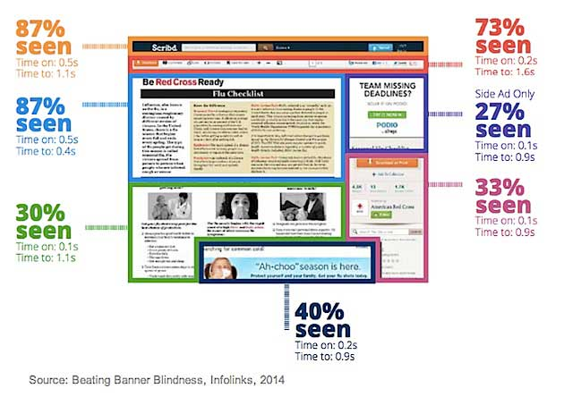
16. Experiment with placement
Did you know that users pay less attention to content that’s on the far right side of a website?
Changing up your ad placement may give you a surprising spike in conversions.
Try the top of the page first, above the fold. That’s where a user focuses the most.
17. Make your Unique Value Proposition crystal clear
You only have seconds––maybe even milliseconds––to persuade someone to click on your ad.
If you want to have a fighting chance, you need to create an irresistible Unique Value Proposition (UVP).
Your UVP is your central benefit.
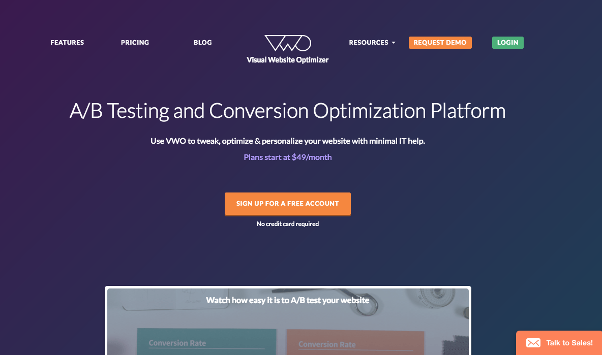
For example, Visual Website Optimizer’s UVP is easy to spot in the above the fold space:
Aim for clarity. You want zero confusion, and you need to make it exciting.
18. Examine your calls-to-action
You probably know that calls-to-action (CTAs) are important. How often do you see boring “Buy Now” CTAs?
Instead, opt for a unique phrase that matches your brand.
This DeBeers ad features the phrase “Discover Your Bridal Style,” which is a perfect extension of their brand:
19. Color your CTA
Remember earlier when I said you need to focus on color? That goes for CTAs too.
While there’s no single best color for CTAs, you want to make sure it stands out in your ad.
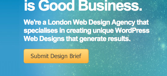
Check out how this ad places a vibrant yellow CTA against a blue/green background:
Complementary colors (like red and green) and triadic colors (like red, yellow, and blue) work well for creating contrast.
20. Optimize your onsite ads
Almost every ad manager and marketer focuses on the ads that are on other sites, and they ignore their own onsite ads.
But experts almost unanimously say that it costs anywhere from 4 to 10 times as much to gain a new customer than to keep an existing one.
You may have heard that before: Customer retention is cheaper than customer acquisition.
So focus on using all of these tips on ads on your site too. Don’t ignore your already loyal fans.
21. Take typography into account
The typography you use can build trust, but it can also create distrust.
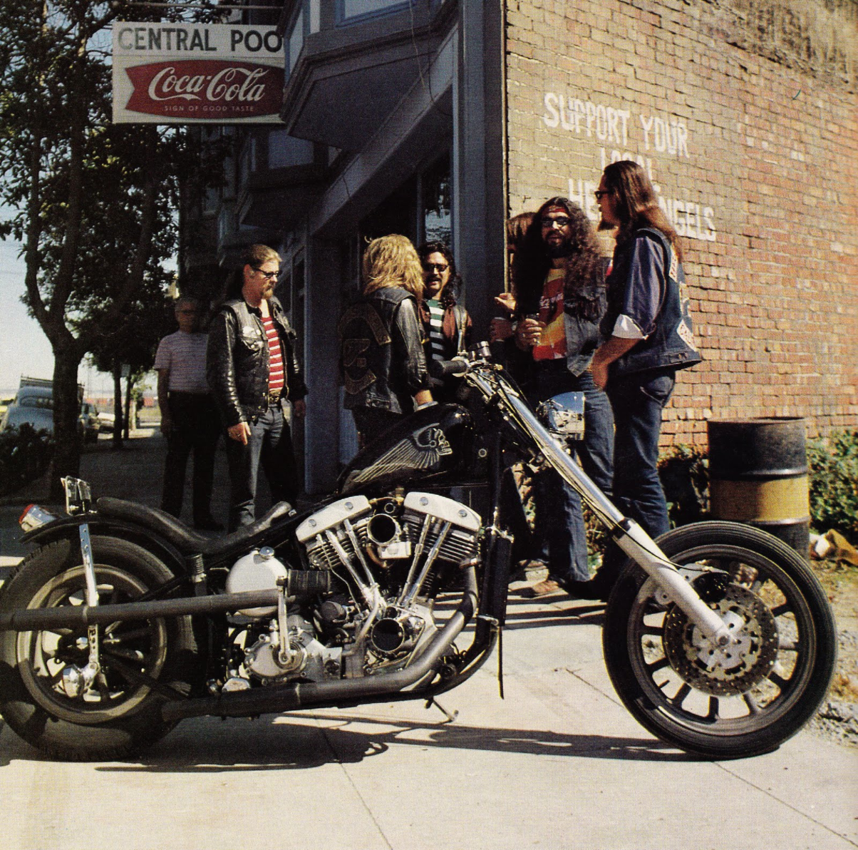
For example, take a look at this:
Is the above font relevant to a Harley riding club?
I’m not seeing it.
Font matters.
The New York Times conducted a study disguised as a quiz back in 2012.
As it turns out, people found statements in a typeface like Baskerville to be more trustworthy than a typeface like Comic Sans.
Take that into consideration the next time you’re designing an ad.
22. Try responsive ads
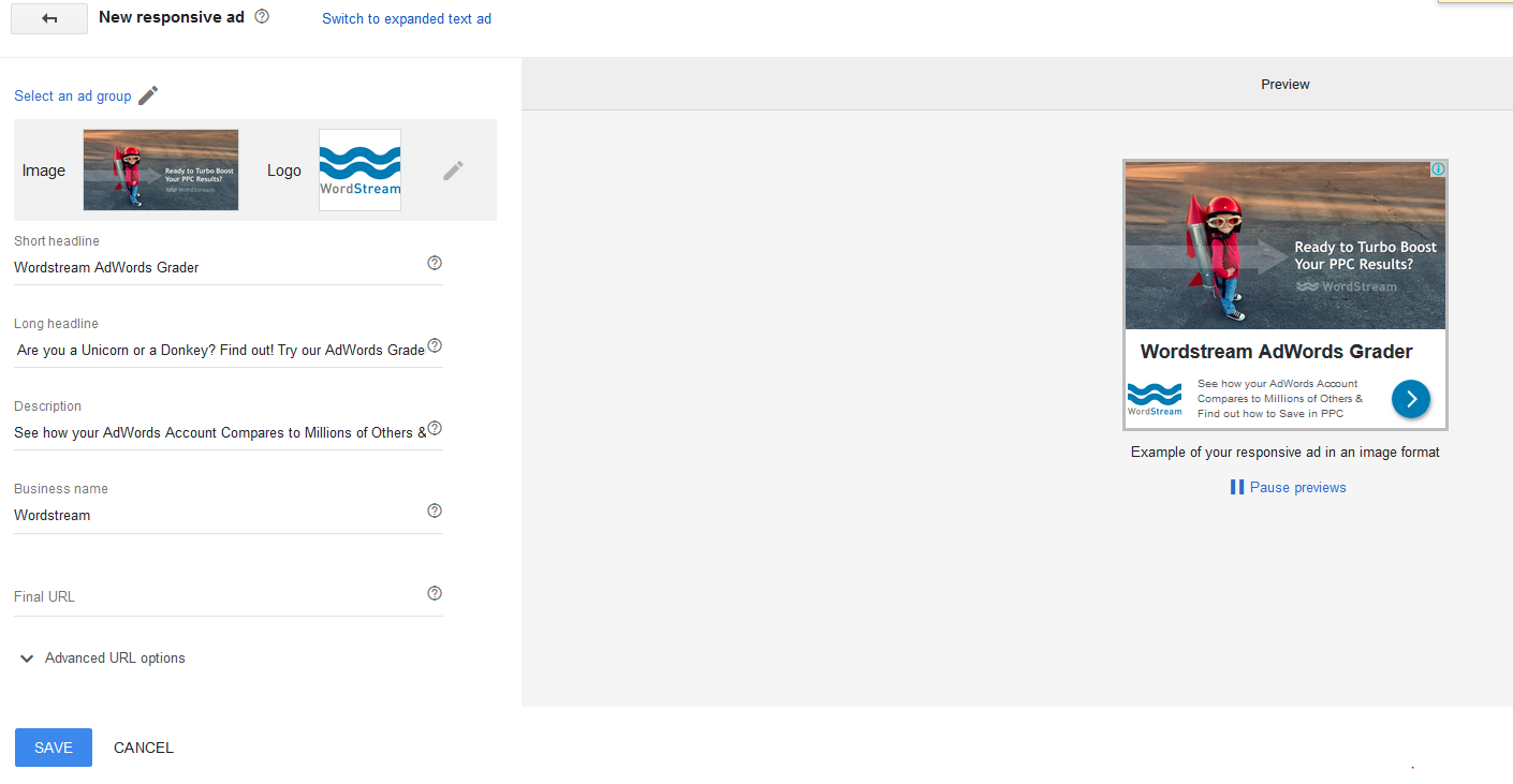
If you’re using Google AdWords, try out their responsive ad feature.
Responsive ads help you get an edge in mobile advertising.
Here’s how MarketingLand describes them.
These display ads adjust automatically to fit into available ad space across the Google Display Network (GDN). The size, appearance and format of the ad will be tailored to match the look and feel of the web page, your targeting and the campaign goals that you have set up.
Like this…
And, according to MarketingLand’s research, here’s how they help:
- 10 percent increase in click-through rate.
- 59 percent increase in conversion rate.
- 19 percent decrease in cost-per-acquisition.
Not a bad uptick for a small change!
23. Use animation
It makes sense that our eye will be drawn to something that’s moving. You can take advantage of that by creating an animated ad.
Don’t make it too flashy. Add just enough motion so that you capture your users’ attention.
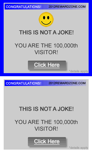
Whatever you do, stay away from the old-school eyeball-popping one-millionth visitor ads.
Everyone hates those.
Subtle and sophisticated motion, however, beats static and boring ads hands down.
Studies have proven that motion and animation such as explainer videos and animated GIFs will improve conversion rates.
The same applies to your display ads as well.
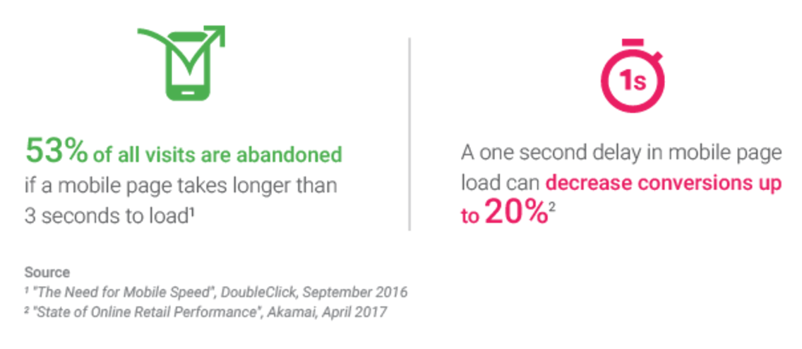
24. Make sure your ads load quickly
Users expect web content to load really quickly. Any longer than 2 seconds, and you’re in trouble.
You’ve seen the stats, right?
The solution is to make your ads as lightweight as possible so they load as quickly as possible.
Thankfully, Google is on your side on this one. They’ve started “speeding up ads served across the Google Display Network by using the same technology that makes AMP pages so fast.”
25. Try increasing the size of your ad
You might be a bit nervous to make your ad bigger. I’d guess you’re afraid a bigger ad would be more intrusive and get less clicks.
But the studies say the opposite.
Larger ads generally work better because, well, there’s a better chance of a larger ad being noticed, especially on a busier webpage.
Google published a study that concluded vertical ad units are the most visible.
So we can assume that the most visible ad would be a larger vertical ad, preferably on the left side of the page.
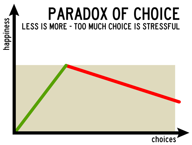
26. Think about the paradox of choice
Did I reel you in with this cool sounding heading?
It’s a pretty powerful concept popularized by Barry Schwartz. It states that humans actually feel freer when less choices are involved.
Sounds counterintuitive, right? But it’s true.
There are a few ways you can apply this concept to your ads.
First, the more ads you have on your site, the more confused your users will be. So make sure you display only 1 or 2 ads on each page (ideally just 1).
Second, each of your ads should have 1 CTA. Just one option. Otherwise, your users may experience the paradox of choice and end up not clicking on anything at all.
27. Put your ads on the right sites
You might be getting hundreds of clicks on your ads, but if they’re not the clicks you want, they’re nearly worthless.
Find sites that your target demographic visits and advertise there. It’s crucial to know your audience before you run a single ad.
I recommend reading these two pieces of content from Google before you run a display ad.
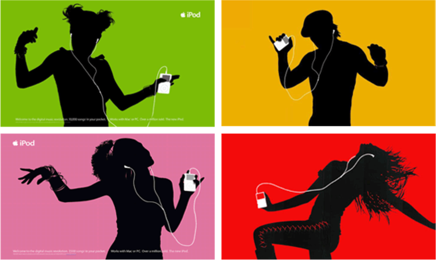
28. Make the ad visually consistent with your brand
If you look through this list again, you’ll notice a pattern: I’ve been talking about consistency a lot.
You’d recognize an iPod ad anywhere, right?
Apple’s ad consistency is on point.
Your ads should be part of your brand. Just because they’re ads doesn’t mean you can suddenly break your brand vibe, color scheme, or overall design style.
29. Study ads in your niche
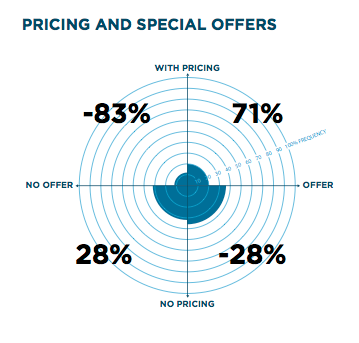
Here’s an interesting one: Your niche may determine how your banner ad should look.
Bandit found that travel, media, and dining ads each had distinct properties.
For example, travel ads that included prices performed well:
But hotel ads with prices didn’t fare so well:
So don’t assume that general rules will work perfectly for your niche. See what your competition is doing and analyze their ads to understand why they might be performing so well.
30. Target by income
Income is an important demographic, but you might not be giving it enough attention.
It can be a major factor in how people react to display ads:
In general, it seems that people who earn less, like minimum wage workers or students, are more influenced by ads to follow through and buy something.
Conclusion
Ten years and 18 million ads later, I’m a lot wiser than I was when I started.
But it wasn’t easy.
Some of these lessons I’ve shared with you took me years to learn and even longer to fully understand. Often, failure was my teacher.
I hated feeling that way, and I lost a lot of time and money by doing the wrong things.
I don’t want you to have to go through the same things I did. I don’t want you to have to learn from your failures.
That’s why I wrote this article.
Specifically, I wrote it because display ads are tricky.
Lots of people don’t like them because they’ve gained a reputation for being spammy and low quality.
And with the advent of ad blocking software, lots of people are claiming that ads are dead.
But lots of people also say SEO is dead, and it’s anything but dead.
Even though ad blocking is the norm, there are still millions of users online who still see ads. People still click on them, and they still lead to conversions.
Should you pour all of your money into ads? Not at all!
At the same time, you shouldn’t ignore ads. The ad is a powerful medium that can reach an audience you wouldn’t normally have access to, and they represent your brand effectively.
So don’t write off display ads too quickly. If you do them the right way, you’ll get tons of conversions and, eventually, sales.
What are your favorite tips for making awesome display ads?












Comments (16)