Traffic is one of the most essential ingredients that every business needs to grow.
But, once you’re done with SEO, content marketing and paid advertising, what do you do with those visitors?
You need to convert them.
For acquiring customers and earning revenue, you need to think beyond vanity metrics, like search engine rankings and website traffic.
Most websites get over their traffic problem. But, they almost always have difficulty boosting their conversion rate and earning dollars.
The following stats show proof of the huge gap in conversion optimization that small businesses need to fill:
- Only 22% of businesses are satisfied with their conversion rates.
- For every $92 dollars spent acquiring customers, only $1 is spent on converting them.
This brings me to the subject of this article – the value and importance of A/B testing.
Otherwise known as split testing (or bucket testing), A/B testing allows you to compare two webpages or apps to see which one performs better.
Further, A/B testing tends to deliver an improvement in conversion rates, allows for specific, focused questions, and helps you determine if your marketing strategy is on point.
What’s more? A/B testing is simpler to run than MVT (multivariate tests) and will provide you with insights on what your customers want.
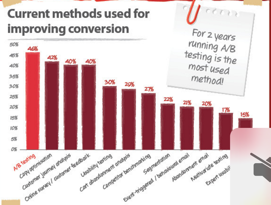
Just 44% of companies use A/B testing software tools. It was the most used conversion optimization tactic, back in 2012.
Google alone ran more than 7,000 A/B tests in 2011. They even tested 50 shades of blue on their call-to-action button, to find the highest converting shade.
Given the value of A/B testing, which lets you test a variation against a current experience, I want to share 9 simple A/B testing case studies that can impact your conversion rates.
Hopefully these split test examples will get you thinking–and positively affect your bottom line.
But, before we begin evaluating these A/B testing examples, I want to present a couple caveats, so that I don’t paint a lopsided picture.
2 caveats when you run A/B tests
If your conversions are low, then don’t assume that running a split test will always solve the problem. Here are 2 specific limitations, to adjust your expectations.
1. As per Noah Kagan from Appsumo,
Only 1 out of 8 A/B tests have driven significant change in conversion rates.
Most split tests will only bring about a 5% gain. So, you need to think of conversion optimization as a continuous process.
I like how Peep Laja put it,
It’s about incremental gains, as, at the end, all improvements will add up.
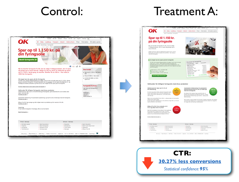
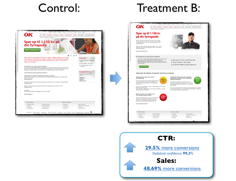
Failed experiments will also help you learn. A.M.B.A, a major oil and energy company, found a losing variation in a split test that they ran.
Instead of panicking, they conducted follow-up experiments to isolate the friction areas on the treatment landing page and found a variation that increased their conversions by 48.69%. As you can see, A/B testing can enable you to make careful, focused changes to improve your conversion rates.
2. You can’t measure true conversion rates. So, you need to mitigate the risks by using confidence intervals and increasing the size of your sample.
This means that you need to patiently wait for a split test to run and determine statistical significance. This ensures that your results are caused by the changes you made and not by random factors.
You can check whether your results are statistically significant by plugging numbers into this tool.
Double check the margin of error. Also, run A/A tests (copy your landing page and leave it as it is) to check if your testing tool is reporting false data.
Now that you’ve set realistic expectations from A/B testing, let’s begin with the list of 9 simple A/B split tests.
1. Color of your CTA buttons
This is one of the most common split tests that you’ll probably encounter. You’ll find gurus saying that a particular color, like red, creates emergency and is the go-to color for all of your CTAs.
Don’t listen to them. There’s no one color that works best–and ab testing can help you determine what that is.
There are various factors, including how your CTA interacts with surrounding elements and creates contrast.
Testing color is one of the simplest ways to make your CTA stand out. For Performable, Hubspot found that the red color CTA got a 21% higher CTR than the green one in their split test.
For Matthew Woodward, blue links outperformed red and pink – both in conversion rates and in engagement (higher visit duration and lower bounce rate).
Verdict: Color matters, but there’s no universally highest converting color. Use A/B testing to determine which colors on your CTA create a strong contrast between your CTA button and website design.
2. The images on your landing page
I am a huge advocate of long-form copy. It helps in addressing all of the objections of your prospects and it builds trust.
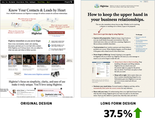
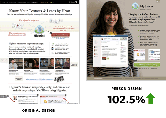
Incidentally, long-form design worked well for Highrise. Take a look at this split test, which sets a variation against their original design.
But, you need to debunk or confirm all of your assumptions and biases by conducting A/B tests. That’s what Highrise did and they tested a person design (with an image of a customer and much less information) against this long-form page. Split tests of this nature allow you to make creative but informed decisions.
It also resulted in a giant boost of conversions by 102.5%.
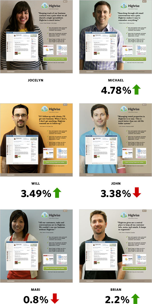
Then, Highrise ran another split test to determine if changing the person in the photo with another image of a person would affect conversion rates. And, it didn’t make a huge difference with the set of people they tested.
Hubspot also generated 24% more form submits, by using an image on their landing page.
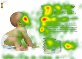
You can also use images as implicit directional cues.
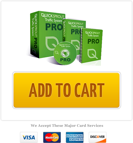
Or, if your product is confusing, include a picture of your product in your CTA (like I did with the Quick Sprout system to increase my conversions by 28%).
Verdict: Using images on your landing page will affect your overall design and elicit emotion from your audience, and split testing allows you to determine which image is the most effective.
3. Craft compelling and benefit-oriented headlines
The headline is your value proposition and it must catch the reader’s attention within 5 seconds. If your title doesn’t sell your desired action, then the consumer isn’t going to engage further with your landing page.
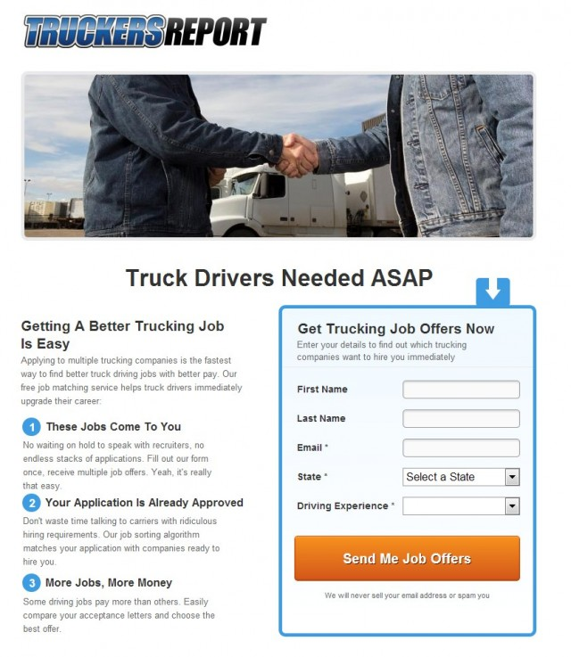
Truckers Report initially had the following landing page, with the title as “Truck Drivers Needed ASAP.” This is a weak headline as it does not address any pain points of the audience nor sell any benefits of the product.
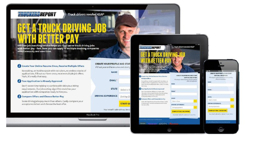
Truckers Report ran a series of tests, across 6 months, including an important one on the headline.
They found that the straightforward headline that sells the benefit, “Get a truck driving job with better pay,” worked best for their audience.
They also guided their further tests based on the premise that making the page simpler would increase conversion rates. Finally, they arrived at a 79.3% boost in conversions.
A Scandinavian Outdoor Store similarly tested their plain version with a more compelling headline and bargain pricing text.
The result?
A 127% increase in conversion rate.
And, they increased signups by 38%.
Verdict: Your headlines should transfer critical information to the user effectively and succinctly. A/B testing can help you determine which title will be more to your benefit.
4. Your email subject lines
Having thousands of email subscribers doesn’t matter if they don’t engage with your brand and never open your emails.
As per Epsilon’s analysis of 7.3 billion emails in Q4 2012, the average open rate was 27.4%.
I found an email subject line testing formula that boosted my open rates by 203% – that can translate to thousands of dollars of additional revenue from email marketing.
So how can you increase your open rates?
Write shorter and descriptive subject lines that pique the curiosity of your subscribers: Mailchimp reports that 28-39 character subject lines work best.
That’s how Glen Allsopp was able to get an 83.2% open rate.
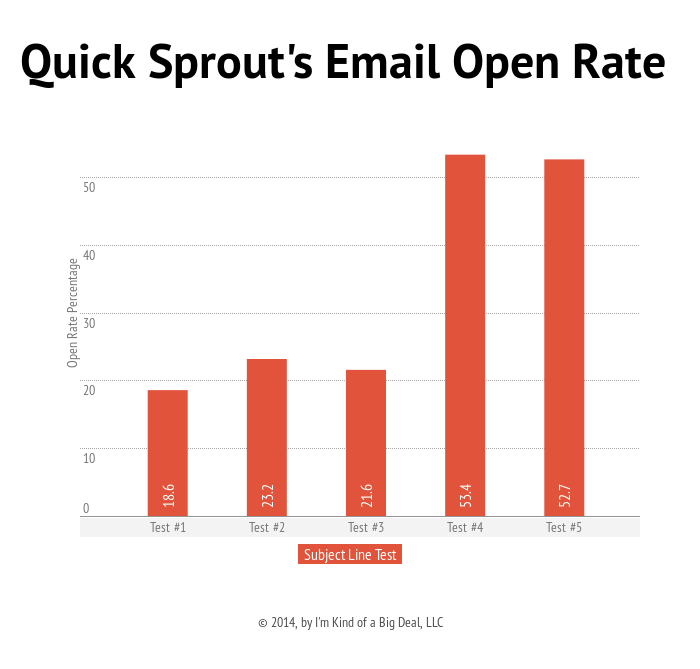
If a subject line reveals the content of your email and sparks curiosity, then it will get higher opens. For instance, the subject line below, from Quick Sprout, got major opens.
Instead of trying to sell something to your subscribers, try to communicate value. Look at how the following email subject lines make their offers benefit focused.
Verdict: Consider A/B testing to evaluate your email subject lines and arrive at a formula that works for your audience. Keep in mind that email subject lines also help in building a loyal subscriber base.
5. The phrases you use on your navigation bar
The navigation bar is probably one of the most underrated website elements, although it sets the focus and flow for your website visitors.
Bryan Harris moved the navigational links to the bottom, in his upside down homepage test. And, he found that it decreased his bounce rate by 83%.
Using A/B testing, you can also reorder the navigational menu items or rewrite the navigation item copy to find the one that brings the highest number of clicks.
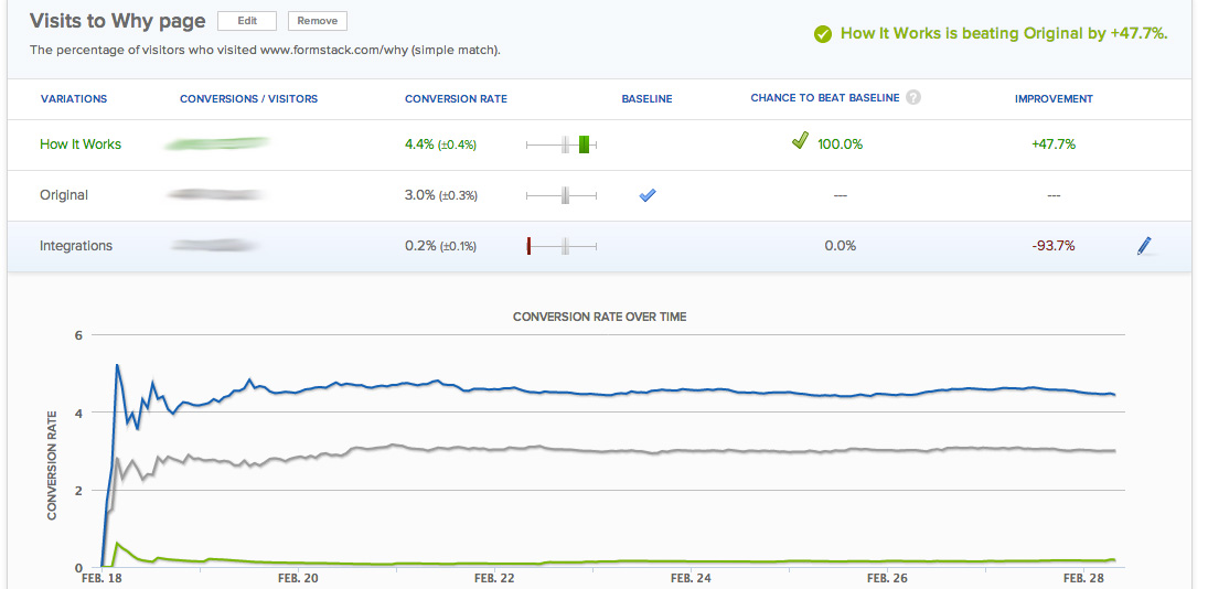
Optimizely ran a simple copy test on their navigation bar. They changed their navigation bar phrase from “Why Use Us” to “How It Works” and achieved 47.7% more clicks.
The simple copy change also increased their page views by about 50% and overall website conversions by 8%.
Verdict: To boost your conversion rates, don’t undermine simple website elements like the navigation bar. They can tremendously affect user interaction and lift your sales.
6. The number of form fields you use
This is a no brainer. Even if it takes a little extra time to fill in an extra field, it most likely leads to higher physical and mental friction.
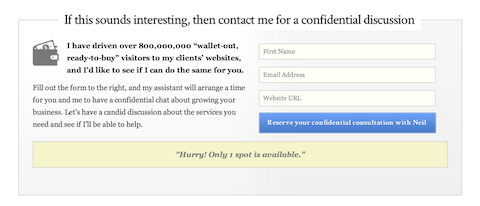
In the past, I reduced the number of form fields at NeilPatel.com from four to three, for booking a consultation with me. This boosted my conversion rate by 26%.
I was asking for revenue information in the fourth field and I assume that many people didn’t want to share it.
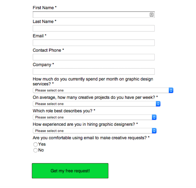
Sometimes, you might need to increase the number of fields, so that you drive only qualified leads to your offer.
For example, Design Pickle required landing page visitors from their Facebook advertisement to answer multiple questions. This ensured that they drove fewer, yet more serious prospects that were most likely to convert.
7. The length of your product’s trial
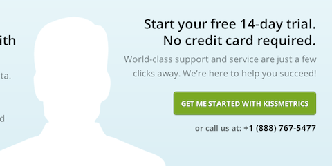
All popular marketing tools, including Ahrefs, Long Tail Pro, Moz and KISSMetrics, have a trial period of 14 days or so.
It wasn’t always this way, though, for most of these tools.
I thought that a longer length of the product trial would attract more customers. Except, one day when my co-founder, Hiten Shah, insisted on reducing the length of our trial from 30 days to 14 days.
If you’ve read a few psychology backed marketing articles, you’ll know that scarcity is a brilliant tool to increase your conversions.
So, in our trial length test at KISSMetrics, we found no decrease in the number of signups. But, 102% more people actually used the product, when they signed up for the 14-day trial vs. the 30-day trial.
This extra usage helped in increasing our revenue, as more customers got their hands on KISSMetrics.
Similarly, Acuity Scheduling saw 268.14% higher paid signups, after they gave up their freemium business model (offering limited features).
Verdict: Scarcity is a powerful tool to get customers to use your product. Shortening your product’s trial is one great way of achieving it.
8. Offering time-sensitive bonuses with your product
This is the second classic psychology marketing tool in action…
Urgency.
I used to sell the Quick Sprout traffic system for $197. Initially, I didn’t offer any bonuses.
Then, I tested a free software plugin and a video course, as free bonuses with the product.
The result was an 11% boost in my conversion rate.
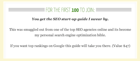
I took it a step further and offered time-based bonuses – special gifts to people who sign up first.
This created scarcity around the bonuses and also encouraged people to sign up then and there.
The result was a 47% increase in conversion rate.
Time-based bonuses are now a regular fixture in most digital products – especially courses and books. Bryan Harris recently offered numerous time-based bonuses, while launching his, “Get 10,000 Subscribers,” course.
9. The position of your CTA button
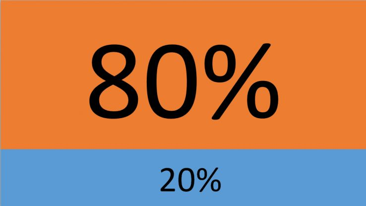
You might already know that the area of your website known as “above-the-fold” is precious real estate for businesses. Content placed in this region still gets 80% of our attention.
But, when running a split test, you need to let go of all your assumptions and biases.
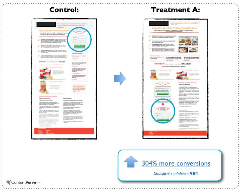
Content Verve shared the case study of a B2C landing page in which:
A long-form landing page with a CTA below-the-fold outperformed a CTA above-the-fold.
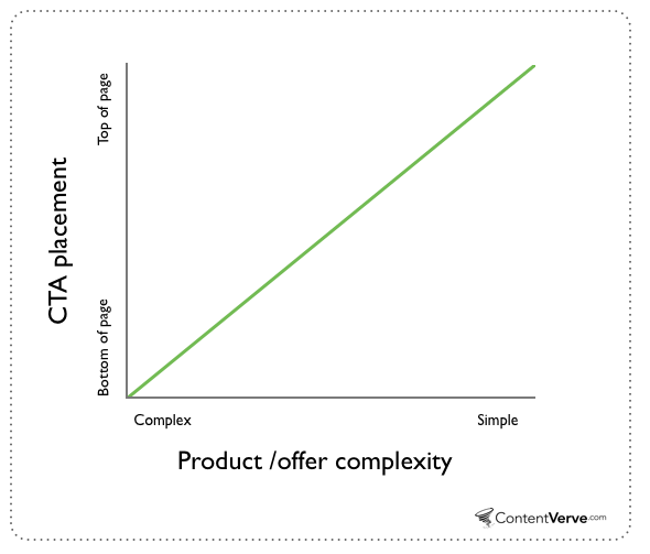
The explanation is that your CTA deserves a place on the landing page where it complements the decision-making process. Generalization of the position won’t help in closing more sales.
Verdict: Scrolling has become second-nature for internet users. The optimal placement of your CTA will depend on your product’s complexity and a variety of other factors. A/B testing can help you determine where it will serve you best.
Conclusion
Only 52% of companies that use landing pages employ A/B testing to find ways to improve conversion rates. I hope that the 9 tests I shared here will inspire you to start split testing so that you too can discover a way to boost your conversion rate.
If you start A/B testing, don’t blindly pick a random test from the above and get started. The best starting point for split testing can be determined by analyzing your data. So, crunch some numbers, while considering the above list of simple tests.
Are there any other simple A/B tests that you’ve found to increase your conversion rates? I would love to hear about your results in the comments below.








Comments (16)