If you want to grow your email opt-ins, you’re not alone.
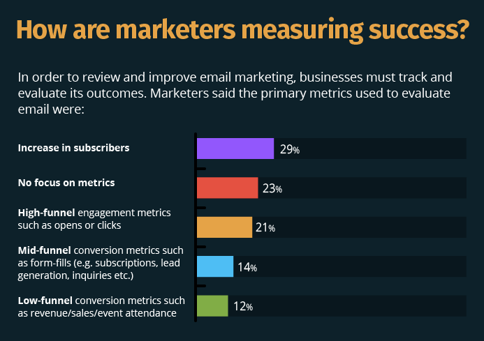
A full 29% of marketers measure their email marketing success by subscriber count, which means that it’s a metric that’s in high demand.
Thankfully, there are plenty of strategies that can help you triple your email opt-ins in just a few weeks.
To get started, you need to figure out where you’re growing your email opt-ins.
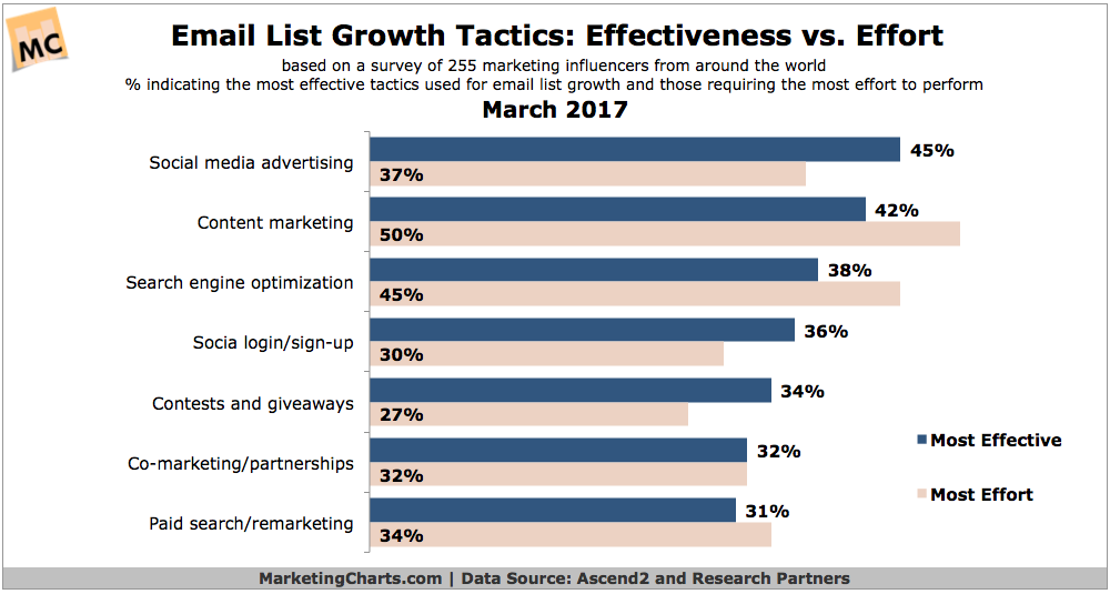
Marketers are using a variety of ways to increase their email list. The three most popular are social media advertising, content marketing, and SEO.
Each of these requires different strategies, so be mindful that the strategies that others recommend may or may not work best for your situation.
Whichever strategies you use, I recommend trying them out, testing, and revising to see if there’s progress.
Either way, you can make some massive progress on building your email list by implementing just a few of these killer strategies.
Let’s jump in!
1. Change your homepage to a landing page
Of course, the ultimate way to convert visitors into subscribers is through a landing page.
This is a page specifically designed to increase the number of email subscriptions and nothing more.
To get started, you’re going to remove the basic home page you have now. This shouldn’t include anything. I don’t even have a link to my blog on the home page.
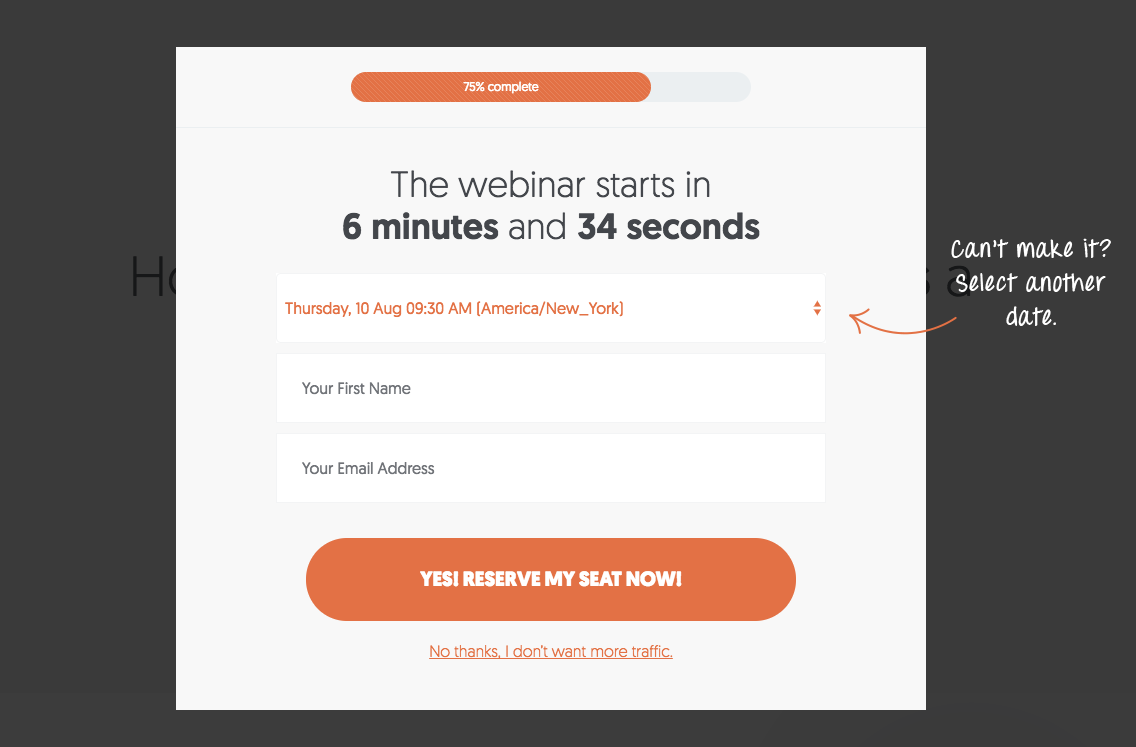
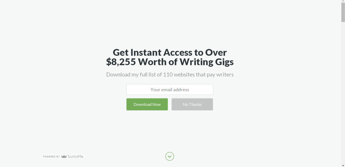
Instead, it’s a landing page with a popup that encourages visitors to watch my webinar on gaining more traffic.
Of course, by the time you read this, it may have changed! I’m constantly testing and improving to find what works best.
The key is to only allow visitors to leave your home page when they’ve signed up for your email list.
2. Include popups on every page
It may be old news, but popups still work amazingly well. That’s why you continue to encounter them across the web. They work!
If you don’t already have an opt-in set up on your website, it’s time to join the game.
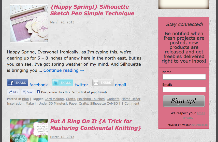
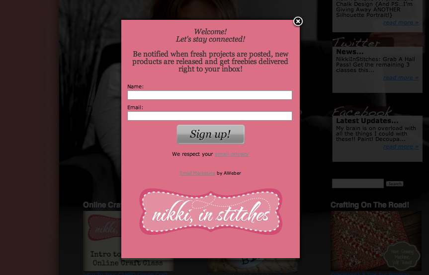
Food blogger Nikki McGonigal found that popups resulted in a 1,375% increase over her sidebar in email opt-ins. That’s insane!
She started with a simple sidebar.
But even a basic popup resulted in a massive increase in email subscribers.
Don’t worry about making this perfect. You can always adjust, test, and improve later. The key is to make a system that works well for you and presents a clear offer to your potential subscribers.
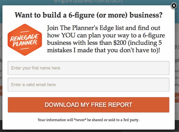
Renegade Planner uses a clear call to action and closely matches the style of the site with this pop-up.
This is a great basic start.
3. Add exit-intent choices
If your subscriber is planning on leaving your site, it’s a great time to grab his or her attention and request an email subscription.
Most of the time, these visitors will never return, so you want to get the most value out of each visitor that drops by your site.
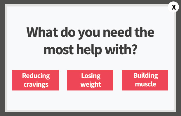
There are lots of ways to run an exit-intent popup, but I’ve found a question to be a great way to engage the potential subscriber.
Opt-inMonster recommends asking the users a simple 3-part question to determine their next steps. You can then segment them into a list depending on their answers.
You can automatically segment the list this way, as well, delivering even higher value to your subscribers and blowing them away with high-quality content.
4. Include a welcome mat on your site
You’ve undoubtedly seen a welcome mat on different sites you’ve visited, and there’s a good reason.
Welcome mats are a simple way to turn every page on your website into a landing page at first. You can then test this page to ensure that it works at its absolute best.
These welcome-mat landing pages don’t have to be complicated.
Bamidele Onibalusi collected an extra 1,200 email subscribers per month when he started using this welcome mat.
If you haven’t tried this strategy yet, it’s a true game changer.
5. Use a better color for your sign-up button
There’s a lot of psychology behind the colors we use and see. Even slight changes can result in huge gains on your email list opt-in rate.
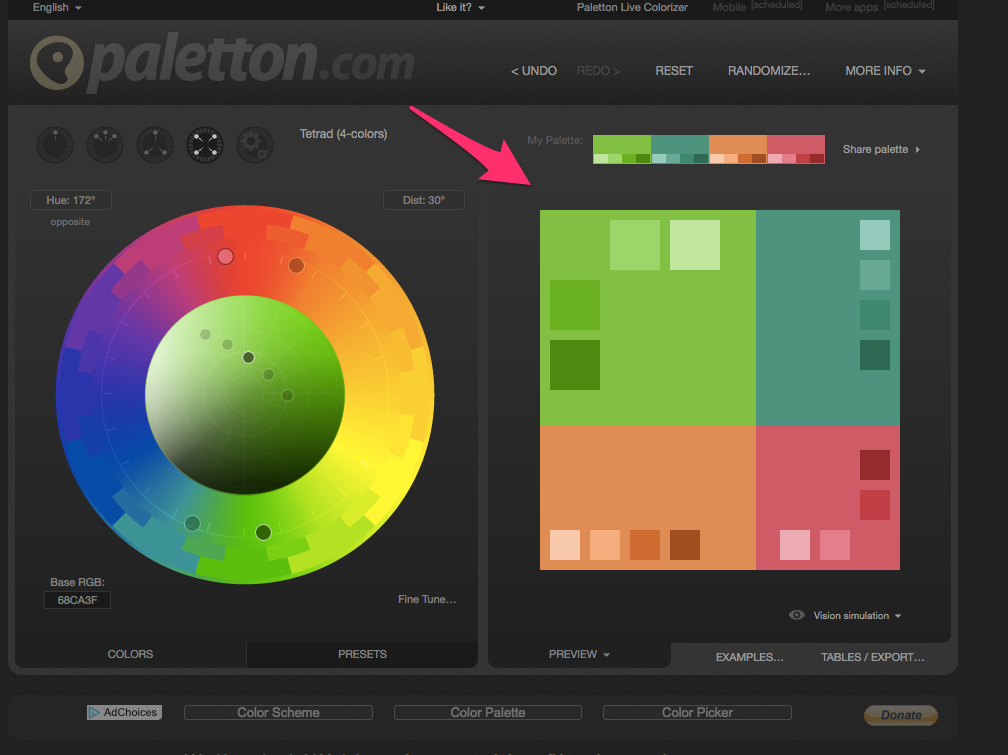
To get started, look at the main color scheme you use on your page. Decide what colors might provide the best contrast.
I like to use a tool like Paletton. You can easily see what colors would provide a great contrast based on the original color scheme on the page.
HubSpot did a test of different colors and found that red converted 21% better than green.
This was probably because the red provided more contrast than green, which was the dominant color on the page.
6. Use a changing button that interacts with subscribers
Again, the smallest hacks can make big changes to the ways in which potential email subscribers respond to your offers.
One marketer found a 40% increase in sign-ups just by using a button like this, according to Kissmetrics.
This pulls attention to the button when the reader hovers over it, making the button more effective and increasing the likelihood that the visitor will click on it.
If this is something you’re considering, look to the CSS property :hover. This allows you to change the color of any button you’re currently using on your website.
7. Don’t require too much information in your sign-up form
It’s a simple psychological principle: The simpler the action you ask someone to take, the more likely he or she is to actually take that action.
If your landing page asks your potential email subscribers for too much information, it might be helpful in the backend.
But the result of the request might actually be a reduction in the total number of people who sign up.
For every piece of information you want to ask your subscribers for, you need to decide if it outweighs the costs.
Can you get along without it? Is it possible to move forward even if they don’t provide you with their full name, email, phone number, company, and job description?
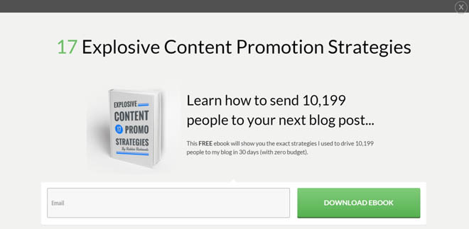
The fewer things you asked for, the better you’ll do. Robbie Richards had a massive 12.24% opt-in rate with his opt-in form.
One of the reasons for his success was asking users only for their email addresses.
I recommend only asking for an email address, with a first name if you really need it to personalize your marketing campaigns.
8. Encourage sharing
As much as you’d like people to share your emails, the sad truth is that most will never actually forward an email to someone else.
The old days of long forwarded message chains are mostly behind us, and social media is quickly taking their place.
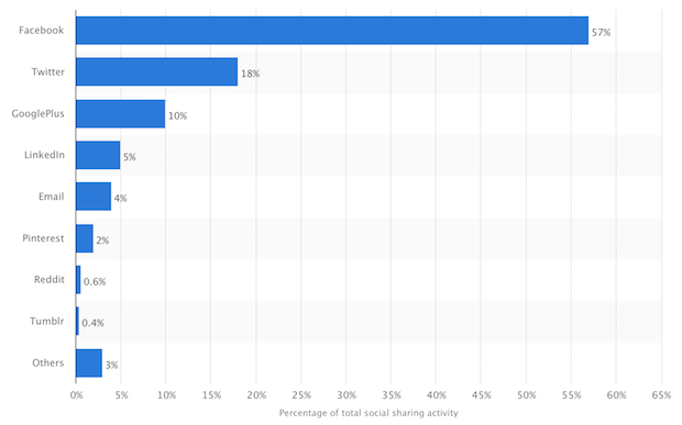
The data backs this up. Email only accounts for 4% of global sharing activity, according to research published by Opt-inMonster.
Of course, that’s a great thing for your marketing! By tapping into these channels, you can ensure that your message has an even broader reach.
To increase the sign-ups for your email list, you can encourage people to share the message on social media. The easiest way to do this is actually in the body of your email.
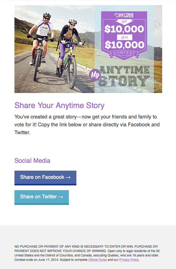
Anytime Fitness ran a campaign that landed a top spot in HubSpot’s top 1% in viral emails. One of their secrets was encouraging people to share the email in the body of the message itself.
By including simple, easy-to-share links, you can expand the reach of your campaign and increase the number of email opt-ins.
9. Add a photo to your landing page
Increasing your email opt-ins might be as simple as just adding a photo the landing page.
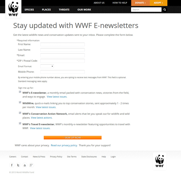
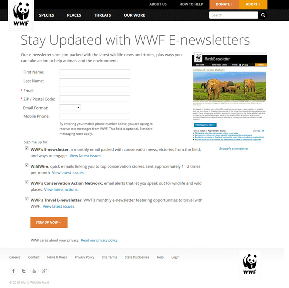
This is what World Wildlife Fund found. Their original page was almost exclusively text.
They tested by changing a few parts of their landing page. Most notably, they added an image.
It wasn’t anything complicated — just a screenshot of their newsletter — but the results spoke for themselves.
After making this change, the organization saw a 23.4% increase in opt-ins. If you’re struggling to increase your opt-ins, you might just need to add an image!
10. Make your testimonials more prominent
Testimonials are one of the most powerful persuasion techniques at your disposal.
Most marketers understand this already and include testimonials of some kind on their landing pages.
But it may surprise you that even moving the testimonial to a more prominent place on the page can increase the number of email opt-ins you receive.
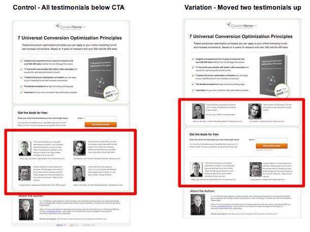
Michael Aagaard included testimonials on his download page, but he didn’t feature them prominently. By moving the testimonials up, he was able to increase opt-ins by 63.53%.
Consider adjusting the placement of your testimonials for better results with your email marketing opt-in forms.
11. Include a landing page link in your Twitter bio
Social media is becoming the primary way people find us these days. Why not use it to increase your e mail subscriber opt-ins in the next few weeks?
To get it started, just include a simple link to a landing page. You can either include this in your bio itself or under the URL option that Twitter provides.
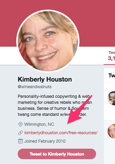
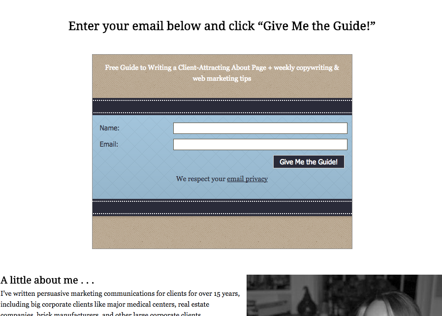
Copywriter and marketer Kimberly Houston’s Twitter bio has an opt-in form in the link section.
This link leads to her free resource opt-in page.
It’s an easy hack that’ll only take a few seconds to set up, but it can reap big dividends over time.
12. Pin a Tweet linking to a landing page
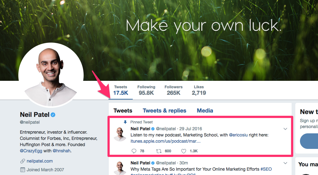
At the top of your Twitter feed, you can easily pin a tweet. This is visible to anyone who looks at your Twitter feed and can be a great way to increase awareness for a page.
Here’s an example of a pinned Tweet on my own Twitter feed.
I’ve used it to share a recent podcast episode, but you can easily repurpose the medium to promote your email list.
It’s a fast and simple way to guarantee more email subscribers. Just post a link to a landing page.
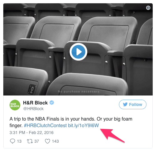
H&R Block used a pinned Tweet to promote their contest by including subtle details and linking to a landing page.
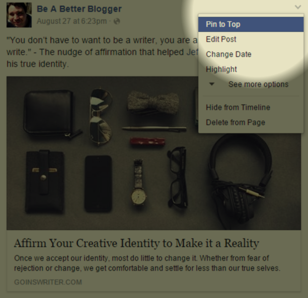
13. Pin a Facebook post to the top of your feed
Just like you can pin a popular Tweet to the top of your Twitter feed, you can do the same thing on Facebook.
Kevin J. Duncan of Be a Better Blogger has found this to be a successful way to add subscribers to his list.
Find a compelling landing page and pin this to the top.
14. Test button copy
The words we write change how people perceive us, and it’s no secret that more effective copy can be better at driving more email opt-ins.
To get started, devise a few different options you’d like to test for your button copy.
Experiment with different wording. State features or benefits, include the call to action in more casual language, or add a positive word (like “yes!”) in the text.
I recommend testing two of these at a time and seeing which one works better.
As you keep going, you’ll eventually find the button copy that performs best for you.
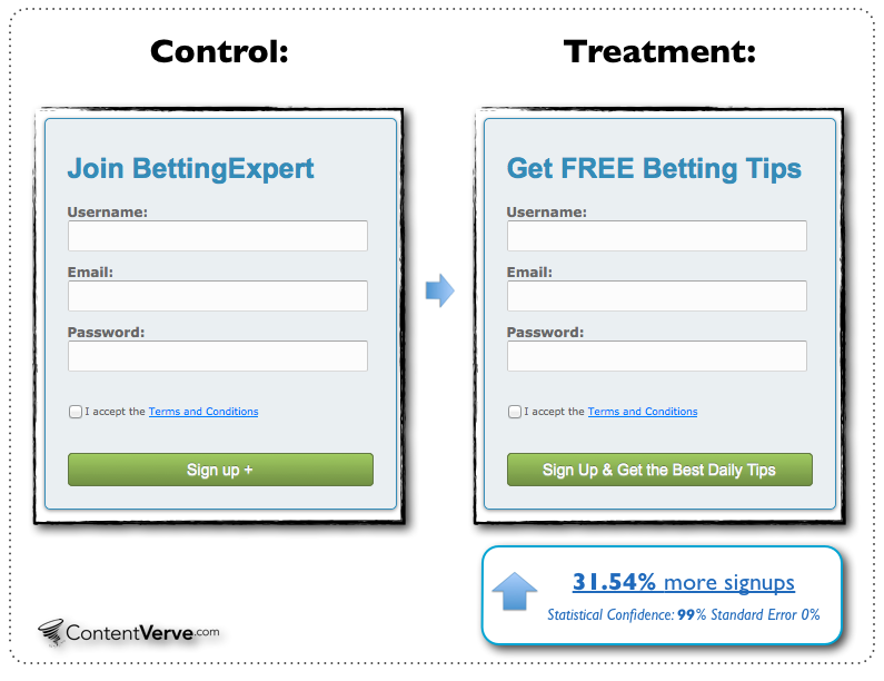
Unbounce collected a massive 31.54% more sign-ups with copy that said “Sign Up & Get the Best Daily Tips” instead of a button that just said, “Sign Up.”
This is a perfect example of including features and benefits in your button copy to increase opt-ins.
15. Add an arrow to your signup button
People often don’t know where to direct their attention. Of course, you want them to move ahead and sign up for your email list, but they might need a little nudge
To get started with this, you can add a simple arrow to tell people where they should direct their eyes.
It’s best if this isn’t obvious or gaudy. Instead, create a small arrow that’s simple and subtle.
These types of arrows work best for gently directing the reader’s eyes to where you want him or her to sign up.
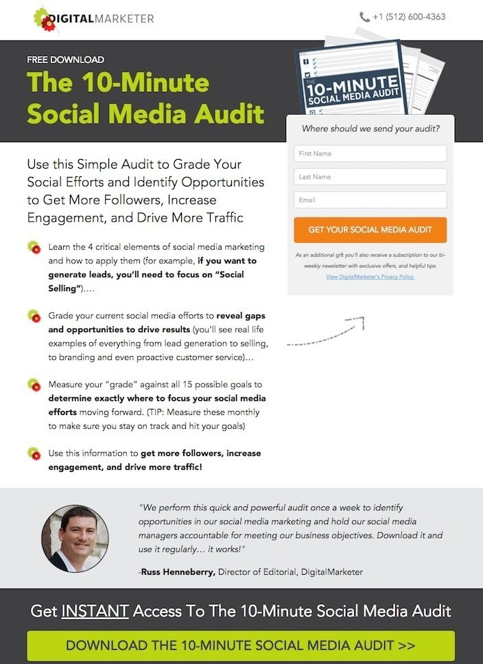
DigitalMarketer adds a small gray arrow on their opt-in page directing people to sign up.
16. Add an opt-in form at the end of each article
There’s a reason most guest posts include an author bio and call to action at the end of each post.
It helps to bring in new subscribers!
If you don’t already have a call to action in the bio you include at the bottom of the posts you write, it’s time to get started.
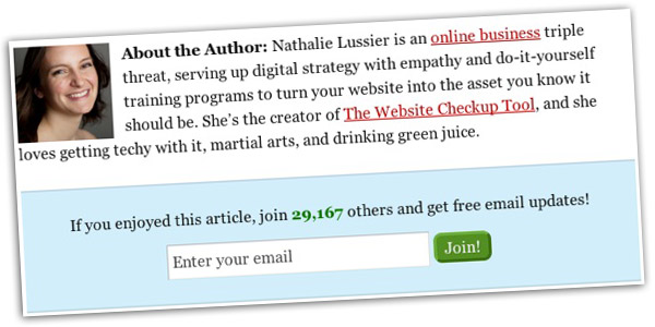
Digital strategist Nathalie Lussier recommends this strategy for increased opt-ins.
To do it, you can either include a simple text link to your recommended call to action in the bio or, if you’re the site owner, you can easily include a call to action underneath the bio.
Nathalie Lussier has done both in the example above. She has a few links as well as a simple online sign up form to increase her email opt-ins.
17. Include custom content upgrades
If you haven’t jumped on the content upgrade bandwagon yet, it’s time!
A content upgrade is a custom lead magnet designed to extend the value of an article through bonus content or a different format.
This makes a much more compelling choice for potential subscribers to opt in to your form. You’re appealing to the reason they read the article.
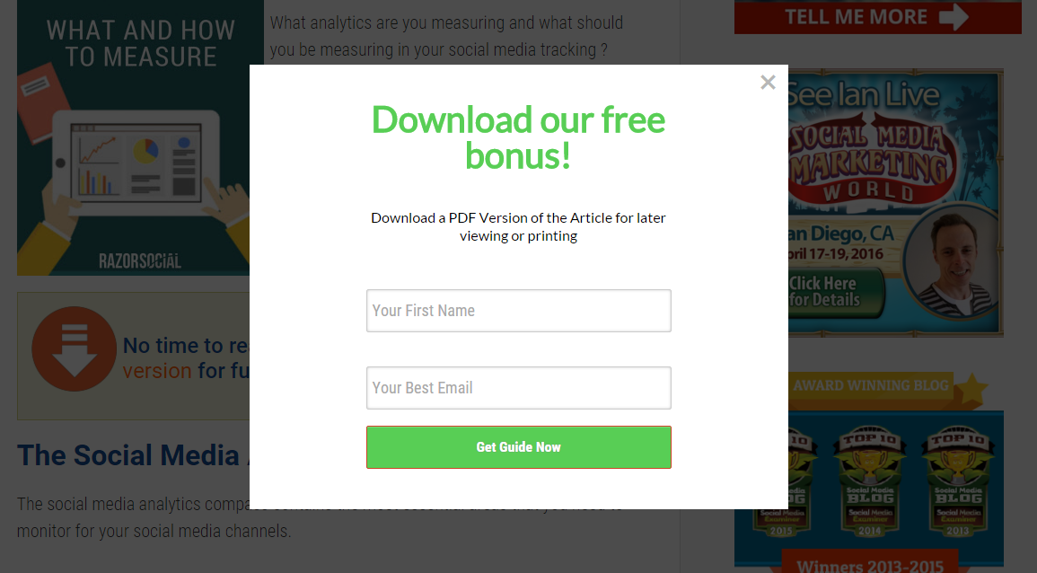
It’s no surprise that content upgrades tend to do very well. RazorSocial increased their opt-in rate by 520% using content upgrades. That’s amazing!
The easiest kind of content upgrade is just to provide a PDF version of the article.
Instead of working hard to develop custom content for each article you write, you can simply offer the article in a different, more convenient format.
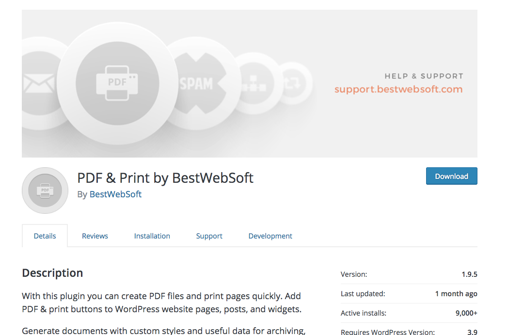
To get this done quickly and easily, download a WordPress plugin like PDF & Print.
This allows you to quickly convert the page to an easy-to-download PDF that will skyrocket your opt-in rate.
18. Include a featured comment that promotes email sign-ups
Depending on the comment software or plugin you use, you may be able to include a featured comment. If you can do this, it’s a great way to promote your email list.
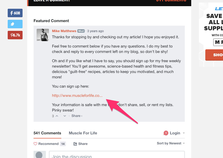
FItness expert Mike Matthews does a great job with this on his in-depth articles. At the bottom of each article, he has an extensive comment section.
At the top of the comments, he has a featured comment of his own. This includes a link to a signup form.
It’s an easy, quick hack to encourage email opt-ins without being pushy or obtrusive.
19. Install and test Hello Bar
Sometimes, you just want a way to encourage sign-ups to your email list without a massive popup or another distracting message.
Enter Hello Bar.
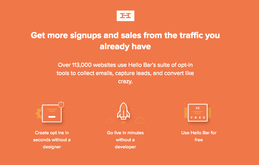
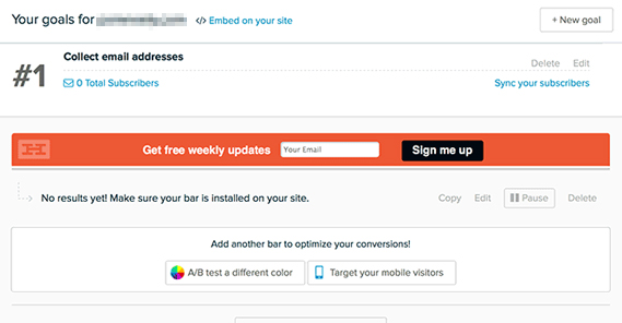
It’s a tool I created that allows you to easily display a short message at the top of your website page at all times.
James Parsons writes on Growtraffic that you can easily use HelloBar to increase your number of email opt-ins.
I recommend testing a few different variations of your Hello Bar to see which one works best for your goals.
This functionality is built into the Hello Bar tool, so it’s easy to split test.
20. Use a slide-up opt-in form
One of the most effective types of email opt-ins I’ve found is the slide-up.
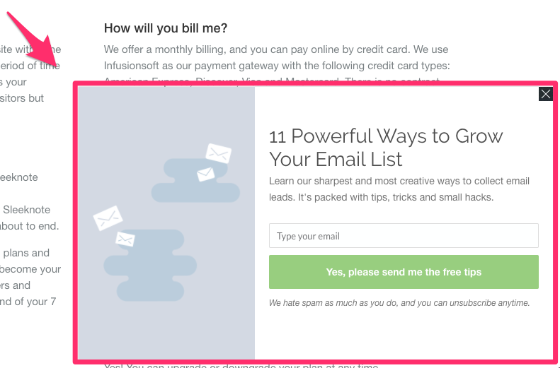
This is like a pop-up box, but it slides up from the bottom. It doesn’t block the main content, but it provides a noticeable call to action.
Sleeknote uses a slide-up on their pricing page.
It includes a simple email signup form and offers a free bonus as a lead magnet.
21. Add a P.S. to your content
Most of your customers will read the P.S. at the bottom of your emails or articles, so be sure to include one that links to your email signup form.
When Buffer did this with their articles, they received an extra 20-40 new email sign-ups each week from the P.S. alone.
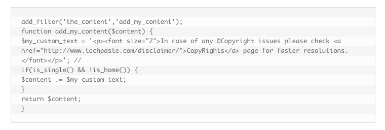
While you can simply add a P.S. manually to each of your posts, I recommend using a plugin or custom code that will display a P.S. for you.
The most adaptable version of this I’ve seen is this code from TechPaste.
Depending on your needs, you can easily adapt and format it to resemble the Buffer P.S. and drive more people to sign up to your list.
22. Add a quiz
Readers love engaging content, and there’s no better way to do this than with a quiz. A quiz encourages readers to take it, then requires an email address to get the results.
Buffer doubled their email sign-ups and credited a quiz as one of the reasons behind their success.
If you’re looking for a program to use for this, consider Qzzr. You can create a variety of custom quizzes and require an opt-in with one of their paid plans.
Conclusion
However you’re measuring the success of your email marketing, you need to be tracking the new sign-ups and opt-ins you’re getting on a regular basis.
This will allow you to accomplish more and sell more of your products or services.
It’s critical that you increase opt-ins without taking up too much time.
These tactics are surefire ways to increase the number of subscribers on your email list.
Which tactic will you use to increase your email subscribers?




Comments (0)