Website design can be difficult to master.
When it comes to creating a design that boosts conversions and generates revenue, many businesses continue to struggle. Your website needs to be appealing, but it also needs to make money.
It’s still a common mistake for businesses to focus on a design that looks good rather than one that maximizes their conversion rates.
These mistakes are subtle, but they do a lot of damage.
They make it difficult for customers to buy, introduce objections and problems unnecessarily, and overwhelm visitors.
They push people away.
If you’d like to increase the amount of traffic, leads, and sales your website gets, you’ll want to avoid making the same mistakes as your competitors.
Fixing these mistakes takes work, but it’s not rocket science.
With consistent effort, you can dramatically increase the amount of traffic, leads, and sales your website produces. It starts with identifying each of the mistakes that hurt your website.
Let’s take a look at those mistakes.
Design mistakes
1. No responsive design
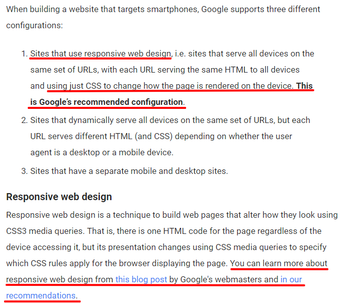
Responsive design has been listed as the most important feature for a website.
That’s a pretty big claim to make, but it makes sense when you realize that responsive design makes your website accessible to everyone regardless of their device.
Visitors viewing your website on desktops, smartphones, iPads, and PS4s have an experience that’s optimized for their device, which, as it turns out, is what Google recommends.
2. No favicon
Many website visitors prefer to use lots of tabs while they’re browsing.
Some users leave tabs open so they can review them later. Favicons give visitors the visual cue they need to orient themselves, find what they’re looking for, and return to your tab while they’re browsing.
3. Generic 404 pages
404 pages are silent traffic killers. An informal survey of 3,475 users showed that the vast majority of users don’t even try to take a positive action to resolve the problem.
Most users simply hit the back button, leaving your site for good.
4. Your home page uses carousels.
Carousels aren’t always terrible on their own.
They become a problem when they scroll automatically. These carousels are conversion killers because they induce banner blindness (they look like ads), reducing visibility.
They distract and annoy your website visitors, moving their attention away from the one thing they should be focused on: conversion!
5. Your website is slow.
If it takes more than four seconds for any web page to load completely, it’s too slow.
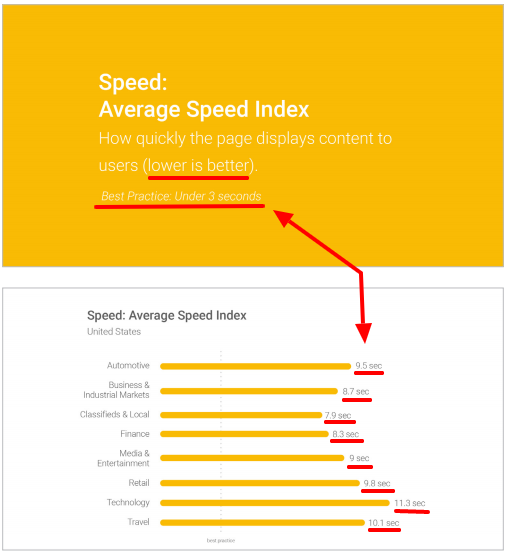
Google found that 70 percent of the websites they surveyed in their study took seven seconds or longer to load.
They also found that the slower the site, the more likely a user is to bounce. Google also noted 3 that seconds is the accepted best practice for website owners who want to keep their visitors on-site.
What makes this even more complicated is the fact that page speed can significantly impact your rankings. Google page speed is used as a ranking factor to assess pages in its index.
Google uses a few different metrics to assess site speed including:
- Time to the first byte. When you enter a URL in your browser, it asks the server for the HTML document at that URL. The faster the response time, the more likely it is that the rest of the page will load quickly.
- Start to render. Computer code creates and presents the visual display on your screen. It shows visitors that something is going on and that the web page is loading.
- Visual completeness. The web page has finished loading, is fully visible, and has become fully available to your visitors.
- Document complete. The web page may be visually complete, but there are lots of additional details loading in the background. When it comes to loading times, this is actually a more accurate measure of completeness.
- Fully loaded. Asynchronous code begins loading data once the site is fully loaded. This asynchronous code doesn’t actually prevent users from using the site so it’s not considered part of the website load time.
- The number of file requests. When you load a web page, your browser loads JavaScript, CSS, and image files. Loading lots of small (or large) files decreases page load times.
6. Slow server response times
If you’ve optimized your web pages for speed, but your server response time is slow, your website will still be slow.
Slow server response times typically indicate that there’s an underlying performance problem.
Google strongly recommends that you reduce your server response time to 200 ms or less. There are dozens of potential causes:
- Slow application logic
- Slow database queries
- Frameworks and libraries
- Resource CPU starvation
- Memory starvation
Sluggish server response times and optimized web pages are must-haves if you’re looking to increase your website speed and performance.
7. Your website rejects design norms.
Users expect your website to follow design conventions. You have a lot of flexibility, but you have to be careful.
If your visitors can’t find the navigation bar or the search function, you’ll lose them. Make sure you include as many accepted design norms as possible.
Typography mistakes
8. Choosing an unclear font
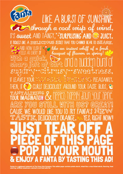
Cursive fonts, hand-drawn scripts, and symbols can be difficult to read. Take a look at this message, for example.
Can you read it?
It’s written using a font called “Bedtime Stories” and I’m not sure what I’m reading. Fonts that are unreadable or difficult to read decrease cognitive fluency.
Cognitive fluency refers to ease of use for the visitor. Is it easy for visitors to understand what they’re looking at? People prefer content that’s easy to read and easy to think about.
An unclear font increases cognitive load and decreases understanding.
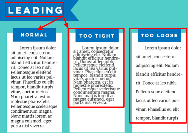
9. Poor kerning, tracking, and leading
Kerning, refers to the space in between two characters (numbers, letters, or symbols).
Tracking refers to the spacing in between your words and phrases.
Leading applies to the spaces in between the lines of your words.
The closer together these are, the harder it is for your website visitors to read and understand what you’re trying to say.
These details seem pretty insignificant on their own; who cares as long as it’s readable?
The problem with kerning, tracking, leading, and other typography mistakes is that they make clarity difficult or impossible. Clarity is incredibly important because you can’t persuade visitors until they understand you.
A Facebook Ad that’s written in Portuguese won’t be persuasive unless you also happen to speak Portuguese, right? Clarity trumps persuasion because clarity is an element of persuasion.
10. Using too many fonts
Using too many font types and font styles creates confusion. Visitors are distracted by the presentation when they should be focused on the message you’re trying to convey.
Repeatedly changing your fonts decreases cognitive fluency. It’s a visual speed bump that breaks your visitor’s focus.
Your website may be appealing, but overdoing it with lots of fonts and styles isn’t a good idea. A good rule of thumb is to focus on two or three fonts.
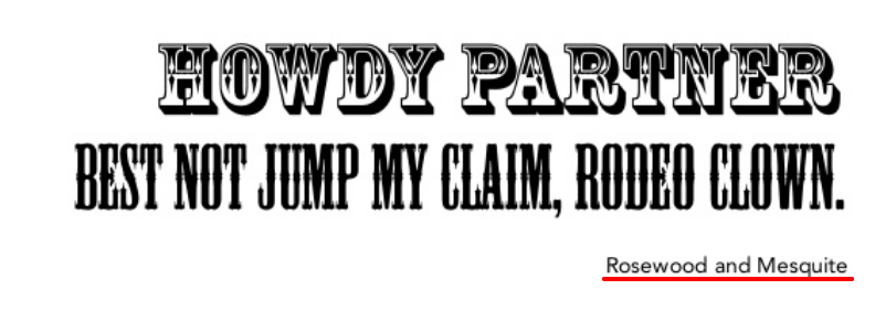
11. Using conflicting fonts
Using two or three fonts is a bad idea if the fonts you choose conflict with each other. Conflicting fonts fight for visitors’ attention, taking the focus away from the important parts of your message.
Conflicting fonts are a problem because they create emphasis and focus where there is none.
Content mistakes
12. Your content isn’t focused on visitors.
Inexperienced content marketers focus on creating content that’s focused on their business and how great they are. This content ignores visitors’ desires, goals, fears, frustrations, and problems.
This decreases credibility and it makes it harder to convert visitors into customers.
13. Your content isn’t scannable.
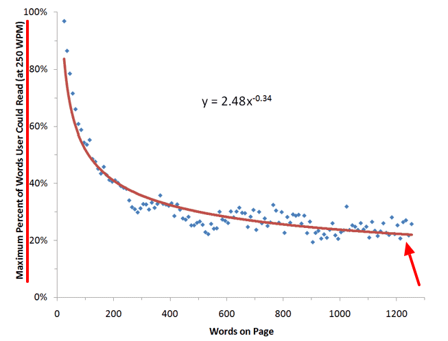
Your website visitors have just enough time to read 28 percent of the text on an average web page during an average visit.
Does this mean you should minimize the amount of content you create for your visitors? No, it just means you create content that’s easy to scan. What does scannable content look like?
- Descriptive sub-headings
- Short paragraphs (two or three sentences)
- Bold, italicized, and highlighted formatting
- Bullet points and numbered lists
This kind of content is easy to scan and far more likely to be read by your visitors.
14. Poor use of whitespace
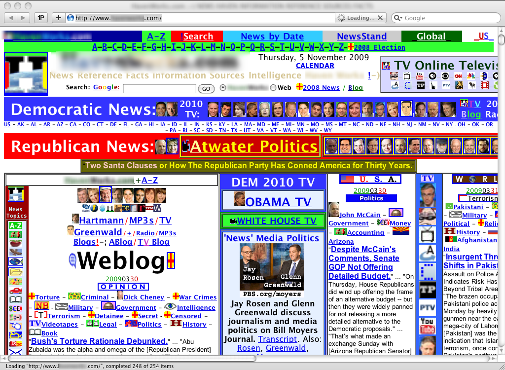
When it’s used well, whitespace increases comprehension, improves readability, increases attention, and maximizes clarity. When there isn’t enough whitespace, content is overwhelming for visitors to read.
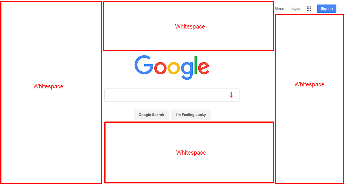
That’s a pretty extreme example, but it shows that whitespace is important. Google uses whitespace to focus their user’s attention on what is most important.
What about too much whitespace? That’s a bit more difficult to assess. Here’s what it looks like.
What’s the difference between this example and Google?
Intent.
Google wants visitors to focus their attention on searching for an answer to their question. Their whitespace has a purpose and it fits with their visitors’ goals.
When there’s an issue with too much whitespace, it typically means one of two things.
- The whitespace doesn’t have a purpose; or
- It has a purpose but it doesn’t fit with your website visitor’s goals.
When there’s too much whitespace or too little, it decreases clarity and focus.
15. Poor grammar
We all struggle with grammar mistakes from time to time. That’s understandable and something most website visitors are willing to forgive.
Grammar creates a problem when it becomes a habit. It erodes your website’s credibility, it makes a pretty terrible first impression, and it costs you money.
Usability mistakes
16. Not answering visitor questions
Your website visitors arrive with very specific questions they want to be answered. Visitors leave websites that ignore or refuse to answer those questions.
The list of questions varies depending on your industry, but here are a few common questions your visitors have:
- How do I get in touch with a real person at your company?
- What’s the price of your products and services?
- How do you handle refunds and exchanges?
- Why should I do what you’re asking me to do right now?
- What’s your privacy policy?
- What will you do with my information?
- What’s your shipping policy?
- Where are you located?
- What makes your company different?
- Why should I choose your product or service over a competitor?
Your website visitors have lots of questions they want you to answer. These questions change as they move from visitor to subscriber to prospect to customer.
17. Poor search
Your visitors, especially in e-commerce, use search to find what they’re looking for. Search is how visitors master large and complex websites. A great onsite search engine can handle:
- Typos
- Plurals
- Hyphens
- Keyword variations
Sorting results based on the number of keywords and queries isn’t helpful. If your site needs a search engine, make sure it prioritizes the best or most relevant search results for each query.
Navigation mistakes
18. Not changing the color of visited links
Visitors use links to figure out where they are and where they’ve been. This is important because your visitors use the color of visited links to exclude pages that didn’t give them what they were looking for.
This is also helpful because it keeps visitors from visiting the wrong page over and over again.
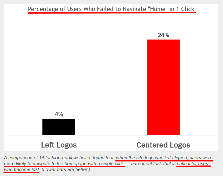
19. Centering website logos
When website logos are centered, it’s 6 times more difficult for visitors to find your home page within a single click.
Why is it important for visitors to get to your homepage? It’s one of the first places they’ll go when they become lost or disoriented on your site.
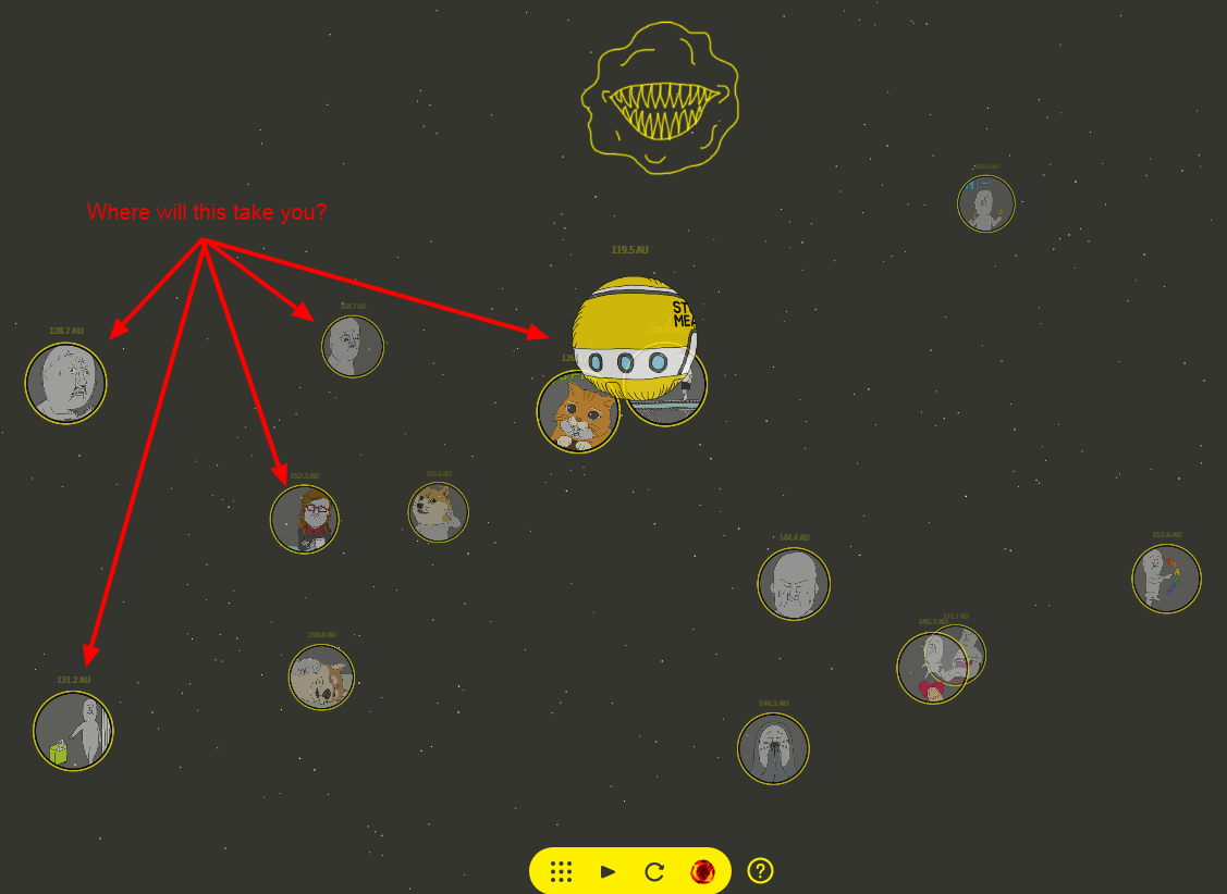
20. Invisible navigation menus
These don’t answer the “Where am I?” question.
Your website visitors use visual cues from your navigation menus and breadcrumb navigation to move through your site. They use these visual cues to repeatedly answer the “Where am I?” question.
Invisible navigation menus, a.k.a. mystery-meat navigation menus, force visitors to guess which elements on the page are menu items, where these menu items will take them, and whether that page will answer their questions or solve their problem.
Clear navigation, on the other hand, keeps your visitors oriented on the page. Clear menus, breadcrumb navigation, and design cues answer the “Where am I?” question for your visitors.
See the difference?
21. Uncontrollable navigation
Animated navigation — anything that rolls, flashes, bounces, or moves while your visitors are trying to find an answer to their question — are conversion killers.
Visitors spend their time trying to figure out how to use the navigation when they should be looking for answers to their questions. Most website visitors hate it when this happens and they usually abandon the site.
Graphics and image mistakes
22. Generic stock photography
Cheesy stock photos hurt your website performance for one simple reason. They’re confusing. When you use generic stock photos, you take away clarity and meaning.
When they’re used well, stock photos add meaning to your content. These photos reinforce what you’re saying, making it easy for visitors to understand your message.
Generic stock photos do the opposite: They take away meaning and create confusion.
Original photos are best.
If you don’t have the time, resources, or know how, use stock photos that add to your message. Just make sure that your images do one of two things.
- Use a story to answer visitor questions.
- Teach and demonstrate
Both types of images should be relevant and focused on one particular subject. If your image is irrelevant, it’s a waste of space and resources.
23. Poor sizing and scaling
Stretched or poorly-sized images look cheap and unprofessional. It also decreases trust. Images should be scaled vertically and horizontally with a one-to-one ratio.
What about large images?
Large images decrease load times and, as we’ve seen, slow load times cause visitors to bounce. If you want to work with images, use common file formats like PNG, JPEG, and GIF (stay away from TIFF).
A good rule of thumb is to size images for the dimensions where your image(s) will appear and save each image using sizes that are optimized for the dimensions that will be used as well as for the social network you’d like to share your images on. Use a CDN if you’re hoping to increase page speed.
24. Unresponsive image sizing.
Google recommends using CSS media queries to ensure that graphics, images, and media are fully responsive. Your CSS should accommodate the various changes in size and shape, resizing your images and media based on screen dimensions.
25. Missing metadata
Digital cameras save a lot of unhelpful metadata. File names like DSLR000167.jpg aren’t helpful to visitors or search engines.It’s a better idea to strip out
It’s a better idea to strip out metadata and replace it with data that’s descriptive and helpful — both to your visitors and to search engines.
Performance mistakes
26. Your website doesn’t work with all modern browsers (when it should).
27. You’ve become overly dependent on JavaScript. The design of your site, individual web pages, and core functionality shouldn’t break if your visitors decide to turn JavaScript off.
28. There’s no image or file compression. Image files have a lot of redundant information. Image compression removes this redundant data, giving you the same image (with comparable quality), but a smaller file size.
29. There’s no browser caching. When browser caching is enabled, your web pages load faster. Caching downloads files and assets initially, then stores the data on your hard drive.
Retrieving files and assets from your hard drive is always faster than retrieving it from a web server.
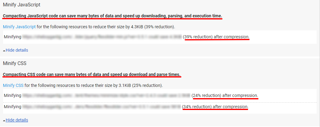
30. CSS, HTML, and JavaScript haven’t been minified. Minifying your code removes all of the unnecessary characters from your code without changing the functionality of your code.
Compacting your code improves the page speed and website performance overall.
Legal mistakes
31. No Privacy policy
50 percent of Americans don’t know what a privacy policy actually is. Does that mean your privacy policy doesn’t matter?
Actually, 20 percent of Internet users always read privacy policies, even though many of them don’t understand what they’re reading. A large portion of your website visitors wants to see that you have a privacy policy in place.
They want to know what you’re going to do with their information and how you’ll use it.
A privacy policy shows your website visitors that you have a plan in place to protect them, even if they don’t understand what that plan means.
32. No return policy or warranty information
Website visitors want to know that you’ll take care of them in the unlikely event that something goes wrong. They want to see that you have a return policy in place and that you honor it.
Here’s the secret about your return policy and warranty information.
They’re all designed to increase sales. The more comfortable your website visitors feel about taking a risk with you, the more likely they are to become a loyal customer.
Conclusion
This isn’t a comprehensive list, but it’s a great starting point if you’re looking to create a profitable website. Website design isn’t rocket science, but it does take work.
When it comes to creating a design that drives a lot of traffic and creates a lot of revenue, most businesses struggle.
They make simple and very common mistakes.
Creating an attractive website is important, but it’s also important to create a website that makes you money.
You can dramatically increase the amount of traffic, leads, and sales you get from your website.
Just create a site that’s focused on your website customers.
When you get to know your audience, and you focus on the things they want, building a profitable website is easy.
But it starts with your visitors. Figure out what they want, when and how they want it, then give it to them.
Then you’ll find that website design isn’t a difficult thing to master.
What kind of website design mistakes have you run into recently?





Comments (32)