Does this situation feel familiar? —
Your web designer reckons your site is outdated. It makes you look amateurish. If we’re being honest, we might even say it’s downright ugly and you should be ashamed of attaching it to your brand.
The solution?
A redesign, of course. Not just a few tweaks, mind you, but a reinvention, taking your tired old website and bringing it into the modern day.
It’ll have snazzy vector paths, cute cartoon scenes, jQuery carousels, full-page high-resolution background photos, the works. By the time you’re done, you’ll have a breathtaking design that cost you a fortune to create—but you shouldn’t hesitate, because it’ll be worth it.
Why?
Well, check out the reasons!
1. Sites with images look good, and people enjoy eye-candy, so they’re more likely to browse around
2. Images are attention-grabbing, so new visitors won’t hit the back button
3. An eye-catching site impresses prospects, and impressed prospects are more likely to buy
4. Flashy images show that you’re hip and modern, and people trust hip and modern companies—so you get more sales
5. In summary, for every bit of eye-candy on your site, your sales will increase an average of 16.5%*
Wrong, wrong, wrong!
Many years ago, advertising legend David Ogilvy commissioned research into the use of images. He wanted to be sure that when he wrote ads, the images in them would increase response rates. The prevailing wisdom was that any kind of image would attract attention, and therefore get people reading. But Ogilvy wasn’t so sure.
What he discovered from testing various kinds and placements of images was quite different to the popular opinion of designers—then and now:
Images can reduce readership.
Yes, they catch people’s attention. But without some very specific conditions in place, that attention does not translate into people reading the body copy—or coughing up cash.
You might be wondering why you should care about research done in offline advertising. Well, Ogilvy’s ads were specifically structured to look like news articles. They bear an uncanny resemblance to most forms of online content. And the best practices he discovered for images revolve around broad psychological principles, rather than medium-specific tactics. So they apply to all kinds of content—not just advertising copy.
What Ogilvy Discovered
Here are four principles Ogilvy’s research turned up. If you ignore these principles, your images will generally reduce your readership. If you apply these principles, your images will increase your readership.
Of course, they are just best practices—a sensible place to start. The only way to know for sure how they will work for you is by testing.
1. Placement matters—a lot
The natural sequence for reading involves a very specific order. First we look at the image, if there is one. Then we scan the headline. Then we read the body copy (if the headline is interesting enough).
An image at the top of the page is a common practice, to catch people’s attention and draw them into the article. But if you’re doing this, you’d better be sure it’s above your headline.
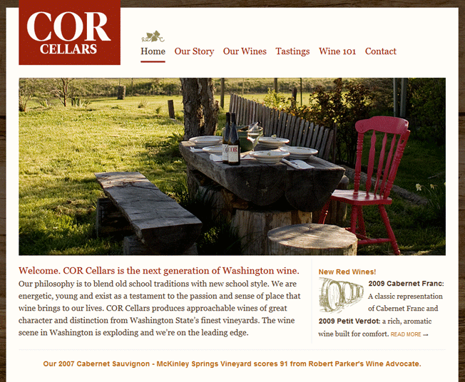
This site’s headline isn’t much to speak of, but at least it follows the tried-and-true layout—situated below the image, where it will get read.
Ogilvy found that, on average, headlines placed below an image are read by 10% more people than headlines above. Since reading the headline is a prerequisite of reading the body copy, you’re losing a potential 10% of your audience if you’re distracting them with an image in the wrong place. If you have a large audience—say 145,000 people—then putting your image below your headline could be costing you nearly fifteen thousand potential readers! As Ogilvy sardonically said, that’s not to be sneezed at.
2. Captions get read more than body copy—four times more
An image placed somewhere in the middle of text draws the reader’s attention more than the text itself. It might even draw him out of the copy (see the next point). For that reason, it’s extremely important to have a caption under every image—to press your main point home, and hopefully to get him back into the copy.
Captions under images are read on average 300% more than the body copy itself, so not using them, or not using them correctly, means missing out on an opportunity to engage a huge number of potential readers. (For images above a headline, the headline itself can serve as a caption.)
Newspapers have long understood the value of captions for drawing readers in. Yet this knowledge doesn’t seem to have filtered down to web designers and marketers.
In copy that aims to sell something, your caption should include your brand name and your promise. That way, you have another chance to get your reader interested and to push him back into the copy—or even directly to the call to action. You have to make the most of his brief attention.
For other kinds of content, figure out the central purpose of the page itself, and encapsulate that in your caption. It is wise to craft your captions as you would craft your headlines—because they are similar lengths, with similar purposes.
3. Don’t break the left margin
When we read, we rely on the left margin always being there as an anchor, to give us a place to return our eyes to. Without a consistent left margin it’s exceptionally difficult to follow the text. (The reverse is true for text read right-to-left.)
That’s why body copy is never justified to the center or right in the Western world: if the location of the left margin changes, we have to relocate it before we can continue reading. Our eyepath is interrupted, along with our train of thought.
Yet you’ll see an awful lot of websites that scatter left-aligned images throughout body copy. If you have a particularly clever designer, copy might even flow around images in an arty way.
This forces the left margin of the copy to change location—breaking your reader’s flow and forcing him to readjust. Far from helping to keep his attention, such techniques threaten to lose it.
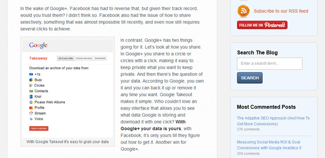
“Oops”. I couldn’t resist a gentle poke at Unbounce, who break the left margin here on their blog.
For images placed inline with text, always be sure to align them on the right margin. Never break the left margin.
4. Images without clear relevance are a waste of space
If the images you’re using are not clearly tied to your value proposition, or to the central theme of your page, then they will only confuse your readers. At best, they’ll be pointless distractions. At worst, they’ll give the wrong impression and lead readers to feel tricked or disappointed.
It’s actually pretty easy to avoid irrelevant images just by using captions. If you can’t come up with a good caption for an image, it’s probably because the image has no place on the page.
The best kinds of images fall into just two categories:
1. Images with story appeal
2. Images which demonstrate
An image with story appeal is best for putting above your headline. It evokes a strong sense of curiosity in your reader. He wants to know what’s going on in it—so he reads your copy to find out.
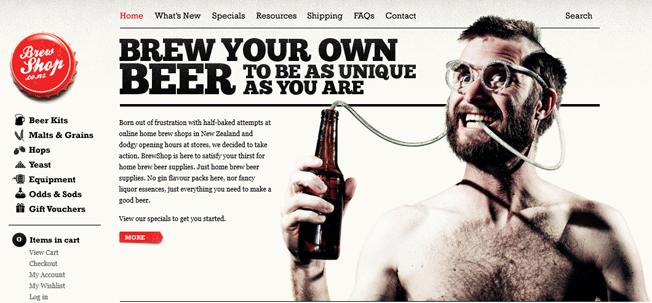
Although brewshop.co.nz doesn’t do everything right, its homepage image has some serious story appeal.
But these kinds of images are not very easy to come up with. Most of the images I see at the beginning of web pages are obviously taken straight from some stock photography site, and have at best a tenuous connection to the content on their pages. Not only do they have little story appeal, but when I see them, I immediately suspect the story they’re telling is not the same as the story in the copy.
An image which demonstrates is exactly as it sounds. It demonstrates something you’ve said in the copy.
It’s hard to go wrong with this sort of image—the only caveat is that it needs to convey your value proposition or central theme with more force than copy alone could. Product photos, before-and-after shots, charts or graphs showing comparisons and so on all fit the bill nicely. And the higher quality the better—if it needs to be downsized to fit into a fairly narrow column of text (and it probably will), then make it clickable, so readers can see a larger version in a lightbox.
Images that turn readers off
Here are some kinds of images to avoid like the plague. They will distract your readers with their visual dominance, without the benefit of interesting your readers with their content. And very often they will convey the impression that you are incompetent, thoughtless about your page content, or just unable to come up with anything of real quality.
- Stock photographs that are obviously stock photographs—their generic dullness and lack of imagination rubs off on you. Just because a stock photo is attractive doesn’t mean it will be effective.
- Poor quality images of any kind—better to not show anything than to show something pixelated, over-compressed, badly resized, of a low resolution, or otherwise shoddy-looking.
- Crowd shots. Try to use photos that have a single main subject—people find crowd shots boring because there’s no one to focus on.
- Bigger than life-size images of faces. According to Ogilvy, readers avoid them because they seem slightly grotesque.
- Historical subjects—unless you’re catering to an audience of history enthusiasts, it’s a safe bet your readers will find historical shots boring.
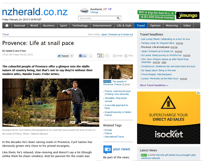
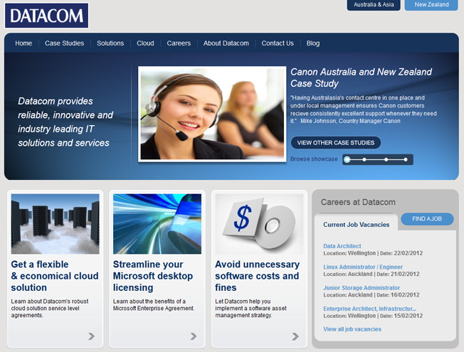
This website is a study in images done wrong: there is a stock photo top center depicting a model we all know doesn’t work for Datacom—and to add insult to injury, it has been distorted from resizing. The images in the columns beneath have relevance only in the sense that they were forced into context without being needed—they convey no value whatsoever since they demonstrate nothing.
Every image must be worth its page weight in gold
Lastly, while you’re mulling over whatever fancy graphic your web designer wants to sex your page up with, mull over this: page load times are still the number one criterion for maximizing readership. For example, a few months back Google discovered that a loading time increase from 0.4 seconds to 0.9 seconds decreased traffic by 20%. In fact, we created a handy infographic showing how more and more readers abandon a page as load time increases. Needless to say, images increase page load time.
So take a look at your latest graphically-endowed content. Is that extra weight really helping? Is each image demonstrating your value proposition forcibly, or teasing your reader into your copy with story appeal? Is it positioned correctly and captioned enticingly? Is it worth its weight in gold? If you’re not sure, it’s time to start testing, measuring—and perhaps culling.
* Figures are entirely made up for effect. Designers don’t really go this far…but I’m sure some of them want to.
About the Author: Bnonn is known in the boroughs as the Information Highwayman, he helps entrepreneurs sell more online by improving both their web copy and design. When he’s not knee-deep in the guts of someone’s homepage, he is teaching his kids about steampunk, Nathan Fillion, and how to grapple a zombie without getting bit.
Comments (100)