
By now, most SEOs are pretty good at mobile SEO.
Mobile SEO has been around for a while. We’ve heard the same things about mobile first design, accelerated mobile pages, and mobile-friendly user interfaces.
Even though this is all true, I still see people making mistakes.
Big ones.
This happened recently. I was helping out a national SEO agency with some marketing ideas. When I pulled up their checkout page, I went 😱.
It was, to put it simply, not optimized for mobile!
You may be making some of these mistakes, too! I hope you’re not, but what if you are?
If you are, then you’re missing out valuable traffic, possibly losing rank, frustrating your users, and maybe even losing revenue.
As much as we say “mobile matters!” do our websites reflect it?
Look, it’s 2017! The mobile phenomenon isn’t a big surprise anymore. It’s a way of life.
If our websites aren’t fully optimized for mobile search, we need to change things.
I’ve put together this master list of SEO mistakes. You can use this article as a checklist. Work through it, and analyze your own websites or your client’s websites.
Then, using the solutions I’ve explained, try to fix the issues as soon as possible.
Now, just because I’m addressing “you” in these sections doesn’t mean you’re doing anything bad. It just means I want to to do whatever it takes to fix your mobile issues.
Keep in mind that there’s a lot of overlap between mobile design, mobile SEO, mobile content, and mobile UX.
In fact, they’re all mixed up in a giant ball of important! That’s why you’ll see a variety of issues below, ranging from technical stuff to big-picture stuff. It all matters.
Learn the exact steps I took to generate 195,013 visitors a month without spending a dollar on ads.
You’re ignoring the way that people read content on mobile devices
You might have thought I was going to launch in on a tirade about touch points or AMP, right?
Wrong.
One of the most important features about mobile SEO is one that most people don’t even think of: Content.
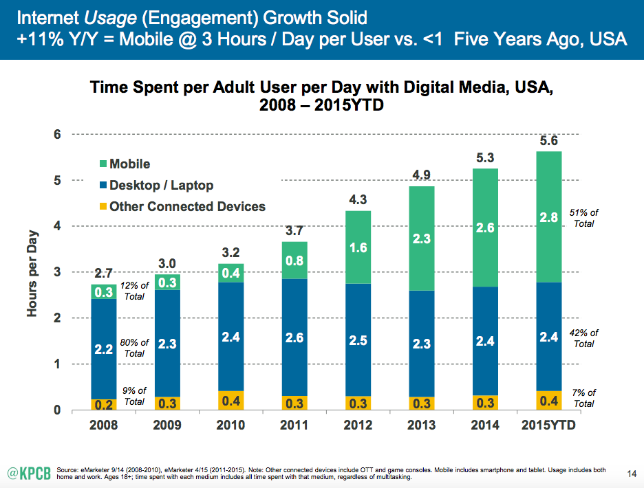
Take this little statistic into account. In the U.S., people spend most of their total digital media time on a mobile device — about 2.8 hours per day.
What are they doing on their mobile device?
They’re checking the weather. No, really.
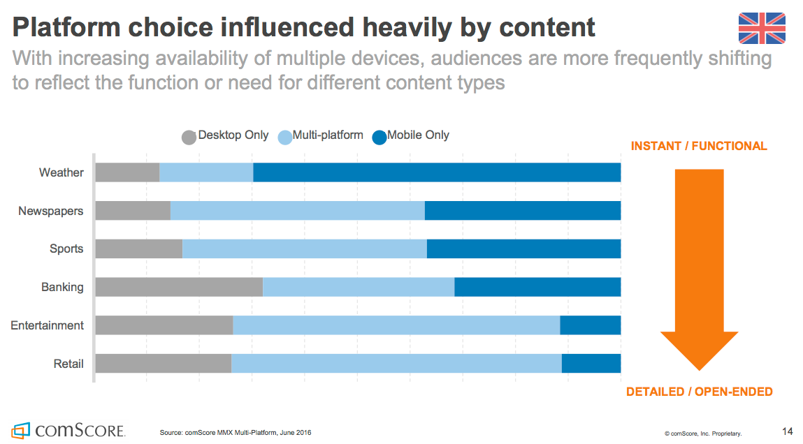
More specifically, they choose to do certain activities on their mobile device as opposed to an alternative.
They choose to check the weather, read the newspaper, and keep up with sports on their mobile device.
In other words, they’re interacting with a lot of content. Much of this content could be videos or images, but they also interact with a lot of written content.
When it comes to reading news, specifically, take a look at which websites/apps people prefer:
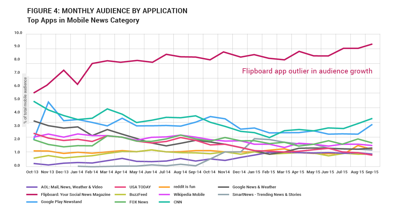
Do you see the outlier? The line way up at the top of the chart?
It’s Flipboard. It’s not even a news websites. It’s a mobile app!
There is a reason why Flipboard has huge usage. It’s because they repackage news and information specifically for mobile readers.
Take a look at these screenshots I just took on my mobile device.
This article from HBR looks inviting.

Browsing through articles is easy and aesthetic.

It even looks like a magazine!

The other sites probably have responsive sites and AMP, but they don’t have the same style of content presentation that Flipboard has.
My point is this: Mobile users interact with content differently than non-mobile users. Ignore it at your peril.
Let’s go through a few practical things you can do to optimize your content for mobile users.
Use a large, comfortable font for the body of your content.
You want people to read your content without squinting.
Typecast recommends a minimum of a 16px font for mobile readers.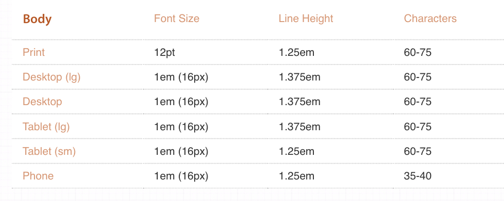
Don’t go overboard on your font size for the headline.
If you make your headline too large, it’s going to fill the whole screen. People will have to scroll to see the first line of your content.

Try to avoid that. Instead, make your headline small enough so people can see it and the opening content or image at the same time.
Like this:

Break it up with white space.
Mobile users need white space for their eyes to rest, and for their mind to gain clarity. Use plenty of white space in your content.
The easiest way to do this is by writing short paragraphs.
Have you ever noticed that my paragraphs are rarely longer than three lines even on mobile? Why is this?
It’s because I’m trying to give both mobile and non-mobile users a good experience with small chunks of content.
Break it up with headings and images.
Headings and images both help to break up your content. Use them.
Mobile readers behave differently from non-mobile users when interacting with content. They scan. They skim. They skip. They save for later.
Adapt to their needs by creating your content with this style in mind.
You’re optimizing according to traditional keyword research, not mobile keyword research
It comes as a surprise to a some people, but keyword research for mobile and for desktop should be different.
This makes sense when you think about it. When searching on mobile device, these things are true:
- People make typos easier.
- People try to type shorter queries if possible.
- Often, people speak their queries rather than type them.
- People search for different things on mobile (e.g. a local restaurant).
The most important thing to keep in mind is that mobile searchers are sometimes speaking instead of typing.
That’s why you get queries like these…
But it’s not just directions.
It’s more sophisticated queries, like this…
Instead of doing traditional keyword research, think about keyword research terms of mobile search practices such as these:
- Conversational phrases
- Questions
- Full sentences
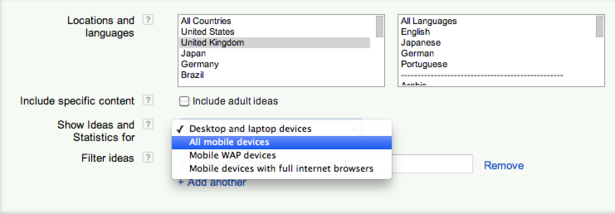
How should you do your keyword research? If you use Google Keyword Planner, be sure to click on “Show ideas and statistics for…All Mobile Devices.”
You’re ignoring the mobile user journey.
The mobile user journey is different from a typical desktop journey.
These differences have an SEO impact.

When you go about creating your customer journey, start with the mobile experience first.
If you develop your mobile customer journey first, it will enhance all of the mobile SEO work that you do.
Your calls to action are tiny
One major usability error that has SEO impact is tiny calls to action (CTAs.)
You’ve probably seen mobile buttons that look like the tiny ones at the bottom of this screen:
That doesn’t work.
The average mobile user’s finger will cover both of those buttons!
I recommend making mobile buttons the full width of the screen. This is what I’ve done on my mobile site below.

You’re not segmenting your mobile traffic.
How you measure your mobile traffic has a huge impact on how you make SEO decisions.
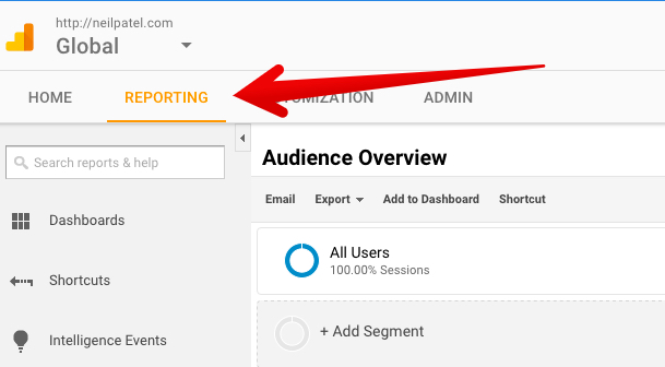
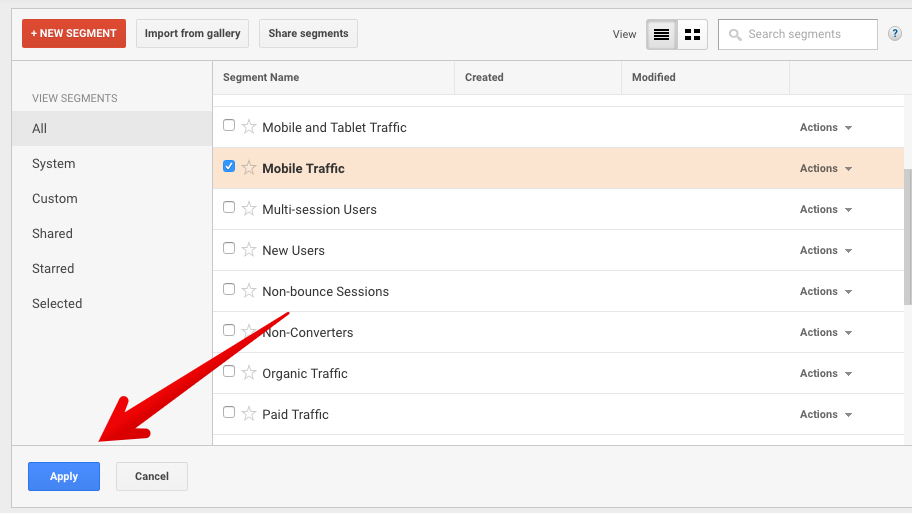
To create a segment in Google Analytics, follow these steps.
Click the reporting tab.
Click “Add Segment.”
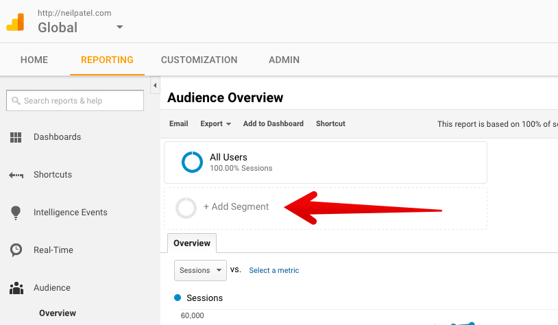
Click “Mobile Traffic” in the checklist.
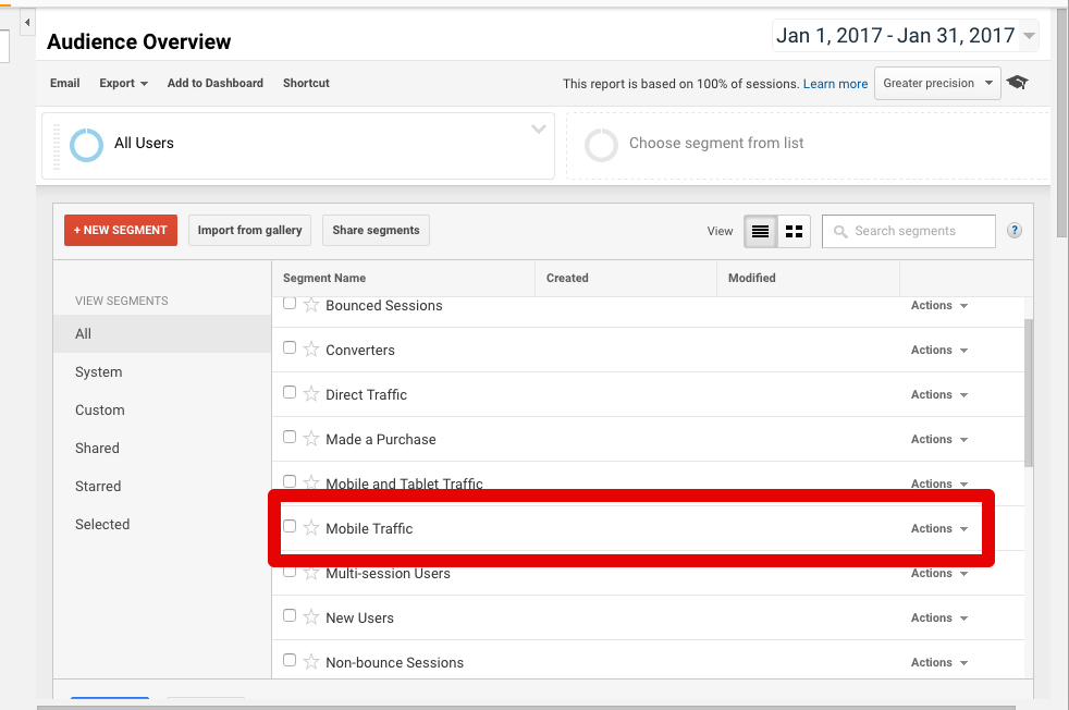
Then click “Apply.”
I recommend making segments for a variety of actions, users, and channels.
At the very least, be sure you’re analyzing mobile traffic on its own, so you know how to adapt your SEO strategy to their needs.
Your JavaScript, CSS, or image files are blocked
If your site is blocking any scripts or images from the mobile site, Google is going to ding your site with a low grade.
They said so themselves! Here’s the quote:
Blocked JavaScript, CSS, and Image Files….directly harms how well our algorithms render and index your content. This can result in suboptimal rankings.
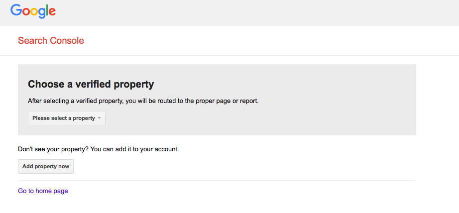
Thankfully, there’s an easy way to determine if there’s a problem with your site’s mobile fetching.
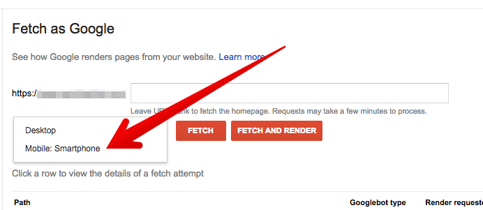
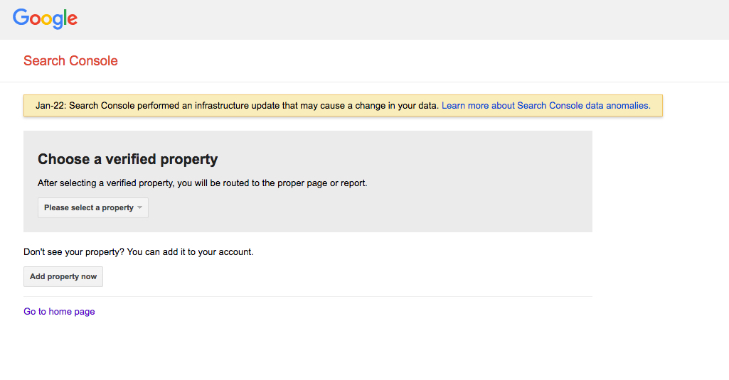
Go to the Fetch as Google tool. Select from the dropdown menu the property you want to analyze.
You’ll see an overview of the tool.
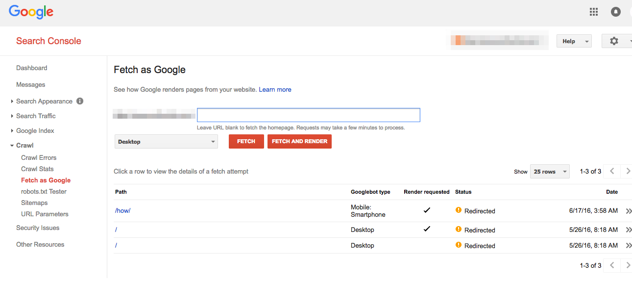
Select “Mobile: Smartphone” from the menu.
Click the “Fetch and Render” button. It may take a few seconds for the tool to fetch and render.
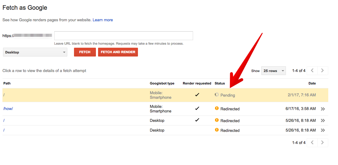
You can click on the entry to get a detailed report of the fetch and render process. In this case, the URL has a 301 redirect.
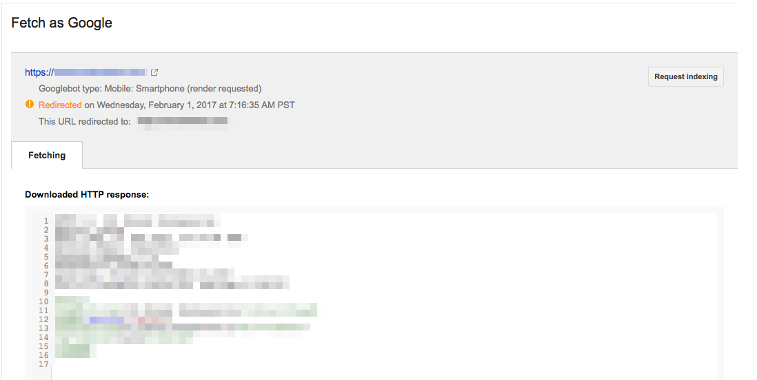
If you want to, you can request indexing from Google.
Your content isn’t playable.
You may have seen a message like this on your mobile device.

Usually, the problem is with embedding or old technology.
The solution is to ask your developers to use HTML5 standards for all playable content.
You’re still not using responsive design
You’d think by now that responsive design is being used by everyone.

Sadly, it’s still not the case.
If your website still isn’t responsive, make it your goal to do so this year.
Non-responsive websites simply do not rank as well (if at all!) in mobile search.
You’re not routinely checking for crawl errors.
Sometimes, mobile SEO issues are easy to spot and fix
One thing you should be doing on a routine basis is checking your mobile crawl reports.
Here’s how.
Go to the Google’s Crawl Errors reports page, and click “open the crawl errors report.”
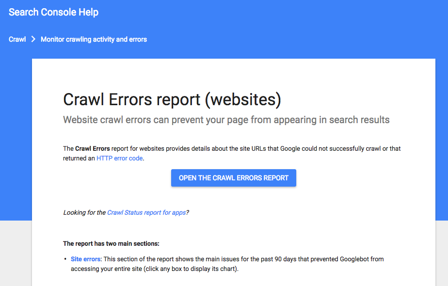
Select your property from the dropdown menu.
See if you have any errors.
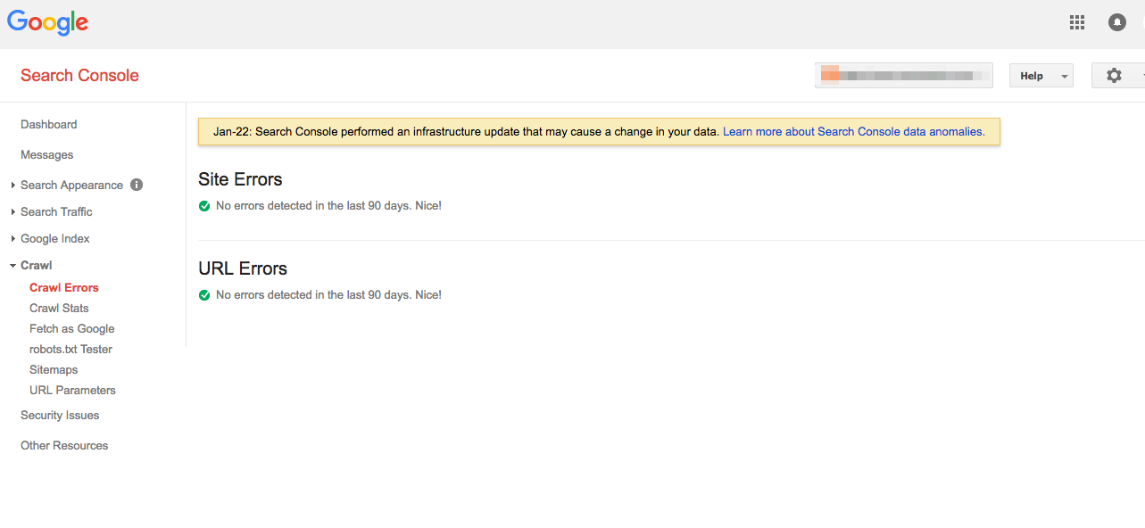
If you don’t have any errors, pat yourself on the back.
If you do have errors, Google will provide suggestions as to how you should fix them.
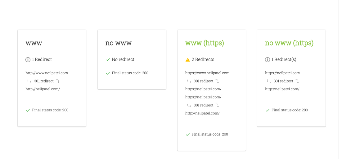
One such error has to do with URLs and redirects. In the age of responsive design, mobile redirect errors aren’t as much of a problem as they used to be.
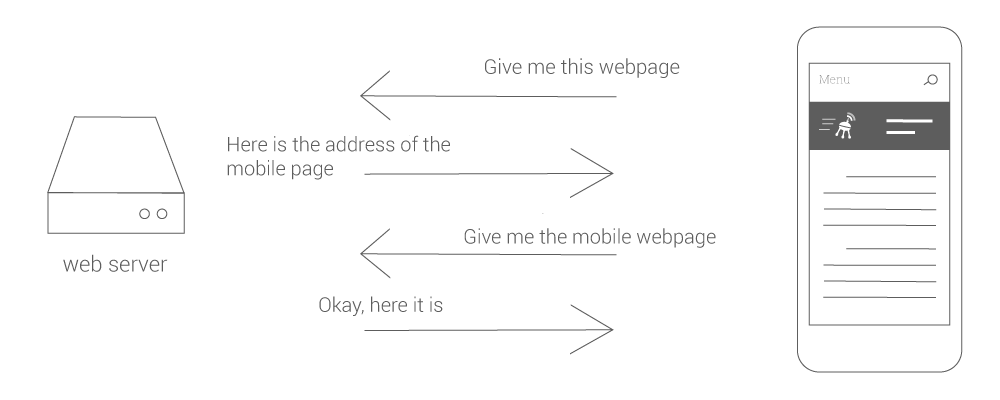
Occasionally, they do come up. Scan your website with a redirect mapper tool, like this one from Varvy.
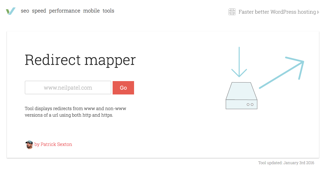
You’ll gain a clear sense of where the errors are, and how to fix them.
You’re serving a 404 to mobile users trying to access a URL.
Everyone hates 404s.
But when they happen on mobile, it’s particularly frustrating.

Checking the crawl errors report (above) is the best way to spot mobile 404s, and fix them as they come up.
Again, this is usually a problem for non-responsive sites.
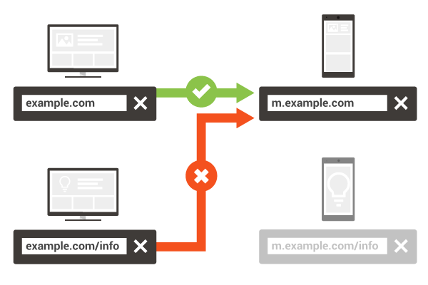
If you are using a mobile-only site (m.example.com), but don’t have a corresponding page for mobile devices, then make sure you’re directing users to the desktop page instead of a 404 page.
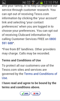
You’re checkout process is completely useless to mobile users.
Mobile checkouts are increasingly common.
If you have a checkout page, give it a close examination to make sure that it is an optimal mobile experience.
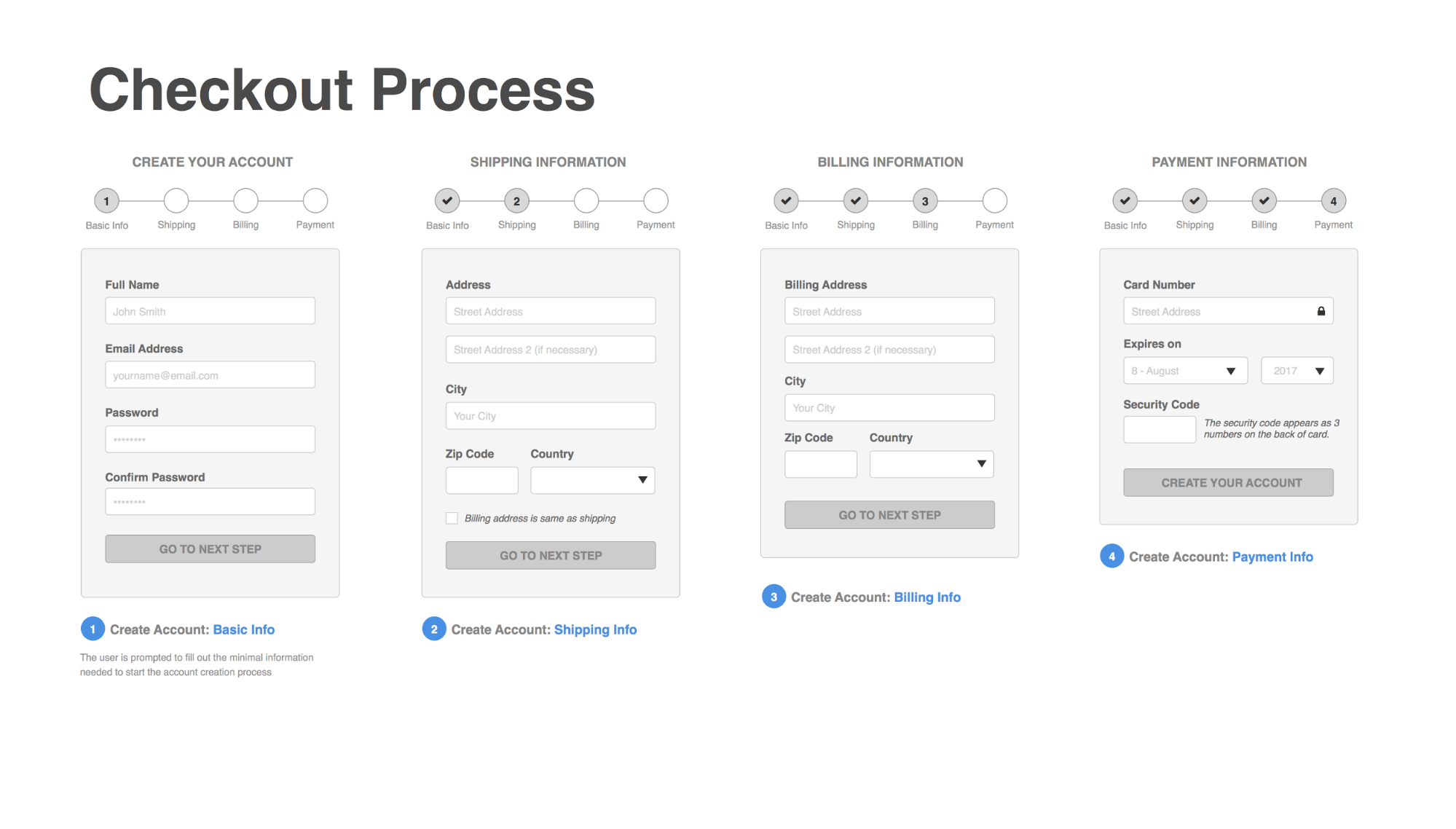
Some basic requirements are:
- Large touch points
- Large buttons
- Progress bar
You are using interstitials incorrectly.
Interstitials aren’t all bad.
There are some cases, particularly for marketing purposes, in which you want to present an interstitial in order encourage a particular action.
If you are using interstitials, do so cautiously. Google recognizes that interstitials may ruin the user experience.
Google rolled out a search signal on January 10, 2017 that affects the ranking of mobile sites that improperly use interstitials.
January 10, 2017 update: Starting today, pages where content is not easily accessible to a user on the transition from the mobile search results may not rank as high. As we said, this new signal is just one of hundreds of signals that are used in ranking and the intent of the search query is still a very strong signal, so a page may still rank highly if it has great, relevant content. Please head to the webmaster forums if you have any questions.
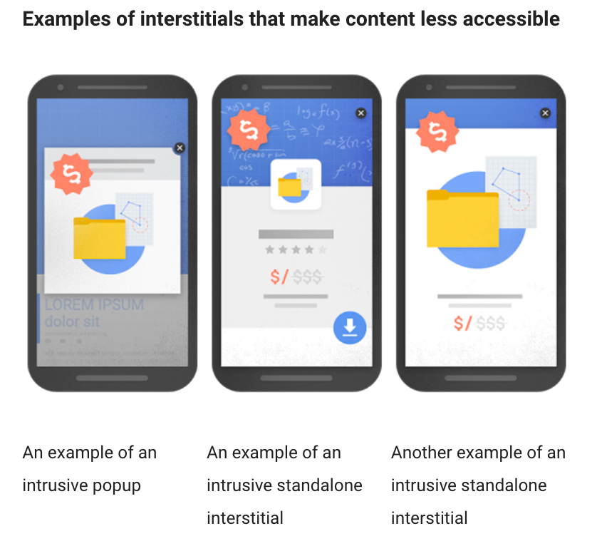
Google shows three types of interstitials that they consider bad, or “that make content less accessible.”
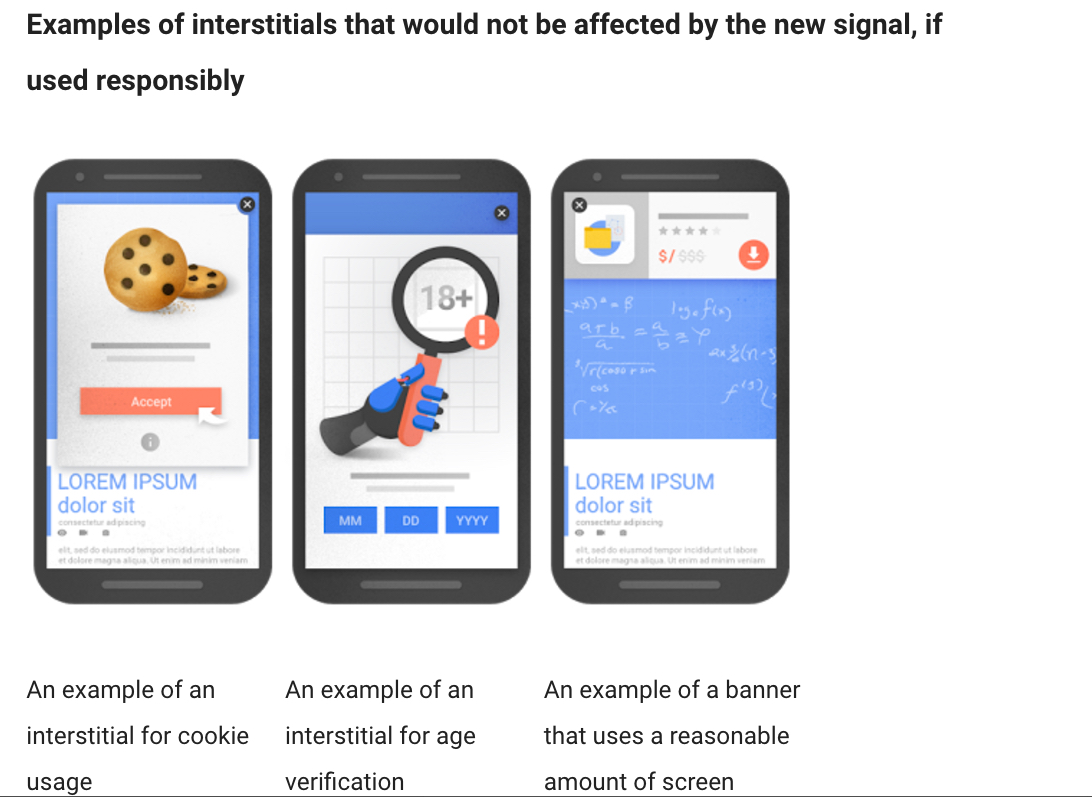
There are interstitials that are okay in Google’s eyes.
The moral of the story with interstitials is be careful.
If you don’t need them, don’t use them.
You’re using irrelevant cross links.
Irrelevant cross linking happens on mobile sites (as opposed to responsive sites.)
In some cases, a mobile link points to the desktop page. Sometimes, it’s the desktop version that redirects to the mobile version.
The simple solution is to change the target link.
The better solution is to use a responsive site.
Your mobile pages take more than one second to render.
Mobile users are impatient, and Google takes their side.
If your mobile website takes more than a second to load, you are frustrating your users and possibly receiving lower rankings.
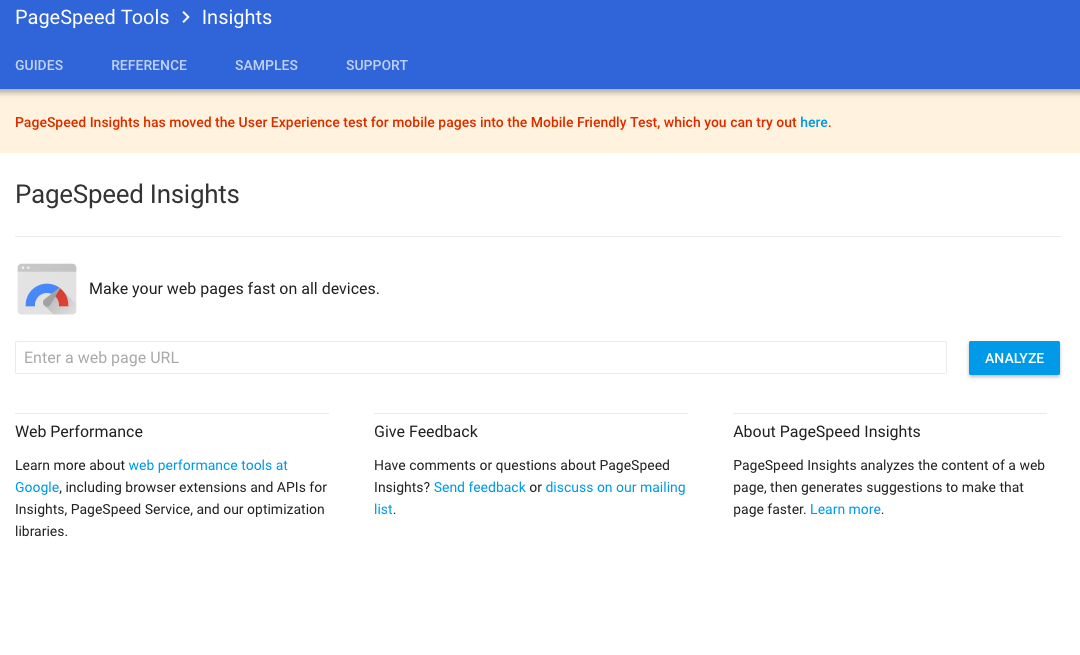
You can test the speed of your website using Google’s PageSpeed insights.
Put your URL in the field, and click “Analyze.”
Google provides helpful instructions for improving site speed.
However, they don’t give a report of your page speed in seconds.
To get your page speed in seconds, use Pingdom’s Website Speed Test.

Enter your URL and select a test location (preferably the location closest to you).
Click “Start Test,” and then view the results.
You haven’t thought about accelerated mobile pages.
Accelerated mobile pages were all the rage a few months ago.
It’s important to consider using AMP for your mobile site.
Why? Simple. AMP-optimized pages will load faster on mobile, and they tend to rank better.
However, you should not automatically assume that AMP is necessary for your website. AMP sites tend to minimize the user experience in favor of quick load time.
That’s great for sites with regular content delivery, such as a news site.
If your goal is a more engaging, immersive, and interactive experience, you may not want to use AMP.
Conclusion
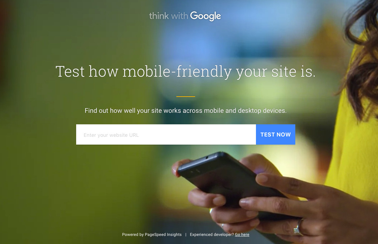
The best way today to get an accurate report of all your mobile issues, is to use Google’s mobile friendly test.
The test takes just a few seconds to run.

You can review an easy-to-understand report.
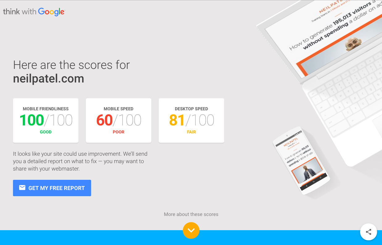
They provide you with a mobile-friendliness score, which is a helpful way to understand your site’s overall mobile usability.

Most web designers, developers, and SEOs today are able to create mobile-optimized sites with no problem.
But occasionally, you’ll encounter one of those thorny SEO issues that perhaps you forgot about or that randomly came up.
Always be thinking mobile. Test your site. Use your site on mobile. Look for issues.
The more you do, the more you’ll be aware of problems and know how to fix them.
What’s your experience with mobile SEO mistakes? Have you made any of these? How did you fix them?
Comments (29)