Who wants to 10x their revenue?
Okay. You can put your hand down.
Of course, you want to 10x your revenue this year. Everyone wants to.
But I don’t mean to discredit that goal. It’s a worthy undertaking — one that should be at the top of every serious marketer’s list.
However, like many dreams and ambitions, 10x-ing your revenue is far easier said than done.
While many people want to 10x their revenue, few will actually accomplish doing so.
Fortunately, you’re here to learn how you can pull it off.
And the trick revolves around optimizing your website for conversion.
If more people convert, that directly impacts your revenue.
Sadly, conversion rates often sit at just a few measly percentage points.
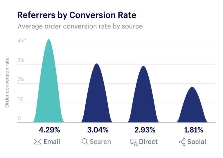
Email is at 4%, search and direct at 3%, and social isn’t quite at 2%.
Those numbers can discourage even the most hard-headed marketer.
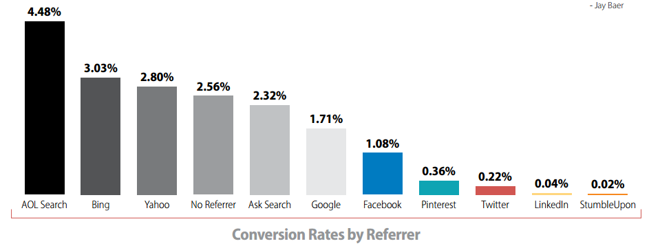
And the picture is similarly discouraging when you look at conversion rate by referring source.
Or conversion rate by platform.
In all of these cases, you’re lucky to see a conversion rate that sits around 4% and more likely to see one that sits around 2% on average.
I know. That’s not very promising.
But you needed to hear it.
Now that we’ve gotten that out of the way, we can talk about how you’re not going to fall victim to those cruddy averages.
Instead, you’re going to learn from nine studies that explain how you can increase your conversion rate and 10x your revenue.
The studies are timeless, and for that reason, it’s important for you to be aware of them in 2018.
Here they are.
1. Save money to make money
Maybe you already know this. But one of the best ways to make money is to save more money.
If you can spend less on your marketing campaigns and generate the same effect, then that can work wonders to increase your profitability.
In fact, the first timeless conversion study we’re going to look at is one done by AdEspresso.
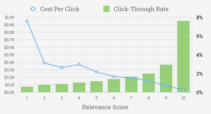
They analyzed the correlation between cost-per-click, click-through rate, and relevance score on Facebook Ads.
The result?
They found that as the relevance score goes up, so too does click-through rate. And the cost per click goes down.
In other words, a higher relevance score on your Facebook Ads saves you money and makes you money simultaneously.
And you don’t just make money because you’re spending less — you make money because you get a higher click-through rate.
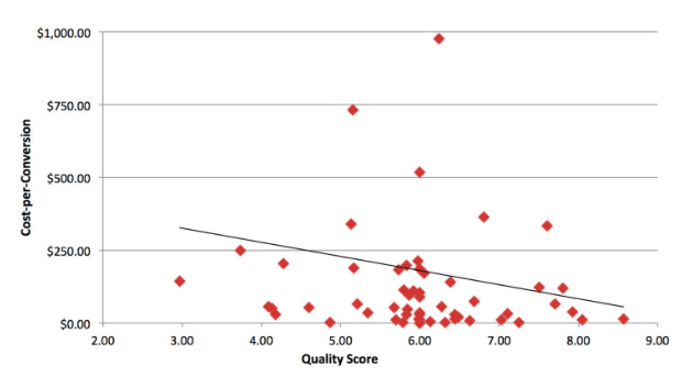
This truth is similar to your PPC ads quality score.
As the quality score increases, the average cost per conversion goes down.
Which means it costs you less to gain new customers.
That’s an AdWords win for any marketer.
Although it’s easy to neglect the quality score and relevance score, those numbers are great indicators of how much you’re spending and how much you’re making.
Focus additional time and energy on increasing those scores if you are serious about 10x-ing your revenue in 2018.
To do that, target specific buyer personas to ensure that you understand your ideal customer.
And always, always, always A/B test your advertisements. This will help you determine which ads perform well, which ones don’t, and then iterate upon the best.
That’s a quick recipe for increasing quality and relevance scores for your paid advertisements.
If you want to make more money, you have to save more money.
2. Use review stars
Golden five-point stars are the bane of some marketers and the wealth of others.
Allowing reviews on different platforms is a great way to swiftly hurt your business if you have a bad product or help your business if you have a great product.
But, generally speaking, those reviews help rather than hurt.
If for nothing else, simply because they allow customers to openly express their opinions about your product.
Which, in turn, increases the amount of trust people feel willing to place in your business.
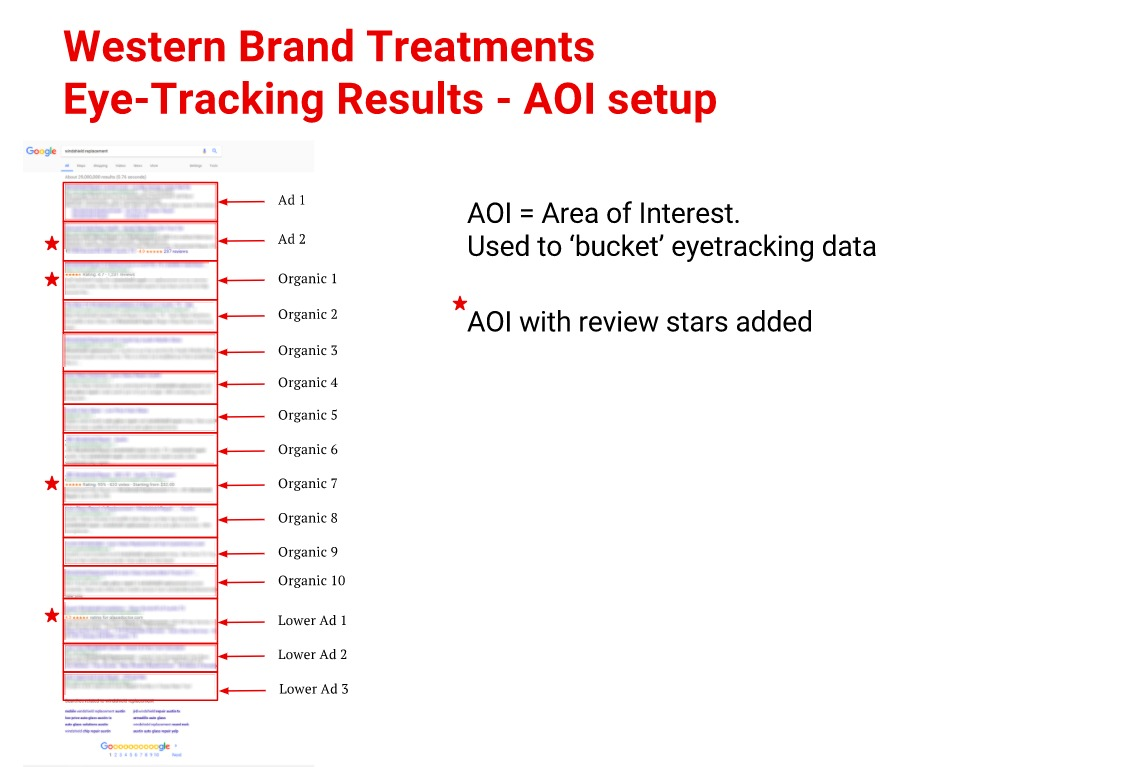
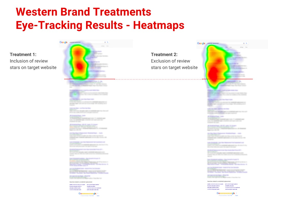
As proof, consider the original study done by ConversionXL, where they tracked the correlation between click-through rate and review stars in Google results.
You’ve seen these results on Google before, haven’t you?
The ones with the review stars. Some results have them. Others don’t.
Of course, Google isn’t the only place where these five-pointed conversion helpers live. They live on Amazon, a variety of e-commerce websites, and even on SaaS platforms.
Everyone is using reviews to increase their conversion rate.
And for good reason.
ConversionXL even ran a heatmap during the study to determine how people were interacting with the SERP.
Their results?
They saw a 35% boost in click-through rate for results with star reviews with a 97% chance that review stars will have a higher CTR than its review-less counterpart.
If that doesn’t convince you to include reviews on your webpage and in Google’s SERP, then I don’t know what will.
But one thing’s for certain. People want to see reviews and if you let them, more people will buy.
And that increases your revenue.
It’s a simple fact with a simple recipe for success. Reviews make a big difference in consumer purchasing decisions.
Leverage them whenever you can.
3. Leverage social proof
Similar to review stars, but more holistic, is social proof.
Social proof is essentially showing consumers that they should buy your product because other people bought it and loved it before them.
Truthfully, no one wants to be a pioneer.
Consumers want to feel that they’re making a smart and informed buying decision. Social proof provides them with that assurance.
Basically, it says, “Look at all these other people who bought and love the product! You’re not risking anything. If they loved it, you’ll love it too!”
This conversion study comes straight from the gurus of conversions: ConversionXL.
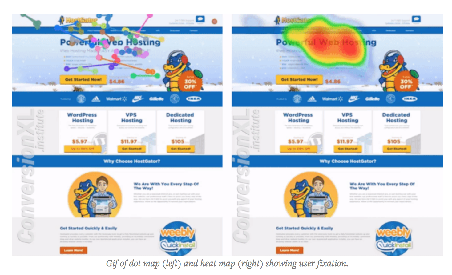
They ran a study that examined the HostGator website for the effect of social proof on building brand awareness.
Because let’s be honest. The more people who know about your business, the more people who will buy from you.
Now and in the future.
Building brand awareness might not seem like a conversion-optimization play, but it is. Just indirectly.
You’re telling people about your business so that, when they are ready to buy, they’ll think of you.
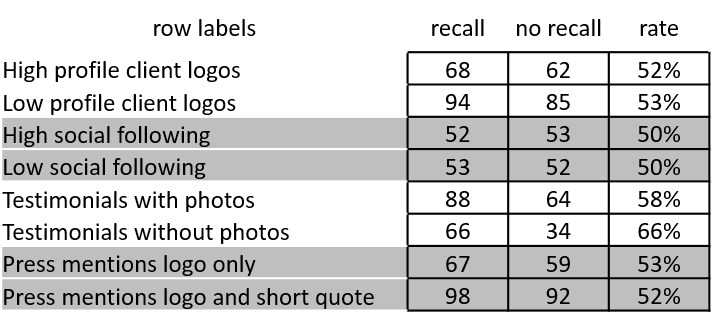
ConversionXL then measured people’s recall of different elements on the page to try and determine which types of social proof stood out the most and created the longest-lasting brand awareness.
Here’s what they found, in their own words.
“First, it seems that testimonials that included text garnered more attention than simple logo social proofs. Next, testimonials with photos were significantly more effective at generating recalls. Similarly, high-profile client logos were better than low-profile logos at generating recall. Finally, we found that, in general, photos are memorable, logos and numbers are not.”
In other words, if you want people to remember your business and buy when they’re ready, use testimonials with photos instead of logos.
Then, people will remember you in the long run, giving you a better chance of 10x-ing your revenue in 2018.
4. Send welcome emails
For a long time, welcome emails have been the pillar of great email content.
They are friendly. They represent an opportunity to connect with new customers personally.
And they are a great way to introduce people to your business.
But here’s what you might not know about them.
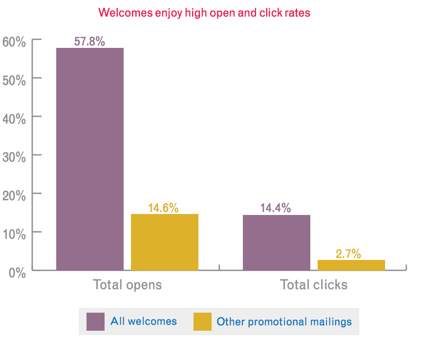
Welcome emails also have a remarkably high open and click-through rate.
Specifically, welcome emails have a 57.8% open rate and 14.4% click-through rate.
Compare that with other kinds of promotional emails to feel the full effect.
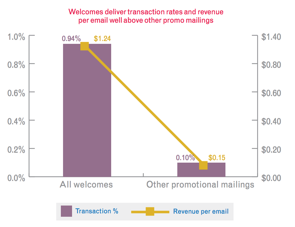
But welcome emails don’t just receive more opens and clicks.
They also generate more revenue per email.
In other words, they represent loads of selling potential for your business.
Unfortunately, most welcome emails simply say “hello” and leave it at that.
Now you know, however, that you should do much more than that with your welcome emails.
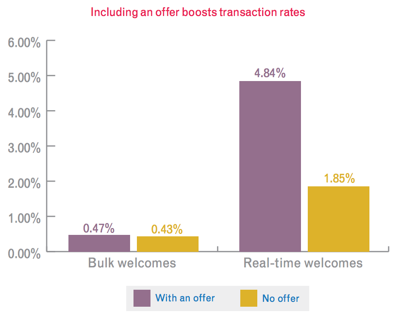
You should offer a discounted product for joining or a special offer for signing up.
Because the same study found that special offers boost the transaction rate of welcome emails as well.
If you’re not sending welcome emails, then you’re missing out on loads of extra revenue.
If you are sending them, then make sure you include a special offer to pull every penny of potential you can out of new customers.
5. Different colors get noticed first
For years now, marketers have argued about whether red is a better converter than blue, or whether yellow is better than green, or why orange is the best of all.
The final answer?
None of the above… or all of the above.
As the studies that ended up coining the Von Restorff Effect claim, it all depends on the colors you’re already using.
The Von Restorff Effect posits that the colors which stand out the most are the ones which are the most unusual.
In other words, if you have a green background, then a red button will stand out. But a green button on a green background? That will be difficult for the eye to find.
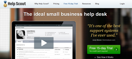
Consider this example from Help Scout.
The green button stands out because nothing else on the page is green.
Since it’s isolated by color, it’s more noticeable.
And thus it’s more likely to be clicked.
After all, if people don’t notice your CTA, they sure as heck aren’t going to click it.
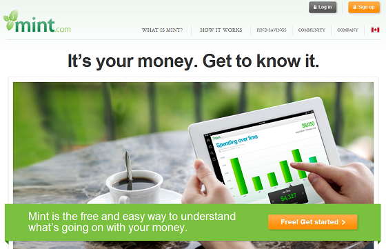
Similarly, consider this example from Mint.
There are two CTAs on the page, and both are orange. As you can see, nothing else on the page is orange, so this works well to draw your eye.
In one case, green is better.
In another case, orange is better.
It all depends on the color scheme of your website. Choose a color for your CTA that is different than the rest of your website and that will automatically and easily increase your conversion rate.
6. Make them follow the hero’s gaze
Everybody needs a hero.
But your customers need one most of all.
I’m not talking about Superman or Spiderman or Deadpool, though. I’m talking about a picture of someone on your landing page that looks at the CTA.
You heard me right.
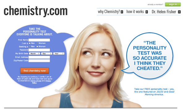
Something like this, from Chemistry.com, for instance.
Why does that work to increase your conversion rate?
Well, as it turns out, people naturally want to follow another person’s gaze to see what they’re looking at.
In fact, this truth is so effective that Unbounce found even using a graphic of a face increases conversion rates.
Similarly effective, Unbounce reports, are arrows.
The point is, you need to draw your viewer’s attention to the CTA with one of three different things.
- A hero
- A graphic
- An arrow
With that simple trick, your conversion rate will surge forward.
7. Keep your copy active
What if I told you that active words convert better than passive words?
Things like “Beat the smelly giant in your armpits!” is better than “Stop smelling bad.”
Would you believe me?
Well, as it turns out, you don’t have to.
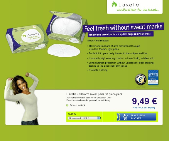
Kissmetrics reports on a massive study that measured the impact of active copy on click-through rate.
Here was the original version of the page that the study analyzed.
As you can see, the primary call out is quite inactive: “Feel fresh without sweat marks.”
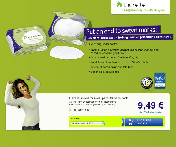
Here was the variation that they measured up against the original.
Now, that’s a bit more exciting.
“Put an end to sweat marks!” makes me feel like I’m part of some ongoing and courageous battle against my pit stains.
But here’s the important thing.
That doesn’t just make people more excited. It makes them click more.
How much more?
According to Kissmetrics, 93% more.
That’s a lot of action for your CTA.
All because you used active language instead of passive language. A simple change to nearly double your click-through rate.
8. Include a picture of a person
Earlier, we talked about using the hero’s gaze to draw the attention of the website viewer.
And yes, that tactic increases conversion rates.
But, evidently, you don’t even need to have the hero look in a particular direction to increase your conversion rate.
You just have to include them in the first place.
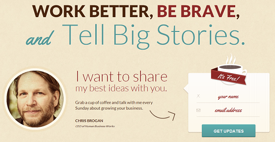
Basically, you just need to have a picture of a person on your sign-up page, and that might just automatically increase your conversion rate.
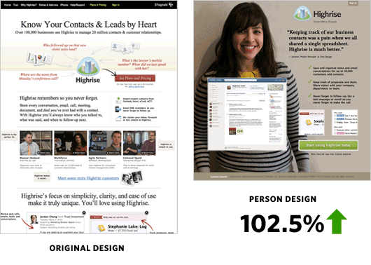
Kissmetrics again reports on a study that supports that claim.
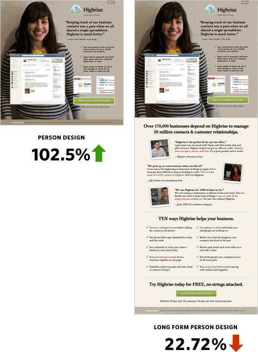
This website experienced a 102.5% increase in conversions when switching to the landing page on the right.
And again, they saw the same landing page was better than the challenger on the right below.
Including a photo of a person on your landing page increases your conversion rate.
But why is that the case?
Well, people are fascinated with each other. We all enjoy studying one another’s faces, and we attribute certain qualities to certain people.
If you choose a picture of a person that fits the image you want to convey as a business, then that can work wonders toward your goal of 10x-ing your revenue this year.
9. Longer is better (sometimes)
Is a longer landing page better than a short one?
According to a test by Crazy Egg, it is.
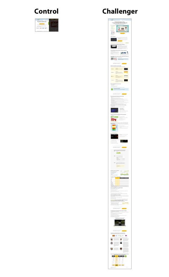
Here are the control and the variation pages we tested.
As you can see, the challenger is massively longer than the control page is.
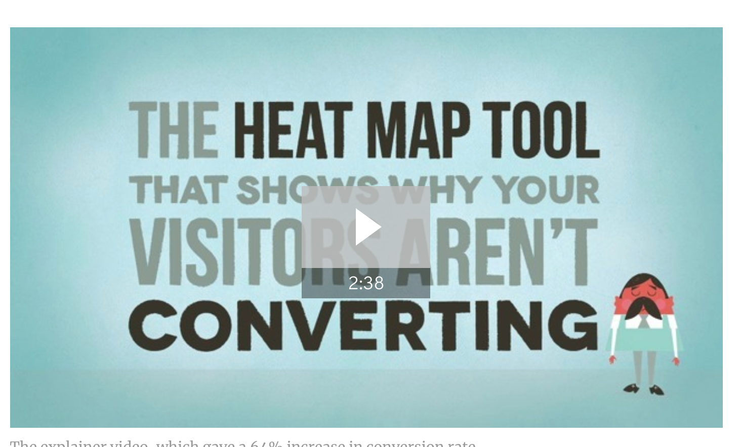
We even included an explainer video on the page.
But what was their result? Could that long of a challenger really compete with short and snappy?
In the case of Crazy Egg, yes. Yes, it can.
In fact, the new page beat the control by a whopping 30%.
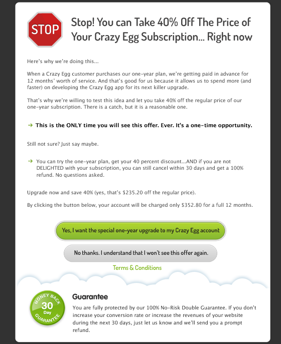
Then, we went ahead and showed this offer to all of our customers once.
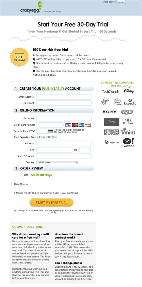
Finally, we revamped our checkout process to add some social proof and extra incentive.
Fortunately for us, all of that hard work paid off. In the end, it increased our overall conversion rate by 363%.
And as you already saw, a big part of that change was the length of the landing page.
But… longer isn’t always better.
If you sell a product that people are already familiar with, a short and snappy landing page is probably best.
For those of you with more complicated and hard-to-understand products, though, a longer landing page might just increase your conversion rate.
One thing’s for sure. You won’t know unless you test it.
Conclusion
Conversion rates all over the digital globe are notoriously low. From 2% to 3% to 4%.
None of those numbers hold much promise for your goal of 10x-ing your revenue in 2018.
Luckily, though, you don’t have to listen to those average naysayers.
You can carve your own path.
Or, rather, the path of tried-and-true conversion optimization methods.
Because optimizing your website for conversion is one of the best ways to 10x your revenue this year.
So take a hint from one of these studies: raise your relevance score on Facebook Ads, use reviews, add social proof, leverage welcome emails, use unique colors for CTAs, make people follow the hero’s gaze, keep your copy active, include a picture of a person, and see if a long (or short) landing page is right for you.
With those nine timeless conversion study principles, you’ll be well on your way to a multiplied income.
What conversion study is the most impactful on your own conversion optimization efforts?


Comments (10)