If you’re a marketer, you’re undoubtedly looking for techniques to optimize your website for better conversions. Fellow marketers have released tactics that worked from them. In this post, I’ve curated some of these. They’ve come from multiple sources and been placed in one post. I present to you 100 conversion optimization case studies!
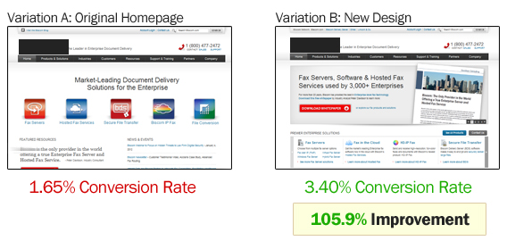
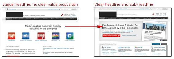
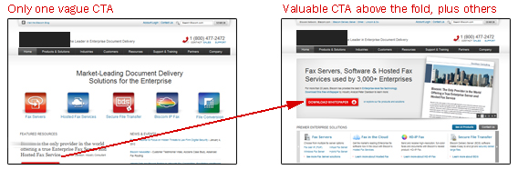
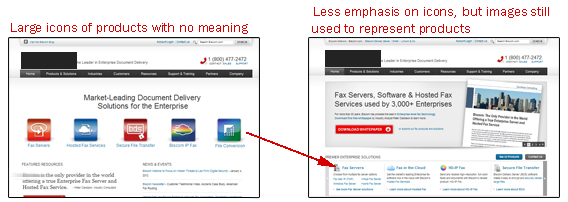
1. Updated Design Increases Conversions 33%
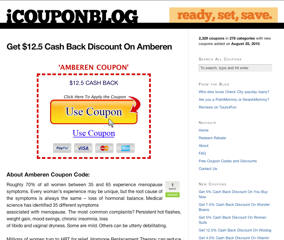
Overview and Results Achieved:50. Removing Social Proof Increased Engagement
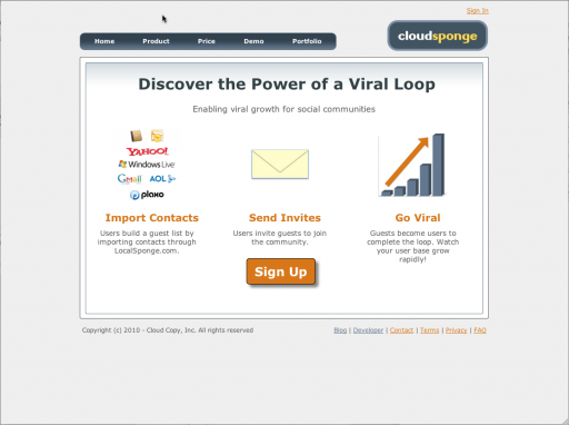
CloudSponge had an outdated website design:
This is the redesign:
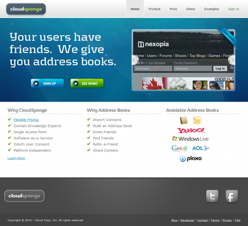
The new design achieved a 33% conversion increase.
Key Findings:
-You can see the difference between the two designs. One is boring, has one call to action, and gives no good reasons why anyone should choose CloudSponge. The new website lets visitors view a demo and also gives them reasons to try CloudSponge.
If your website looks like the original CloudSponge, get a new design. It’ll pay for itself once you see a conversion bump.
Source:
2. Making Copy Action Oriented Causes 93% More People to Click
Overview and Results Achieved:
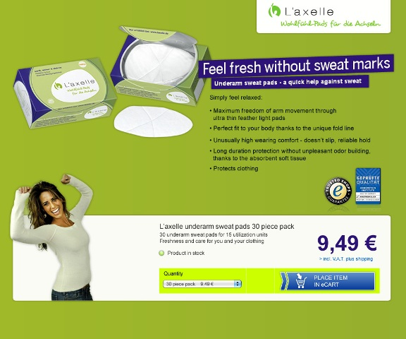
L’Axelle wanted to get more people to click on their add to cart button. This was their original homepage:
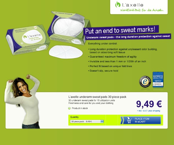
This was the test:
L’Axelle describes the original copy as being comfort oriented. They sell on the basis of people feeling relieved and relaxed.
The test copy is action oriented. It is about solving a problem.
The action oriented headline and copy earned a 38.3% conversion rate, 93% better than the original.
Key Findings:
-“Put an end to sweat marks” is action oriented and assures some relief for customers. Adding the word “end” makes it sound like they won’t get sweat marks ever again. If the headline read “Reduce Sweat Marks,” the copy might not have performed well.
Source:
https://www.abtests.com/test/125001/landing-for-laxelle
3. Clear Homepage Helps Weather Channel Increase Conversions 225%
Overview and Results Achieved:
The Weather Channel wanted to turn people into premium subscribers. They decluttered their homepage and had a single action. These changes increased conversions 225%.
Key Findings:
-When in doubt, simplify. Simplicity is difficult and requires restraint, but it’s much easier for visitors and helps them make decisions.
Source:
https://www.marketingsherpa.com/article/case-study/how-to-convert-225-more
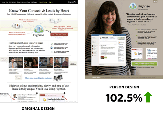
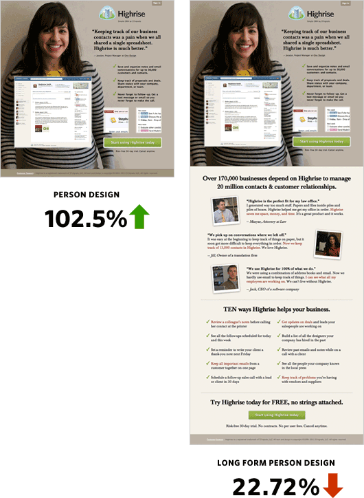
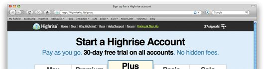
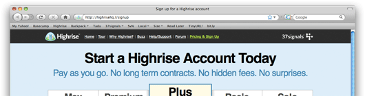
4. Adding a Picture of a Person Increases Highrise Signups by 102.5%
Overview and Results Achieved:
37signals changed the design of their Highrise product page. While they’ve done many tests, we’ll feature one where they had a white background and tested it against a background of a customer. Here is the test and results:
And they tried a long page with the same background vs a short page. The long page performed worse:
Key Findings:
-As you can see, the type of background with the person really sticks out from most of the other pages on the internet. It may signal to the visitor the importance of the website and make them want to read more of the offering.
Source:
https://37signals.com/svn/posts/2991-behind-the-scenes-ab-testing-part-3-final
5. Improved Value Proposition Causes 128% More Visitors to Register for Games
Overview and Results Achieved:
The Sims 3 wanted to get more people to register. They tested their value proposition.
The original page:
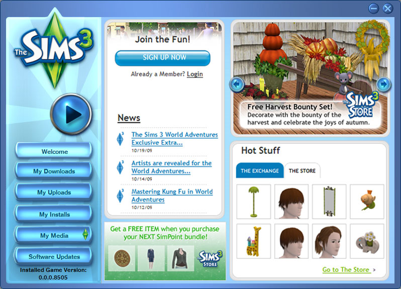
The test:

The test increased game registrations 128%.
Key Findings:
-As you can see, the test emphasizes “free.” If your product is free or offers a free trial, don’t hide it. Let people know, because most are willing to try something that is free.
Source:
6. Making Call to Action More Prominent Increases Conversions 591%
Overview and Results Achieved:
Nature Air had 17 separate landing pages. They did a single A/B test on each landing page. The control did not make the CTA prominent:
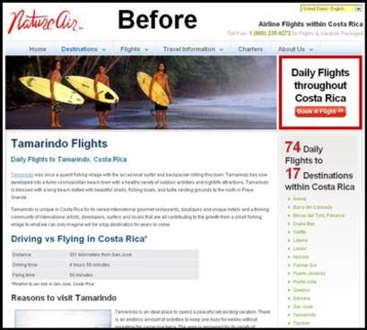
Then they put the CTA in the content area:
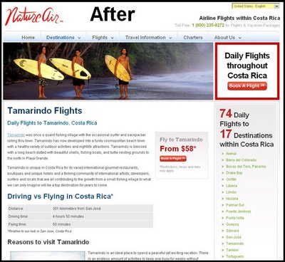
Conversions went from 2.78% to about 19%, meaning their conversions improved 591%!
Key Findings:
-No matter how compelling your offer, if you don’t make it easy for visitors to click on something, they’ll never know. Make your CTA prominent, part of the content area, and easy to find. You’ll preferably want to keep it above the fold.
Source:
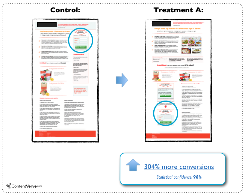
https://www.blastam.com/blog/index.php/2009/06/google-website-optimizer-increases-conversion-591/
7. Adding Reviews Boosts Conversions More Than 35%
Overview and Results Achieved:
FigLeaves sells women’s apparel on their website. They added product reviews to the site, and this change made customers 35% more likely to purchase.
Key Findings:
-Helping the visitor navigate and make decisions proves once again to be helpful at increasing conversions and making the visitor more likely to buy.
Source:
https://blog.arhg.net/2010/02/reflections-on-bryan-eisenbergs-keynote.html
8. Redesigning Pricing Page Brings 25% More Conversions
Overview and Results Achieved:
BaseKit wanted to get more performance out of their pricing page. This was the old design:
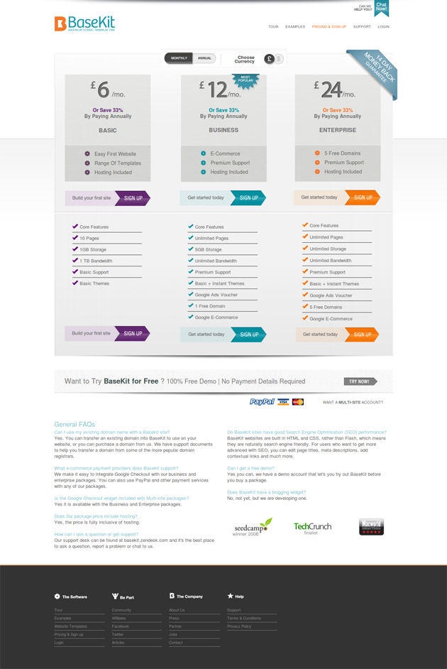
This is the new design:
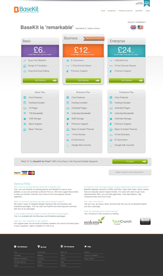
BaseKit calls this new version “Bolder, brighter, clearer pricing, nicer design, testimonial, more obvious currency selection.” The new design achieved a 25% higher conversion rate.
Key Findings:
-Your pricing page is just as important as your pricing. The way you present your pricing and the information surrounding it can play a big role in whether the visitor becomes a customer.
Source:
https://visualwebsiteoptimizer.com/split-testing-blog/increase-conversions-pricing/
9. Changing Homepage Makes Visitors 2-3x More Likely to Buy
Overview and Results Achieved:
Hawk Host A/B tested their homepage.
This is the control:

This is the test, with the prominent padlock:

The padlock converted 2-3x better than the original. No official percentage was given.
Key Findings:
-I’m not sure what purpose the globe served, so it shouldn’t be too surprising that a padlock increased conversion rates. It gives a subliminal message of security and assures visitors. Aim to have your images link with your unique value proposition and main message.
Source:
https://blog.hawkhost.com/2010/02/21/multivariate-testing-a-real-life-example/
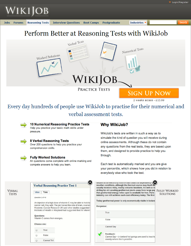
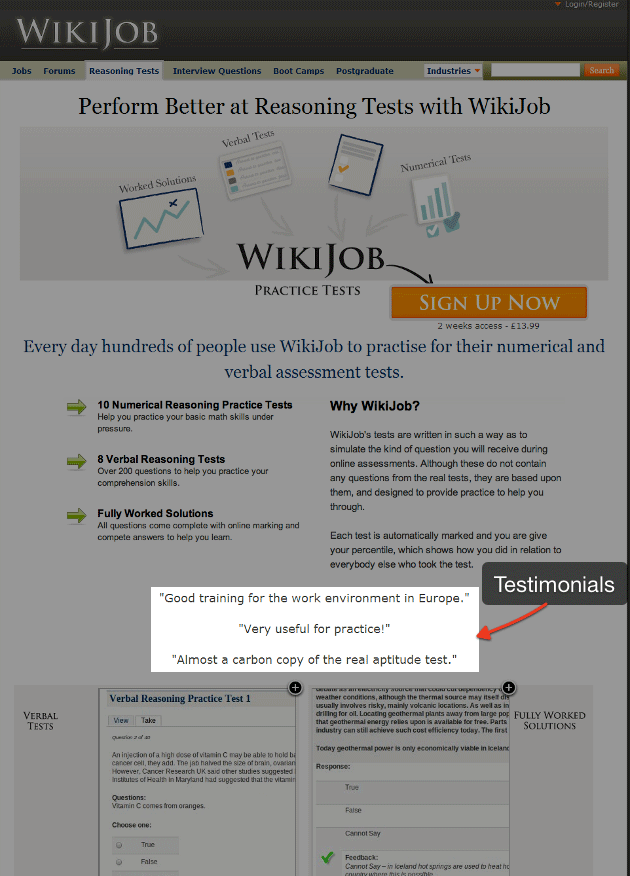
10. Adding Testimonials Increases Conversions 34%
Overview and Results Achieved:
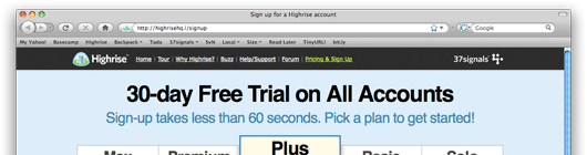
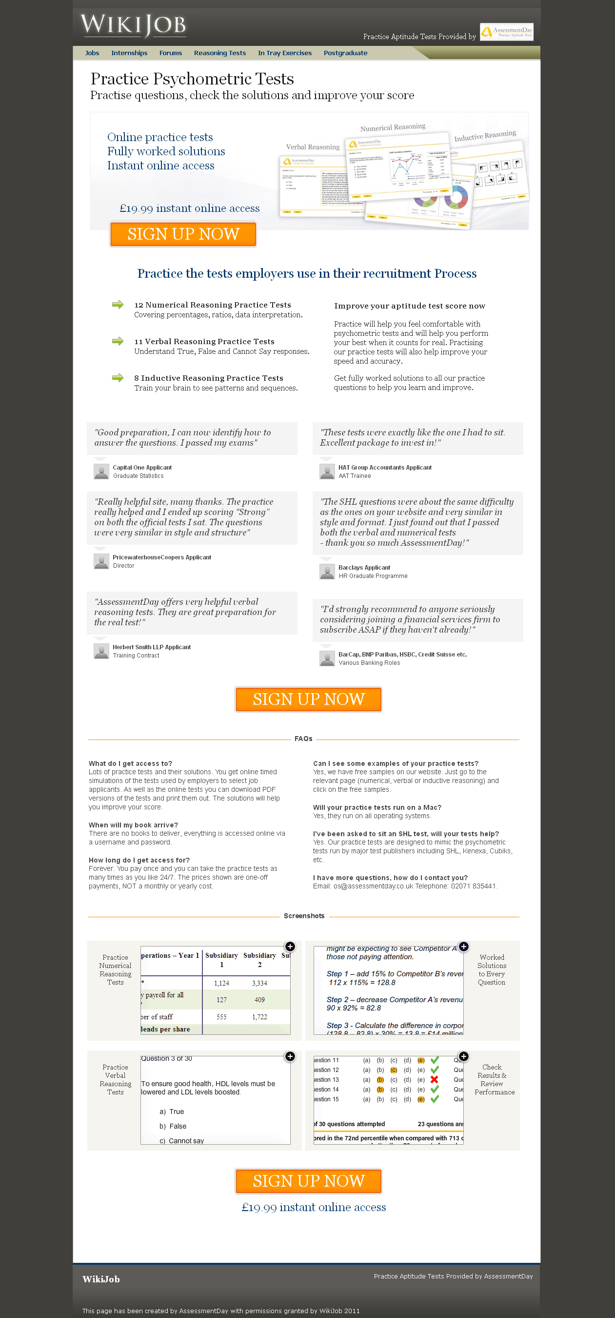
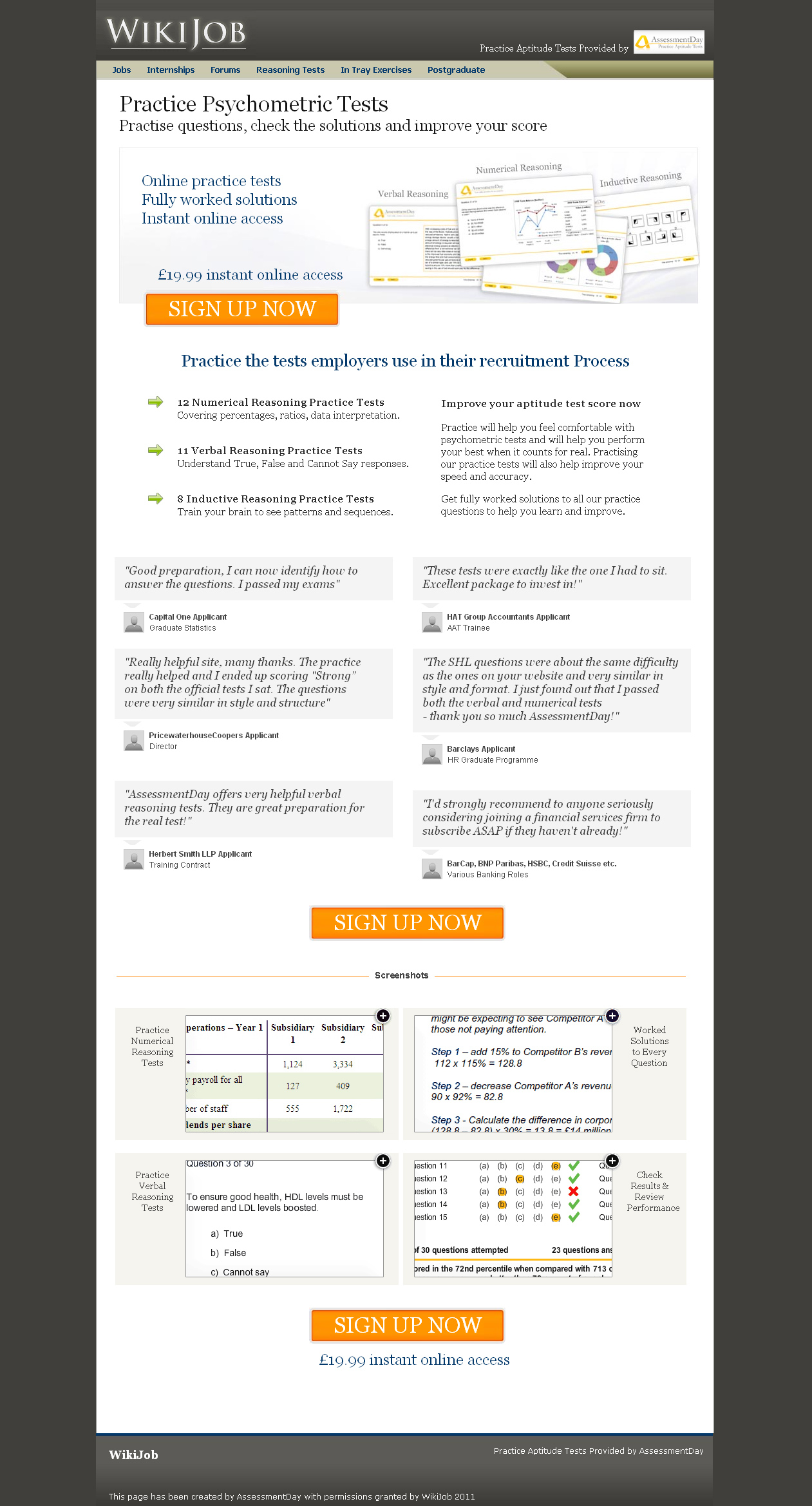
WikiJob had three testimonials on their homepage. They had a couple of problems with these testimonials, though. The testimonials weren’t attributed to any specific customers and no one even knew if they were testimonials. They were just quotes placed on the homepage. WikiJob did have testimonials, but they were at the bottom of the page. WikiJob decided to A/B test and move the testimonials to the top of the page.
What they experienced was a 34% increase in conversion rates.
Key Findings:
-Testimonials can give visitors assurance that previous people had success with you, thus ensuring your reputability.
Source:
https://www.salesnexus.com/blog/sales/the-importance-of-using-testimonials-2/
11. Conversions Increase 2.20% When Website Flow is Redesigned
Overview and Results Achieved:
Zen Windows had a conversion rate of .75%. They hired a firm that redesigned the visitor flow.
Old design:
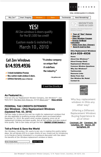
New design:
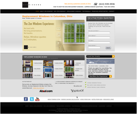
As a result of the redesign, their conversion rate increased to 2.95%.
Key Findings:
-The redesign made it easier for visitors to navigate the website. If your visitors are struggling to navigate your site, you can bet it’s having a negative effect on your conversions. If you’d like to learn what visitors think of your website, check out User Testing.
Source:
https://www.marketingadept.com/blog/2011/01/zen-windows-case-study/
12. Changing Button Color to Red Increases Conversions 21%
Overview and Results Achieved:
Performable tested their homepage with two buttons: One was green, and the other was red. They kept the text (Get Started Now!) the same.
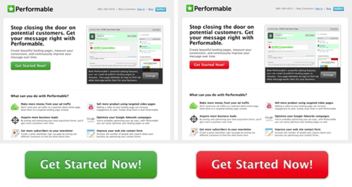
They found that 21% more people clicked on the red button than the green button.
Key Findings:
-As the article mentions, button color is easy to test. Experiment and you may be surprised with your results.
Source:
https://blog.hubspot.com/blog/tabid/6307/bid/20566/The-Button-Color-A-B-Test-Red-Beats-Green.aspx
13. Red Color on CTA Increases Conversions 2.5%
Overview and Results Achieved:
UK airline BMI had an urgent CTA that read “Hurry! Only XX seats left.” When they added a red background to the CTA, they increased their conversions 2.5%.
Key Findings:
-Colors that coordinate with the message may increase conversions. Consistency among text and colors can help reinforce the message you want to instill in visitors.
Source:
14. Protecting Purchases with Bonds Improves Conversions 10.4%
Overview and Results Achieved:
BellaCor offered bonds from Buy Safe to a select group of visitors. They tested this against a group that was not given an option of bonds. The group that was offered bonds had a 10.4% better conversion rate than the control.
Key Findings:
-Consumers want to protect their transactions. They need assurances and security.
Source:
https://www.internetretailer.com/2010/08/26/bellacorcom-boosts-conversions-bonds
15. Security Seal Increases Conversions 7.6%
Overview and Results Achieved:
Oriental Furniture added a Buy Safe seal to their website. They checked this against the control that didn’t have the seal. After a couple of months of testing, Oriental Furniture experienced a 7.6% bump in conversion rate.
Key Findings:
-Assurances are almost always beneficial for websites and customers.
Source:
https://www.internetretailer.com/2011/01/05/orientalfurniturecom-drives-conversion-76-security
16. Adding Google Site Search Increases Conversions 11%
Overview and Results Achieved:
WaterFilters.net needed a search for their website. They turned to Google Site search.
As a result of implementing the search, bounce rate decreased 4% and conversions increased 11%.
Key Findings:
-Aiding visitors in their navigation through your site is a good tactic for increasing conversions.
Source:
17. Intuit Increases Conversion Rates 211% by Implementing Proactive Chat
Overview and Results Achieved:
Intuit implemented proactive chat in different areas on their website.
Adding chat to the checkout process increased the average order value 43%. And there was a 20% increase in conversions compared with not using chat.
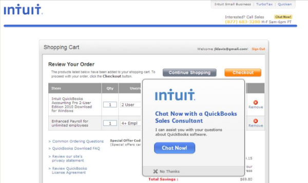
Using proactive chat on a product comparison page increased sales 211%:
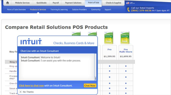
It also was included on their checks and supplies product page:
And on the lead generation page:
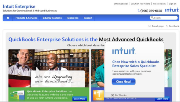
Key Findings:
-Introducing proactive chat, where the visitor can see the chat box, may improve conversions if placed in areas of your website where visitors have questions.
Source:
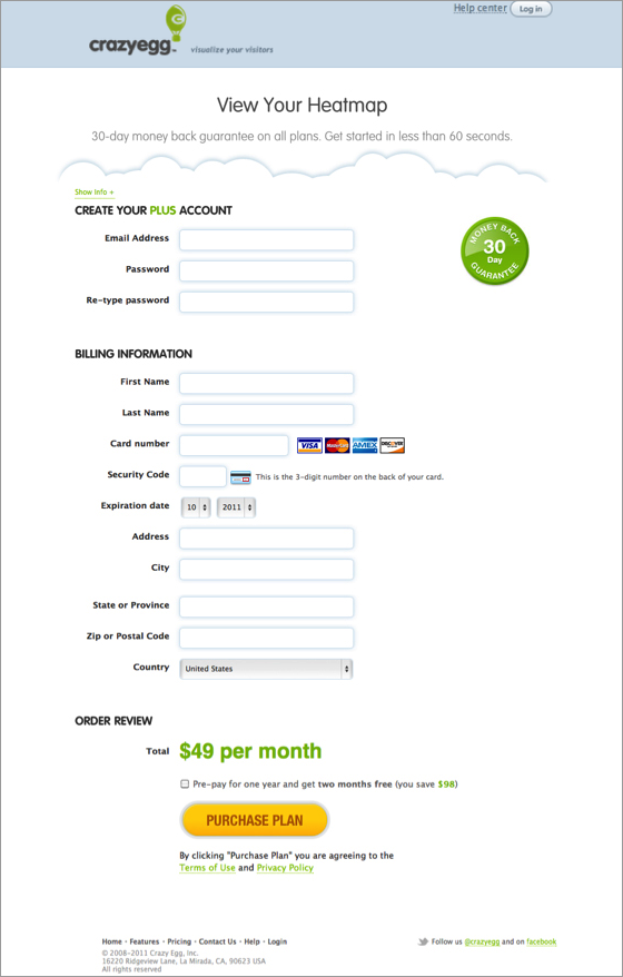
18. 21% Improvement in 30 Days with a Website Redesign
Overview and Results Achieved:
Crazy Egg got a website redesign and in 30 days improved their conversions 21%. They highlighted a few of their key changes:
-Let visitors try before they buy – the old design
-Align the brand with the audience
-Pay attention to the details
-Test, learn, and never be satisfied
Source:
https://www.dtelepathy.com/blog/design/get-more-conversions-website
19. 400% Conversion Rate Improvement by Removing One Image
Overview and Results Achieved:
Bradley Spencer had this big secure image on a website:
And without the secure image:
The results were surprising – a 400% increase in conversions over 3 days. Four times more people clicked the coupon link.
Key Findings:
-Conventional wisdom says that adding security badges on your site would increase conversions, and 8 or 9 out of 10 times it would. This is one of those rare times when it didn’t. Always be experimenting, you’ll never know what you can remove to increase users.
Source:
https://www.bradleyspencer.com/2010/5-surprising-lessons-from-user-testing/
19. Image Slider Outperforms Video by 30%
Overview and Results Achieved:
Device Magic wanted to test if video or an image slider converted better.
The original – with video:
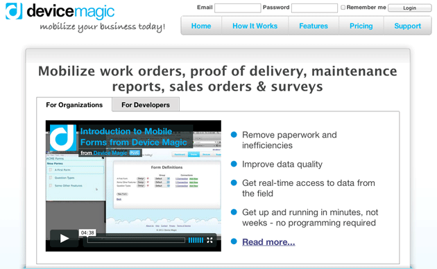
The variation – with image slider:
The image slider increased conversions from homepage to signup page by 35% and subsequent signups by 31%.
Key Findings:
-Every website is different, so it cannot be surprising that an image slider outperformed video. Unfortunately, this video is too long (visitors know they’ll be sitting there for over 4 minutes to watch) and the screencap doesn’t make the video seem too interesting.
Source:
https://visualwebsiteoptimizer.com/split-testing-blog/video-or-image-slider-ab-test/
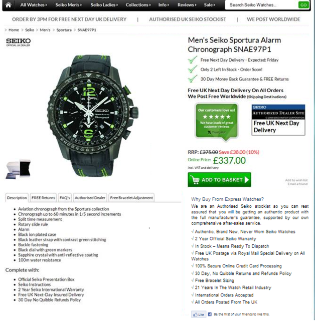
20. Proving Authenticity Increases Sales 107%
Overview and Results Achieved:
Express Watches is a UK based online seller of Seiko watches. A big customer anxiety is the fear of getting counterfeit watches. Express Watches A/B tested on whether customers cared more about price or authenticity.
The control – competing on price point:
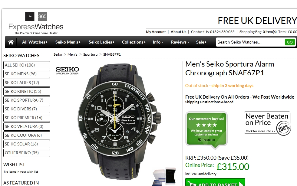
The variation – assuring authenticity:
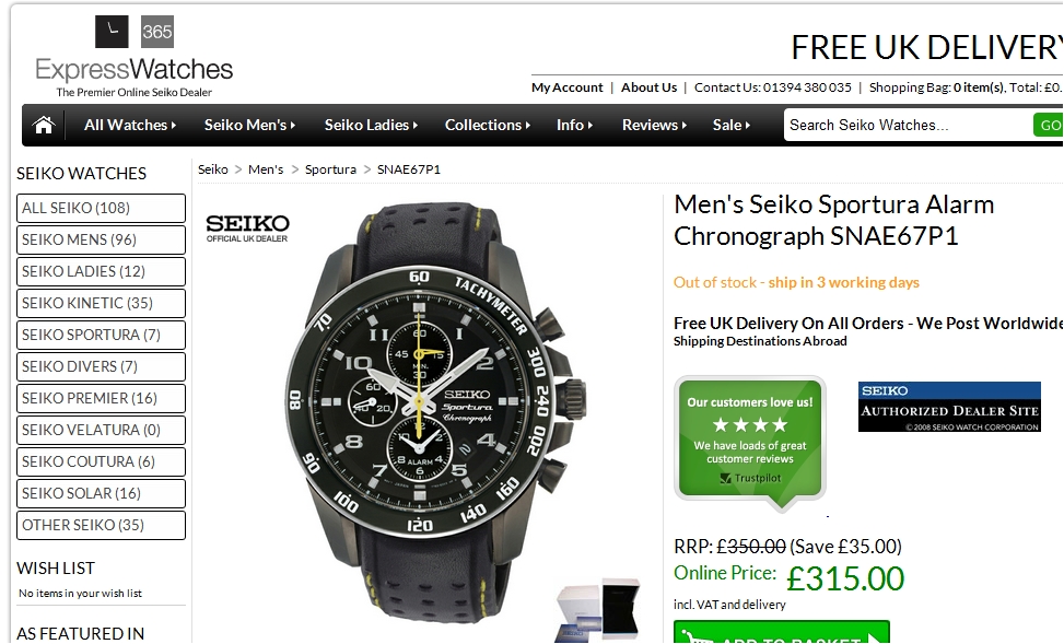
The variation increased sales 107% over the original.
Key Findings:
-This result is likely industry specific. In industries where a lot of fraud exists, it certainly helps to prove you’re authentic. This can be applied to other industries as well. Placing badges like “Certified __ Partner” may increase sales.
Source:
https://visualwebsiteoptimizer.com/split-testing-blog/increase-in-sales/
21. Showing Price on Landing Page Doubles Lead Generation
Overview and Results Achieved:
SafeSoft Solutions develops products for customer contact centers. They A/B tested to see if leaving pricing on a landing page increased or decreased conversions.
The control:
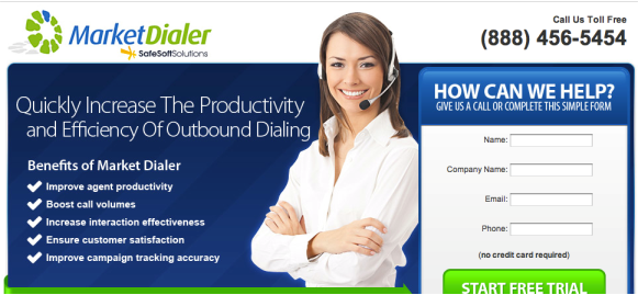
The variation:
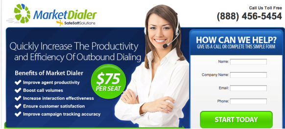
The variation brought a 100% boost in leads generated over the control. In this case, showing the price did have a positive impact.
Key Findings:
-People have a notion in their head that if a company doesn’t display pricing, it’s likely an expensive product. To get pricing, you have to talk to one of their salesmen and hear a sales pitch first. The variation removes this question and tells the visitor up front what the price is.
Source:
22. eCommerce Site Removes a Filter and Increases Site Engagement by 27%
Overview and Results Achieved:
UK Tool Centre thought that having an extra product filter on their website was reducing visitor engagement. The filter was a brand of wood care products called Cuprinol.
This is the control:
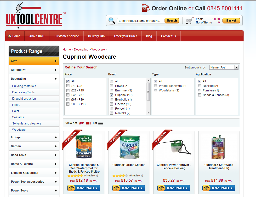
In the variation, the filter menu was removed:
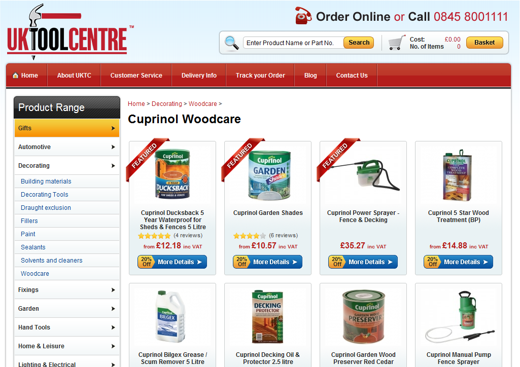
The variation resulted in an increase of 27% engagement in the product pages. This was due to visitors being less distracted.
Key Findings:
-Don’t distract visitors with unnecessary options.
Source:
23. AMD Increases Social Sharing 3600%
Overview and Results Achieved:
AMD used ShareThis for social sharing. They wanted to increase the amount of sharing among visitors. They tested six variations, with different icons and placement. They tested it on AMD’s Support & Drivers page.
AMD found the best place for your social buttons is the left-position chicklet version with dynamic adjustment based on browser window size:
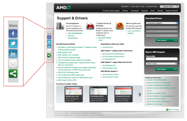
Key Findings:
-Experiment and learn the optimal place for your social media buttons. Many websites place them on the left-hand side, but only you can test to see what works best.
Source:
https://visualwebsiteoptimizer.com/split-testing-blog/amd-3600-social-sharing-increase/
24. Reduced Shopping Cart Abandonment 26%
Overview and Results Achieved:
One company had shopping cart abandonment rates of around 80%. They had the goal of getting it down to 70%, hoping they’d see a 50% increase in sales. Down to 60% and maybe their sales would double. When they factored this in, they knew they had to redesign their shopping cart experience.
Here’s a comparison of their redesign compared to the old design:
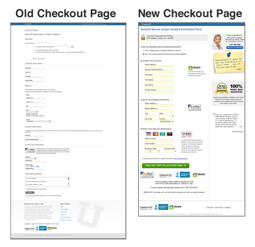
As you can see, the new design is greatly improved. There is a little help section along with guarantees on the right, live customer support, customer testimonials, backend improvements, and they shortened and categorized the form.
This resulted in an abandonment rate that went down from 80% to 54%.
Key Findings:
-If you have an abandonment rate in the 80% class or above, it’s time to put some focus into a redesign. Changing a struggling homepage while ignoring the checkout experience will keep you stagnant. Find what the problems are (big or small) and work to fix them. You’ll see improved conversion rates and more income for your business.
Source:
https://experienceblogger.com/post/1081389180/design-for-conversion-checkout-page-redesign
25. Bigger Button Makes For Bigger Conversion Rate
Overview and Results Achieved:
SAP BusinessObjects originally had a small blue text link for its add to cart option.

They added a big orange button on the test:

And increased their conversions 32%.
Key Findings:
-Making a CTA will almost undoubtedly increase conversion rates.
Source:
https://www.widerfunnel.com/proof/case-studies/sap-landing-page-optimization
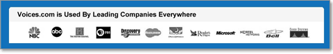
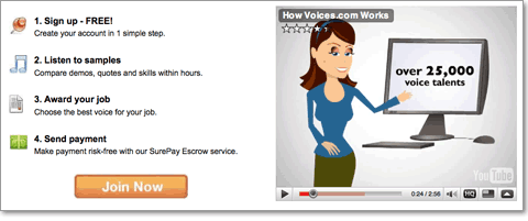
26. Voices.com Improves Conversion 400%
Overview and Results Achieved:
Voices.com improved their conversions 400% by implementing these tactics (as well as a few others not published):
Social proof:
Segmenting visitors:

Demonstration videos:
And learning what customer objections are and working to overcome them.
Source:
https://www.conversion-rate-experts.com/voices-case-study/
27. One Company Makes up a Product, Increases Conversions 233%
Overview and Results Achieved:
One company became inspired by the book Predictably Irrational, which states that people tend to act irrationally in a predictable fashion. The book showcases a study on pricing for The Economist. The pricing looked like this:
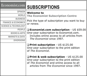
Of this pricing, 84% bought the print and web subscription while 16% bought the online version.
When the print only option was removed, 68% bought the web only option and 32% bought the web and print option. See the reversal?
One company decided to try the same for their business. This is the original page:
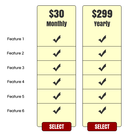
With this pricing, 40% bought the yearly plan and 60% purchased the monthly plan.
This is the new page:
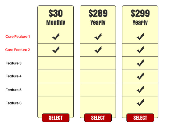
The company knew that customers wanted the first two features, so they included it in all plans.
The result was a 233% increase in conversions. Eighty-six percent purchased the $299 plan and 14% chose the monthly.
Key Findings:
-Read The Irresistible Offer and Predictably Irrational to learn more about consumer behavior and pricing tactics.
Source:
https://unbounce.com/conversion-rate-optimization/made-up-product-increased-conversions/
28. Eliminating One Field Increases Expedia’s Profit by $12 million
Overview and Results Achieved:
This is a mockup of what Expedia’s registration process looked like:
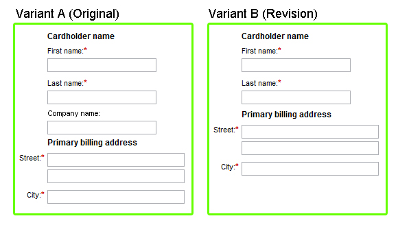
Simply eliminating “Company Name” (and thus visitor confusion) led to a large increase in profit.
Key Findings:
-Removing the unnecessary clears the way for users to complete registration and order a product. Adding the unnecessary clogs up the registration process and needlessly adds time and confusion for the visitor.
Source:
29. Mortgage Company Earns Hundreds More Applicants a Month by Adding a Checkbox to the Homepage
Overview and Results Achieved:
A mortgage company wanted to increase the number of applications received online. They added this checkbox to the homepage:

If visitors checked that box, then they’d have to enter their first name and email to begin the refinance process.
The checkbox increased their successful application conversion by 11%.
Key Findings:
-Other mortgage company websites likely have a pretty daunting online application process. Visitors who arrived at this mortgage website first were asked to make a small, positive commitment to filling out the application. It reinforced their commitment to filling out the form. This is known as a commitment checkbox. Try it on your site and see the results you get.
Source:
30. One Hour of Work Equals 46% More Customers
Overview and Results Achieved:
ThetaBoard is a project management app. They wanted to get people to try their one click demo, so they put an offer for the one-click demo on every page. This simple tactic made 20-30% of visitors try the demo.

While they saw more visitors trying the demo, they didn’t see a big increase in visitors signing up for the free trial.
They received advice from a fellow founder and added Bootstrap Tour to their demo. They thought this would help visitors to the demo become more acclimated to the product. They picked 7 steps to point out the features of ThetaBoard.
When a user completes the tour, they receive a final tip “Don’t forget to save this board!”
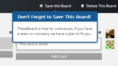
Adding these steps increased conversions of demo to free trial 46%.
Key Findings:
-In this case, one hour of work means 46% more customers. That’s quite an ROI, especially when no money was invested, only an hour of time. Many users can be a little discouraged to sign up for a free trial or even paid account after first seeing a demo. Things can look a little confusing if they don’t have the wow factor. This is why it’s helpful to show the different features of your product. It’ll help them warm up to the product and possibly agree to a free trial or paid account.
Source:
https://www.thetaboard.com/blog/how-we-improved-our-conversion-rate-46-in-one-hour?r=400
31. Adding a Guarantee Improves Ecommerce Sales 41%
Overview and Results Achieved:
Horloges.nl is a Netherlands based webstore that sells watches. Their landing page for the Casio G-Shock line of watches had this banner just above product images:

The text translates to:
- Official G-Shock dealer
- Free shipping
- Tomorrow at home (aka “Delivered the next day”)
They made the banner in the test version smaller. It also included a 2 year guarantee:

- Free shipping – Familiar with PostNL (aka “reliably with PostNL”)
- Tomorrow at home – Order before 16:00
- Official Dealer – 2 year guarantee on watches
The variation generated 41% more turnover on visitors that visited the G-Shock page. Additionally, the average order value improved 6%.
Key Findings:
-Including a guarantee on your ads or headlines may improve sales.
Source:
https://visualwebsiteoptimizer.com/split-testing-blog/increase-trust-to-increase-sales/
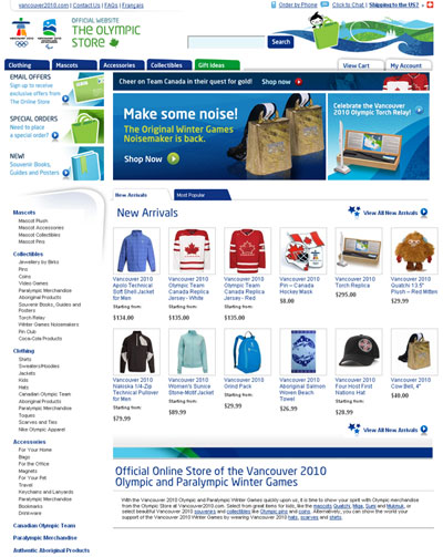
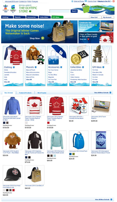
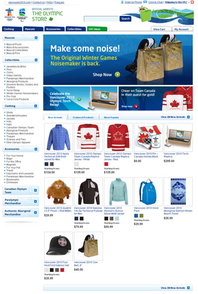
32. Improved Navigation Earns a 7.74% Increase in Conversions
Overview and Results Achieved:
The Olympic Store wanted visitors to click on a product.
The original:
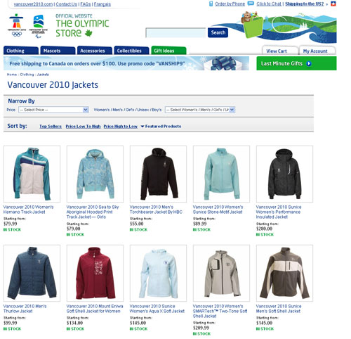
Variation A:
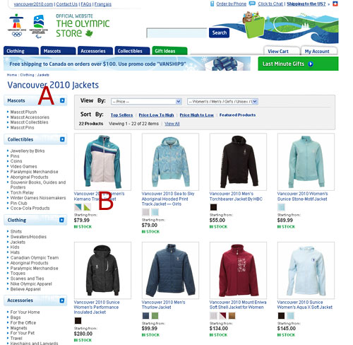
A) Introduced a vertical menu that shows all subcategories for easier access to other products
B) Provided color thumbnails to products that have alternative colors
Variation B:
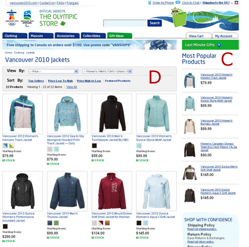
C) With help of recommendation engine (cross-sell), showed most popular products from that specific category to increase revenue from top selling items
D) Introduced a minor face-lift to filtered navigation to improve usability
Variation A earned a 7.74% improvement over the original.
Key Findings:
-Showing popular products seems to work better.
-Improved navigation also helps
Source:
https://www.abtests.com/test/245001/product-for-the-olympic-store
33. Server Density Increases Revenue 114% by A/B Testing Pricing Pages
Overview and Results Achieved:
Server Density is a website monitoring service. They were inspired by reading an article that saw one company increase revenue by increasing prices. They formed two hypotheses:
1. Increasing prices will reduce free signups
2. Increasing prices will increase revenue in spite of fewer signups
The two goals were Free Trial Signups and an Upgrade.
This is their initial page:
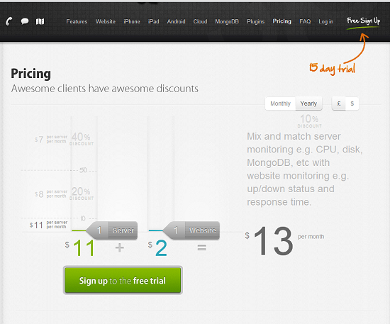
The test:
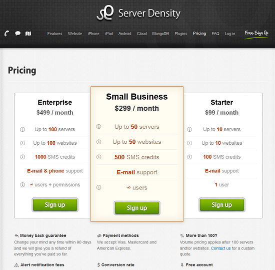
The results:
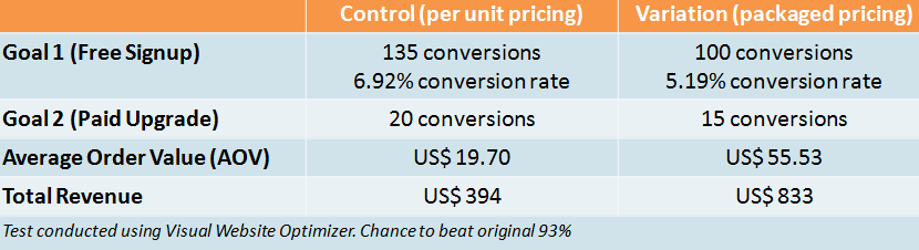
Key Findings:
-Never leave money on the table. Even things like your pricing aren’t untouchable and static. They can be tested.
Source:
https://visualwebsiteoptimizer.com/split-testing-blog/saas-pricing-ab-test/
34. Changing One Word Increases CTR 161.66%
Overview and Results Achieved:
Veeam Software asked visitors who visited their product page what other information they’d like to see. Visitors said they wanted to see pricing. Veeam Software couldn’t do that because they sell their software through partners and those prices may vary. They did, however, put up a “Request a Quote” link that led to a sales inquiry form. The goal was to increase CTR to the sales inquiry page. They tested two different messages. One was “Request a quote,” and the other was “Request pricing.”
Control:
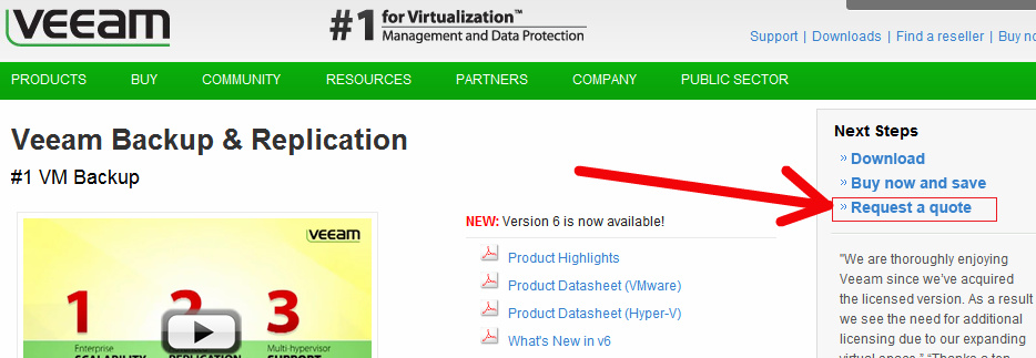
Variation:
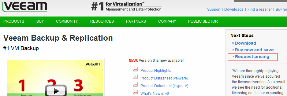
Conversions went from .54% to 1.40%, equal to a 161.66% increase in click-through rate.
Key Findings:
-As the article mentions, Veeam Software did it the right way. They surveyed users and learned their objections. Then they experimented with tactics to overcome the objections and successfully earned a higher conversion rate because of it.
Source:
https://visualwebsiteoptimizer.com/split-testing-blog/increase-click-through-rate/
35. 22% Increase in Sales by Making CTA Less Generic
Overview and Results Achieved:
Kaya Skin Clinic is a beauty clinic. They had the goal of driving more booked appointments and sales via their website.
Control:
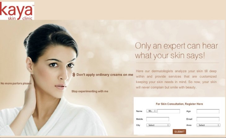
Variation 1:
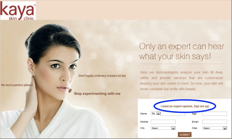
Variation 2:
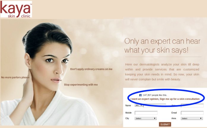
As you can see from variation 1 and 2, the CTA is moved to just above the form. And what results did that produce?
Variation 1 performed 137.5% better than the control, the CTA change increased sales by 22%, and adding social proof further increased the conversion rate 70%.
Key Findings:
-Being less generic and more specific will increase conversion rates. What sounds more intriguing:
For Skin Consultation, Register Here:
or
I want an expert opinion. Sign me up!
I’d guess you would choose the latter. Your copy should be dynamic and intriguing, and you can see how just a small change like this can have such a big impact on sales and your bottom line.
Source:
https://visualwebsiteoptimizer.com/split-testing-blog/call-to-action-increase-sales/#
36. Removing 3 Form Fields on a Registration Form Increases Conversions 10.48%
Overview and Results Achieved:
BliVakker.no is a Norway-based online beauty shop. Their registration process was complicated and they wanted to simplify.
The original (control) had 17 form fields.
The second version (Skjema-light) had the original 17, minus 3. Account number, phone number, and evening phone number were eliminated.
The third version (Skjema-uberlight) had far fewer fields and less navigational elements.
This shows version two:
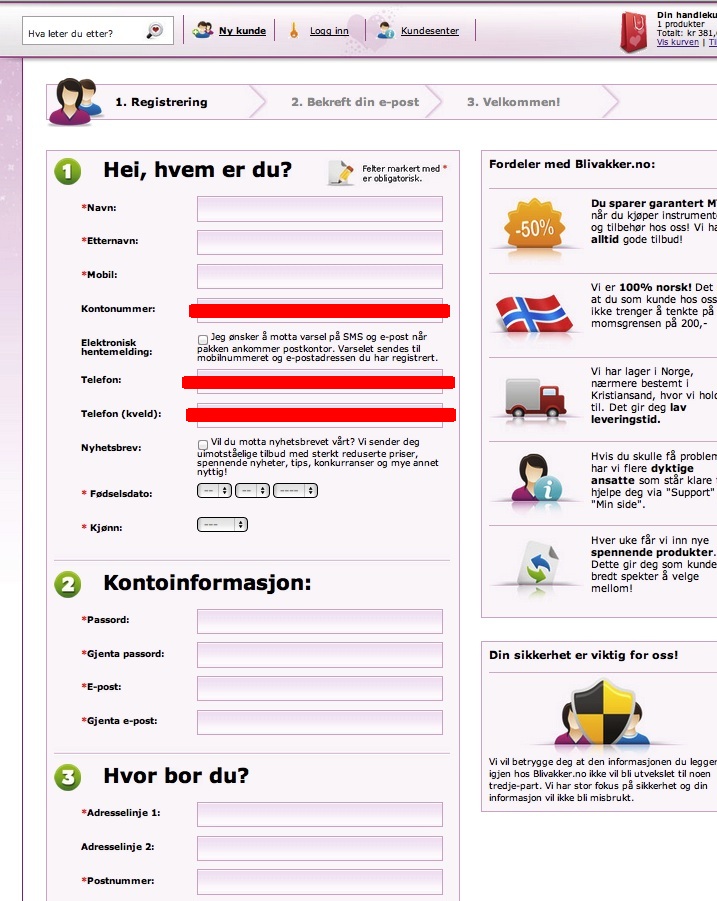
As you can see version 2 outperformed the control and the third version.
Key Findings:
-It shouldn’t be too surprising that reducing workload for visitors increases conversions. In everything you do, always look at things from a customer perspective. See everything from their point of view. Have respect for their time, make things easy for them, and you’re more likely to get them as a customer.
Source:
https://visualwebsiteoptimizer.com/split-testing-blog/ab-testing-form-fields-increase-conversions/
37. Short Landing Page Increases Signups 13%
Overview and Results Achieved:
DesignBoost provides online courses that teach students how to design mobile apps, landing pages, and more with photoshop. They had the goal of increasing signups.
Long version:
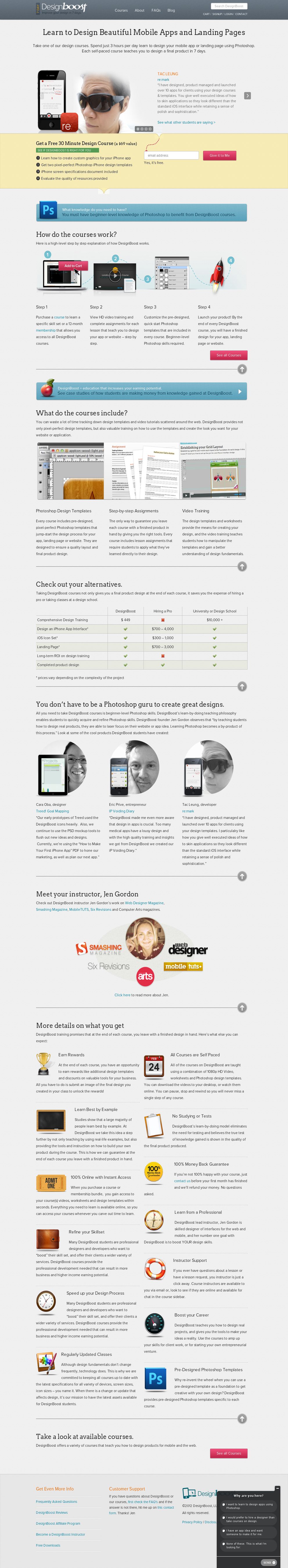
Short version:
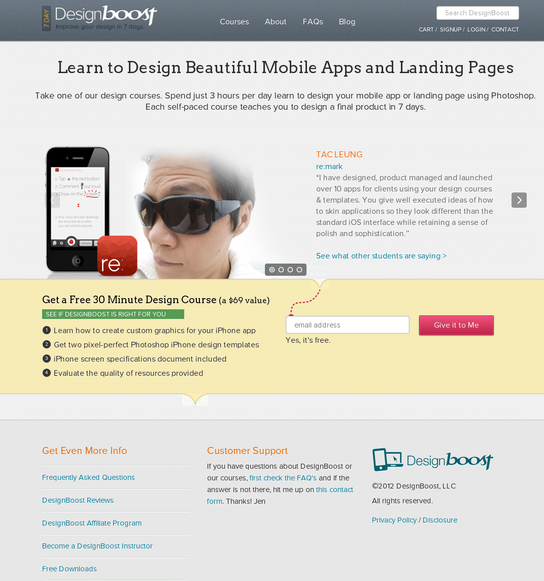
The short version had a 13% increase in signups over the long version. It also achieved 25% more click throughs to the courses page.
Key Findings:
-As you’ll see in these case studies, in some cases, long pages convert better than shorter pages, and vice versa. Nothing is set in stone, so it’s always best to test. Never rule out anything.
Source:
https://visualwebsiteoptimizer.com/split-testing-blog/short-landing-pages/
38. Reducing Questions Increases Conversions by 35%
Overview and Results Achieved:
Flying Scot provides airport parking in Edinburgh. They had the goal of increasing conversions through their website.
This is their original details page:
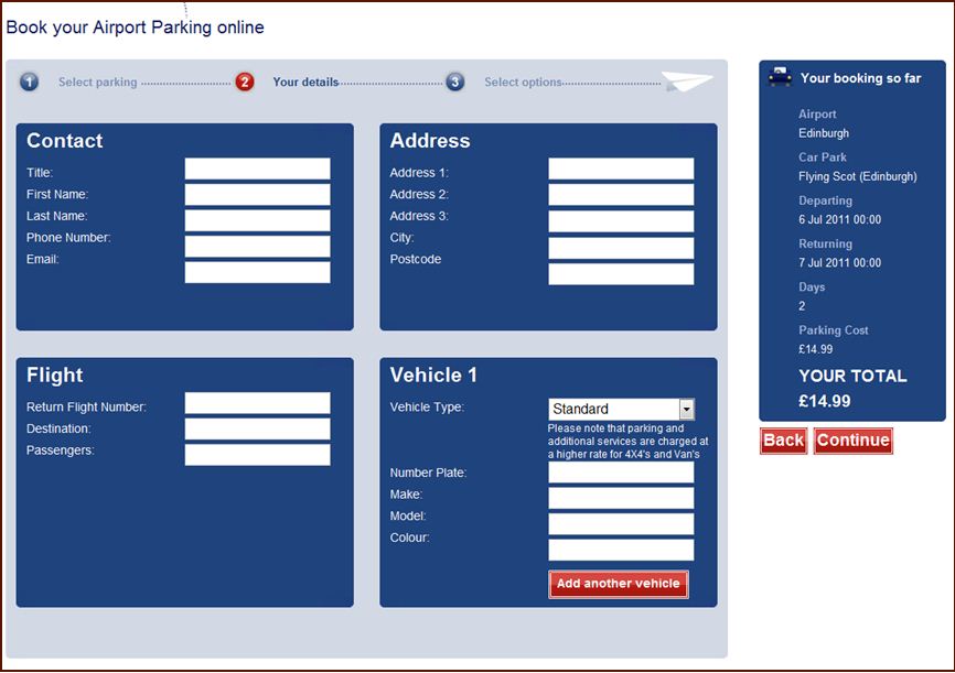
Test:
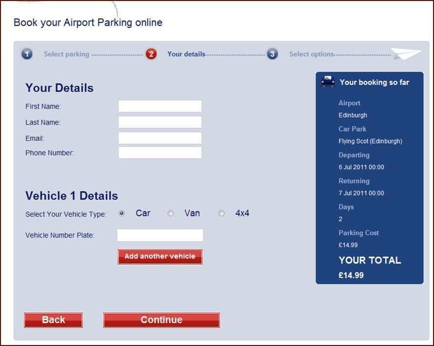
The result was a 45.45% increase in visitors moving to the next step and a 35% increase in form submissions.
Key Findings:
-Don’t make the user work too hard or make it look difficult on their end. Filling out a form should not be a task.
Source:
https://visualwebsiteoptimizer.com/split-testing-blog/career-advice-and-ab-testing/
39. Discounts Bring Huge Returns for Meebox
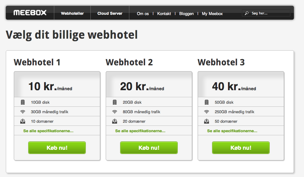
Overview and Results Achieved:
Meebox is a Denmark based web hosting and cloud hosting company. They ran a test on the pricing page. The original had no discount, while the variation had discounts of 20% and 40% for the highest plan. These discounts applied only if customers locked in for a 2-year period.
Original:
Variation:
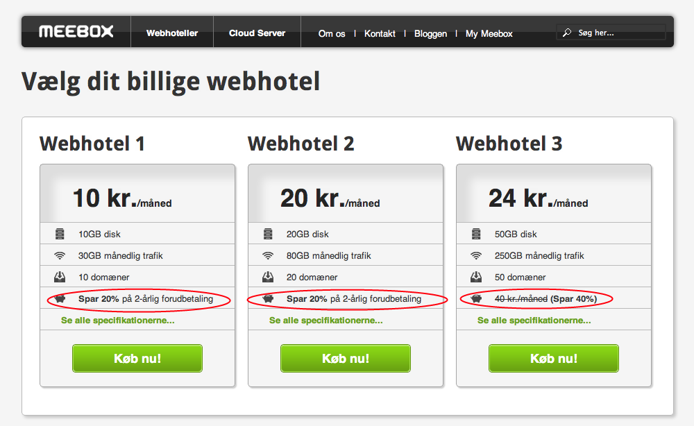
Meebox saw a 121.56% increase in revenue, a 46.24% increase in Average Order Value, and a 51.85% increase in conversions.
Key Findings:
-It shouldn’t be a surprise that Meebox saw an increase in conversions, but what is surprising is the increase in average order value. Perhaps customers were so happy to get the discount that they added more than they typically would to their order.
-As the author points out, when offering discounts to potential customers, try to make it work for your company as well. It may not have been profitable for Meebox to offer a discount if they didn’t get customers locked in for 2 years. You can discount all you want, but if it’s not fiscally wise, you won’t be doing it for long as you’ll eventually be out of business with no money.
Source:
https://visualwebsiteoptimizer.com/split-testing-blog/ab-testing-price-discounts/
40. CarWoo! Increases Homepage Conversions 25%
Overview and Results Achieved:
CarWoo! made a “refresh” of their homepage.
New design vs old design:
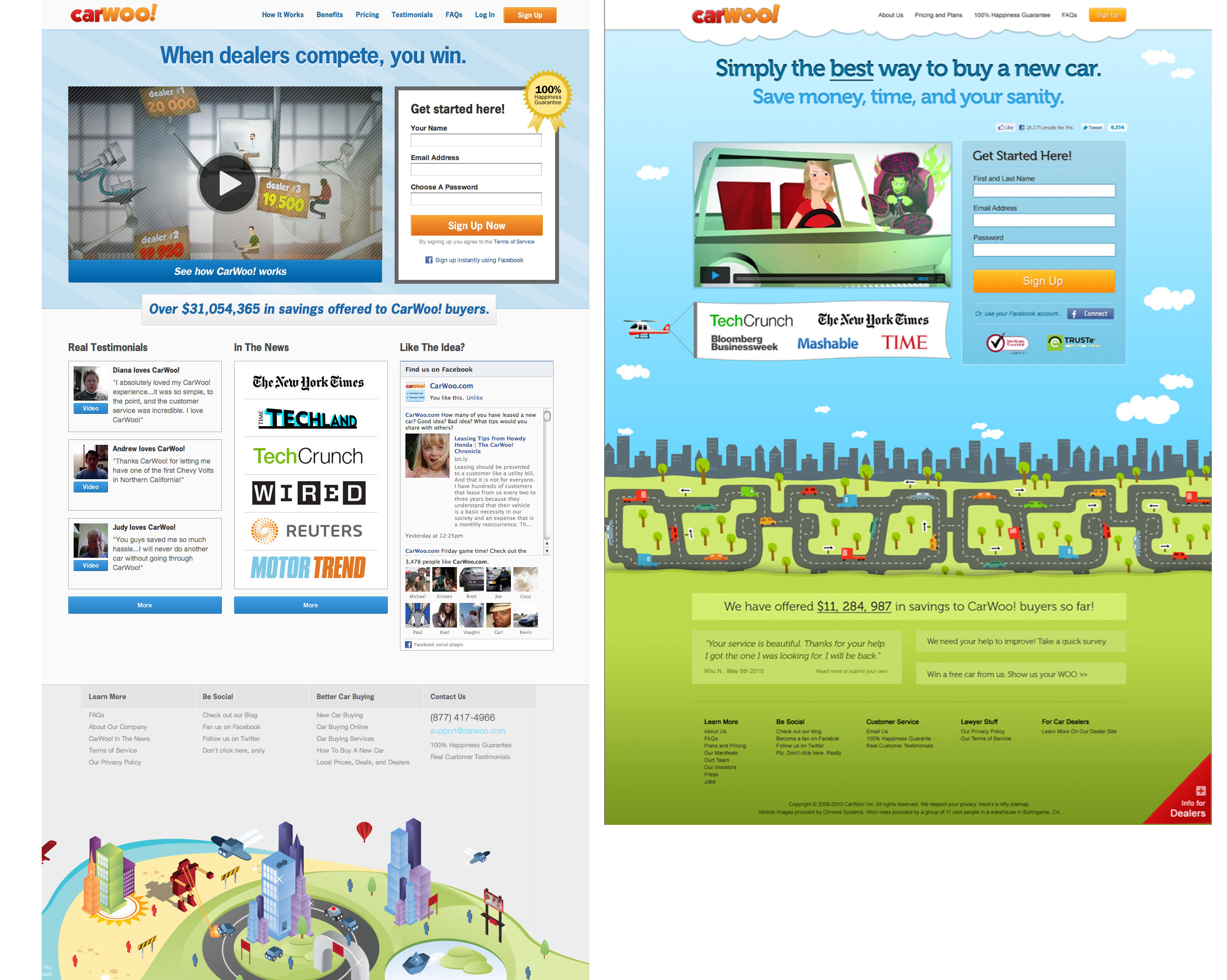
The new design achieved a 25% increase in conversions.
They changed many things in their new design, so it’s tough to say which one (or a combination) caused the increase in conversion. But there are lessons to learn from these changes made:
- Fewer words: Previous design had 1000 words on the “How it Works” page. The new “How it Works” page features 125 words and 4 enhanced screenshots.
- Wrote more about benefits and less about features
- Sign up from any page
- Visual design looks better in IE
Key Findings:
CarWoo! lists their lessons learned as:
-“Don’t forget common sense: cut down on word count, put benefits before features, polish your visual design, and make it cross-browser compatible.
-Make it easy to sign up from any part of your brochure, not just the home page or the header.
-Try VideoGenie to experiment with more authentic user testimonials.
-Analyze conversion rates from your brochure holistically.”
Source:
https://carwoo.com/blog/design-tips/
41. Bigger Product Images Increase Sales 9%
Overview and Results Achieved:
MALL.CZ is the Czech Republic’s second largest ecommerce retailer. They sell a variety of products, much like Amazon. Their goal was to increase sales.
There are two types of tests, one with larger images and the other with large images with product description over a mouseover.
Control – original size of product image with text description:
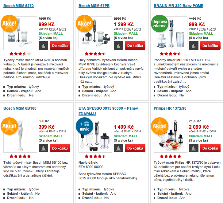
Variation 1 – Large product images with text:
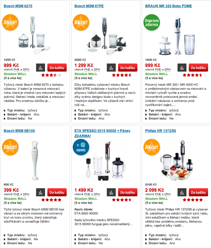
Variation 2 – Large product images with text description viewable on mouseover:
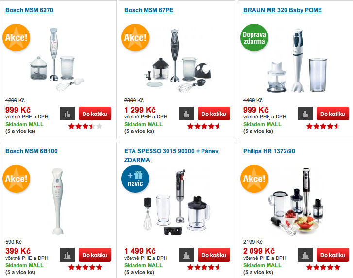
Variation 2 was the winner with a 9.46% increase in sales.
Key Findings:
-We’ve seen cases where bigger buttons decrease conversions, so it’s interesting to see bigger product images increasing sales. There’s a reason why cereal manufacturers make their product images on the box bigger (i.e., enlarged to show detail). They have undoubtedly done the same research and found that bigger product images increase sales.
Source:
42. Making CTA More Prominent Increases Conversions 32.12%
Overview and Results Achieved:
The Vineyard is a luxury hotel in London. On their website, the CTA “Book Hotel” was at the bottom of the page, barely visible:
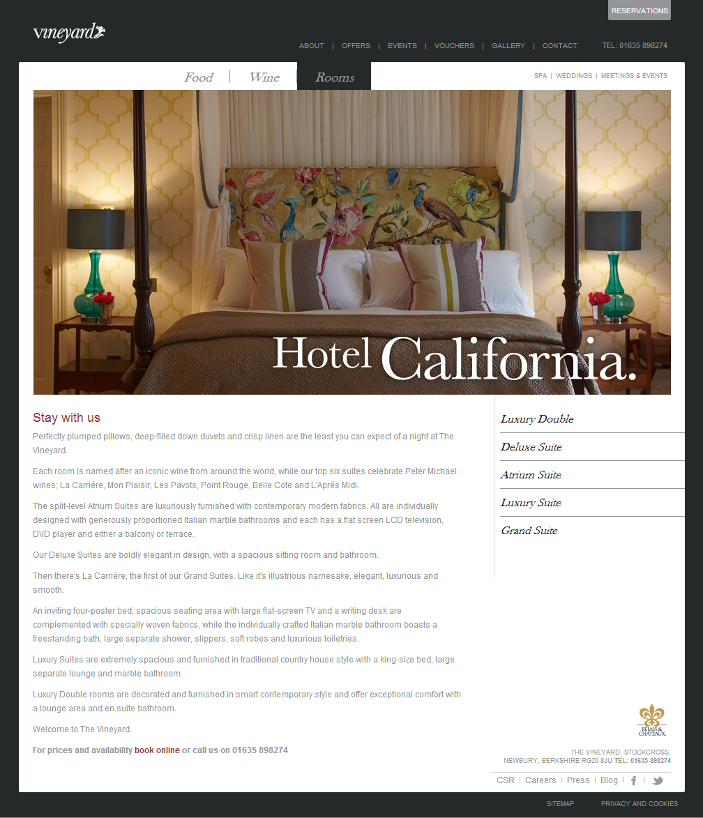
They added a new button to make the CTA more prominent:
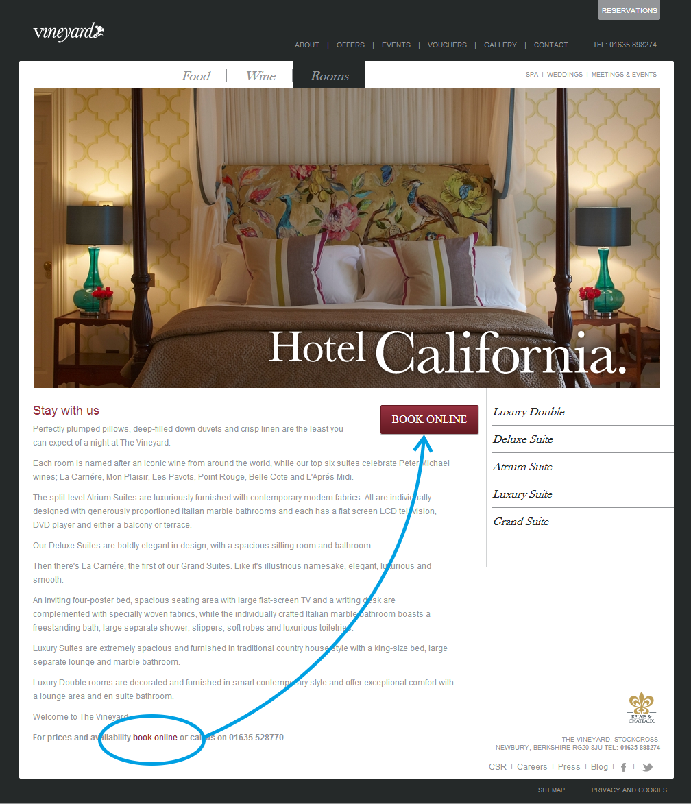
The CTA button achieved a 32.12% improvement.
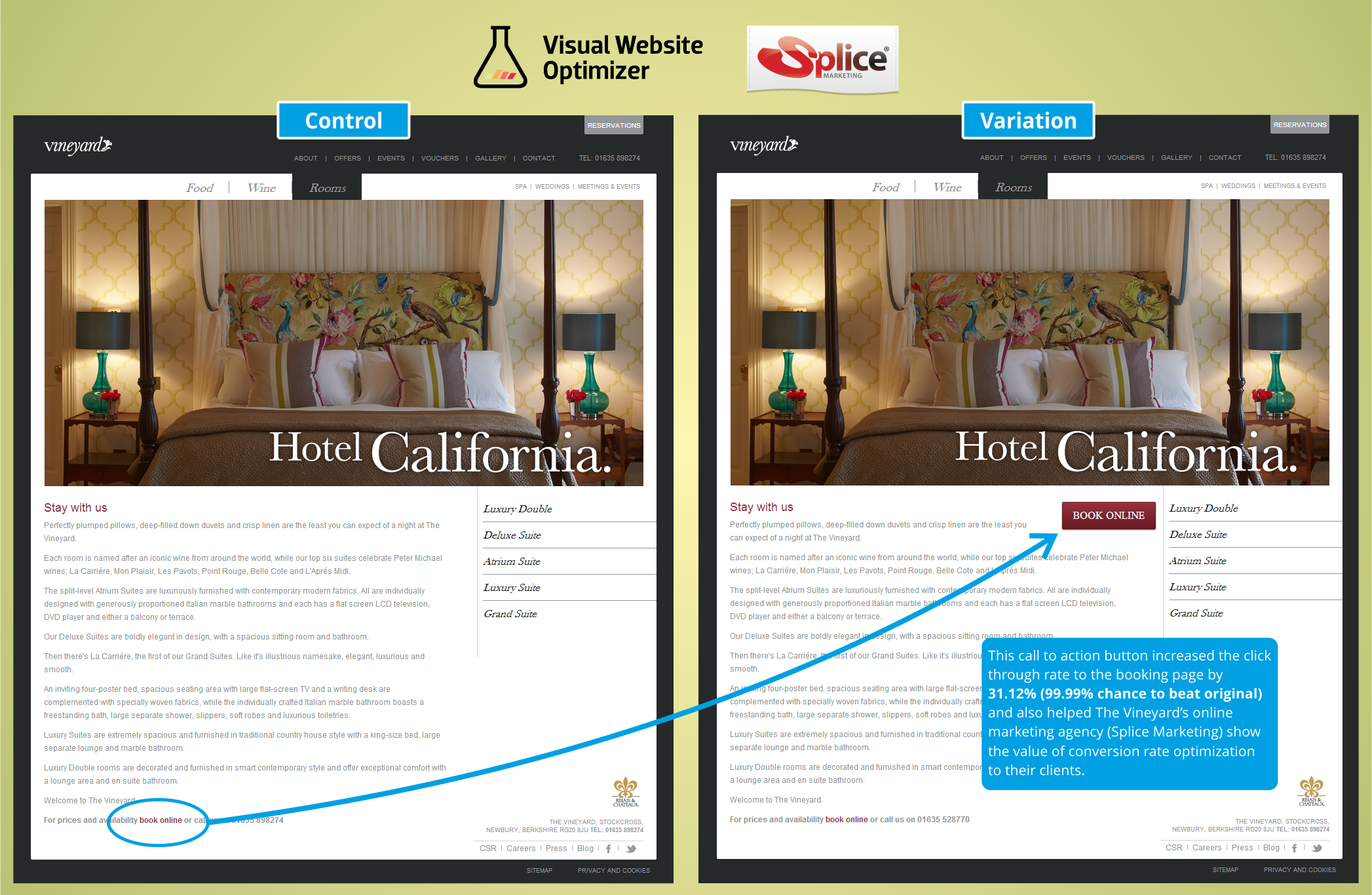
It should not be a surprise that making the CTA clear improves conversion rates.
Key Findings:
-What is your goal for a page? Make it clear to the users. If you want them to sign up, make your signup CTA clear.
Summary:
https://visualwebsiteoptimizer.com/split-testing-blog/ab-testing-to-convince-stakeholders/
43. Video Improves Email Signups by 100%
Overview and Results Achieved:
Vidyard wanted to improve email signups for their alpha product. They tested a landing page with and without video:
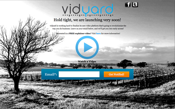
The results:
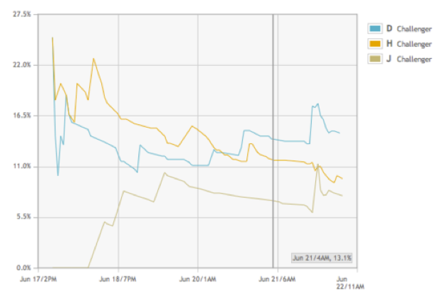
Challengers D and H used video in a light-box and an embedded i-frame. Challenger J did not include video.
J achieved a 6.5% conversion rate, H achieved an 11% conversion rate (69% boost), D achieved a 13% conversion rate (100% boost).
The content of the video showed a demo animation of the product as well as a voice over: Click here to watch video.
Key Findings:
-It wasn’t just about video. It was about the content in the video, too. Video alone won’t improve conversions. Just like written copy, video content matters just as much.
Source:
44. Changing Button Copy Increases Conversions 83.4%
Overview and Results Achieved:
GamesForLanguage had the goal of visitors playing a demo on their homepage.
Control:
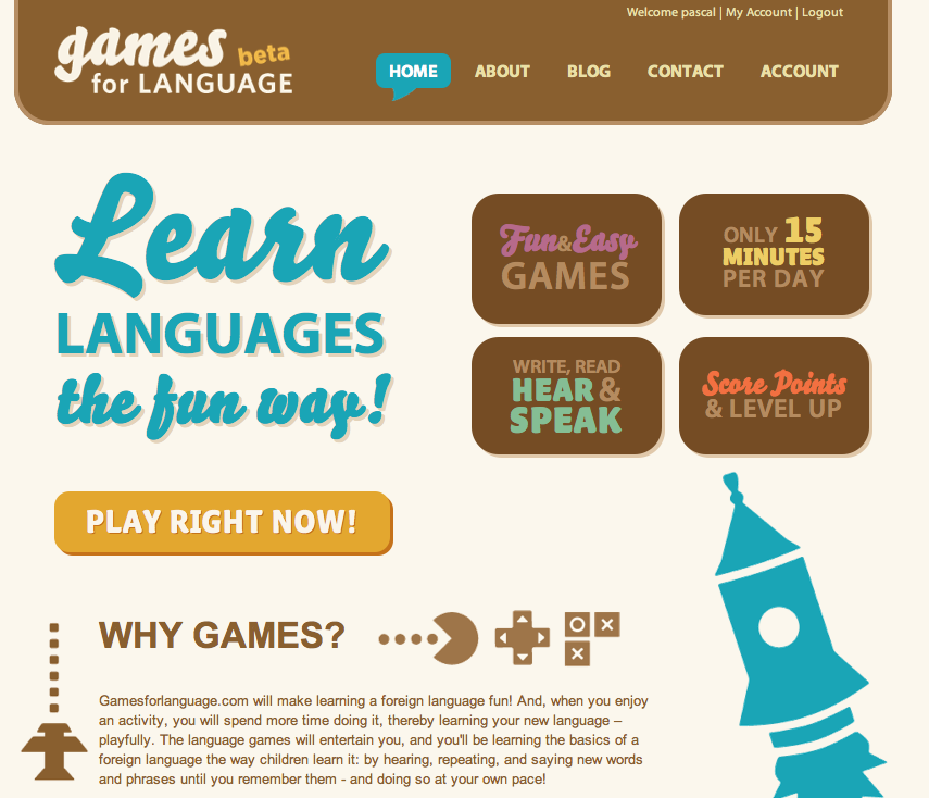
Test:
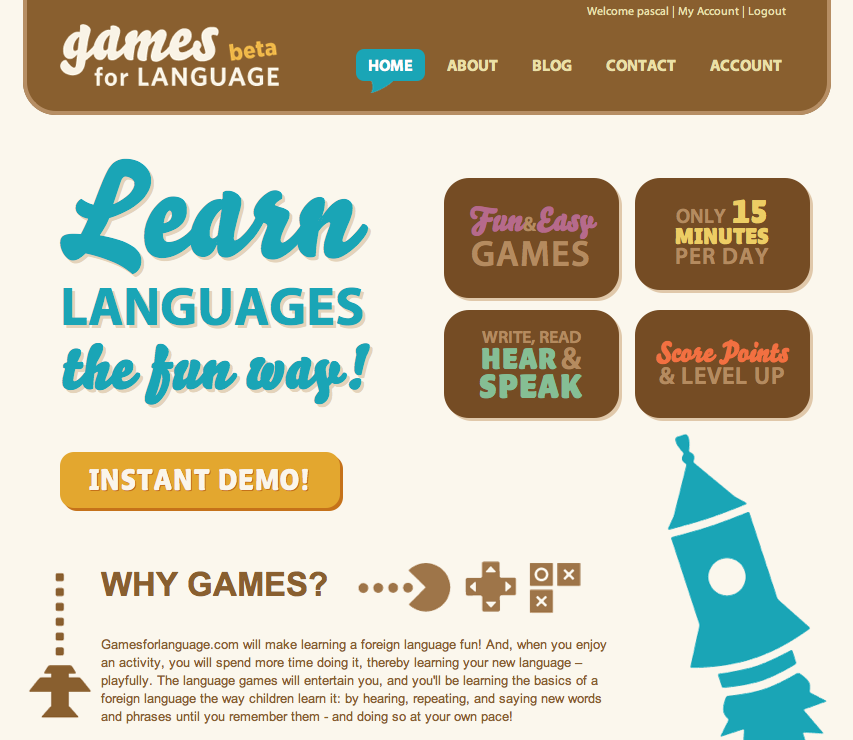
The control achieved a 21.2% conversion rate, while the test achieved a 38.8% conversion rate.
“Play Right Now” may make people think they have to pay, while “Instant Demo” makes visitors think it’s free to try. This could explain the increase in conversions.
Key Findings:
-If something is free, people need to know. The button “Play Right Now” doesn’t tell visitors that it’s free and may make some believe that it will lead to a signup form, whether it’s free or not.
Source:
https://www.abtests.com/test/240003/homepage-for-gamesforlanguage-com
45. Long Page Homepage Improves Conversion Rates 30%
Overview and Results Achieved:
Conversion Rate Experts and Crazy Egg worked together to increase conversions of their homepage. They found four objections visitors had:
- Visitors were not sure what heat maps were.
- They were not sure the value justified the price.
- Some thought it was no different than overlay reports in Google Analytics.
- Some thought it had fewer features than competitors’ products.
This is the control:
This is the test:
The test page outperformed the control by 30%.
They also included a short video to explain Crazy Egg. The video achieved a 64% increase in conversion rate.
They also optimized the checkout after finding that visitors didn’t want to enter their credit card number for a free trial. Crazy Egg added an explanation that they would not be charged for the free trial.
They overcame another objection by explaining the billing process in the new checkout.
Control:
Test:
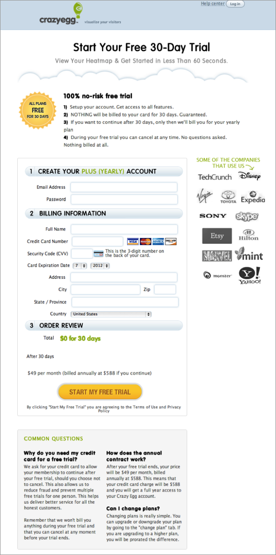
This resulted in 116% more signups.
Key Findings:
-Long pages seem counterintuitive to people who focus on maintaining user attention; but this test shows you can maintain user attention and get them to sign up with a long page. It’s a break from the ordinary.
Source:
https://www.conversion-rate-experts.com/crazy-egg-case-study/
46. 70.9% Increase in Video Plays by Reducing Detail of Product
Overview and Results Achieved:
Yobongo tested two screencaps for their video.
Control:
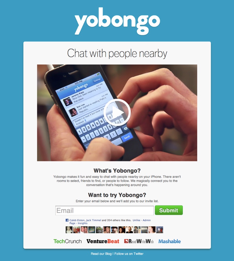
Test:
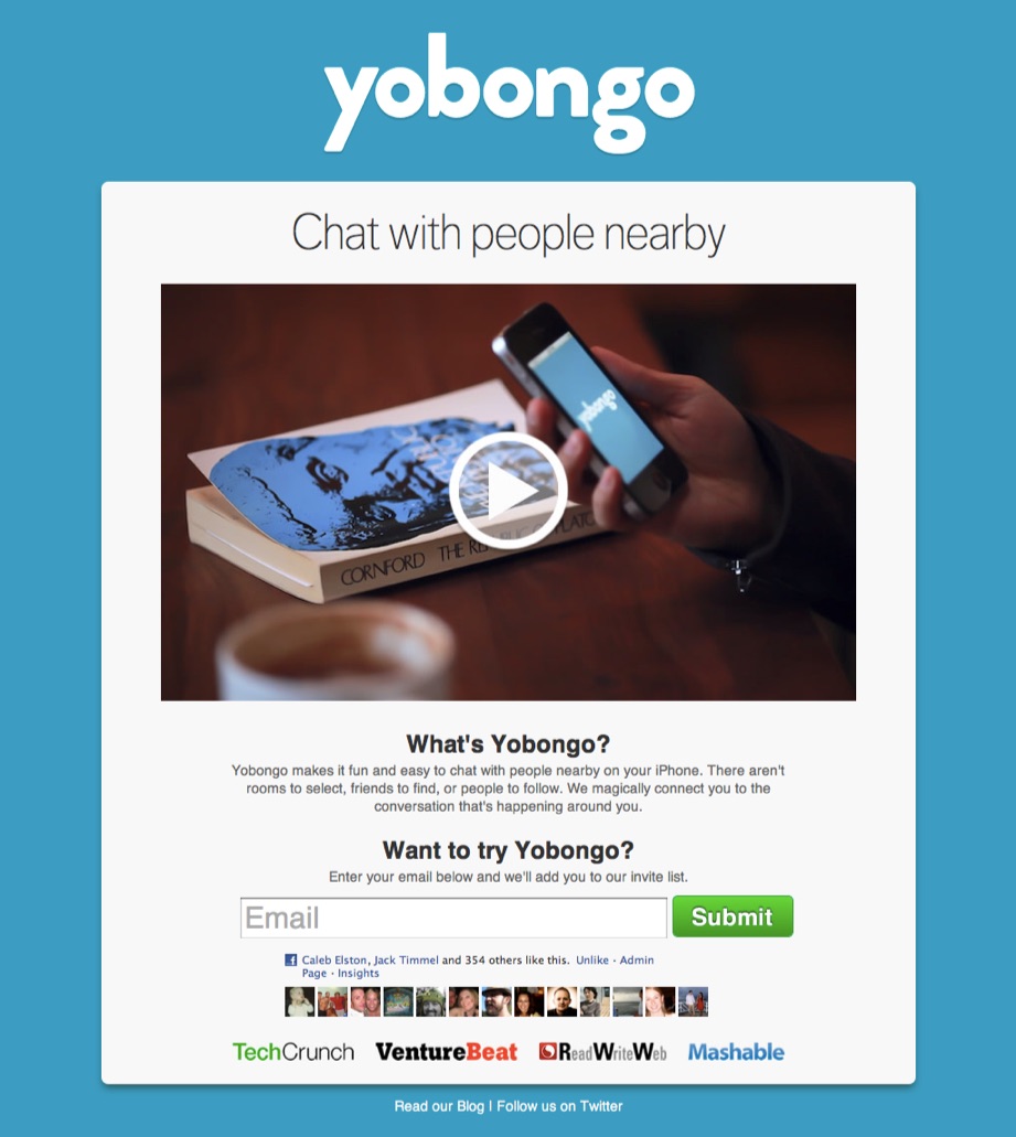
The control focuses primarily on the app and nothing else. The test shows it in a different context. The app is not the entire focus of the shot and it appears to be someone on the app in a coffee shop.
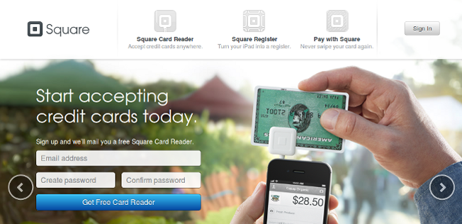
Key Findings:
-Showing a close-up of your product is not always the best. It may help to show it in a familiar environment. The test shows a relaxed scene and the app is a part of it. This also may be true for images, as you can see from Square’s old home page:
Source:
https://www.abtests.com/test/248002/homepage-for-yobongo
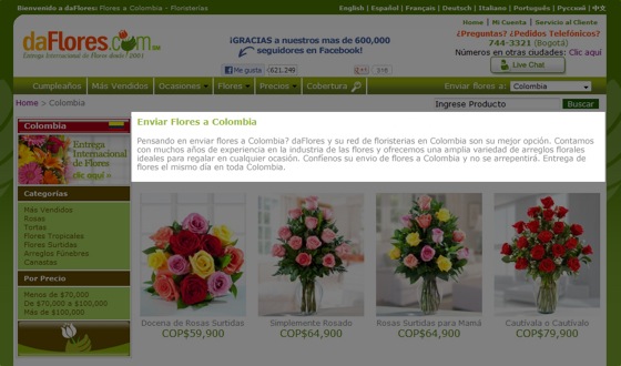
47. Overcoming Objections Earned Flower Shop 44% Boost in Sales
Overview and Results Achieved:
daFlores is an online flower delivery shop in South America. They had the goal of increasing conversion rates. They (and Conversion Rate Experts) first started out learning what visitor objections were. The team:
- Ran surveys using 4Q
- Added Qualaroo exit surveys to certain pages
- Read through thousands of lines of live chat transcripts to learn what the most common inquiries were
- Emailed a SurveyMonkey survey to shopping cart abandoners
- Received insights with ClickTale
One of the highlighted changes was adding a sense of urgency. Their research showed visitors were concerned that their flowers would not be delivered on time and were not aware daFlores offered same day delivery.
To add a sense of urgency, daFlores put on their website “Order in the next x hours for delivery today.”
Control:
Test (urgency):
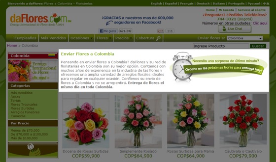
This ended up giving daFlores a 27% boost in sales.
In another case, daFlores added social proof to their website because some users had not previously heard of daFlores and were understandably skeptical. daFlores had more Facebook likes than any competitor. They showed this off.
Control:
![]()
Test:
![]()
The test showed three customer quotes in rotation. The control said only “Thanks to our 600,000+ Facebook fans.”
Replacing the static quote with rotating quotes earned daFlores a 44% uplift in sales.
Key Findings:
-This is a crucial case study because it shows you cannot blindly follow tests and hope to receive the same results. You have to conduct research, learn about visitors, find out what their objections are, and work to overcome them. That’s exactly what daFlores did, and they earned a boost in sales because of it.
-Adding social proof may help if you have a low number of Likes or Followers. But again, it’s about overcoming objections so don’t embed social proof if it doesn’t serve a purpose.
Source:
https://www.conversion-rate-experts.com/daflores-case-study/
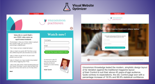
48. Understanding Your Audience Proves More Valuable Than Just Good Design
Overview and Results Achieved:
Uncommon Knowledge had a product launch on the way and wanted to expand their reach prior to the launch. They had the goal of getting people on their email list.
They spread the word with a free three-video set which would be available after users entered their name and email address.
Control:
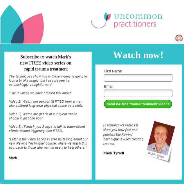
Test:
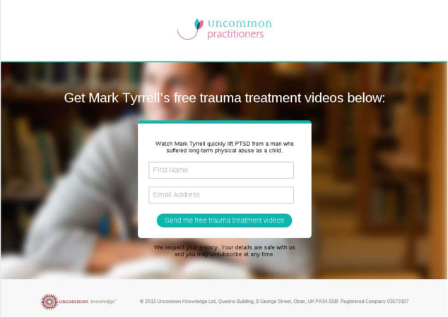
The new design is more modern and appealing. Uncommon Knowledge also let people know that they would be able to unsubscribe to their emails at anytime, something that was not mentioned in the control. It is possible that users (who were shown the control) were not aware they would receive any follow up emails beyond the videos. This could explain the better results.
Their demographics:
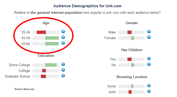
Their demo shows they attract an older audience, which could explain why they liked the more conventional control design better. Older demographic groups may be more hesitant to give their email address, so letting users know (like they did with the test design) that there would be follow up emails likely made them more cautious about giving an email address.
Key Findings:
-In some cases, it may be better to know your users and explain your value than just keeping things too simple.
-Headshot adds a personal touch and may increase conversions.
Source:
https://visualwebsiteoptimizer.com/split-testing-blog/good-design-bad-conversion-rate/
49. Customer Reviews Widget Increases Sales 58.29%
Overview and Results Achieved:
Express Watches had the idea that adding a customer review widget on product pages would increase sales. They thought this because of the results of a customer survey which stated that customers wanted to know if they were getting the best price, if it was a real watch (problem with replica watches), and if the company was legitimate.
The original:
The test page:
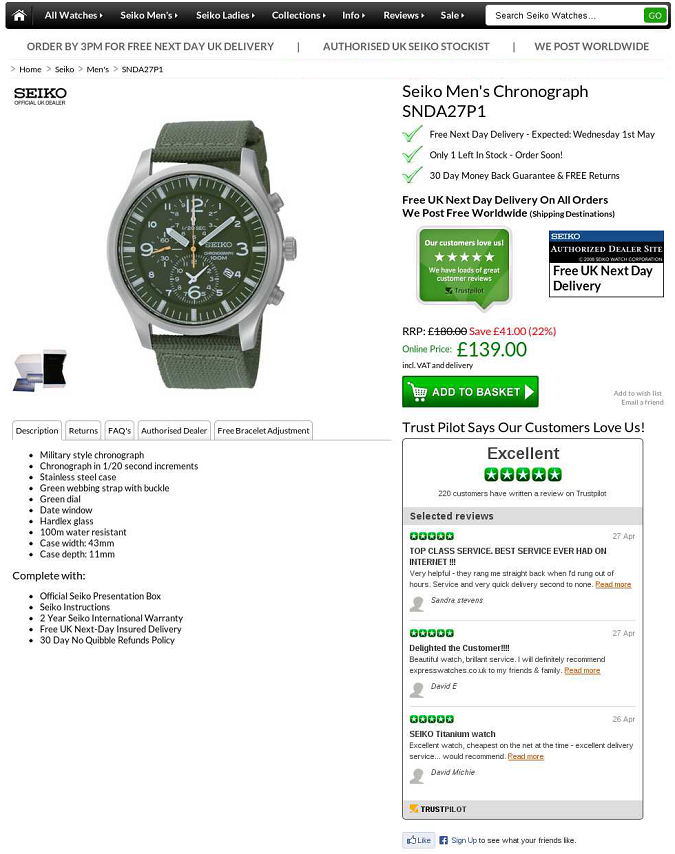
Results:
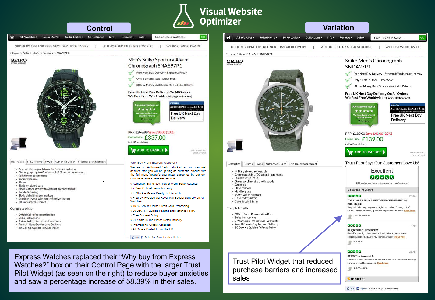
Key Findings:
-This is another case where a company overcame visitor objections and increased conversion rates. They used visitor surveying tool Qualaroo to learn what the objections were.
-It almost always helps to add trust symbols and assure visitors of your business’s security and legitimacy.
Source:
50. Removing Social Proof Increased Engagement
Overview and Results Achieved:
Calpont wanted to know if having social media signals on their pages increased engagement. They removed social media icons at the tops of their pages. Eleven different goals were tracked.
Without social sharing:
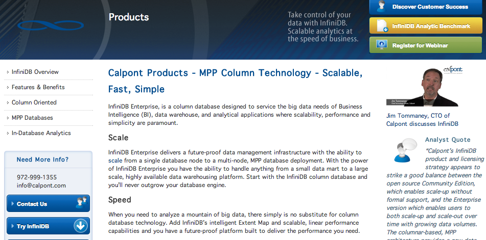
With social sharing:
After three weeks, three of the eleven goals had reached statistical significance. Many of the other goals also were showing positive trends. Their key goal, sending a sale inquiry, showed a “massive improvement.”
The two goals that showed a decline were Debian Downloads and Engagement. They attribute this to the placement or possibly the low number of Likes.
Key Findings:
-Visitors may become discouraged if you integrate social media buttons on your website and they show low numbers of Tweets, Likes, or +1’s.
Source:
https://visualwebsiteoptimizer.com/split-testing-blog/social-proof-decreases-conversions/
51. Improved Page Design Yields 201% Increase
Overview and Results Achieved:
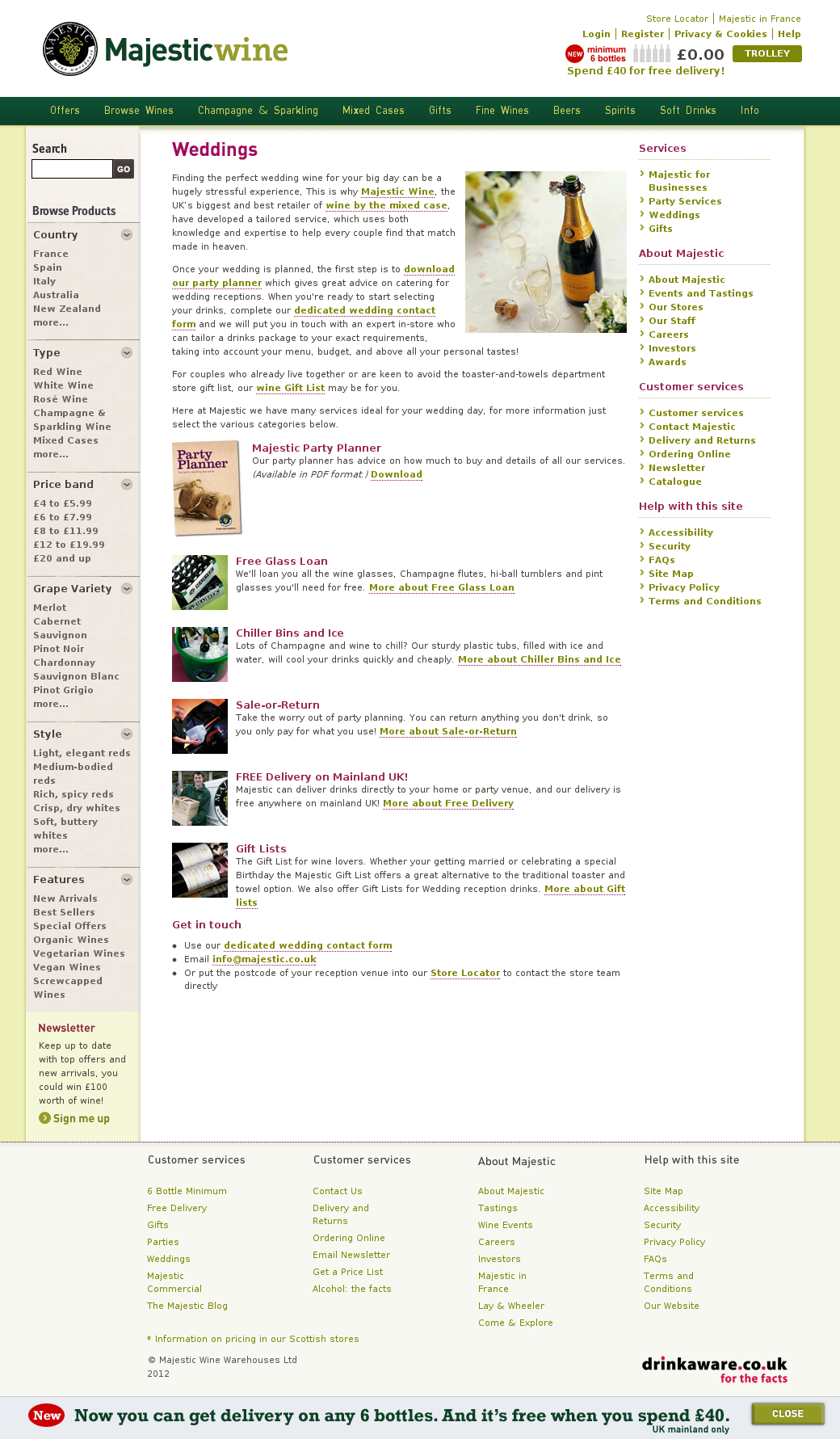
UK-based Majestic Wine is an online store that sells wines. They had the goal of increasing conversions (fill out enquiry form) via their Weddings page. To start with the changes to their landing page, they first talked to their customers and garnered feedback from them. They also had discussions with their own staff.
The control:
The team wanted to reduce distractions, improve communication and clarity of their unique selling proposition, and feature a video that explains their services. This is what they came up with (the test):
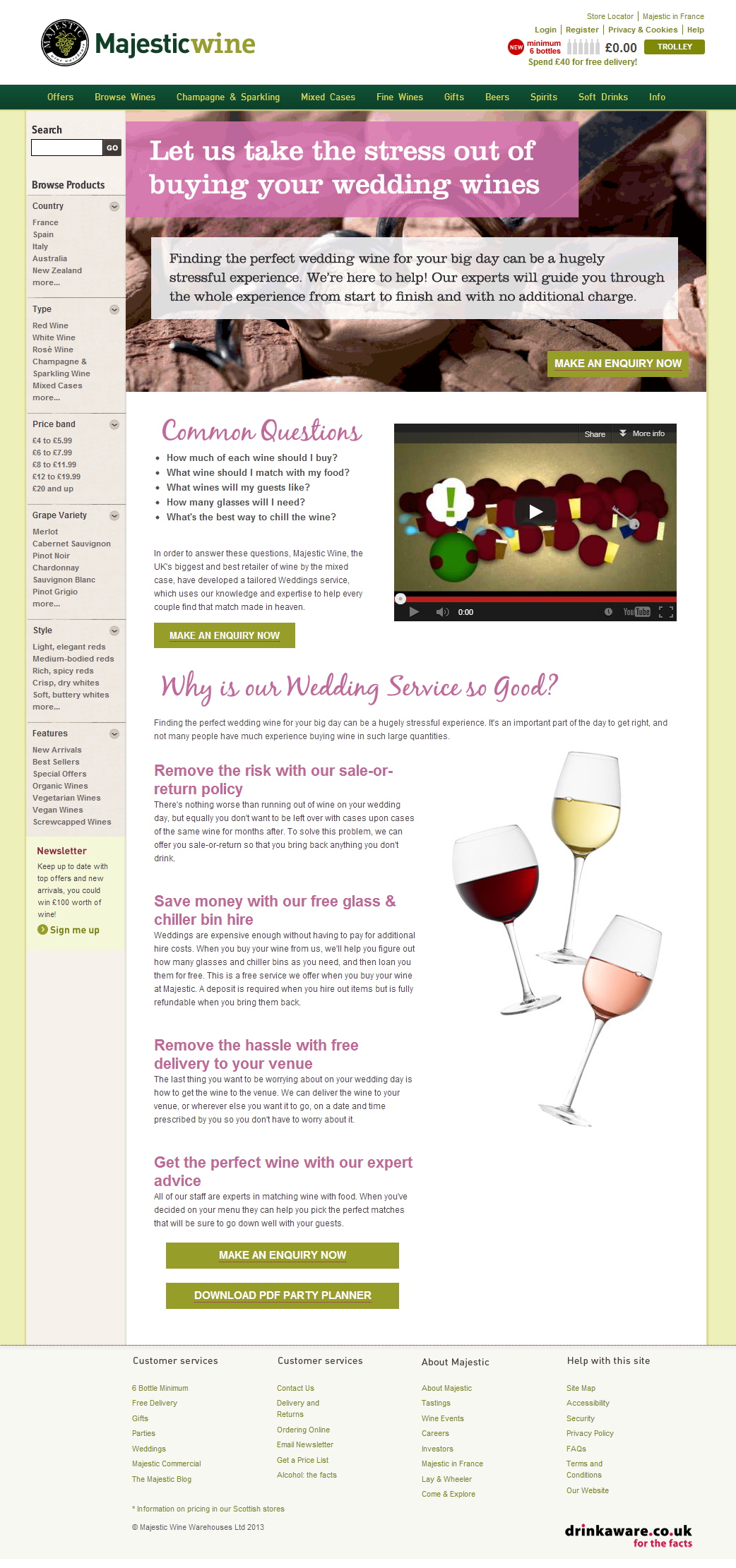
The results:
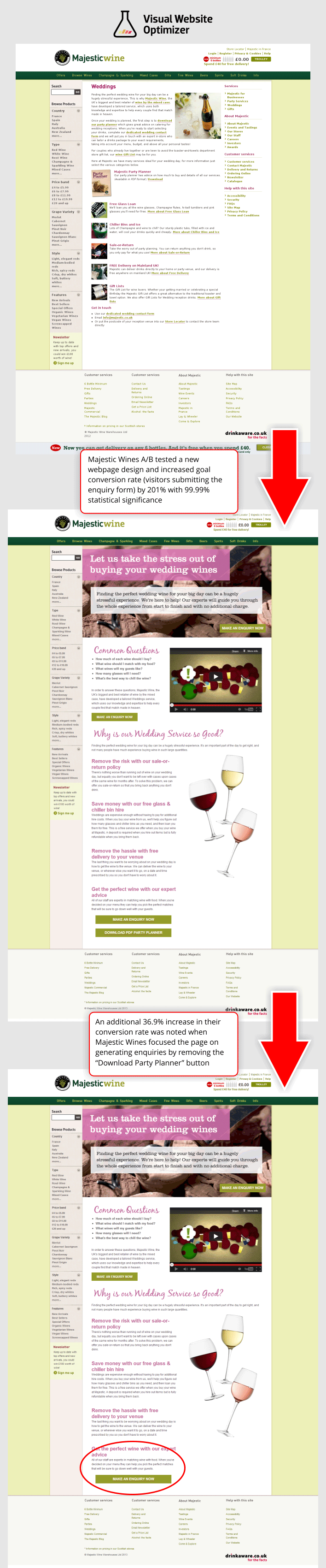
Key Findings:
-Simplicity is much better than clutter.
-Emphasizing points is better than not emphasizing anything.
Source:
https://visualwebsiteoptimizer.com/split-testing-blog/website-redesign-increased-conversions/
52. Adjustments to Landing Page Results in 232% Increase in Lead Generation Conversion
Overview and Results Achieved:
Open Mile wanted to increase the lead generation rate for their landing page.
Original page:
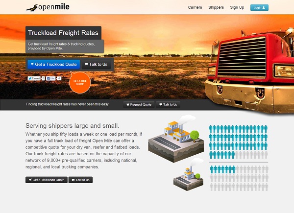
Test page:
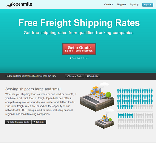
Comparison of the two pages and results:
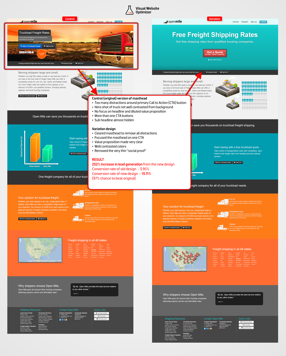
You can see one difference between the two is the test page has a much clearer, more focused value proposition. Also, the CTA button is clearer and more prominent, and the word “free” is mentioned three times above the fold with the test page.
Key Findings:
-Color contrast matters and can improve conversion rates.
-Removing distractions and limiting options makes users more prone to convert.
Source:
https://visualwebsiteoptimizer.com/split-testing-blog/abtesting-increases-lead-generation-rate/
53. Below the Fold CTA Outperforms Above the Fold CTA
Overview and Results Achieved:
An anonymous Danish company runs a subscription food service. Their goal was to get people to fill in their contact form. As you’ll see in the control and test, they adjusted more than just the contact form.
The control:
The test:
The results:
Key Findings:
-The “above the fold myth” has been discussed before on this blog. This case study proves that customers can scroll to the bottom of a page to sign up. When they land on a page, they may not immediately want to be presented with a contact form. It may make them put their guard up and be less willing to enter their information. That doesn’t mean above the fold is ineffective, but it helps to test.
Source:
https://contentverve.com/how-moving-the-call-to-action-below-the-fold-generated-a-304-lift/
54. Changing One Word on a CTA Button Changes Conversions 38.26%
Overview and Results Achieved:
An anonymous Danish company had the goal of increasing its click-through rate on its CTA. Any extra clicks beyond that is a bonus.
The author theorizes that the more value you can convey via your button copy, the more conversions you’ll get. With this information in mind, the authors changed the format from “Order Information” to “Get Information.” The thinking behind this was “Order” makes it sound like something the visitor has to do. “Get” means that they are receiving and sounds much more appealing.
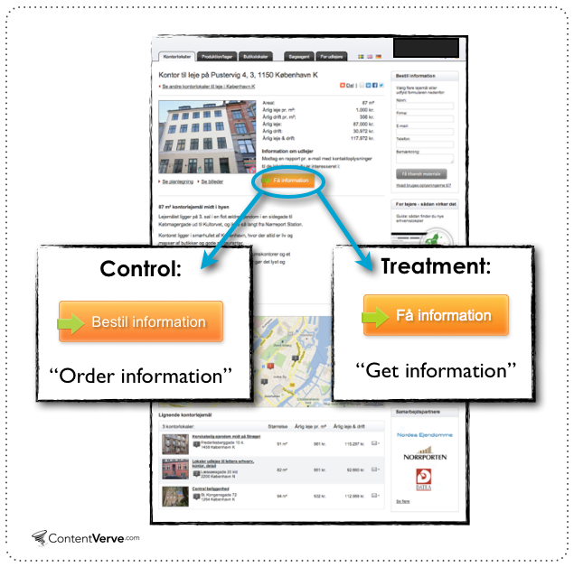
The results:
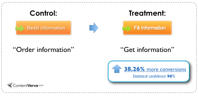
Key Findings:
-The CTA is so important that it’s likely the tipping point between conversion and bounce rate.
-Take out words that make visitors think they have to do something. Think about the difference between the words “Order” and “Get” and the variation it causes in conversion rate.
Source:
55. 189% Increase in Donations for a Non-Profit Think Tank
Overview and Results Achieved:
Conservative non-profit think tank, The Heritage Foundation, wanted to increase donations with its landing page.
The control:
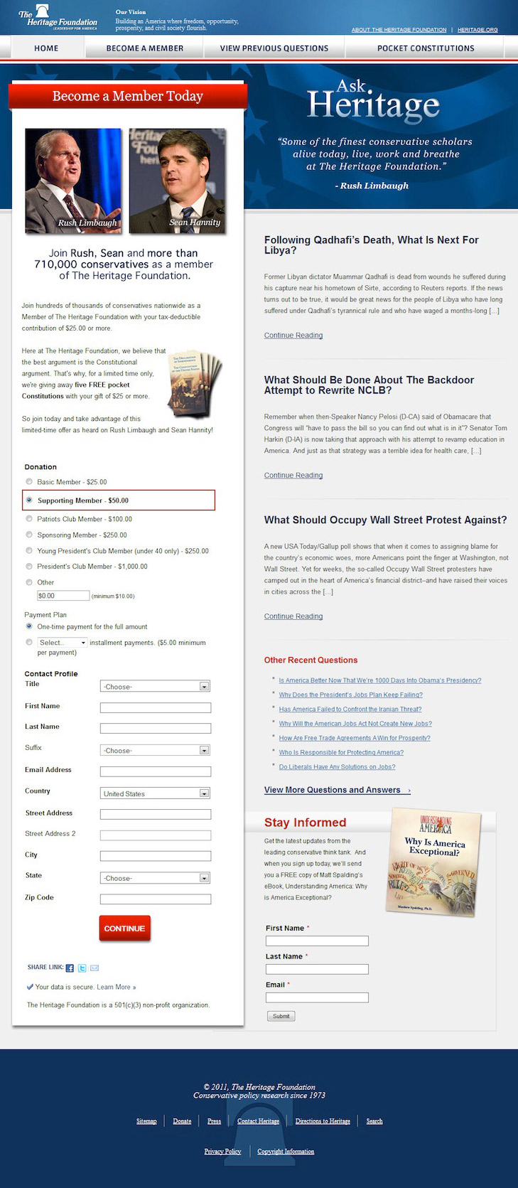
The test (note the donation form sitting at the bottom):
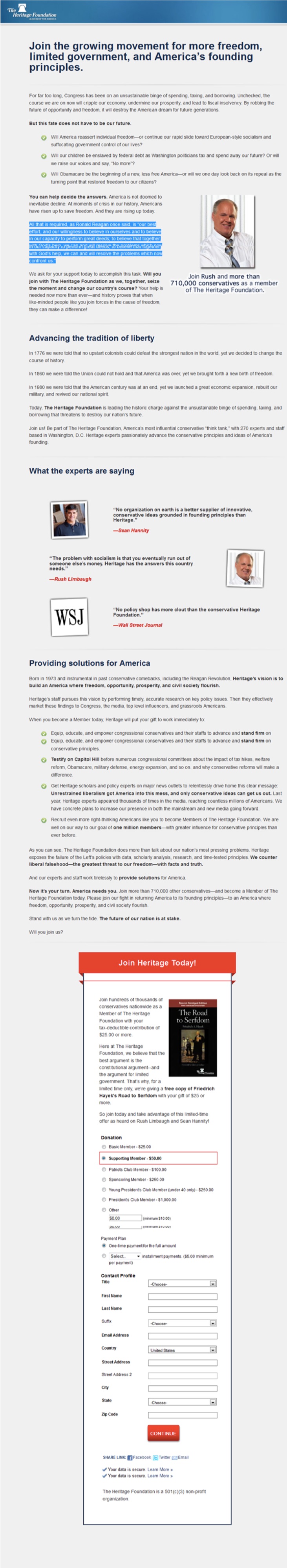
The test page achieved a 189% increase in donations, and the conversion rate increased 74%. These two factors combined to create a 274% lift in revenue over the original.
Key Findings:
-In this case, it appears that the value prop is far more important than the placement of donations. The value prop of “Join the growing movement….” makes the visitors feel that this is a cause greater than self and they must donate to preserve freedom, limited government, and America’s Founding Principles.
-This new landing page affects a visitor’s emotional side. Politics is partly emotional, and if you exploit that, you can get people to be willing to give up money in favor of a cause.
-As the authors note:
“What we have concluded is that when you convey a strong value proposition, and you communicate that value proposition with a tremendous force throughout the landing page, not only do people say “yes” more often, they say “yes” on a much higher level – they don’t just donate, they donate more dollars.”
Source:
https://contentverve.com/conversion-optimization-helped-a-nonprofit-increase-donations-274/
56. 99.4% Increase in Landing Page Conversions by Adjusting Images, Copy, Removing Tabs, and Adding Trust Symbols
Overview and Results Achieved:
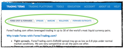
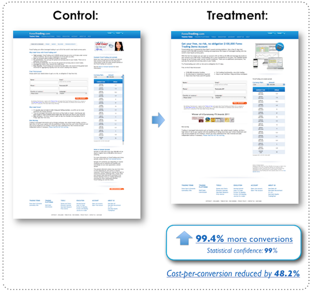
Forex Trading had the goal of increasing conversions from their landing page.
This is the original landing page:
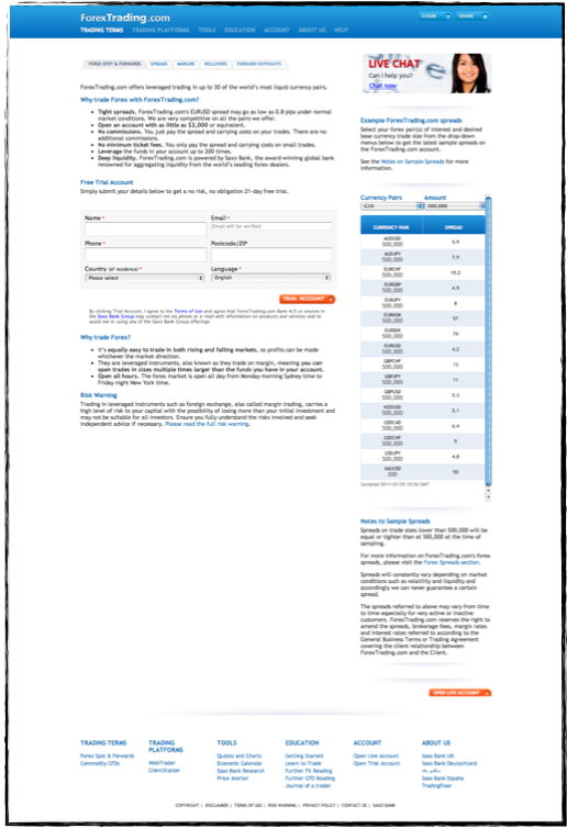
This is the revised page:
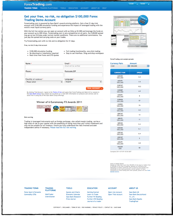
Up close changes:
Copy tweaks convey value:
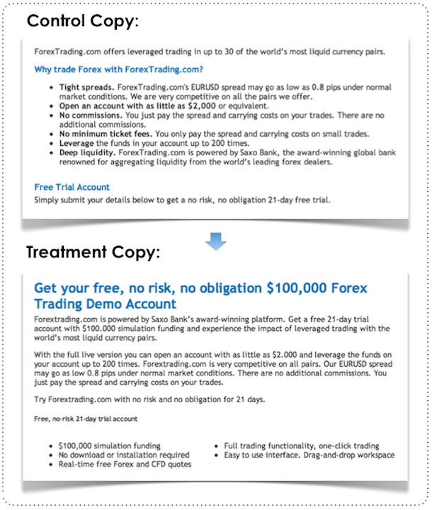
More relevant image:

Tabs were removed:
Trust symbols added:

The results:
Key Findings:
-You don’t have to totally reinvent the design to get significant gains in conversions. This case study shows you can adjust the content on the page to achieve a boost in conversions.
-Explain value on your landing page and you’ll increase conversions.
Source:
57. Bigger Button Reduces Conversions 10.56%
Overview and Results Achieved:
WriteWork tested whether increasing the size of their CTA button would increase conversions. It didn’t. A decrease of 10.56% in their conversions was achieved.
Key Findings:
-It’s not just the copy of a button that has an impact on conversions, but also the size of the button. Bigger does not mean better; in this case it means worse.
Source:
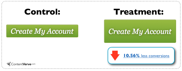
58. Removing “My” on CTA Buttons Increases Conversions 31.03%
Overview and Results Achieved:
WriteWork wanted to increase the number of subscriptions sold. Their payment page was the focus of the test.
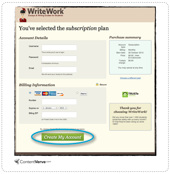
As you can see, the control CTA reads “Create My Account.” This button was tested against this:

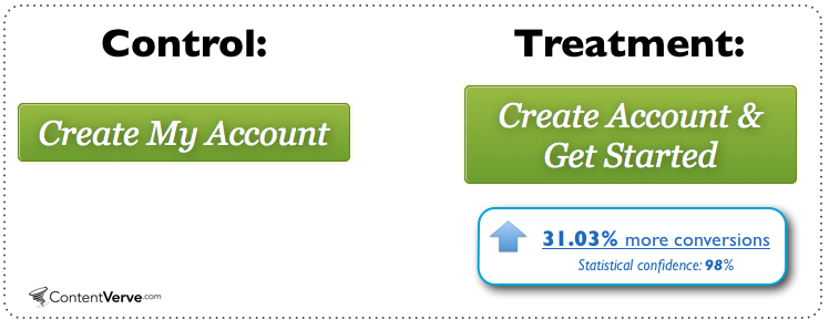
Key Findings:
-The author says that in all of his tests, ‘’Your” consistently outperforms “My.”
-Adding urgency can increase CTA.
Source:
59. Communicating Value Increases Email Signups by 31.54%
Overview and Results Achieved:
Betting Expert wanted to increase the conversions on their email signup form.
Here is the homepage, where the email signup form is located:
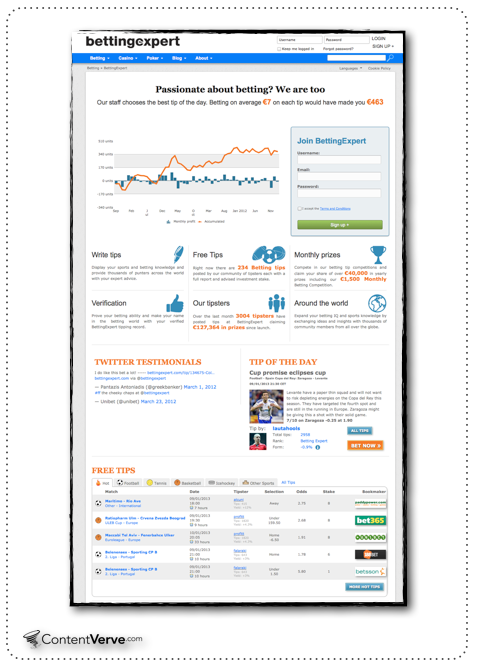
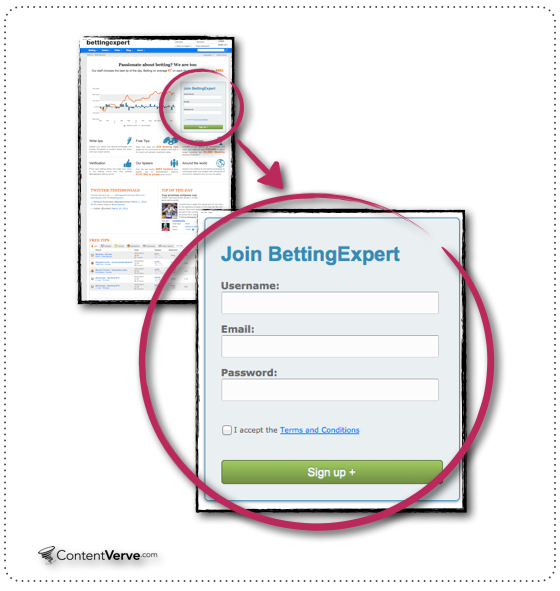
The problem was that it didn’t communicate any unique value the visitor will be receiving if they add themselves to the email list. The new form copy sought to answer the question “Why should I fill out this form?”
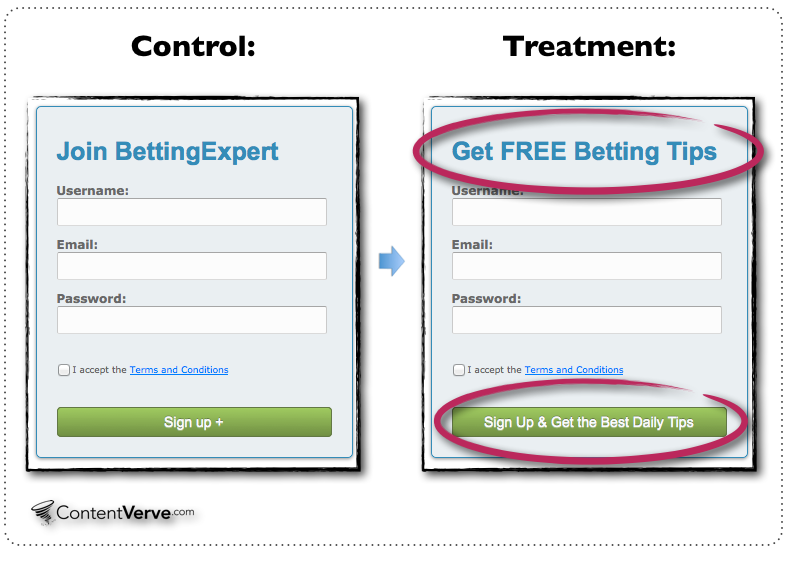
After 13,560 visitors, the treatment achieved a conversion rate of 31.54%.
Key Findings:
-Find out the reason visitors are at your site, understand their motivations, and target your messaging toward that.
-Be clear and succinct in your value prop for email signup
-The benefit is also made clear in this new headline.
Source:
https://contentverve.com/case-study-31-54-more-conversions-signup-form-copy/
60. Removing Social Proof Increases Signup Form Conversion
Overview and Results Achieved:
Derek Halpern tested his signup form for DIYthemes.
Control, Variation 2, and Variation 1
The results, with 2,068 visits:
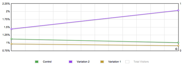
Removing social proof actually increased conversion rates.
Key Findings:
-This test doesn’t prove that social proof isn’t effective at improving conversion rates. It does, however, show that nothing is set in stone. Everything can be challenged and tested.
Source:
https://diythemes.com/thesis/increase-conversions-split-testing/
61. Homepage Change Sends 9.6% More Visitors to Pricing Page
Overview and Results Achieved:
Visual Website Optimizer noticed their top right “Free Trial” button was getting four times the clicks of the “Try it For Free” button.
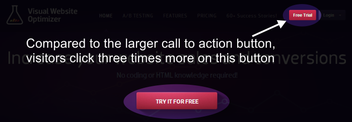
They theorized this was due to many sites placing their Settings and/or Login details on the top right of a page. Facebook, Google, Twitter, and many others place these buttons at the top right.
With the fact that their secondary CTA was getting four times the clicks of their primary CTA, they decided to adjust some things with the primary.
Here is the control:
This is the test – they added the heat maps in the headline due to the fact that many customers use this tool:
https://visualwebsiteoptimizer.com/split-testing-blog/headline-test-increases-clickthroughs/
The test yielded no significant change in signups or revenue. One thing that did change was visits to the pricing page, yielding a 9.6% improvement.
Key Findings:
-Many headlines are very succinct, which is good for some visitors. But testing longer headlines that include a lot of the features of your product may be helpful. It may intrigue enough people to check out your pricing page.
Source:
https://visualwebsiteoptimizer.com/split-testing-blog/headline-test-increases-clickthroughs/
62. 14.5% Conversion Rate Increase by Emphasizing a Free Trial
Overview and Results Achieved:
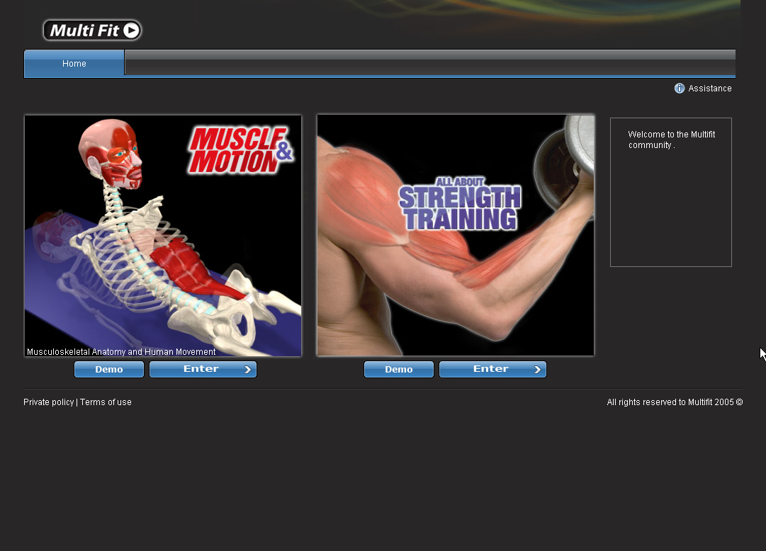
MuscleandMotion’s original homepage had very few details on the product and no mention of a free product:
The second version included many more details and included the free mention:
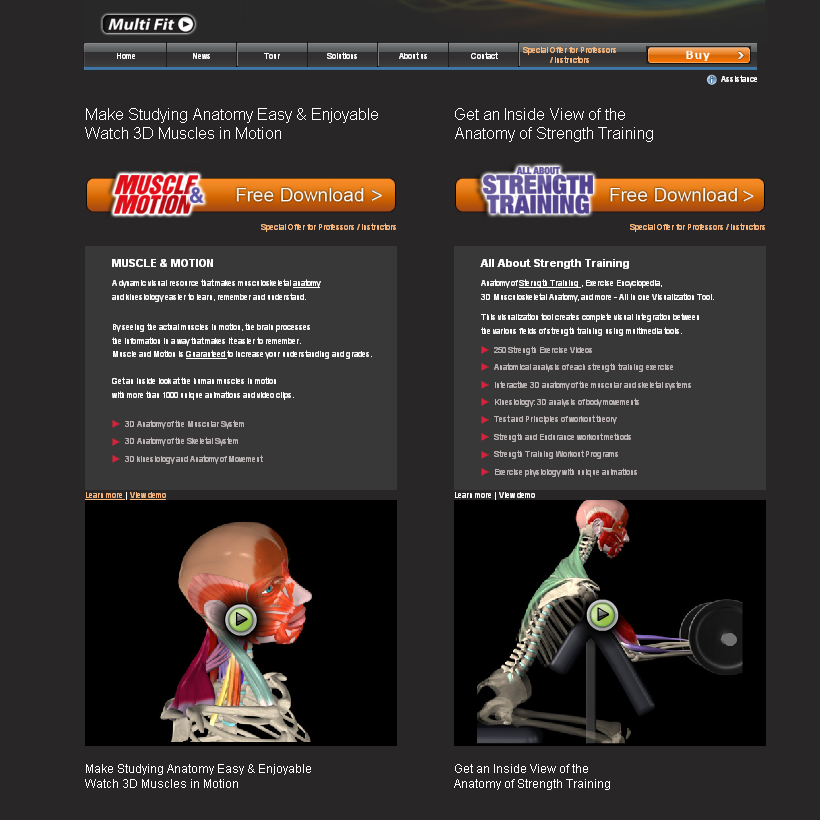
With the goal of increasing viewer downloads of the free trial, the second version achieved a 14.5% improvement over the original with a conversion rate of 51.3%.
Key Findings:
-Their previous homepage was pretty barebones, so it’s not too surprising that adding information about a product improved conversions. However, a 44.8% conversion rate (for the original) isn’t too bad either.
Source:
https://www.abtests.com/test/248001/homepage-for-muscleandmotion
63. 144.1% Improvement by Focusing on User Needs
Overview and Results Achieved:
WriteWork sells academic papers for a fee. They wanted to sell more essays. The goal was to get users to buy the essay through the “Read Full Essay Now” button, but a conversion only counted if they converted on the first page they visited because it was paid traffic.
Here’s the original version (6.2% conversion rate):
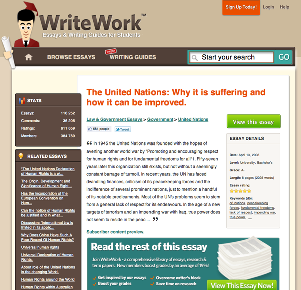
Here’s the test version (15.1% conversion rate):
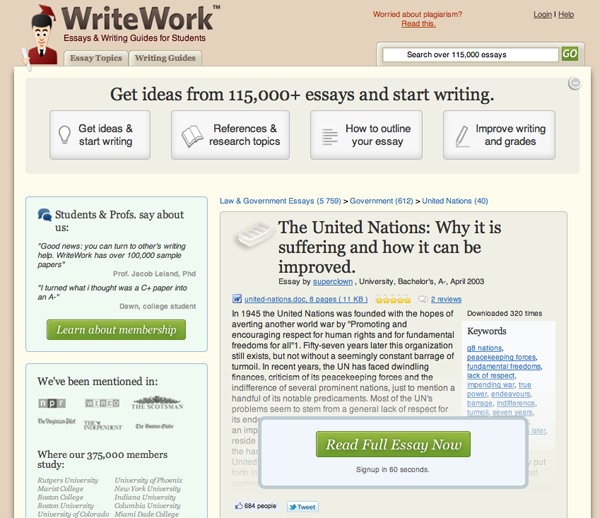
In the test version, benefits and social proof were more clearly communicated.
Key Findings:
-Have a focus on user needs and overcome objections.
Source:
https://www.abtests.com/test/257001/landing-for-writework
64. 60% Landing Page Improvement by Removing Signup Form
Overview and Results Achieved:
Vendio has one landing page that embedded the signup form into the page.
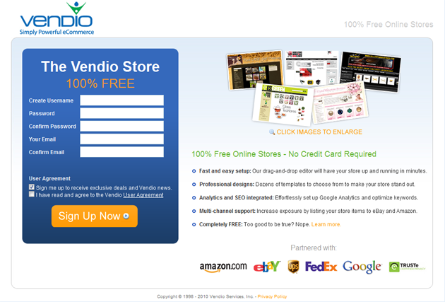
They removed it in a test:

This led to a 60% increase in visitor signups.
The “Signup Now” button leads to the signup form.
Key Findings:
-It’s quite possible that adding steps to signup increases conversions.
Source:
https://www.abtests.com/test/258001/landing-for-vendio
65. Changing Placement Increases CTA Conversions
Overview and Results Achieved:
Compare Courses provides a searchable database of courses that can be studied in Australia and around the world. On their landing page, they included three calls to action:
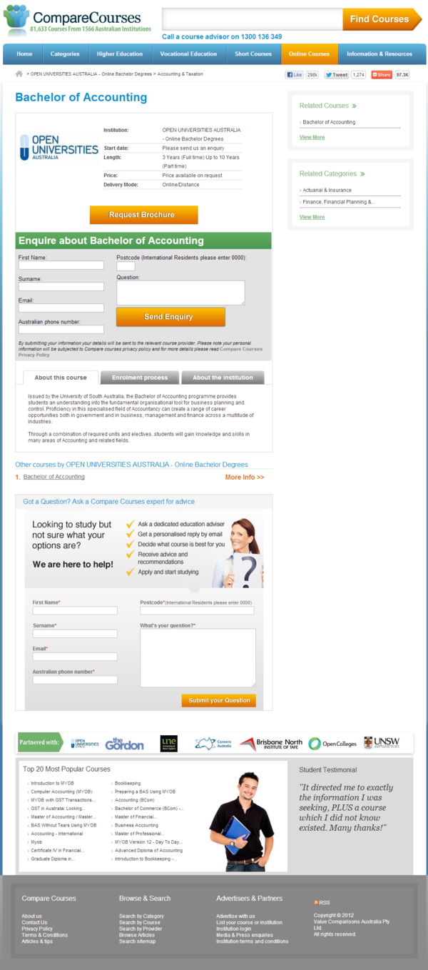
Compare Courses primarily wanted to increase overall conversions of the page.
This is the new design, with the lead enquiry now above the fold:
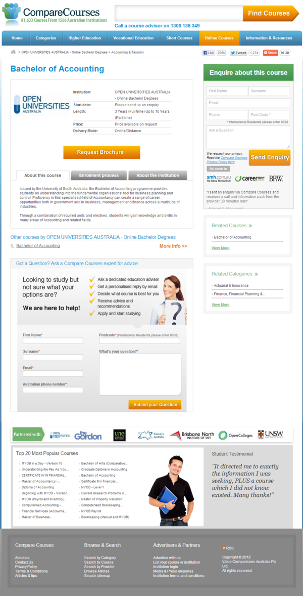
With the new page design, the ask-an-expert CTA increased 159.52%, while the request brochure CTA increased 13.3%. The enquiry CTA decreased 53.87%.
The original page converted at 9.71%, while the new page with lead enquiry placed above the fold earned a 9.52% conversion rate.
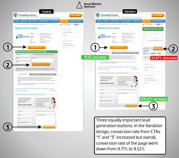
Key Findings:
-We say that if you have an idea for a better page design, you should test it. This is true, but always keep in mind that you can get worse results for the new design than the original. Not every test means an improvement over the original.
Source:
https://visualwebsiteoptimizer.com/split-testing-blog/unexpected-ab-test-results/
66. Conversion Rate Increase 36.3% by Changing a Few Words
Overview and Results Achieved:
Streamline Metrics had a button on a page that read “Submit.” They changed it to “Get Quote Now,” and their conversion rate improved 36.3%.
The original (Submit button) had 854 visitors with 64 conversions, equaling a 7.49% conversion rate.
The test version had 842 visitors with 86 conversions, equaling a conversion rate of 10.2%.
Key Findings:
-This test proves that a small adjustment can create a substantial change in the business. Remember, no test is too small.
Source:
https://streamlinemetrics.com/blog/one-simple-way-to-increase-your-conversion-rate-by-363.php
67. Birchbox Doubles Social Sharing by Adding Seasonal Message
Overview and Results Achieved:
Birchbox is a monthly subscription company that sends out beauty and lifestyle samples to their customers every month. At the end of checkout, they offer customers a way to share their purchase via social media. Here are the two options they tested:
This is the typical sharing widget:
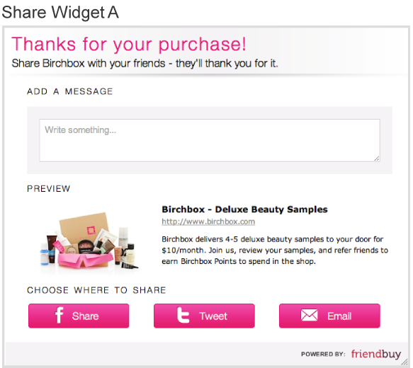
This is what they used during the Holiday season:
Referral traffic from newsfeeds more than doubled, while referral conversions doubled.
Key Findings:
-Helping people may help. Some people out there may have been looking for a gift from a different company they hadn’t previously heard of, so Birchbox appearing to them with the words “The Perfect Holiday Gift” may have promoted interest.
Source:
https://www.friendbuy.com/blog/a-simple-ab-test-to-optimize-social-sharing-and-referral-performance/
68. 148.3% Improvement on Product Page
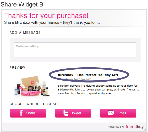
Overview and Results Achieved:
Corkscrew Wine gained a 148.3% boost in their conversions by highlighting their sale on a product.
Page A:
Page B:
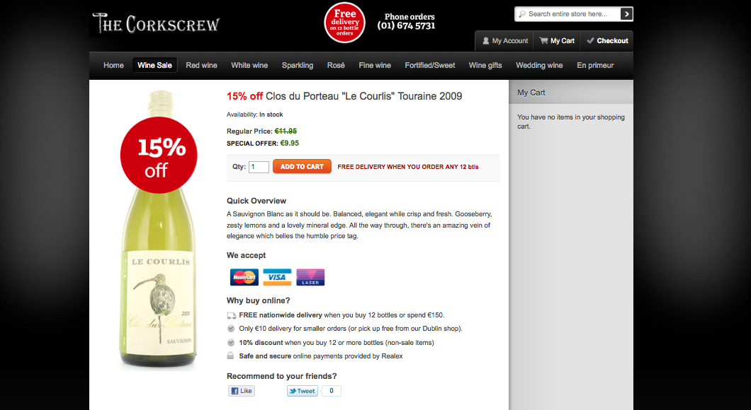
As you can see from the two, they made sure users knew it was 15% off that bottle of wine. Both were the same price, but adding the discount sticker resulted in more people putting the product in the cart. Page A had a 12.5% conversion rate, while Page B earned a 31.0% conversion rate.
Key Findings:
-What’s interesting about this is that the price was the same, but pointing out that it was 15% off sent conversions through the roof. I’m sure Corkscrew Wine isn’t the first to have success with this tactic. If you’re in ecommerce, look into trying it.
Source:
https://www.abtests.com/test/263001/product-for-the-corkscrew-wine-merchants
69. 37.6% Improvement on Home Page
Overview and Results Achieved:
TextMagic had the goal of sending people from their homepage to view their pricing page.
Their control page had the CTA copy of “Buy SMS Credits”. They changed the copy to “View SMS Credits” and improved conversions to 20.9%, a 37.6% improvement over “Buy SMS Credits”.
A few other changes:
-Money Back Guarantee icon
-Customer testimonials
-Added “SMS Solutions Since 2011” text
-Added site stats: “messages sent” and “active customers”
-Rotating customer testimonial box
Key Findings:
-If your homepage CTA says “Buy ____,” people may think that if they click on the button, they’ll be charged. Be clear in what your CTA says.
Source:
https://www.abtests.com/test/275002/homepage-for-textmagic-homepage-ab-test
70. WikiJob Achieves 34.0% Improvement
Overview and Results Achieved:
WikiJob wanted visitors to click through to the PayPal checkout and buy something and complete the checkout.
Original page:
Variation page:
The variation page achieved a 34.0% improvement over the original due to the testimonials.
Key Findings:
-Testimonials placed near the fold (not at the bottom) may have a positive impact on conversions. Try using a picture of a human next to the testimonial.
Source:
https://visualwebsiteoptimizer.com/split-testing-blog/customer-testimonials-increase-sales/
71. Homepage Increase by 106%
Overview and Results Achieved:
An unnamed website took HubSpot’s “12 Critical Elements Every Homepage Must Have” to heart. The images aren’t large, but you can see the overall changes highlighted:
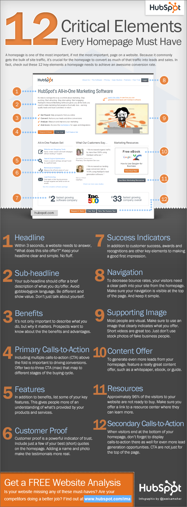
How did they achieve such an increase? A few ways:
Key Findings:
-As the images point out, their headline became less vague and clearly answered the who, what, where, and why.
-They also included an above the fold call to action.
-And they used meaningful graphics.
Source:
72. Less Accounting Improves Conversion Rate by Flipping the Side of Call to Action
Overview and Results Achieved:
Less Accounting switched their green “Try Less Accounting Free” button from the left side of the “See the Tour” link to the right.
Page A (Conversion Rate 12.3%):
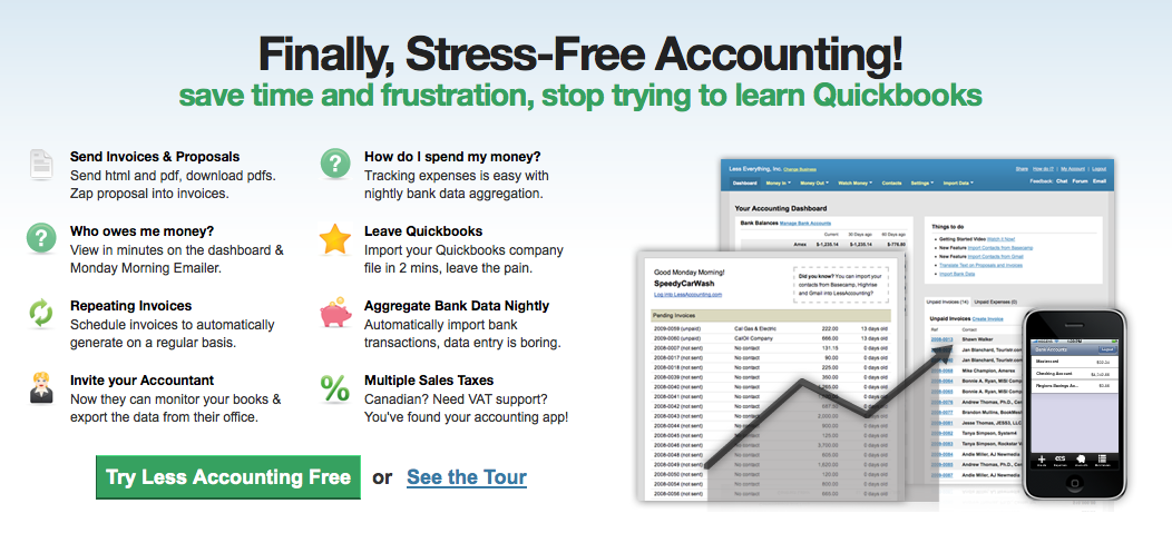
Page B (Conversion Rate 13.8%):
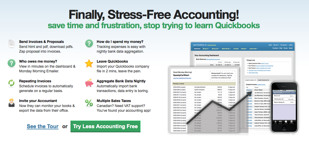
It should be noted, however, that this test did not specify how many visitors were in the test and whether or not it reached statistical significance.
Key Findings:
-Perhaps putting the CTA closer to the image of your product may mean a higher conversion rate.
Source:
https://www.abtests.com/test/19012/homepage-for-less-accounting
73. Trust Badge Increases Conversion by 72.05%
Overview and Results Achieved:
Bag Servant, an ecommerce site that sells all kinds of bags, wanted to increase conversions. Their control page featured their Twitter followers:
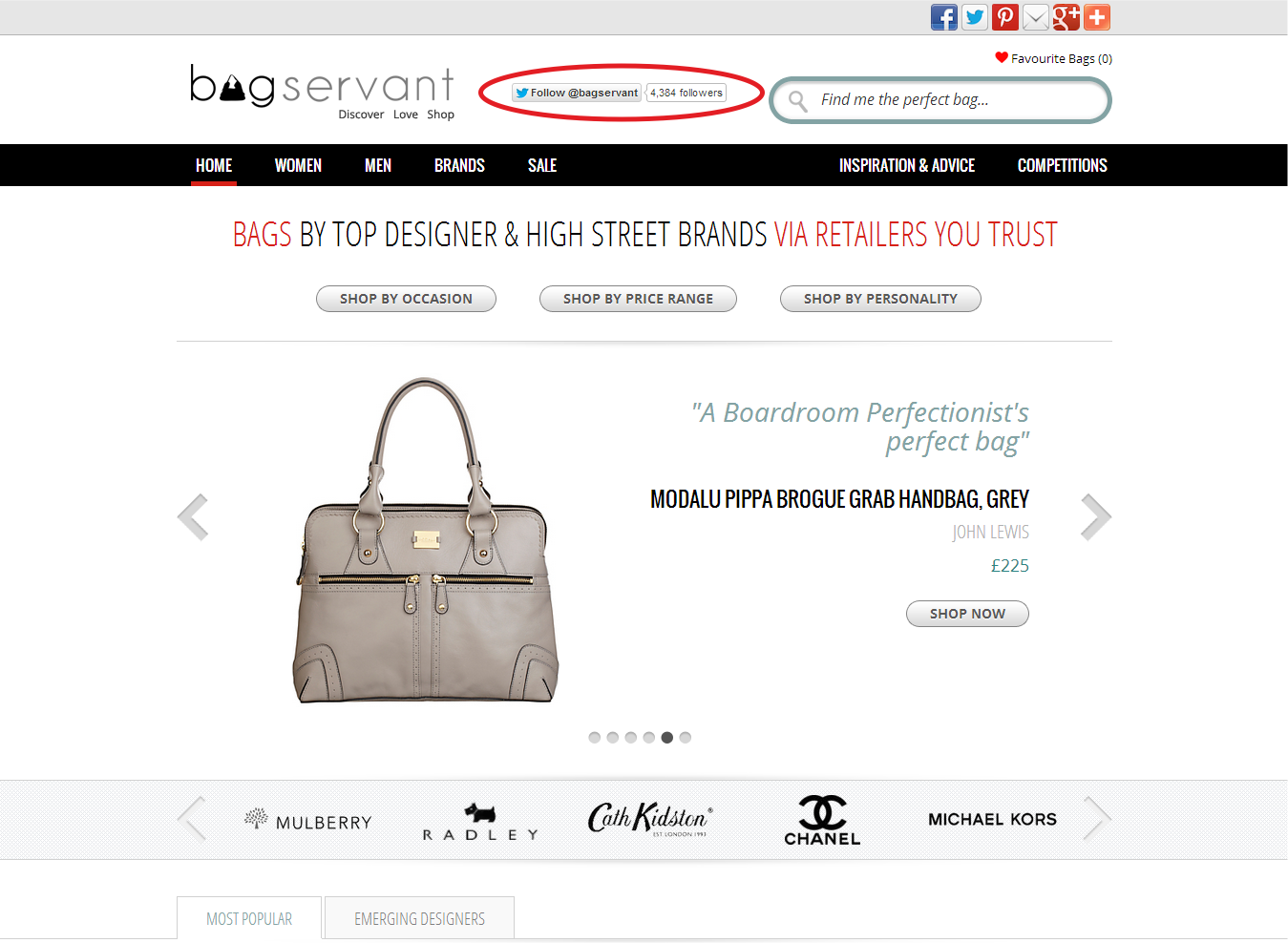
The variation page featured a WOW badge – a respected badge given to them by Jacqueline Gold:
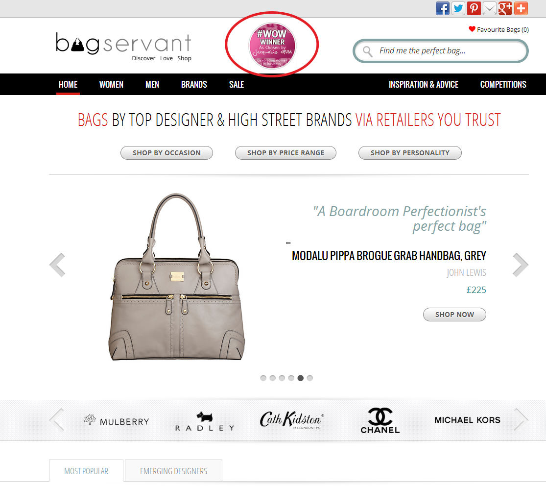
Comparison:
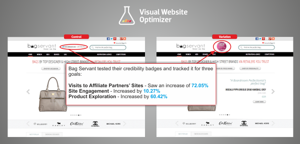
The three tracked goals and their results:
-Visits to affiliate partners’ sites marked a 72.05% improvement
-Site engagement – 10.27% boost
-Product exploration – 60.42% increase
Key Findings:
-We’ve discussed before how you create a trustworthy website. It comes as no surprise that adding a certificate showing your credibility boosts engagement. This can be especially helpful if you own a smaller website that people may not trust as much.
Source:
https://visualwebsiteoptimizer.com/split-testing-blog/increase-conversion-rate-with-trust-badges/
74. Bigger Product Image Increased Conversion Rates by 63%
Overview and Results Achieved:
Skinner Auctions ran an A/B test that increased their product images by 28%, an increase totaling 350 pixels across. The big image meant that a lot of the content was pushed below the fold. Note: Images are from WhichTestWon and are protected by Copyright.
Image A:
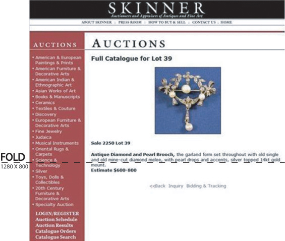
Image B:
The larger image made 63% more people click to start bidding. However, this only started the bidding process. An additional 329% who started bidding filled out the online forms that were required to place the bid.
Key Findings:
-Enlarged to show detail works. If you have physical products that you’re selling (and possibly even virtual products), you may want to try showing the details of your product through up-close images.
Source:
75. Faster Firefox Landing Page Results in a 15% Increase in Downloads
Overview and Results Achieved:
Mozilla observed that their landing pages for Firefox loaded much slower than the Chrome and Opera pages. After some tweaks, Mozilla improved the Firefox landing page speed by 2.2 seconds. These seconds increased download conversions by 15.4%. This means an additional 10.28 million downloads per year.
Key Findings:
-Speed has been shown to improve landing page downloads in many other tests. It also counts in other areas, such as Google’s search algorithm. To test your page speed and gain insights, check out Google’s PageSpeed Insights.
Source:
https://blog.mozilla.org/metrics/2010/04/05/firefox-page-load-speed-%E2%80%93-part-ii/
76. Visual Hierarchy Increases Sales by 35.6%
Overview and Results Achieved:
Underwater Audio implemented the concept known as visual hierarchy. It has been described as “how you utilize subtle visual cues so that your visitors process the information the way you want [them to and then] take your desired action unconsciously.”
This is the control page for their testing:
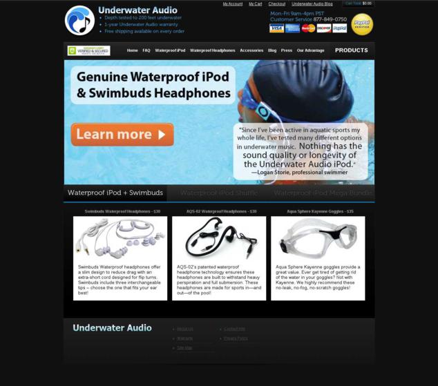
Variation page:
The two pages side by side with the changes highlighted:
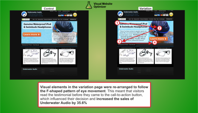
The variation beat the control with a percentage increase of 35.6%. Imagine if you had a salesman who could do that – what would he be worth to you?
Key Takeaways:
-Ensure that what you want people to read is not hovering over a picture. You’ll notice that most memes and text in images get out of the focus of the picture and stay to the side and edges; make sure your design does the same.
Source:
https://visualwebsiteoptimizer.com/split-testing-blog/improved-visual-hierarchy-increases-sales/
77. Giving Up Freemium and Going to Free Trial Increases Conversions by 268.14%
Overview and Results Achieved:
Acuity Scheduling had a freemium plan, but many users ended up cancelling due to its reduced feature set. When they did have the plan, the key call to action was the freemium plan. Acuity changed their call to action to bring users a free 14 day trial of their professional plan, which cost $10 per month.
With this free trial, customers entered their credit card number right from the start, instead of entering it in the Accounts tab under the freemium tab.
The Acuity team tracked signups for the paid version of the professional plan and signups for their premium plan.
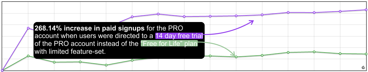
The free trial had a 99.99% chance of beating the freemium offer.
What’s surprising is the 77.78% improvement for premium plan signups as well.
Key Takeaways:
-The freemium model has worked well for a lot of companies (namely Dropbox, Evernote, Buffer, Skype, etc.), but it’s not untouchable. Some companies, as the article points out, increase their revenue by eliminating freemium.
-The success of this case study was largely achieved by listening to users and overcoming their objections. Blindly following any case study without first looking at underlying principles is misguided.
Source:
https://visualwebsiteoptimizer.com/split-testing-blog/ab-testing-free-trial-versus-freemium/
78. Using Persuasion Principles to Increase Conversions by 7%
Overview and Results Achieved:
Betfair is an online betting exchange platform. The goal was CTR to their registration page and page engagement. They tried six persuasion techniques (reciprocity, scarcity, commitment and consistency, liking, authority, and social proof) described in the book, Persuasion.
This is the control (red box not included):
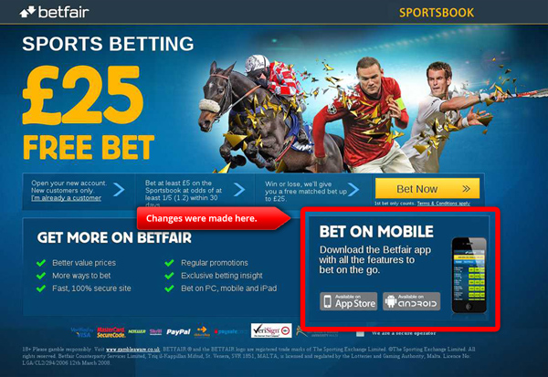
Reciprocity:

Scarcity:

Social proof:
A comparison of all four in one image:
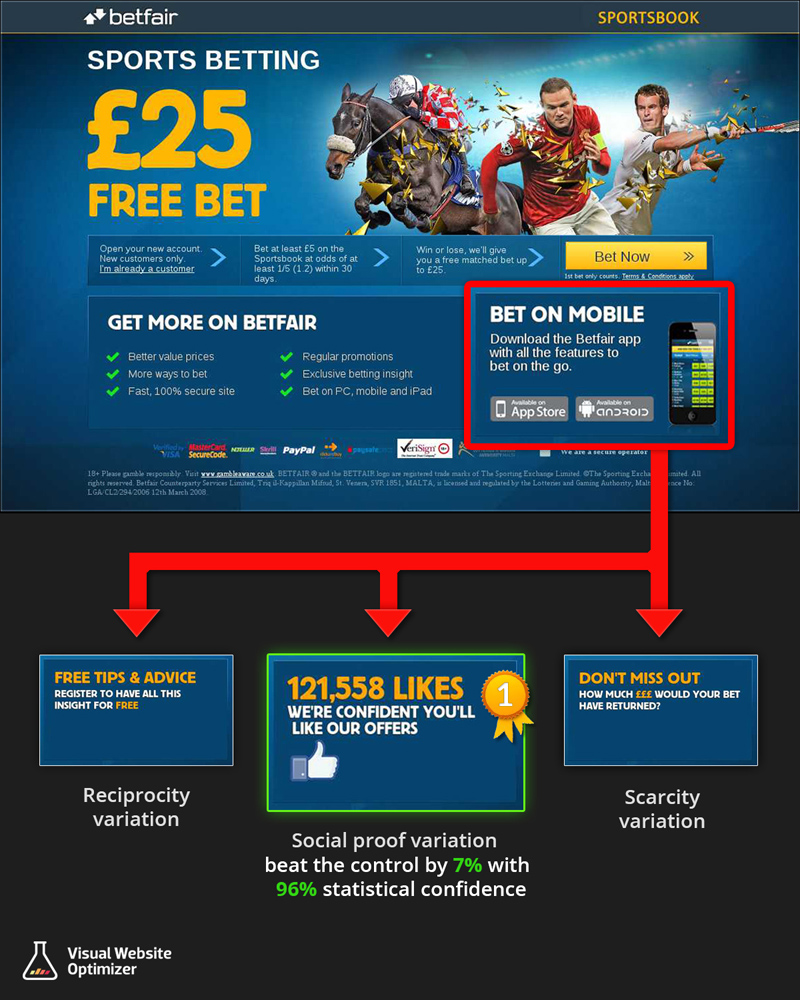
All of them achieved positive results, but statistical significance was achieved with only the social proof option. It achieved a 96% chance to beat the original and improved CTRs to the registration page by 7% over the original. It also beat the original with 4.18% page engagement over the original.
Key Findings:
-Never rule out the power of social proof.
-Study persuasion principles (pick up the book if interested) and see how it can apply to your marketing.
-Use a strength of yours (whatever it is) and show it off on your landing page. In this case, Betfair had hundreds of thousands of Facebook Likes but never fully took advantage of them until they showed them off to their landing page visitors.
Source:
https://visualwebsiteoptimizer.com/split-testing-blog/persuasion-principles-increase-conversions/
79. 3% Conversion Rate Improvement
Overview and Results Achieved:
The 2010 Vancouver Canucks Olympic Store underwent testing to see what could convert sales better.
The control:
Variation A:
Variation B:
After 2400 transactions, Variation A was chosen due to its 3% improvement over the control. It also achieved lower bounce rates.
Key Findings:
-Reducing the number of banner ads and making the banner ads you have more prominent can help.
-Increasing the sizes of images may be beneficial.
-Fewer options + better organization = better conversion rate.
Source:
https://www.getelastic.com/ab-test-case-study-homepage/
80. 258% Increase in Conversions
Overview and Results Achieved:
A performance marketing company (unnamed) wanted to find an alternative to telephone opt-in and improve a landing page conversion rate. The conversion goal was to have visitors download a white paper. The headlines:
This received a 25% opt-in rate from the checkbox option and a 36.4% conversion rate gain through white paper downloads.
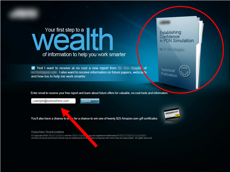
This landing page achieved a 258% increase in conversions over the original page.
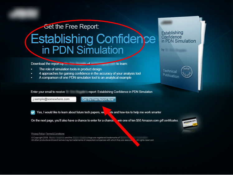
They also offered incentives by offering Amazon gift cards. The first one had 20 Amazon gift cards worth $25.
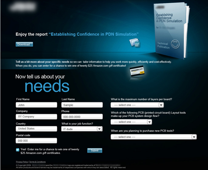
Against 10 $50 Amazon gift cards.
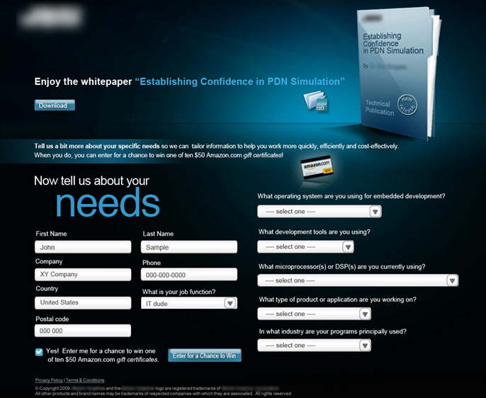
The 10 $50 Amazon gift cards achieved a 31% higher conversion rate.
Source:
https://www.marketingexperiments.com/blog/research-topics/response-capture-case-study.html
81. 90% Improvement Conversion Rate over the Original
Overview and Results Achieved:
CityCliq, a business which provides webpages for small businesses, tested different headlines for their homepage. The conversion goal was a click on their pricing page. The test was run for two weeks. These four headlines were tested:
Businesses grow faster online! (25.3% conversion rate – original)
Create a webpage for your business (47.8% conversion rate)
Get found faster! (31.8% conversion rate)
Online advertising that works! (20.2% conversion rate)
Key Findings:
-The winner, Create a webpage for your business, shows that prospective customers already are aware of the benefits of having a website.
-Every headline had an exclamation point except for the winner. The winner tells visitors exactly what CityCliq does.
Source:
82. 30% Improvement with a Headline Adjustment
Overview and Results Achieved:
37signals tested the five headlines and sub headline on the Highrise signup page.
5th place (the original):
4th place (7% better conversion than the original):
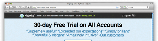
3rd place (15% better conversion than the original):
2nd place (27% better conversion than the original):
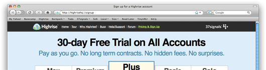
1st place (30% better conversion than the original):
Key Findings:
-The winner put the emphasis on the 30 day free trial and mentioned that signup takes less than 60 seconds. The winner was the only one to combine these two. Second place had “30-Day Free Trial on All Accounts” as the headline but made no mention of the short signup process. Fourth place also mentioned the 30 day free trial. The no-nonsense headline won.
Source:
https://37signals.com/svn/posts/1525-writing-decisions-headline-tests-on-the-highrise-signup-page
83. 20% Increase in Homepage Conversion Rate
Overview and Results Achieved:
Gyminee tested their homepage. Their old homepage had a myriad of options:
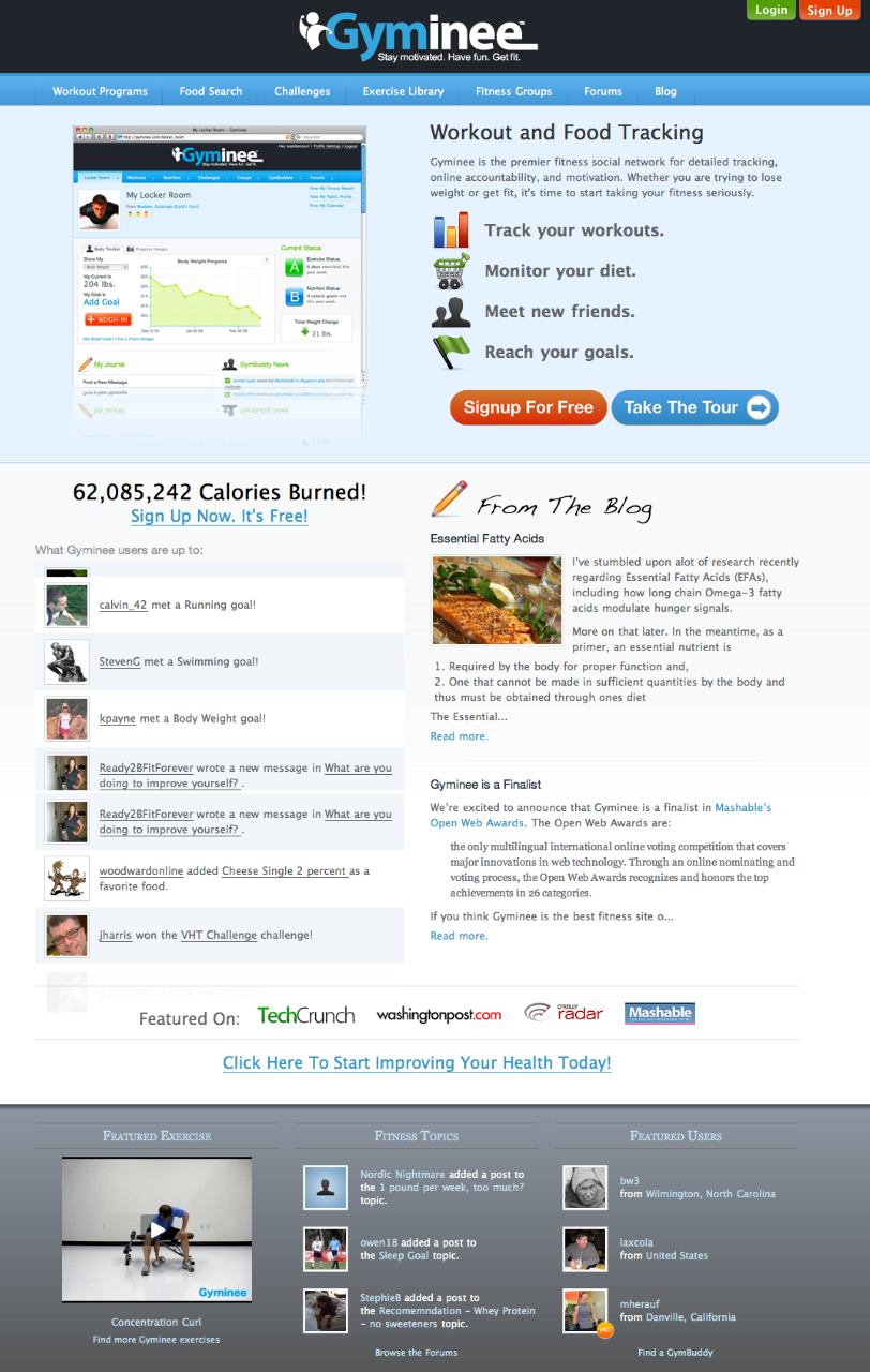
The new homepage reduced the number of options from 25 to 5. A drastically simplified homepage:
With this new design, the signup button became much more visible.
Key Findings:
-Reducing the number of options increases the signup rate by an average of 20.45%.
Results
Test 1 Conversion Rates: Original (24.4%), Simplified (29.6%), Observed Improvement (21.1%)
Test 2 Conversion Rates: Original (18.9%), Simplified (22.7%), Observed Improvement (19.8%)
Source:
https://www.fourhourworkweek.com/blog/2009/08/12/google-website-optimizer-case-study/
84. Removing mention of free trial, no credit card required, and excess features increases SaaS signups by 73%
Overview and Results Achieved:
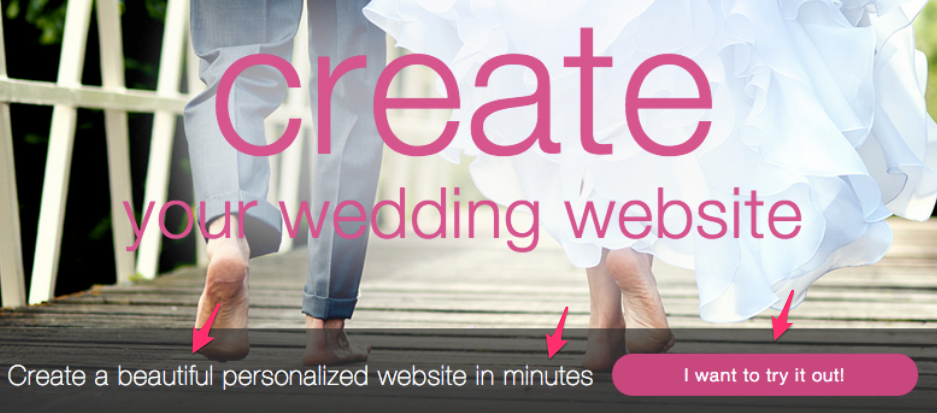
Wedbuddy wanted to increase free trial signups to their wedding website builder. Their main call to action originally mentioned “no credit card required” and a “free trial”:
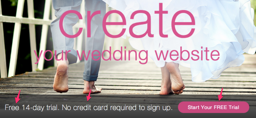
They changed it to mention benefits instead of payment details:
As well as removed a long list of features:
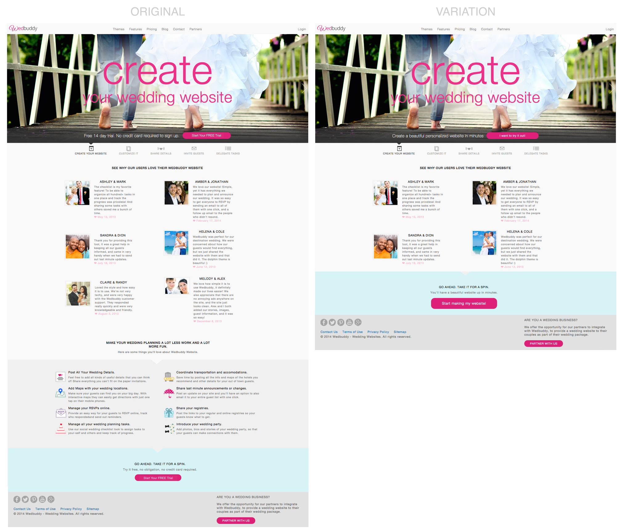
They saw 139% more clicks to signup and 73% more free trial signups.
Key Findings:
– Lots of companies mention free trial and “no credit card required” in hopes of reducing users’ barriers, but reminding users of payment details instead of benefits near a CTA can often reduce conversion rates. Testing benefit focused CTA copy can uncover large conversion gains.
– You are proud of your long list of app features, but most users only want one or two key benefits. Test reducing your feature list for less distractions and more signups.
Source:
https://deveshdesign.com/saas-conversion-optimization/
85. Three Experiments Improve Conversion Rates by a Combined 72%
Overview and Results Achieved:
Three experiments were run by the CareLogger team.
Homepage Headline (signup goal):
At the first launch of the website, this was their headline:
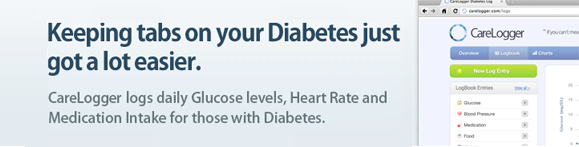
The team realized that people weren’t looking at the CareLogger software because it was easier than what they currently do. What they wanted was better insight so they could maintain optimal wellness. So they changed their headline to this:
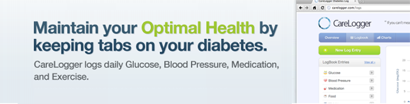
The headline change resulted in a 31% increase in conversions after 1000 trials.
Changing Signup Button Color:
CareLogger changed their signup button from green to red:

After 600 participants, the conversion rate increased by 34%. The homepage had a lot of green, so the red button stuck out a little more. As they say, “it’s all about contrast.”
Changing button text:
CareLogger changed the signup button text from “Signup for Free” to “Get Started Now.” After 1000 trials, this button text adjustment resulted in a 7% increase in conversions. It’s theorized that the increase in conversions was due to “Get Started Now” sounding easier.
Key Takeaway:
-Contrast is key. Make sure people see your call-to-action.
-Little things like button colors (but not exclusively colors) can make a difference. It’s not necessarily true: smaller the change = bigger the increase or decrease. And vice versa.
-Make things sound easy and risk-free for the user or visitor.
Source:
https://dmix.ca/2010/05/how-we-increased-our-conversion-rate-by-72/
86. Adding Sidebar Improves Conversions 34%
Overview and Results Achieved:
Slideshop wanted visitors to add products to their cart. They tested ways to achieve this.
The original:
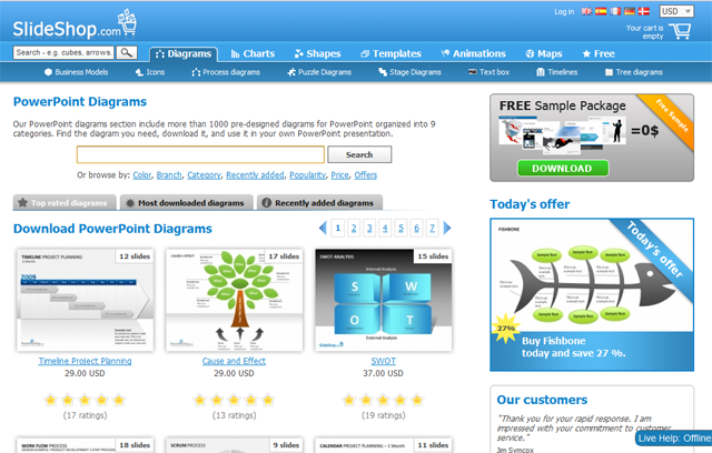
The test – with sidebar:
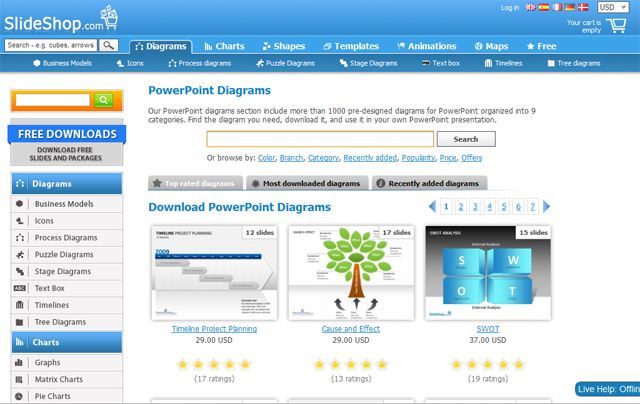
The test made 34% more people add a product to their cart.
Key Findings:
-The improvement can likely be attributed to the improved navigation. The test looks much more like an eCommerce site that helps the visitor find and select products they are looking for.
Source:
https://www.abtests.com/test/228001/homepage-for-slideshop
87. 112.5% Increase in Conversions By Having a Specific and Relatable Demonstration
Overview and Results Achieved:
Performable A/B tested their landing page with the goal of getting visitors to click the free trial button.
The original:
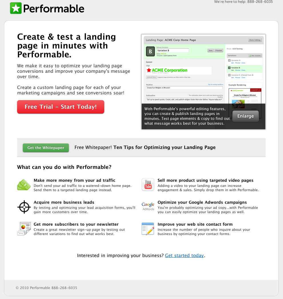
The test:
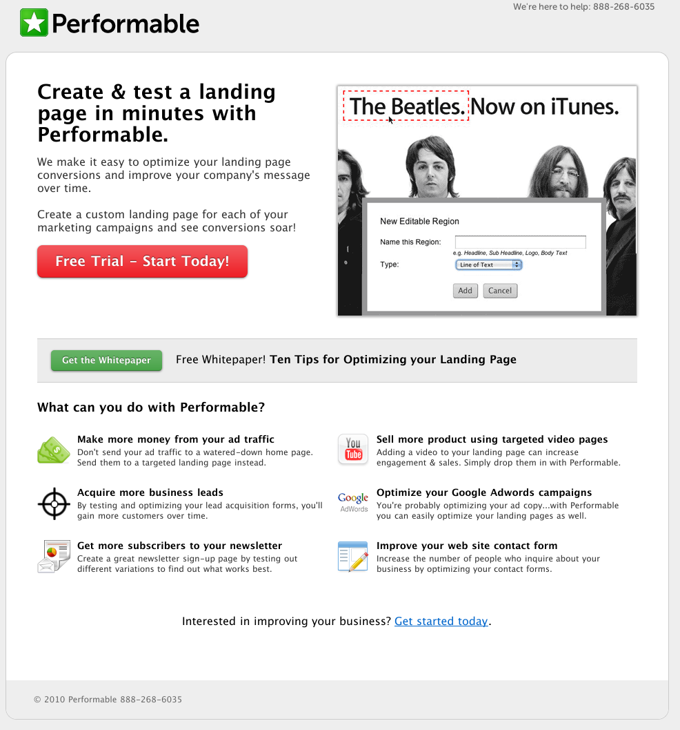
As you can see, the variation used iTunes to demonstrate a part of Performable. This earned a conversion rate 112.5% better than the original.
Key Findings:
-The variation is much more of an eye catcher. It’s something people can easily spot and relate to versus another product mockup.
Source:
https://www.abtests.com/test/236001/landing-for-performable
88. Removing Some Content From Landing Page Increases Sales 62%
Overview and Results Achieved:
Assessment Day (part of WikiJob) A/B tested their website. Here is the original:
They tested it against a couple variations. Here’s one variation:
And here’s the other:
The first variation, which removed the FAQ, saw a 62% increase in sales. The second variation, which removed the screenshots, saw a 56% increase in sales.
The next step they took was removing both the screenshots and the FAQ:
That actually reduced sales by 3%.
Key Findings:
-Find the optimal amount. More is not necessarily better and less is not necessarily better either. Give users information, but don’t overload them.
Source:
https://visualwebsiteoptimizer.com/split-testing-blog/increase-sales-landing-page/
89. Showing Images in Site Search Box Increases Conversions
Overview and Results Achieved:
Online retailer BrickHouse Security added product images to their drop down search menu. So when visitors typed in a product they had in mind, a drop down menu would appear showing products specific to those search terms.
BrickHouse says they get a 100% conversion lift by using these product images in the dropdown menu.
Key Findings:
-Adding images makes the site more elegant and more importantly helps the visitor. Today, Facebook and Twitter feature a drop down menu and profile pictures when the user is searching. They do this to help the user find what they’re looking for and to help the usability and efficiency of the site.
Source:
https://www.internetretailer.com/2010/04/29/product-images-site-search-window-boosts-conversions
90. Site Built Around Credibility Increases Conversions 48%
Overview and Results Achieved:
An American Express travel representative, Cook, A/B tested their website. Here is the original:
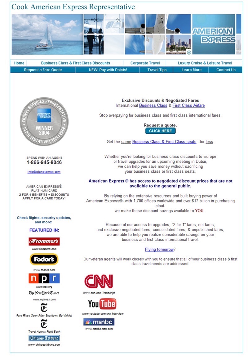
And this is one of the variations they tested it against:
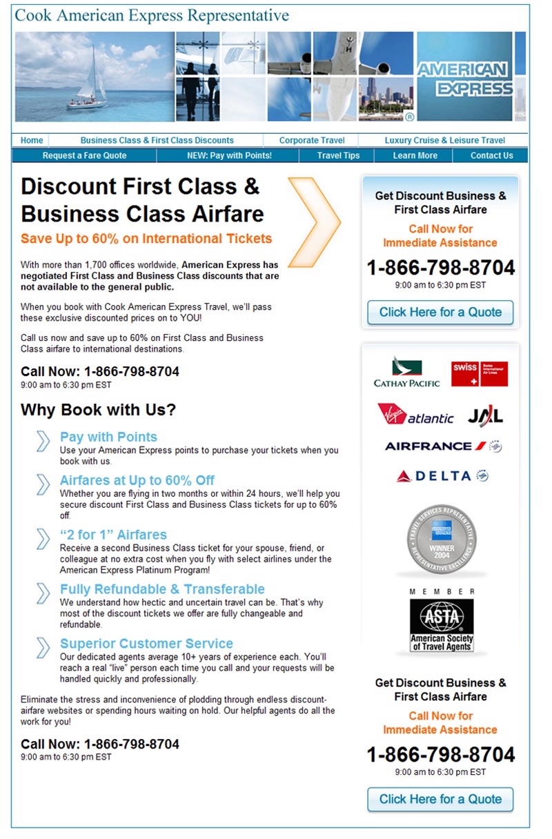
The variation was built around Cook establishing their credibility. This credibility variation earned Cook a 48% increase in conversions of the original.
Key Findings:
-We have a lot of case studies to demonstrate the effectiveness of establishing your credibility. The internet is a big place with lots of fraudulent sites and there are a lot of scared consumers, so establishing your credibility is a priority, especially if you’re in the travel industry.
Source:
91. Red Links Convert Better Than Blue Links
Overview and Results Achieved:
Beamax A/B tested to see whether blue links or red links got more clickthroughs.
The original:
Red link:
Red banner:
Of the three tested, the red link got 53.13% more clickthroughs than blue links.
Key Findings:
-The color red adds a sense of urgency and can become more prominent when people are used to seeing blue links. Break the mold and test something against it – you may just get an increase in conversions.
Source:
https://visualwebsiteoptimizer.com/split-testing-blog/blue-link-vs-red-link/
92. Showing Humans Increases Conversions
Overview and Results Achieved:
Visual Website Optimizer did some research to see if using human faces (as opposed to paintings or other images) increased conversions. Here is an example from Medalia Art, who sells paintings online:

Here is the test:

The variation showed pictures of the artists. This got 95% more people to click to view the paintings with a rate of 17.2% of people clicking.
In another test, a face went up against a generic picture. The original:
The test:

Once again, the photo of the human got more clicks by a margin of 48% with 5.5% of people clicking.
Key Findings:
-This shows that using humans in pictures increases the chances that they’ll be clicked on. It’s much more natural than seeing a painting or a generic picture, so when possible use pictures of people (and not stock photos).
Source:
https://visualwebsiteoptimizer.com/split-testing-blog/human-landing-page-increase-conversion-rate/
93. Free Trial Button Increases Free Trial Signups by 158% While Not Decreasing Paid Signups
Overview and Results Achieved:
Email marketing provider GetResponse had a Free Trial plan, but the problem was few people knew about it because it wasn’t showcased on the homepage. The biggest call to action was the “Buy Now” button, no mention of a free signup.
Here is the original:
The test puts Free Trial next to Buy Now:
By adding the Free Trial button, free signups increased 158.60%. It had no effect on paid signups.
Key Findings:
-If there’s a free trial option, visitors will want to know. Don’t make them hunt for it, put it out there and welcome them to trying your product.
Source:
https://visualwebsiteoptimizer.com/split-testing-blog/a-b-testing-free-trial-button/
94. Product Video Increases Conversions by 247%
Overview and Results Achieved:
According to research from Treeopedia, adding a video to Jewelry sites increases conversions 247%. Here is their data:
Raw Data:
| Category | Without video | With video | Increase in Conversions | Views ratio |
| Bracelet Average | 1.58% | 5.02% | 260.13% | 7.18% |
| Earrings Average | 2.55% | 5.66% | 190.33% | 8.55% |
| Engagement rings Average | 1.94% | 5.45% | 186.08% | 7.26% |
| Pendants Average | 2.62% | 7.50% | 370.60% | 8.39% |
| Rings Average | 2.26% | 5.90% | 212.64% | 8.25% |
| Grand Average | 2.20% | 5.93% | 247.00% | 7.96% |
Key Findings:
-There appears to be a benefit with adding video to a homepage or landing page. The key is in the details that make up the video. This means the actual content of the video, the thumbnail for the video, the length of the video, and quality of the video. If the video has to buffer at all, it may have a negative impact on conversions.
Source:
https://blog.treepodia.com/2011/11/product-videos-boost-jewlery-conversions-by-247-case-study/
95. Dropbox Video Boosts Conversions 10%
Overview and Results Achieved:
Most of us are aware of the video on the Dropbox homepage. It’s since been replaced, but it’s estimated that it’s been played a few million times. The real question is whether it increases signups. It has, according to someone who has crunched the numbers. It’s estimated that the referral page that people come to when a friend sends them to Dropbox has a 30.0% conversion rate when the video is not played. When the video is played, the conversion rate bumps up to approximately 33.2%
Key Findings:
-Simply having a video on your homepage may not be enough. There’s also the element of ensuring it gets played. You can help ensure this by keeping the video the main focus of the page and limiting any other content.
Source:
https://www.commoncraft.com/common-craft-video-dropboxcom-effective
96. Adding Phone Number to Website Increased Conversions 1.8%
Overview and Results Achieved:
LessAccounting A/B tested to see whether having a phone number featured on their website would increase conversions. It did – by 1.8%.
Key Findings:
The authors form a couple theories for why the phone number placement increased conversions:
-The phone number helped assure visitors that LessAccounting was there to help when needed.
-Showing support and a person side.
Source:
97. Removing Signup Button From Homepage Increases Signups 350%
Overview and Results Achieved:
An anonymous company had a Signup button on their homepage. As a test, they removed it in place of another button.
This is a mockup of the changes:
Surprising to some, removing the Signup button from the homepage actually resulted in a 350% increase in signups.
Key Findings:
-Asking for a signup too soon (right when a visitor lands on the homepage) may be too soon.
Source:
https://zurb.com/article/816/why-burying-sign-up-buttons-helps-get-mor
98. Mad Libs Style Increased Form Conversions 25-40%
Overview and Results Achieved:
HuffDuffer put a new twist on forms. Originally they had this form layout (before column):
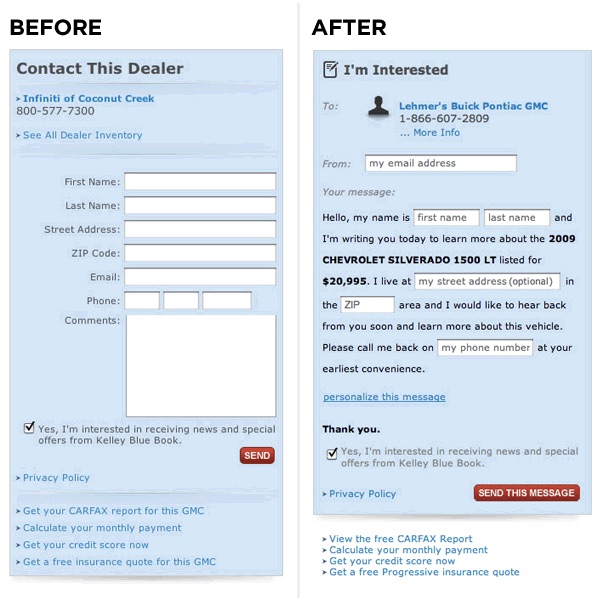
They changed it to this (after column):
And earned a 25-40% improvement in form completions and conversions.
Key Findings:
-These new forms are much more fun to fill out than the typical forms. People have to fill out hundreds of forms in their life, so add a little creativity and put a new twist on forms. You may end up with more customers because of it.
Source:
https://www.lukew.com/ff/entry.asp?1007
99. Making Features Bullet-Pointed Increases Membership Signups 15.9%
Overview and Results Achieved:
Swedish Company Unionen wanted to get visitors to signup for a membership. They A/B tested and this is version A:
The copy:
Unionen makes work life enjoyable.
With nearly half a million members, we are the largest union for the private sector. Unionen is widely represented, from large multinational corporations to small family-owned businesses. Our vision is to create job security, success and satisfaction. Do you want to join?
Version B:
The copy:
3 strong reasons to become a member
As a member, you get, among other things:
* Income insurance that guarantees you 80% of your salary
* Career coaching, salary and development talks
* Advice, legal and negotiation help
Become a member
Version B had a 5.3% conversion rate, 15.9% improvement over version A.
Key Findings:
-Bullet points make text easier to read, so it’s best to use them in key spots (such as where you list your benefits). Always choose bullet points over paragraphs of text.
Source:
https://www.abtests.com/test/38003/other-for-unionen-www-unionen-se
100. Adding Product Filter Increases Conversions 26% and Revenues 76%
Overview and Results Achieved:
BuyaKilt sells kilts online. They wanted to test if adding product filters would increase conversions.
The original:
The test:
Adding the left handed “shop by” tool had a significant impact on their bottom line. They experienced a 76.1% increase in revenue, 26% increase in conversions, and 19.76% increase in shopping cart visits.
Key Findings:
-This is another test that proves how aiding the visitor and helping them make decisions can help improve conversions. When designing your website, have them in mind and build your site around them.
Source:
https://visualwebsiteoptimizer.com/split-testing-blog/product-filter-ecommerce-ab-testing-revenue/
Phew! There’s 100!
There you have it, 100 case studies on conversion optimization. There’s a key to remember with all this – don’t turn your site into an ugly robotic website that’s overly optimized for conversions. These case studies only serve to give you ideas on what to test, no conversion improvement is guaranteed. What works for one audience may not work for another, so it’s important to test and not take it on blind faith.
Hope you enjoyed it and will use it as a reference. Let me know your feedback in the comments.
About the Author: Zach Bulygo (Twitter) likes marketing, finance, and learning about different businesses.
Comments (76)