
Google Analytics is a powerhouse of data.
Any marketer using Google Analytics is rich in data.
But knowing how to navigate its complex platform to put that data to actionable use is another story.
Analytics has hundreds of different reports ready to access, and thousands more that require a little tweaking.
To unlock actionable data that you can use to boost sales, you need to look past the basic vanity metric reports.
Past the typical data that Analytics wants to give you.
Sure, users, sessions, bounce rate and session duration are important. But they don’t give you any actionable steps to go off of.
Here is how to boost your sales using these actionable Google Analytics tips.
1. Don’t dilly-dally: have specific reasons to check analytics
This first tip is perhaps the most important of all.
When it comes to boosting sales with data, you can’t just come into Google Analytics, run 20 reports and instantly increase sales.
It doesn’t work like that, unfortunately.
Checking data for the sake of “crunching numbers” and checking data is a waste of time.
Before stepping into Google Analytics, you should have specific action items that you want to address.
Real tasks on a list that you can cross off once you locate the right data.
Ask yourself a few key questions before proceeding with any use of Google Analytics.
Here are a few questions that I ask myself before ever opening Analytics:
- What specific bottleneck am I investigating? For example, cart abandons or drop-offs in CTA engagement.
- What metrics do I need to look at to understand this bottleneck?
- How can I monitor and improve it through potential data?
Once you have a specific idea in mind as to where to start, you can utilize the following tips.
Otherwise, you’ll get caught up in random reports and triple your time spent on analytics, which nobody wants to do.
Ready for tip two?
2. Get emailed versions of your top reports
One of the biggest problems with Google Analytics is the time it takes to extract useful data.
You can sift around for hours at a time trying to locate something that could help you boost conversions or sales.
The upside of a platform that allows for deep customization and hundreds of stock reports also presents a serious downside in complexity and creates an Ikea-esque maze of information.
Instead of browsing Analytics for hours on end to locate data that can help you increase sales, create custom reports.
To do this, head to the Admin section of your Analytics account:
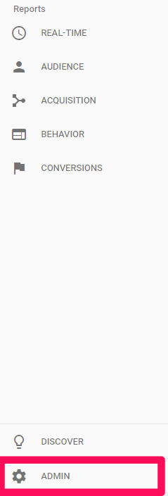
Under the “View” section, select “All Web Site Data” and then find the “Custom Alerts” tab:
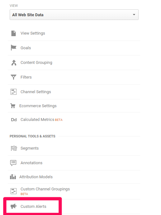
With custom alerts, you can receive email updates and text message notifications each time something happens.
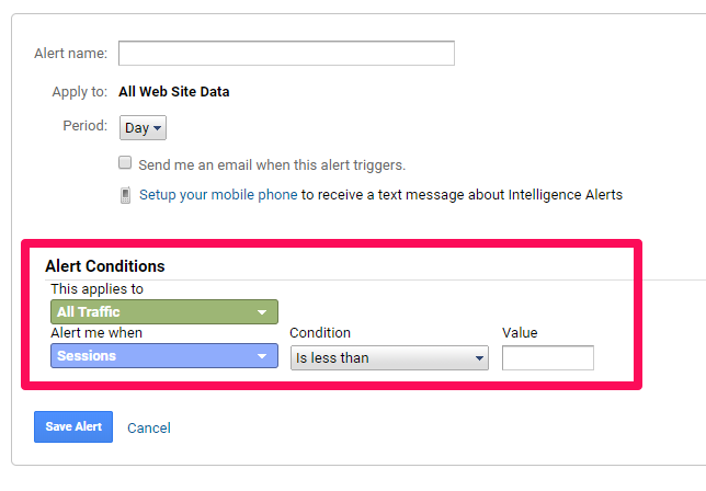
Using the Alert Conditions, you can customize specific scenarios that you want to be alerted for.
For example, if your traffic declines heavily or goal completions (sales) tank over the last few days.
You can alert yourself of just about anything.
I suggest creating dozens of alerts for the most key information that you monitor on a daily or weekly basis.
This way you’ll spend less time checking different reports, and instead, can just be alerted by Analytics to tell you what’s happening.
3. Discover your real conversion rate
With inbound marketing, we’ve all been in this scenario:
You just wrote an amazing blog post. One that even went slightly viral and gained dozens of high-quality backlinks.
You drove thousands of new visits, but only a few people signed up for your webinar or clicked on a call to action.
Typical website conversion rates suck.
Why? The majority of traffic doesn’t care about your product or service and won’t convert.
The Opportunity Pie theory by Avinash Kaushik proves this.
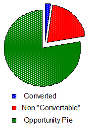
The Opportunity Pie theory states that not all traffic you get is convertible, meaning your standard conversion rates are lying to you.
That’s simply the nature of the inbound-marketing beast.
But when you place conversion under a lens using the Opportunity Pie theory, you start to see that conversion data is wrong.
Tons of your traffic would never convert even if you gave it to them for free. Why? Because they simply don’t need it or aren’t interested.
But each visitor is counted in your conversion data.
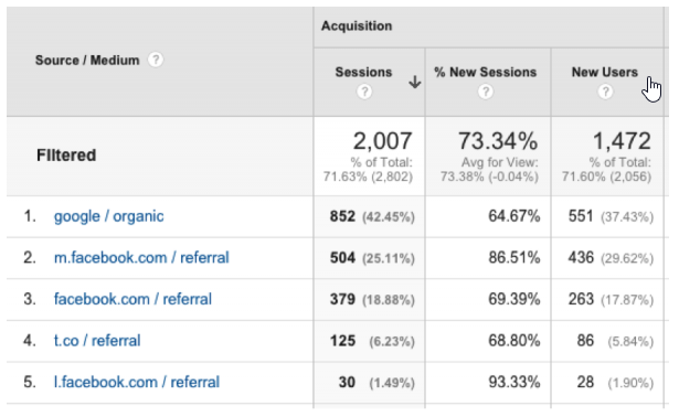
To combat this and understand what your real sales numbers are, you need to filter out users who bounce fast and destroy your data.
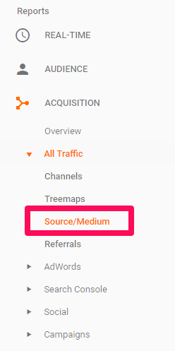
Head to the “Source / Medium” report under Acquisition:
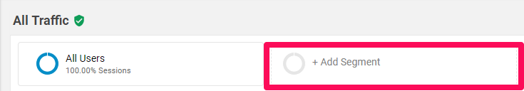
From here, create a new segment where you can add custom parameters into the audience:
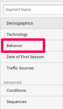
Create a new segment and select the Behavior tab:
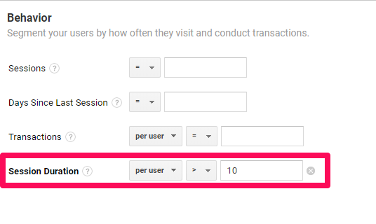
Under Behavior, customize the “Session Duration” element, ensuring that session durations under ten seconds are eliminated from your data.
Click save and analyze the table below to see what your real conversion rates look like.
By eliminating people who left your site within ten seconds, you can guess that they likely saw what you had to offer and realized it wasn’t for them.
They left fast because you weren’t relevant for them or their business.
Eliminate them with this report to get a better idea of how your sales strategy is or isn’t working.
4. Utilize on-site search queries
When people land on your site for the first time, chances are they’ll be overwhelmed.
Unless your site is a one-pager, it’s not uncommon.
Most people tackle this issue head-on with a search bar, but some don’t.
And if you don’t, you are missing out on some amazing data.
One of the biggest hidden goldmines is laying right on your website and right within Google Analytics.
The on-site search terms report.
This report shows you the most common searches conducted on your site and the exact keywords used.
It gives you clear insight into what people expect to see when landing on your site.
To locate the report, navigate to “Site Search” and “Search Terms” under the Behavior report section.
You can leverage these searches for better sales by:
- Using them as email campaigns
- Using common products or service pages as recommendations or upsells
- Creating new landing pages dedicated to specific search terms
The on-site search terms report is one of the best places to locate keyword data and leverage that data to help you drive more engagement and sales by providing what people most often search for.
5. Become a power user with keyboard shortcuts
Are you spending too much time on Analytics? Probably.
I know I’m guilty of it. It’s easy to get lost on the platform trying to create and run new reports.
That’s why I’ve memorized the keyboard shortcuts on GA.
Most people don’t even know they exist, but keyboard shortcuts help you get things done much faster.
When on your dashboard, hit the “?” key on your keyboard to pull up the shortcut list:
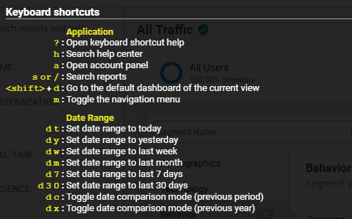
While it might take you a few hours of practice to get familiar with the shortcuts, they can be a great time-saver when creating and editing new reports.
6. See how leads become sales
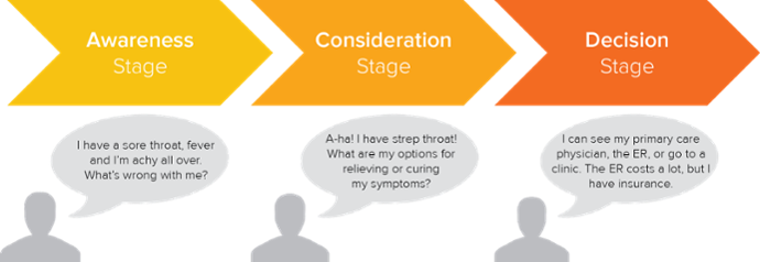
As we all know, the buyer’s journey tells us that people don’t just buy from you out of thin air.
Trust me. I wish that were the case.
Instead, users move through three different common stages before ever pulling out their wallets:
- Awareness
- Consideration
- Decision
In each stage, they are moving from understanding their pain point to evaluating options and making a final decision on how to solve it.
Think about it:
When was the last time you searched for a product and instantly purchased from a brand you had never heard of?
It’s unlikely to ever happen. Sure, sometimes it can, but more often than not, it doesn’t.
Instead, you need to understand how users move on your site from the first touch to buying.
You need to be able to answer this question if you want sales to flow smoothly:
What causes them to buy and why?
Use the “Behavior Flow” report in the Behavior section to understand what touchpoints people land on before buying, and what common pages they venture to next.
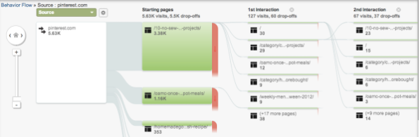
Sort it by “new users” to get data on only your non-brand-aware visits.
Doing this will show you only unique visitors and how non-brand-aware users engage with your site.
You can use this data to see common sequences of page history that you can leverage for better user experiences on-site.
7. Analyze sales between mobile and desktop
Mobile traffic has surpassed desktop traffic. Currently, it’s the driving factor in traffic across the world.
But still today, most people spend more time optimizing their sales for desktop conversions rather than mobile.
And that’s a huge mistake for most.
A great place to start is by analyzing the sales and conversions between desktop and mobile to see what you need to focus on for sales.
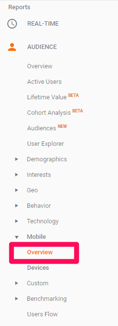
To do this, you can use the Mobile Overview report under Audience:
Once inside the report, segment your tabled data by selecting your primary conversion/sales goal:
This will sort the information and compare desktop, mobile and tablet traffic on your site and how they compare in terms of behavior and total conversions.
Analyze for any discrepancies in traffic, behavior, and conversions.
If you notice that mobile has tons of traffic and low conversions, you can infer that your mobile site isn’t easy for users to convert on.
Mobile is a fast-paced world. You need to make conversions seamless, as people can change their mind in just a matter of seconds.
8. Analyze site speed to improve it
Site speed is of paramount importance to sales and search engine optimization.
According to Google, the majority of sites in every industry are too slow:
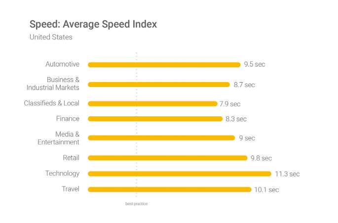
Their benchmark is three seconds for page speed loading time, yet most sites are above the nine-second mark.
Speed directly impacts your bounce rate. Google found that for every small increase in load time, bounce probability skyrockets:
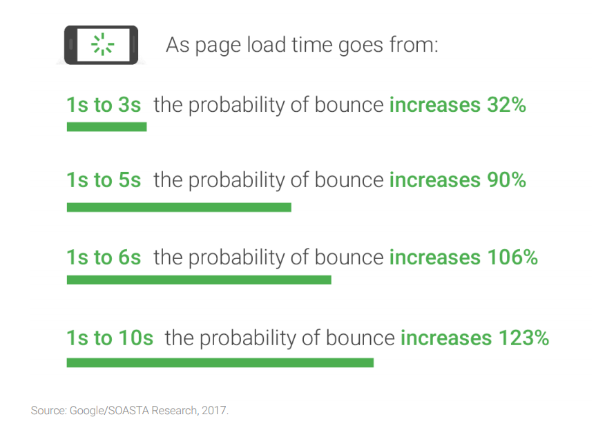
You literally can’t afford to have a slow site. It’s killing your conversion potential before people even load the page.
Using Analytics, you can analyze specific pages on your site to see which ones need improvement, saving you time by only targeting the top-performing pages first.
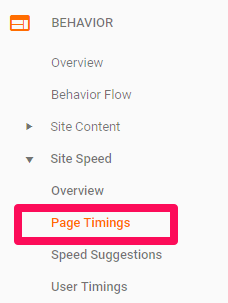
Navigate to the “Page Timings” report under Site Speed:
In this report, you can see all of the pages on your site and how the speed compares:
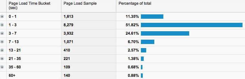
If you notice that specific pages are slow, they are likely causing you to lose valuable customers.
If you navigate back to the “Speed Suggestions” report, you can see the average load times for each page, the PageSpeed score and any suggestions for improvement.
This hidden gem of a report can help you close up any leaking pages and retain more visitors to sell to.
9. Custom dashboards
With all of the diverse reports that Google Analytics offers, you can often get lost in the vanity metrics.
Things that don’t matter to the overall big picture of your success or failure.
Custom dashboards are the solution to this. They should be your bread-and-butter. Your go-to section to find data fast without searching aimlessly.
With custom dashboards, you can create your own Analytics dashboard with only the information you care about most.
Meaning you can quickly pop in and out of Analytics to view your most important data with a single click.
If you aren’t sure what to use in a custom dashboard, you can easily import from a selection of thousands of pre-made ones for any industry or goal.
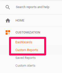
To do this, navigate to the Customer Reports section and import ones from the curated gallery:
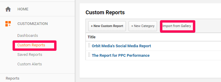
On the left-hand side, you can filter the reports based on categories, user reviews, and the most popular ones:
Try multiple reports for different aspects of your marketing and sales strategy.
Use them to get data faster without having to put in more time and effort on GA.
10. Run attribution reports
Unless you have an airtight omnichannel selling strategy, chances are your conversions are all credited to direct email sales or your website.
But the truth is, that’s last touch bias.
Last touch bias is the tendency for reporting systems to assign credit to the last platform a user converted on.
So despite hopping from social to email to PPC to organic search and then converting from a direct link, direct linking gets the conversion credit.
You can’t trust it. Why? Your other channels played a massive role in the sales process.
Attribution reports can solve this by showing you what channels played a role even if they don’t get the credit for the sale.
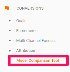
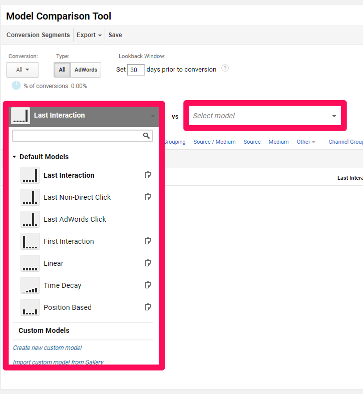
Experiment by running multiple types of attribution reports in the Model Comparison Tool:
You can choose between multiple different models or even import a custom model.
Try comparing two separate models together and you’ll be able to extract data on what channels assisted conversions despite getting zero credit:
11. Supplement attribution with multi-channel funnel reporting
Sometimes attribution reports aren’t enough. They give you great insight into what channels held their weight to drive sales, but they don’t tell you the why behind it.
In addition to attribution reports, use the Top Conversion Paths report under Multi-Channel Funnels:
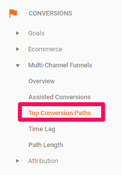
Using the Top Conversion Paths report, you can visualize the attribution data in a sequence.
This shows you the common order of how users discover your brand, become brand-aware, make considerations and complete purchase decisions.
You can use this data to drive more sales by leveraging each platform for their strengths.
If social is great for building brand awareness, focus on posting for branding, not sales.
If organic is great for research, focus on pumping out informative content instead of sales-jargon landing pages.
12. Run assisted conversion reports for more specificity
On top of attribution and visualized conversion paths, you can run assisted conversion reports to see what channels boosted the chance of selling to new customers.
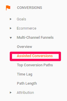
To locate this report, head to Assisted Conversion under Multi-Channel Funnels:
In the table this report generates, focus on three main metrics:
- Assisted Conversions: the number of conversions for which that channel showed up on the conversion path but was not the final driver of a sale.
- Last Click or Direct Conversions: the number of sales for which this channel was the final interaction.
- Assisted / Last Click or Direct Conversions: values closer to zero mean that channel was more likely to be the final conversion action.
Use this report to dive deeper into the reasons why each channel’s data is the way it is.
13. Reverse engineer your sales
Speculating on how people went from awareness to decision is the bain of marketing and sales teams’ existences.
Did they jump from About to Pricing? Did they research on XYZ blog post?
Without concrete data, it’s still speculation.
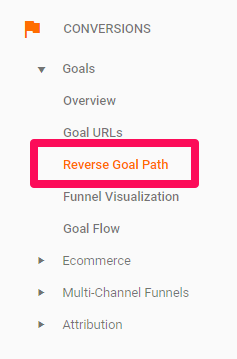
Using the Reverse Goal Path report, you can reverse engineer real sales.
People who actually bought from you, rather than just all website visitors.
There is no need for speculation anymore.
It shows you people who bought from you and every single touchpoint they landed on before doing so.
The first column shows you what landing page they converted on. Each consecutive column shows you the previous step they took that led them to the sale.
Reverse engineer the process of common sales to see how you can better push people through each page to drive more sales.
14. Compare new vs. returning users to see what you should focus on
The age-old dilemma for sales persists in today’s modern world:
Do I focus on increasing customer lifetime values or ramping up my customer acquisition strategy?
In other words, do you focus on selling more to existing customers or looking to bring in more new customers?
Well, that highly depends on your business.
But knowing is the first step in deciding where to proceed from there.
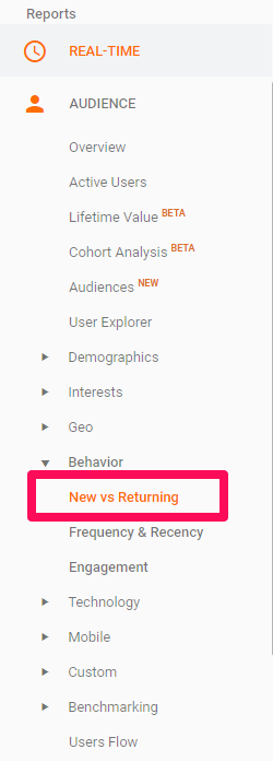
To get started, find the “New vs. Returning” report under Audience:
In the table, you can start to analyze what portion of your traffic and active site visitors are new or returning customers:
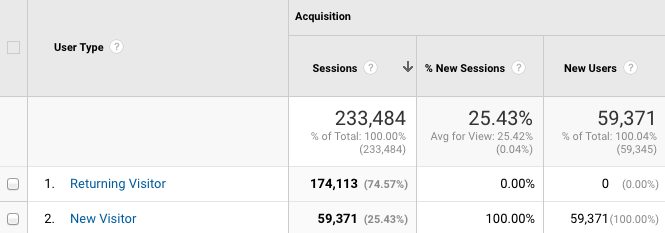
To get a deeper insight into how each segment compares and performs for your bottom line, sort the table by Goal Conversion Rate and analyze your sales in the bottom right-hand corner.
If new visitor sales are sky high for a cheap cost per conversion, you can start to focus heavily on acquiring more customers.
If your returning visitors convert often and for cheap, keep selling to them as your primary focus for sustainable growth.
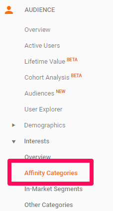
15. Use affinity categories to understand your customers better
Everybody says they understand their customers. They know their ins and outs.
But what do they really enjoy?
What gives them happiness and helps them thrive?
That’s tough to know. But it’s also the key to unlocking easier sales.
Why? It helps you resonate with them.
It helps you personalize your offers and products directly to their wants and needs without seeming like a pushy, used-car salesman.
Using the Affinity Categories report under the Audience section, you can see exactly what your customers are into.
This can help you position your brand and selling with ease.
With the Affinity report, you can analyze for common trends in your buyers to see what they are concerned about, giving you room to improve your value proposition.
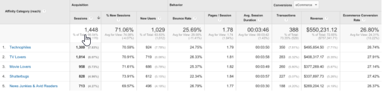
Look for common or popular affinity groups and start to consider changing your selling strategy and value proposition to better suit their interests, wants, needs and lifestyles.
16. Exclude internal traffic
Admit it, you check your website more times than your customers.
We all do it. We refresh over and over, making sure everything is working properly.
But that also directly impacts your data.
It adds more visits and traffic but no conversions. And it sabotages your conversion rate.
Using filters, filter out your IP address and any of your coworkers to ensure that your data isn’t being sabotaged.
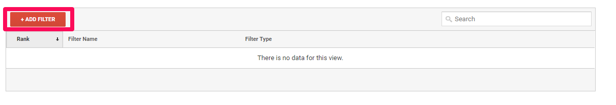
To do this, navigate back to the admin section of your dashboard and click on “Filters:”
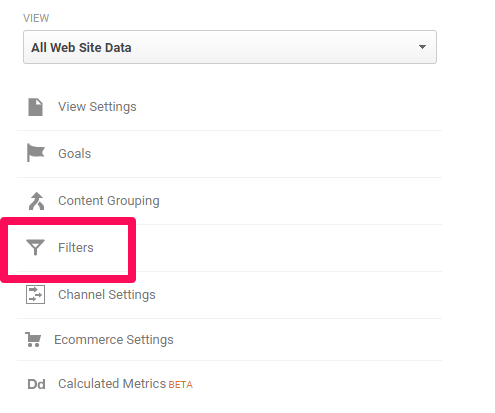
From here, create a new filter:
As your filter type, choose predefined and then exclude all traffic from specific IP addresses:
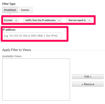
Enter your IP address into the box and add the filter. Repeat this process for each IP address that you want to exclude from your Analytics data.
This will ensure that you don’t keep tracking your own team’s visits and potentially impacting your valuable sales data.
17. How many times does it take for a person to convert
This is one of the most puzzling questions when it comes to sales.
How long. How many times. How many visits do they need to convert?
Using the Path Length report under Multi-Channel Funnels, you can see how many interactions people need with your site before buying.
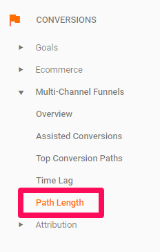
With this report, Path Length in Interactions will show you the most common touches that it takes before generating a conversion.
Leverage this data into new email campaigns and understand that you can’t go for the sale immediately, not when people need more visits to your site before making a decision.
If you notice that sales are coming with just a single path touch, it’s likely that they came from direct links and are already brand aware.
Focus on longer paths and realizing that you’ll have to warm up most of your visitors before they buy from you.
18. Visualize your funnel
The funnel process is often very complex when it comes to inbound marketing and online selling.
It often takes multiple lead magnets, email campaigns and calls to action to drive a single sale for a new user.
Visualizing the funnel can help you understand what pages on your site correlate to each funnel stage, giving you major room for improvement and optimization for copy and calls to action.
This report is found under Funnel Visualization in the Conversions section:
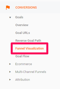
Start by selecting your conversion/sales goal at the top of the table:
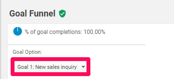
Now you should see a visualized version of your selling funnel:
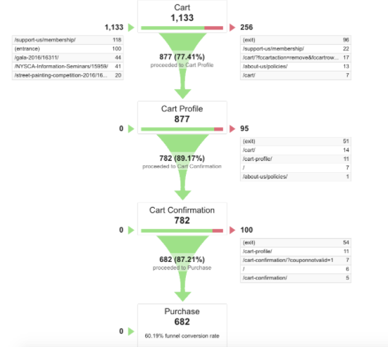
Here you can see the specific pages that most line up to each funnel stage.
Optimize your copy, CTAs and value propositions on each to reflect the intent of each funnel stage for better conversions and easier transitions from awareness to decision.
19. Analyze your current traffic and double-down on it
More than likely, you’re getting traffic from multiple sources.
Almost everybody uses different platforms to share content and engage online.
But do you know what they are and if they even play a role in your success?
Using the Source/Medium report, you can sort by landing page as the secondary dimension:
With the secondary dimension, you can see what referral traffic or traffic types drive visits to specific landing pages.
To get more depth in your data, sort it again by goal completions to see which drive sales.
Now you can effectively double-down on those platforms and landing pages to ensure they capture more sales.
20. Connect AdWords and Analytics
If you’re currently using AdWords as a PPC platform, it’s imperative that you connect it back to your Google Analytics dashboard.
Why? Connecting them will give you a wealth of data on keywords and search terms.
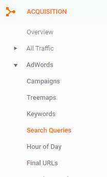
With the Search Queries report under AdWords Acquisition, see which search terms are driving sales.
Then use them to create new product pages on your site for organic search sales that will supplement your PPC strategy.
21. Use real-time reporting to see actual user behavior
Real-time reporting is one of my favorite features in GA.
It helps you assess and monitor the user experience as it’s happening, live on your site.
You can unlock potential conversion roadblocks or UX bottlenecks that are destroying conversions.
On the flipside, you can even see what’s working to drive real conversions.
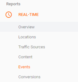
With the Real-Time report, you can see different traffic sources, IP locations, content that’s being browsed, and conversions/events currently happening on-site.
Conclusion
Analytics is a wealth of data. But sometimes, it’s overwhelming.
Follow these 21 actionable Google Analytics tips to help you make smarter, informed, data-driven decisions that can boost your sales through the roof.
What are your favorite Google Analytics reports or tips to drive sales?
Comments (53)