I was out of town the other day and needed to pick up a few items at the local supermarket.
Even though I hadn’t been to that store, I managed to find what I needed easily and happily moved on.
Why? Because the organization of the store follows the same logic as the supermarket in my neighborhood.
Imagine that supermarket is your website.
You want to make sure that your information is set up in a way that makes sense to your visitors so they can find what they need quickly and easily.
Otherwise, they’d most likely leave your site and go somewhere else.
Designing a good user experience is the key to helping your visitors find what they need and take the necessary actions that will achieve your business objectives.
It has everything to do with your conversion rate.
After all, if people can’t find what they need, they can’t buy anything from you.
At the foundation of a website’s user experience is its information architecture.
A good understanding of information architecture will help you organize your content in a way that sells.
It enables you to communicate with your designers and developers so you can create an effective and user-friendly website.
Now let’s dig in.
What’s information architecture in web design?
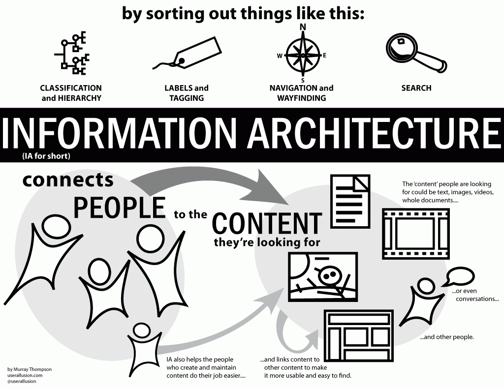
The goal of information architecture in the context of web design is to help people understand the “environment” of your website so they can find the information they’re looking for.
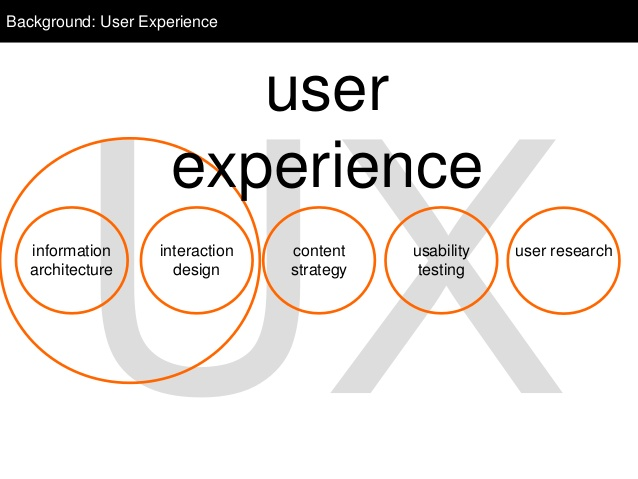
Information architecture is part of user experience design and is a vital component in making content on a website usable for visitors.
The discipline of information architecture involves the creation of site maps, hierarchies, categorizations, navigation, and metadata.
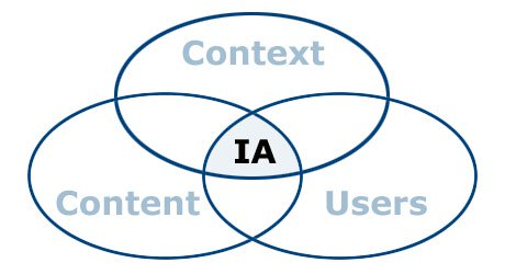
It takes into account context, content, and users when organizing and labeling information on a website.
The goal of information architecture is to create a website structure that optimizes user experience and meets business objectives.
The process of designing a website’s architecture involves both big picture user-centric elements and details such as how search results are organized on a page.
Put yourself in your visitors’ shoes when you design the information architecture of your website:
- Let them know that they’re at the right place.
- Help them make sense of the information on your website so they can find what they’re looking for.
- Show them options while presenting information in a way that aids their decision-making process.
- Let them know what actions they need to take.
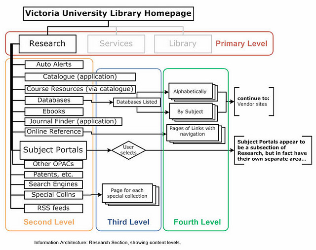
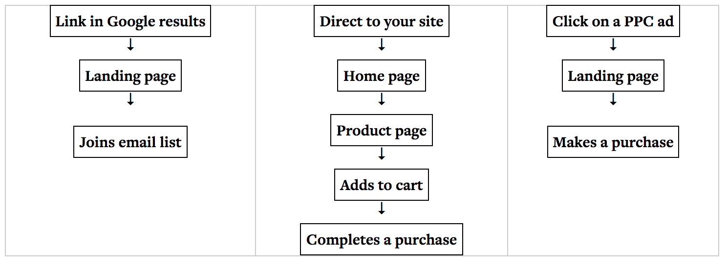
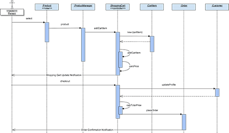
The information architecture of a website is often documented in the form of site maps, user flow diagrams, and wireframes.
These documents will then be passed on to designers and content creators for the next phase of implementation.
Common methodologies used in information architecture
Information architecture has been around since the 1970’s, before website, mobile apps, and user experience design came into existence.
It draws on a number of fields and disciplines for the organization and labeling of information.
Library science
Library science is the development of “knowledge-organization systems” and the study of how to categorize, catalog, and locate resources.
You bet there’s a thing or two information architects can learn from this discipline.
Specifically, the art of cataloging and archival science inform the creation of appropriate and usable metadata and the organization of content in well-maintained archives.
Cognitive psychology
Information architecture works with how our brain perceives and utilizes information to effectively organize data and content.
A few particular aspects of cognitive psychology have influenced the discipline of information architecture:
- Cognitive load – The brain can only process so much information at one time, so don’t overwhelm your website visitors with too much information all at once.
- Mental models – We all have a way of interpreting and organizing information according to how we see the world. Users can find the information they need much faster if the site structure reflects their mental models.
- Decision making – Information architecture can help provide the right information at the right moment to present the right amount of options and aid in decision making.
Architecture
The founder of modern information architecture was actually an architect.
Just like architecture, information architecture is based on a precise, intentional structure and designed around a specific set of constraints and requirements.
How to design your website’s information architecture
Now that we have a good overview of information architecture, let’s look at how to put it together for your website.
User research
In order to design a satisfactory user experience, you need to know who your visitors are.
The first step for any information architecture project is to get a comprehensive understanding of the website users so you can organize the content and information in a way that’s relevant to them.
Here are some questions to consider:
- Who comes to this website?
- What problem do they need to solve?
- How will they use the information provided on the website?
- How would they like to get this information, and when do they need it?
- What mental model do they apply to understand the information?
- What do they want to get out of interacting with the website?
- How does delivering the information visitors are seeking also meet your business objectives?
You can find the answers by conducting user research.
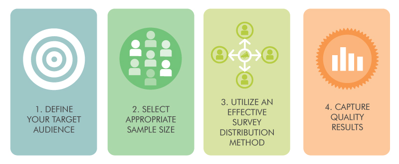
- Survey – To find out what your target audience wants, ask them. Make sure you’re asking the right questions, keeping your survey short, having a large enough sample size, sending your survey at the optimal time, and making it mobile-friendly.
You can set up a survey quickly and easily using a Google Form. - Google Analytics – If your website already has Google Analytics, you can get some insightful data on how visitors interact with the content.For example, you can look for the best converting landing page and reverse engineer it to figure out why it’s appealing to your target audience.
- Interviews – One-on-one interviews help you gain real-world insights. You can also ask specific follow-up questions for clarification. There are different interview methods, such as directed interviews, non-directed interviews, and ethnographic interviews.
- Usability tests – During usability testing, you ask subjects to perform a task and observe their behaviors. There are many methods for usability testing, including moderated usability tests, unmoderated usability tests, and guerilla testing.
Customer persona and use cases
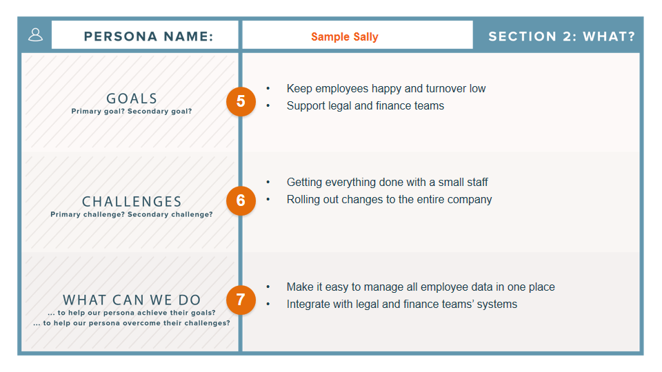
You’re designing your website for a specific audience, so you need a good grasp of their goals, motivations, characteristics, and behaviors.
By constructing a customer persona of your visitors, you’ll be able to understand why they’re on your website, how they think, what information they need, and how they react to information.
After you have created your buyer personas, the next step is to connect them with use cases.
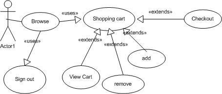
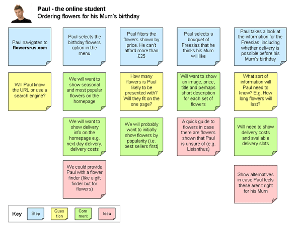
Use cases are mini “stories” of how an individual persona will perform a task on your website.
Each use case focuses on one persona and illustrates how one goal or business objective is achieved (download a PDF, watch a video, complete a transaction).
Some UX designers call this process scenario mapping, an exercise during which every step of the user path for each persona is described in detail.
The creation of use cases or user scenarios will help you design a customer-centric flow so the organization of your content is geared toward delivering the optimal user experience.
User tasks mapping
After listing each step your visitors need to take to achieve an objective, you have to figure out all the pages involved in the process.
Each page needs to accomplish two things:
- Allow the user to achieve a specific task.
- Provide easy access to the next step in the user flow.
You need to understand the nature of each page so it can be optimized to help visitors perform a particular type of action.
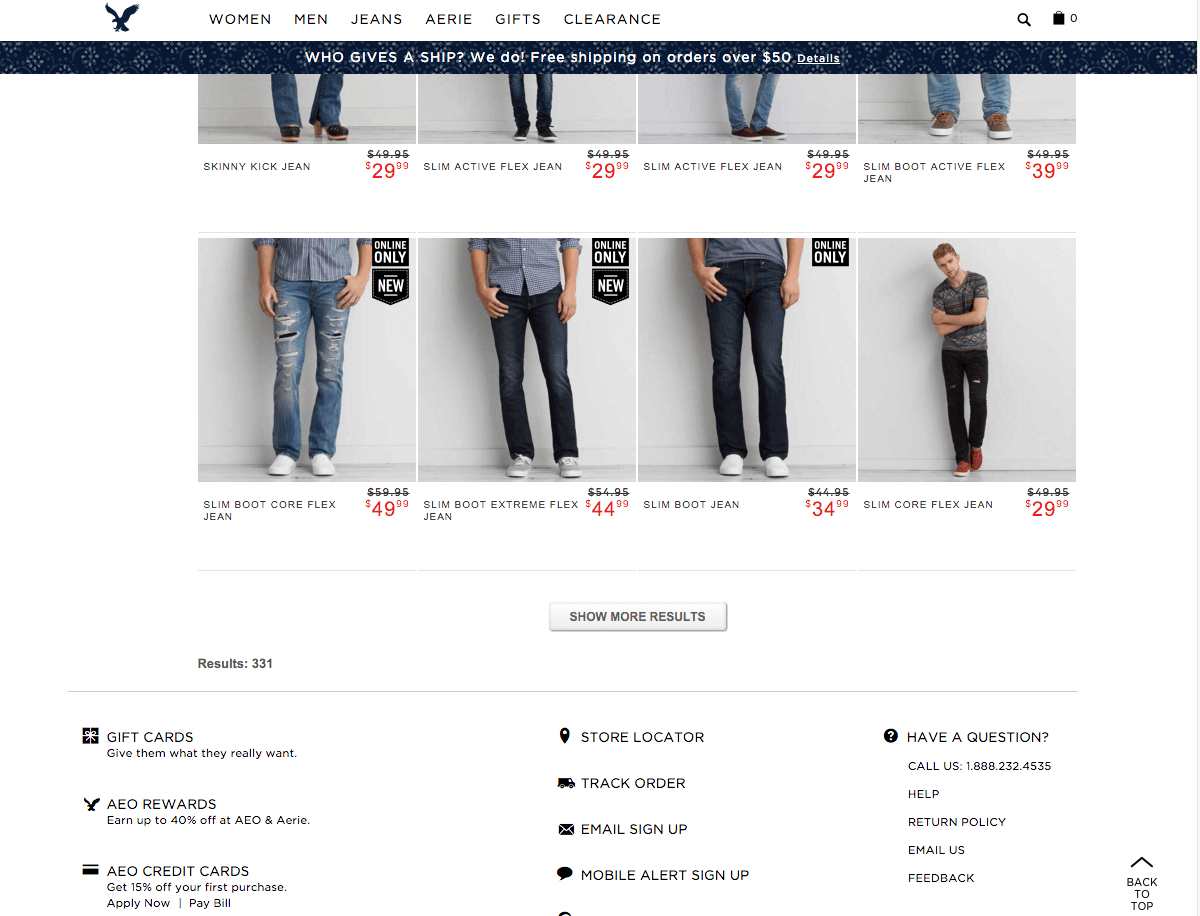
- Navigation pages – They help users determine what they need and give them a way to access it, such as a homepage or a search results page. While presenting options, consider “cognitive load” to make sure you don’t overwhelm the users.
- Consumption pages – These are mostly information-rich pages such as articles, videos, sales pages, or pricing information. In many cases, the information is designed to get visitors to take an action. If so, make sure a call-to-action is prominently displayed.
- Interaction pages – Users are required to enter information or manipulate data on these pages. An example could be a signup form or checkout sequence.
Instructional text
Some tasks in a user flow are quite self-explanatory, while others might require some learning.
To improve the usability of your website so visitors can accomplish the task at hand, look for steps that may be less intuitive, and plan to include help text or microcopy.
The key to effective instructional text is to offer the right help at the right moment with the least interruption.
That’s why snippets of prompts are often more effective than a link that goes to a separate FAQ page. The user doesn’t have to navigate away from the page and interrupt the task at hand.
Taxonomies andmetadata
After you have mapped out the use cases, you’ll know what pages to create.
Next, you need to make sure visitors can find the pages that contain the information they need.
That’s where taxonomies and metadata come in.
Taxonomy is how we group similar content or pieces of information. It should reflect your ideal audience’s mental model.
Metadata is the information about information.
When your visitors use search engines or the search function on your website, they’d enter a search term.
If you want to be found on Google or provide relevant search results to your visitors, you need to know how they’d search for the information or items they need, such as by product attributes or brand name.
Revisit your buyer persona to understand their mental models. The way they see the world influences how they search for information.
User flow
Now that you have all the pages accounted for, it’s time to make sure they’ll work together for a variety of user types.
Look at the different ways people seek information on websites and create a series of user flows.
- Known item – Visitors know exactly what they want and have a fairly good understanding of how they can find it, such as using the search function or links on your navigation menu.
- Exploratory – Users have an idea of what they’re looking for but may not be able to articulate it. They’ll most likely browse through the navigation or take advantage of related links on a page.
- “Don’t know what they need to know” – Visitors may think they need one thing, but after some research, realize they need a different solution. Maybe they were told to look up your website by a friend but are not sure what they can get out of it.For these visitors, you’ll need to provide more information or simply answers to their questions that’ll guide them to the next step.
- Re-finding – Returning users may want to go back to products or information they’ve seen on your site. If a visitor has an account and is in a logged-in state, you can allow them to retrieve browsing history or “favorite” an item for future reference.
Data (or content) modeling
If you already have a website, you need to consider the migration of the existing content.
You want to make sure that your current users or customers can take advantage of an upgraded user experience without getting completely lost on the redesigned website.
Data modeling helps you consider how the new data model is mapping, or not mapping, to the current site structure.
It ensures that the site organization takes into account user needs, business logic and requirements, and internal editorial practices.
Navigation and hierarchy
Navigation and hierarchy determine how the information on a website is displayed and accessed.
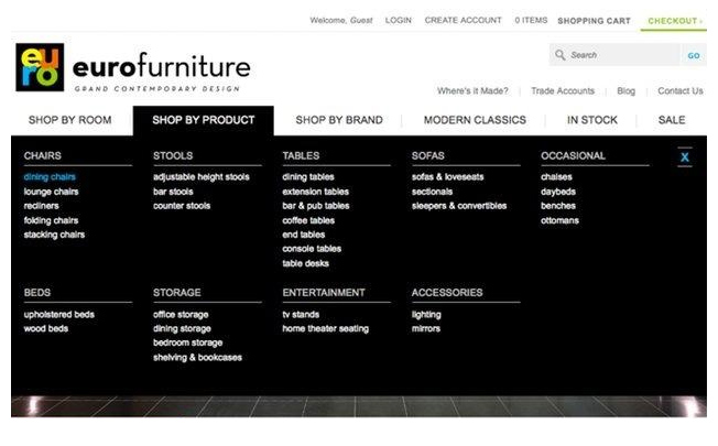
Navigation design includes the organization and labeling of the links that are displayed on a menu.
The organization of the links needs to reflect your visitors’ mental model and the way you want to position the content.
Structure your links in a hierarchical order to figure out which ones will be on the primary navigation bar and which ones belong to the secondary level.
If you have many pages on your website, you may need a more extensive exercise to help organize the pages.
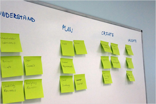
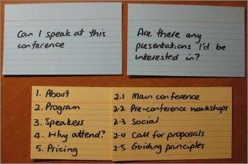
One of the more popular methods is card sorting. It can be done in-person or virtually, on your own, with a team, or in a user testing environment.
Don’t put too many items on your navigation menu or your visitors are likely to miss the important pages.
As a rule of thumb, keep the top-level navigation to five items.
Labeling is also an important part of helping your visitors find what they need quickly.
Establish a naming convention to keep everything consistent across the website.
The labels you use should be on-brand, descriptive, and reflect how your ideal audience talks about your products or services.
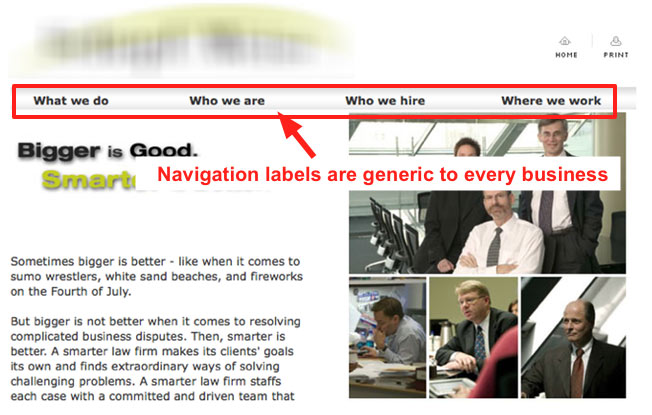
Avoid using generic labels. Not only do they make you sound like everyone else, but you’re also missing out on the opportunity to indicate your relevance to search engines and improve your SEO ranking.
After you have decided what to put on your navigation and how to label them, you have to design the menu to optimize usability.
- Make sure the links look clickable on the menu bar.
- Use the concept of visual hierarchy to communicate priority.
- Provide consistent global navigation by having the menu bar and footer navigation in the same place on every page.
- Place the menu where it’s expected. Your visitors have been around the Internet block many times, and most of them expect to find navigation menus either at the top or on the left
- Determine the number of levels of navigation you need. If you have a lot of content, you may need a few levels, but don’t use more than necessary.
Wireframes
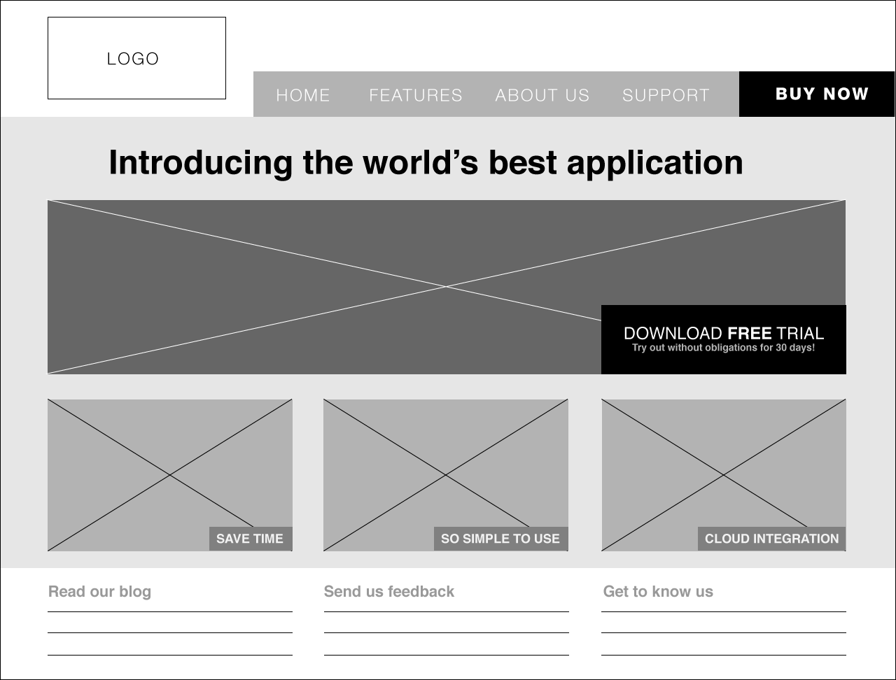
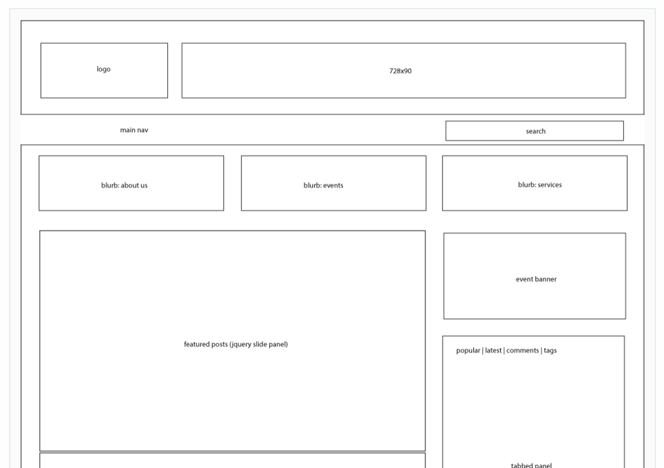
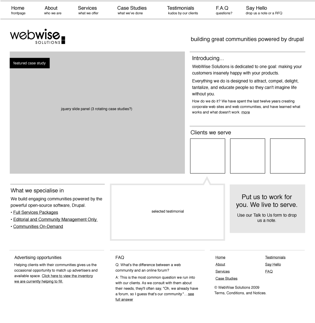
Wireframes are visual representations of how the information is organized on key screens.
They show the hierarchy of the content, illustrate key functionalities, and indicate how users will interact with the content (e.g., what happens when they click on a button).
Visual hierarchy is a key component to helping visitors find what they want and take the desired actions. It contributes to a good user experience that leads to conversion.
A wireframe will help you clearly indicate the most important elements on a page to make sure the priority is properly captured during the design phase.
Wireframes can be of various levels of detail depending on your objective for the exercise and the complexity of your site.
They can be as simple as a series of boxes with generic labels.
Or as detailed as what some would call “hi-definition” wireframes, which contains all the actual copy to be used on the page.
Helpful tools
In the good old days, information architects had to wrangle with PowerPoint to draw boxes and move arrows.
Not anymore.
There are many useful tools to help get the job done much faster and with less pain. Here are a few free options to get you started:
User flow and site map
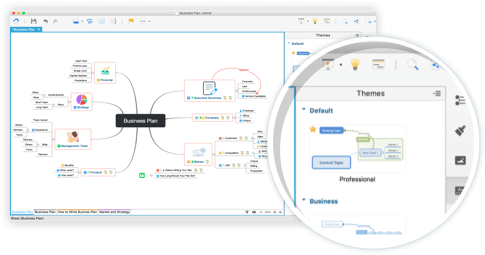
XMind is an open source mind mapping program perfect for capturing content ideas and documenting user flow.
Gliffy is a website diagram application with templates for flowcharts, sitemaps, and wireframes.
Wireframe
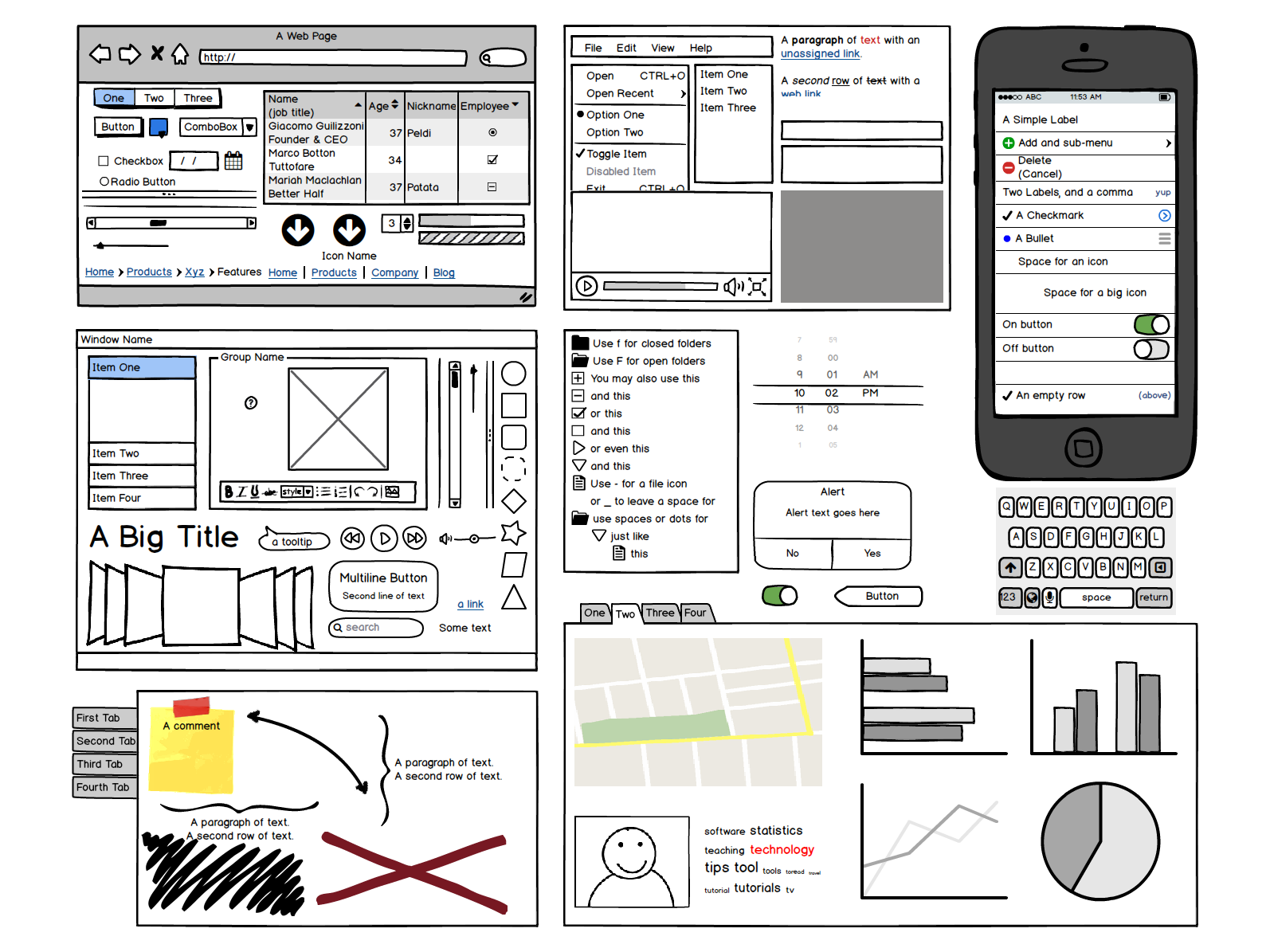
Balsamiq Mockups is an easy-to-use wireframing tool that helps you focus on the big picture.
Prototype
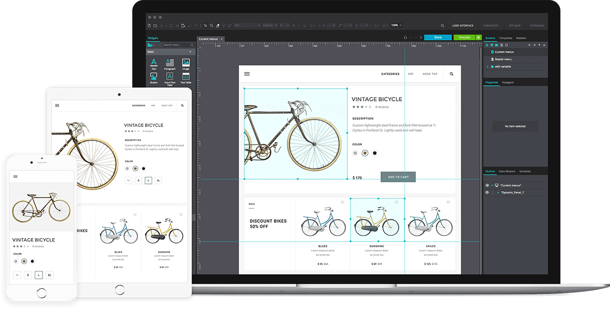
Justinmind prototyper is an all-in-one prototyping tool that helps you create anything from clickable wireframes to fully functional UI prototypes.
User testing and feedback
Helio is an application that allows you to quickly test your prototypes and understand user behaviors.
Polldaddy is a web application for publishing surveys and polls.
Conclusion
Your website’s information architecture is the foundation for an outstanding user experience that will result in repeat visitors and better conversion.
It goes hand in hand with usability to ensure that visitors can find what they want quickly and easily.
Keep in mind that we don’t all see the world the same way. An information architecture that works well for other sites may not be the best for your website.
In the early stages, test and validate your assumptions and website organization.
Testing an information architecture is a rather simple process.
It gives you the confidence to proceed to the design and development stages knowing that the underlying structure of your website is sound.
How do you structure your website’s information to make sure it’s delivering the best user experience?





Comments (4)