It’s critical. The design of a website’s navigation has a bigger impact on success or failure than almost any other factor. It affects traffic and search engine rankings. It affects conversions and user-friendliness. Everything important about your website is connected to the navigation, from content to the URLs.
Let’s look at some common navigation mistakes and see what we can learn.
Mistake #1: Non-Standard Style
Visitors expect to find horizontal navigation across the top or vertical navigation down the left side. Putting your navigation in standard places makes your site easier to use. That means a lower bounce rate, more pages per visit and higher conversions.
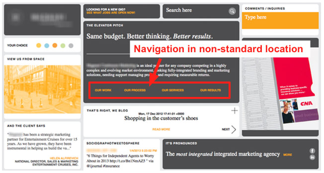
Be expected. Yes, marketing is about differentiation, but your navigation style isn’t the place to do it. Your goal is to help people find your content, not show them a new way to get around a website.
Mistake #2: Using Generic Labels
Navigation should be descriptive. Labels like “Products” or “Services” are generic to all businesses and do nothing to communicate with visitors. Ironically, “What we do” doesn’t say what you do. Save visitors the click (and help reduce your bounce rate) by making your website navigation descriptive.
When your navigation shows your main services or products, your site will communicate instantly.
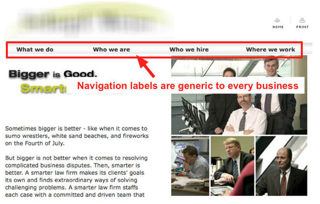
Your navigation is also a huge opportunity to indicate your relevance to search engines. Since your audience isn’t searching for “products” or “services,” navigation with these labels won’t help you rank. Use labels that include popular keyphrases according to the Google Keyword Tool.
Pro Tip! The navigation throughout the site and the site’s structure itself should be planned with search engines in mind.
Mistake #3: Drop Down Menus
Drop down menus are bad for two reasons. Depending on how they’re programed, can be difficult for search engines to crawl. But there’s another, bigger reason…
Drop down menus are annoying, according to usability studies from the NN Group. This is because as visitors, we move our eyes much faster than we move the mouse. When we move the mouse to a menu item, we’ve already decided to click…and then the drop down gives us more options. It’s a moment of friction in our minds as visitors.
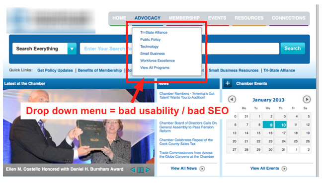
Even worse, drop downs encourage visitors to skip important top-level pages. If your site uses drop down menus, you can see the problem right there in your stats: low visits on high pages.
Exception: really big “mega drop downs” with lots of options test well in usability studies. If you have a big site with many sections, they may improve usability.
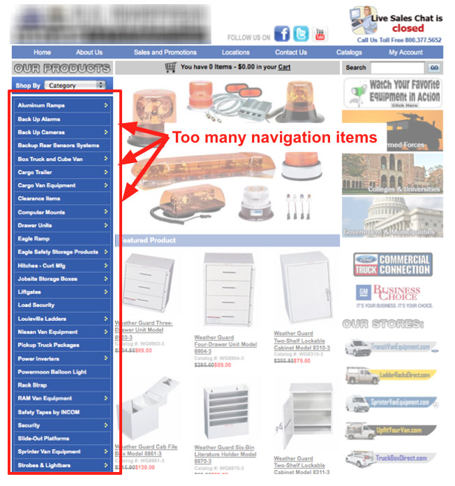
Mistake #4: Too many items in your navigation
You’ve seen this before: that website with hundreds of links on the home page. Terrible. But even eight may be too many. This is because short term memory holds only seven items. That means that, eight is a LOT more than seven.
With fewer menu items, your visitors’ eyes are less likely may scan past important items. Every time you remove a menu item, the remaining items become more prominent. Challenge yourself to limit your navigation to five items.
Pro Tip: This trick also works for the rest of the page, not just the navigation. Every visual element removed makes everything remaining more prominent. You can many anything “louder” by making other things “quieter.”
Concise navigation is also important for SEO. Since are inevitably more links to your home page than your interior pages, it has the most “authority” with search engines. SEOs call this authority “link juice” and like a liquid, it flows from the home page to deeper pages through the navigation.
When your navigation has too many links, less authority and trust passed down to the interior pages. The link juice is diluted. The more concise your navigation, the more home page authority will flow to interior pages, making them more likely to rank.
Use the Link Juice Calculator to count the total number of clickable items on your home page. Amazon has around 100 and their site is bigger than yours, right?
Mistake #5: Getting the order wrong
Items that appear first or last on any list are most effective. Navigation is no exception. Psychology studies show that, attention and retention are highest for things that appear at the beginning and at the end. It’s called the “serial position effect,” and it’s based on the principles of primacy and recency.
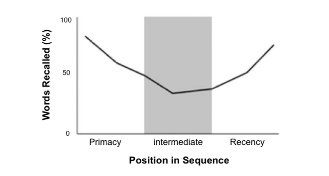
So put your most important items at the beginning of the navigation and the least important items in the middle. “Contact” should be the last item on the list, putting it at the far right in top-level horizontal navigation, a standard location.
Bonus Reminder! Always links, never buttons
In case you’ve missed the web design trends from the last eight years and you’re still tempted to use graphical, button-based navigation (rather than text-based links) here are five good reasons not to:
- Buttons are not search friendly, since the text within is invisible to search engines.
- Buttons are harder to update than links, requiring Photoshop and a new image for every update.
- Buttons load more slowly that links, making them especially bad for mobile visitors.
- Buttons are less accessible to the visually impaired.
- Buttons are unnecessary, even if you want to use non-standard fonts, thanks to tools like TypeKit.
5 Examples of Navigation Done Right
Let’s wash out our eyes with some better designs. Here are five sites that don’t make the mistakes we just looked at.
Smith Brothers – descriptive, concise navigation
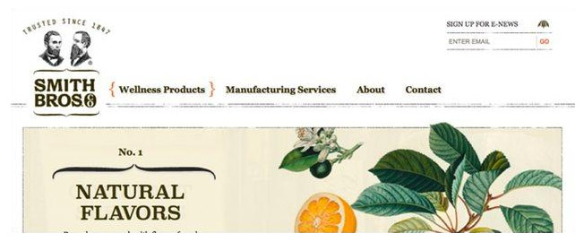
Navigation on the Smith Brothers site is descriptive and concise. Just four items, starting with the first and second most important services and ending with a contact link.
Independent Publishers Group – descriptive, grouped navigation

The IPG website uses strong contrast to differentiate between the primary and secondary navigation in the header. Each with five or fewer items, making it easy to scan. The general term “services” is broken up into two more descriptive labels: “distribution services” and “digital services.”
Sweat Vac – descriptive, concise navigation with short labels
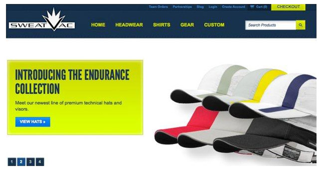
In case you didn’t see the photo (or you’re a search engine) the navigation tells you what this company does: headwear. Other products, like shirts and gear are listed next. In this minimalist approach, each item is one simple word.
Kiefer Swimwear – descriptive, ordered navigation
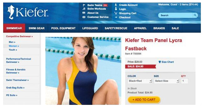
The Kiefer site has a huge catalog, but the categories are available as main navigation throughout the site. The most important items to visitors (swimwear and swim gear) are listed first. An important item for Kiefer (sale) is listed last. Less popular categories are in the middle.
EuroFurniture – ordered navigation with mega drop downs
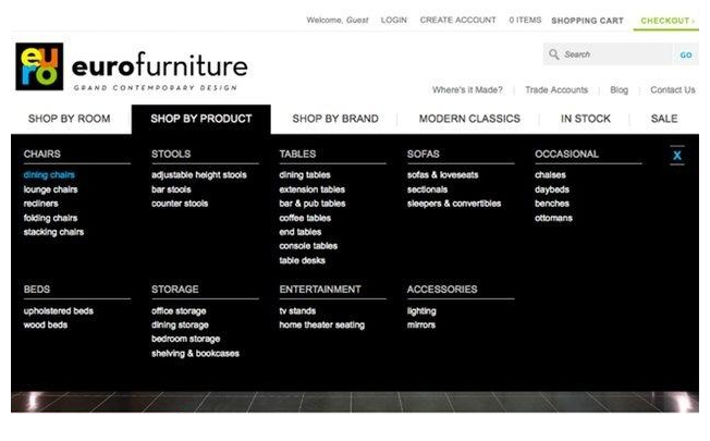
Most visitors have a room in mind. Fewer visitors are looking for a specific product or a brand. The EuroFurniture navigation lists items accordingly. Mega drop downs make it easy to jump into this huge furniture catalog.
Pro Tip: Tablet Friendly Mega Drop Downs. Notice the little blue ‘x’ in the top right of the mega drop down above. It’s a close button. Without this, tablet users would have no way to dismiss the window, since they have no mouse cursor to move off of the drop down.
TL;DR – Conclusion
Website navigation mistakes are expensive and avoidable. One mistake could affect both search rankings user friendliness. Make the labels descriptive. Limit the number of items to seven. Put the important stuff at the beginning. Avoid drop down menus. Follow the web navigation best practices in this article. …Then finally, check the difference in your analytics.
About the Author: Andy Crestodina is the Strategic Director of Orbit Media, a Chicago web design company. He’s also the author of Content Chemistry, An Illustrated Guide to Content Marketing You can find Andy on Google+ and Twitter.
Comments (67)