You have a website, and it’s gaining traffic.
But nobody’s doing much of anything.
No matter what you do, it feels like nobody’s even watching.
They visit the site, spend some time browsing, but never take any action.
Are they even real people or just bots?
How can you tell whether or not your website is actually gaining traction?
That’s a common situation faced by every new online business.
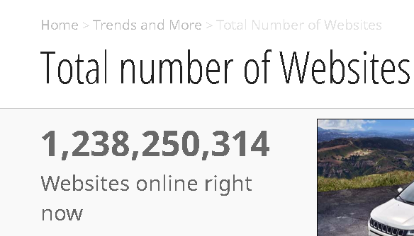
According to Internet Live Stats, there are over 1.2 billion websites online right now.
And that number is steadily climbing!
Standing out in that competitive landscape is hard enough, but getting people to your website is only half the battle.
Traffic that comes and goes with no purpose is worthless.
You need traffic that converts.
Whether it’s purchasing a product, opting in to email newsletters, or following you on social media, conversions justify traffic.
That’s why I want to present you with seven easy ways to boost your online conversions.
Here’s a video introducing the basics.
The combination of these seven steps can increase your conversions by 158%!
But I barely touch on them in the video. It’s a great overview, and we’re going to dive a little deeper into these steps.
I’m going to show you how you can use these tools and tactics to generate a more positive ROI.
Let’s get started.
1. Leverage countdown clocks
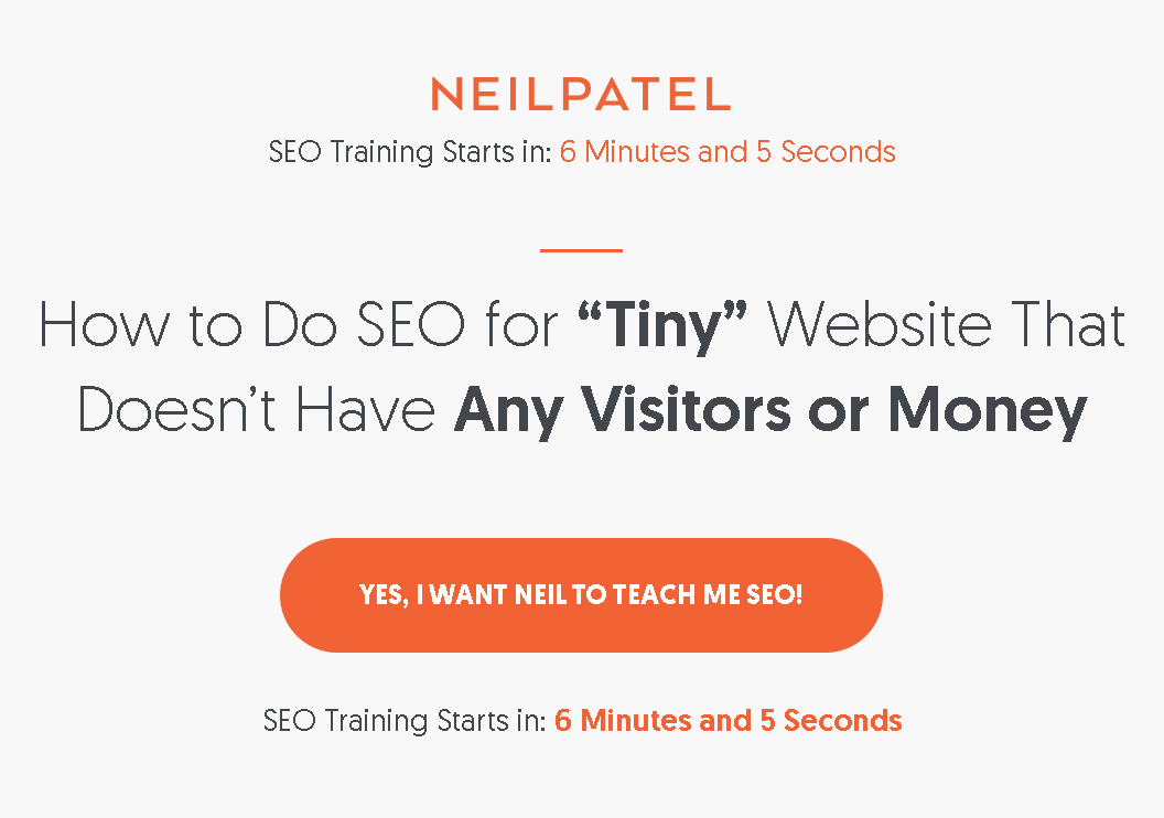
When you visit the NeilPatel.com homepage, one of the first things you’ll notice is a countdown clock.
It’s one of my favorite sales techniques.
This countdown clock shows when the next SEO training seminar starts.
And it’s accurate.
Now, of course, I’m not sitting here holding live training sessions 24 hours a day.
The clock represents the next time an offer is ending.
It’s an effective tool that improved my conversions by 11%.
But don’t just take my word for it!
One online retailer recently increased revenue by 9% by using a countdown timer.
This was just a small tweak to one page.
Imagine what that boost could do to a site like Amazon.
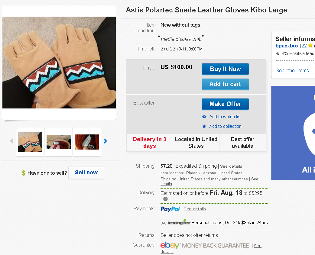
Countdown timers are practically what made eBay the online marketplace it is today.
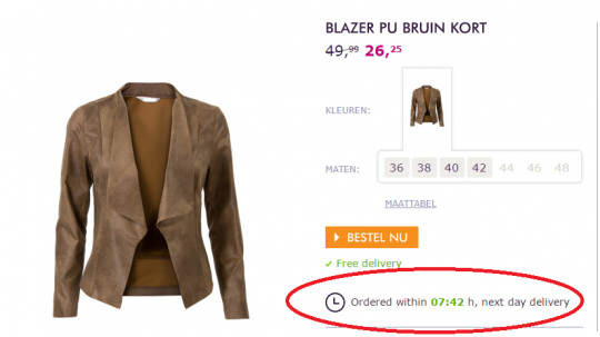
Psychologists say that these timers create a sense of urgency and scarcity.
It’s a gamification technique that isn’t limited in its use to these marketplaces or my website.
If you sit on my homepage long enough, you’ll notice that the countdown timer freezes at one second.
You can use them to increase revenue and clicks on your own site.
If you’re not familiar with coding, there are plenty of free tools available online.
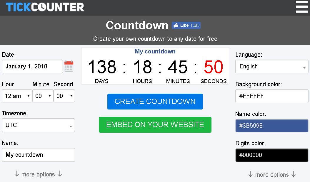
One of my favorites is TickCounter.
With TickCounter, you can customize and personalize a basic counter to add to your website.
Of course, you’ll want to integrate these into your site the way they make sense.
However, don’t discount them.
They’re not spammy, they don’t trigger ad-blocking software, and they are widely used by retailers and marketers everywhere.
If you don’t read on, this message will self-destruct in 5…4…3…2…
2. Use exit pop-ups
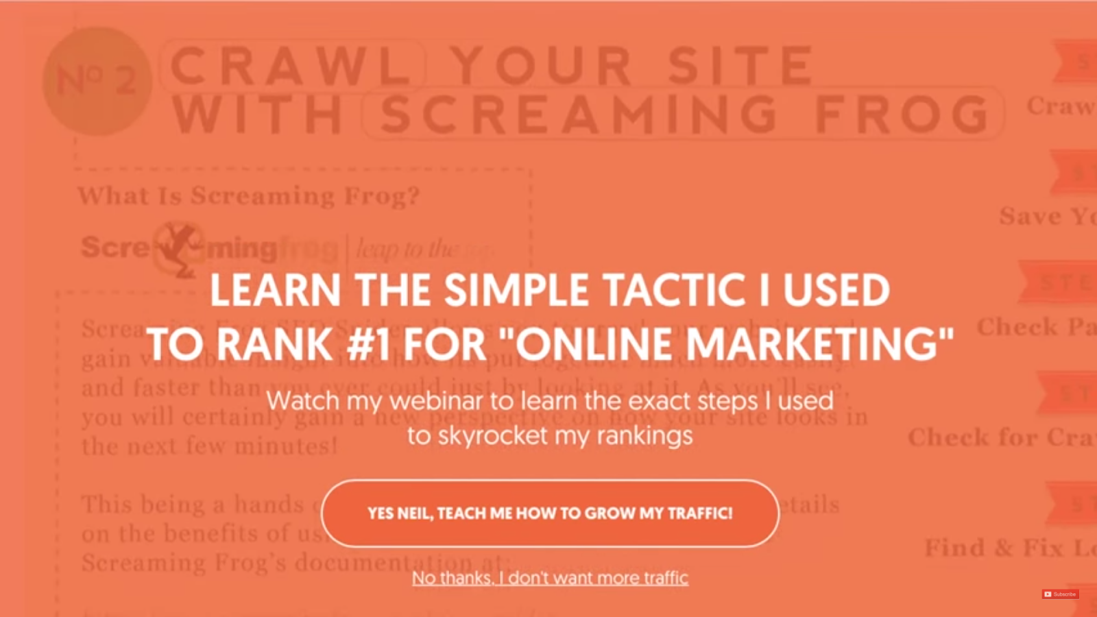
An exit popup is another way in which I’ve improved conversions on my website.
In fact, it’s one of the single most effective converting factors on my site.
This one popup improved conversions by 17% on NeilPatel.com!
Visitors are inevitably going to leave without converting.
Everyone leaves your website at one point or another, even if it is after making a purchase.
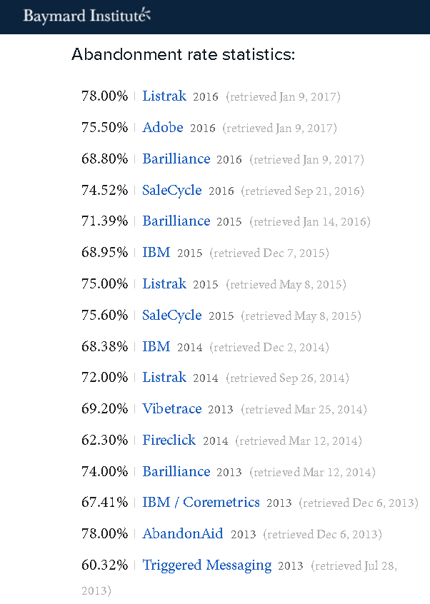
According to the Baymard Institute, the average shopping-cart abandonment rate is 69.23%.
Here’s a bigger picture of where they got that average.
Companies like IBM and Adobe have researched these rates for years.
Each comes up with different results because of timing and other data discrepancies.
The average is accurate.
These are just the people who make it through the rest of the sales funnel.
Bounce rates will vary by individual pages.
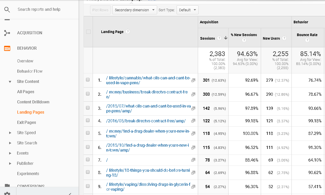
If you want to see your bounce rates, a good place to check for this is in Google Analytics.
The Landing Pages report under Behavior – Site Content shows bounce rates broken down by page.
It may look grim if you have large numbers, but don’t fret.
Bounce rates can be fixed with a few simple SEO and on-page tweaks.
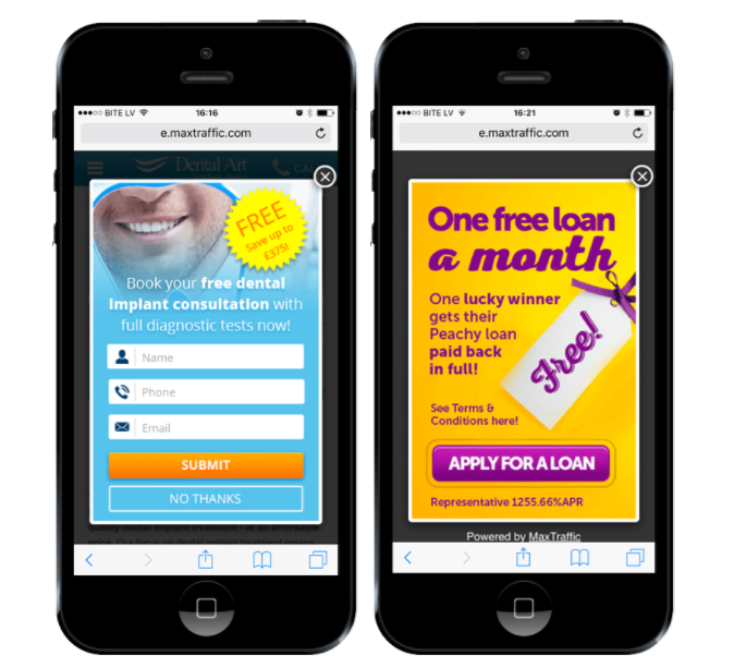
Regardless of how many people are leaving, they’ll all get an exit popup that’s personalized to their individual situation.
An exit popup gives them one last chance to convert before moving on to the next website.
They’re especially effective on mobile devices.
Whether it’s to fill out a form, complete a sale, or some other reason, these exit popups work.
You can capture your leads and throw together one last elevator pitch.
When done right, it’s a savvy business move that catches people who were just on the right side of the fence.
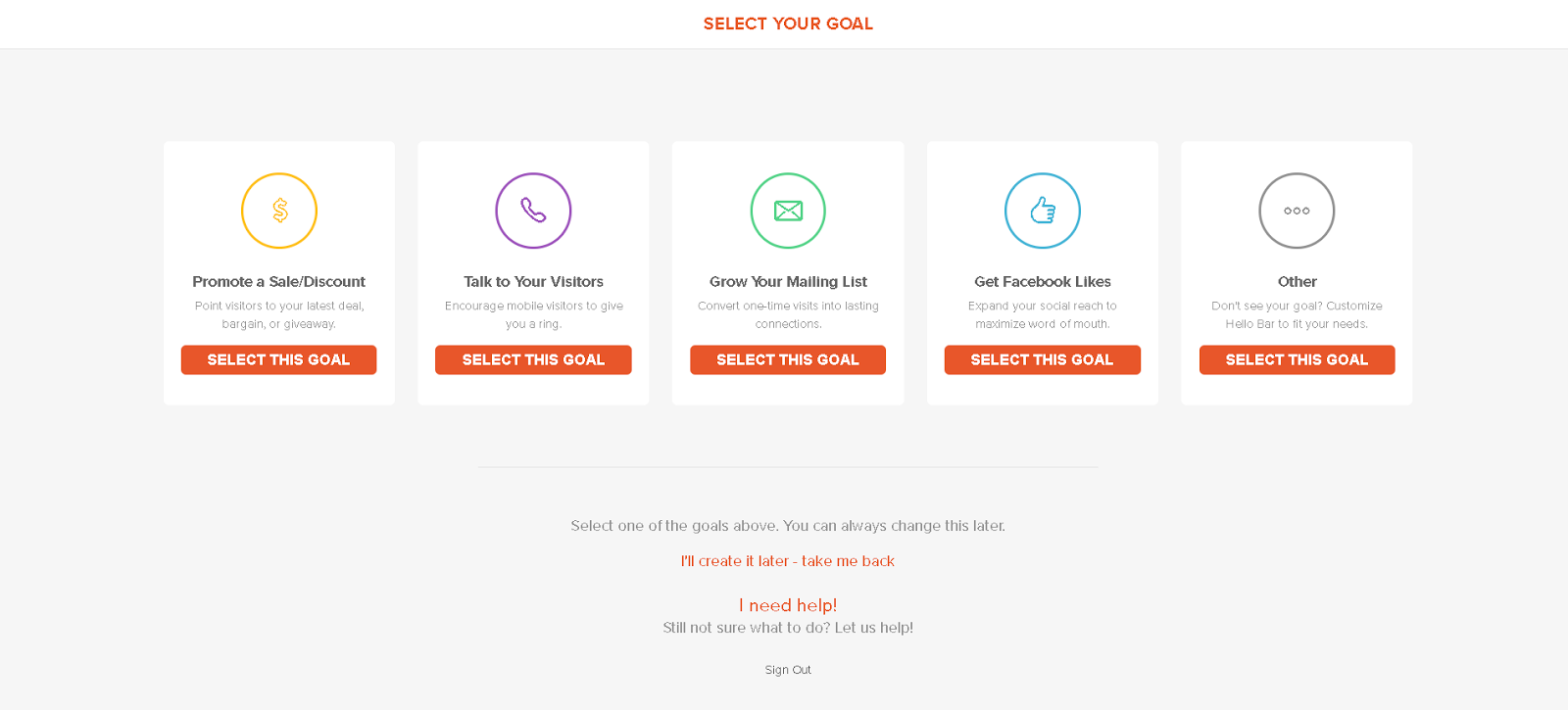
If you’re not sure how to make them, the Hello Bar tool can do this for you.
Once you enter your website URL, you’ll be asked to select your conversion goal.
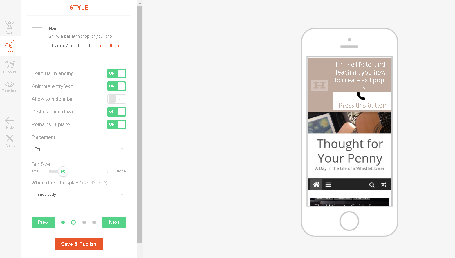
After that, you’ll be able to personalize your popup before finally publishing it.
Animations, branding, position, imagery, colors, font, and more can be changed.
An effective exit popup provides contact information and a CTA.
It won’t take long after implementing these popups before you start seeing a steady increase in conversions.
It helps if you have a great offer to present.
Here’s an idea.
3. Offer limited trials
Limited trials are a great way to attract more conversions.
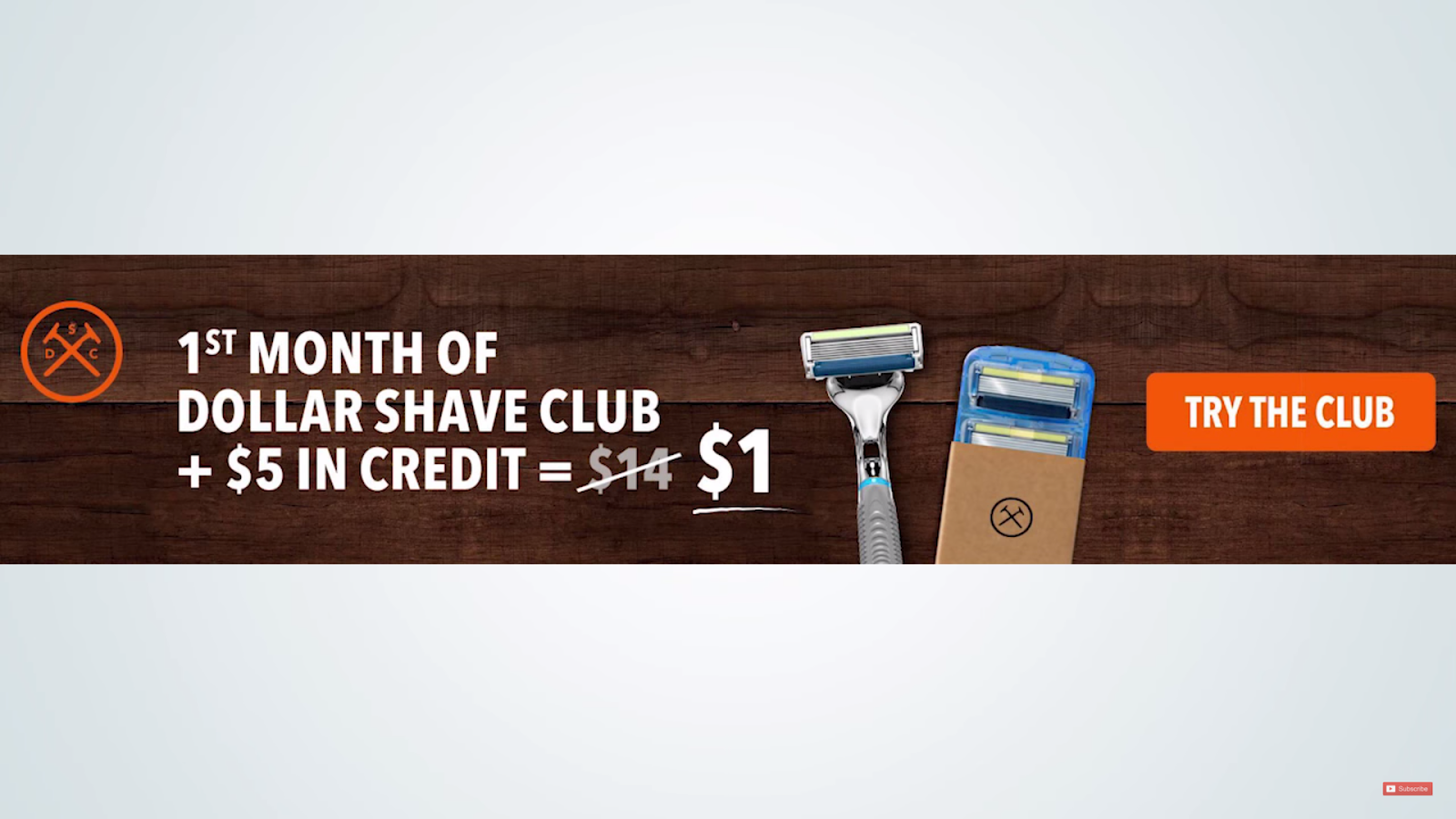
Whether you offer a free trial or a low introductory rate, such as $1, these trials get customers’ feet in the door.
This is a tactic that Dollar Shave Club used to great success.
The $1 trial is even inferred in the name of the company.
Without these trials, there would be no DSL or other subscription services.
The entertainment industry would certainly be different.
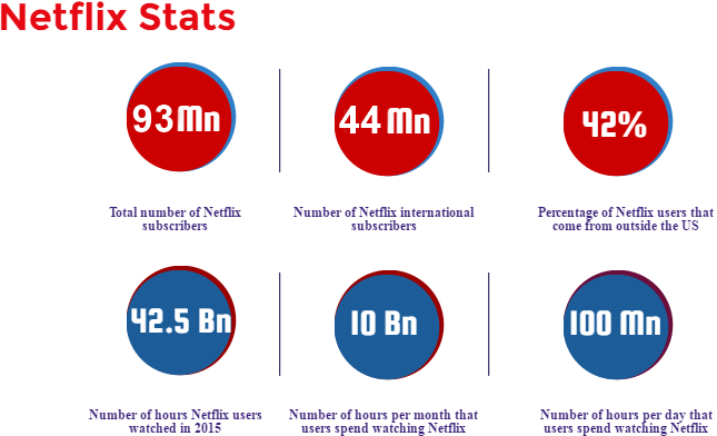
Netflix offers a 30-day free trial that helps convert customers.
That’s how it built a subscriber base of 93 million people!
The money lost on squeezing margins for the trial is easily made up for over the lifetime value of the customer.
Don’t look at it as giving away free merchandise or services.
Look at it as rewarding visitors for providing you with their personal contact information.
In order to sign up for the trial offer, they’ll need to create an account, enter their name, address, email, and social media profiles, payment information, and more.
Many customers will enjoy the service and continue reordering. Some will forget to cancel and convert to paying customers.
Limited trials are how I increased conversions by 15% on NeilPatel.com back when I sold on my site.
They’re a great way to boost conversions on your site, too.
4. Geotarget your readers
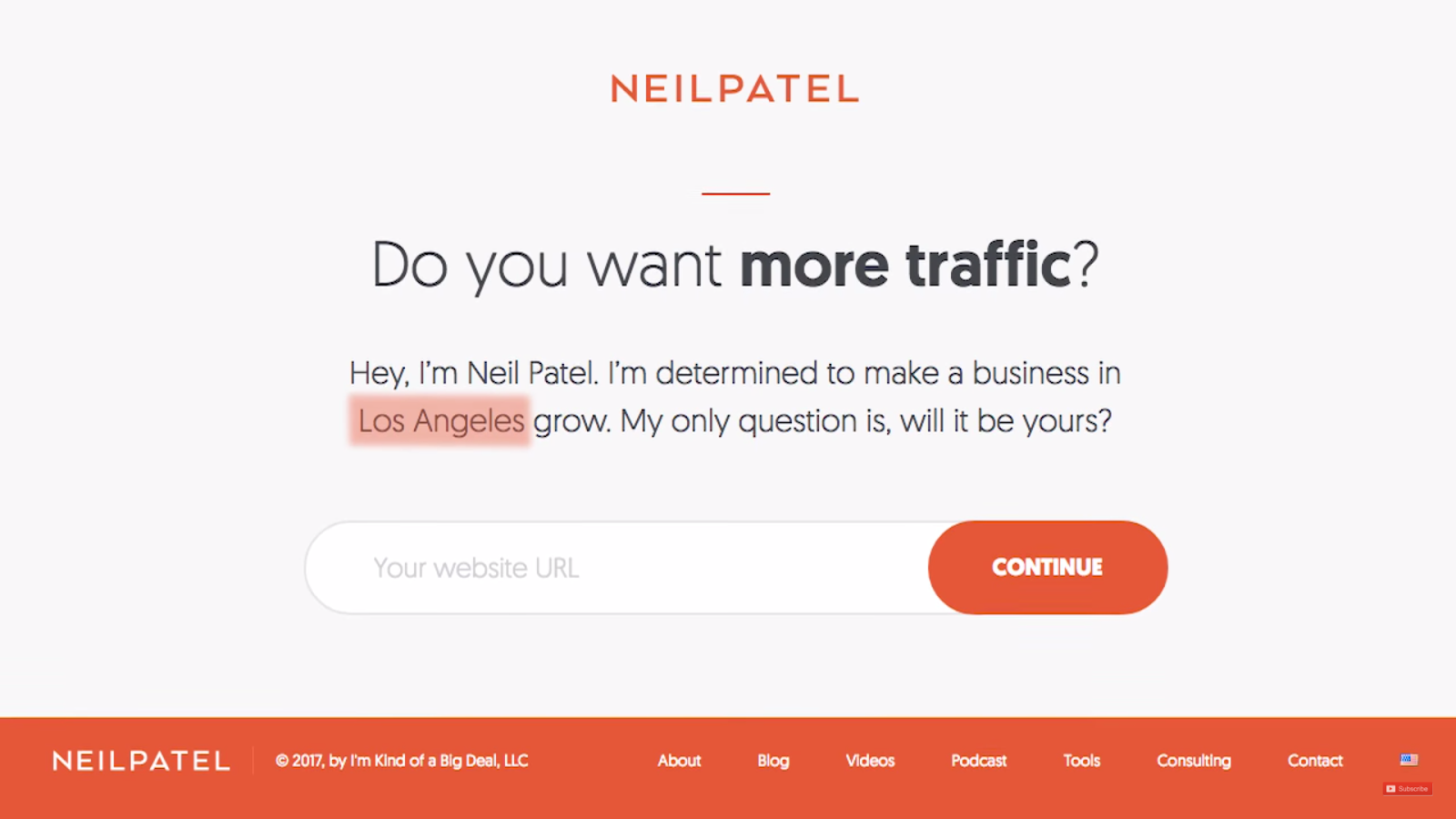
Another way I’ve been able to increase conversion rates (by 20%, to be exact) is by personalizing content through geotargeting.
You’ll notice on my website that it says the name of the city you’re in.
I didn’t write a new page for every single city.
That would take forever!
Instead, I included one geotargeted section within my frame to add a touch of personalization.
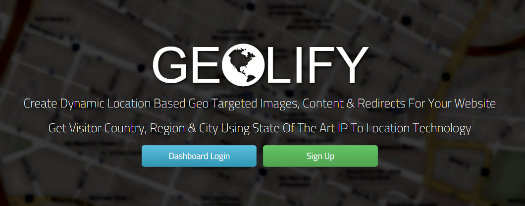
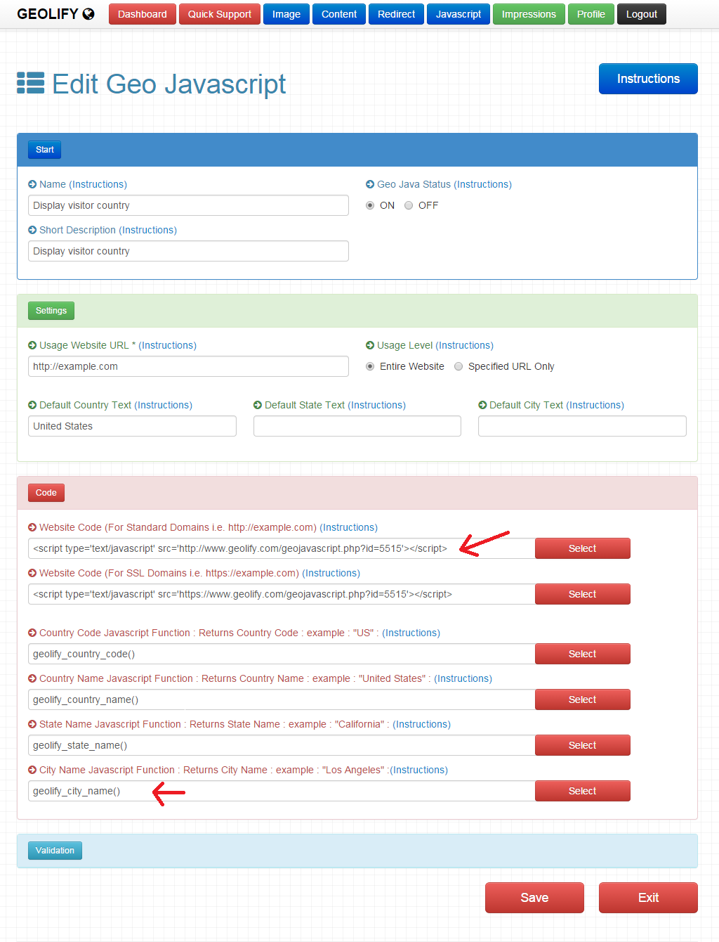
There are several tools available to do this, but we’ll focus on Geolify.
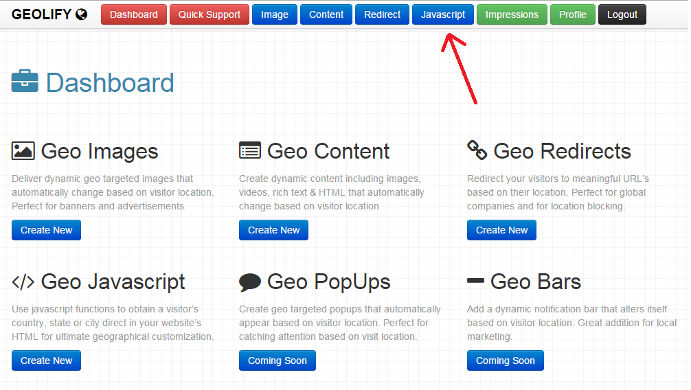
WIth Geolify, you can create the javascript necessary to personalize your content by geographic location.
The process is simple.
Just fill out a few forms, and you’ll be on your way to creating the necessary javascript.
Cities are the most personalized option, but there are reasons to use the state and country as well.
From there, you’ll have the module to enter into your site’s HTML code.
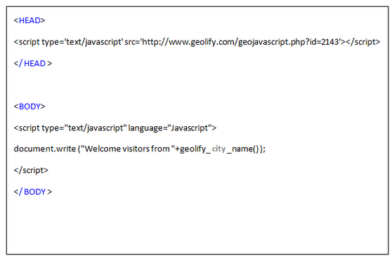
Here’s what a sample looks like.
The header defines the script, and it’s initiated in the body.
Geolify is a great tool to help implement these advanced techniques.
There are plenty of others, as well.
Of course, this is just one way to utilize geotargeting. It can be used to focus on or block traffic from certain locations.
It’s also great for targeting display ads and other features on your site.
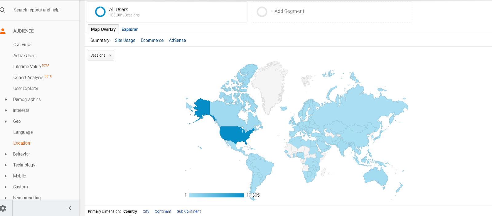
To see where your current traffic comes from, Google Analytics is always handy.
Select Audience – Geo – Location to see a map of where your traffic is coming from.
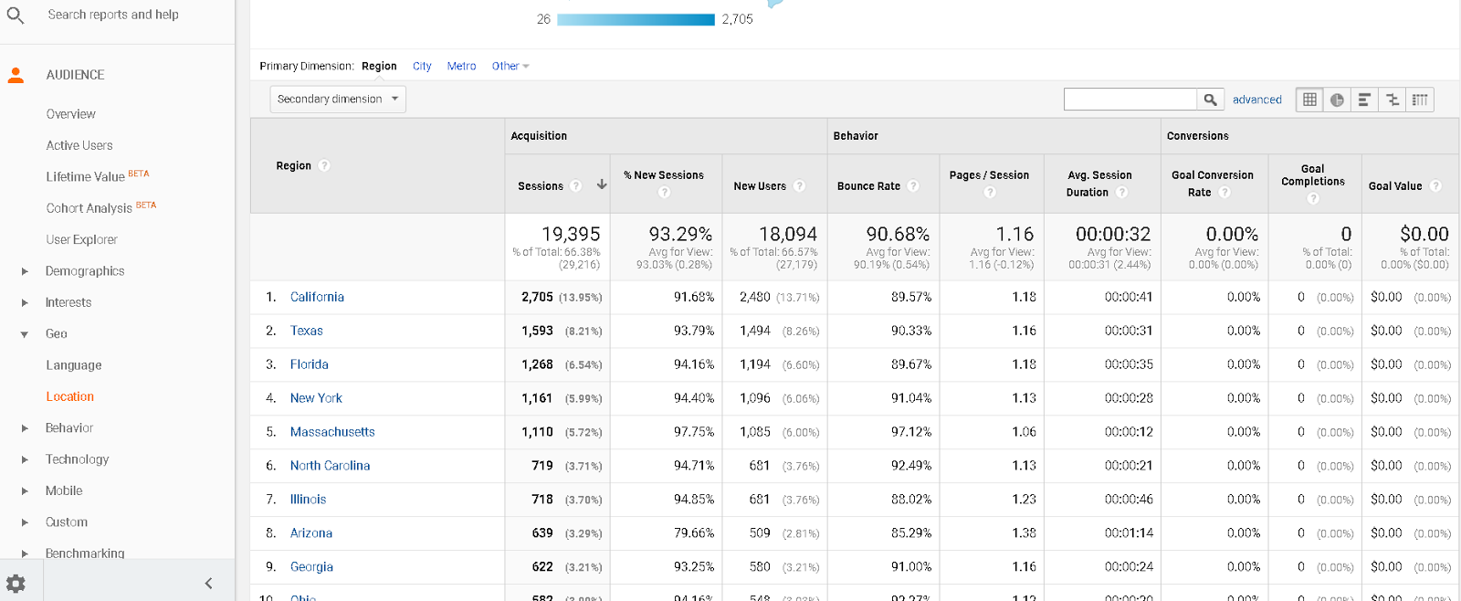
You can break it down by country, state, and even city.
Once you know where your traffic is coming from, you can geotarget in more specific ways.
WordPress plugins like AdRotate Banner Manager are invaluable tools to have on hand for managing geotargeting.
This particular plugin shows a different banner ad to different audiences based on geolocation targeting.
If you’re specifically targeting local markets, many of these tactics can still work, but you’ll have another option available.
You can just write content specifically for a specific city.
Regardless of how you choose to do it, integrating this personalized location in your website can have a huge impact on conversions.
5. Personalize your images
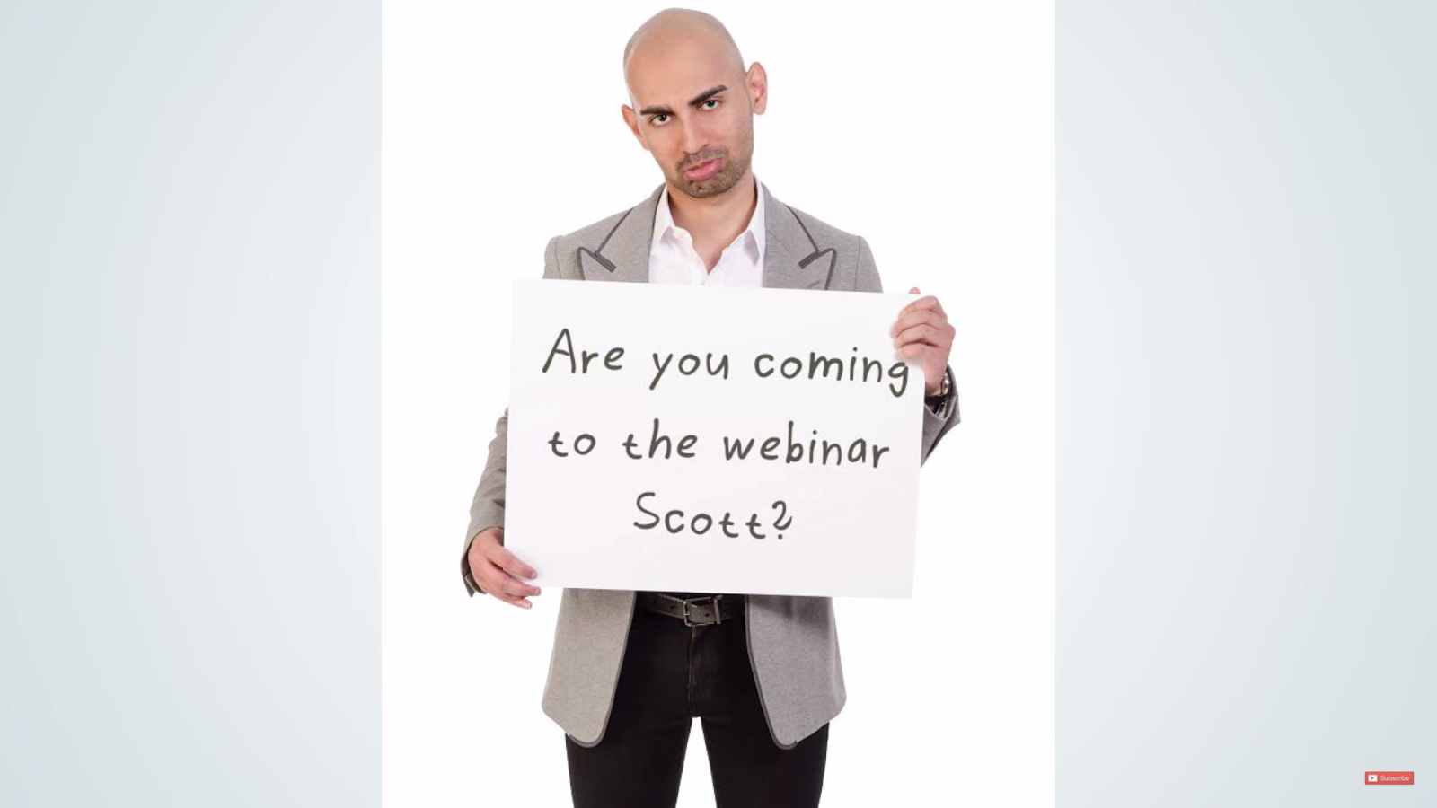
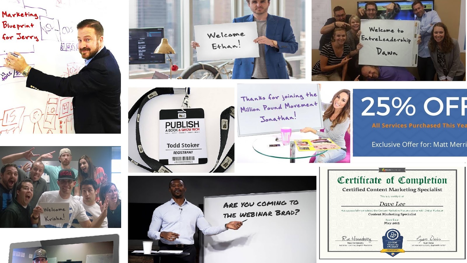
I discuss in the video how I use personalized photos in emails.
It was really fun taking photos for this shoot.
And obviously, I didn’t hold up a sign for every name in the book.
Ain’t nobody got time for that!
I increased conversions by 22% by using these personalized images throughout NeilPatel.com.
They’re reminiscent of the viral memes that float around social media, so people relate to the images.
Integrating a level of pop culture into my website like this makes me more accessible to readers like you!
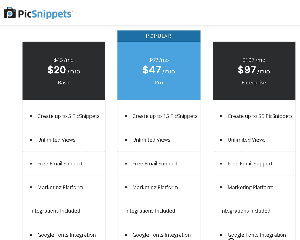
PicSnippets is my tool of choice for accomplishing this.
PicSnippets isn’t a free tool, and it’s not as easy to replicate as using Photoshop.
A script is run within the picture, so there’s a lot going on in the backend.
There are three paid plans available.
Which plan you choose depends on how many PicSnippets you actually want to use.
They’re all monthly subscription plans that come with free email support and unlimited views.
Of course, any visuals on your page can increase conversions.
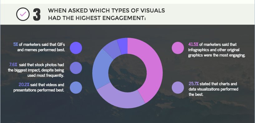
A recent HubSpot survey of marketers breaks it down even further.
Infographics and other original graphics perform the best, according to 41.5% of these marketers.
This means you’ll need to focus on updating the images on your site.
Use high-resolution photos, drawn images, and whatever else you can come up with.
Stock photos won’t cut it unless they’re well done.
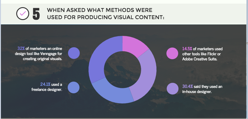
HubSpot continued to learn how these graphics are typically produced.
I use a lot of freelance designers and photographers to free up time for other endeavers.
I’m not alone in this, as 24.1% of marketers use freelancers. I’m also among the 32% of marketers using online design tools.
PicSnippets is just one of them.
I’ll touch on others in another blog post, but my main point is that we need to diversify our tools to boost conversions.
6. Remarket on multiple channels
People who don’t convert after visiting my checkout and credit-card pages are presented with this video.
It happens after they leave my site while they’re watching YouTube, searching Google, or browsing Facebook.
It’s called remarketing, and it’s an important step in converting visitors.
I increased conversions by 13% using remarketing!
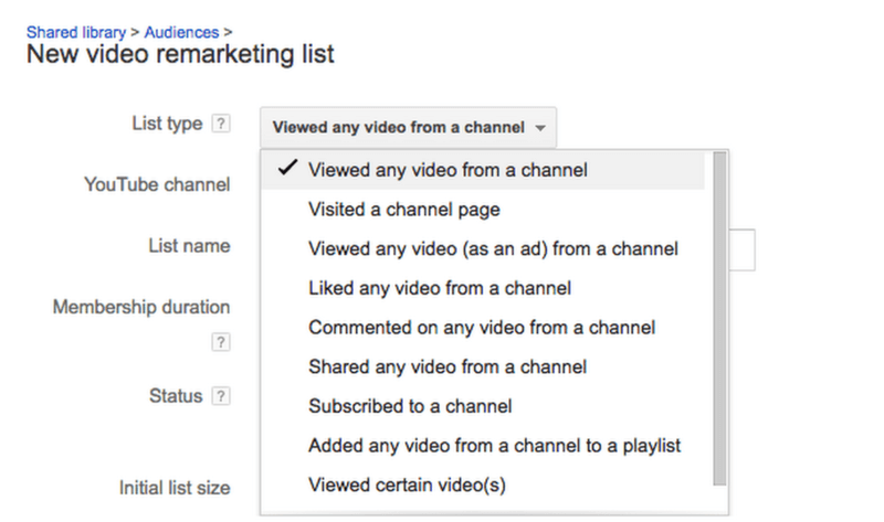
Google also recently made remarketing across YouTube and its search channels a lot easier.
This means that I can target my video not only to users who leave my web form without converting but also to people who watch the video without converting.
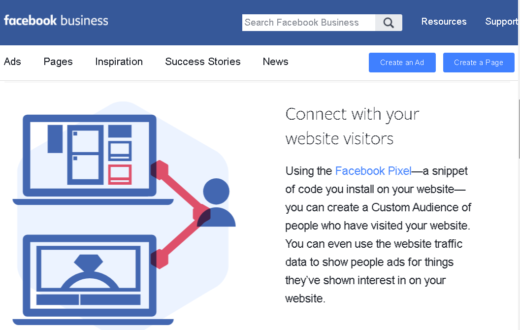
Remarketing lists are available on social media, too. Facebook Pixel is used to create custom audiences through your Facebook Business account.
It’s pretty easy to get started.
You’ll need to add the Facebook Pixel code to your website so Facebook can track your visitors.
From there, click Create an Ad Set.
You can customize the ad set like any other.
I have several great Facebook advertising and marketing guides throughout my blog that go into more detail on how to do this.
Once you’re done, you’ll be automatically retargeting your customers through Facebook Ads.
The combination of Facebook, Google, and YouTube gives you a wide reach you can’t ignore.
7. Use quizzes to increase engagement
Whenever I create a quiz on my website, I find that 60% of people click through to the end and fill out their email addresses.
It’s one of the most effective lead-generation tools I use.
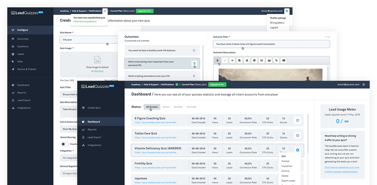
LeadQuizzes is my go-to service for creating my site’s quizzes.
These quizzes are easy to create and increase audience engagement.
Quizzes also increase conversions, click-through rates, and search engine rankings.
It’s a great way to get customers to opt in, share your page on social media, and more.
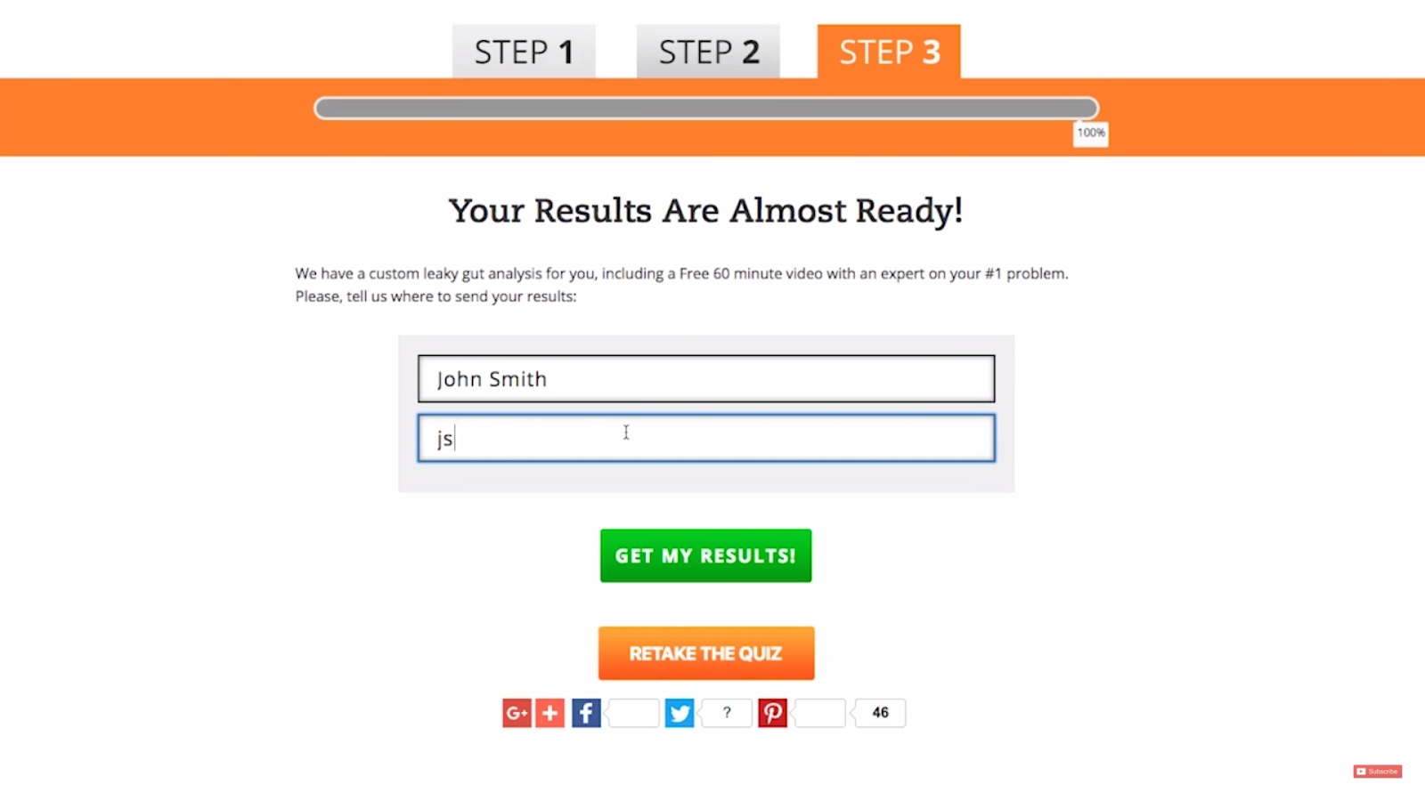
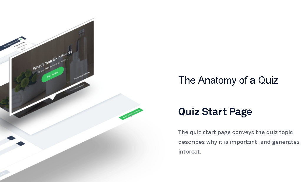
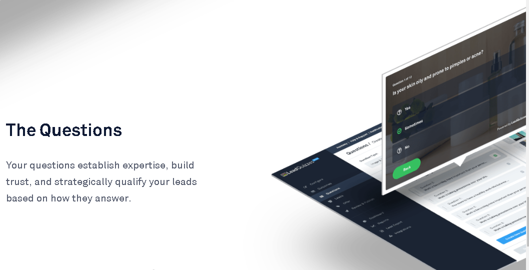
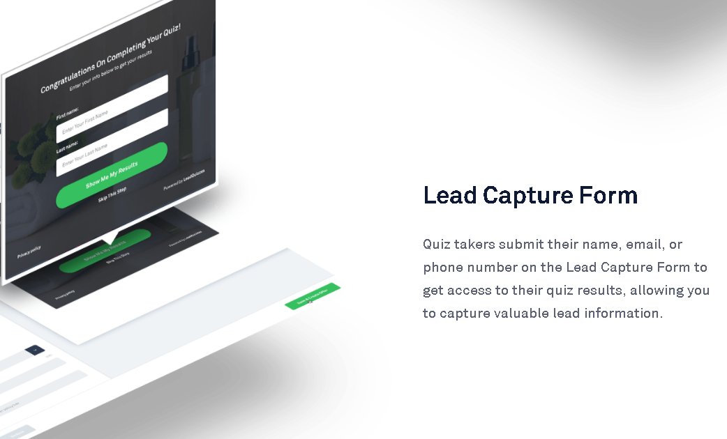
Although this quiz example from LeadQuizzes shows 3 steps, there are actually 4.
I’ll walk you through each so you can optimize them to fit your needs.
Quiz start page – This is the front page, or cover, of your quiz.
The quiz start page has to be short and colorful and convey the right message. It’s what draws people to click and begin.
Start with a simple title like, “How effective are your digital marketing efforts?”
You then have two lines to draw the customer to begin like, “Get personalized results today,” and “Get started.”
The questions – The meat of your quiz is the question-and-answer section.
This is where your visitors are volunteering to give you information about them.
It’s your chance to match an email to very targeted demographic and segmentation questions.
It’s important to really consider the order and phrasing of each question to keep your visitors reading and clicking to the next page.
Meanwhile, you’re qualifying leads automatically.
All you need is to capture their contact information.
Lead capture form – At the end of the questions, you need the lead to identify themselves before they see the results.
If you do it the other way around, you’ll lose them. The results of the quiz are a carrot on a stick.
Ask for a name, email address, phone number, social media profile, and whatever else you’d like.
If they don’t enter the information, you can use a remarketing campaign to bring them back and try again.
Don’t skip the lead capture form or it’ll all have been for nothing.
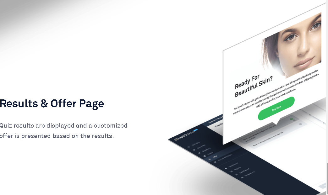
Results and offer page – Now you can display the quiz results your users were salivating for.
This is also the place to make your sale.
Quiz-takers who related to the information and felt impressed by the results are more likely to click through and make a purchase.
As you can see, quizzes are not only raising conversions, but they’re also stacking several into one spot.
That’s why quizzes are always so viral on Facebook.
Quizzes are an integral part of my marketing strategy.
I hope you find ways to leverage them for your benefit too!
Conclusion
So these are a few of my more unorthodox methods to boost online conversions, but they’re not the only ones.
I have a wide variety of tools and tactics available, and I use different ones for different scenarios.
Each website has its own strengths and weaknesses.
There’s no easy fix or universal way to win.
In reality, it’s a combination of all these tools being used repeatedly over time that really creates the most impact.
I didn’t get to where I’m at because I tried all this once and stopped. It’s a continuous process.
What digital marketing tactics have you used to increase your online conversions?


Comments (4)