
You only have seven seconds to grab a visitor’s attention on your website. Seven measly seconds to relay your message, hook your reader, and convince prospects to trust you.
No matter how brilliant the web content, conversion rate optimization (CRO) is tough. A recent Hubspot study reports that only 22% of businesses are satisfied with their conversion rates.
Are you in that happy 22% or in the outside 78% looking in?
Consumer attention spans are short and digital competition is fierce.
We all want to keep our visitors happy and engaged. So how do you keep them from abandoning ship?
Thankfully, there are some proven strategies to keep your web traffic engaged and interested in what you have to say.
I’m going to show you five exit-overlay strategies to convert bored visitors into loyal customers.
But first, you need to understand what constitutes a great (or not-so-great) exit overlay.
Why aren’t your current exit-overlay strategies working?
Over three-quarters of abandoning visitors intend to return to your site to continue the purchasing process, but less than one-third of those visitors actually come back.
That’s a lot of lost conversions and revenue.
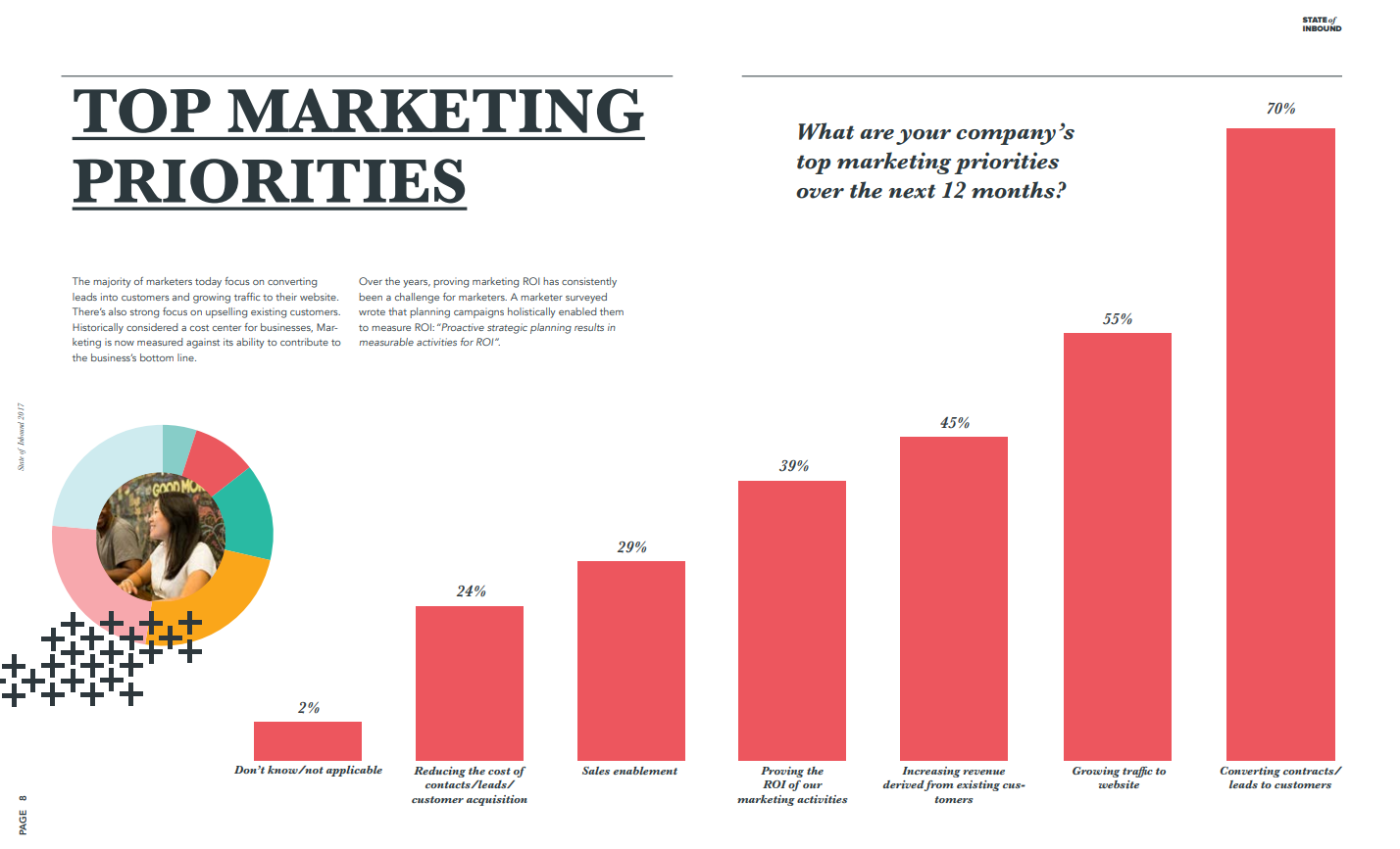
Converting leads to customers continues to be one of the most challenging, yet most crucial goals for marketers, according to this Hubspot survey:
This is where exit overlays come in.
An exit overlay (or exit-intent overlay) is a screen or pop-up designed to win back a reader’s interest before they abandon your website.
They show up in the nick of time — just before your visitor closes your page and you’ve lost them forever. Here is an example:

Done right, they create conversions.
Done wrong, they annoy people.
So what’s the secret sauce to an exit-overlay strategy that pulls people in instead of repelling them?
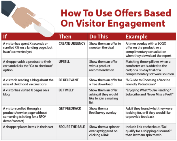
- Know the right exit triggers. When does your user’s scrolling behavior or mouse movement signal the exit overlay to appear?
- Understand your buyer’s journey. Make sure your exit overlays are sophisticated enough to adjust to the right information. Did your visitor spend most of their time looking at pricing? Display a well-timed discount pop-up.
- Use context to provide an authentic experience. New visitors may need an informational pop-up. Returning visitors will know about your brand already, so it’s time to pull out a meatier exit overlay to keep them interested.
- Keep it simple. Don’t try to write a book. The best exit overlays are concise and give the visitor a quick way to “x” out of the pop-up.
Now that we’ve covered the basic building blocks, here are five proven exit overlay strategies you can start building for better conversion rates.
1. Make them an offer they can’t refuse
People love free stuff.
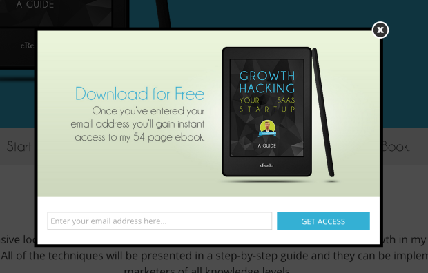
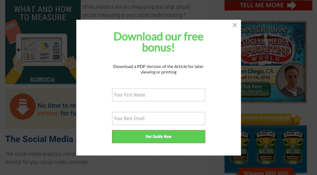
Whether it’s a free e-book, a coupon or the chance to win a prize, your visitor is more likely to stick around if you offer them something to make it worth their while.
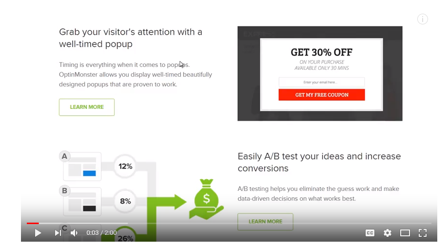
Like this download offer from an OptinMonster client.
Coupon and giveaway exit overlays act in similar ways. One offers a discount and the other offers something for free.
You can also entice visitors with the possibility of winning something through a contest entry or create a discount/coupon/giveaway combination. There is no wrong formula.
Why do these exit overlays work so well?
One of the top reasons visitors leave a website is a simple matter of money. They might not want to pay for shipping or pay full price or pay at all, for that matter.
It’s your job to overcome objections like these and prove your value.
A coupon or giveaway reduces cost objections and doubles as a foot in the door for future interactions.
By providing a piece of free content or a resource your visitor can use immediately (without having to fork over any money), you make it easy for visitors to trust you and return to your website when they are ready to purchase.
Brand loyalty is built one brick at a time. Be patient and trust the process.
Check out this example from Quick Sprout:
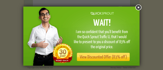
An 83% discount is hard for even the most fiscally-conscious visitor to pass up.
It’s also a low-risk offer for Quick Sprout to make. They not only get revenue from the immediate sale, but they also build goodwill and a higher likelihood of future sales.
Picreel, a CRO software provider, helped one of their customers boost conversions by over 13% by using a coupon exit overlay with a twist:

In addition to a visible call to action, this savvy advertiser added an element of urgency with a “don’t run out of time” counter.
Visitors must act fast, or pay full price. It creates the kind of mental justification that can nudge cost-aware visitors over the conversion line, turning them into customers.
Not an e-commerce site? Giveaway overlays aren’t just for physical products.
If it’s email subscribers you’re after, a giveaway could be just the ticket.
WPBeginner boosted their sign-up list 600% by offering a free WordPress toolkit.
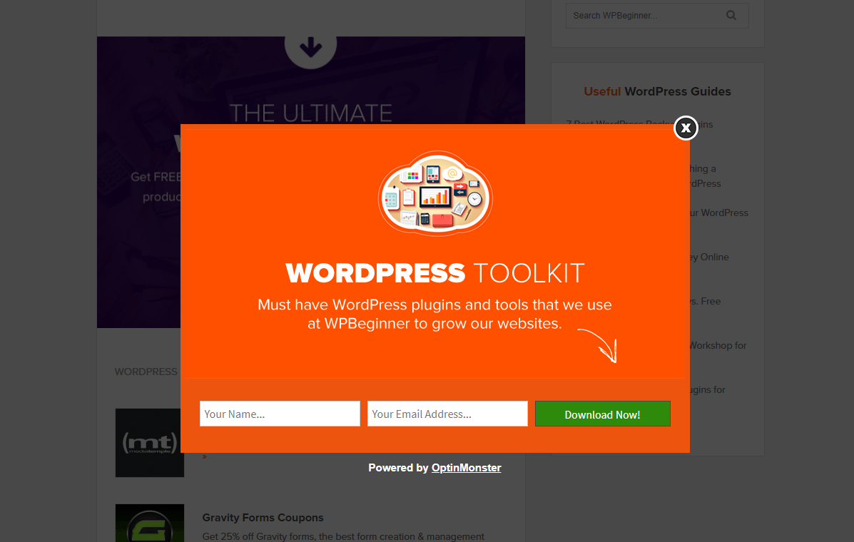
One, polite little exit overlay. One repeatable resource giveaway. 600% more subscribers.
Ready to try it out?
First, you need to find the right exit overlay formula for you.
For example, if you’re interested in building your email list, take this example from Invision:
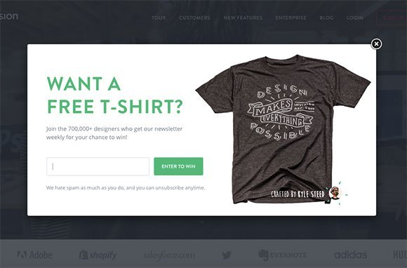
For the price of one t-shirt (which, coincidentally, is free marketing from whoever wears it), they can collect dozens of email addresses for their subscriber list.
That means dozens more potential customers — all for the price of a t-shirt.
Companies like Wishpond can help you build out a simple contest overlay like this one so you can start collecting the email addresses that are slipping through your lead funnel.
2. Create an emotional appeal
Let’s face it. It’s hard to make digital connections.
How do you build relationships with a nameless, faceless reader?
First, you need to gain their trust through an emotional connection.
The easiest way to build that bond is by solving a problem for your web visitors.
If they feel like their needs aren’t being met, the shopping process is too complicated, or they aren’t finding what they need right away, they won’t stick around long.
This is when an emotional exit overlay swoops in like a superhero, solving your visitor’s problem (often before they even know they have it).
Look at this example from online handbag retailer meli melo.
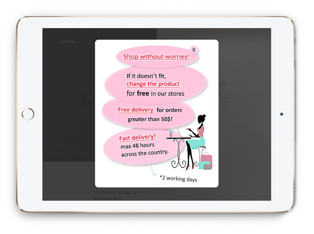
Omniconvert hypothesized that if meli melo gave visitors a reason to trust them, they would see a lift in conversions.
They ran an experimental exit overlay that addressed common concerns about online purchasing.
It worked.
They saw a 67% increase in add-to-cart value after adding an emotional overlay to proactively address common shopper concerns about return fees and shipping costs and times.
Instant credibility.
On the other side of the emotional aisle, don’t be afraid to evoke a few (harmless) negative emotions to influence visitor behavior.
Set the stage by telling visitors you don’t want them to miss out on a great offer.
Create the problem in their mind.
Once FOMO has taken root, make sure you quickly and easily solve their problem with a well-placed emotional exit overlay, like this one from Cloudways.
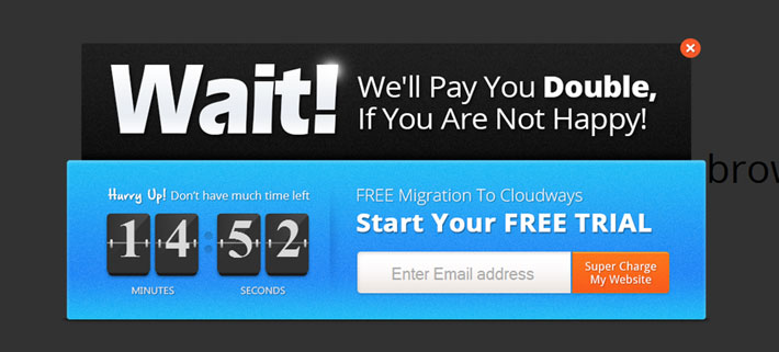
With the addition of a countdown timer and a subtle “Hurry Up,” they create the perceived problem that time is running out.
They not only solve the problem with a clear call-to-action but also add the proverbial icing on the cake in the form of a double-your-money-back guarantee.
It ensures that the end result is happiness and convinces visitors that they are making a choice they can feel good about.
So long, fear and risk. Hello, happiness and blissful satisfaction.
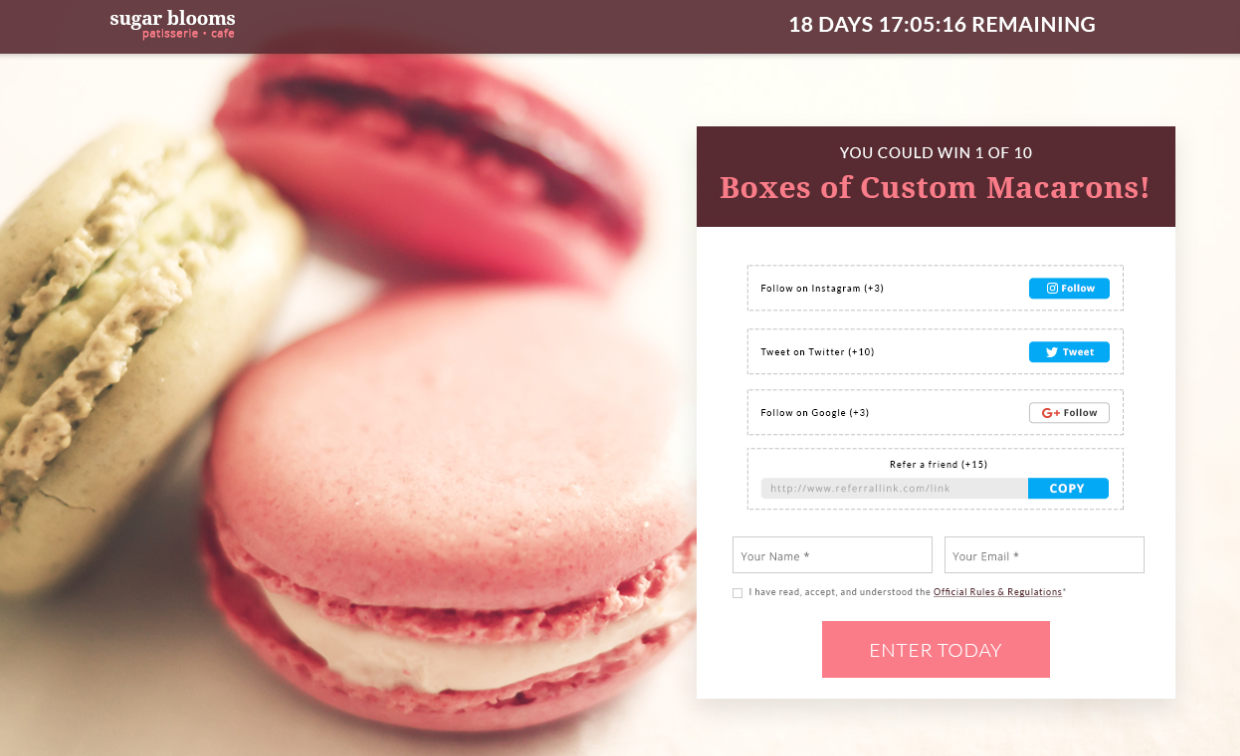
Here’s another example from ConvertFlow of an emotional exit overlay that generated almost 8,000 leads and $50,000 in extra revenue in only two months.
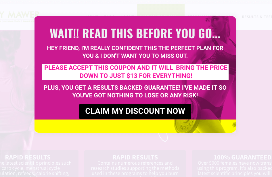
Again, it has all of the right ingredients to create all of the right negative and positive emotions — fear of missing out, the removal of risk, and the assurance of happiness.
Don’t underestimate the power of suggestion when it comes to emotional exit overlay strategies.
To test what emotional pleas lead to the right visitor behaviors, you may need to experiment with several scenarios.
Wall-Street, an online investment publication, enlisted the help of Omniconvert to test two variations of an emotional exit overlay.
In the first, they play on the fear of missing out on crucial information, but they pair it with a buttoned-up, businesslike image:

In the second, they used a more lighthearted image and slightly modified the copy:

While both images won out over the control version, they found that the first variation outperformed the second with an increase in sign-ups of 279%.
What’s the lesson here?
Know your audience.
Investors and financial analysts responded more positively to the “professional” image. Don’t assume you know what your readers want. Assumptions don’t convert.
Test, adjust and test again.
3. State the obvious
Nearly 70% of shopping carts are abandoned, but it isn’t a hopeless inevitability.
Nothing is worse than a visitor spending a ton of time on your website, adding items to their cart…and then vanishing without a trace.
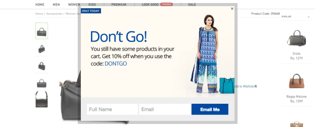
Try a notification overlay to gently tap your visitor on the shoulder and remind them of the obvious.
“Did you mean to leave this in your cart?”
“Did you forget to check out?”
“We don’t want you to miss out!”
Framed as a polite nudge or question (and often coupled with an incentive), these reminders can create the extra opportunity it takes to hook your visitor back in to complete the transaction.
Notification overlays are the shiny, helpful objects that catch your visitor’s eye:
63% of potentially lost revenue from abandoned carts is recoverable. It’s yours for the taking.
Take it before someone else does.
Look at this notification overlay from one of Picreel’s e-commerce customers.
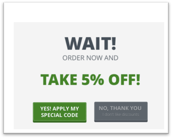
One simple screen with a modest discount, well-placed negative emotion, and one simple click, caused 64% of shoppers clicked on this overlay and converted instead of abandoning their cart.
That’s a lot of recovered revenue.
Convinced?
Companies like Picreel, will walk you through an audit of your existing strategy, help you define your business objectives, and tell you how to get there.
Still unsure if exit overlays will work for you?
Here are some notification overlay tips you can try right now:
- Change up your CTA buttons. Are they too subtle? The wrong colors? Make them pop.
- Experiment with wording. If “there is something in your cart” isn’t getting the results you want, try something bolder. Add an incentive. Throw in some humor. See what resonates with your audience.
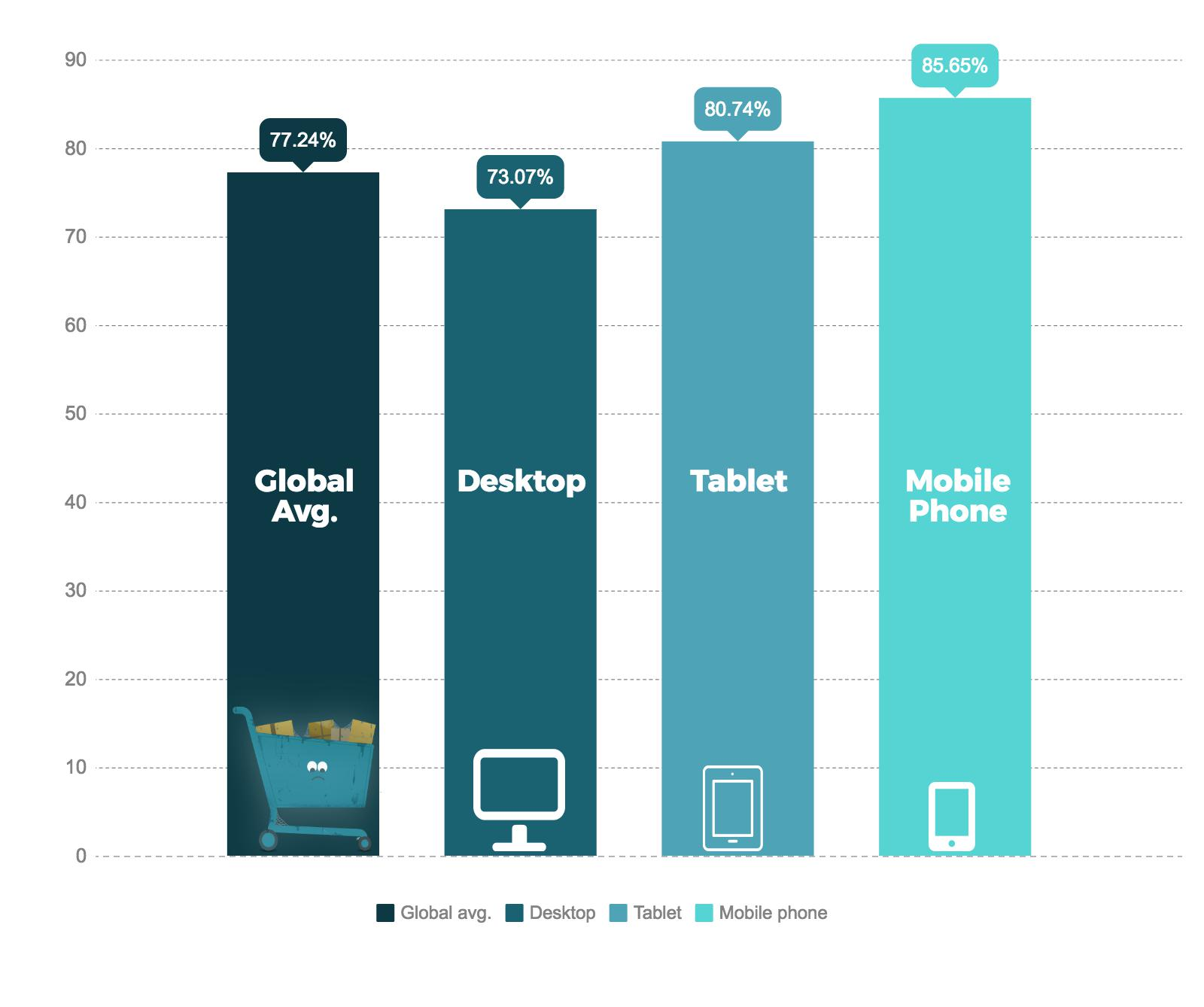
- Don’t forget about mobile. Make sure your notification overlay works on small screens too. Keep in mind that you can’t rely on mouse movements for mobile overlays, so you’ll need to consider other actions like browser switches and “back” arrows. Abandonment rates can reach over 85% on mobile platforms.
A good rule of thumb?
Browse your website with the eyes of a consumer. Look for tripwires in your exit overlays and remember that whatever doesn’t run smoothly on a desktop will only further annoy visitors using mobile devices.
Be the consummate well-oiled machine on every platform.
4. Know that timing is everything
Understanding when to add an element of time to your exit-intent offer is key, but it’s only half the battle.
We’ve already talked about incorporating a countdown timer or a “don’t let time run out” layer to your exit overlay.
But have you considered the best time for your overlays to appear — regardless of their type?
Well-timed overlays can keep visitors from abandoning your site, but the psychology behind it requires a little bit of research.
Too early and visitors will get annoyed and leave.
On the other hand, if you bring in your overlay too late, visitors will feel lost and ignored.
So how do you strike a balance?
Experiment with time delays.
How do conversion rates respond to a ten-second delay? 15 seconds?
At what point do they start to drop off? Do some testing to get it right.
Rather than designing a “one-time-fits-all” overlay, take the time to understand user behavior.
Are they actually signaling exit intent with their mouse movements, or simply looking for more content in your navigation bar?
At what point do you really lose them?
If it’s immediately after your exit-intent form pops up, you’re a bit early to the party. Adjust your timing and test again.
Please don’t make users fight off your exit intent like an annoying fly when all they really want to do is browse your content at their leisure.
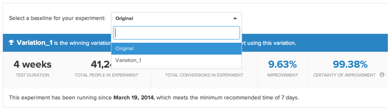
It isn’t an exact science, but it’s worth the time and effort to take advantage of the wide variety of A/B testing tools available.
Like this one from Kissmetrics:
5. Don’t be afraid to cross-sell
Exit overlays are a handy little vehicle for cross-selling and upselling.
Why?
If you’ve already done the right research on trigger actions and user behaviors, you’ll have a good sense of what your visitors are looking for and what they’ll look for next.
Save them a step and bring it to them.
An exit overlay is a perfect opportunity to present additional information, discounts or products that will provide more value to your visitor and create another potential conversion for you.
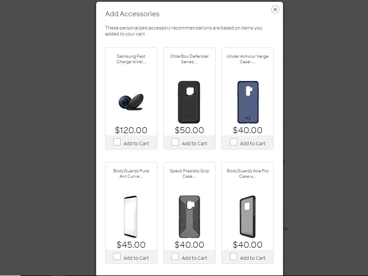
Look at this example from another OptinMonster client:
Cross-selling and upselling are responsible for up to one-third of e-commerce revenue, yet many sites neglect to proactively place opportunities to capture more of that revenue.
Not sure how to go about it?
Here’s a simple example:
Let’s pretend you sell smartphones.
Your customer browses, compares products, selects a smartphone and adds it to their cart.
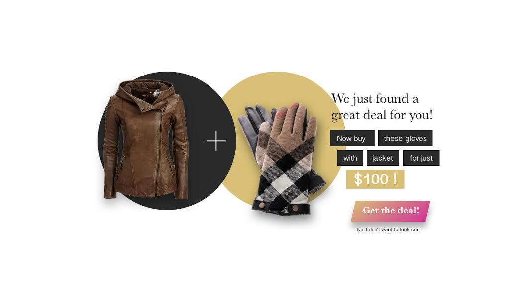
Before they click out of the shopping screen and into the checkout screen, (where you may or may not see them again after the sale), you add a simple exit overlay and remind them to purchase a case to protect that shiny new phone.
Something like this pop-up from AT&T, for example:
Still with me?
You’ve not only upsold the customer, but you’ve proactively suggested a solution for a problem they didn’t even realize they had (leaving their brand new smartphone unprotected).
You brought the answer to them before they even asked the question.
That’s just one example, but it’s an easily repeatable process no matter what products or services you offer.
And if your visitor starts to leave the page without making a purchase, it’s the perfect time to show an exit overlay with the product they were looking at, matched with a complementary product.
Throw in a discount, like this e-commerce site did, and you’ll likely save the original sale and upsell it to boot.
Get the gist?
The possibilities are virtually endless if you understand the customer journey for your website and use it to your advantage with a smart exit overlay or two.
Conclusion
Consumers are flooded with choices, and it feels impossible sometimes to keep their attention.
With online conversion rates hovering around 1-2%, you simply must find new ways to collect information and to keep engaging with your audience until they eventually buy from you.
It’s a marathon, not a sprint.
Many people who find your website by “accident” have never heard of you and have no reason to purchase from you or subscribe to your newsletter.
All is not lost, however.
While it’s true that businesses have to work harder than ever to keep web traffic engaged, there are plenty of tools available to customize a strategy that drives positive ROI.
No matter what type of overlay you use, remember to create a strong call-to-action, offer something of value, and don’t leave timing to chance.
So if you want to stop wasting valuable web traffic and letting conversions slip through your fingers, start experimenting with exit overlays.
What exit-overlay strategies have you used to boost conversion rates?
Comments (18)