
Calls to action are the number one way to drive conversions on a given page.
Without them, your traffic has no clue what you want them to do.
If you don’t ask them to sign up for a newsletter or download an e-book, they won’t do it.
But the problem with CTAs is that many of them don’t work.
The typical “Download” button isn’t working anymore.
Users are getting fed up with boring, standard, non-personalized calls to actions that don’t compel them to click.
If the value proposition isn’t on point, they won’t convert.
And if the placement of your CTA is bad, they’ll simply get frustrated.
Nobody likes being berated with popups the first moment they land on a site.
They don’t even know you yet, and you might be asking them to buy something with a coupon.
But you need CTAs if you want to succeed in online marketing.
You can’t drive sales without them.
Thankfully, there are still some calls to action that work well.
A few specific CTA variations will still drive big conversions for your business.
In this article, I’ll give you 3 examples of the best CTAs and tell you how to implement them in your own content.
1. No-risk CTAs
One of the best ways to drive interest in your product or service is by offering no risk, free trials.
Think about it:
When you land on a website for the first time, are you ready to convert? Probably not.
In fact, it’s no secret that the vast majority of your website traffic won’t convert on the first visit.
Just look at the typical buyer’s journey according to HubSpot:
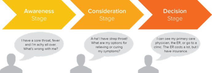
Most people will take multiple steps before even moving to the consideration stage.
People generally need to figure out their problem and test products before making a final decision.
Conversions just don’t happen instantly for most products.
The reality is:
People don’t need your tool. And they don’t want to pay for it.
So it’s your job to flip the script and convince them why they need it.
Free trials do exactly that.
Your free trial should blow the user out of the water and make them realize that they’re in deep trouble without your tool. They need your tool to function properly.
Make them realize that with your tool, they’re quicker, more efficient, more productive, and have an awesome final product.
Which means they’d be slower, less efficient, less productive, and have a worse final product.
Make them understand that and the user will have to buy it.
For example, check out this CTA on a Facebook Ad that I saw from the popular CRM software Pipedrive:
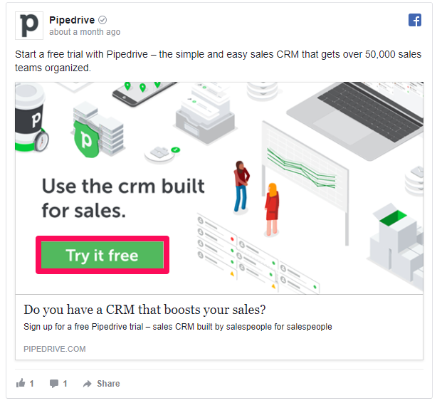
Instead of begging me to convert without me ever even experiencing the product, they asked me to use a free trial.
Free trials work when you have a product that is second to none.
If you can effectively solve a user’s problem or increase their efficiency with a free trial, you can expect huge conversions to full services.
People love to experience things before they buy.
Think about the last time you went to the supermarket. You probably ate a few free samples.
That’s the same idea as a free trial. You test it before you buy it, only to realize you need it.
One of my favorite CTAs with a risk-free trial comes from Textedly. Here’s the top of their homepage:
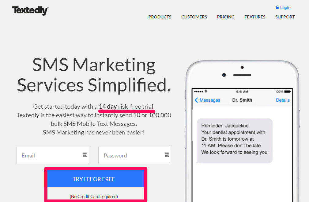
Did you notice how they emphasize “risk-free” and “No Credit Card required”?
This emphasis is crucial if you want to get more sign-ups for your trial offerings.
Credit cards will drive sales away fast. People know that they’ll forget to cancel if they don’t like it.
It’s a higher risk factor for people to give credit card information and potentially pay for something they aren’t familiar with yet.
Another great example comes from CoSchedule, a popular marketing calendar tool:
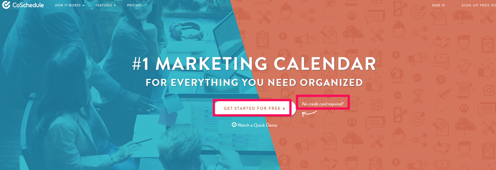
They allow anyone to use their product for a free test run without asking them to give credit card information.
This approach generates far more conversions on initial sign-ups than CTAs that demand higher risk. Totango even found that it can increase conversions from 2% to 10%.
Offering a free trial is a must if you sell SaaS-based products.
Almost every company is doing it.
But what do you do after they sign up for a free trial?
You need to get them to convert and purchase your product.
One of the biggest mistakes I see at this point is failing to call for a sales conversion.
People offer a free trial, but they see few conversions because they lack good CTAs and value propositions.
So how do you do it?
When I want to use great CTAs within my free trials, I turn to Appcues.
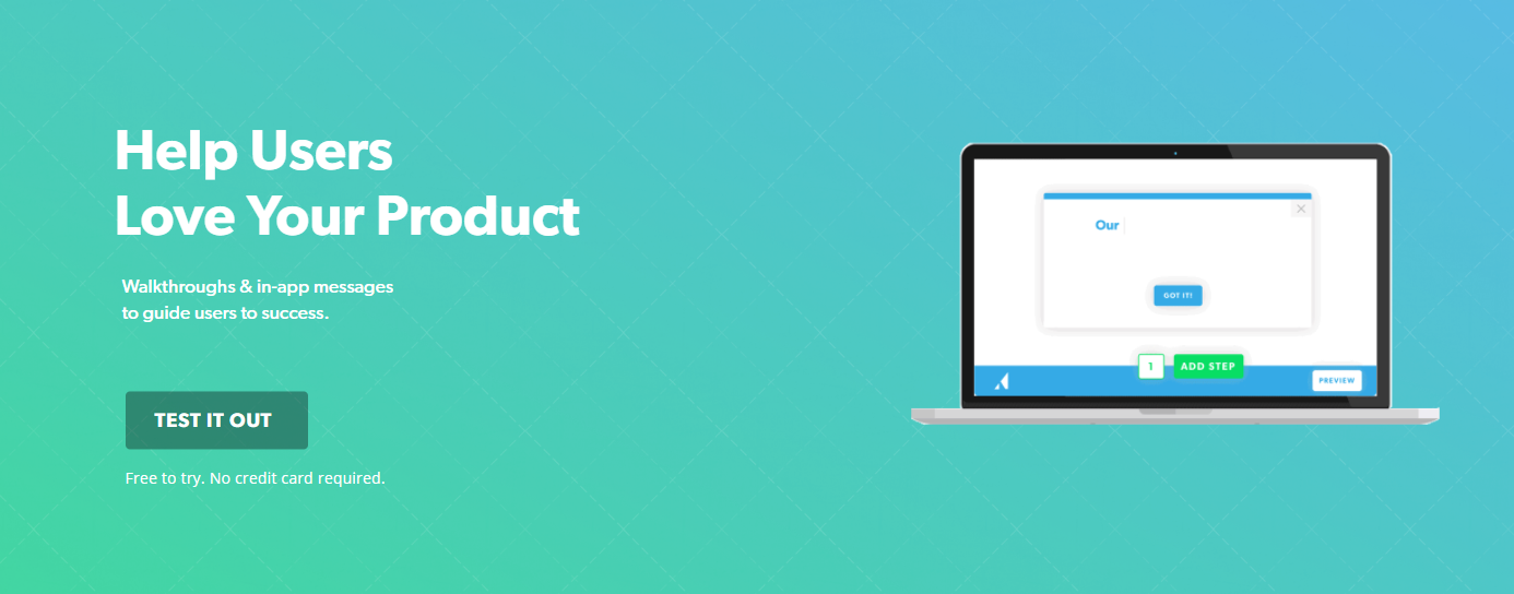
Look at that CTA: A free trial with no credit card required!
To get started, click, “Test It Out” and create a free account.
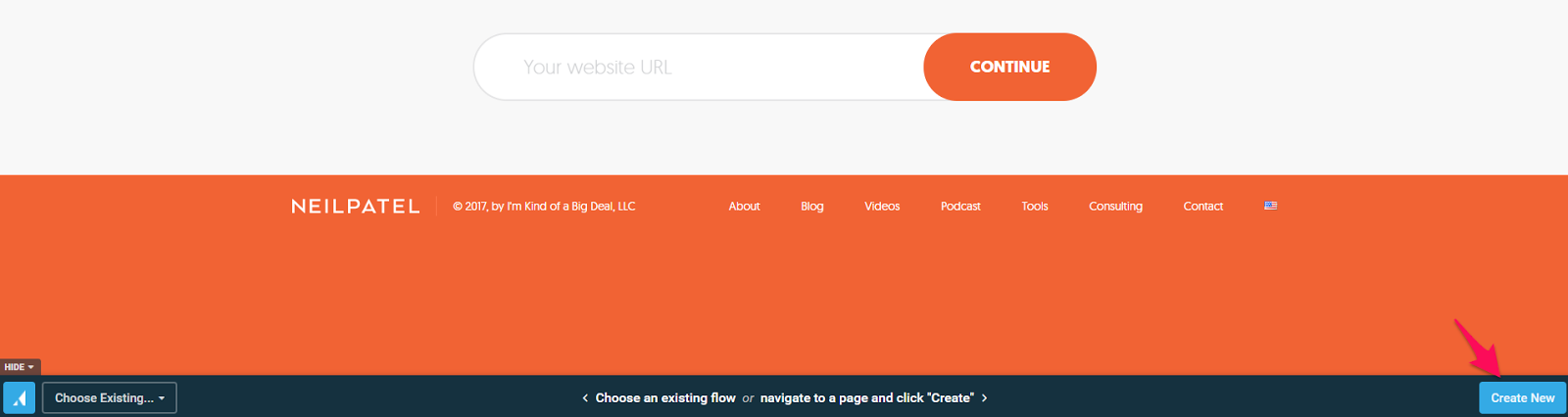
Once you’re on your dashboard, click “Create” in the flows section:

One of the coolest aspects of this SaaS tool is that it lets you test it directly on your site:
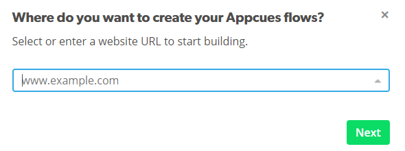
Type in your URL to get started.
Next, add the Google Chrome extension:
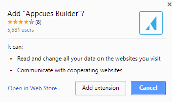
Then, navigate to your homepage and activate the Chrome plugin.
A small bar at the bottom of your site will pop up. This is where you can begin creating a new flow:
You can choose a template, or work from scratch with a blank canvas:
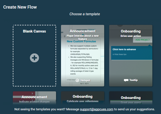
I like to start with a blank canvas so I can quickly customize it to my liking:
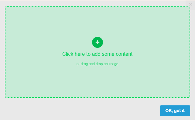
Simply add new content by clicking on the “+” button or dropping in images.
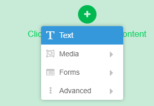
You can add things like text, media, or even advanced content like HTML and buttons.
Here’s what my final, free, trial-based conversion CTA looks like after just a few minutes of work:
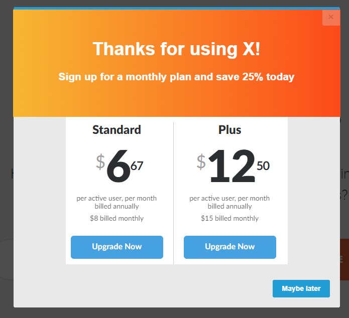
How awesome is that?
That literally took me 2 minutes to create.
Appcues is an incredible tool that can help you drive tons of conversions on your free-trial offerings.
Convert users to a free trial with no-risk CTAs, and then close the final sale with a beautifully-designed and optimized CTA.
2. Persistent header CTA
Persistent header CTAs are one of my favorite tools to drive more sign-ups and conversions.
If you’re not familiar with them, here’s an example of how I use them on my blog to capture emails and drive conversions:

These header CTAs can remain static, or they can pop into the frame after a specified time or on specific pages and posts.
These options allow you to customize which CTAs you offer to individual users based on browsing habits and page-focused offers.
I also use these persistent header-style CTAs on Crazy Egg:

Persistent headers are great because you can always have your CTA on display in a format that’s unique.
Instead of a typical end-of-post, static call to action, you can have one that sticks to the top of your page.
Think about it this way:
When you finish reading a blog post, you tend to scroll back to the top of the page to see more content.
If your CTA is stagnant at the bottom of the page, your reader might scroll away before they even see it.
But with a persistent header, the CTA will remain visible and relevant no matter where they are on the page.
A user doesn’t have to be at the bottom to convert anymore.
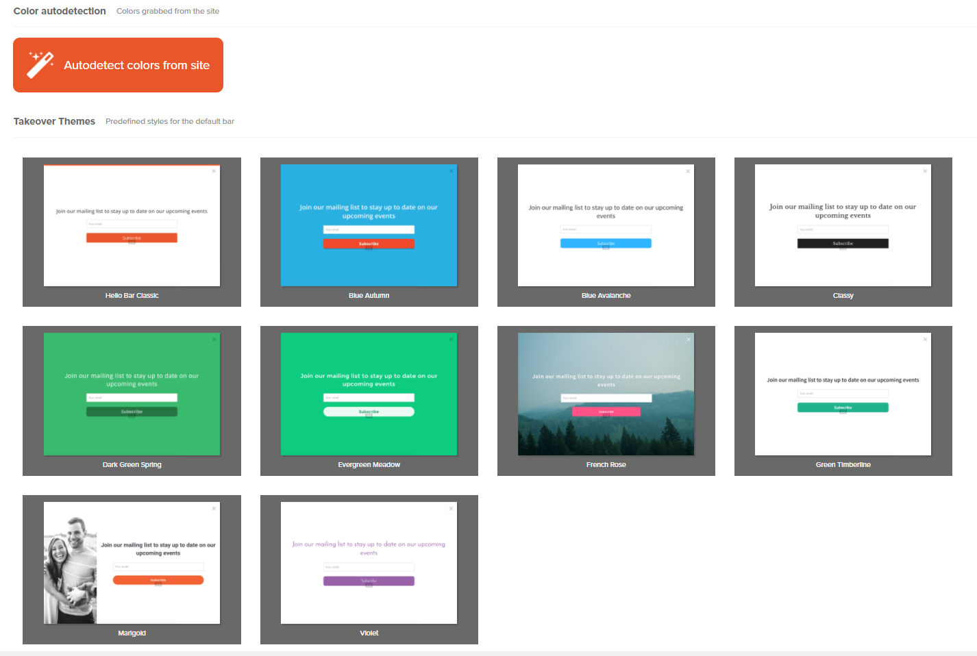
If you’re looking to add a persistent header CTA, one of the best tools is Hello Bar.
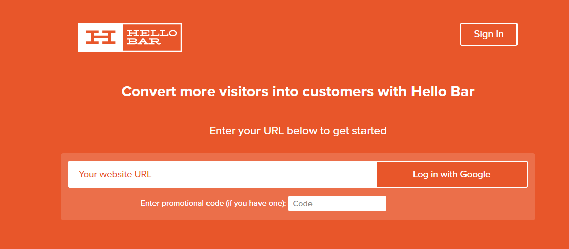
Hello Bar is a free tool that allows you to add compelling CTAs to the top of your page.
To get started, type in your website URL and log in with a Google-based account.
Once you’ve created your account, you can place your Hello Bar script on your site in a few ways:
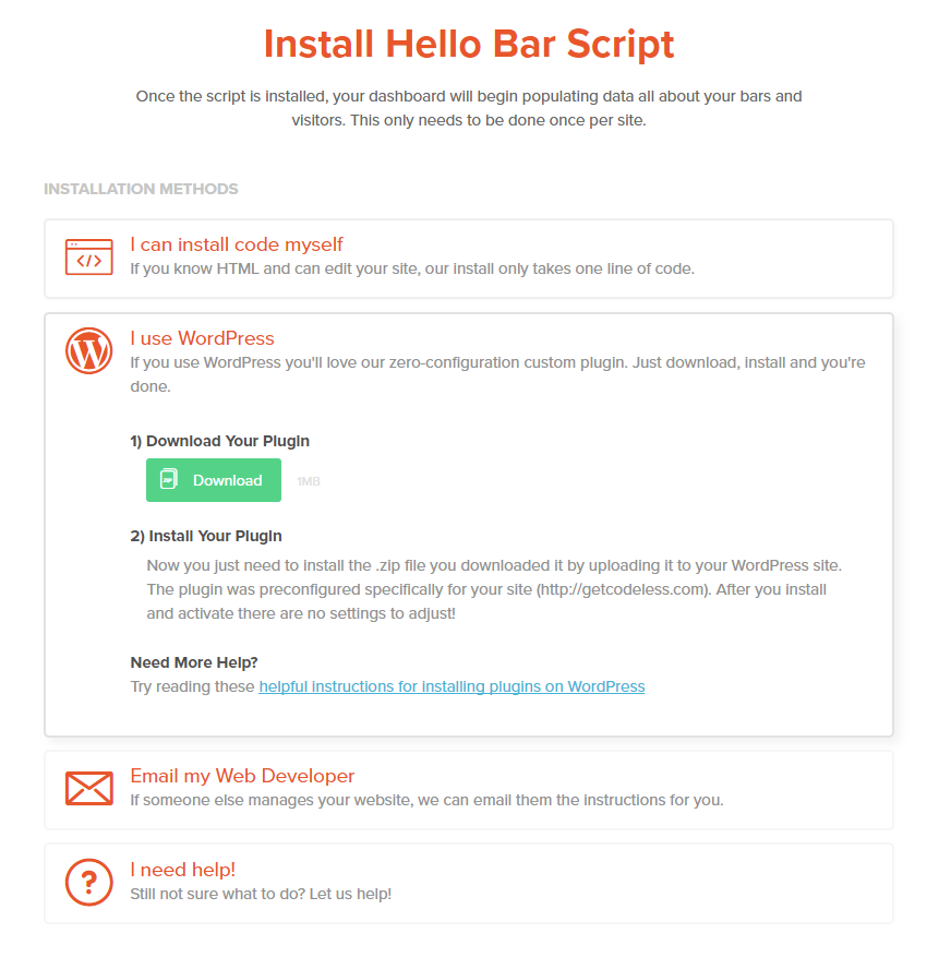
If you have WordPress, you can download and install a plugin. If you don’t, you can easily install the code yourself.
If you aren’t sure how to work with HTML, just email your web developer.
And lastly, if you don’t have a web developer, you can always click the “I need help!” option to get detailed instructions.
Once you’ve installed your code, it’s time to build your CTA.
On the left-hand sidebar, click the “Create New” button:

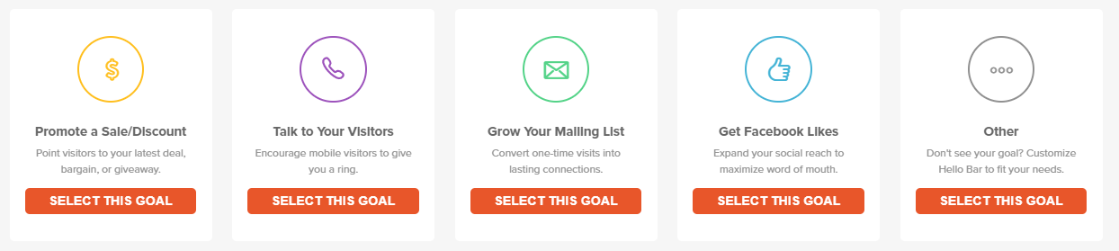
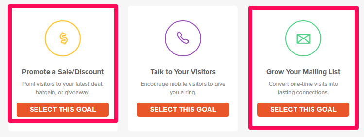
Next, you need to choose an option based on your goals.
If you want to collect leads, then you’ll want to select the mailing list option. If you have different goals in mind, you can create a custom goal.
Once you select a goal, you’ll want to customize the messaging and branding.
Always strive for a compelling offer that jumps out at users.
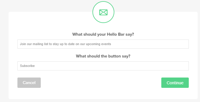
Start by giving a compelling statement or headline in the first box.
Tell users what they can expect by clicking on this CTA.
Will they get a lead magnet, like an e-book or a checklist? Will they receive an informative and interesting newsletter in their inbox every month?
Next, be sure to make your button copy stand out.
Personalize it by saying something like, “Sign me up” or, “Give me the e-book” rather than, “Download” or, “Subscribe.”
Next, you can customize the size of the bar and when it gets displayed:
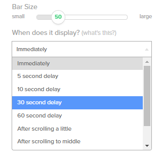
For example, you can choose to trigger it by scrolling. Or, if you want to trigger it with a time delay, you can do that too.
This flexibility allows you to customize the CTA for tons of different actions.
For example, you could set up a CTA that delivers in 5 seconds to get people to sign up for a simple offer.
Then, after the visitor scrolls to the middle of the page, you could set up another CTA to ask them to download an e-book.
The options are limitless.
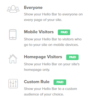
With Hello Bar, you can also implement diverse targeting options for various scenarios and devices:
Hello Bar is a great way to effectively promote your new content or newsletters.
It’s one of the better CTAs that actually works.
3. Exit-intent popups
Exit-intent popups can be used to capture leads that are about to slip through the cracks.
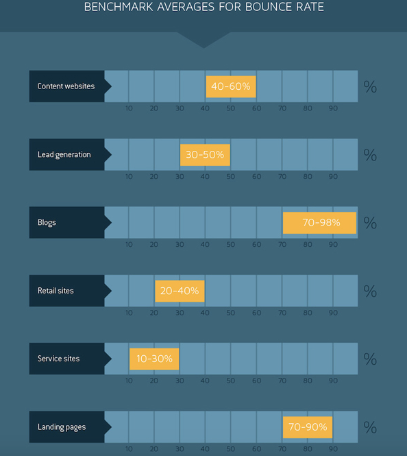
Blog traffic has a higher bounce rate than most traffic.
It’s no secret that most people who find your blog content organically have never heard of you.
They are likely seeing you for the first time, meaning that it’s actually common to have a decently high bounce rate.
So what do you do? How do you capture these people as leads before they bounce?
Well, sometimes they simply won’t respond to a typical end-of-post CTA.
Those don’t work all that well.
But one type of CTA, known as exit intent, works extremely well.
Check out this exit-intent CTA from Backlinko:

It does a great job of compelling me to convert at the last second.
Exit-intent popups are triggered when someone is about to click off your page.
For example, when someone is reading and decides to leave, the popup will be triggered when their mouse cursor goes towards the X button on their browser.
Then a popup like the one above will appear and try to convert them at the last second.
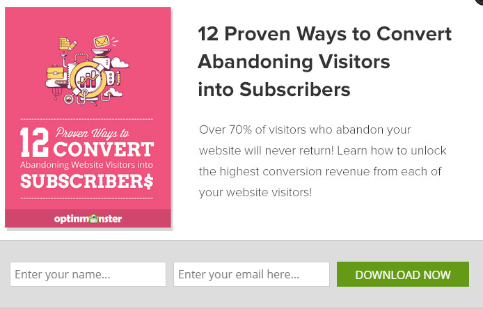
Here’s another great example from OptinMonster:
An exit-intent popup is a great feature that can help you save those lost conversions.
After all, it can’t hurt to show a simple popup-based CTA to someone who is about to leave.
The worst thing they could do is leave, which they were already doing anyway!
Tons of businesses are starting to use exit-intent popups to drive more conversions.
Here’s an example from Post Planner:
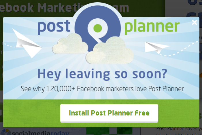
According to a 2016 study, exit-intent popups capture 35% of people who are about to leave.
That’s a huge amount of visitors regained who would have otherwise been gone for good.
If you want to get started using exit-intent popups today, you can easily add them to your site using Hello Bar again.
This time, create a new element based off of either a mailing list submission or discount promotion:
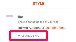
The key to making an exit-intent popup with Hello Bar is changing the style.
At the top of your customization panel, click “Change Type”:
Here you can select from a few different options:
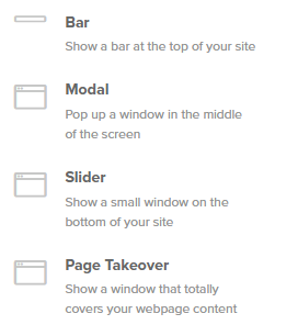
Personally, I have found that “Page Takeover” converts better when it comes to exit intent.
From here, you can select a few templates or match the colors directly to your site’s branding:
To finalize the CTA, make sure you select when the popup appears. Choose when the, “User intends to leave”:
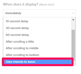
This option will create a proper exit-intent popup that shows when the user is about to leave your site.
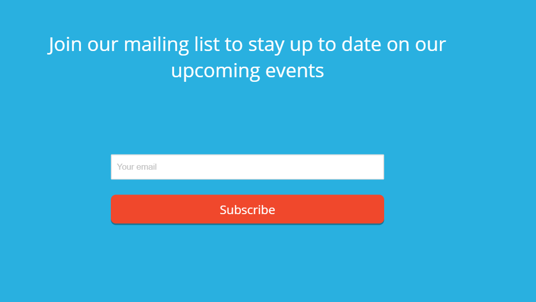
Here’s an example of what an exit-intent popup might look like on your site:
You can also customize the popup by adding images or video.
Finally, install the code (as we reviewed earlier), and you can start converting visitors that are bouncing from your site.
Exit-intent popups are very effective when it comes to converting users.
The CTA works because it grabs the user’s attention and offers a great value for little-to-no hassle or exchange of information.
Use it today if you want to start capturing more leads.
Conclusion
Utilizing a call to action is the number one way to drive conversions on your website.
Content marketing is useless without CTAs to capture leads that will hopefully convert in the end.
If you don’t compel a user to convert, they become wasted traffic. And wasted traffic can cause your business to suffer.
But the problem with most CTAs is that they are too intrusive, too boring, or simply don’t work.
Users don’t want to be forced to see a CTA the moment they land on your site for the first time.
No one wants to visit a new website and immediately get attacked by a huge call to action that takes up the entire page.
That approach won’t convert someone who visits your site for the first time.
So what do you do when most CTAs aren’t working?
You need to follow in the footsteps of the top companies in your space to see what is working.
Start by adding a no risk, free-trial CTA to your site. Free trials are one of the best ways to get new leads and users on your platform fast.
Make sure to deliver a great call to action at the end of their free trial (or in the middle) to drive better conversions to a paid plan.
Next, implement a persistent header CTA to capture tons of emails with content marketing.
Lastly, take advantage of exit-intent popups. They convert at high rates and serve as a last-ditch effort to save customers before they leave your site.
These popups could be the crucial factor that determines whether a lead converts or leaves for good.
And these CTAs are some of the best to actually convert visitors.
Implement them today to start seeing a massive increase in leads.
What are your favorite CTAs that drive higher conversion rates?
Comments (2)