Do you want increased conversions?
That’s a trick question. I know you do.
Okay, serious question. On a scale of 1 to 10, how strong are your calls to action?
If the answer is anything under 10, listen up.
The call to action (CTA) can be seen as the bridge between marketing and sales.
Everything that you’ve done, all the branding and engagement, was so that people would eventually go from potential customer to paying customer.
Businesses use the CTA as a tool to guide the consumer into the sales funnel.
Simple enough, right?
There’s just one minor issue. A flimsy CTA can compromise everything that you worked so hard to achieve with your marketing efforts.
With so much riding on them, it can be challenging to decide exactly what kind of CTA you should use.
But don’t worry, I’ve got you covered.
I happen to know a thing or two about CTAs.
Of course, there are plenty of great CTA examples out there right now that you can learn from.
That’s why today, we’re going to go down the list of some of my favorite CTAs and break down exactly why they work so well.
But first, let’s go over some of the basic best practices you need to know to develop the best CTAs for your business.
The basics of effective CTAs
The interesting thing about CTAs is that everyone seems to have their own style and approach to them.
If you asked 10 marketing experts what the most important component of a successful CTA was, you’d get 10 different answers.
That being said, this article is going to make a lot more sense if we’re all on the same page.
So in the spirit of keeping things simple, I’m going to describe what I’ve consistently seen in the most effective CTAs being used today.
But before we can understand what practices lead to increased conversions, we first need to understand what the CTA does for the consumer.
All of your marketing efforts have revolved around one core concept: Providing value, either through education or entertainment.
CTAs that don’t work are CTAs that abandon that concept.
Remember that going for the sale doesn’t mean you have to throw away all the good will you’ve earned throughout your marketing campaign.
Your marketing efforts worked because you offered value. So, what’s the easiest way to guarantee that your CTA will work?
Keep offering value.
The more straightforward your point, the better.
You’ve already identified the needs of your audience. As long as your CTA is tailored to those needs, you’ll be on the right path.
If your CTA comes off as self-serving or simply doesn’t meet your core audience’s needs, it won’t resonate with them.
Simple as that.
When it comes to the actual practices that pop up consistently in effective CTAs, there are typically three.
- Appeal to the consumer’s needs.
- Make your CTA easy to find.
- Guide the consumer to the next stage.
As long as those three criteria are met, your CTA has an increased chance of being successful and driving conversions.
Appeal to the consumer’s needs
The average consumer isn’t some unsolvable riddle waiting to be solved.
They’re regular people, like you and me.
Which means that, like most people, before they consider actually spending money on a product or service, they need to be sure that their needs will be met.
“What value does this product/service bring me?” Before a consumer makes their decision, that question needs to be answered.
I’m constantly showing you guys the kind of value I bring to the table.
Part of this means determining not only what your users want, but also finding out what they want to avoid.
Handling objections is just part of the sales game. And if you want to increase conversions, you’ll need to address any potential issues and satisfy consumers in the process.
Make your CTA easy to find
When it comes to a implementing a CTA, you’re constantly trying to strike a balance.
You don’t want to overload users with CTAs to the point that they stop taking them seriously.
But the other side of that coin isn’t great either.
You can’t increase conversions with a CTA if no one can see it!
CTAs need to stand out, one way or another.
I’ve discovered that sound can increase conversions when paired with CTAs. It’s a little-used trick to draw the consumer’s attention.
Of course, other strategies work just as well.
Some of you may choose to create a CTA that matches the color scheme you’ve created, which helps visually confirm that the CTA button is directly associated with your brand.

Others may go down the route of choosing a color that provides a stark contrast and stands out, in the hopes that consumers will notice the button immediately.
Both of these options work because they rely on the principle of being easily identifiable.
Having a landing page with a washed-out white CTA button on a white background isn’t going to help increase conversions very much, is it?
Speaking of backgrounds, make sure that you’re presenting your CTA in the best possible light possible.
Backgrounds don’t have to be fancy. But they do have to work.
Your choice in visuals should match the overall aesthetic of your brand.
Guide the consumer to the next stage
Remember what I said earlier about CTAs being the bridge between marketing and sales?
Well, you can’t expect people to cross that bridge unless they’re sure what’s on the other side.
CTAs should be specific and action-driven.
Don’t just tell people to “Download” or “Check this out”.
Instead, your CTAs should say things like “Download my marketing blueprint” or “sign-up for 3 free months.”

The consumer should be able to decide whether or not they’re interested just by looking at your button.
As for the details of the design and how you should implement these concepts, let’s take a look at the examples below to understand what exactly drives conversions.
1. Uber
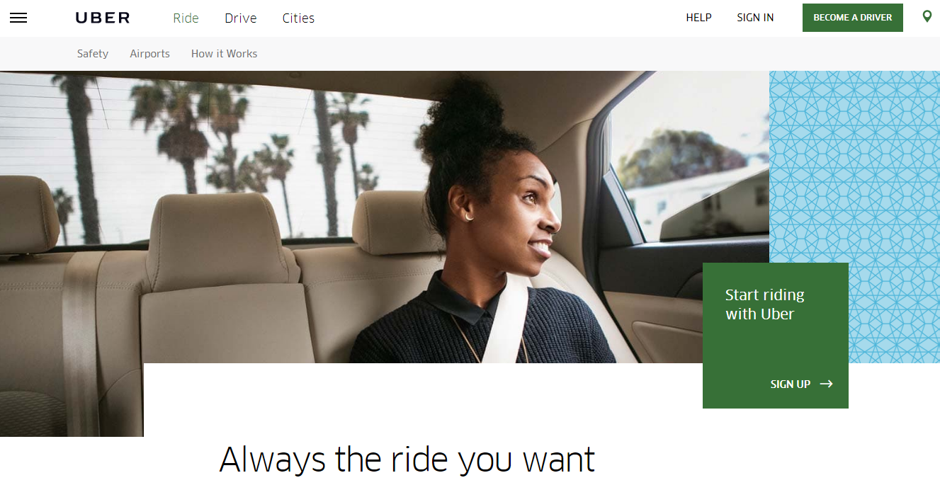
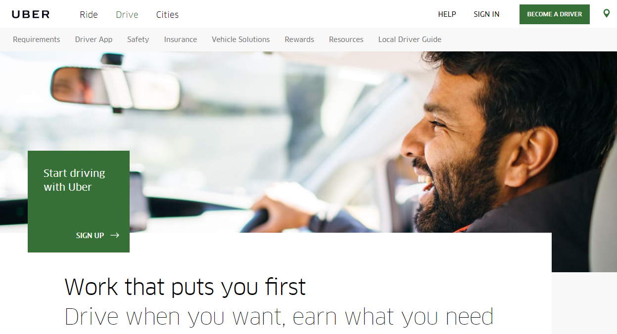
Uber is an interesting place to start because of how expansive their CTA effort has to be.
Keep in mind that, unlike most of the CTAs on this list, Uber offers two separate services and has two separate sign-up pages.
Not only does Uber have to appeal to the people who are considering signing up to use their service, but they also have to draw in potential drivers too!
Seems like it’d be a difficult thing to pull off.
But take one look at their website and you’ll see that they’ve made it look easy.
Essentially, you’re presented with two options.
From left to right, the tabs say “Ride” and “Drive.”

No matter which you pick, you’re presented with a large image in the background of the website that shows one aspect of the Uber experience.
What’s really impressive is that they decided to incorporate the needs of all their users so effortlessly.
If you’re looking to be a rider, the process is straightforward enough.
If you’re interested in being a driver, you can easily figure out where to go and get there quickly.
There are unique CTAs for each user, but they’re the exact same size and shade of green.
Why? Because both are considered to be equally important.
The CTA designed for potential riders is in the form of a green box on the right side of the screen. It says, “Start riding with Uber.”
The CTA for drivers is similar, with a CTA button on the left side of the screen that says, “Start driving with Uber.”

The visuals are certainly compelling. The CTAs are clearly labeled. And the next steps couldn’t be more clearly defined. As far as I’m concerned, the needs of the audience are definitely being addressed.
2. Pinterest
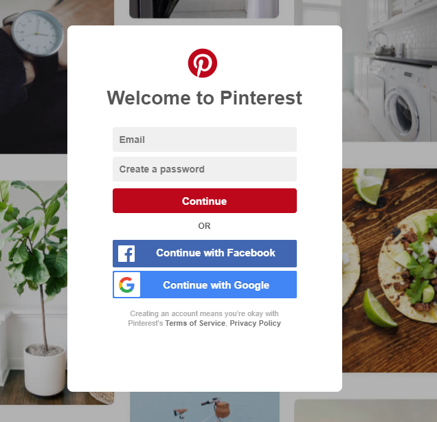
On the surface, it might look like Pinterest wants to give you as many options as possible to sign up and doesn’t care which you chose.
When you get to their signup page, you’ll see options to sign up with either an email or your Facebook account.
But take a closer look. If you do, you’ll realize that Pinterest clearly wants you to sign up with your Facebook account.
How can you tell? First, consider the aesthetics. The blue Facebook CTA is significantly more vibrant and designed to grab my attention, especially with the branded color and logo present.
The email signup may be above it, but it’s been left in a bland white. Not quite as appealing, right?
And that’s no surprise, honestly. For starters, signing up with your Facebook is typically a 2-click process. Click on the CTA and then confirm to Facebook that you’re okay with all this.
That’s how signing up with Facebook helps you. Signing up with Facebook helps Pinterest HQ by giving them access to your Facebook’s API data.
Armed with that information, they can further tailor your experience to match your preferences, increasing the chances that you’ll have a positive experience.
The next step is clearly defined, the CTA is anything but hidden, there’s a clearly defined next step, and they’ve appealed to people’s need to simplify the signup process.
My favorite detail is the subtle CTA for people who already have Pinterest accounts to sign in on the top right. Never alienate any member of your user base!
3. WordStream
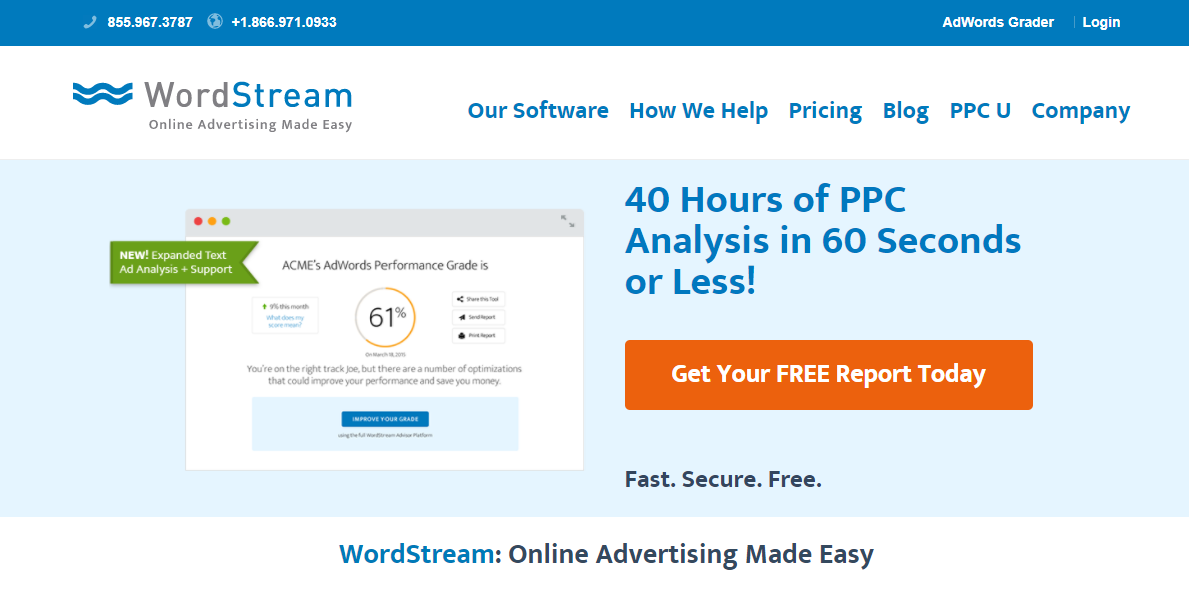
What makes WordStream such a great example is the fact that they do an amazing job of using contrasting colors to make their CTA stand out.
Once you’ve decided on a color palette, anything that could potentially disturb that is seen as a risk.
Instead of trying to find the right shade of blue to use, they decided to go in the opposite direction and opt for a contrasting color.
The effectiveness of their CTA goes beyond that, though.
They appeal to the needs of their audience by saying twice that their product is free, which is enough to make anyone give it a try.
WordStream goes on to present their own product at work on this page, showcasing how intuitive and user-friendly it is.
Compelling visuals, a clearly defined next step, a bold CTA, and appealing to customers’ needs? Looks like WordStream has their bases covered.
4. Ugmonk
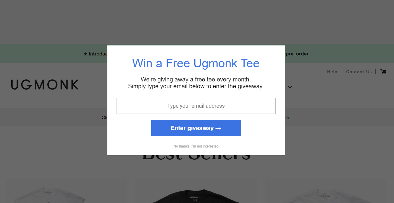
Ugmonk is a great opportunity to talk about popups.
Wait, don’t run off! I promise this isn’t about spam.
Most of the time, when people talk about popups, they’re thinking about those annoying ones that show up in a separate window on a website. You don’t notice them until you close out of that window.
Exit-intent pop-ups are different.
They’re designed to detect a user’s behavior, and they’ll only activate when it looks like you’re getting ready to leave the site.
These exit CTAs are great tools to use as a last-ditch effort to seal the deal. You’d be surprised by how effective they can be.
By getting involved right before people leave the site, these CTAs are the perfect way to put all of your cards on the table and give the user one final reason to stay.
Ugmonk’s exit CTA is actually two-fold. First, you’re presented with a chance to win a free Ugmonk tee.
The second layer to this CTA is that the next step is clearly labeled and designed to drive conversions.
Below the offer, you’re presented with a clear next step. “Type your email address,” followed by “Enter giveaway.”
Not only is the copy clear and concise, but the directness of it leaves nothing to the user’s imagination.
Notice that the signup button is brighter than the chance to decline. It’s designed to draw people’s attention, which can get you that split-second of consideration it takes to convert.
5. Spotify
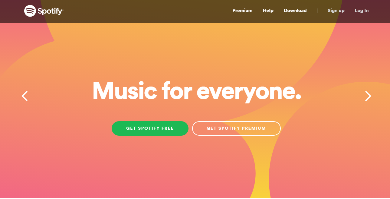
Spotify is a fun look at how you appeal to different tiers of consumers.
Their homepage shares the space for both the free user signup and the premium account signup.
What’s interesting here is how you can clearly see that one of these is more important to Spotify than the other one.
The premium signup CTA button is designed to blend in with the rest of the website.
The free account CTA button was definitely built to stand out. The color choice makes it jump right off the screen.
But there’s more. Even the copy they chose to use is clearly designed draw you toward their free account.
When it comes to a service like Spotify, it’s no wonder why this is happening. A conversion to their free service is significantly easier to sell than a premium service signup.
Still, Spotify manages to appeal to the needs of their entire user base, while clearly defining the next step and presenting their CTA front and center.
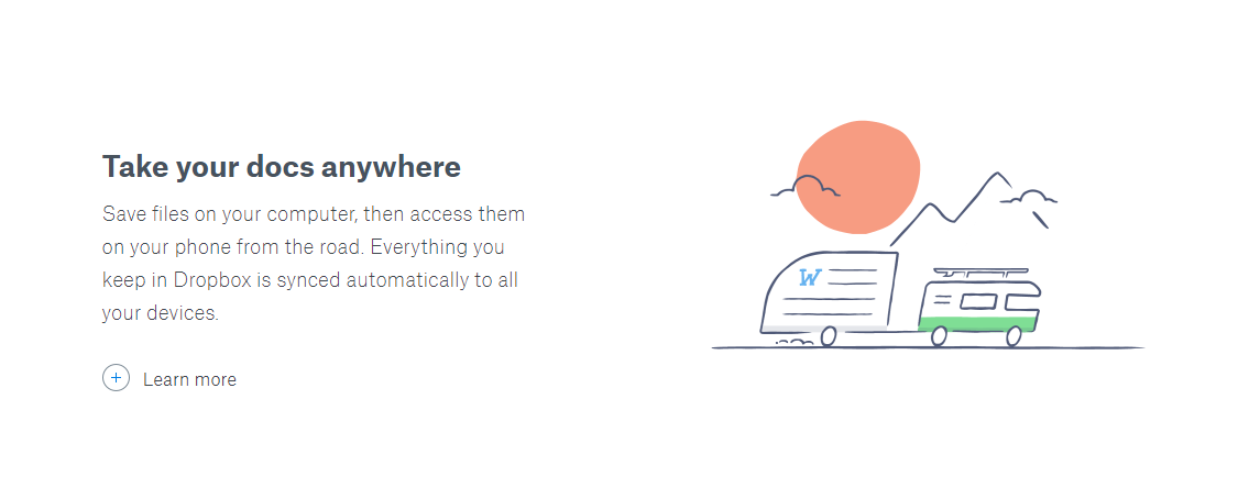
6. Dropbox
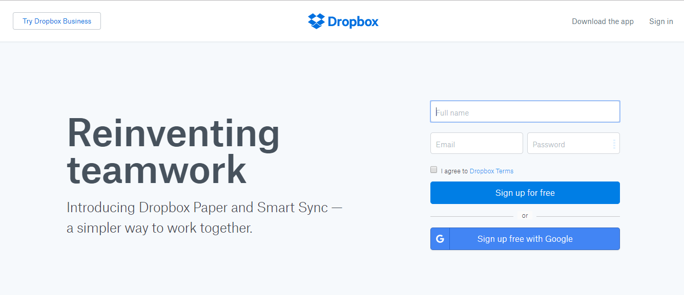
Dropbox has developed a brand that revolves around having a simplistic, almost minimalist design.
The lack of images clearly visible near the CTA on their homepage plays nicely into this style.
Keeping that in mind, it’s easy to see why their CTA works so well in this environment.
The “sign-up for free” CTA button definitely doesn’t blend in here. It fits into the color scheme that Dropbox created while still managing to stand out.
It also has the added benefit of being the same color as the official logo.
That might seem like a minor detail, but it easily lets the visitor know that this CTA is the official “sign up for Dropbox” button.
The copy on this page is also pretty compelling. “Reinventing teamwork.”
The beauty of this simple line is that it instantly fits into the visitor’s lifestyle.
If they’re considering signing up, chances are they’d already been considering how to reinvent their team dynamics.
With the seed already planted, the copy goes on to tell visitors that there’s a “simpler way to work together.”
If that’s not appealing to your audience’s needs, I don’t know what is!
Their CTA is easy to identify, they have a clearly defined next step, and their presentation works perfectly with the aesthetic they’ve created.
7. Netflix
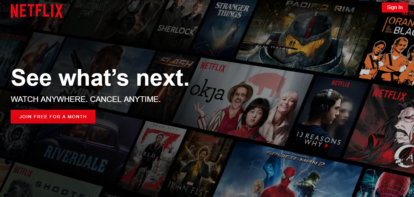
If you had to guess, what would you say is the biggest fear that free users have when it comes to signing up for something?
It’s usually that canceling their subscription will be an absolute nightmare.
And the average consumer isn’t wrong for worrying about that. Most businesses don’t exactly make it easy to cancel their plans.
Recognizing that this fear was likely the biggest objection any potential consumers might have, Netflix makes it a point to put them at ease.
With a focus on reassuring their audience, the “Join Free for a Month” CTA button is paired with the copy “Cancel Anytime.”
While that may seem like a minor detail, it’s actually the clearest indicator on this entire website that Netflix understands the needs of their audience.
But it’s about more than that.
Netflix doesn’t just understand you. They’re willing to do everything in their power to put your fears to rest.
Appealing to your audience’s needs often means meeting them halfway. That’s why something like a free trial can be such an effective CTA.
The combination of an easy cancellation process and a free month to test out their service is what makes this CTA so enticing.
If we dive even deeper into the Netflix homepage, we’ll see yet another reason why this page works so well.
They have two CTA buttons: One for new users…

…And another for users that have already signed up and are looking for a place to sign in.

Notice anything special about these buttons?
Both of them match the Netflix logo color, which confirms to users that this is the official “sign up for a free month of Netflix” button.
8. Instagram
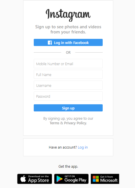
Looking at the Instagram sign-up page, it’s important to keep a few things in mind.
Right off the bat, we need to acknowledge that Instagram is a social media platform that operates mainly as a mobile app.
There’s definitely desktop accessibility, but it’s just not how most people use Instagram.
Why does this matter?
Because as much as Instagram would like you to sign up, they’d like it even more if you downloaded their app.
The platform is optimized for mobile users, so it only makes sense that they’d want to push you in that direction.
That’s why you’ll notice two additional CTAs for the Apple App Store and Google Play.
While these were designed to clearly stand out from the rest of the site, it’s worth noting that both are the exact same color and size because they’re both equally important.
Instagram doesn’t care whether you’ve got an iPhone or a Samsung. They just want to make sure you actually download the app!
From there, Instagram employs some textbook CTA tactics.
The “Log in with Facebook” CTA button is presented in blue, to match the color scheme on Facebook and to draw the attention of potential users.
Gaining access to a user’s Facebook data makes appealing to consumers’ needs even easier, so encouraging a Facebook signup is a smart move here.
The email signup option is there, too, but it’s left in a bland white, almost blending in with the background.
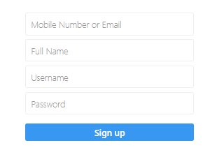
What makes this tactic such an important one to master is because it gives you the best of both worlds.
You never want to alienate potential consumers. At the end of the day, an email signup is better than no signup at all.
Still, you should do everything in your power to attract consumers to the outcome you want the most.
If someone signs up with Facebook? Great!
If someone signs up with email? That’s cool, too.
Instagram has essentially created a win-win situation for their business, and that’s something that we could all learn from.
9. Trello
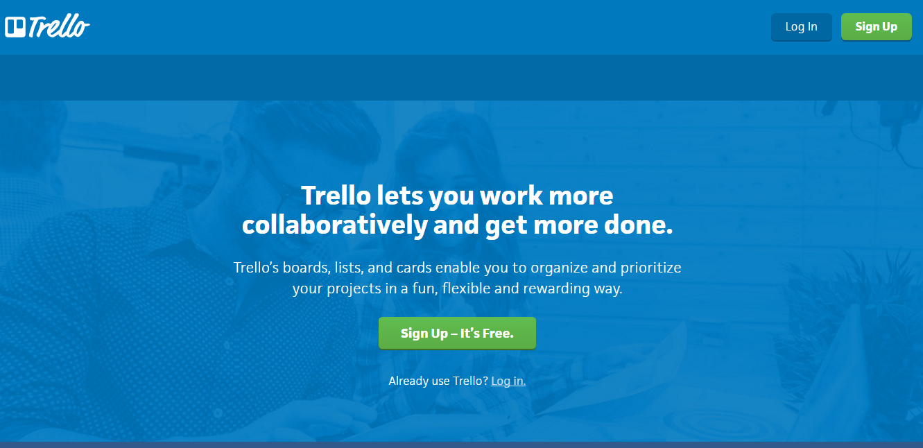
Looking at them objectively, we can all agree that CTAs have to accomplish a lot in a very short amount of time.
Within a few words, your potential consumers need to interpret value, understand what to do next, and be reassured that this is the right thing to do.
“Elegant” is a word you don’t hear too often when you’re talking about CTAs.
Which is too bad, since some of these are pretty darn elegant.
And when I say that, I don’t mean fancy or high-tech. When I think ‘elegance’, I think ‘simplicity’.
The less-is-more approach is a necessity with CTAs, and few brands have managed to pull this off quite like Trello has.
They’ve got some compelling copy as well as a CTA button that’s front-and-center and that stands out from the established color scheme.Both qualities help it appeal to the user’s fear by reassuring them it’s free to use.
Both qualities help it appeal to the user’s fear by reassuring them that it’s free to use.
This is already impressive enough, but what really fascinates me is how simple the page is.
Other than the essentials, there’s not much else to see on their homepage.
Instead of trying to overdo it, Trello leans into a high-value, low-fluff aesthetic that defines their brand, and it pays off here.
10. Square
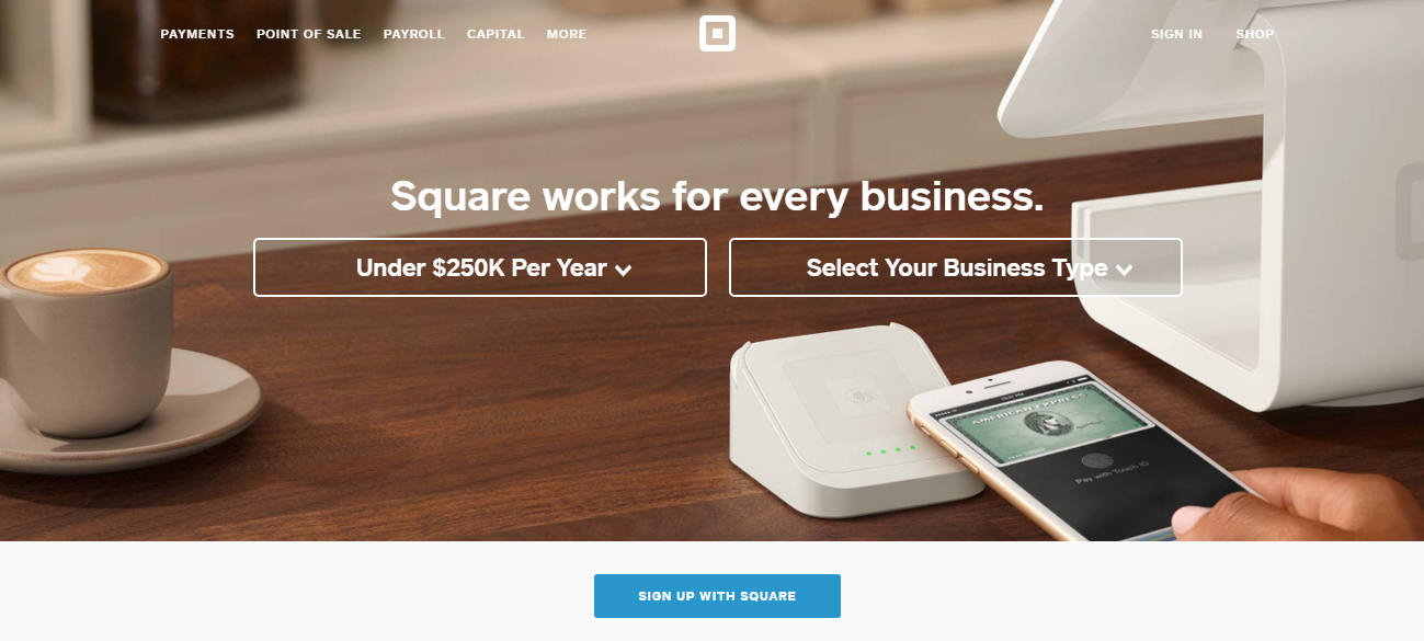
Take one look at the Square homepage and you’ll realize what makes this one of my favorites.
In some way or another, Square manages to incorporate just about every effective CTA tactic into their strategy.
“Square works for every business” is front-and-center, and this small bit of copy is perfectly suited to appeal to vendors and their needs.
The background visual is compelling, but not distracting.
The CTA button is distinctly colored and designed to stand out and grab your attention.
The button itself has “sign-up with Square” clearly labeled on it, so users don’t have to worry about what their next step should be.
Each of these tactics would be useful on their own. But when you bring them together, you create a website that’s fully optimized for conversions.
Conclusion
I’ll be the first to admit that the science of creating compelling CTAs can sometimes feel a bit confusing.
I get it. Trying to create the perfect CTA can get overwhelming pretty quickly.
So let’s take a step back for a second and focus on the fundamentals.
Appeal to the needs of your consumer. Offer value with your CTA. Consumers need a clear reason why they should sign up or buy your product.
Make sure to consider potential objections. Are they afraid of a rough cancellation process? Assure them that you have a painless one.
If you’re going to include visuals, they’d better be compelling! A background video can provide a nice touch, but a background image will typically do the trick.
Don’t be afraid to present consumers with your CTA. They understand that you’re a business, so don’t apologize for it. As long as you’re offering value, you’re in the clear.
Remember that the consumer’s next step should be straightforward and clearly defined. Ambiguity is the enemy of meaningful action.
This is your base. Any CTA that you start designing should start from here.
Every business is different, so if you have to bend the rules a bit, you’re forgiven.
Dropbox may not have stunning visuals, but they don’t need to. In fact, noisy graphics would probably clash with the aesthetic they’ve worked so hard to develop!
This is about as fancy as Dropbox needs to get.
What’s important to keep in mind is that your CTAs should always operate from the perspective of “what do I have to give the consumer?”
As long as your CTAs all revolve around the concept of offering as much value as possible, you’ll be on the path toward increasing conversions.
Speaking of CTAs, how do you structure yours?
Comments (0)