
As a blogger, you might have chosen to monetize your website with Google AdSense because it’s hassle-free. You had to submit an application to Google. And, once your account got approved, you just needed to paste a code on your website.
Content marketing requires to jump in. All your digital advertising efforts should result in traffic and conversion.
If you’re getting a sufficient amount of traffic on your website, you’ll keep earning money, even while you sleep.
That’s the dream. Right?
Banner advertising (display ad marketing) isn’t new. It has been around for 18 years now.
If you’re using advertising as a source of revenue, then you must be feeling all warm and fuzzy inside right now.
Don’t you?
But don’t get too excited, as there are some potential problems lurking.
For example, a major reason for lower CTR and ad blocking by users is because most banner ads are boring, irrelevant and intrusive. Hence banner blindness, which is nothing more than selective ignoring.
But that’s just the tip of the iceberg.
There is a bigger web usability phenomenon leading to even the good ads getting ignored – Banner Blindness.
Let’s begin this post by looking at how this phenomenon leads you to subconsciously (or consciously) ignore banner-like, online ad information.
Later in this post, I will share 5 strategies to help you get your ads noticed and kill banner blindness.
Why do we selectively shield information (particularly banner advertisements) while browsing the internet?
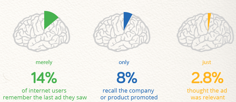
The ability to recall vital information is very handy.
So I want to test your memory.
Do you remember the last banner ad you clicked?
No?
That’s okay.
Do you even remember the last banner advertisement you saw?
It’s highly likely that you don’t.
This does not mean that you’ve poor memory skills. It means a lot of content marketing isn’t effective when it comes to getting you to see an online ad to generate a click-through rate for the advertiser.
You’re consciously or unconsciously ignoring banner-like information while browsing websites and this phenomenon is called banner blindness and is common in digital advertising today.
It’s not just about you, either.
According to a 2013 study by Infolinks, 86% of consumers suffer from banner blindness.
This protective shielding of information by web users was first found by Benway and Lane after they conducted a web usability test in 1998.
In the experiment, they requested that the subjects search for specific information on a website. A display ad being one piece.
But, even when useful information about their task was presented in banners, the participants didn’t notice the banners. Even the location of the ads didn’t matter.
This was the first study to contradict the web design guideline suggesting large and brightly colored banners for garnering the attention of users. It even begged the question: would a text ad better serve a successful click-through rate?
A major reason for this blindness in the above test was probably that the subjects were assigned specific tasks.
So they interacted with the websites only at places where they hoped to find relevant information. This is the goal of content marketing, thus needs to be the goal of all digital advertising.
Let’s look at a more recent study by Nielsen. Here are the heatmaps from eye-tracking studies for 3 activities – quick scanning, partial reading, and thorough reading.
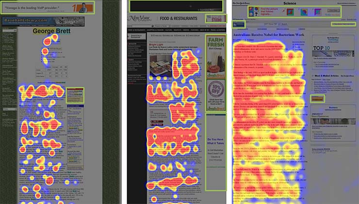
All the above 3 types of interaction suggests that people don’t care about digital advertising banners. Whether they’re performing a quick scan of a webpage to check a fact or they are (lightly or heavily) engaging deeply with the content of a website, the outcome was the same.
The conclusion is – Web users don’t look at any website element that looks like an ad. Content marketing needs to adjust.
What do you think might’ve triggered this blindness?
As per Carrie A. Lee, it’s the sensory overload with tons of information from various sources coming at us constantly.
Banner blindness is our defense mechanism against information overload.
The internet is now a major part of our daily routines. So, we’ve formed mental frameworks for browsing websites. Content marketing is always throwing more at us with more blogs, businesses and news outlets competing for our time.
Whenever you land on a new website to find necessary information, you use these frameworks to look for parts of the webpage that look promising. They’re mostly places where you found valuable information previously.
Such web-related associations for completing different categories of tasks are called cognitive schema.
A banner-like information presentation (display ad) does not fit into your schema because you previously had a terrible experience after clicking on a banner advertisement.
A study by Havas Media found that banner blindness has even started infiltrating Facebook, reducing click-through rate numbers on FB digital marketing campaigns.
Only 20% of stories in the news feed generated an emotional response from 50 participants in a stream of “funny job titles,” personal content like selfies, photos of new-born babies and sponsored ads from real brands like Cadbury and Shopcade.
Whether you’re a marketer or a publisher, I don’t think you want to see your advertisements getting ignored by your target audience.
Would you like to save your precious dollars?
Then let’s look at 5 strategies to overcome banner blindness and get the best bang of your buck.
How to get the attention of visitors habituated with ignoring banner ads? Here are 5 ways…
In content marketing, when using an advertisement business model, you want to get more clicks on your advertisements. As a marketer, you want to get maximum brand exposure through banner advertising at an optimal price (and lower your ad CPC as much as possible). This means a high click-through rate.
There’s this one problem causing your visitors to ignore your banner ads – banner blindness in digital advertising.
Here are 5 strategies to overcome this phenomenon and get your ads noticed.
Note: I want to help both of you – publishers and marketers. If you are a publisher, you can consider the investment strategies I share as an alternative advertisement type that you can test for monetizing your website.
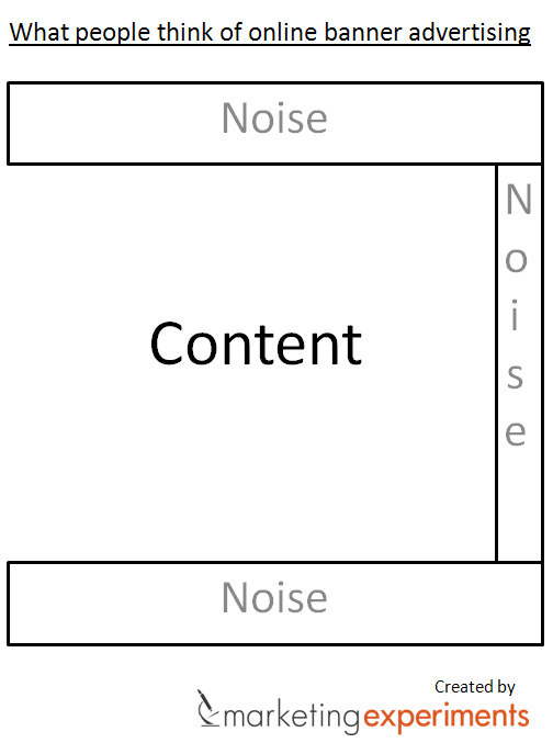
Native Advertising – Can you recall the most common geography where you typically see a display ad?
One location would definitely be the right sidebar for an online ad. Another might be at the top of the website. These are the most traditional locations to place ads and generally chase more visibility.
But which part of the website gets the most engagement?
It’s the editorial stream – the core content areas.
So the best place to deliver your ads is where you can natively embed them in your website’s content. Digital advertising needs to be in the content.
One major reason for the effectiveness of native advertisements is that they’re personalized and unique (as compared to programmatic distribution of ads based on algorithms in other advertising).
70% of internet consumers want to learn about a product through content rather than through traditional advertisement. This is why content marketing is so effective.
They’re also more likely to share a native advertisement versus a banner advertisement with their friends (or family).
Due to higher click rates and engagement (especially on mobile), the native advertising spending on online ad campaigns is expected to keep rising every year.
Because each year, smart content marketing experts increase their click-through rate by adjusting display ad formatting.
I’m guessing that you now recognize the effectiveness of this model for brands.
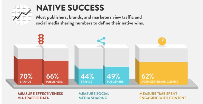
If you’re worried about how to measure the effectiveness of these native online ad campaigns, then some good metrics are: traffic, social shares and time spent engaging with content.
These metrics are essential for content marketing at all levels.
Ready to jump on the native advertising bandwagon?
I don’t want to paint a completely rosy picture.
Let’s look at the major concerns with this model.
There is a strong ethical conflict about whether or not native advertising needs complete disclosure when implemented in the publisher’s usual editorial stream (the good-old church vs. state debate in journalism).
Even NNGroup concluded that although an unethical design is effective in getting online ad fixation, it reduces the value of advertising networks.
So native advertising has transparency issues and can lead to loss of customers in the long run. I would recommend that you exercise caution when publishing a native advertisement.
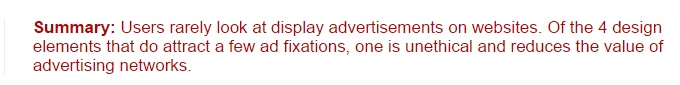
Test non-traditional ad unit sizes and locations – Standard display banner ads are 728 × 90 leaderboards and 300 × 250 rectangles.
They’re generally placed in these two locations.
The leaderboard is placed at the top of the content and frequently falls to banner blindness.
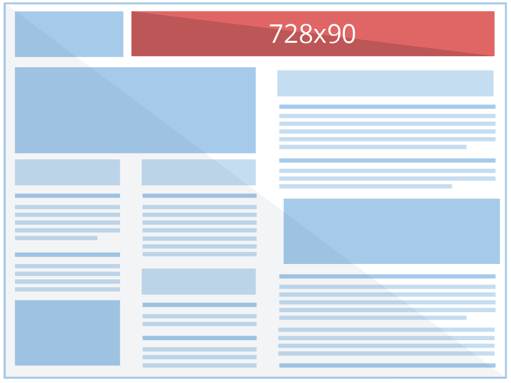
And the medium rectangle is placed in the right sidebar.
But are these sizes and locations the only effective ones in engaging your website visitors?
Nope.
Remember that web users are now already habituated to seeing these ad sizes in these places, thus banner blindness.
Since most of the ad units don’t relate to their current task, the users give standard ad placements a pass.
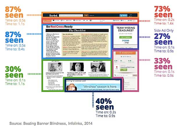
Infolinks found that more consumers tend to see above the fold. 156% more people saw the top of content versus the bottom of the content area.
But, where exactly will you gain maximum visibility and engagement in above the fold area?
Infolinks found that 75% respondents liked its unconventional placement of inSearch ads at the bottom of screens (just above the fold).
As you can see, the left-hand corner got seen by the maximum visitors – 73% consumers.
Don’t be skeptical of testing unconventional ad placements. Test different areas and see where you get the best click-through rate.
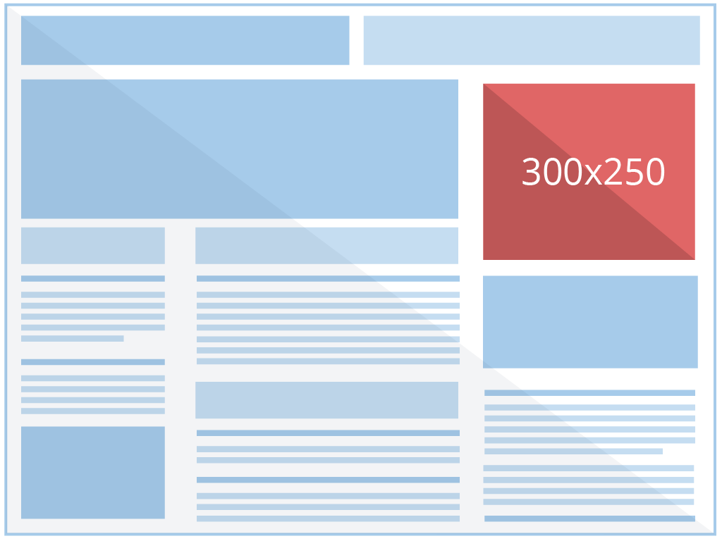
Maybe you could try advertising in your website’s edges, margins…
And perhaps even nestled between your content areas.
You can also try the new-age (dare I say, disruptive) popups – welcome page ads.
They’re great to increase the impressions of your ad and are normally served only once per day to a user.
But you might be thinking:
Aren’t such welcome ads nastily obstructive to the user? How can they receive any kind of engagement?
Let’s look at two renowned publishers that use welcome ads.
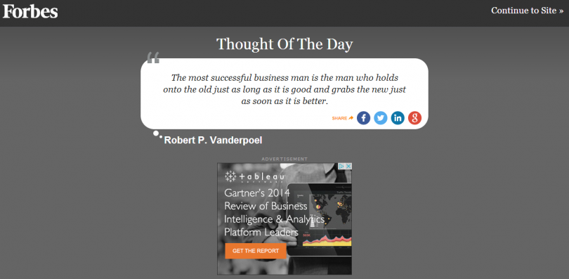
The first is Forbes.
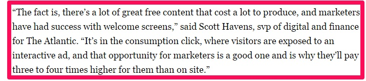
The second publisher using welcome ads is Atlantic.
Scott Havens (SVP of digital and finance for The Atlantic) also said that marketers are ready to pay three to four times for such interactive full-page welcome ads than on-site ads because they’ve seen more success with them.
As you can see, welcome ads are high-impact units and can substantially increase your display ad revenue. But, you should only consider using them on your website if you’re an established brand.
If you’re only getting started or don’t have good traffic on your website:
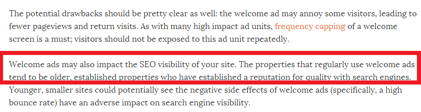
The loss of traffic, lower number of returning visitors and higher bounce rate might trigger a drop in your search ranking visibility.
Whatever ad placement and size options you choose:
Always remember to not go overboard bombarding your user with too many ads. This is sure to increase banner blindness.
User experience is of utmost importance. It’s crucial to keep relevancy between your webpage’s content and the ads you serve.
Try to implement these unconventional ads considering the real-time user intent and your engagement will rise substantially. Use your content marketing chops to engage customers with creativity and enticement.
Create a stunning design – A compelling advertisement design will immediately attract the attention of a visitor, increase your engagement and garner more clicks
On the other hand, if you serve a fake computer error banner as a pop-up ad, you’re instantly going to lose credibility.

Here are 5 design principles to help you think outside the banner ad box and increase your CTR with digital advertising.
1. Keep your design simple and similar elements close – Don’t clutter your advertisement with irrelevant information and images. Use of too many colors, verbose copy and flashing images are jarring to users.
For catching the attention of passerby visitors, you just need to:
Think of the most critical selling point of your product, a concise description, supporting imagery and a compelling CTA.
Then designate importance to each of the above elements and place them accordingly
Here is a simple hierarchy you can follow.

You can also play around with the sizes to highlight a specific element. See how the lamp and bag are made extra-large to draw focus on them?

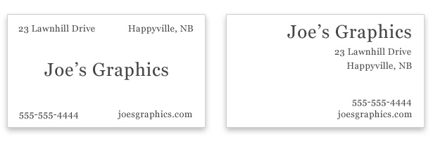
Remember it’s not just about whitespace. You also must group relevant information together as demonstrated in the business cards below. This is called the principle of proximity.
The left-hand design is weak, despite whitespace, because the elements aren’t grouped logically. You have to scan the card multiple times to gather information.
2. Use sufficient contrast with the rest of the web page – You’ll immediately catch the viewer’s attention by contrasting your ad colors with the website’s color scheme.
When host sites are light-colored, it’s better to use dark colors for your ads and vice-versa.
Remember that the contrast principle does not just apply to colors. Even the imagery and typography can direct users to where you want them to go.
Try the good old serif with a sans-serif combination.
As an example, look at the advertisement below with contrasting fonts used.

Remember to not use similar fonts like Helvetica and Arial. They don’t create contrast, but rather disrupt the reader’s flow.
3. A prominent CTA – If you want visitors to convert, you’ve got to incentivize your visitors to engage on your advertisement.
Not only should your CTA stand out from your ad, it should clearly convey the benefit of clicking.
Look at the Gillette banner ad below. It has a clean layout with easily identifiable CTA.

Now compare it with the cluttered and stressful ad below.
Yikes.
Doesn’t it hurt your eyes?
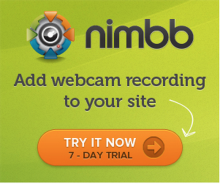
4. Use human faces or directional cues – Internet users like seeing smiling human faces and getting directed through visual cues.
Look at the banner ad of nimbb below. The CTA button was already prominent, but the small arrow further directs the visitor to click.
You can also use human faces with eyes directed towards your product to increase interaction on your ad.

5. Create interactive advertisements – I don’t recommend that you use shabby gifs. You can innovate and deliver more than an electronic billboard to your users.
In the stream of rich media content, you can experiment with interactive banners that either entertain or add value to your audience.
Don’t use the same advertisement for all visitors. Instead, serve them a message based on their location and browsing habits.
A great example of an interactive advertisement is Pringles. They created a banner ad that persuades people to keep clicking – 97 clicks to be exact.
And they received an overwhelming response with people sharing the banner advertisement experience all over social media and blogs.
Watch the video below to look at how a banner advertisement can actually build a relationship with your customers.
[youtube https://www.youtube.com/watch?v=btTw9rHxilg]
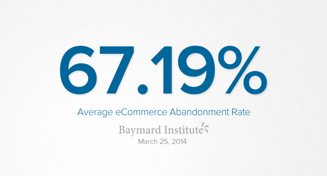
Launch remarketing campaigns – Imagine this situation. A visitor liked a product on your website. He took out his credit card and started filling the checkout form.
But, then his phone rang and circumstances led him to shut down his computer.
You just lost yourself a sale because of cart abandonment. And such abandonment due to distractions is more rampant than you think. It’s typically 67.19% for eCommerce websites.
Similarly, losing your first-time website visitors is also painful. Wouldn’t you like a repeated source of traffic from your email list?
Selling to your existing customers is a lot more profitable than the cost of acquiring new ones.
You can use retargeting ads that follow the user around on the internet.
How exactly?
By using a special tracking code to place cookies on your website visitor’s computer.
You may wonder how retargeting ads are more effective than normal banner ads.
It’s because the user has shown interest in your product i.e. taken a small step towards you.
Because of this, it’s more likely that he will take a larger step i.e. buy from you (or complete the activity you consider as a conversion), especially in the short-term.
5. Invest in video advertisements – Do you like reading, even while browsing the internet on your smartphone?
I don’t.
In a month, an average internet user is exposed to hundreds of videos.
So it makes sense for you to target the video loving audience with video.
If you look at results beyond CTR, even the completion rate of video ads is higher than traditional banners.
Videos improve the people’s understanding of your product by 74% and an average user is already spending 16.49 minutes every month watching video advertisements.
Look at the recall and action statistics generated by online videos.
Would you like to know the possible brand exposure that comes with video advertisements?
Let me share results from a successful Facebook video advertising campaign.
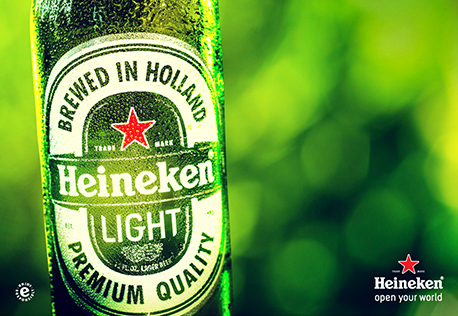
Heineken Light reached 35 million people (54% of its audience) in 3 days using Facebook video ads.
That’s a measly $.07 per view.
I hope that you’re now convinced to tell your product’s story in a video format. They work seamlessly and receive great engagement across devices.
Video advertisements are effective in even distracted environments. You may watch a video ad while walking to your office or during your lunch break, then come back later to buy the product.
Once you’ve created the video, you can run the advert on Facebook and YouTube.
When creating a video, you need to consider your target audience’s browsing habits.
The length of the video also affects the amount of engagement it receives. Right?
If you’re creating a video commercial for your product, try to keep it under 60 seconds.
But sometimes you can’t bind your creativity in a shorter length. You can produce longer video adverts, as long as they tell interesting stories, entertain the user or foster emotion.
As an example, look at the almost 3-minute video advertisement by Dove below. It took on a social psychological perspective and received great engagement.
Before you start creating your first video advert, I should warn you:
You’ll have to spend substantial dollars to ensure that the video quality is nothing short of awesome. A poor quality video ad will be a huge turn-off and can hamper your brand image.
Conclusion
Banner Blindness is a serious issue for webmasters. There is perhaps more probability that you’ll survive a plane crash or win the lottery than click a banner ad.
As a marketer, you don’t want to shell out dollars running ads that get ignored. If you’re a publisher relying on an advertisement business model, you won’t like receiving less and fewer clicks on your banner ads.
But, you can create interactive banner ads or try video ads or another strategy I mentioned in the article to overcome banner blindness.
If you provide value and serve relevant ads that serve the real-time user intent, then you should receive good interaction, even on your banner ads.
I would love to hear your thoughts. What are the strategies you’ve used in combating banner blindness as a publisher and how do you create attention-grabbing ads that get clicks as a marketer?
Comments (36)