Running an eCommerce website is not always easy. There are sales to make, orders to fill, and payments to receive. This is why it is essential to make sure you have your bases covered when it comes to running a well-rounded website.
Here we will look at things from a visitor’s point of view. We’ll start at the very beginning, when the user visits an eCommerce website, and work through to the very end, when that user places an order. We’ll go through how a business can excel at every step of the way.
We won’t be getting into every detail of an eCommerce site. Instead, we are going to give some tips that will lay a strong foundation for your eCommerce business.
Let’s look at the first step, when the visitor gets his or her first impression of a website.
Design
Have you ever walked into a store that is disorganized, smells, and has a very uninviting atmosphere?
On the other hand, have you ever walked into a store that is clean, spacious, and has a very comforting feeling, such as an Apple Store?
I’m sure you’ve been in both types of businesses. Which one gives you the impression that it’s well-managed, cares about its customers, and offers better products?
It’s probably the business that cares about its appearance.
Now think of a physical store as your eCommerce site. Design matters; and good website design signals that there’s a solid company behind the screen.
If visitors aren’t saying “wow” (in a good way) when they visit your site, it still needs work. Do not cut corners on design. Every pixel, every picture, and every word matters. Hire a good designer if you can afford it and make design a priority.
Here are a few resources to help you with improving your website design:
- If you want to get some external feedback on your website, check out a company like Usertesting.com.
- If you would like more information about web design, read our article: Does Website Design Impact The Bottom Line?
- If you’re looking for a list of what to avoid with websites, read 9 User Experience Pitfalls That Repel Website Visitors.
- If you’re looking for a good site search tool, check out Google’s Site Search. It’s relatively inexpensive and provides a quality experience in terms of site search functionality.
Speed
If you’re like me, you notice when you’re visiting a speedy website. Everything feels different. Pages take no more than a second or two to load, and information is delivered to you sooner. The site just feels better when you navigate it.
Apparently, it does more than just deliver a warm tingly feeling; it also increases sales for businesses.
Dave Garr of User Testing has said that increasing site speed improved his conversion rate by 78%.
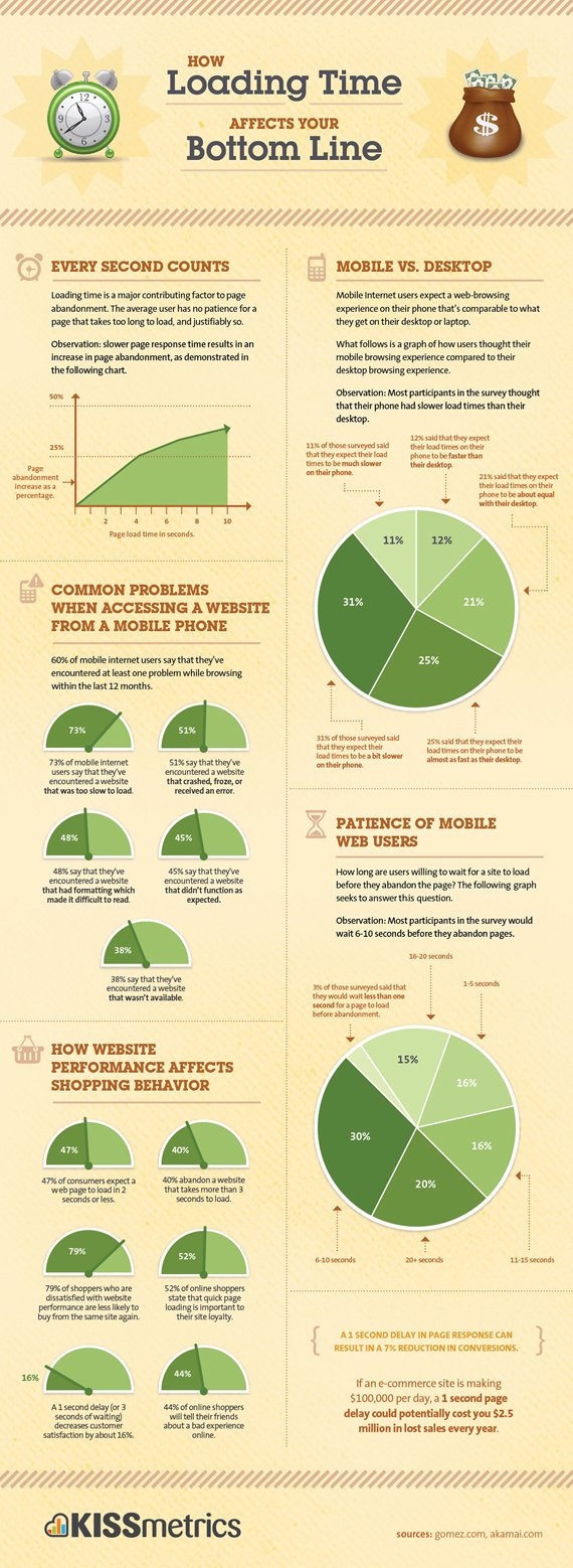
We have our own infographic on the importance of speed and what it means for the bottom line.
A second may not seem like a big deal, but it can mean hundreds of dollars (sometimes thousands) in lost sales for a business. Don’t underestimate the impact of speed.
If you think your website isn’t up to speed, you can look into getting a content delivery network (CDN).
Product Selection
Obviously, most startups cannot afford to have a product selection like Amazon or Zappos. However, having too many choices can actually cost you sales. So don’t think that having an enormous selection of products is the key to success. Sometimes limiting your selection can:
- Allow customers to quickly find what they are looking for.
- Keep customers from having “decision paralysis”.
- Increase conversions by naturally limiting the number of clicks to checkout.
What this means is product selection should be carefully thought out and strategized. And always remember: trying to source TONS of inventory can have its own logistical nightmares that can cause order delays and customer frustration. Definitely consider chopping down your selection.
Startups should look at a business like Ecomom as a reference. It services a niche, and is quite successful at doing so. It has a good product selection that competes with the Amazon baby department and reasonable prices. The question becomes:
How do you help your visitors find the products they are looking for quickly and easily?
Many eCommerce websites let users choose by brand or category:
This helps users who aren’t sure what brand to look for, but know what they need. For example, an auto parts eCommerce site can sell a lot of products. If a user knows they need an oil filter but aren’t sure what brand, the category function helps.
Finally, the obvious helper in this arena is to provide awesome search capability. Don’t underestimate this part. Generally, your run of the mill, default on-site search engine may really stink. Invest time and money into providing and excellent search experience that provides:
- Useful results that match your customers true intentions.
- Clear and easy to read results. Consider using product image thumbnails in your search results.
- An optimal number of search results. There is an optimal number of results that helps your customers when they perform a search on your site. Your job is to test this and figure that number out.
- A lightning fast return of results. This is usually not a problem, but if your search results are slow to load – then they become effectively useless.
If you find that searching is a big part of your customer’s user experience, then make your search box bigger and more obvious. Testing placement, box size, fonts and colors of your search box can all have effects on your customer shopping experience.
Product Pages
I’m going to give you 10 seconds to pitch a product to me. I already know a little bit about the product. I understand the category the product fits under, the makers of the product, and the price, but no more than that. You give me a 10 second pitch on why I should buy it.
What do you tell me?
What you tell me should be the above-the-fold content for each product page.
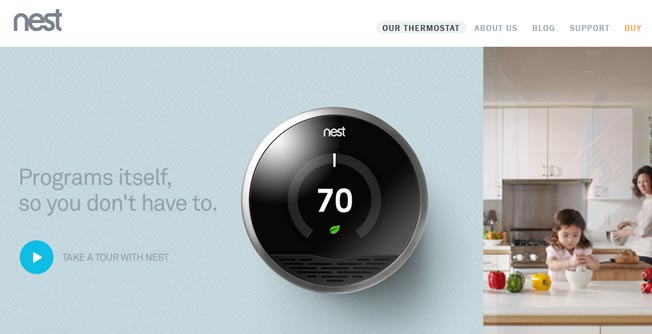
One of my favorite product pages is the Nest thermostat. It shows the benefits by the days and weeks, and gives the price at the end.
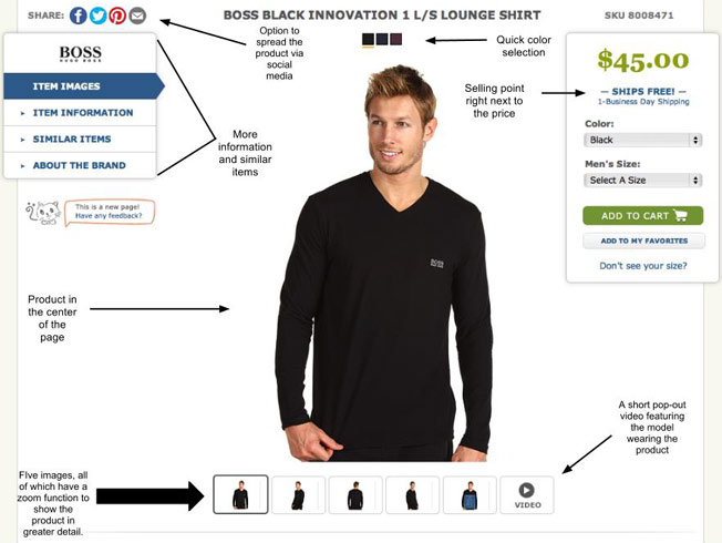
If you want inspiration for a product page, look no further than Zappos.
If you have time, have a video for each product. The best product pages take advantage of both pictures and video.
We have article on how graphics affect conversions.
Shopping Cart and Making the Transaction
The customer has come this far. They’ve visited your website, viewed your product selection, picked a product they want to buy, and put it in their shopping cart. How could the eCommerce website screw up now? A few ways — unexpectedly high shipping costs, not accepting certain payment methods, and requiring users to create accounts before they place an order. Let’s break down how to avoid these three hiccups:
- Unexpectedly high shipping costs — Many websites are now posting their shipping costs on the product page or home page. This eliminates the surprise of a high shipping cost and lets the user factor in the total cost before adding it to the shopping cart.
- Not accepting certain payment methods — Most shopping cart software products accept a variety of payment gateways. Shopify, for example, accepts over 50 providers. This lets sites accept credit cards and PayPal (if they use them as a gateway). Many eCommerce sites still accept checks and money orders.
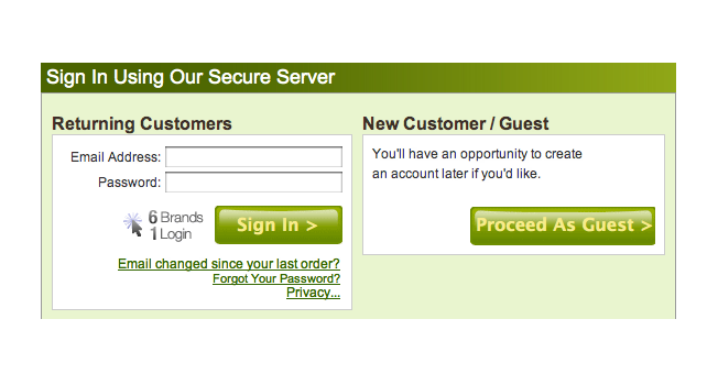
- Requiring users to create accounts before they place an order — This does not benefit the user. It’s best to let users create an account after placing an order. ProFlowers lets their users sign up after ordering:
After the Transaction
After the user has completed the order, he or she should quickly receive a receipt via the email address provided. Generally, most receipts contain the order number, contents of the customer order, an email, phone number, and social media links to contact the business.
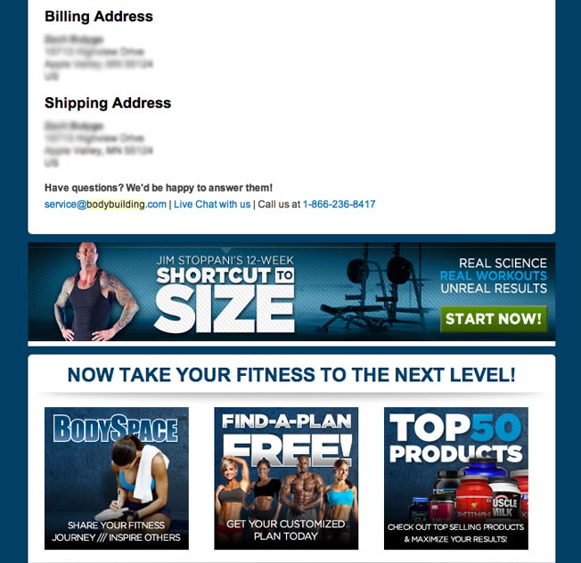
What most businesses don’t include are links back to the website. If your eCommerce site has content, you may want to consider adding banners to your latest content (educational videos, blog posts, or even coupons) in your email receipts.
Bodybuilding.com does a great job of this:
Many eCommerce sites have a web based order management function. Customers can see their order, its status, and a tracking number from the freight carrier.
The majority also send out an email once the order has shipped. The email contains the expected delivery date, the contents of the package, the tracking number from the shipping company, and a thank you from the company notifying them once again of the contact information for the company.
1 ½ – 2 Weeks after Order
About 2 weeks after the order has been placed, the CEO or the customer service manager should email the customer personally asking how everything went.
Something like this typically works well:
“Hey [name],
I want to personally thank you for the order you placed on [date].
I would like to get your feedback on the order so I can know how everything went and if anything needs improvement.
You can email me, call me, or even tweet me.
Thanks again,
[Name]
[Position in Company]
[Email]
[Phone Number]
[Twitter handle]
[Company mission statement or slogan]”
It may be beneficial to add a little personalization to the email. Mention any problems with the order that you are aware of, and possibly add in a little about the core business goal for customers. If you sell baby food, perhaps add “We hope your infant likes the [enter food name], and we hope you like the convenience of buying online!”
Even if you don’t get a good response rate, you’re still opening the door to customer feedback, which is never a bad thing.
2-3 Months after Order
If the customer hasn’t ordered again in a couple of months, you can send them an email asking them why and offering a discount code. This kind of email template should suffice:
“Hey [name],
I’ve noticed you haven’t placed an order with us in a few months. Have you seen our latest product selection [enter link] and latest content [enter link]?
We would like to welcome you back by offering you a 10% off coupon. Just apply [enter coupon code] to your next order and 10% will be automatically deducted from the total. Hurry, though, the code expires in 3 weeks.
If there’s a specific reason why you haven’t placed an order with us that we can resolve, let me know. Call, email, or tweet me.
Thanks,
[Name]
[Position in Company]
[Email]
[Phone Number]
[Twitter handle]
[Company mission statement or slogan]”
Depending on your business, you may want to make the 10% coupon bigger or smaller, and possibly extend or shorten the expiration range.
eCommerce sites are not easy. They require constant iteration, keeping up to date with the latest and greatest products, and competing with Amazon, which is no small task. Hopefully, these tips will help you gain a little advantage.
Anything else you would like to add? What do exceptional eCommerce sites do?
About the Author: Zach Bulygo is a content writer, you can follow him on Twitter @zachcb1.



Comments (31)